
Search results for "Tiny experiment" in Home Design Ideas
 Simply Home Decorating
The kitchen may be the heart of a home, but the dining room is where the family gathers to enjoy special occasions, create and pass on traditions, and savour each other’s company free from distractions. The family behind this particular dining room enjoys doing just that.
When they are not traveling the world, Matthew and Anna (names changed) love to cook meals at home with their teenage daughter, entertain family and friends, and live amongst their cherished travel souvenirs and heirlooms. Their dining room, however, was far from the perfect backdrop for these experiences.
Before: Dining Room:
When Matthew and Anna contacted us, they imagined a space that would comfortably seat 8 to 10 people and incorporate their beautiful inherited dining table and sideboard in a fresh, modern way. Above all, they wanted a dining room that they would feel proud to share.
They worked with us to design, lightly renovate, and furnish their dining room and adjacent living space. Now, the room is nothing short of inviting and elevated.
Classic Yet Contemporary Dining Room:
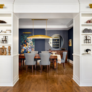
Viewed from the living area, the dining room is a hidden gem waiting to be discovered. Matthew and Anna wanted dark blue for the walls, and we couldn’t have been happier to find the perfect shade for them. By leaning darker, this rich blue creates the perception of depth, making the room feel enticing, comfortable and secluded.
The previous built-ins were underwhelming and lacked function, so we designed wider, taller, double sided cabinets that integrated the existing bulk-head, and then accessorized the shelves with the family’s travel finds, books, and decor. Topping these units with brass art lights not only blends contemporary and traditional styles, it also draws attention to the dining table’s modern show-stopping chandelier. You can’t miss it.
Inside the dining room, the effect is equally impressive: enveloping yet spacious, warm yet cool, classic yet contemporary. We incorporated their heirloom pieces seamlessly into the design thanks to the 1:2 ratio. For every traditional piece, we introduced two more modern or contemporary pieces — clean lines, subtle curves, and lustrous brass hardware. The result is a collected yet updated look.
In any room with dark walls, lighting is of the utmost importance. We placed a mirror adjacent to the window to reflect natural light throughout the room, and we kept the trim and ceiling white for brightness. To provide maximum versatility, we provided multiple light sources that can be adjusted to create different levels of light to suit any mood or occasion. These include: pot lights and a chandelier on dimmers, a sculptural trilight lamp on the sideboard, and art lights on the bookcases and above important art pieces.
The built-ins have another surprise waiting inside this special dining room:
Double-sided built-ins: dining room shelving and living room shelving.
Rather than keep them white like we did in the living room, we painted the back wall of the book cases the same dark blue as the walls in the rest of the room. This reduces the contrast with the surrounding walls and emphasizes the white outline of the cabinets. We also love the dark blue walls’ role as a beautiful backdrop for this family’s treasures. The brass accessories and hand-painted vases and bowls feel like part of the experience.
Of course, what is beauty without function? It may not look like it, but the base storage is only accessible from the dining room side. The units include deep cabinets for storing serving ware, as well as another delightful surprise: silverware drawers lined in luxurious navy velvet!
Lastly, we designed this beautiful nook for their heirloom sideboard. From afar, the wall looks as if it has texture and perhaps a touch of shine. Up close, you will notice that it is actually navy blue wallpaper with tiny golden dots. This unique touch accentuates the brass in the room touches throughout the space.. The room feels curated, contemporary, and full of character.
Words of Praise:
Anna and Matthew were thrilled with their new dining room and with the design process itself, which is always the highest compliment. They said:
“Working with Lori and her team at Simply Home Decorating was a great experience. The design they came up with was both beautiful and practical for our family. Renovations can be stressful but working with Simply Home made the process much more pleasant.
“Simply Home's project management and their longstanding relationships with reliable trades meant we could relax, knowing that everything was taken care of. If an issue arose, the entire Simply Home team was quick to address it. They were excellent at communicating with us—we never felt like we didn't know what was going on. We would highly recommend working with Simply Home Decorating.”
Thank you, Matthew and Anna! We are honoured to have been part of your journey and wish your family many happy memories in these new spaces.
Now, is it your turn? Are you ready to uncover the hidden potential in your home? If so, contact us here to start the conversation or download my guide Uncovering the Hidden Potential in Your Home below to learn more about what we can do for you.
 Simply Home Decorating
The kitchen may be the heart of a home, but the dining room is where the family gathers to enjoy special occasions, create and pass on traditions, and savour each other’s company free from distractions. The family behind this particular dining room enjoys doing just that.
When they are not traveling the world, Matthew and Anna (names changed) love to cook meals at home with their teenage daughter, entertain family and friends, and live amongst their cherished travel souvenirs and heirlooms. Their dining room, however, was far from the perfect backdrop for these experiences.
Before: Dining Room:
When Matthew and Anna contacted us, they imagined a space that would comfortably seat 8 to 10 people and incorporate their beautiful inherited dining table and sideboard in a fresh, modern way. Above all, they wanted a dining room that they would feel proud to share.
They worked with us to design, lightly renovate, and furnish their dining room and adjacent living space. Now, the room is nothing short of inviting and elevated.
Classic Yet Contemporary Dining Room:
Viewed from the living area, the dining room is a hidden gem waiting to be discovered. Matthew and Anna wanted dark blue for the walls, and we couldn’t have been happier to find the perfect shade for them. By leaning darker, this rich blue creates the perception of depth, making the room feel enticing, comfortable and secluded.
The previous built-ins were underwhelming and lacked function, so we designed wider, taller, double sided cabinets that integrated the existing bulk-head, and then accessorized the shelves with the family’s travel finds, books, and decor. Topping these units with brass art lights not only blends contemporary and traditional styles, it also draws attention to the dining table’s modern show-stopping chandelier. You can’t miss it.
Inside the dining room, the effect is equally impressive: enveloping yet spacious, warm yet cool, classic yet contemporary. We incorporated their heirloom pieces seamlessly into the design thanks to the 1:2 ratio. For every traditional piece, we introduced two more modern or contemporary pieces — clean lines, subtle curves, and lustrous brass hardware. The result is a collected yet updated look.
In any room with dark walls, lighting is of the utmost importance. We placed a mirror adjacent to the window to reflect natural light throughout the room, and we kept the trim and ceiling white for brightness. To provide maximum versatility, we provided multiple light sources that can be adjusted to create different levels of light to suit any mood or occasion. These include: pot lights and a chandelier on dimmers, a sculptural trilight lamp on the sideboard, and art lights on the bookcases and above important art pieces.
The built-ins have another surprise waiting inside this special dining room:
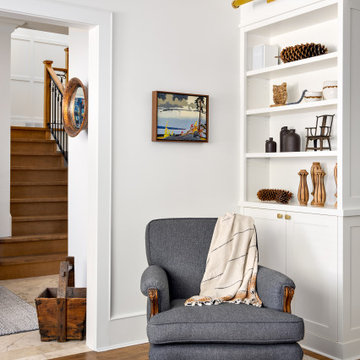
Double-sided built-ins: dining room shelving and living room shelving.
Rather than keep them white like we did in the living room, we painted the back wall of the book cases the same dark blue as the walls in the rest of the room. This reduces the contrast with the surrounding walls and emphasizes the white outline of the cabinets. We also love the dark blue walls’ role as a beautiful backdrop for this family’s treasures. The brass accessories and hand-painted vases and bowls feel like part of the experience.
Of course, what is beauty without function? It may not look like it, but the base storage is only accessible from the dining room side. The units include deep cabinets for storing serving ware, as well as another delightful surprise: silverware drawers lined in luxurious navy velvet!
Lastly, we designed this beautiful nook for their heirloom sideboard. From afar, the wall looks as if it has texture and perhaps a touch of shine. Up close, you will notice that it is actually navy blue wallpaper with tiny golden dots. This unique touch accentuates the brass in the room touches throughout the space.. The room feels curated, contemporary, and full of character.
Words of Praise:
Anna and Matthew were thrilled with their new dining room and with the design process itself, which is always the highest compliment. They said:
“Working with Lori and her team at Simply Home Decorating was a great experience. The design they came up with was both beautiful and practical for our family. Renovations can be stressful but working with Simply Home made the process much more pleasant.
“Simply Home's project management and their longstanding relationships with reliable trades meant we could relax, knowing that everything was taken care of. If an issue arose, the entire Simply Home team was quick to address it. They were excellent at communicating with us—we never felt like we didn't know what was going on. We would highly recommend working with Simply Home Decorating.”
Thank you, Matthew and Anna! We are honoured to have been part of your journey and wish your family many happy memories in these new spaces.
Now, is it your turn? Are you ready to uncover the hidden potential in your home? If so, contact us here to start the conversation or download my guide Uncovering the Hidden Potential in Your Home below to learn more about what we can do for you.
 Home Advertising
The Perfect Blend of Tradition and Timekeeping
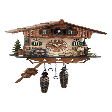
Are you considering adding a touch of charm and elegance to your home decor? Look no further than the timeless and delightful cuckoo clock. Originating from the Black Forest region in Germany, these enchanting timepieces have captured the hearts of clock enthusiasts around the world. In this article, we will explore the top five reasons why you should buy a cuckoo clock today.
1. Immerse Yourself in German Culture
There's no better way to immerse yourself in the rich heritage of German craftsmanship and tradition than by owning an authentic cuckoo clock. With its intricate designs and meticulous craftsmanship, each cuckoo clock tells a story of German culture. From the beautifully carved wooden figurines to the enchanting melodies that accompany the cuckoo's call, these clocks are a true representation of German artistry.
Did you know? The Black Forest region in Germany has been renowned for its clockmaking since the 17th century. It is home to some of the most skilled artisans in the world.
2. Experience the Beauty of Mechanical Engineering
In today's digital age, where most timepieces are powered by batteries or electricity, owning a mechanical cuckoo clock is a delightful departure from the norm. Witnessing the intricate gears, levers, and pendulums in motion is an experience in itself. The rhythmic ticking and soothing sound of the cuckoo's call bring a sense of tranquility and nostalgia to your living space.
Fun Fact: The mechanical movement of a cuckoo clock is powered by weights that need to be wound manually. This interaction with the clock adds a tactile and engaging element to the overall experience.
3. Enhance Your Home Decor
A cuckoo clock is more than just a timekeeping device; it's a statement piece that adds character and warmth to any room. Whether you prefer a traditional chalet-style clock or a more contemporary design, there is a cuckoo clock to suit every taste and interior decor. Hang it on a prominent wall, and watch as it becomes a focal point, captivating the attention of guests and family members alike.
Pro Tip: Consider the size and color of your cuckoo clock to ensure it complements the existing elements in your room. Earthy tones like brown and black are popular choices that blend well with various decor styles.
4. Delight in the Charming Cuckoo Call
One of the most enchanting features of a cuckoo clock is, of course, the cuckoo's call itself. With each hour, the tiny bird emerges from its wooden abode and chirps the corresponding number of times. The gentle sound of the cuckoo's call evokes a sense of whimsy and nostalgia, transporting you to the idyllic Black Forest region. It's a delightful way to keep track of time and adds a touch of magic to your everyday routine.
Did you know? The cuckoo's call is produced by a small bellows system inside the clock. As air pressure changes, the bellows push air through two wooden pipes, creating the familiar "cuckoo" sound.
5. Pass Down a Cherished Heirloom
Investing in a cuckoo clock is not just a purchase; it's an investment in a cherished heirloom that can be passed down through generations. These meticulously crafted timepieces are built to stand the test of time, both in terms of durability and timeless appeal. By owning a cuckoo clock, you can create a legacy and leave a piece of your own history for your loved ones to treasure.
Pro Tip: Regular maintenance and care, such as oiling the gears and keeping the clock away from direct sunlight, can help ensure the longevity of your cuckoo clock.
FAQs about Cuckoo Clocks
Q1. How long do cuckoo clocks typically last?
Cuckoo clocks are known for their longevity. With proper care and maintenance, a well-crafted cuckoo clock can last for generations.
Q2. Do all cuckoo clocks have the same design?
No, cuckoo clocks come in various designs, ranging from traditional chalet-style clocks to more contemporary and whimsical designs. There is a wide variety to choose from, catering to different tastes and preferences.
Q3. Can I adjust the volume of the cuckoo's call?
Yes, most cuckoo clocks have a volume control feature that allows you to adjust the sound of the cuckoo's call to your liking.
Q4. Are cuckoo clocks difficult to set up and maintain?
While setting up a cuckoo clock requires some initial adjustments, it is not overly complicated. Regular maintenance, such as oiling the gears and keeping the clock clean, will ensure its smooth operation.
Q5. Are cuckoo clocks environmentally friendly?
Cuckoo clocks are generally considered environmentally friendly as they operate using mechanical movements and do not rely on electricity or batteries. However, it is important to ensure that the wood used in the clock is sourced responsibly.
Q6. Can I find cuckoo clocks with modern features, such as automatic night shut-off?
Yes, many modern cuckoo clocks offer additional features like automatic night shut-off to silence the clock during the nighttime hours, ensuring a peaceful sleep.
In Conclusion
Owning a cuckoo clock is a delightful way to bring a touch of German tradition and craftsmanship into your home. From immersing yourself in German culture to experiencing the beauty of mechanical engineering, a cuckoo clock offers much more than just timekeeping. So why wait? Indulge in the enchantment of a cuckoo clock today and create a cherished heirloom that will be treasured for years to come.
Find the right local pro for your project

 BAUFORMAT
Wavy mother of pearl porcelain tile, wavy white tile for bathroom shower or backsplash. Perfect for fireplace or accent wall
Example of a trendy bathroom design in Los Angeles
Example of a trendy bathroom design in Los Angeles


 Advance Design Studio, Ltd.
Karen and Chad of Tower Lakes, IL were tired of their unfinished basement functioning as nothing more than a storage area and depressing gym. They wanted to increase the livable square footage of their home with a cohesive finished basement design, while incorporating space for the kids and adults to hang out.
“We wanted to make sure that upon renovating the basement, that we can have a place where we can spend time and watch movies, but also entertain and showcase the wine collection that we have,” Karen said.
After a long search comparing many different remodeling companies, Karen and Chad found Advance Design Studio. They were drawn towards the unique “Common Sense Remodeling” process that simplifies the renovation experience into predictable steps focused on customer satisfaction.
“There are so many other design/build companies, who may not have transparency, or a focused process in mind and I think that is what separated Advance Design Studio from the rest,” Karen said.
Karen loved how designer Claudia Pop was able to take very high-level concepts, “non-negotiable items” and implement them in the initial 3D drawings. Claudia and Project Manager DJ Yurik kept the couple in constant communication through the project. “Claudia was very receptive to the ideas we had, but she was also very good at infusing her own points and thoughts, she was very responsive, and we had an open line of communication,” Karen said.
A very important part of the basement renovation for the couple was the home gym and sauna. The “high-end hotel” look and feel of the openly blended work out area is both highly functional and beautiful to look at. The home sauna gives them a place to relax after a long day of work or a tough workout. “The gym was a very important feature for us,” Karen said. “And I think (Advance Design) did a very great job in not only making the gym a functional area, but also an aesthetic point in our basement”.
An extremely unique wow-factor in this basement is the walk in glass wine cellar that elegantly displays Karen and Chad’s extensive wine collection. Immediate access to the stunning wet bar accompanies the wine cellar to make this basement a popular spot for friends and family.
The custom-built wine bar brings together two natural elements; Calacatta Vicenza Quartz and thick distressed Black Walnut. Sophisticated yet warm Graphite Dura Supreme cabinetry provides contrast to the soft beige walls and the Calacatta Gold backsplash. An undermount sink across from the bar in a matching Calacatta Vicenza Quartz countertop adds functionality and convenience to the bar, while identical distressed walnut floating shelves add an interesting design element and increased storage. Rich true brown Rustic Oak hardwood floors soften and warm the space drawing all the areas together.
Across from the bar is a comfortable living area perfect for the family to sit down at a watch a movie. A full bath completes this finished basement with a spacious walk-in shower, Cocoa Brown Dura Supreme vanity with Calacatta Vicenza Quartz countertop, a crisp white sink and a stainless-steel Voss faucet.
Advance Design’s Common Sense process gives clients the opportunity to walk through the basement renovation process one step at a time, in a completely predictable and controlled environment. “Everything was designed and built exactly how we envisioned it, and we are really enjoying it to it’s full potential,” Karen said.
Constantly striving for customer satisfaction, Advance Design’s success is heavily reliant upon happy clients referring their friends and family. “We definitely will and have recommended Advance Design Studio to friends who are looking to embark on a remodeling project small or large,” Karen exclaimed at the completion of her project.

 RAJ Kitchen and Bath, LLC
 “Full apartment design”.
IF you have not yet seen this apartment conversion before, we strongly urge you to go to the bottom left of this page and click on the short 2-minutes video. It would put a lot of things into perspective when you come back and continue reading this.
It is true we were literally handed the keys and told a list of things that they wanted to have happen and we were to go into the apartment, look at the space and come up with a design that would satisfy all of that need. UNTIL we showed up! The unit had really seen some better days but we knew we had to look past that and come up with a concept that would work for them.
The immediate challenges were centered around 3 big ideas:
1. Adding a second bedroom to the already small footprint
2. Figuring out a way to make the kitchen bigger, better and brighter
3. Creating a master room walk in closet
It’s always difficult to add new rooms into existing footprint without expanding out or up and not incurring any opportunity cost. In this case, that was exactly what we had to do. Item one and two above had to be tackled as one. We went ahead and switched out the location of the dining room and eliminating an area where there was a “nook” type eat-in area. By doing so, we were able to cut right into that footprint and change the layout of the kitchen.
That one move allowed us to dig into the kitchen design because it was now the main focal point in the apartment. It was no longer an option to keep it in that tiny hole where it was, so we had to ensure that this design was functional and aesthetically pleasing at the same time. By adding the table into the space where an Island typically would go, we were able to both cut cost and still provide a dining experience. The Table serves as an Island as well when cooking.
We then proceeded to block in the existing doorway to the dining room. By doing this, we were able to create a full room which allowed us to put a door on the other side and called that room Bedroom #2. This was easier to do because all of the mechanicals were already in that space (light, heater and windows). By shifting things around, we also achieved a huge wall to wall closet from inside. PERFECT!
Then we moved into the Single bedroom. We thought it was a big room with a small closet, so by creatively adding an L shaped wall and steal some footprint into the bedroom side, we were able to put a door on that new room and design it for the walk-in closet. Even after this, the bedroom still holds a queen size bed with 2 night stands, a TV on the wall, a sitting chair and plenty of room to walk around. This was done by rethinking the location for the bed and night stands.
The bathroom was gutted to make sure there was no leaks and rebuild from the ground up. We kept all of the plumbing where it was, added a new vanity, medicine cabinet, tiles and lighting and it was done.
From there, the rest of the unit had new flooring all throughout, paint, and lighting. After completion and walk through, this project was handed over back to the clients.
Execution and collaboration between all the trades were: Reggie and his team from Premier Interiors and Rohan from RD Mechanical Services.
p.s. Please see our website to see the video.

 RAJ Kitchen and Bath, LLC
 “Full apartment design”.
IF you have not yet seen this apartment conversion before, we strongly urge you to go to the bottom left of this page and click on the short 2-minutes video. It would put a lot of things into perspective when you come back and continue reading this.
It is true we were literally handed the keys and told a list of things that they wanted to have happen and we were to go into the apartment, look at the space and come up with a design that would satisfy all of that need. UNTIL we showed up! The unit had really seen some better days but we knew we had to look past that and come up with a concept that would work for them.
The immediate challenges were centered around 3 big ideas:
1. Adding a second bedroom to the already small footprint
2. Figuring out a way to make the kitchen bigger, better and brighter
3. Creating a master room walk in closet
It’s always difficult to add new rooms into existing footprint without expanding out or up and not incurring any opportunity cost. In this case, that was exactly what we had to do. Item one and two above had to be tackled as one. We went ahead and switched out the location of the dining room and eliminating an area where there was a “nook” type eat-in area. By doing so, we were able to cut right into that footprint and change the layout of the kitchen.
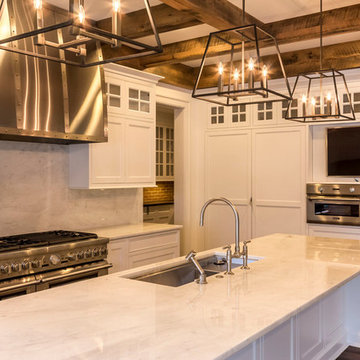
That one move allowed us to dig into the kitchen design because it was now the main focal point in the apartment. It was no longer an option to keep it in that tiny hole where it was, so we had to ensure that this design was functional and aesthetically pleasing at the same time. By adding the table into the space where an Island typically would go, we were able to both cut cost and still provide a dining experience. The Table serves as an Island as well when cooking.
We then proceeded to block in the existing doorway to the dining room. By doing this, we were able to create a full room which allowed us to put a door on the other side and called that room Bedroom #2. This was easier to do because all of the mechanicals were already in that space (light, heater and windows). By shifting things around, we also achieved a huge wall to wall closet from inside. PERFECT!
Then we moved into the Single bedroom. We thought it was a big room with a small closet, so by creatively adding an L shaped wall and steal some footprint into the bedroom side, we were able to put a door on that new room and design it for the walk-in closet. Even after this, the bedroom still holds a queen size bed with 2 night stands, a TV on the wall, a sitting chair and plenty of room to walk around. This was done by rethinking the location for the bed and night stands.
The bathroom was gutted to make sure there was no leaks and rebuild from the ground up. We kept all of the plumbing where it was, added a new vanity, medicine cabinet, tiles and lighting and it was done.
From there, the rest of the unit had new flooring all throughout, paint, and lighting. After completion and walk through, this project was handed over back to the clients.
Execution and collaboration between all the trades were: Reggie and his team from Premier Interiors and Rohan from RD Mechanical Services.
p.s. Please see our website to see the video.

 Anne Hauck Art Deco
The high-ceilinged entrance area features Art deco banding to accentuate the ceiling and doorways. The contemporary French pedestal and the Screen in the style of Jean Dunand from Anne Hauck showroom. Lighting and artwork from Paris. Area leads into office.

 Interiors by Maite Granda
"I want a place to hide from my sisters and play Lego with my friends" his only request. So, the idea came out very easily. Being the house located in an island what a better place to hide than a pirate ship with dark hardwood floors, fisheye windows , wood ladders with limited access to his sisters. Meanwhile, the sleeping area was designed with all nautical decor, whites, blues and red colors, furniture from pottery barn and a bunk bed that easily accommodate 3 kids, a desk with a chair and plenty of space to play.
Rolando Diaz & Bluemoon Filmworks
 RAJ Kitchen and Bath, LLC
 “Full apartment design”.
IF you have not yet seen this apartment conversion before, we strongly urge you to go to the bottom left of this page and click on the short 2-minutes video. It would put a lot of things into perspective when you come back and continue reading this.
It is true we were literally handed the keys and told a list of things that they wanted to have happen and we were to go into the apartment, look at the space and come up with a design that would satisfy all of that need. UNTIL we showed up! The unit had really seen some better days but we knew we had to look past that and come up with a concept that would work for them.
The immediate challenges were centered around 3 big ideas:
1. Adding a second bedroom to the already small footprint
2. Figuring out a way to make the kitchen bigger, better and brighter
3. Creating a master room walk in closet
It’s always difficult to add new rooms into existing footprint without expanding out or up and not incurring any opportunity cost. In this case, that was exactly what we had to do. Item one and two above had to be tackled as one. We went ahead and switched out the location of the dining room and eliminating an area where there was a “nook” type eat-in area. By doing so, we were able to cut right into that footprint and change the layout of the kitchen.
That one move allowed us to dig into the kitchen design because it was now the main focal point in the apartment. It was no longer an option to keep it in that tiny hole where it was, so we had to ensure that this design was functional and aesthetically pleasing at the same time. By adding the table into the space where an Island typically would go, we were able to both cut cost and still provide a dining experience. The Table serves as an Island as well when cooking.
We then proceeded to block in the existing doorway to the dining room. By doing this, we were able to create a full room which allowed us to put a door on the other side and called that room Bedroom #2. This was easier to do because all of the mechanicals were already in that space (light, heater and windows). By shifting things around, we also achieved a huge wall to wall closet from inside. PERFECT!
Then we moved into the Single bedroom. We thought it was a big room with a small closet, so by creatively adding an L shaped wall and steal some footprint into the bedroom side, we were able to put a door on that new room and design it for the walk-in closet. Even after this, the bedroom still holds a queen size bed with 2 night stands, a TV on the wall, a sitting chair and plenty of room to walk around. This was done by rethinking the location for the bed and night stands.
The bathroom was gutted to make sure there was no leaks and rebuild from the ground up. We kept all of the plumbing where it was, added a new vanity, medicine cabinet, tiles and lighting and it was done.
From there, the rest of the unit had new flooring all throughout, paint, and lighting. After completion and walk through, this project was handed over back to the clients.
Execution and collaboration between all the trades were: Reggie and his team from Premier Interiors and Rohan from RD Mechanical Services.
p.s. Please see our website to see the video.
 RAJ Kitchen and Bath, LLC
 “Full apartment design”.
IF you have not yet seen this apartment conversion before, we strongly urge you to go to the bottom left of this page and click on the short 2-minutes video. It would put a lot of things into perspective when you come back and continue reading this.
It is true we were literally handed the keys and told a list of things that they wanted to have happen and we were to go into the apartment, look at the space and come up with a design that would satisfy all of that need. UNTIL we showed up! The unit had really seen some better days but we knew we had to look past that and come up with a concept that would work for them.
The immediate challenges were centered around 3 big ideas:
1. Adding a second bedroom to the already small footprint
2. Figuring out a way to make the kitchen bigger, better and brighter
3. Creating a master room walk in closet
It’s always difficult to add new rooms into existing footprint without expanding out or up and not incurring any opportunity cost. In this case, that was exactly what we had to do. Item one and two above had to be tackled as one. We went ahead and switched out the location of the dining room and eliminating an area where there was a “nook” type eat-in area. By doing so, we were able to cut right into that footprint and change the layout of the kitchen.
That one move allowed us to dig into the kitchen design because it was now the main focal point in the apartment. It was no longer an option to keep it in that tiny hole where it was, so we had to ensure that this design was functional and aesthetically pleasing at the same time. By adding the table into the space where an Island typically would go, we were able to both cut cost and still provide a dining experience. The Table serves as an Island as well when cooking.
We then proceeded to block in the existing doorway to the dining room. By doing this, we were able to create a full room which allowed us to put a door on the other side and called that room Bedroom #2. This was easier to do because all of the mechanicals were already in that space (light, heater and windows). By shifting things around, we also achieved a huge wall to wall closet from inside. PERFECT!
Then we moved into the Single bedroom. We thought it was a big room with a small closet, so by creatively adding an L shaped wall and steal some footprint into the bedroom side, we were able to put a door on that new room and design it for the walk-in closet. Even after this, the bedroom still holds a queen size bed with 2 night stands, a TV on the wall, a sitting chair and plenty of room to walk around. This was done by rethinking the location for the bed and night stands.
The bathroom was gutted to make sure there was no leaks and rebuild from the ground up. We kept all of the plumbing where it was, added a new vanity, medicine cabinet, tiles and lighting and it was done.
From there, the rest of the unit had new flooring all throughout, paint, and lighting. After completion and walk through, this project was handed over back to the clients.
Execution and collaboration between all the trades were: Reggie and his team from Premier Interiors and Rohan from RD Mechanical Services.
p.s. Please see our website to see the video.
 RAJ Kitchen and Bath, LLC
 “Full apartment design”.
IF you have not yet seen this apartment conversion before, we strongly urge you to go to the bottom left of this page and click on the short 2-minutes video. It would put a lot of things into perspective when you come back and continue reading this.
It is true we were literally handed the keys and told a list of things that they wanted to have happen and we were to go into the apartment, look at the space and come up with a design that would satisfy all of that need. UNTIL we showed up! The unit had really seen some better days but we knew we had to look past that and come up with a concept that would work for them.
The immediate challenges were centered around 3 big ideas:
1. Adding a second bedroom to the already small footprint
2. Figuring out a way to make the kitchen bigger, better and brighter
3. Creating a master room walk in closet
It’s always difficult to add new rooms into existing footprint without expanding out or up and not incurring any opportunity cost. In this case, that was exactly what we had to do. Item one and two above had to be tackled as one. We went ahead and switched out the location of the dining room and eliminating an area where there was a “nook” type eat-in area. By doing so, we were able to cut right into that footprint and change the layout of the kitchen.
That one move allowed us to dig into the kitchen design because it was now the main focal point in the apartment. It was no longer an option to keep it in that tiny hole where it was, so we had to ensure that this design was functional and aesthetically pleasing at the same time. By adding the table into the space where an Island typically would go, we were able to both cut cost and still provide a dining experience. The Table serves as an Island as well when cooking.
We then proceeded to block in the existing doorway to the dining room. By doing this, we were able to create a full room which allowed us to put a door on the other side and called that room Bedroom #2. This was easier to do because all of the mechanicals were already in that space (light, heater and windows). By shifting things around, we also achieved a huge wall to wall closet from inside. PERFECT!
Then we moved into the Single bedroom. We thought it was a big room with a small closet, so by creatively adding an L shaped wall and steal some footprint into the bedroom side, we were able to put a door on that new room and design it for the walk-in closet. Even after this, the bedroom still holds a queen size bed with 2 night stands, a TV on the wall, a sitting chair and plenty of room to walk around. This was done by rethinking the location for the bed and night stands.
The bathroom was gutted to make sure there was no leaks and rebuild from the ground up. We kept all of the plumbing where it was, added a new vanity, medicine cabinet, tiles and lighting and it was done.
From there, the rest of the unit had new flooring all throughout, paint, and lighting. After completion and walk through, this project was handed over back to the clients.
Execution and collaboration between all the trades were: Reggie and his team from Premier Interiors and Rohan from RD Mechanical Services.
p.s. Please see our website to see the video.
 RAJ Kitchen and Bath, LLC
 “Full apartment design”.
IF you have not yet seen this apartment conversion before, we strongly urge you to go to the bottom left of this page and click on the short 2-minutes video. It would put a lot of things into perspective when you come back and continue reading this.
It is true we were literally handed the keys and told a list of things that they wanted to have happen and we were to go into the apartment, look at the space and come up with a design that would satisfy all of that need. UNTIL we showed up! The unit had really seen some better days but we knew we had to look past that and come up with a concept that would work for them.
The immediate challenges were centered around 3 big ideas:
1. Adding a second bedroom to the already small footprint
2. Figuring out a way to make the kitchen bigger, better and brighter
3. Creating a master room walk in closet
It’s always difficult to add new rooms into existing footprint without expanding out or up and not incurring any opportunity cost. In this case, that was exactly what we had to do. Item one and two above had to be tackled as one. We went ahead and switched out the location of the dining room and eliminating an area where there was a “nook” type eat-in area. By doing so, we were able to cut right into that footprint and change the layout of the kitchen.
That one move allowed us to dig into the kitchen design because it was now the main focal point in the apartment. It was no longer an option to keep it in that tiny hole where it was, so we had to ensure that this design was functional and aesthetically pleasing at the same time. By adding the table into the space where an Island typically would go, we were able to both cut cost and still provide a dining experience. The Table serves as an Island as well when cooking.
We then proceeded to block in the existing doorway to the dining room. By doing this, we were able to create a full room which allowed us to put a door on the other side and called that room Bedroom #2. This was easier to do because all of the mechanicals were already in that space (light, heater and windows). By shifting things around, we also achieved a huge wall to wall closet from inside. PERFECT!
Then we moved into the Single bedroom. We thought it was a big room with a small closet, so by creatively adding an L shaped wall and steal some footprint into the bedroom side, we were able to put a door on that new room and design it for the walk-in closet. Even after this, the bedroom still holds a queen size bed with 2 night stands, a TV on the wall, a sitting chair and plenty of room to walk around. This was done by rethinking the location for the bed and night stands.
The bathroom was gutted to make sure there was no leaks and rebuild from the ground up. We kept all of the plumbing where it was, added a new vanity, medicine cabinet, tiles and lighting and it was done.
From there, the rest of the unit had new flooring all throughout, paint, and lighting. After completion and walk through, this project was handed over back to the clients.
Execution and collaboration between all the trades were: Reggie and his team from Premier Interiors and Rohan from RD Mechanical Services.
p.s. Please see our website to see the video.

 Closet Factory (Fort Lauderdale)
Our daily routine begins and ends in the closet, so we believe it should be a place of peace, organization and beauty. When it comes to the custom design of one of the most personal rooms in your home, we want to transform your closet and make space for everything. With an inspired closet design you are able to easily find what you need, take charge of your morning routine, and discover a feeling of harmony to carry you throughout your day.
 RAJ Kitchen and Bath, LLC
 “Full apartment design”.
IF you have not yet seen this apartment conversion before, we strongly urge you to go to the bottom left of this page and click on the short 2-minutes video. It would put a lot of things into perspective when you come back and continue reading this.
It is true we were literally handed the keys and told a list of things that they wanted to have happen and we were to go into the apartment, look at the space and come up with a design that would satisfy all of that need. UNTIL we showed up! The unit had really seen some better days but we knew we had to look past that and come up with a concept that would work for them.
The immediate challenges were centered around 3 big ideas:
1. Adding a second bedroom to the already small footprint
2. Figuring out a way to make the kitchen bigger, better and brighter
3. Creating a master room walk in closet
It’s always difficult to add new rooms into existing footprint without expanding out or up and not incurring any opportunity cost. In this case, that was exactly what we had to do. Item one and two above had to be tackled as one. We went ahead and switched out the location of the dining room and eliminating an area where there was a “nook” type eat-in area. By doing so, we were able to cut right into that footprint and change the layout of the kitchen.
That one move allowed us to dig into the kitchen design because it was now the main focal point in the apartment. It was no longer an option to keep it in that tiny hole where it was, so we had to ensure that this design was functional and aesthetically pleasing at the same time. By adding the table into the space where an Island typically would go, we were able to both cut cost and still provide a dining experience. The Table serves as an Island as well when cooking.
We then proceeded to block in the existing doorway to the dining room. By doing this, we were able to create a full room which allowed us to put a door on the other side and called that room Bedroom #2. This was easier to do because all of the mechanicals were already in that space (light, heater and windows). By shifting things around, we also achieved a huge wall to wall closet from inside. PERFECT!
Then we moved into the Single bedroom. We thought it was a big room with a small closet, so by creatively adding an L shaped wall and steal some footprint into the bedroom side, we were able to put a door on that new room and design it for the walk-in closet. Even after this, the bedroom still holds a queen size bed with 2 night stands, a TV on the wall, a sitting chair and plenty of room to walk around. This was done by rethinking the location for the bed and night stands.
The bathroom was gutted to make sure there was no leaks and rebuild from the ground up. We kept all of the plumbing where it was, added a new vanity, medicine cabinet, tiles and lighting and it was done.
From there, the rest of the unit had new flooring all throughout, paint, and lighting. After completion and walk through, this project was handed over back to the clients.
Execution and collaboration between all the trades were: Reggie and his team from Premier Interiors and Rohan from RD Mechanical Services.
p.s. Please see our website to see the video.
 RAJ Kitchen and Bath, LLC
 “Full apartment design”.
IF you have not yet seen this apartment conversion before, we strongly urge you to go to the bottom left of this page and click on the short 2-minutes video. It would put a lot of things into perspective when you come back and continue reading this.
It is true we were literally handed the keys and told a list of things that they wanted to have happen and we were to go into the apartment, look at the space and come up with a design that would satisfy all of that need. UNTIL we showed up! The unit had really seen some better days but we knew we had to look past that and come up with a concept that would work for them.
The immediate challenges were centered around 3 big ideas:
1. Adding a second bedroom to the already small footprint
2. Figuring out a way to make the kitchen bigger, better and brighter
3. Creating a master room walk in closet
It’s always difficult to add new rooms into existing footprint without expanding out or up and not incurring any opportunity cost. In this case, that was exactly what we had to do. Item one and two above had to be tackled as one. We went ahead and switched out the location of the dining room and eliminating an area where there was a “nook” type eat-in area. By doing so, we were able to cut right into that footprint and change the layout of the kitchen.
That one move allowed us to dig into the kitchen design because it was now the main focal point in the apartment. It was no longer an option to keep it in that tiny hole where it was, so we had to ensure that this design was functional and aesthetically pleasing at the same time. By adding the table into the space where an Island typically would go, we were able to both cut cost and still provide a dining experience. The Table serves as an Island as well when cooking.
We then proceeded to block in the existing doorway to the dining room. By doing this, we were able to create a full room which allowed us to put a door on the other side and called that room Bedroom #2. This was easier to do because all of the mechanicals were already in that space (light, heater and windows). By shifting things around, we also achieved a huge wall to wall closet from inside. PERFECT!
Then we moved into the Single bedroom. We thought it was a big room with a small closet, so by creatively adding an L shaped wall and steal some footprint into the bedroom side, we were able to put a door on that new room and design it for the walk-in closet. Even after this, the bedroom still holds a queen size bed with 2 night stands, a TV on the wall, a sitting chair and plenty of room to walk around. This was done by rethinking the location for the bed and night stands.
The bathroom was gutted to make sure there was no leaks and rebuild from the ground up. We kept all of the plumbing where it was, added a new vanity, medicine cabinet, tiles and lighting and it was done.
From there, the rest of the unit had new flooring all throughout, paint, and lighting. After completion and walk through, this project was handed over back to the clients.
Execution and collaboration between all the trades were: Reggie and his team from Premier Interiors and Rohan from RD Mechanical Services.
p.s. Please see our website to see the video.
 RAJ Kitchen and Bath, LLC
 “Full apartment design”.
IF you have not yet seen this apartment conversion before, we strongly urge you to go to the bottom left of this page and click on the short 2-minutes video. It would put a lot of things into perspective when you come back and continue reading this.
It is true we were literally handed the keys and told a list of things that they wanted to have happen and we were to go into the apartment, look at the space and come up with a design that would satisfy all of that need. UNTIL we showed up! The unit had really seen some better days but we knew we had to look past that and come up with a concept that would work for them.
The immediate challenges were centered around 3 big ideas:
1. Adding a second bedroom to the already small footprint
2. Figuring out a way to make the kitchen bigger, better and brighter
3. Creating a master room walk in closet
It’s always difficult to add new rooms into existing footprint without expanding out or up and not incurring any opportunity cost. In this case, that was exactly what we had to do. Item one and two above had to be tackled as one. We went ahead and switched out the location of the dining room and eliminating an area where there was a “nook” type eat-in area. By doing so, we were able to cut right into that footprint and change the layout of the kitchen.
That one move allowed us to dig into the kitchen design because it was now the main focal point in the apartment. It was no longer an option to keep it in that tiny hole where it was, so we had to ensure that this design was functional and aesthetically pleasing at the same time. By adding the table into the space where an Island typically would go, we were able to both cut cost and still provide a dining experience. The Table serves as an Island as well when cooking.
We then proceeded to block in the existing doorway to the dining room. By doing this, we were able to create a full room which allowed us to put a door on the other side and called that room Bedroom #2. This was easier to do because all of the mechanicals were already in that space (light, heater and windows). By shifting things around, we also achieved a huge wall to wall closet from inside. PERFECT!
Then we moved into the Single bedroom. We thought it was a big room with a small closet, so by creatively adding an L shaped wall and steal some footprint into the bedroom side, we were able to put a door on that new room and design it for the walk-in closet. Even after this, the bedroom still holds a queen size bed with 2 night stands, a TV on the wall, a sitting chair and plenty of room to walk around. This was done by rethinking the location for the bed and night stands.
The bathroom was gutted to make sure there was no leaks and rebuild from the ground up. We kept all of the plumbing where it was, added a new vanity, medicine cabinet, tiles and lighting and it was done.
From there, the rest of the unit had new flooring all throughout, paint, and lighting. After completion and walk through, this project was handed over back to the clients.
Execution and collaboration between all the trades were: Reggie and his team from Premier Interiors and Rohan from RD Mechanical Services.
p.s. Please see our website to see the video.


 RAJ Kitchen and Bath, LLC
 “Full apartment design”.
IF you have not yet seen this apartment conversion before, we strongly urge you to go to the bottom left of this page and click on the short 2-minutes video. It would put a lot of things into perspective when you come back and continue reading this.
It is true we were literally handed the keys and told a list of things that they wanted to have happen and we were to go into the apartment, look at the space and come up with a design that would satisfy all of that need. UNTIL we showed up! The unit had really seen some better days but we knew we had to look past that and come up with a concept that would work for them.
The immediate challenges were centered around 3 big ideas:
1. Adding a second bedroom to the already small footprint
2. Figuring out a way to make the kitchen bigger, better and brighter
3. Creating a master room walk in closet
It’s always difficult to add new rooms into existing footprint without expanding out or up and not incurring any opportunity cost. In this case, that was exactly what we had to do. Item one and two above had to be tackled as one. We went ahead and switched out the location of the dining room and eliminating an area where there was a “nook” type eat-in area. By doing so, we were able to cut right into that footprint and change the layout of the kitchen.
That one move allowed us to dig into the kitchen design because it was now the main focal point in the apartment. It was no longer an option to keep it in that tiny hole where it was, so we had to ensure that this design was functional and aesthetically pleasing at the same time. By adding the table into the space where an Island typically would go, we were able to both cut cost and still provide a dining experience. The Table serves as an Island as well when cooking.
We then proceeded to block in the existing doorway to the dining room. By doing this, we were able to create a full room which allowed us to put a door on the other side and called that room Bedroom #2. This was easier to do because all of the mechanicals were already in that space (light, heater and windows). By shifting things around, we also achieved a huge wall to wall closet from inside. PERFECT!
Then we moved into the Single bedroom. We thought it was a big room with a small closet, so by creatively adding an L shaped wall and steal some footprint into the bedroom side, we were able to put a door on that new room and design it for the walk-in closet. Even after this, the bedroom still holds a queen size bed with 2 night stands, a TV on the wall, a sitting chair and plenty of room to walk around. This was done by rethinking the location for the bed and night stands.
The bathroom was gutted to make sure there was no leaks and rebuild from the ground up. We kept all of the plumbing where it was, added a new vanity, medicine cabinet, tiles and lighting and it was done.
From there, the rest of the unit had new flooring all throughout, paint, and lighting. After completion and walk through, this project was handed over back to the clients.
Execution and collaboration between all the trades were: Reggie and his team from Premier Interiors and Rohan from RD Mechanical Services.
p.s. Please see our website to see the video.
17