
Search results for "Tiny experiment" in Home Design Ideas
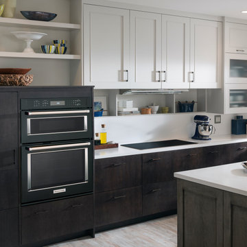


 Western Window Systems
A prefab modular fits neatly on a tiny Santa Monica corner lot.
On a quiet corner lot near Santa Monica’s Ocean Park neighborhood, just blocks from the Pacific Ocean, architect Jennifer Siegal made the most of her unique talent in utilizing prefabricated modules to create an eye-catching home.
Working with a lot measuring only 25 feet wide by 100 feet long, Siegal, owner of Venice, California-based architecture firm Office of Mobile Design, carefully fitted two stacking prefab modules to form the two-story 2,330-square-foot home.
Siegal, winner of the 2016 ArcVision Prize-Women and Architecture, has been recognized internationally as “a fearless pioneer in the research and development of prefabricated construction systems.” It’s easy to see why with her Santa Monica prefab.
For such a seemingly confined area, the home features an airy, open floor plan, with a combined living-dining-kitchen space opening up to cozy, foliage-lined back patio via a three-panel Western Window Systems Series 600 Multi-Slide Door. When open, the door seamlessly merges the indoor living space with the patio, letting Pacific Ocean breezes course through the space. Bamboo flooring throughout augments the openness of the floor plan with its clean look and light color.
A small garage, just yards from the street, doubles as another indoor living space featuring a roll-up door with frosted glass panels to let in natural light when closed. When open, it provides a unique sitting experience.
The second floor also makes the most of the narrow space, with two bedrooms, two bathrooms and a master-bedroom terrace over the back patio. Various shapes and sizes of Western Window Systems Series 670 Awning and Casement Windows help the home make the most of the ideal Santa Monica weather.
Atop it all is a unique butterfly roof that gives the modular shape of the home a playful twist and a sense of mobility.

 Ancient Surfaces
Product: Authentic Limestone for Exterior Living Spaces.
Ancient Surfaces
Contacts: (212) 461-0245
Email: Sales@ancientsurfaces.com
Website: www.AncientSurfaces.com
The design of external living spaces is known as the 'Al Fresco' design style as it is called in Italian. 'Al Fresco' translates into 'the open' or 'the cool/fresh exterior'. Customizing a fully functional outdoor kitchen, pizza oven, BBQ, fireplace or Jacuzzi pool spa all out of old reclaimed Mediterranean stone pieces is no easy task and shouldn’t be created out of the lowest common denominator of building materials such as concrete, Indian slates or Turkish travertine.
The one thing you can bet the farmhouse on is that when the entire process unravels and when your outdoor living space materializes from the architects rendering to real life, you will be guaranteed a true Mediterranean living experience if your choice of construction material was as authentic and possible to the Southern Mediterranean regions.
We believe that the coziness of your surroundings brought about by the creative usage of our antique stone elements will only amplify that authenticity.
whether you are enjoying a relaxing time soaking the sun inside one of our Jacuzzi spa stone fountains or sharing unforgettable memories with family and friends while baking your own pizzas in one of our outdoor BBQ pizza ovens, our stone designs will always evoke in most a feeling of euphoria and exultation that one only gets while being on vacation is some exotic European island surrounded with the pristine beauty of indigenous nature and ancient architecture...
Find the right local pro for your project

 VPC Builders, LLC
Nestled deep in the Blue Ridge mountains, this custom home backs up to Moses Cone Manor. The home features three bedrooms and three baths with 1900 heated square feet. One of the many unique features of this home is the loft. The loft overlooks the main living space and takes advantage of natural light from the window wall. We used a welded wire railing to continue that open feeling as well as continue the same design of the deck outside and bring it inside. The loft also provides a functional space for the homeowner and currently serves as a place for the homeowner to focus on their passion of cycling. A small kitchenette was installed to provide the upstairs guest rooms with their morning coffee or midnight snacks.
The home was finished with wide plank, white oak flooring and tongue and groove vaulted ceilings in the living room. The design allows for this quaint mountain cabin to feel open and inviting despite its small footprint by utilizing a flexible floor space from the entry to the living room and kitchen. The natural coloring in the wood finishes inside and out mixed with traditional finishes really create a unique cabin experience that we try to celebrate here in our area of the mountains.

 Spire North
Tucked away in the backwoods of Torch Lake, this home marries “rustic” with the sleek elegance of modern. The combination of wood, stone and metal textures embrace the charm of a classic farmhouse. Although this is not your average farmhouse. The home is outfitted with a high performing system that seamlessly works with the design and architecture.
The tall ceilings and windows allow ample natural light into the main room. Spire Integrated Systems installed Lutron QS Wireless motorized shades paired with Hartmann & Forbes windowcovers to offer privacy and block harsh light. The custom 18′ windowcover’s woven natural fabric complements the organic esthetics of the room. The shades are artfully concealed in the millwork when not in use.
Spire installed B&W in-ceiling speakers and Sonance invisible in-wall speakers to deliver ambient music that emanates throughout the space with no visual footprint. Spire also installed a Sonance Landscape Audio System so the homeowner can enjoy music outside.
Each system is easily controlled using Savant. Spire personalized the settings to the homeowner’s preference making controlling the home efficient and convenient.

 Advance Design Studio, Ltd.
Jennifer and Dan have lived in their Deer Park Illinois home for 15 years, slowly making minor fixes like painting and decorating; but they had a new plan for their kitchen the entire time. An awkwardly placed garage door, and an island cooktop with a terrible downdraft made a full-scale kitchen remodel an absolute must. Jennifer had many ideas in mind and wanted to work with a company that could provide high-end work, while partnering with a designer that would tailor the kitchen to her ideas.
She was intrigued by the phrase “Common Sense Remodeling” in Advance Design’s feature she discovered while perusing an issue of the community’s Quintessential Barrington Magazine. Doing further research on the company’s website, as she looked through project profiles and read about Advance Design’s “Common Sense Remodeling” philosophy, she promptly scheduled an appointment to see if the people and ideas she read about were truly who they said they were. The more she read, the more she knew that the “Common Sense” approach to remodeling they described was exactly the type of company she was looking for.
The partnership was sealed after an initial consultation with Owner Todd Jurs and Project Designer Michelle Lecinski. They displayed a combination of friendliness, professionalism and respect that was unmatched by any of the other companies Jennifer talked to. She knew that with Advance Design, she would be able to retain the vision that she had in mind with high-quality craftsmanship.
“I reached out to Advance Design because of the ‘Common Sense Remodeling’ tagline,” Jennifer said. “That’s what lingered for me”. “Advance Design was the most respectful- of the house and of my design ideas, and the most professional of the handful of companies that looked at my project”.
Soon after the meeting Jennifer began working with Michelle on the project design. They quickly developed chemistry. Jennifer loved how Michelle researched and located every detail that Jennifer wanted for the kitchen. Between the two of them, every concept and idea was worked through and perfected. “Jennifer had definite ideas about what she wanted the new kitchen to look like, she just didn’t know how to bring it all together. We worked together really well to make her ideas into the practical reality necessary for a well-functioning kitchen, with the look and feel that she had envisioned”, says Michelle.
“Michelle was wonderful in using the CAD system she would show me new drawings every time we changed the layout while working through the design,” Jennifer said. “She was a really wonderful partner in execution, she made sure everything happened quickly and easily.”
The finished design drew out elements of Jennifer’s style and personality. The pair call the look “sophisticated farmhouse” to describe the kitchen renovation to family and friends. The result was a beautifully crafted, authentic-feeling space that satisfied Jennifer’s dreams 15 years in the making. The whole project consisted of a kitchen remodel, mudroom upgrade with powder room, and garage entry relocation. “The projects I personally like the best, are the ones that put the client’s dreams on display,” Project Designer Michelle said. “And this is one of those projects.”
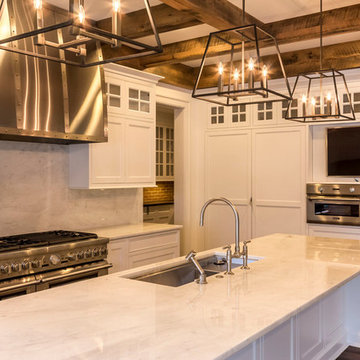
The main focal point of the kitchen is custom zinc and brass ventilation hood with a vintage sheen, which was hand made to order by a small company in Indiana named Vogler Metalworking. “It’s like sculpture, a true work of art”, says Jennifer. Your eye is immediately drawn towards this elegant yet practical hood that eliminated the home’s downdraft problem and added a striking conversation piece at the same time. The carpenters had to use special gloves when transporting and installing it, so they didn’t smudge it with fingerprints. The beautiful hood centers proudly over the stunning black enamel and brass LaCornue Range. “I had a friend who had a LaCornue range and after learning how easy it was to cook perfect meals, I was convinced I wanted to have one”, says Jennifer. This unique, breathtaking combination anchors the entire kitchen and is apparent immediately as you walk into the great room the surrounds the space.
DuraSupreme Crestwood cabinets with a Kendall Panel add function and sophistication. A custom gray paint color paired with a storm blue was developed so that the new kitchen looked like it belonged to the existing space. Unlacquered brass faucets and hardware were important to Jennifer because she wanted the living finishes to age over time. Remarkable brass diamond mesh cabinet door inserts imported from the UK continue to add this one-of-a-kind kitchen renovation; giving it a “you won’t see this everywhere” quality. The use of old railcar flooring for the coffee bar countertop and reclaimed oak for the open shelving gives an authenticity to the space uncommon in kitchens today.
Jennifer and Michelle fell in love with the Limestone Grey Stone while they were investigating unique island countertop ideas. They liked the fact that the limestone as a living finish will age and change over time. Calcutta Miel Quartz countertops made for an excellent pairing around the perimeter, as it’s durable and perfect for cooking preparations. A textured white subway tile backsplash that runs to the ceiling keeps your eye moving towards the open shelving, and to the main focal point of the stunning range hood combination.
“The kitchen functions beautifully, and it’s gorgeous,” beams Jennifer as she gestures with both hands while smiling ear to ear. “The most important thing was I wanted a kitchen that had a wonderful flow, cooked beautiful meals and was a great gathering place for family and friends, and this space does that perfectly! Beauty wise, it turned out exactly how I had envisioned. I felt the function part was the hardest part, and that was nailed”!
Relocating the garage entry to the new mudroom was a huge priority and has finally separated the family’s arriving home functions from their kitchen. Now coats and shoes and bags have their own area for dropping once members arrive home. Matching gray DuraSupreme cabinetry helped create gorgeous, purposeful lockers for the family. A reclaimed vintage sink and custom wall paper were added to the tiny powder room to beautify the once previously only functional space. Advance Design was even able to create a custom space for their dog to sleep while the family is away.
“It was unbelievable that a project of this size was completed in such a short time, and I think that’s because of the large amount of planning and preparation that went into it,” Jennifer marveled, “When we started, we were ready, and everything was prepared”.
When it came to execution, Project Manager Justin Davis and his crew were quick, accessible, and organized. Projects like this kitchen are typically completed in as little as 8-10 weeks. Jennifer’s kitchen however despite the relocation of some challenging HVAC in a soffit and moving of an exterior door was completed remarkably fast in part because the team was working with an existing tile floor that ran throughout the first floor that the client really loved.
“You get to know these people really well because they’re living in your house while you’re living in your house. They were so fast and really good, it didn’t take as long as even planned” reported Jennifer. “I would text Justin and he always responded almost immediately. I got to know all the guys who were working in our house and they were all wonderful people”.
Details in a customized kitchen like this one require skill and care from the people who install it. “All the guys on the job were skilled at what the did. I wanted small details like little feet to look like furniture, that is where their carpentry skill came in to make these all perfect”, said Jennifer. “The tile guys were wonderful. They even let me determine how I wanted the texture with the grout to appear for a salt and pepper look; now that is a very skilled trade person making it custom”.
In Jennifer’s interview, she continued to reference Advance Design’s “Common Sense Remodeling”, so I took a minute to ask her exactly what that phrase meant to her and how it played out in her experience with her project and the Advance Design team. Here is what she said: “I was intrigued about Common Sense Remodeling and in my head that there would be clear costs and prices, great communication between the design team, the execution team and me”, said Jennifer. They did deliver on that, it was so clear about the cost breakdown, what I could expect from everyone who came to my house, and everything that we had ordered. That to me is the Common Sense”!
It’s great to see a client take literally our assertion that a well-planned remodeling project is simply “Common Sense”! She anticipated each step of the way would be clear, concise, and predictable, all the while protecting the outcome due to the careful upfront planning. “Advance Design delivered on their ‘Common Sense Remodeling’ promise,” Jennifer said. “From the design team, to the execution team - everything was straight forward like I imagined. The project turned out exactly how I envisioned, I enjoyed this process and absolutely would recommend Advance Design Studio to anyone.”
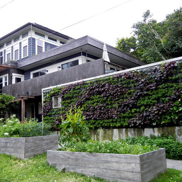
 Batt + Lear
“House with the Common View,” Wallingford
AWARDS: Best of Wallingford, Built Green Hammer Award
Description
Artistic, sustainable addition to a small Wallingford bungalow which was necessary to allow a growing family to continue to thrive in a neighborhood that they love.
Challenge
Growing family needed more space but they didn’t want to move. They knew that they would have to build up but don’t want to block views or ruin the experience for their neighbor friends. Because of the size and shape of the lot, there were also permitting and structuring challenges.
Inspiration
We found inspiration in the family and their commitment to the place, neighborhood and friends. We wanted to create a house that is not only functional and respectful of the neighbor’s view, but that actually gives back to the neighborhood. We had to lean in hard in the design process to pull all of that off.
Solutions + Innovations
We engaged in a meticulous design process included literal “boots on the ground” elements like standing on the property with sticks to measure the neighbor’s view. We not only maintained that view but enhanced it by giving the neighbors a view of green roof gardens on 4 sides of the house. To support that work, we had to rebuild the foundation. As an amenity for the neighborhood at large, we created a rain path that channeled into living wall and structured rain garden that was adjacent to the sidewalk.
How is it sustainable?
We salvaged or repurposed all of the materials that we could, including salvaging painted shingles on from house and repurposing them for a tiny play house (which also has a green roof). The old beams from basement became a cabinet in the new bathroom. We also used orchard-salvaged walnut which matched the horizontal grain already existing in the kitchen.
We economized on space, saving the footprint on the main floor, and only added 600 feet upstairs which house two bedrooms and one batch. We used casework to create walls, used the stairs for part of the cabinets, and built walk-n cabinets, creating adaptable space for long term needs. More adaptable space included a sharable bathroom/wetroom which is functional for both adults and kids.
We developed a green roof system, rain gardens, and a green wall along sidewalk.
We took the opportunity to improve the envelope, insulating outside the building before the siding went back on. We also incorporated solar into the design, created the opportunity for natural daylighting all day on upper level and stairwell, as well as using resin-based eco countertops.

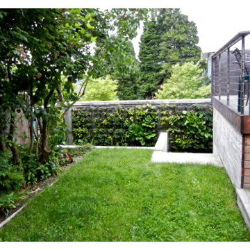 Batt + Lear
“House with the Common View,” Wallingford
AWARDS: Best of Wallingford, Built Green Hammer Award
Description
Artistic, sustainable addition to a small Wallingford bungalow which was necessary to allow a growing family to continue to thrive in a neighborhood that they love.
Challenge
Growing family needed more space but they didn’t want to move. They knew that they would have to build up but don’t want to block views or ruin the experience for their neighbor friends. Because of the size and shape of the lot, there were also permitting and structuring challenges.
Inspiration
We found inspiration in the family and their commitment to the place, neighborhood and friends. We wanted to create a house that is not only functional and respectful of the neighbor’s view, but that actually gives back to the neighborhood. We had to lean in hard in the design process to pull all of that off.
Solutions + Innovations
We engaged in a meticulous design process included literal “boots on the ground” elements like standing on the property with sticks to measure the neighbor’s view. We not only maintained that view but enhanced it by giving the neighbors a view of green roof gardens on 4 sides of the house. To support that work, we had to rebuild the foundation. As an amenity for the neighborhood at large, we created a rain path that channeled into living wall and structured rain garden that was adjacent to the sidewalk.
How is it sustainable?
We salvaged or repurposed all of the materials that we could, including salvaging painted shingles on from house and repurposing them for a tiny play house (which also has a green roof). The old beams from basement became a cabinet in the new bathroom. We also used orchard-salvaged walnut which matched the horizontal grain already existing in the kitchen.
We economized on space, saving the footprint on the main floor, and only added 600 feet upstairs which house two bedrooms and one batch. We used casework to create walls, used the stairs for part of the cabinets, and built walk-n cabinets, creating adaptable space for long term needs. More adaptable space included a sharable bathroom/wetroom which is functional for both adults and kids.
We developed a green roof system, rain gardens, and a green wall along sidewalk.
We took the opportunity to improve the envelope, insulating outside the building before the siding went back on. We also incorporated solar into the design, created the opportunity for natural daylighting all day on upper level and stairwell, as well as using resin-based eco countertops.
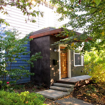 Batt + Lear
“House with the Common View,” Wallingford
AWARDS: Best of Wallingford, Built Green Hammer Award
Description
Artistic, sustainable addition to a small Wallingford bungalow which was necessary to allow a growing family to continue to thrive in a neighborhood that they love.
Challenge
Growing family needed more space but they didn’t want to move. They knew that they would have to build up but don’t want to block views or ruin the experience for their neighbor friends. Because of the size and shape of the lot, there were also permitting and structuring challenges.
Inspiration
We found inspiration in the family and their commitment to the place, neighborhood and friends. We wanted to create a house that is not only functional and respectful of the neighbor’s view, but that actually gives back to the neighborhood. We had to lean in hard in the design process to pull all of that off.
Solutions + Innovations
We engaged in a meticulous design process included literal “boots on the ground” elements like standing on the property with sticks to measure the neighbor’s view. We not only maintained that view but enhanced it by giving the neighbors a view of green roof gardens on 4 sides of the house. To support that work, we had to rebuild the foundation. As an amenity for the neighborhood at large, we created a rain path that channeled into living wall and structured rain garden that was adjacent to the sidewalk.
How is it sustainable?
We salvaged or repurposed all of the materials that we could, including salvaging painted shingles on from house and repurposing them for a tiny play house (which also has a green roof). The old beams from basement became a cabinet in the new bathroom. We also used orchard-salvaged walnut which matched the horizontal grain already existing in the kitchen.
We economized on space, saving the footprint on the main floor, and only added 600 feet upstairs which house two bedrooms and one batch. We used casework to create walls, used the stairs for part of the cabinets, and built walk-n cabinets, creating adaptable space for long term needs. More adaptable space included a sharable bathroom/wetroom which is functional for both adults and kids.
We developed a green roof system, rain gardens, and a green wall along sidewalk.
We took the opportunity to improve the envelope, insulating outside the building before the siding went back on. We also incorporated solar into the design, created the opportunity for natural daylighting all day on upper level and stairwell, as well as using resin-based eco countertops.

 highland
Ever been out in a park, forest, or even just in your backyard and wanted to see just a small side of the picture? Beauty is in the midst of us, but we are not doing enough to see it—we see only at a superficial level. The reality is that there is an entire universe on a scale that is so miniscule yet all around us, waiting to be discovered.
Put the digital microscope camera on the scope, and that little quantum universe you never knew was there awaits your gaze. Makes everyday outdoor activities exciting adventures and learning experiences with leaves, rocks, and bugs that are all interesting. It used to look just the same, and now it's vibrant with patterns, textures, and stories you didn't know before!
What is a Digital Microscope Camera?
A digital microscope camera is a compact device that magnifies very small objects and can display its real-time image on the screen. This new type of microscope can be taken outside and is much easier to transport than a conventional microscope. It is based on three important technologies: the magnification lenses, digital imaging, and As the name implies, snapping up shots of the objects when you bring them close and displaying them clearly on your smartphone, tablet, or its built-in display. This gives you the power to see details of a microworld anywhere you go, with no special equipment.
How a Digital Microscope Camera Works in Real Life
It is easy and yet powerful to operate a digital microscope camera. It brings very small objects closer by employing a system of lenses, and through a digital sensor, it turns the image into a compelling display. After focusing, the image becomes so big that it displays details that the human eye isn't able to see. Whereas, in an actual setting, an individual can simply place the gadget over an object, such as a leaf, insect, or soil surface. This is then performed to get a focus on the details, clear and sharp. In the blink of an eye, you will be exploring a hidden reality with patterns and structures.
Why Nature Looks Completely Different at the Micro Level
If you watch nature with an unbiased eye, it's all straightforward. Leaves are green; insects are tiny and land on a mere brown earth. However, things look so different through the microscope camera's zoom-in. A leaf is more than a leaf: it is a complex system of veins and cells! However, the insect is not merely a tiny insect anymore, but it gradually turns into an object with wings, eyes, and patterns, all of which seem almost like art. From soils a combination of small particles of rock, organic material, and unseen creatures.
Gaining appreciation for the details in leaves and plants.
Plant life is one of the most interesting objects to be examined under the microscope. The details on the leaves, stems, and petals are amazing and would get lost in the details otherwise. By using a digital microscope camera, the vein network that transports water and nutrients can be readily observed. These veins are naturally occurring and run in patterns that resemble roads and/or rivers in the landscape. Every leaf grows differently and is as individual as a fingerprint.
Discovering the Hidden World of Insects
There is no better thing to see under the microscope than one of the many interesting insects. They may appear at first glance to be quite unassuming and tiny, but magnified, they let one in on the whole other universe. They feature fine patterns in their wings – like those found on glass artworks – that are often difficult to see. They have eyes comprised of multiple repeating units. Even their legs and segments of their bodies have special textures.
The Secret Life Inside Soil and Sand
A microscope camera reveals a soil in which activity is taking place in a lively world in the seemingly lifeless soil. The very small particles of rock, decayed plant material, and micro-living organisms are interacting. Sand grains look similar to miniature crystals; all of them are distinctively shaped and structured. As organic matter decomposes, it forms patterns that illustrate how nature continually recycles itself.
Tree Bark: A Natural Storybook
Another interesting area of interest for micro-focusing is the bark of trees. Apparently, this appears to be rough and simple, but under magnification, it is seen as a highly detailed landscape of cracks, lines, and textures. The bark patterns that can be observed on each branch offer a glimpse of the branch's years of growth, weather, and environmental stresses. It's as if someone wrote the history of a tree on its trunk!
Tips for Getting the Best Microscopic Results Outdoors
A few simple techniques can make a big difference in the variety of images you get before getting clear and detailed images. Always make sure that the hands are stable or have a resting surface so that there is no shaking. Moving, even slightly, can cause the picture to become blurry. Lighting is one of the other important ones. This is because natural soft lighting is best suited, as it doesn't create strong reflections and it does show detail. Minimize exposure to strong sunlight/deep shade when possible.
Conclusion:
The digital microscope camera isn't just a camera; it's a new way of viewing life. Makes routine walks outdoors into thrilling explorations of the scientific world and how minute details make a difference. It can teach us something about living by the rules of nature! It is something that we can contemplate, clarify, and enjoy more.
What is a Digital Microscope Camera?
A digital microscope camera is a compact device that magnifies very small objects and can display its real-time image on the screen. This new type of microscope can be taken outside and is much easier to transport than a conventional microscope. It is based on three important technologies: the magnification lenses, digital imaging, and As the name implies, snapping up shots of the objects when you bring them close and displaying them clearly on your smartphone, tablet, or its built-in display. This gives you the power to see details of a microworld anywhere you go, with no special equipment.
How a Digital Microscope Camera Works in Real Life
It is easy and yet powerful to operate a digital microscope camera. It brings very small objects closer by employing a system of lenses, and through a digital sensor, it turns the image into a compelling display. After focusing, the image becomes so big that it displays details that the human eye isn't able to see. Whereas, in an actual setting, an individual can simply place the gadget over an object, such as a leaf, insect, or soil surface. This is then performed to get a focus on the details, clear and sharp. In the blink of an eye, you will be exploring a hidden reality with patterns and structures.
Why Nature Looks Completely Different at the Micro Level
If you watch nature with an unbiased eye, it's all straightforward. Leaves are green; insects are tiny and land on a mere brown earth. However, things look so different through the microscope camera's zoom-in. A leaf is more than a leaf: it is a complex system of veins and cells! However, the insect is not merely a tiny insect anymore, but it gradually turns into an object with wings, eyes, and patterns, all of which seem almost like art. From soils a combination of small particles of rock, organic material, and unseen creatures.
Gaining appreciation for the details in leaves and plants.
Plant life is one of the most interesting objects to be examined under the microscope. The details on the leaves, stems, and petals are amazing and would get lost in the details otherwise. By using a digital microscope camera, the vein network that transports water and nutrients can be readily observed. These veins are naturally occurring and run in patterns that resemble roads and/or rivers in the landscape. Every leaf grows differently and is as individual as a fingerprint.
Discovering the Hidden World of Insects
There is no better thing to see under the microscope than one of the many interesting insects. They may appear at first glance to be quite unassuming and tiny, but magnified, they let one in on the whole other universe. They feature fine patterns in their wings – like those found on glass artworks – that are often difficult to see. They have eyes comprised of multiple repeating units. Even their legs and segments of their bodies have special textures.
The Secret Life Inside Soil and Sand
A microscope camera reveals a soil in which activity is taking place in a lively world in the seemingly lifeless soil. The very small particles of rock, decayed plant material, and micro-living organisms are interacting. Sand grains look similar to miniature crystals; all of them are distinctively shaped and structured. As organic matter decomposes, it forms patterns that illustrate how nature continually recycles itself.
Tree Bark: A Natural Storybook
Another interesting area of interest for micro-focusing is the bark of trees. Apparently, this appears to be rough and simple, but under magnification, it is seen as a highly detailed landscape of cracks, lines, and textures. The bark patterns that can be observed on each branch offer a glimpse of the branch's years of growth, weather, and environmental stresses. It's as if someone wrote the history of a tree on its trunk!
Tips for Getting the Best Microscopic Results Outdoors
A few simple techniques can make a big difference in the variety of images you get before getting clear and detailed images. Always make sure that the hands are stable or have a resting surface so that there is no shaking. Moving, even slightly, can cause the picture to become blurry. Lighting is one of the other important ones. This is because natural soft lighting is best suited, as it doesn't create strong reflections and it does show detail. Minimize exposure to strong sunlight/deep shade when possible.
Conclusion:
The digital microscope camera isn't just a camera; it's a new way of viewing life. Makes routine walks outdoors into thrilling explorations of the scientific world and how minute details make a difference. It can teach us something about living by the rules of nature! It is something that we can contemplate, clarify, and enjoy more.

 User
UserOur client and her sister own a condo in Florida and although her sister lives there full-time, our client only comes to Florida for the winter and utilizes the guest room and a separate bathroom as her own. At the time, enthusiastic to be in Florida she went all out in decorating in the old Florida style with a green and yellow tropical feel including a plethora of palm trees (see before picture). All the furniture had to be from Tommy Bahama and even the light fixtures had a tropical theme.
Fast forward to 2015 and our client was tired and bored in these surroundings and said to me, “what was I thinking!” She didn’t have the budget to change everything and I assured her that we could update her bedroom keeping the existing furniture. One of her previous decorating problems was the tiny window over the bed which she had covered by adding a faux canopy. Unfortunately, the fabric was thin and the window showed through. I tried to persuade her that a solution for the window issue could be a large painting over the bed but she wasn’t keen so we agreed to refresh the canopy with a more modern look.
We started with fresh silvery-grey paint and glossy white trim. Using subtle greeny-blue bedding from Eastern Accents we extracted a simple palette and mixed in several patterns including a classic Greek key. There are geometrics in the pillows and a floral in the custom cornice and draperies and we found a fabric from the same color palette for the drapery behind the bed from Kravet. It has a beautiful sheen which reflects light and is heavily lined to cover the window. Our project manager added the wood trim to the cornice board.
The modern chair is upholstered in a sea green herringbone while the table has an interesting story; my client loved the shape of the table but it was originally finished completely in gold leaf. Part of our update was to change everything metal such as door knobs and drapery hardware to chrome so our project manager offered to re-finish the table in silver leaf. Along the way we had a hiccup in the communication… she asked if the top was glass and was told it was but we didn’t realize that she hadn’t unpacked it so didn’t see the gold rim. On installation day we were surprised to see the gold rim against the silver legs! Happily, it was a really good error as the painting behind the chair has both gold and silver leaf and our error looks as though it were meant to be.
We finished with turquoise blown glass lamps, several pieces of art, and a large floor mirror (not in photo). The client asked if she could choose some pretty accessories at local art fairs and one painting is by her artist brother-in-law.
This project was very enjoyable as we were able to modernize the room with an updated coastal palette while at the same time utilizing existing furniture.
Photographer: Rolando Diaz
 So Cal Builders & Design
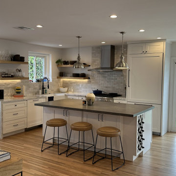
We transformed the existing layout by eliminating three interior support walls, thereby establishing a seamless connection between the kitchen and living room for an open concept design. We also enhance the living experience by incorporating a brand-new bi-folding door that opens up to the backyard, fostering a harmonious indoor-outdoor ambiance. The client opt for elegant white shaker cabinets, complemented by a sleek gray countertop and a full subway tile backsplash, to elevate the aesthetic appeal of the space.


 John R. Schroeder, AIA
Photography by Caryn B. Davis
Located in the Cornfield Point area of Old Saybrook along Long Island Sound, this project brought a classic, yet forgotten beach house back to life. Through a little detective work and some creative ingenuity, we restored and enhanced the exterior to it’s former glory and transformed the interior to a highly efficient and functional home all the while uplifting its quaint cottage charm. On the exterior, we recreated a wonderful, airy front porch with cozy bench seats that look out to the water. The white cedar shingle siding is pre-bleached with a subtle flair at the bottom and a delicate break at mid-elevation. The asphalt shingles are not only beautifully matched with the siding, but offer superior reflective qualities to dissipate the heat of the summer sun. On the interior, we joined the front seasonal porch with the family room to form a larger, open living and dining space with paneled walls and ceilings anchored by the original round stone fireplace. In the rear, we carefully crafted a galley kitchen and laundry space with an adjacent first floor master suite. The diminutive house and property posed multiple practical and regulatory challenges which were overcome by a strong team effort, due diligence, and a commitment to the process.
John R. Schroeder, AIA is a professional design firm specializing in architecture, interiors, and planning. We have over 30 years experience with projects of all types, sizes, and levels of complexity. Because we love what we do, we approach our work with enthusiasm and dedication. We are committed to the highest level of design and service on each and every project. We engage our clients in positive and rewarding collaborations. We strive to exceed expectations through our attention to detail, our understanding of the “big picture”, and our ability to effectively manage a team of design professionals, industry representatives, and building contractors. We carefully analyze budgets and project objectives to assist clients with wise fund allocation.
We continually monitor and research advances in technology, materials, and construction methods, both sustainable and otherwise, to provide a responsible, well-suited, and cost effective product. Our design solutions are highly functional using both innovative and traditional approaches. Our aesthetic style is flexible and open, blending cues from client desires, building function, site context, and material properties, making each project unique, personalized, and enduring.

 David Trubridge
FLO-0800-BLK-BLK - Floral - Bamboo Pendant - 32 - Black Stain
Floral designed three years after Coral light, is based on a geometric polyhedra forms. The intricate form is made from just one single component repeated 60 times. Floral was designed to offer a softer more decorative offering alongside Coral which is more structured.
KOU-0750-NAT-AQU - Kōura - Bamboo Pendant - 30 - Natural (Side A) - Aqua (Side B)
Koura was inspired by woven baskets and also from the curled form of the New Zealand native fresh water shrimp, koura, which is its Maori name. Like our other lights Koura is available in a wide range of sizes from small and intimate to very large and dramatic
KIN-0600-NAT-YEL - Kina - Bamboo Pendant - 24 - Natural (Side A) - Yellow (Side B)
Kina references the inner shell of the local salt water sea-urchin called kina in Maori. David saw a kina shell in Antarctica – an exquisite jewel sunk in a tiny hollow in the sea ice. The shell had absorbed enough warmth from the sun to melt the ice around it.
COR-0600-NAT-NAT - Coral - Bamboo Pendant - 24 - Natural
Coral is based on one of the geometric polyhedra that have interested David since he was a boy. The intricate form is made from just one single component repeated 60 times. Originally designed purely as an experiment, it only became a light later when David tried to find a use for it by putting a bulb inside. This was a pivotal moment. What followed was a whole new direction in exploring lighting structures made from minimal shell-like skins which also act as patterned shadow- makers.
 Simply Home Decorating
The kitchen may be the heart of a home, but the dining room is where the family gathers to enjoy special occasions, create and pass on traditions, and savour each other’s company free from distractions. The family behind this particular dining room enjoys doing just that.
When they are not traveling the world, Matthew and Anna (names changed) love to cook meals at home with their teenage daughter, entertain family and friends, and live amongst their cherished travel souvenirs and heirlooms. Their dining room, however, was far from the perfect backdrop for these experiences.
Before: Dining Room:
When Matthew and Anna contacted us, they imagined a space that would comfortably seat 8 to 10 people and incorporate their beautiful inherited dining table and sideboard in a fresh, modern way. Above all, they wanted a dining room that they would feel proud to share.
They worked with us to design, lightly renovate, and furnish their dining room and adjacent living space. Now, the room is nothing short of inviting and elevated.
Classic Yet Contemporary Dining Room:
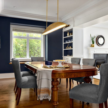
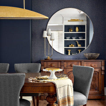
Viewed from the living area, the dining room is a hidden gem waiting to be discovered. Matthew and Anna wanted dark blue for the walls, and we couldn’t have been happier to find the perfect shade for them. By leaning darker, this rich blue creates the perception of depth, making the room feel enticing, comfortable and secluded.
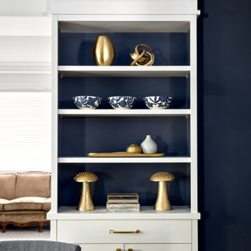
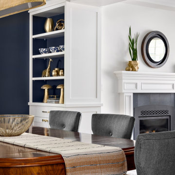
The previous built-ins were underwhelming and lacked function, so we designed wider, taller, double sided cabinets that integrated the existing bulk-head, and then accessorized the shelves with the family’s travel finds, books, and decor. Topping these units with brass art lights not only blends contemporary and traditional styles, it also draws attention to the dining table’s modern show-stopping chandelier. You can’t miss it.
Inside the dining room, the effect is equally impressive: enveloping yet spacious, warm yet cool, classic yet contemporary. We incorporated their heirloom pieces seamlessly into the design thanks to the 1:2 ratio. For every traditional piece, we introduced two more modern or contemporary pieces — clean lines, subtle curves, and lustrous brass hardware. The result is a collected yet updated look.
In any room with dark walls, lighting is of the utmost importance. We placed a mirror adjacent to the window to reflect natural light throughout the room, and we kept the trim and ceiling white for brightness. To provide maximum versatility, we provided multiple light sources that can be adjusted to create different levels of light to suit any mood or occasion. These include: pot lights and a chandelier on dimmers, a sculptural trilight lamp on the sideboard, and art lights on the bookcases and above important art pieces.
The built-ins have another surprise waiting inside this special dining room:
Double-sided built-ins: dining room shelving and living room shelving.
Rather than keep them white like we did in the living room, we painted the back wall of the book cases the same dark blue as the walls in the rest of the room. This reduces the contrast with the surrounding walls and emphasizes the white outline of the cabinets. We also love the dark blue walls’ role as a beautiful backdrop for this family’s treasures. The brass accessories and hand-painted vases and bowls feel like part of the experience.
Of course, what is beauty without function? It may not look like it, but the base storage is only accessible from the dining room side. The units include deep cabinets for storing serving ware, as well as another delightful surprise: silverware drawers lined in luxurious navy velvet!
Lastly, we designed this beautiful nook for their heirloom sideboard. From afar, the wall looks as if it has texture and perhaps a touch of shine. Up close, you will notice that it is actually navy blue wallpaper with tiny golden dots. This unique touch accentuates the brass in the room touches throughout the space.. The room feels curated, contemporary, and full of character.
Words of Praise:
Anna and Matthew were thrilled with their new dining room and with the design process itself, which is always the highest compliment. They said:
“Working with Lori and her team at Simply Home Decorating was a great experience. The design they came up with was both beautiful and practical for our family. Renovations can be stressful but working with Simply Home made the process much more pleasant.
“Simply Home's project management and their longstanding relationships with reliable trades meant we could relax, knowing that everything was taken care of. If an issue arose, the entire Simply Home team was quick to address it. They were excellent at communicating with us—we never felt like we didn't know what was going on. We would highly recommend working with Simply Home Decorating.”
Thank you, Matthew and Anna! We are honoured to have been part of your journey and wish your family many happy memories in these new spaces.
Now, is it your turn? Are you ready to uncover the hidden potential in your home? If so, contact us here to start the conversation or download my guide Uncovering the Hidden Potential in Your Home below to learn more about what we can do for you.

 Rodwin Architecture & Skycastle Construction
Rodwin Architecture and Skycastle Homes
Location: Boulder, Colorado, United States
We helped the clients find a beautiful lot in North Boulder, then crafted this modern 3,300 s.f. house to be their dream home.
The clients asked for a warm modern style home, with an open floor plan that connected to the outdoors and took full advantage of the rare lot. We sited and engineered the house for optimal passive solar design, while simultaneously capturing unobstructed panoramic views of the Flatirons from both levels. The home’s simple, clean lines reflect their unpretentious, easy-going character. The gourmet kitchen, dining and Great room are flooded with sunshine from the 9ft high ceilings and walls of glass. A gracious covered west porch flows seamlessly out from the Great room through a giant bank of sliding doors, creating a fantastic opportunity for indoor/outdoor living. The porch has solid cedar columns and Beetle-kill wood on the ceiling to create a warm feeling.
On the ground floor, walk past the front hall to reach a guest suite and a rec room that is divided between a small media room for the boys and a north facing painting studio.
Follow the stair to the second floor where you’ll immediately be presented with a stunning view from the open study and balcony. All the bedrooms get a south facing Flatiron view and the master has its own private balcony.
The owners wanted the HERS 37 house to be as green as possible, and the house has tiny energy and water bills as well as a healthy indoor air environment. It features solar photovoltaic panels, Energy Star fiberglass windows, foam insulation, LED lights, Watersense plumbing fixtures, a 96% efficient furnace & zero-VOC finishes.
Learn more about it and its artistic owners in Boulder Home & Garden Magazine
Built by Skycastle Construction.
 Simply Home Decorating
The kitchen may be the heart of a home, but the dining room is where the family gathers to enjoy special occasions, create and pass on traditions, and savour each other’s company free from distractions. The family behind this particular dining room enjoys doing just that.
When they are not traveling the world, Matthew and Anna (names changed) love to cook meals at home with their teenage daughter, entertain family and friends, and live amongst their cherished travel souvenirs and heirlooms. Their dining room, however, was far from the perfect backdrop for these experiences.
Before: Dining Room:
When Matthew and Anna contacted us, they imagined a space that would comfortably seat 8 to 10 people and incorporate their beautiful inherited dining table and sideboard in a fresh, modern way. Above all, they wanted a dining room that they would feel proud to share.
They worked with us to design, lightly renovate, and furnish their dining room and adjacent living space. Now, the room is nothing short of inviting and elevated.
Classic Yet Contemporary Dining Room:
Viewed from the living area, the dining room is a hidden gem waiting to be discovered. Matthew and Anna wanted dark blue for the walls, and we couldn’t have been happier to find the perfect shade for them. By leaning darker, this rich blue creates the perception of depth, making the room feel enticing, comfortable and secluded.
The previous built-ins were underwhelming and lacked function, so we designed wider, taller, double sided cabinets that integrated the existing bulk-head, and then accessorized the shelves with the family’s travel finds, books, and decor. Topping these units with brass art lights not only blends contemporary and traditional styles, it also draws attention to the dining table’s modern show-stopping chandelier. You can’t miss it.
Inside the dining room, the effect is equally impressive: enveloping yet spacious, warm yet cool, classic yet contemporary. We incorporated their heirloom pieces seamlessly into the design thanks to the 1:2 ratio. For every traditional piece, we introduced two more modern or contemporary pieces — clean lines, subtle curves, and lustrous brass hardware. The result is a collected yet updated look.
In any room with dark walls, lighting is of the utmost importance. We placed a mirror adjacent to the window to reflect natural light throughout the room, and we kept the trim and ceiling white for brightness. To provide maximum versatility, we provided multiple light sources that can be adjusted to create different levels of light to suit any mood or occasion. These include: pot lights and a chandelier on dimmers, a sculptural trilight lamp on the sideboard, and art lights on the bookcases and above important art pieces.
The built-ins have another surprise waiting inside this special dining room:
Double-sided built-ins: dining room shelving and living room shelving.
Rather than keep them white like we did in the living room, we painted the back wall of the book cases the same dark blue as the walls in the rest of the room. This reduces the contrast with the surrounding walls and emphasizes the white outline of the cabinets. We also love the dark blue walls’ role as a beautiful backdrop for this family’s treasures. The brass accessories and hand-painted vases and bowls feel like part of the experience.
Of course, what is beauty without function? It may not look like it, but the base storage is only accessible from the dining room side. The units include deep cabinets for storing serving ware, as well as another delightful surprise: silverware drawers lined in luxurious navy velvet!
Lastly, we designed this beautiful nook for their heirloom sideboard. From afar, the wall looks as if it has texture and perhaps a touch of shine. Up close, you will notice that it is actually navy blue wallpaper with tiny golden dots. This unique touch accentuates the brass in the room touches throughout the space.. The room feels curated, contemporary, and full of character.
Words of Praise:
Anna and Matthew were thrilled with their new dining room and with the design process itself, which is always the highest compliment. They said:
“Working with Lori and her team at Simply Home Decorating was a great experience. The design they came up with was both beautiful and practical for our family. Renovations can be stressful but working with Simply Home made the process much more pleasant.
“Simply Home's project management and their longstanding relationships with reliable trades meant we could relax, knowing that everything was taken care of. If an issue arose, the entire Simply Home team was quick to address it. They were excellent at communicating with us—we never felt like we didn't know what was going on. We would highly recommend working with Simply Home Decorating.”
Thank you, Matthew and Anna! We are honoured to have been part of your journey and wish your family many happy memories in these new spaces.
Now, is it your turn? Are you ready to uncover the hidden potential in your home? If so, contact us here to start the conversation or download my guide Uncovering the Hidden Potential in Your Home below to learn more about what we can do for you.
 Simply Home Decorating
The kitchen may be the heart of a home, but the dining room is where the family gathers to enjoy special occasions, create and pass on traditions, and savour each other’s company free from distractions. The family behind this particular dining room enjoys doing just that.
When they are not traveling the world, Matthew and Anna (names changed) love to cook meals at home with their teenage daughter, entertain family and friends, and live amongst their cherished travel souvenirs and heirlooms. Their dining room, however, was far from the perfect backdrop for these experiences.
Before: Dining Room:
When Matthew and Anna contacted us, they imagined a space that would comfortably seat 8 to 10 people and incorporate their beautiful inherited dining table and sideboard in a fresh, modern way. Above all, they wanted a dining room that they would feel proud to share.
They worked with us to design, lightly renovate, and furnish their dining room and adjacent living space. Now, the room is nothing short of inviting and elevated.
Classic Yet Contemporary Dining Room:
Viewed from the living area, the dining room is a hidden gem waiting to be discovered. Matthew and Anna wanted dark blue for the walls, and we couldn’t have been happier to find the perfect shade for them. By leaning darker, this rich blue creates the perception of depth, making the room feel enticing, comfortable and secluded.
The previous built-ins were underwhelming and lacked function, so we designed wider, taller, double sided cabinets that integrated the existing bulk-head, and then accessorized the shelves with the family’s travel finds, books, and decor. Topping these units with brass art lights not only blends contemporary and traditional styles, it also draws attention to the dining table’s modern show-stopping chandelier. You can’t miss it.
Inside the dining room, the effect is equally impressive: enveloping yet spacious, warm yet cool, classic yet contemporary. We incorporated their heirloom pieces seamlessly into the design thanks to the 1:2 ratio. For every traditional piece, we introduced two more modern or contemporary pieces — clean lines, subtle curves, and lustrous brass hardware. The result is a collected yet updated look.
In any room with dark walls, lighting is of the utmost importance. We placed a mirror adjacent to the window to reflect natural light throughout the room, and we kept the trim and ceiling white for brightness. To provide maximum versatility, we provided multiple light sources that can be adjusted to create different levels of light to suit any mood or occasion. These include: pot lights and a chandelier on dimmers, a sculptural trilight lamp on the sideboard, and art lights on the bookcases and above important art pieces.
The built-ins have another surprise waiting inside this special dining room:
Double-sided built-ins: dining room shelving and living room shelving.
Rather than keep them white like we did in the living room, we painted the back wall of the book cases the same dark blue as the walls in the rest of the room. This reduces the contrast with the surrounding walls and emphasizes the white outline of the cabinets. We also love the dark blue walls’ role as a beautiful backdrop for this family’s treasures. The brass accessories and hand-painted vases and bowls feel like part of the experience.
Of course, what is beauty without function? It may not look like it, but the base storage is only accessible from the dining room side. The units include deep cabinets for storing serving ware, as well as another delightful surprise: silverware drawers lined in luxurious navy velvet!
Lastly, we designed this beautiful nook for their heirloom sideboard. From afar, the wall looks as if it has texture and perhaps a touch of shine. Up close, you will notice that it is actually navy blue wallpaper with tiny golden dots. This unique touch accentuates the brass in the room touches throughout the space.. The room feels curated, contemporary, and full of character.
Words of Praise:
Anna and Matthew were thrilled with their new dining room and with the design process itself, which is always the highest compliment. They said:
“Working with Lori and her team at Simply Home Decorating was a great experience. The design they came up with was both beautiful and practical for our family. Renovations can be stressful but working with Simply Home made the process much more pleasant.
“Simply Home's project management and their longstanding relationships with reliable trades meant we could relax, knowing that everything was taken care of. If an issue arose, the entire Simply Home team was quick to address it. They were excellent at communicating with us—we never felt like we didn't know what was going on. We would highly recommend working with Simply Home Decorating.”
Thank you, Matthew and Anna! We are honoured to have been part of your journey and wish your family many happy memories in these new spaces.
Now, is it your turn? Are you ready to uncover the hidden potential in your home? If so, contact us here to start the conversation or download my guide Uncovering the Hidden Potential in Your Home below to learn more about what we can do for you.
 Simply Home Decorating
The kitchen may be the heart of a home, but the dining room is where the family gathers to enjoy special occasions, create and pass on traditions, and savour each other’s company free from distractions. The family behind this particular dining room enjoys doing just that.
When they are not traveling the world, Matthew and Anna (names changed) love to cook meals at home with their teenage daughter, entertain family and friends, and live amongst their cherished travel souvenirs and heirlooms. Their dining room, however, was far from the perfect backdrop for these experiences.
Before: Dining Room:
When Matthew and Anna contacted us, they imagined a space that would comfortably seat 8 to 10 people and incorporate their beautiful inherited dining table and sideboard in a fresh, modern way. Above all, they wanted a dining room that they would feel proud to share.
They worked with us to design, lightly renovate, and furnish their dining room and adjacent living space. Now, the room is nothing short of inviting and elevated.
Classic Yet Contemporary Dining Room:
Viewed from the living area, the dining room is a hidden gem waiting to be discovered. Matthew and Anna wanted dark blue for the walls, and we couldn’t have been happier to find the perfect shade for them. By leaning darker, this rich blue creates the perception of depth, making the room feel enticing, comfortable and secluded.
The previous built-ins were underwhelming and lacked function, so we designed wider, taller, double sided cabinets that integrated the existing bulk-head, and then accessorized the shelves with the family’s travel finds, books, and decor. Topping these units with brass art lights not only blends contemporary and traditional styles, it also draws attention to the dining table’s modern show-stopping chandelier. You can’t miss it.
Inside the dining room, the effect is equally impressive: enveloping yet spacious, warm yet cool, classic yet contemporary. We incorporated their heirloom pieces seamlessly into the design thanks to the 1:2 ratio. For every traditional piece, we introduced two more modern or contemporary pieces — clean lines, subtle curves, and lustrous brass hardware. The result is a collected yet updated look.
In any room with dark walls, lighting is of the utmost importance. We placed a mirror adjacent to the window to reflect natural light throughout the room, and we kept the trim and ceiling white for brightness. To provide maximum versatility, we provided multiple light sources that can be adjusted to create different levels of light to suit any mood or occasion. These include: pot lights and a chandelier on dimmers, a sculptural trilight lamp on the sideboard, and art lights on the bookcases and above important art pieces.
The built-ins have another surprise waiting inside this special dining room:
Double-sided built-ins: dining room shelving and living room shelving.
Rather than keep them white like we did in the living room, we painted the back wall of the book cases the same dark blue as the walls in the rest of the room. This reduces the contrast with the surrounding walls and emphasizes the white outline of the cabinets. We also love the dark blue walls’ role as a beautiful backdrop for this family’s treasures. The brass accessories and hand-painted vases and bowls feel like part of the experience.
Of course, what is beauty without function? It may not look like it, but the base storage is only accessible from the dining room side. The units include deep cabinets for storing serving ware, as well as another delightful surprise: silverware drawers lined in luxurious navy velvet!
Lastly, we designed this beautiful nook for their heirloom sideboard. From afar, the wall looks as if it has texture and perhaps a touch of shine. Up close, you will notice that it is actually navy blue wallpaper with tiny golden dots. This unique touch accentuates the brass in the room touches throughout the space.. The room feels curated, contemporary, and full of character.
Words of Praise:
Anna and Matthew were thrilled with their new dining room and with the design process itself, which is always the highest compliment. They said:
“Working with Lori and her team at Simply Home Decorating was a great experience. The design they came up with was both beautiful and practical for our family. Renovations can be stressful but working with Simply Home made the process much more pleasant.
“Simply Home's project management and their longstanding relationships with reliable trades meant we could relax, knowing that everything was taken care of. If an issue arose, the entire Simply Home team was quick to address it. They were excellent at communicating with us—we never felt like we didn't know what was going on. We would highly recommend working with Simply Home Decorating.”
Thank you, Matthew and Anna! We are honoured to have been part of your journey and wish your family many happy memories in these new spaces.
Now, is it your turn? Are you ready to uncover the hidden potential in your home? If so, contact us here to start the conversation or download my guide Uncovering the Hidden Potential in Your Home below to learn more about what we can do for you.
16