
Search results for "Tiny experiment" in Home Design Ideas

 Viridis Design Studio, Inc.
Denver Image Photography, Tahvory Bunting
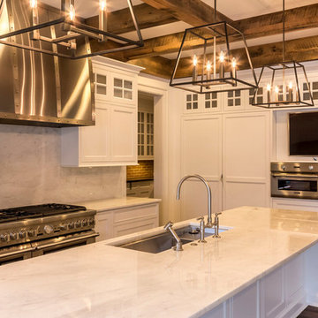
Inspiration for a large timeless l-shaped medium tone wood floor eat-in kitchen remodel in Denver with a farmhouse sink, raised-panel cabinets, medium tone wood cabinets, marble countertops, white backsplash, stone tile backsplash, stainless steel appliances, beige walls and an island
Inspiration for a large timeless l-shaped medium tone wood floor eat-in kitchen remodel in Denver with a farmhouse sink, raised-panel cabinets, medium tone wood cabinets, marble countertops, white backsplash, stone tile backsplash, stainless steel appliances, beige walls and an island
 Designer's Touch
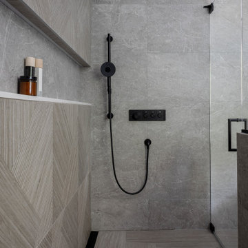
We took this awkward bathroom, with its tiny shower and toilet in the center of the floor, and created an oasis that is not just functional, but also luxurious and sophisticated. Below a custom mirror, the gray bathroom vanity features a white quartz waterfall edge countertop. The toilet has been relocated to the other side of the vanity and is now mounted to the wall. The heated floors are covered in a gray herringbone pattern that complements the custom gray built-in cabinets - perfect for storing towels, supplies and personal items. The walls have large scale tiles arranged in a diamond pattern, with an accent wall in a warm ash-color. And finally, to create a high-end experience, we installed a bubble jet freestanding tub which sits in front of the 10’ wide shower, featuring a wall niche with LED light.
 Designer's Touch
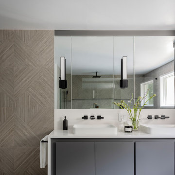
We took this awkward bathroom, with its tiny shower and toilet in the center of the floor, and created an oasis that is not just functional, but also luxurious and sophisticated. Below a custom mirror, the gray bathroom vanity features a white quartz waterfall edge countertop. The toilet has been relocated to the other side of the vanity and is now mounted to the wall. The heated floors are covered in a gray herringbone pattern that complements the custom gray built-in cabinets - perfect for storing towels, supplies and personal items. The walls have large scale tiles arranged in a diamond pattern, with an accent wall in a warm ash-color. And finally, to create a high-end experience, we installed a bubble jet freestanding tub which sits in front of the 10’ wide shower, featuring a wall niche with LED light.
Find the right local pro for your project
 Designer's Touch
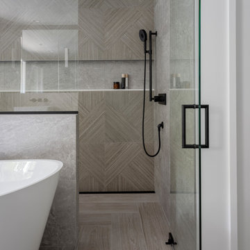
We took this awkward bathroom, with its tiny shower and toilet in the center of the floor, and created an oasis that is not just functional, but also luxurious and sophisticated. Below a custom mirror, the gray bathroom vanity features a white quartz waterfall edge countertop. The toilet has been relocated to the other side of the vanity and is now mounted to the wall. The heated floors are covered in a gray herringbone pattern that complements the custom gray built-in cabinets - perfect for storing towels, supplies and personal items. The walls have large scale tiles arranged in a diamond pattern, with an accent wall in a warm ash-color. And finally, to create a high-end experience, we installed a bubble jet freestanding tub which sits in front of the 10’ wide shower, featuring a wall niche with LED light.

 catlin stothers design
A dysfunctional layout on the main floor included a tiny kitchen and dining room, both of which were disproportionate with other rooms in this sprawling five bedroom home. The spatial constraints didn’t allow for large gatherings nor was the kitchen remotely functional.
The removal of several interior walls, along with opening door entries to their maximum heights and widths provide greater flow and a more inviting atmosphere. Views to the garden were exploited by replacing one small window with a thirteen foot linear window in the kitchen.
Other windows were transformed into exterior doors for easy access to the large terrace leading to a swimming pool during summer months.
The kitchen is a luminous sanctuary, combining a serene palette of muted grey cabinetry and marbled quartz counters. Panels of white oak maintain minimal lines while concealing an abundance of storage. The former dining room gave way to a more casual experience, with a custom built-in banquette spanning the width of the kitchen.
Continuing the oak floors from the living room into the kitchen, creates a visual flow that was integral to the open concept of the main floor.
 catlin stothers design
A dysfunctional layout on the main floor included a tiny kitchen and dining room, both of which were disproportionate with other rooms in this sprawling five bedroom home. The spatial constraints didn’t allow for large gatherings nor was the kitchen remotely functional.
The removal of several interior walls, along with opening door entries to their maximum heights and widths provide greater flow and a more inviting atmosphere. Views to the garden were exploited by replacing one small window with a thirteen foot linear window in the kitchen.
Other windows were transformed into exterior doors for easy access to the large terrace leading to a swimming pool during summer months.
The kitchen is a luminous sanctuary, combining a serene palette of muted grey cabinetry and marbled quartz counters. Panels of white oak maintain minimal lines while concealing an abundance of storage. The former dining room gave way to a more casual experience, with a custom built-in banquette spanning the width of the kitchen.
Continuing the oak floors from the living room into the kitchen, creates a visual flow that was integral to the open concept of the main floor.
 Designer's Touch
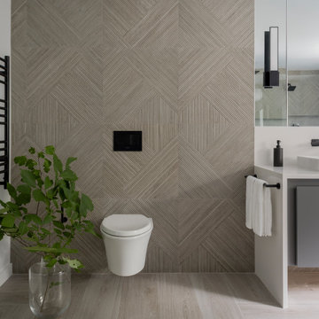
We took this awkward bathroom, with its tiny shower and toilet in the center of the floor, and created an oasis that is not just functional, but also luxurious and sophisticated. Below a custom mirror, the gray bathroom vanity features a white quartz waterfall edge countertop. The toilet has been relocated to the other side of the vanity and is now mounted to the wall. The heated floors are covered in a gray herringbone pattern that complements the custom gray built-in cabinets - perfect for storing towels, supplies and personal items. The walls have large scale tiles arranged in a diamond pattern, with an accent wall in a warm ash-color. And finally, to create a high-end experience, we installed a bubble jet freestanding tub which sits in front of the 10’ wide shower, featuring a wall niche with LED light.

 Designer's Touch
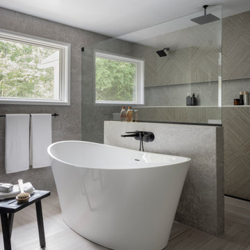
We took this awkward bathroom, with its tiny shower and toilet in the center of the floor, and created an oasis that is not just functional, but also luxurious and sophisticated. Below a custom mirror, the gray bathroom vanity features a white quartz waterfall edge countertop. The toilet has been relocated to the other side of the vanity and is now mounted to the wall. The heated floors are covered in a gray herringbone pattern that complements the custom gray built-in cabinets - perfect for storing towels, supplies and personal items. The walls have large scale tiles arranged in a diamond pattern, with an accent wall in a warm ash-color. And finally, to create a high-end experience, we installed a bubble jet freestanding tub which sits in front of the 10’ wide shower, featuring a wall niche with LED light.
 Westminster Teak
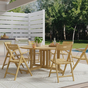
Ideal for small spaces, the Barbuda Surf 7 piece Set is a completely foldable set. Each piece can be conveniently stored away when not needed. Whether on a tiny patio, in a high rise apartment, or on the deck of a boat or yacht, this set is quick to set up when you have impromptu guests. The 5ft Barbuda Round Table can be folded in half and placed against a wall to serve as a drink station or desk. The Surf Armchair folds for convenient storage. This dining set provides luxurious dining experiences for years to come.
The 7 piece Barbuda Surf Foldaway Dining Set features:
6 x Surf Folding Chairs
1 x Barbuda 5 ft Fold Up Table.
Table can accept optional umbrella.
All pieces fold completely for convenient storage.
No assembly required.
316L Stainless Steel Hardware
Optional cushions made with Quick Dry Foam® core and 100% solution dyed Sunbrella fabrics. Crafted with SVLK Certified Grade A Teak harvested from sustainable plantations in Indonesia. Every piece is precision manufactured to standard specifications for commercial and residential use.

 Nar Design Group
This fun classic kitchen in Gold River features Columbia frameless cabinets in Sandy Hook grey. A green glass backsplash in a random matte and polished pattern complements the cabinets which are faced with both painted wood and frosted glass. The Silestone countertops in the Lyra finish have an ogee bullnose edge. The floors are finished in a rich brown porcelain tile of varying sizes that are made to resemble distressed wood.
Photo Credit: Nar Fine Carpentry, Inc
 Bennett Contracting, Inc.
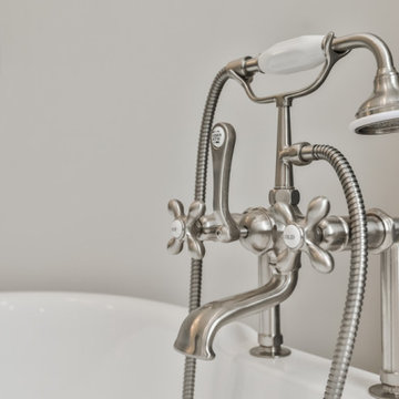
Recently in Saratoga Springs, clients of ours reached out for some assistance with their main bathroom. Project Manager, EJ Bonacker, requested the assistance of Designer, Sarah McDonald for a major bathroom overhaul. The clients were looking to open up the space and update the look and feel. Out went the old tub and surround along with the tiny acrylic shower. A stunning clawfoot soaking tub took the old space and fit nicely angled in the corner. A spacious walk-in shower was installed to elevate the bathing experience to celestial heights. The walls boast gorgeous tiles all the way up to the ceiling, adorned with mosaic accents on both the walls and niche that add a touch of charisma. Complementing this modern aesthetic, the floor features a chic hexagon pattern, adding a touch of updated farmhouse elegance. Amidst the serene palette of whites, silvers and grays, a bold Ballard blue vanity steals the show, injecting a vibrant burst of color. The result? A masterpiece of design and functionality thanks to our talented field staff. Ready to turn your bathroom dreams into a reality? Reach out to us to embark on your own transformative remodeling journey and discover what your space can hold.
 Westminster Teak
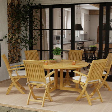
Ideal for small spaces, the Barbuda 7 piece Folding Set is a completely foldable set. Each piece can be conveniently stored away when not needed. Whether on a tiny patio, in a high rise apartment, or on the deck of a boat or yacht, this set is quick to set up when you have impromptu guests. The 5ft Barbuda Round Table can be folded in half and placed against a wall to serve as a drink station or desk. Functional and versatile with contoured seating, the Barbuda Armchair folds for convenient storage. This dining set provides luxurious dining experiences for years to come.
The 7 piece Folding Set features:
6 x Barbuda Folding Armchairs
1 x Barbuda 5 ft Folding Table.
Table can accept optional umbrella.
All pieces fold completely for convenient storage.
No assembly required.
Features 316L Marine Grade Stainless Steel Hardware
Optional cushions made with Quick Dry Foam® core and 100% solution dyed Sunbrella fabrics. Crafted with 100% Grade A Teak harvested from sustainable plantations in Indonesia, every piece is precision manufactured to standard specifications for commercial and residential use.

 Schloegel Design Remodel
With dual shower heads, one being stationary and the other a handheld on a shower bar, our clients get the ultimate spa experience. Perhaps the most luxurious addition to the bathroom is the one unseen. Underfloor heat was installed throughout the bathroom and is carried into the shower and even the shower seat!
 Westminster Teak
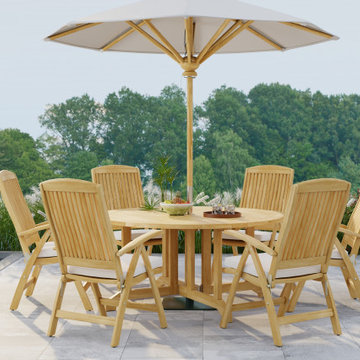
Ideal for small spaces, the Barbuda 7 piece Dining Set with Recliner Chairs is a completely foldable set. Each piece can be conveniently stored away when not needed. Whether on a tiny patio, in a high rise apartment, or on the deck of a boat or yacht, this set is quick to set up when you have impromptu guests. The 60 inch Dia Barbuda Round Drop Leaf Gate Leg Table can be folded in half and placed against a wall to serve as a drink station or desk. The Barbuda reclining chair offers six reclining positions and folds. This dining set provides luxurious dining experiences for years to come. Part of the Barbuda Collection.
The 7 piece Reclining Dining Set features:
6 x Barbuda Reclining Chairs
1 x Barbuda 5 ft Folding Table.
Table can accept optional umbrella.
All pieces fold completely for convenient storage.
No assembly required.
Optional cushions made with Quick Dry Foam® core and 100% solution dyed Sunbrella fabrics. Crafted with 100% Grade A Teak harvested from sustainable plantations in Indonesia, every piece is precision manufactured to standard specifications for commercial and residential use.
 Boss Design Center
Welcome to our latest kitchen renovation project, where classic French elegance meets contemporary design in the heart of Great Falls, VA. In this transformation, we aim to create a stunning kitchen space that exudes sophistication and charm, capturing the essence of timeless French style with a modern twist.
Our design centers around a harmonious blend of light gray and off-white tones, setting a serene and inviting backdrop for this kitchen makeover. These neutral hues will work in harmony to create a calming ambiance and enhance the natural light, making the kitchen feel open and welcoming.
To infuse a sense of nature and add a striking focal point, we have carefully selected green cabinets. The rich green hue, reminiscent of lush gardens, brings a touch of the outdoors into the space, creating a unique and refreshing visual appeal. The cabinets will be thoughtfully placed to optimize both functionality and aesthetics.
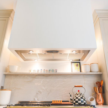
The heart of this project lies in the eye-catching French-style range and exquisite light fixture. The hood, adorned with intricate detailing, will become a captivating centerpiece above the cooking area. Its classic charm will evoke the grandeur of French country homes, while also providing efficient ventilation for a pleasant cooking experience.
 catlin stothers design
A dysfunctional layout on the main floor included a tiny kitchen and dining room, both of which were disproportionate with other rooms in this sprawling five bedroom home. The spatial constraints didn’t allow for large gatherings nor was the kitchen remotely functional.
The removal of several interior walls, along with opening door entries to their maximum heights and widths provide greater flow and a more inviting atmosphere. Views to the garden were exploited by replacing one small window with a thirteen foot linear window in the kitchen.
Other windows were transformed into exterior doors for easy access to the large terrace leading to a swimming pool during summer months.
The kitchen is a luminous sanctuary, combining a serene palette of muted grey cabinetry and marbled quartz counters. Panels of white oak maintain minimal lines while concealing an abundance of storage. The former dining room gave way to a more casual experience, with a custom built-in banquette spanning the width of the kitchen.
Continuing the oak floors from the living room into the kitchen, creates a visual flow that was integral to the open concept of the main floor.
 catlin stothers design
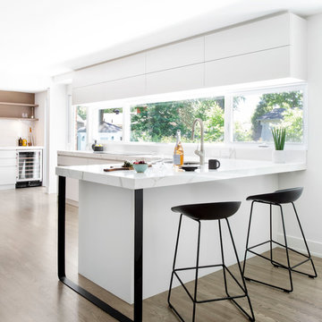
A dysfunctional layout on the main floor included a tiny kitchen and dining room, both of which were disproportionate with other rooms in this sprawling five bedroom home. The spatial constraints didn’t allow for large gatherings nor was the kitchen remotely functional.
The removal of several interior walls, along with opening door entries to their maximum heights and widths provide greater flow and a more inviting atmosphere. Views to the garden were exploited by replacing one small window with a thirteen foot linear window in the kitchen.
Other windows were transformed into exterior doors for easy access to the large terrace leading to a swimming pool during summer months.
The kitchen is a luminous sanctuary, combining a serene palette of muted grey cabinetry and marbled quartz counters. Panels of white oak maintain minimal lines while concealing an abundance of storage. The former dining room gave way to a more casual experience, with a custom built-in banquette spanning the width of the kitchen.
Continuing the oak floors from the living room into the kitchen, creates a visual flow that was integral to the open concept of the main floor.
 catlin stothers design
A dysfunctional layout on the main floor included a tiny kitchen and dining room, both of which were disproportionate with other rooms in this sprawling five bedroom home. The spatial constraints didn’t allow for large gatherings nor was the kitchen remotely functional.
The removal of several interior walls, along with opening door entries to their maximum heights and widths provide greater flow and a more inviting atmosphere. Views to the garden were exploited by replacing one small window with a thirteen foot linear window in the kitchen.
Other windows were transformed into exterior doors for easy access to the large terrace leading to a swimming pool during summer months.
The kitchen is a luminous sanctuary, combining a serene palette of muted grey cabinetry and marbled quartz counters. Panels of white oak maintain minimal lines while concealing an abundance of storage. The former dining room gave way to a more casual experience, with a custom built-in banquette spanning the width of the kitchen.
Continuing the oak floors from the living room into the kitchen, creates a visual flow that was integral to the open concept of the main floor.
 catlin stothers design
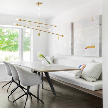
A dysfunctional layout on the main floor included a tiny kitchen and dining room, both of which were disproportionate with other rooms in this sprawling five bedroom home. The spatial constraints didn’t allow for large gatherings nor was the kitchen remotely functional.
The removal of several interior walls, along with opening door entries to their maximum heights and widths provide greater flow and a more inviting atmosphere. Views to the garden were exploited by replacing one small window with a thirteen foot linear window in the kitchen.
Other windows were transformed into exterior doors for easy access to the large terrace leading to a swimming pool during summer months.
The kitchen is a luminous sanctuary, combining a serene palette of muted grey cabinetry and marbled quartz counters. Panels of white oak maintain minimal lines while concealing an abundance of storage. The former dining room gave way to a more casual experience, with a custom built-in banquette spanning the width of the kitchen.
Continuing the oak floors from the living room into the kitchen, creates a visual flow that was integral to the open concept of the main floor.
 catlin stothers design
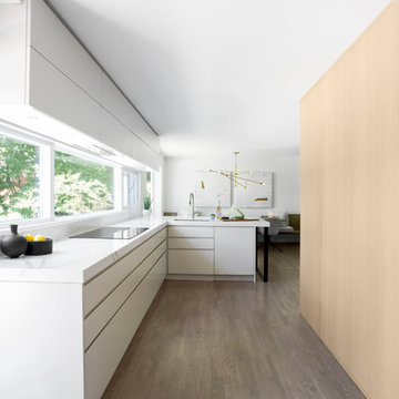
A dysfunctional layout on the main floor included a tiny kitchen and dining room, both of which were disproportionate with other rooms in this sprawling five bedroom home. The spatial constraints didn’t allow for large gatherings nor was the kitchen remotely functional.
The removal of several interior walls, along with opening door entries to their maximum heights and widths provide greater flow and a more inviting atmosphere. Views to the garden were exploited by replacing one small window with a thirteen foot linear window in the kitchen.
Other windows were transformed into exterior doors for easy access to the large terrace leading to a swimming pool during summer months.
The kitchen is a luminous sanctuary, combining a serene palette of muted grey cabinetry and marbled quartz counters. Panels of white oak maintain minimal lines while concealing an abundance of storage. The former dining room gave way to a more casual experience, with a custom built-in banquette spanning the width of the kitchen.
Continuing the oak floors from the living room into the kitchen, creates a visual flow that was integral to the open concept of the main floor.
13