
Search results for "Tiny experiment" in Home Design Ideas

 California Deluxe Windows
For more information visit http://www.cdwindows.com.com or call (800) 639-9463.
Imagine a 180° view outside your dining room that would make a spaceship jealous…
If we could compare our company to an aerospace company, this project would be the equivalent of launching a rocket, if we were a shipbuilding company it would be the equivalent of our newest creation leaving the dock for the first time. What makes this project so special? It is the first curved floor-to-ceiling projected panoramic window that is dual-pane!
The visual effect inside the dining room is stunning. This room was not even used before due to the uncomfortable heat coming in through the single-pane glass accompanied by terrible noise. Previously this opening was just a low-tech assembly from six individual single-pane pieces of glass connected with aquarium like caulking.
Today, the homeowner has the experience of having a glorious view of the colorful landscape that feels like it surrounds you with only a tiny whisper when a car passes. Presently there is no discomfort from the heat and all the interior furnishing and flooring are saved from the damaging UV rays. No doubt that having a window like this in your home makes a huge statement of pride in ownership and appreciation of beauty and quality.
 California Deluxe Windows
For more information visit http://www.cdwindows.com.com or call (800) 639-9463.
Imagine a 180° view outside your dining room that would make a spaceship jealous…
If we could compare our company to an aerospace company, this project would be the equivalent of launching a rocket, if we were a shipbuilding company it would be the equivalent of our newest creation leaving the dock for the first time. What makes this project so special? It is the first curved floor-to-ceiling projected panoramic window that is dual-pane!
The visual effect inside the dining room is stunning. This room was not even used before due to the uncomfortable heat coming in through the single-pane glass accompanied by terrible noise. Previously this opening was just a low-tech assembly from six individual single-pane pieces of glass connected with aquarium like caulking.
Today, the homeowner has the experience of having a glorious view of the colorful landscape that feels like it surrounds you with only a tiny whisper when a car passes. Presently there is no discomfort from the heat and all the interior furnishing and flooring are saved from the damaging UV rays. No doubt that having a window like this in your home makes a huge statement of pride in ownership and appreciation of beauty and quality.
 Stalburg Design
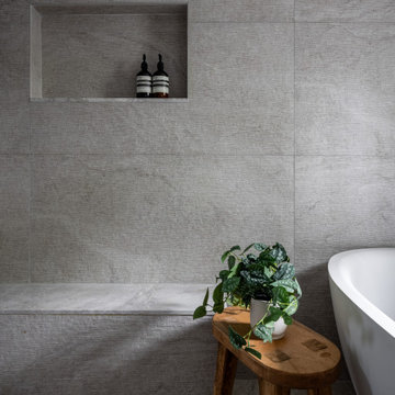
Relocating from their home in Brisbane, Australia with ocean views to the Pacific, our clients envisioned a refresh for their new lakefront cottage on Pine Lake in West Bloomfield, Michigan. Completed in July 2024, we created new spaces, reimagined old ones, and even swapped places for a primary bedroom and its en suite bath.
Our goal was to create a serene and soothing spa- like experience for the bathroom, all while maintaining gorgeous lake views. But this reconfiguration presented some challenges. The primary bedroom was oversized, while its adjacent bath was tiny and crowded. We completely flipped the locations of the bedroom and bathroom, even rerouting plumbing over the bar in the lower level to accommodate the freestanding tub.
To maximize space, we designed large, walk-in dressing pantries that are as functional as they are beautiful, and lead to the large dual custom vanity. The vanity itself is freestanding to provide access for hand towel bath hardware on its sides. The his-and-hers unit contains built-in dividers, laundry hampers and trash pullouts to maximize its function. An enclosed water closet allows for privacy in the open concept bathroom, and is placed beyond the cabinetry.
The star of this space is the large enclosed wet room. As the focal point of the bathroom, its oversized tiled walls and deep built-in bench allow for a steam or soaking in the tub while enjoying stunning lake views. The wet room is spacious and serene, and perfect for an end to a Michigan winter day.
Find the right local pro for your project

 Advance Design Studio, Ltd.
Jennifer and Dan have lived in their Deer Park Illinois home for 15 years, slowly making minor fixes like painting and decorating; but they had a new plan for their kitchen the entire time. An awkwardly placed garage door, and an island cooktop with a terrible downdraft made a full-scale kitchen remodel an absolute must. Jennifer had many ideas in mind and wanted to work with a company that could provide high-end work, while partnering with a designer that would tailor the kitchen to her ideas.
She was intrigued by the phrase “Common Sense Remodeling” in Advance Design’s feature she discovered while perusing an issue of the community’s Quintessential Barrington Magazine. Doing further research on the company’s website, as she looked through project profiles and read about Advance Design’s “Common Sense Remodeling” philosophy, she promptly scheduled an appointment to see if the people and ideas she read about were truly who they said they were. The more she read, the more she knew that the “Common Sense” approach to remodeling they described was exactly the type of company she was looking for.
The partnership was sealed after an initial consultation with Owner Todd Jurs and Project Designer Michelle Lecinski. They displayed a combination of friendliness, professionalism and respect that was unmatched by any of the other companies Jennifer talked to. She knew that with Advance Design, she would be able to retain the vision that she had in mind with high-quality craftsmanship.
“I reached out to Advance Design because of the ‘Common Sense Remodeling’ tagline,” Jennifer said. “That’s what lingered for me”. “Advance Design was the most respectful- of the house and of my design ideas, and the most professional of the handful of companies that looked at my project”.
Soon after the meeting Jennifer began working with Michelle on the project design. They quickly developed chemistry. Jennifer loved how Michelle researched and located every detail that Jennifer wanted for the kitchen. Between the two of them, every concept and idea was worked through and perfected. “Jennifer had definite ideas about what she wanted the new kitchen to look like, she just didn’t know how to bring it all together. We worked together really well to make her ideas into the practical reality necessary for a well-functioning kitchen, with the look and feel that she had envisioned”, says Michelle.
“Michelle was wonderful in using the CAD system she would show me new drawings every time we changed the layout while working through the design,” Jennifer said. “She was a really wonderful partner in execution, she made sure everything happened quickly and easily.”
The finished design drew out elements of Jennifer’s style and personality. The pair call the look “sophisticated farmhouse” to describe the kitchen renovation to family and friends. The result was a beautifully crafted, authentic-feeling space that satisfied Jennifer’s dreams 15 years in the making. The whole project consisted of a kitchen remodel, mudroom upgrade with powder room, and garage entry relocation. “The projects I personally like the best, are the ones that put the client’s dreams on display,” Project Designer Michelle said. “And this is one of those projects.”
The main focal point of the kitchen is custom zinc and brass ventilation hood with a vintage sheen, which was hand made to order by a small company in Indiana named Vogler Metalworking. “It’s like sculpture, a true work of art”, says Jennifer. Your eye is immediately drawn towards this elegant yet practical hood that eliminated the home’s downdraft problem and added a striking conversation piece at the same time. The carpenters had to use special gloves when transporting and installing it, so they didn’t smudge it with fingerprints. The beautiful hood centers proudly over the stunning black enamel and brass LaCornue Range. “I had a friend who had a LaCornue range and after learning how easy it was to cook perfect meals, I was convinced I wanted to have one”, says Jennifer. This unique, breathtaking combination anchors the entire kitchen and is apparent immediately as you walk into the great room the surrounds the space.
DuraSupreme Crestwood cabinets with a Kendall Panel add function and sophistication. A custom gray paint color paired with a storm blue was developed so that the new kitchen looked like it belonged to the existing space. Unlacquered brass faucets and hardware were important to Jennifer because she wanted the living finishes to age over time. Remarkable brass diamond mesh cabinet door inserts imported from the UK continue to add this one-of-a-kind kitchen renovation; giving it a “you won’t see this everywhere” quality. The use of old railcar flooring for the coffee bar countertop and reclaimed oak for the open shelving gives an authenticity to the space uncommon in kitchens today.
Jennifer and Michelle fell in love with the Limestone Grey Stone while they were investigating unique island countertop ideas. They liked the fact that the limestone as a living finish will age and change over time. Calcutta Miel Quartz countertops made for an excellent pairing around the perimeter, as it’s durable and perfect for cooking preparations. A textured white subway tile backsplash that runs to the ceiling keeps your eye moving towards the open shelving, and to the main focal point of the stunning range hood combination.
“The kitchen functions beautifully, and it’s gorgeous,” beams Jennifer as she gestures with both hands while smiling ear to ear. “The most important thing was I wanted a kitchen that had a wonderful flow, cooked beautiful meals and was a great gathering place for family and friends, and this space does that perfectly! Beauty wise, it turned out exactly how I had envisioned. I felt the function part was the hardest part, and that was nailed”!
Relocating the garage entry to the new mudroom was a huge priority and has finally separated the family’s arriving home functions from their kitchen. Now coats and shoes and bags have their own area for dropping once members arrive home. Matching gray DuraSupreme cabinetry helped create gorgeous, purposeful lockers for the family. A reclaimed vintage sink and custom wall paper were added to the tiny powder room to beautify the once previously only functional space. Advance Design was even able to create a custom space for their dog to sleep while the family is away.
“It was unbelievable that a project of this size was completed in such a short time, and I think that’s because of the large amount of planning and preparation that went into it,” Jennifer marveled, “When we started, we were ready, and everything was prepared”.
When it came to execution, Project Manager Justin Davis and his crew were quick, accessible, and organized. Projects like this kitchen are typically completed in as little as 8-10 weeks. Jennifer’s kitchen however despite the relocation of some challenging HVAC in a soffit and moving of an exterior door was completed remarkably fast in part because the team was working with an existing tile floor that ran throughout the first floor that the client really loved.
“You get to know these people really well because they’re living in your house while you’re living in your house. They were so fast and really good, it didn’t take as long as even planned” reported Jennifer. “I would text Justin and he always responded almost immediately. I got to know all the guys who were working in our house and they were all wonderful people”.
Details in a customized kitchen like this one require skill and care from the people who install it. “All the guys on the job were skilled at what the did. I wanted small details like little feet to look like furniture, that is where their carpentry skill came in to make these all perfect”, said Jennifer. “The tile guys were wonderful. They even let me determine how I wanted the texture with the grout to appear for a salt and pepper look; now that is a very skilled trade person making it custom”.
In Jennifer’s interview, she continued to reference Advance Design’s “Common Sense Remodeling”, so I took a minute to ask her exactly what that phrase meant to her and how it played out in her experience with her project and the Advance Design team. Here is what she said: “I was intrigued about Common Sense Remodeling and in my head that there would be clear costs and prices, great communication between the design team, the execution team and me”, said Jennifer. They did deliver on that, it was so clear about the cost breakdown, what I could expect from everyone who came to my house, and everything that we had ordered. That to me is the Common Sense”!
It’s great to see a client take literally our assertion that a well-planned remodeling project is simply “Common Sense”! She anticipated each step of the way would be clear, concise, and predictable, all the while protecting the outcome due to the careful upfront planning. “Advance Design delivered on their ‘Common Sense Remodeling’ promise,” Jennifer said. “From the design team, to the execution team - everything was straight forward like I imagined. The project turned out exactly how I envisioned, I enjoyed this process and absolutely would recommend Advance Design Studio to anyone.”
 Stalburg Design
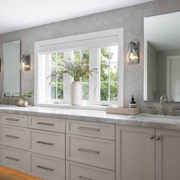
Relocating from their home in Brisbane, Australia with ocean views to the Pacific, our clients envisioned a refresh for their new lakefront cottage on Pine Lake in West Bloomfield, Michigan. Completed in July 2024, we created new spaces, reimagined old ones, and even swapped places for a primary bedroom and its en suite bath.
Our goal was to create a serene and soothing spa- like experience for the bathroom, all while maintaining gorgeous lake views. But this reconfiguration presented some challenges. The primary bedroom was oversized, while its adjacent bath was tiny and crowded. We completely flipped the locations of the bedroom and bathroom, even rerouting plumbing over the bar in the lower level to accommodate the freestanding tub.
To maximize space, we designed large, walk-in dressing pantries that are as functional as they are beautiful, and lead to the large dual custom vanity. The vanity itself is freestanding to provide access for hand towel bath hardware on its sides. The his-and-hers unit contains built-in dividers, laundry hampers and trash pullouts to maximize its function. An enclosed water closet allows for privacy in the open concept bathroom, and is placed beyond the cabinetry.
The star of this space is the large enclosed wet room. As the focal point of the bathroom, its oversized tiled walls and deep built-in bench allow for a steam or soaking in the tub while enjoying stunning lake views. The wet room is spacious and serene, and perfect for an end to a Michigan winter day.
 Stalburg Design
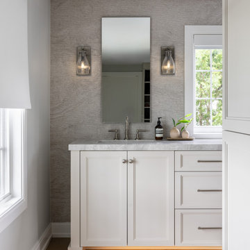
Relocating from their home in Brisbane, Australia with ocean views to the Pacific, our clients envisioned a refresh for their new lakefront cottage on Pine Lake in West Bloomfield, Michigan. Completed in July 2024, we created new spaces, reimagined old ones, and even swapped places for a primary bedroom and its en suite bath.
Our goal was to create a serene and soothing spa- like experience for the bathroom, all while maintaining gorgeous lake views. But this reconfiguration presented some challenges. The primary bedroom was oversized, while its adjacent bath was tiny and crowded. We completely flipped the locations of the bedroom and bathroom, even rerouting plumbing over the bar in the lower level to accommodate the freestanding tub.
To maximize space, we designed large, walk-in dressing pantries that are as functional as they are beautiful, and lead to the large dual custom vanity. The vanity itself is freestanding to provide access for hand towel bath hardware on its sides. The his-and-hers unit contains built-in dividers, laundry hampers and trash pullouts to maximize its function. An enclosed water closet allows for privacy in the open concept bathroom, and is placed beyond the cabinetry.
The star of this space is the large enclosed wet room. As the focal point of the bathroom, its oversized tiled walls and deep built-in bench allow for a steam or soaking in the tub while enjoying stunning lake views. The wet room is spacious and serene, and perfect for an end to a Michigan winter day.
 Stalburg Design
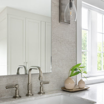
Relocating from their home in Brisbane, Australia with ocean views to the Pacific, our clients envisioned a refresh for their new lakefront cottage on Pine Lake in West Bloomfield, Michigan. Completed in July 2024, we created new spaces, reimagined old ones, and even swapped places for a primary bedroom and its en suite bath.
Our goal was to create a serene and soothing spa- like experience for the bathroom, all while maintaining gorgeous lake views. But this reconfiguration presented some challenges. The primary bedroom was oversized, while its adjacent bath was tiny and crowded. We completely flipped the locations of the bedroom and bathroom, even rerouting plumbing over the bar in the lower level to accommodate the freestanding tub.
To maximize space, we designed large, walk-in dressing pantries that are as functional as they are beautiful, and lead to the large dual custom vanity. The vanity itself is freestanding to provide access for hand towel bath hardware on its sides. The his-and-hers unit contains built-in dividers, laundry hampers and trash pullouts to maximize its function. An enclosed water closet allows for privacy in the open concept bathroom, and is placed beyond the cabinetry.
The star of this space is the large enclosed wet room. As the focal point of the bathroom, its oversized tiled walls and deep built-in bench allow for a steam or soaking in the tub while enjoying stunning lake views. The wet room is spacious and serene, and perfect for an end to a Michigan winter day.
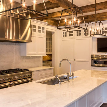

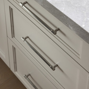 Stalburg Design
Relocating from their home in Brisbane, Australia with ocean views to the Pacific, our clients envisioned a refresh for their new lakefront cottage on Pine Lake in West Bloomfield, Michigan. Completed in July 2024, we created new spaces, reimagined old ones, and even swapped places for a primary bedroom and its en suite bath.
Our goal was to create a serene and soothing spa- like experience for the bathroom, all while maintaining gorgeous lake views. But this reconfiguration presented some challenges. The primary bedroom was oversized, while its adjacent bath was tiny and crowded. We completely flipped the locations of the bedroom and bathroom, even rerouting plumbing over the bar in the lower level to accommodate the freestanding tub.
To maximize space, we designed large, walk-in dressing pantries that are as functional as they are beautiful, and lead to the large dual custom vanity. The vanity itself is freestanding to provide access for hand towel bath hardware on its sides. The his-and-hers unit contains built-in dividers, laundry hampers and trash pullouts to maximize its function. An enclosed water closet allows for privacy in the open concept bathroom, and is placed beyond the cabinetry.
The star of this space is the large enclosed wet room. As the focal point of the bathroom, its oversized tiled walls and deep built-in bench allow for a steam or soaking in the tub while enjoying stunning lake views. The wet room is spacious and serene, and perfect for an end to a Michigan winter day.

![Volume Zero, LLC [architectural design studio]](https://st.hzcdn.com/fimgs/ca0356070537acff_9871-w32-h32-b0-p0--.jpg) Volume Zero, LLC [architectural design studio]
Volume Zero, LLC [architectural design studio]Our goal was to create a luxurious bathing experience out of an ordinary bathroom.
As part of the full renovation of this bathroom, we replaced the existing standard builder's tub with a whirlpool tub. For practical purposes and due to the limitations of the house, we kept the tub/shower configuration. However, we extended the shower curtain rod beyond the typical tub alcove in order to create a space for the shower curtain when not in use, so that it is not in the way when someone is enjoying a bath.
The plumbing fixtures and trim were upgraded to the Waterworks Julia series in polished nickel. The existing man-made marble tub surround was replaced with a combination of iridescent glass mosaic tile and porcelain tile.
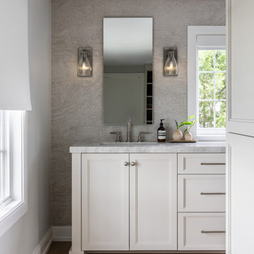 Stalburg Design
Relocating from their home in Brisbane, Australia with ocean views to the Pacific, our clients envisioned a refresh for their new lakefront cottage on Pine Lake in West Bloomfield, Michigan. Completed in July 2024, we created new spaces, reimagined old ones, and even swapped places for a primary bedroom and its en suite bath.
Our goal was to create a serene and soothing spa- like experience for the bathroom, all while maintaining gorgeous lake views. But this reconfiguration presented some challenges. The primary bedroom was oversized, while its adjacent bath was tiny and crowded. We completely flipped the locations of the bedroom and bathroom, even rerouting plumbing over the bar in the lower level to accommodate the freestanding tub.
To maximize space, we designed large, walk-in dressing pantries that are as functional as they are beautiful, and lead to the large dual custom vanity. The vanity itself is freestanding to provide access for hand towel bath hardware on its sides. The his-and-hers unit contains built-in dividers, laundry hampers and trash pullouts to maximize its function. An enclosed water closet allows for privacy in the open concept bathroom, and is placed beyond the cabinetry.
The star of this space is the large enclosed wet room. As the focal point of the bathroom, its oversized tiled walls and deep built-in bench allow for a steam or soaking in the tub while enjoying stunning lake views. The wet room is spacious and serene, and perfect for an end to a Michigan winter day.

 TOC design & construction inc.
DESIGNED BY TOC design
CONSTRUCTION BY TOC design & Construction inc.
PHOTOS BY : Tania Scardellato
I was fortunate to have a young family approach me in desperate need to renovate there only 3 piece bathroom. This space was In dire need of a remodel, with old brown wall to wall tiles and a dated bulky yellow brown single sink vanity.
Storage was a must, lighting a necessity, and proper accessibility to the shower bath area.
We had a tight budget to respect, but a full gut of this bathroom was required. And a good thing too, once we started doing the demolition we noticed that mildew and rotting floors and walls had accumulated throughout the years. Doing it right the first time is no joke when dealing with water and electrical issues.
We discarded all reminisce of old and built from scratch, new walls, new plumbing, new electrical ,new insulation and a new window, a new fan that actually exhausted outside ( I say this laughing as you would be amazed at how many fans are installed but don’t exhaust outside, and you the client would never know unless you go inside the attic space.
Once all the hard stuff was done, the rest is just a matter of smart design. If you have a small bathroom here are some tips to guide you.
10 tips for making a small bathroom feel larger
Is your tiny bathroom cramping your functionality and style, leaving you longing for the enormous bathrooms gracing the pages of design magazines? Even if your bathroom is a fraction of the size, all it takes is some design savvy to make the most of the space you have. Consider these 10 smart tips that will help your bathroom look, feel and function like those larger contenders.
1-Get creative with corners
Space is at a premium in small bathrooms, so it's important to maximize every inch. Corners, for example, provide extra space for shelving, storage units and even hooks. Get creative and install unique design solutions that are not only functional, but also eye-catching. If you love the airiness of floating cabinets, add baskets or decorative boxes under for extra storage. If you are installing floating cabinets insure that they are installed securely to studs or plywood at wall.
2- Let solid colors shine
Busy patterns have a shrinking effect and make small bathrooms seem even smaller. Conversely, light natural hues make a space feel more open. If you're itching to get creative with design, experiment with textures but keep overpowering patterns to a minimum. Tone on tone is the best to achieve this.
3 - Maximize your bathtub
A bathtub takes up a significant portion of the room, but modern, compact options with curved basins, can make the tub feel larger when in use, all while conserving space.
4 - Select a smaller faucet
A faucet is jewelry for the bathroom. And just as accessories can overpower an outfit, a big bulky faucet isn't flattering in a small bath. Single-handle designs conserve counter space, while a wall-mount installation frees it up all together and can create quite the wow-factor, if the budget can accommodate the required changes to plumbing behind the wall.
5 - Make vanity storage simple
If you're in a storage war with your small bathroom, you're not alone in the battle. Toiletries and personal supplies without a place to call home only add clutter and chaos. Store smart with a space-saving vanity, the dual sink vanity shown here, looks quite simple, but in reality it has 4 sets of full extension drawers, and the vanity tower adds extra storage without overpowering the use of space.
6 - Show off the shower
Shower curtains may be pretty, but they interrupt the visual flow of a bathing space and make it feel significantly smaller. In bathrooms with small footprints, opt for a clear glass sliding shower door that doesn't require the clearance of one with a hinged design. Or as shown in this design and for fraction less expensive a half hinged panel installed on a fixed tempered glass panel. If you're embarking on a big remodel, create the illusion of more space by using same tile in the shower that's used throughout; instead of seeing them as two separate zones, the eye will read them as one.
7 - Discover the treasure of hidden storage
Work with a contractor, and you just might find some serious storage potential hidden behind your walls. Whether it's utilizing space between the studs for shallow shelving or a creating a small linen closet by annexing space from an adjacent room, even small additions can make a big difference.
8 - Focal Point
Tile is a beautiful, durable addition to any bathroom. For dainty spaces, consider installing tile at a diagonal to accentuate the focal point or as in this bathroom I used an oversized textured pattern to bring depth to the space at the window wall.
9 - Choose the right lights
Strategically install light to reflect and brighten a small bathroom to make it appear larger. Recessed lighting is an affordable solution for tiny rooms, offering ample light while taking up little space. Wall sconces alongside a mirror also reflect off the walls and make a room feel bright and airy. I always recommend going with LED lighting at 2800 to 3000K.
10 – Accessorize
This is your time to shine in your decorating skills, have fun with your towels, you can change the color scheme daily just by adding pops of color in your accessories, make sure to get items that serve a dual purpose, like baskets, boxes they can always be used as hampers, storing of towels and even a nice display for your guest.

 John R. Schroeder, AIA
Photo by Jody Dole
This charming farmhouse sits atop a grassy hill overlooking a serene Connecticut River Estuary. The new design reformulated the first floor plan making it much more functional and visually exciting. It encompassed the reorganization of multiple spaces including the Mudroom, Kitchen, Dining Room, Family Room, Sun Room, Laundry, Bathroom, and Master Closet. The design also added, deleted, and relocated windows and French doors to greatly enhance exterior views, draw in more natural light, and seamlessly upgrade the articulation of exterior elevations. Improvements to the plumbing and mechanical systems were also made. The overall feeling is both sophisticated and yet very much down to earth.
John R. Schroeder, AIA is a professional design firm specializing in architecture, interiors, and planning. We have over 30 years experience with projects of all types, sizes, and levels of complexity. Because we love what we do, we approach our work with enthusiasm and dedication. We are committed to the highest level of design and service on each and every project. We engage our clients in positive and rewarding collaborations. We strive to exceed expectations through our attention to detail, our understanding of the “big picture”, and our ability to effectively manage a team of design professionals, industry representatives, and building contractors. We carefully analyze budgets and project objectives to assist clients with wise fund allocation.
We continually monitor and research advances in technology, materials, and construction methods, both sustainable and otherwise, to provide a responsible, well-suited, and cost effective product. Our design solutions are highly functional using both innovative and traditional approaches. Our aesthetic style is flexible and open, blending cues from client desires, building function, site context, and material properties, making each project unique, personalized, and enduring.

 Red House Building
This 4,500 sq. ft. house site is perched with breathtaking westerly views to the slopes of Mad River Glen and Green Mountains. The exterior palette is composed of Japanese Shou Sugi Ban siding, board form concrete and natural Hemlock ceilings. The interior is a combination of bright soaring rooms, private cozy retreat spaces and modern-minimalism. The large European windows and doors along with the continuous wood ceilings to the exterior mend the indoor and outdoor living experience.
The Mad River View project tapped a number of regional craftspeople and engineers for the collaboration on many items including a stunning steel and oak staircase, cantilevered concrete deck, locally crafted blackened steel cabinetry, oversized oak entry doors and modern veneer cabinetry. The wooded site has a clean modern landscape of bluestone, river birches and grass plantings with the idea that the lush fern undergrowth will grow back as a transition to the woods.

 Main Line Kitchen Design
Main Line Kitchen Design is a brand new business model! We are a group of skilled Kitchen Designers each with many years of experience planning kitchens around the Delaware Valley. And we are cabinet dealers for 6 nationally distributed cabinet lines like traditional showrooms. At Main Line Kitchen Design instead of a full showroom we use a small office and selection center, and 100’s of sample doorstyles, finish and sample kitchen cabinets, as well as photo design books and CAD on laptops to display your kitchen. This way we eliminate the need and the cost associated with a showroom business model. This makes the design process more convenient for our customers, and we pass the significant savings on to them as well.
We believe that since a web site like Houzz.com has over half a million kitchen photos any advantage to going to a full kitchen showroom with full kitchen displays has been lost. Almost no customer today will ever get to see a display kitchen in their door style and finish there are just too many possibilities. And of course the design of each kitchen is unique anyway.

 Hom Personal Interiors
From the Moment you step under the Taut Green Awning from Central Park West... you begin to feel the Tingling Calm you are about to behold.
As you ascend in the elevator to the Tree Top Floor and enter the Enclave, you know you have arrived, not at a residence, but an experience.
A place that is as Bright and White as the Sun Shining outside the Bank of Windows, yet Tempered by the Green Lush Expanse of all Central Park Laid before your Wandering eyes.
As you turn to Drink in the Apartment, your Eyes are delighted with the Twinkle of Crystal, the Sheen of Marbles, The Roughness of Carved Granite, all played against Cozy Silk and Wool Carpets, Sofas and Chairs that soak you in, the Art and Treasures in glints of Patina-ed Golds and Silver from the Past, The Present and the Future to come, all gift boxed in a setting that harks back to the Golden Age of Pre-War New York but Splashed with Modern Flourishes in design that remind you, you are Here and Now.
In this Trance you can hear the Sounds of Clinking Glasses celebrating a Birthday Celebration, The Laughter of Friends preparing to leave for an Opening Night at the Theater, the soft hush of a night cap toast as you savor in the city lights below before you dream some more, only to wake to the smells of Omelette's and French Toast waiting on White Porcelain with Crisp Linen Napkins all set beside the Mountain of the Sunday New York Times in the Shadow of a Blue Hydrangea arrangement.
The Day and The City awaits you, but you cocoon yourself in the envelope you are savoring, You reach for the Times, or the New Yorker, and curl in, with Cole Porter or Leonard Bernstein wafting through the aerie of peace, as you gaze out the window... Central Park fills with Leaves, People, Rain, or even a Gentle Snow.
This is Central Park West.
This is:
An Experience. Not a Residence.
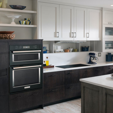


 Western Window Systems
A prefab modular fits neatly on a tiny Santa Monica corner lot.
On a quiet corner lot near Santa Monica’s Ocean Park neighborhood, just blocks from the Pacific Ocean, architect Jennifer Siegal made the most of her unique talent in utilizing prefabricated modules to create an eye-catching home.
Working with a lot measuring only 25 feet wide by 100 feet long, Siegal, owner of Venice, California-based architecture firm Office of Mobile Design, carefully fitted two stacking prefab modules to form the two-story 2,330-square-foot home.
Siegal, winner of the 2016 ArcVision Prize-Women and Architecture, has been recognized internationally as “a fearless pioneer in the research and development of prefabricated construction systems.” It’s easy to see why with her Santa Monica prefab.
For such a seemingly confined area, the home features an airy, open floor plan, with a combined living-dining-kitchen space opening up to cozy, foliage-lined back patio via a three-panel Western Window Systems Series 600 Multi-Slide Door. When open, the door seamlessly merges the indoor living space with the patio, letting Pacific Ocean breezes course through the space. Bamboo flooring throughout augments the openness of the floor plan with its clean look and light color.
A small garage, just yards from the street, doubles as another indoor living space featuring a roll-up door with frosted glass panels to let in natural light when closed. When open, it provides a unique sitting experience.
The second floor also makes the most of the narrow space, with two bedrooms, two bathrooms and a master-bedroom terrace over the back patio. Various shapes and sizes of Western Window Systems Series 670 Awning and Casement Windows help the home make the most of the ideal Santa Monica weather.
Atop it all is a unique butterfly roof that gives the modular shape of the home a playful twist and a sense of mobility.

 Zelaya Properties LLC
We used: Custom cherry cabinetry in Arts & Crafts Shaker style by Kabinart in Boulder and Espresso stains. Liberty Hardware Venetian bronze 1-1/2" cabinet knobs. KitchenAid Architect II Series 22 CF counter-depth French door refrigerator. KitchenAid Architect Series II 27" convection single wall oven. KitchenAid 36" 6-burner dual fuel freestanding commercial-style range. KitchenAid Architect II Series 24" dishwasher. Sharp Insight Pro Series 24" built-in microwave drawer (Model #KB6524PS). Crystorama Solaris 12" wide pendant lights in English bronze. Granite countertops in Brown Fantasy. 3"x6" polished marble backsplash.
Paint colors:
Walls: Glidden Silver Cloud 30YY 63/024
Ceilings/Trims/Doors: Glidden Swan White GLC23
Robert B. Narod Photography

 Ancient Surfaces
Product: Authentic Limestone for Exterior Living Spaces.
Ancient Surfaces
Contacts: (212) 461-0245
Email: Sales@ancientsurfaces.com
Website: www.AncientSurfaces.com
The design of external living spaces is known as the 'Al Fresco' design style as it is called in Italian. 'Al Fresco' translates into 'the open' or 'the cool/fresh exterior'. Customizing a fully functional outdoor kitchen, pizza oven, BBQ, fireplace or Jacuzzi pool spa all out of old reclaimed Mediterranean stone pieces is no easy task and shouldn’t be created out of the lowest common denominator of building materials such as concrete, Indian slates or Turkish travertine.
The one thing you can bet the farmhouse on is that when the entire process unravels and when your outdoor living space materializes from the architects rendering to real life, you will be guaranteed a true Mediterranean living experience if your choice of construction material was as authentic and possible to the Southern Mediterranean regions.
We believe that the coziness of your surroundings brought about by the creative usage of our antique stone elements will only amplify that authenticity.
whether you are enjoying a relaxing time soaking the sun inside one of our Jacuzzi spa stone fountains or sharing unforgettable memories with family and friends while baking your own pizzas in one of our outdoor BBQ pizza ovens, our stone designs will always evoke in most a feeling of euphoria and exultation that one only gets while being on vacation is some exotic European island surrounded with the pristine beauty of indigenous nature and ancient architecture...

 VPC Builders, LLC
Nestled deep in the Blue Ridge mountains, this custom home backs up to Moses Cone Manor. The home features three bedrooms and three baths with 1900 heated square feet. One of the many unique features of this home is the loft. The loft overlooks the main living space and takes advantage of natural light from the window wall. We used a welded wire railing to continue that open feeling as well as continue the same design of the deck outside and bring it inside. The loft also provides a functional space for the homeowner and currently serves as a place for the homeowner to focus on their passion of cycling. A small kitchenette was installed to provide the upstairs guest rooms with their morning coffee or midnight snacks.
The home was finished with wide plank, white oak flooring and tongue and groove vaulted ceilings in the living room. The design allows for this quaint mountain cabin to feel open and inviting despite its small footprint by utilizing a flexible floor space from the entry to the living room and kitchen. The natural coloring in the wood finishes inside and out mixed with traditional finishes really create a unique cabin experience that we try to celebrate here in our area of the mountains.
15