
Search results for "Towards material" in Home Design Ideas
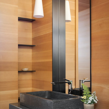
 Marcus Gleysteen Architects
Cove House is a contemporary shoreline sanctuary in the lake region of New Hampshire. The wooded property, which includes several accessory outbuildings and an existing guest cottage, makes up a private micro-cove. The new modern house and existing traditional cottage turn both toward the lake and to each other. Thoughtful siting and landscape architecture establish a connective flow between the two residences, with a notched stone courtyard in the house inviting visitors to go back and forth.
Inspired by the craftsmanship of an antique mahogany powerboat, Cove House pursues architectural quality and beauty at the highest level. The design uses materiality, texture, and daylight to balance livability and artistry. The main entrance leads through a slot-canyon-like hall where a sequence of monumental granite walls reveals a glorious, light-filled living room. A steel moment frame spanning two levels imparts unobstructed panoramic views of the lake.
The magnetism of the New Hampshire waterfront is equalized by a coordinated series of openings, which attune daylight throughout the interior. Large sliding glass doors and windows draw light through the courtyard and into the home’s core – a bright and lofty kitchen. Below the kitchen, a walkout patio illuminates a refined wine-tasting room.
Near the front entry, a gracious granite and steel stair delivers daylight to each level though open risers and glass balustrades. Skylights draw light from above and cast grazing shadows against the textured tile walls of the upper bathrooms.
“We aimed to create a “beautiful reward” and an environment that our clients will enjoy for the rest of their lives.”
– Marcus Gleysteen

 Carlton Edwards
The Cherry Road project is a humble yet striking example of how small changes can have a big impact. A meaningful project as the final room to be renovated in this house, thus our completion aligned with the family’s move-in. The kitchen posed a number of problems the design worked to remedy. Such as an existing window oriented the room towards a neighboring driveway. The initial design move sought to reorganize the space internally, focusing the view from the sink back through the house to the pool and courtyard beyond. This simple repositioning allowed the range to center on the opposite wall, flanked by two windows that reduce direct views to the driveway while increasing the natural light of the space.
Opposite that opening to the dining room, we created a new custom hutch that has the upper doors bypass doors incorporate an antique mirror, then led they magnified the light and view opposite side of the room. The ceilings we were confined to eight foot four, so we wanted to create as much verticality as possible. All the cabinetry was designed to go to the ceiling, incorporating a simple coat mold at the ceiling. The west wall of the kitchen is primarily floor-to-ceiling storage behind paneled doors. So the refrigeration and freezers are fully integrated.
The island has a custom steel base with hammered legs, with a natural wax finish on it. The top is soapstone and incorporates an integral drain board in the kitchen sink. We did custom bar stools with steel bases and upholstered seats. At the range, we incorporated stainless steel countertops to integrate with the range itself, to make that more seamless flow. The edge detail is historic from the 1930s.
At the range itself, there are a number of custom detailed incorporated for storage of cooking oils and spices, in a pullout. A custom knife block that's in a pull out as well.There is a concealed sort of office for the homeowner behind custom, bi-folding panel doors. So it can be closed and totally concealed, or opened up and engaged with the kitchen.
In the office area, which was a former pantry, we repurposed a granite marble top that was on the former island. The walls have a grasscloth wall covering, which is pinnable, so the homeowner can display photographs, calendars, and schedules.

 Haifa Architects
Duplex Y is located in a multi apartment building, typical to the Carmel mountain neighborhoods. The building has several entrances due to the slope it sits on.
Duplex Y has its own separate entrance and a beautiful view towards Haifa bay and the Golan Heights that can be seen on a clear weather day.
The client - a computer high-tech couple, with their two small daughters asked us for a simple and functional design that could remind them of their frequent visits to central and northern Europe. Their request has been accepted.
Our planning approach was simple indeed, maybe even simple in a radical way:
We followed the principle of clean and ultra minimal spaces, that serve their direct mission only.
Complicated geometry of the rooms has been simplified by implementing built-in wood furniture into numerous niches.
The most 'complicated' room (due to its broken geometry, narrow proportions and sloped ceiling) has been turned into a kid's room shaped as a clean 'wood box' for fun, games and 'edutainment'.
The storage room has been refurbished to maximize it's purpose by creating enough space to store 90% of the entire family's demand.
We've tried to avoid unnecessary decoration. 97% of the design has its functional use in addition to its atmospheric qualities.
Several elements like the structural cylindrical column were exposed to show their original material - concrete.
Photos: Julia Berezina
Find the right local pro for your project

 Shuler Architecture
This classic 1970's rambler was purchased by our clients as their 'forever' retirement home and as a gathering place for their large, extended family. Situated on a large, verdant lot, the house was burdened with extremely dated finishes and poorly conceived spaces. These flaws were more than offset by the overwhelming advantages of a single level plan and spectacular sunset views. Weighing their options, our clients executed their purchase fully intending to hire us to immediately remodel this structure for them.
Our first task was to open up this plan and give the house a fresh, contemporary look that emphasizes views toward Lake Washington and the Olympic Mountains in the distance. Our initial response was to recreate our favorite Great Room plan. This started with the elimination of a large, masonry fireplace awkwardly located in the middle of the plan and to then tear out all the walls. We then flipped the Kitchen and Dining Room and inserted a walk-in pantry between the Garage and new Kitchen location.
While our clients' initial intention was to execute a simple Kitchen remodel, the project scope grew during the design phase. We convinced them that the original ill-conceived entry needed a make-over as well as both bathrooms on the main level. Now, instead of an entry sequence that looks like an afterthought, there is a formal court on axis with an entry art wall that arrests views before moving into the heart of the plan. The master suite was updated by sliding the wall between the bedroom and Great Room into the family area and then placing closets along this wall - in essence, using these closets as an acoustical buffer between the Master Suite and the Great Room. Moving these closets then freed up space for a 5-piece master bath, a more efficient hall bath and a stacking washer/dryer in a closet at the top of the stairs.

 Fiorito Interior Design
Like many California ranch homes built in the 1950s, this original master bathroom was not really a "master bath." My clients, who only three years ago purchased the home from the family of the original owner, were saddled with a small, dysfunctional space. Chief among the dysfunctions: a vanity only 30" high, and an inconveniently placed window that forced the too-low vanity mirror to reflect only the waist and partial torso--not the face--of anyone standing in front of it. They wanted not only a more spacious bathroom but a bedroom as well, so we worked in tandem with an architect and contractor to come up with a fantastic new space: a true Master Suite. In order to refine a design concept for the soon-to-be larger space, and thereby narrow down material choices, my clients and I had a brainstorming session: we spoke of an elegant Old World/ European bedroom and bathroom, a luxurious bath that would reference a Roman spa, and finally the idea of a Hammam was brought into the mix. We blended these ideas together in oil-rubbed bronze fixtures, and a tiny tile mosaic in beautiful Bursa Beige marble from Turkey and white Thassos marble from Greece. The new generously sized bathroom boasts a jetted soaking tub, a very large walk-in shower, a double-sided fireplace (facing the tub on the bath side), and a luxurious 8' long vanity with double sinks and a storage tower.
The vanity wall is covered with a mosaic vine pattern in a beautiful Bursa Beige marble from Turkey and white Thassos marble from Greece,. The custom Larson Juhl framed mirrors are flanked by gorgeous hand-wrought scones from Hubbardton Forge which echo the vine and leaf pattern in the mosaic. And the vanity itself features an LED strip in the toe-kick which allows one to see in the middle of the night without having to turn on a shockingly bright overhead fixture. At the other end of the master bath, a luxurious jetted tub nestles by a fireplace in the bay window area. Views of my clients' garden can be seen while soaking in bubbles. The over-sized walk-in shower features a paneled wainscoting effect which I designed in Crema Marfil marble. The vine mosaic continues in the shower, topped by green onyx squares. A rainshower head and a hand-held spray on a bar provides showering options. The shower floor slopes gently in one direction toward a hidden linear drain; this allows the floor to be read as a continuation of the main space, without being interrupted by a center drain.
Photo by Jeff Fiorito
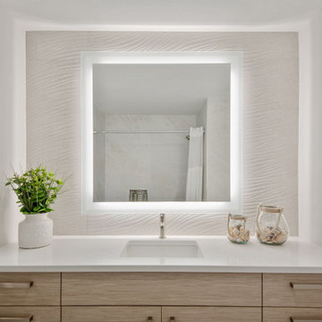
 ADINA HALL DESIGN
Castaway
An Oceanfront Residence
Clearwater, Florida
This breathtaking ocean-front family vacation retreat is positioned between the beach and harbor, an idyllic haven offering panoramic sunset views that will leave you in awe. Our mission was simple yet profound: to let the natural beauty of the surroundings shine while infusing the interior with elements that evoke the tranquility of the ocean.
Drawing inspiration from the sandy shores, we embraced white-washed wood veneers and wood-look porcelain tile flooring, chosen for their practicality and resilience, especially for a space frequented by energetic grandkids. To add a twist of creativity, we installed the tiles in a unique pattern, inviting you to "walk along the plank" towards the mesmerizing vistas.
The dining room serves as a tribute to the couple's engagement in Santorini, adorned with canvas prints of photos taken during these cherished memories. In the dining room and master bedroom, we meticulously selected the perfect "Santorini blue" tones for the accent walls to continue to narrate their story.
Crafted with Treefrog veneers, the custom millwork combines elegance with durability, while the bathrooms exude a spa-like serenity with their natural textures and sandy hues, enhanced by thoughtful lighting.
For the kids' room, we embraced vibrant colors and durable materials, ensuring a space where creativity knows no bounds. Meanwhile, the guest bedroom invites tropical relaxation with its palm leaf motifs and organic accents.
Overall, our design ethos revolves around a light and airy color palette, inspired by the tranquil hues of sand and sea. Strategic pops of color breathe life and vibrancy into the space, creating the perfect atmosphere for a dreamy vacation home experience. Join us as we embark on a journey to transform your space into a coastal paradise!
 EAG Studio
On a quiet street just steps from San Francisco’s beloved Dolores Park, a formerly modest urban structure has been transformed into a luminous vertical residence that quietly redefines contemporary city living. Through a comprehensive remodel and both vertical and horizontal expansion, the project turns a constrained urban footprint into a sequence of serene, art-forward living spaces that unfold upward toward expansive city views.
The architecture balances restraint and warmth: crisp contemporary geometry softened by natural materials, artful lighting, and carefully curated interiors. The result is a home that feels simultaneously grounded and elevated—deeply connected to its neighborhood yet remarkably private.
Reimagining the Urban Envelope
The original building has been almost entirely reconceived. The facade now reads as a disciplined composition of plaster volumes and precisely detailed window openings framed by subtle projecting bands. The geometry references San Francisco’s classic rhythm of bayed facades while stripping the language down to a refined modern expression.
Behind this quiet exterior lies a dramatically expanded interior volume. The redesign adds both additional floor area and new vertical circulation, transforming what was once a conventional city house into a multi-level architectural sequence organized around light, art, and views.
At the roofline, planted terraces soften the building’s silhouette and create a green crown visible from surrounding hillsides.
Interiors as a Sequence of Galleries
Inside, the home unfolds as a series of spatial moments connected by a sculptural stair and gallery-like corridors.
Wide plank oak floors run throughout, providing continuity and warmth against a palette of plaster walls, dark steel detailing, and natural stone. The hallways function almost as curated galleries, with layered artworks suspended in front of mesh panels that create depth and subtle shadow.
Light filters through carefully placed windows and stair openings, transforming circulation spaces into contemplative transitions rather than mere passageways.
A Living Room Anchored by Stone and Light
The primary living room occupies one of the home’s central floors, where a quiet interplay of texture and geometry defines the space.
A monumental fireplace wrapped in dark stone forms the room’s anchor, its mass contrasting with a recessed ceiling plane that seems to float above the seating area. Integrated perimeter lighting creates a soft architectural glow that washes the ceiling and walls.
Furniture is sculptural yet understated—rounded lounge chairs in warm ochre velvet, tailored sofas, and a striking marble cocktail table whose expressive veining becomes a focal artwork in itself. Deep blue carpeting grounds the seating arrangement and subtly absorbs light, enhancing the calm atmosphere.
Above the fireplace, a delicate projection artwork introduces a moment of visual poetry—an unexpected cinematic gesture that transforms the wall into a quietly animated canvas.
Kitchen as Architectural Furniture
The kitchen expresses a different register: crisp, tactile, and materially rich.
Custom walnut cabinetry spans the wall in a continuous plane, punctuated only by the sculpted hood and integrated appliances. The wood’s depth and warmth are balanced by expanses of pale marble that flow seamlessly from countertop to backsplash.
Three dome pendants hover above the island like industrial sculptures, casting pools of warm light onto the stone surface.
A row of vivid red stools introduces a controlled burst of color, a small but confident departure from the otherwise restrained palette.
Dining With a Living Backdrop
Adjacent to the kitchen, the dining room opens toward a glass wall overlooking a vertical garden of climbing ivy. The greenery becomes a constantly changing backdrop—lush and shadowy during the day, atmospheric and cinematic after sunset.
A dark wood table anchors the room, surrounded by pale oak chairs whose understated forms echo Scandinavian design traditions. The simplicity of the furniture allows the view and natural light to become the dominant experience.
Intimate Spaces and Material Contrast
Throughout the home, smaller rooms offer moments of intimacy and material experimentation.
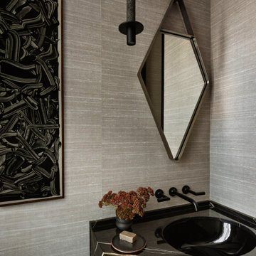
The powder room pairs textured wall coverings with a dramatic black marble vanity whose bold veining feels almost geological. A suspended mirror and slender pendant create a sculptural composition against the tactile backdrop.
The primary bedroom, by contrast, feels serene and expansive. Floor-to-ceiling glazing frames sweeping views of the city, while soft textiles and warm wood paneling create a cocooning effect. Slender black columns subtly define a sitting area without interrupting the openness of the space.
Bathing Above the City
In the primary bathroom, a sculptural freestanding tub sits beside a panoramic window overlooking San Francisco’s hills and rooftops.
The room’s palette—light oak, grey stone, and matte metals—reinforces the spa-like atmosphere. Floating cabinetry and integrated lighting maintain a sense of visual lightness despite the richness of the materials.
Entertaining Above the Park
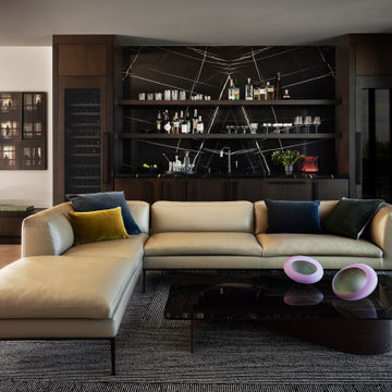
Higher in the house, a lounge and bar area becomes the social heart of the home. Here, dark stone slabs with dramatic veining wrap the bar wall like a piece of monumental art.
Open shelving displays glassware and spirits, while integrated wine storage hints at the home’s entertaining ambitions. A soft leather sectional and low glass table create a relaxed setting for conversation, framed by expansive views of the city skyline.
Cinema and Retreat
The lower level introduces yet another atmosphere: a dedicated media room designed for immersive viewing.
Dark walls, plush seating, and soft lighting create a cinematic environment that contrasts intentionally with the airy upper floors. It’s a retreat within the home—intimate, quiet, and removed from the brightness above.
Architecture That Balances Discipline and Warmth
What makes the project particularly compelling is its balance between architectural discipline and lived warmth.
Every element—from the carefully framed views to the restrained material palette—contributes to a cohesive spatial narrative. Yet the home never feels austere. Natural materials, curated art, and layered lighting create a sense of comfort and depth.
The result is a house that feels both architecturally rigorous and deeply human.
A Contemporary Interpretation of San Francisco Living
In a neighborhood defined by historic homes and iconic park views, this transformation offers a contemporary interpretation of San Francisco living.
It respects the city’s urban density while embracing openness, light, and vertical living. The home rises quietly above its surroundings, culminating in panoramic vistas that stretch across rooftops, hills, and sky.
What began as a conventional structure has become something far more nuanced: a modern urban sanctuary—part gallery, part retreat, and wholly connected to the vibrant city just beyond its walls.


 River Valley Landscapes
This project was the result of the owner’s desire to install a swimming pool and outdoor living space inspired by tropical resorts they had visited on family vacations. The one element asked for specifically was a large waterfall spilling into the pool. The challenge for the designers was how to achieve the look the owner’s wished without the use of clichéd items such as thatched huts and tiki torches. The designers decided lush full plantings using plants found in the northeast region that met certain design criteria would be the primary way of giving the tropical feel. Boulder outcroppings, irregular stone paving and fire bowls along the back of the pool would complete the look.
The property is located in a newer subdivision with homes on both sides and a school to the rear. A walkway connects the neighborhood and the school along one side. The desired privacy would be addressed by the placement of plants and trees around the perimeter in mounded beds. Placing the waterfall to the rear of the pool helped block the view of the school beyond. The township had restrictions on the amount of impervious material allowable on site. The patio was designed to the maximum allowable size with square footage going to where it would be most usable. Planting beds were cut into the patio to decrease unnecessary square footage, divide spaces, and allow for more places to add plants and trees.
A rectangular swimming pool was chosen to make it easier to install an automatic pool cover. The pool was designed, with input from the landscape designers, and contracted separately by the owner. The landscape designers chose the location of pool and waterfall so that it was prominently placed to be the focal point of the backyard. The pool includes a curving sunbathing shelf running from end to end, finished in a lighter color to make it more visible, with removable umbrellas for shade and to add to the resort feel. To tie into the boulders used throughout the design, a large boulder was used as a substitute for a diving board. The yard sloped down towards the back of the property which required a large amount of soil to be added and large boulder retaining wall along the back.
For the planting design, the designers choose to focus on plants with larger leaves, various leaf colors and textures, and plants with large flowers in bold colors. These plants were then arranged into a loose lush planting scheme mixed with more traditional northeast plants such as pines, grasses, and roses. Unique plants such as hardy bananas were added for their tropical and exotic look. The full planting beds help to nestle in and enclose the living space.
Broken flagstone was chosen for the patio and intentionally left irregular at the edges. PA flagstone was avoided and a stone with gold and brown tones was chosen. Boulder outcroppings added to the natural and tropical theme. The fire pit was designed with a large built-in bench to increase the amount of seating. The designers chose a rounded smooth shape and incorporated the same stone as the pool coping for the caps and bench. For entertaining guests the outdoor kitchen was outfitted with a large gas grill, beverage taps, refrigerator, sink and a dedicated lobster cooker. The kitchen was finished with granite countertops and stainless steel cabinets. Two strategically placed fire bowls, along with the low voltage lighting, add additional interest to the space at night.
While the designers were faced with many challenges the resulting design incorporated enough elements to achieve the desired look and feel. Using plants appropriate to the northeast that fit the design criteria and carefully choosing hardscaping materials was essential. The owner’s feel they now have their own tropical theme resort right in their Pennsylvania backyard.
 Architect
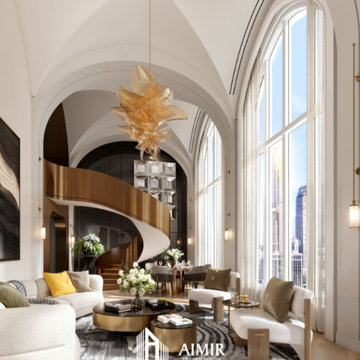
Not all architectural imagery is created equal. Some renderings look obviously computer-generated, with flat lighting and plastic-looking materials that fail to convince viewers. Others are so precise that they are indistinguishable from photographs. That second category, realistic architectural visualization rendering, has become the standard expectation for architects, developers, and marketers who need imagery capable of withstanding close scrutiny from investors, buyers, and planning authorities. As audiences grow more visually literate, the tolerance for obviously artificial, video-game-like imagery in professional presentations continues to shrink.
What Sets Realistic Visualization Apart
Realistic architectural visualization goes beyond simply modeling a building in three dimensions. It requires physically accurate lighting simulation, true-to-life material properties, and careful attention to the small imperfections that make real-world photography convincing, such as subtle reflections, ambient occlusion in corners, and natural depth of field. The goal is an image that a viewer would believe was captured by a camera on-site rather than generated by software. Achieving that level of believability typically means dozens of small adjustments layered on top of one another rather than any single dramatic setting.
Realistic Versus Stylized Rendering Approaches
Stylized or conceptual renderings still have their place, particularly in early design phases when a looser, more artistic representation helps convey mood without locking in every detail. But once a project moves toward marketing, investment, or permitting, stakeholders need to see exactly what they are getting. Realistic visualization removes ambiguity, showing true material colors, accurate proportions, and honest lighting conditions rather than idealized abstractions. Understanding which approach a project actually needs at each stage helps clients avoid paying for a level of polish that a given milestone does not yet require.
Why Realism Builds Client and Buyer Confidence
Buyers and investors are understandably skeptical of overly polished or unrealistic marketing images. When a rendering looks convincingly real, it builds trust rather than raising doubts about what the finished project will actually look like. This is especially important in real estate presales, where buyers are committing significant sums based largely on visual material rather than a finished physical space. A rendering that later turns out to have misrepresented the finished product can also create legal and reputational exposure for developers, making accuracy a genuine business risk rather than just an aesthetic preference.
The Technical Pillars Behind Every Realistic Scene
Achieving true realism depends on several technical disciplines working together: physically based rendering engines that simulate how light actually behaves, high-resolution texture libraries that replicate real materials like stone, wood, and glass, and careful camera work that mimics real photographic lenses and exposure. Post-production adds a final layer of color grading and atmospheric effects that ties everything together into a cohesive, believable image. Each of these pillars depends on the others; even flawless material work can be undermined by lighting that behaves in a physically implausible way.
Applications Across Residential, Commercial, and Institutional Projects
Realistic visualization serves a wide range of building types, from single-family homes and luxury condominiums to office towers, hotels, schools, and healthcare facilities. Each typology has its own material palette and lighting expectations, and an experienced studio adjusts its approach accordingly, whether that means warm, inviting tones for a residential lobby or crisp, professional lighting for a corporate headquarters. Institutional clients such as universities and hospitals often have additional requirements around accessibility signage and wayfinding, which need to be represented accurately alongside the architecture itself.
How AIMIR CG Delivers Photorealistic Accuracy
Our studio specializes in realistic architectural visualization rendering that holds up under close inspection. Every project moves through a disciplined pipeline of modeling, texturing, lighting, and post-production review, with artists cross-checking material references and lighting studies against real-world photography. This attention to detail is why clients consistently describe our end product as impressive and our process as easy to work with. A dedicated quality review stage before delivery catches inconsistencies that might otherwise slip through a faster, less structured pipeline.
Common Challenges in Achieving True Realism
Realistic rendering is technically demanding. Common obstacles include accurately simulating how light bounces between surfaces, matching material reflectivity to real product specifications, and avoiding the uncanny, slightly artificial look that comes from over-processed images. Overcoming these challenges requires experienced artists who understand both the science of light and the craft of photography, not just software proficiency. Rushed production schedules are often the real culprit behind unconvincing renderings, since realism typically requires several iterative passes rather than a single render.
What to Look for in a Realism-Focused Rendering Studio
When evaluating a rendering partner, review their portfolio critically. Do the images include convincing shadow detail and material variation, or do surfaces look uniformly smooth and artificial? Ask about their revision process and how closely they work with architects to source accurate material and lighting references, since realism is ultimately the product of disciplined collaboration, not a single software setting. It also helps to ask for examples of past projects in a similar building type, since a studio's strengths can vary across typologies.
Ready for Renderings That Look Real
If your project deserves imagery that can stand up to the scrutiny of investors, buyers, and planning boards, AIMIR CG is ready to help. Our team combines technical precision with artistic judgment to deliver visualization that looks and feels genuinely real. Contact us to discuss how photorealistic rendering can strengthen your next presentation or marketing campaign, and let us show you examples from projects similar to your own.
 William Prull
Bold, dramatic and precise, this home presents with clean rectilinear lines, utilizing steel, stone and warms tones of stucco. Sumptuous in materials and finishes, it displays a soft palette, with vivid, strategically placed bursts of color, inviting natural light in from every angle, with large pocketing glass openings that allow for seamless indoor/outdoor transitioning. Custom features galore, from cabinetry to built-ins, to alcoves and shelving, each a piece of art on its own.
The home’s natural siting in the landscape caters to a private equestrian compound, adjacent to a 40-acre greenbelt area and neighboring hillsides that all contribute to the preservation of the vast and inspiring mountain views that are enjoyed from every room and outdoor portal. A truly serene and inspiring space that draws you in and invites you to stay.

 Margot Hartford Photography
Photo: Margot Hartford © 2016 Houzz
Victorian exterior home idea in San Francisco
Victorian exterior home idea in San Francisco

 Cape Associates, Inc.
Overthinking a situation isn’t always a bad thing, particularly when the home in question is one in which the past is suddenly meeting the present. Originally designed by Finnish architect Olav Hammarstrom in 1952 for fellow architect Eero Saarinen, this unique home recently received its first transformation in decades. Still in its 1950s skin, it was completely gutted, inside and out. It was a serious undertaking, as the homeowner wanted modern upgrades, while keeping an eye toward retaining the home’s 1950s charm. She had a vision for her home, and she stuck to it from beginning to end.
Perched on a rise of land and overlooking the tranquil Wellfleet Herring Pond, the home initially appears split, with the guest house on the left, and the main house of the right, but both ends are connected with a breezeway. The original home’s bones were in good shape, but many upgrades and replacements were necessary to bring the house up to date.
New siding, roofing, gutters, insulation and mechanical systems were all replaced. Doors and windows with metal frames were custom made by a company in Long Island that fabricates doors for office buildings. Modern heating and cooling systems were added, and the three bathrooms were all updated. The footprint of the home remained unchanged. Inside, the only expansion was more closet space.
The attention to detail in retaining the 50s-style look took a lot of online searching, from handles and knobs to lighting fixtures, with bits and pieces arriving from all over the world, including a doorstop from New Zealand. The homeowner selected many of the fixtures herself, while a very detail-oriented foreman exhaustively researched as well, looking for just the right piece for each and every location.
High-end appliances were purchased to modernize the kitchen and all of the old cabinetry was removed, replaced and refaced with NUVACOR, a versatile surfacing material that not only provided a sleek, modern look, but added convenience and ease of use.
Bare, wood-beamed ceilings throughout give a nod to the home’s natural surroundings, while the main living area (formerly a fisherman’s cabin), with a brick fireplace, was completely trimmed in walnut, while multiple windows of varying sizes welcome sunlight to brighten the home. Here, the sheetrock ceiling with faux rafters provides an interesting and room-brightening feature.
Behind the house sits the serene pond, which can now be enjoyed from the stunning new deck. Here, decking material was not laid out side by side, as it typically is but, instead, meticulously laid out on edge, creating an unusual and eye-catching effect. A railing of tempered glass panels allows unobstructed views of the surrounding natural beauty, and keeps consistent with the open, airy feel of the place. A new outdoor shower is accessible via the deck and left open to the wilderness and the pond below, completing the bold yet sophisticated feeling of this retro-modern home.
 EAG Studio
On a quiet street just steps from San Francisco’s beloved Dolores Park, a formerly modest urban structure has been transformed into a luminous vertical residence that quietly redefines contemporary city living. Through a comprehensive remodel and both vertical and horizontal expansion, the project turns a constrained urban footprint into a sequence of serene, art-forward living spaces that unfold upward toward expansive city views.
The architecture balances restraint and warmth: crisp contemporary geometry softened by natural materials, artful lighting, and carefully curated interiors. The result is a home that feels simultaneously grounded and elevated—deeply connected to its neighborhood yet remarkably private.
Reimagining the Urban Envelope
The original building has been almost entirely reconceived. The facade now reads as a disciplined composition of plaster volumes and precisely detailed window openings framed by subtle projecting bands. The geometry references San Francisco’s classic rhythm of bayed facades while stripping the language down to a refined modern expression.
Behind this quiet exterior lies a dramatically expanded interior volume. The redesign adds both additional floor area and new vertical circulation, transforming what was once a conventional city house into a multi-level architectural sequence organized around light, art, and views.
At the roofline, planted terraces soften the building’s silhouette and create a green crown visible from surrounding hillsides.
Interiors as a Sequence of Galleries
Inside, the home unfolds as a series of spatial moments connected by a sculptural stair and gallery-like corridors.
Wide plank oak floors run throughout, providing continuity and warmth against a palette of plaster walls, dark steel detailing, and natural stone. The hallways function almost as curated galleries, with layered artworks suspended in front of mesh panels that create depth and subtle shadow.
Light filters through carefully placed windows and stair openings, transforming circulation spaces into contemplative transitions rather than mere passageways.
A Living Room Anchored by Stone and Light
The primary living room occupies one of the home’s central floors, where a quiet interplay of texture and geometry defines the space.
A monumental fireplace wrapped in dark stone forms the room’s anchor, its mass contrasting with a recessed ceiling plane that seems to float above the seating area. Integrated perimeter lighting creates a soft architectural glow that washes the ceiling and walls.
Furniture is sculptural yet understated—rounded lounge chairs in warm ochre velvet, tailored sofas, and a striking marble cocktail table whose expressive veining becomes a focal artwork in itself. Deep blue carpeting grounds the seating arrangement and subtly absorbs light, enhancing the calm atmosphere.
Above the fireplace, a delicate projection artwork introduces a moment of visual poetry—an unexpected cinematic gesture that transforms the wall into a quietly animated canvas.
Kitchen as Architectural Furniture
The kitchen expresses a different register: crisp, tactile, and materially rich.
Custom walnut cabinetry spans the wall in a continuous plane, punctuated only by the sculpted hood and integrated appliances. The wood’s depth and warmth are balanced by expanses of pale marble that flow seamlessly from countertop to backsplash.
Three dome pendants hover above the island like industrial sculptures, casting pools of warm light onto the stone surface.
A row of vivid red stools introduces a controlled burst of color, a small but confident departure from the otherwise restrained palette.
Dining With a Living Backdrop
Adjacent to the kitchen, the dining room opens toward a glass wall overlooking a vertical garden of climbing ivy. The greenery becomes a constantly changing backdrop—lush and shadowy during the day, atmospheric and cinematic after sunset.
A dark wood table anchors the room, surrounded by pale oak chairs whose understated forms echo Scandinavian design traditions. The simplicity of the furniture allows the view and natural light to become the dominant experience.
Intimate Spaces and Material Contrast
Throughout the home, smaller rooms offer moments of intimacy and material experimentation.
The powder room pairs textured wall coverings with a dramatic black marble vanity whose bold veining feels almost geological. A suspended mirror and slender pendant create a sculptural composition against the tactile backdrop.
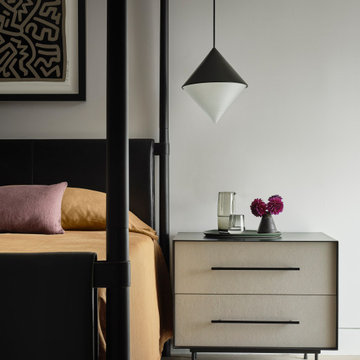
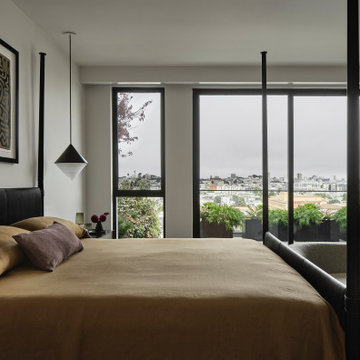
The primary bedroom, by contrast, feels serene and expansive. Floor-to-ceiling glazing frames sweeping views of the city, while soft textiles and warm wood paneling create a cocooning effect. Slender black columns subtly define a sitting area without interrupting the openness of the space.
Bathing Above the City
In the primary bathroom, a sculptural freestanding tub sits beside a panoramic window overlooking San Francisco’s hills and rooftops.
The room’s palette—light oak, grey stone, and matte metals—reinforces the spa-like atmosphere. Floating cabinetry and integrated lighting maintain a sense of visual lightness despite the richness of the materials.
Entertaining Above the Park
Higher in the house, a lounge and bar area becomes the social heart of the home. Here, dark stone slabs with dramatic veining wrap the bar wall like a piece of monumental art.
Open shelving displays glassware and spirits, while integrated wine storage hints at the home’s entertaining ambitions. A soft leather sectional and low glass table create a relaxed setting for conversation, framed by expansive views of the city skyline.
Cinema and Retreat
The lower level introduces yet another atmosphere: a dedicated media room designed for immersive viewing.
Dark walls, plush seating, and soft lighting create a cinematic environment that contrasts intentionally with the airy upper floors. It’s a retreat within the home—intimate, quiet, and removed from the brightness above.
Architecture That Balances Discipline and Warmth
What makes the project particularly compelling is its balance between architectural discipline and lived warmth.
Every element—from the carefully framed views to the restrained material palette—contributes to a cohesive spatial narrative. Yet the home never feels austere. Natural materials, curated art, and layered lighting create a sense of comfort and depth.
The result is a house that feels both architecturally rigorous and deeply human.
A Contemporary Interpretation of San Francisco Living
In a neighborhood defined by historic homes and iconic park views, this transformation offers a contemporary interpretation of San Francisco living.
It respects the city’s urban density while embracing openness, light, and vertical living. The home rises quietly above its surroundings, culminating in panoramic vistas that stretch across rooftops, hills, and sky.
What began as a conventional structure has become something far more nuanced: a modern urban sanctuary—part gallery, part retreat, and wholly connected to the vibrant city just beyond its walls.
Sponsored
Columbus, OH

Trish Takacs Design
Award Winning & Highly Skilled Kitchen & Bath Designer in Columbus
 Cape Associates, Inc.
Overthinking a situation isn’t always a bad thing, particularly when the home in question is one in which the past is suddenly meeting the present. Originally designed by Finnish architect Olav Hammarstrom in 1952 for fellow architect Eero Saarinen, this unique home recently received its first transformation in decades. Still in its 1950s skin, it was completely gutted, inside and out. It was a serious undertaking, as the homeowner wanted modern upgrades, while keeping an eye toward retaining the home’s 1950s charm. She had a vision for her home, and she stuck to it from beginning to end.
Perched on a rise of land and overlooking the tranquil Wellfleet Herring Pond, the home initially appears split, with the guest house on the left, and the main house of the right, but both ends are connected with a breezeway. The original home’s bones were in good shape, but many upgrades and replacements were necessary to bring the house up to date.
New siding, roofing, gutters, insulation and mechanical systems were all replaced. Doors and windows with metal frames were custom made by a company in Long Island that fabricates doors for office buildings. Modern heating and cooling systems were added, and the three bathrooms were all updated. The footprint of the home remained unchanged. Inside, the only expansion was more closet space.
The attention to detail in retaining the 50s-style look took a lot of online searching, from handles and knobs to lighting fixtures, with bits and pieces arriving from all over the world, including a doorstop from New Zealand. The homeowner selected many of the fixtures herself, while a very detail-oriented foreman exhaustively researched as well, looking for just the right piece for each and every location.
High-end appliances were purchased to modernize the kitchen and all of the old cabinetry was removed, replaced and refaced with NUVACOR, a versatile surfacing material that not only provided a sleek, modern look, but added convenience and ease of use.
Bare, wood-beamed ceilings throughout give a nod to the home’s natural surroundings, while the main living area (formerly a fisherman’s cabin), with a brick fireplace, was completely trimmed in walnut, while multiple windows of varying sizes welcome sunlight to brighten the home. Here, the sheetrock ceiling with faux rafters provides an interesting and room-brightening feature.
Behind the house sits the serene pond, which can now be enjoyed from the stunning new deck. Here, decking material was not laid out side by side, as it typically is but, instead, meticulously laid out on edge, creating an unusual and eye-catching effect. A railing of tempered glass panels allows unobstructed views of the surrounding natural beauty, and keeps consistent with the open, airy feel of the place. A new outdoor shower is accessible via the deck and left open to the wilderness and the pond below, completing the bold yet sophisticated feeling of this retro-modern home.
 EAG Studio
On a quiet street just steps from San Francisco’s beloved Dolores Park, a formerly modest urban structure has been transformed into a luminous vertical residence that quietly redefines contemporary city living. Through a comprehensive remodel and both vertical and horizontal expansion, the project turns a constrained urban footprint into a sequence of serene, art-forward living spaces that unfold upward toward expansive city views.
The architecture balances restraint and warmth: crisp contemporary geometry softened by natural materials, artful lighting, and carefully curated interiors. The result is a home that feels simultaneously grounded and elevated—deeply connected to its neighborhood yet remarkably private.
Reimagining the Urban Envelope
The original building has been almost entirely reconceived. The facade now reads as a disciplined composition of plaster volumes and precisely detailed window openings framed by subtle projecting bands. The geometry references San Francisco’s classic rhythm of bayed facades while stripping the language down to a refined modern expression.
Behind this quiet exterior lies a dramatically expanded interior volume. The redesign adds both additional floor area and new vertical circulation, transforming what was once a conventional city house into a multi-level architectural sequence organized around light, art, and views.
At the roofline, planted terraces soften the building’s silhouette and create a green crown visible from surrounding hillsides.
Interiors as a Sequence of Galleries
Inside, the home unfolds as a series of spatial moments connected by a sculptural stair and gallery-like corridors.
Wide plank oak floors run throughout, providing continuity and warmth against a palette of plaster walls, dark steel detailing, and natural stone. The hallways function almost as curated galleries, with layered artworks suspended in front of mesh panels that create depth and subtle shadow.
Light filters through carefully placed windows and stair openings, transforming circulation spaces into contemplative transitions rather than mere passageways.
A Living Room Anchored by Stone and Light
The primary living room occupies one of the home’s central floors, where a quiet interplay of texture and geometry defines the space.
A monumental fireplace wrapped in dark stone forms the room’s anchor, its mass contrasting with a recessed ceiling plane that seems to float above the seating area. Integrated perimeter lighting creates a soft architectural glow that washes the ceiling and walls.
Furniture is sculptural yet understated—rounded lounge chairs in warm ochre velvet, tailored sofas, and a striking marble cocktail table whose expressive veining becomes a focal artwork in itself. Deep blue carpeting grounds the seating arrangement and subtly absorbs light, enhancing the calm atmosphere.
Above the fireplace, a delicate projection artwork introduces a moment of visual poetry—an unexpected cinematic gesture that transforms the wall into a quietly animated canvas.
Kitchen as Architectural Furniture
The kitchen expresses a different register: crisp, tactile, and materially rich.
Custom walnut cabinetry spans the wall in a continuous plane, punctuated only by the sculpted hood and integrated appliances. The wood’s depth and warmth are balanced by expanses of pale marble that flow seamlessly from countertop to backsplash.
Three dome pendants hover above the island like industrial sculptures, casting pools of warm light onto the stone surface.
A row of vivid red stools introduces a controlled burst of color, a small but confident departure from the otherwise restrained palette.
Dining With a Living Backdrop
Adjacent to the kitchen, the dining room opens toward a glass wall overlooking a vertical garden of climbing ivy. The greenery becomes a constantly changing backdrop—lush and shadowy during the day, atmospheric and cinematic after sunset.
A dark wood table anchors the room, surrounded by pale oak chairs whose understated forms echo Scandinavian design traditions. The simplicity of the furniture allows the view and natural light to become the dominant experience.
Intimate Spaces and Material Contrast
Throughout the home, smaller rooms offer moments of intimacy and material experimentation.
The powder room pairs textured wall coverings with a dramatic black marble vanity whose bold veining feels almost geological. A suspended mirror and slender pendant create a sculptural composition against the tactile backdrop.
The primary bedroom, by contrast, feels serene and expansive. Floor-to-ceiling glazing frames sweeping views of the city, while soft textiles and warm wood paneling create a cocooning effect. Slender black columns subtly define a sitting area without interrupting the openness of the space.
Bathing Above the City
In the primary bathroom, a sculptural freestanding tub sits beside a panoramic window overlooking San Francisco’s hills and rooftops.
The room’s palette—light oak, grey stone, and matte metals—reinforces the spa-like atmosphere. Floating cabinetry and integrated lighting maintain a sense of visual lightness despite the richness of the materials.
Entertaining Above the Park
Higher in the house, a lounge and bar area becomes the social heart of the home. Here, dark stone slabs with dramatic veining wrap the bar wall like a piece of monumental art.
Open shelving displays glassware and spirits, while integrated wine storage hints at the home’s entertaining ambitions. A soft leather sectional and low glass table create a relaxed setting for conversation, framed by expansive views of the city skyline.
Cinema and Retreat
The lower level introduces yet another atmosphere: a dedicated media room designed for immersive viewing.
Dark walls, plush seating, and soft lighting create a cinematic environment that contrasts intentionally with the airy upper floors. It’s a retreat within the home—intimate, quiet, and removed from the brightness above.
Architecture That Balances Discipline and Warmth
What makes the project particularly compelling is its balance between architectural discipline and lived warmth.
Every element—from the carefully framed views to the restrained material palette—contributes to a cohesive spatial narrative. Yet the home never feels austere. Natural materials, curated art, and layered lighting create a sense of comfort and depth.
The result is a house that feels both architecturally rigorous and deeply human.
A Contemporary Interpretation of San Francisco Living
In a neighborhood defined by historic homes and iconic park views, this transformation offers a contemporary interpretation of San Francisco living.
It respects the city’s urban density while embracing openness, light, and vertical living. The home rises quietly above its surroundings, culminating in panoramic vistas that stretch across rooftops, hills, and sky.
What began as a conventional structure has become something far more nuanced: a modern urban sanctuary—part gallery, part retreat, and wholly connected to the vibrant city just beyond its walls.
 EAG Studio
On a quiet street just steps from San Francisco’s beloved Dolores Park, a formerly modest urban structure has been transformed into a luminous vertical residence that quietly redefines contemporary city living. Through a comprehensive remodel and both vertical and horizontal expansion, the project turns a constrained urban footprint into a sequence of serene, art-forward living spaces that unfold upward toward expansive city views.
The architecture balances restraint and warmth: crisp contemporary geometry softened by natural materials, artful lighting, and carefully curated interiors. The result is a home that feels simultaneously grounded and elevated—deeply connected to its neighborhood yet remarkably private.
Reimagining the Urban Envelope
The original building has been almost entirely reconceived. The facade now reads as a disciplined composition of plaster volumes and precisely detailed window openings framed by subtle projecting bands. The geometry references San Francisco’s classic rhythm of bayed facades while stripping the language down to a refined modern expression.
Behind this quiet exterior lies a dramatically expanded interior volume. The redesign adds both additional floor area and new vertical circulation, transforming what was once a conventional city house into a multi-level architectural sequence organized around light, art, and views.
At the roofline, planted terraces soften the building’s silhouette and create a green crown visible from surrounding hillsides.
Interiors as a Sequence of Galleries
Inside, the home unfolds as a series of spatial moments connected by a sculptural stair and gallery-like corridors.
Wide plank oak floors run throughout, providing continuity and warmth against a palette of plaster walls, dark steel detailing, and natural stone. The hallways function almost as curated galleries, with layered artworks suspended in front of mesh panels that create depth and subtle shadow.
Light filters through carefully placed windows and stair openings, transforming circulation spaces into contemplative transitions rather than mere passageways.
A Living Room Anchored by Stone and Light
The primary living room occupies one of the home’s central floors, where a quiet interplay of texture and geometry defines the space.
A monumental fireplace wrapped in dark stone forms the room’s anchor, its mass contrasting with a recessed ceiling plane that seems to float above the seating area. Integrated perimeter lighting creates a soft architectural glow that washes the ceiling and walls.
Furniture is sculptural yet understated—rounded lounge chairs in warm ochre velvet, tailored sofas, and a striking marble cocktail table whose expressive veining becomes a focal artwork in itself. Deep blue carpeting grounds the seating arrangement and subtly absorbs light, enhancing the calm atmosphere.
Above the fireplace, a delicate projection artwork introduces a moment of visual poetry—an unexpected cinematic gesture that transforms the wall into a quietly animated canvas.
Kitchen as Architectural Furniture
The kitchen expresses a different register: crisp, tactile, and materially rich.
Custom walnut cabinetry spans the wall in a continuous plane, punctuated only by the sculpted hood and integrated appliances. The wood’s depth and warmth are balanced by expanses of pale marble that flow seamlessly from countertop to backsplash.
Three dome pendants hover above the island like industrial sculptures, casting pools of warm light onto the stone surface.
A row of vivid red stools introduces a controlled burst of color, a small but confident departure from the otherwise restrained palette.
Dining With a Living Backdrop
Adjacent to the kitchen, the dining room opens toward a glass wall overlooking a vertical garden of climbing ivy. The greenery becomes a constantly changing backdrop—lush and shadowy during the day, atmospheric and cinematic after sunset.
A dark wood table anchors the room, surrounded by pale oak chairs whose understated forms echo Scandinavian design traditions. The simplicity of the furniture allows the view and natural light to become the dominant experience.
Intimate Spaces and Material Contrast
Throughout the home, smaller rooms offer moments of intimacy and material experimentation.
The powder room pairs textured wall coverings with a dramatic black marble vanity whose bold veining feels almost geological. A suspended mirror and slender pendant create a sculptural composition against the tactile backdrop.
The primary bedroom, by contrast, feels serene and expansive. Floor-to-ceiling glazing frames sweeping views of the city, while soft textiles and warm wood paneling create a cocooning effect. Slender black columns subtly define a sitting area without interrupting the openness of the space.
Bathing Above the City
In the primary bathroom, a sculptural freestanding tub sits beside a panoramic window overlooking San Francisco’s hills and rooftops.
The room’s palette—light oak, grey stone, and matte metals—reinforces the spa-like atmosphere. Floating cabinetry and integrated lighting maintain a sense of visual lightness despite the richness of the materials.
Entertaining Above the Park
Higher in the house, a lounge and bar area becomes the social heart of the home. Here, dark stone slabs with dramatic veining wrap the bar wall like a piece of monumental art.
Open shelving displays glassware and spirits, while integrated wine storage hints at the home’s entertaining ambitions. A soft leather sectional and low glass table create a relaxed setting for conversation, framed by expansive views of the city skyline.
Cinema and Retreat
The lower level introduces yet another atmosphere: a dedicated media room designed for immersive viewing.
Dark walls, plush seating, and soft lighting create a cinematic environment that contrasts intentionally with the airy upper floors. It’s a retreat within the home—intimate, quiet, and removed from the brightness above.
Architecture That Balances Discipline and Warmth
What makes the project particularly compelling is its balance between architectural discipline and lived warmth.
Every element—from the carefully framed views to the restrained material palette—contributes to a cohesive spatial narrative. Yet the home never feels austere. Natural materials, curated art, and layered lighting create a sense of comfort and depth.
The result is a house that feels both architecturally rigorous and deeply human.
A Contemporary Interpretation of San Francisco Living
In a neighborhood defined by historic homes and iconic park views, this transformation offers a contemporary interpretation of San Francisco living.
It respects the city’s urban density while embracing openness, light, and vertical living. The home rises quietly above its surroundings, culminating in panoramic vistas that stretch across rooftops, hills, and sky.
What began as a conventional structure has become something far more nuanced: a modern urban sanctuary—part gallery, part retreat, and wholly connected to the vibrant city just beyond its walls.
 Cape Associates, Inc.
Overthinking a situation isn’t always a bad thing, particularly when the home in question is one in which the past is suddenly meeting the present. Originally designed by Finnish architect Olav Hammarstrom in 1952 for fellow architect Eero Saarinen, this unique home recently received its first transformation in decades. Still in its 1950s skin, it was completely gutted, inside and out. It was a serious undertaking, as the homeowner wanted modern upgrades, while keeping an eye toward retaining the home’s 1950s charm. She had a vision for her home, and she stuck to it from beginning to end.
Perched on a rise of land and overlooking the tranquil Wellfleet Herring Pond, the home initially appears split, with the guest house on the left, and the main house of the right, but both ends are connected with a breezeway. The original home’s bones were in good shape, but many upgrades and replacements were necessary to bring the house up to date.
New siding, roofing, gutters, insulation and mechanical systems were all replaced. Doors and windows with metal frames were custom made by a company in Long Island that fabricates doors for office buildings. Modern heating and cooling systems were added, and the three bathrooms were all updated. The footprint of the home remained unchanged. Inside, the only expansion was more closet space.
The attention to detail in retaining the 50s-style look took a lot of online searching, from handles and knobs to lighting fixtures, with bits and pieces arriving from all over the world, including a doorstop from New Zealand. The homeowner selected many of the fixtures herself, while a very detail-oriented foreman exhaustively researched as well, looking for just the right piece for each and every location.
High-end appliances were purchased to modernize the kitchen and all of the old cabinetry was removed, replaced and refaced with NUVACOR, a versatile surfacing material that not only provided a sleek, modern look, but added convenience and ease of use.
Bare, wood-beamed ceilings throughout give a nod to the home’s natural surroundings, while the main living area (formerly a fisherman’s cabin), with a brick fireplace, was completely trimmed in walnut, while multiple windows of varying sizes welcome sunlight to brighten the home. Here, the sheetrock ceiling with faux rafters provides an interesting and room-brightening feature.
Behind the house sits the serene pond, which can now be enjoyed from the stunning new deck. Here, decking material was not laid out side by side, as it typically is but, instead, meticulously laid out on edge, creating an unusual and eye-catching effect. A railing of tempered glass panels allows unobstructed views of the surrounding natural beauty, and keeps consistent with the open, airy feel of the place. A new outdoor shower is accessible via the deck and left open to the wilderness and the pond below, completing the bold yet sophisticated feeling of this retro-modern home.

Sponsored
Plain City, OH

The Creative Kitchen Company
Columbus Area Kitchen Remodeling and Refacing Professional
 Cape Associates, Inc.
Overthinking a situation isn’t always a bad thing, particularly when the home in question is one in which the past is suddenly meeting the present. Originally designed by Finnish architect Olav Hammarstrom in 1952 for fellow architect Eero Saarinen, this unique home recently received its first transformation in decades. Still in its 1950s skin, it was completely gutted, inside and out. It was a serious undertaking, as the homeowner wanted modern upgrades, while keeping an eye toward retaining the home’s 1950s charm. She had a vision for her home, and she stuck to it from beginning to end.
Perched on a rise of land and overlooking the tranquil Wellfleet Herring Pond, the home initially appears split, with the guest house on the left, and the main house of the right, but both ends are connected with a breezeway. The original home’s bones were in good shape, but many upgrades and replacements were necessary to bring the house up to date.
New siding, roofing, gutters, insulation and mechanical systems were all replaced. Doors and windows with metal frames were custom made by a company in Long Island that fabricates doors for office buildings. Modern heating and cooling systems were added, and the three bathrooms were all updated. The footprint of the home remained unchanged. Inside, the only expansion was more closet space.
The attention to detail in retaining the 50s-style look took a lot of online searching, from handles and knobs to lighting fixtures, with bits and pieces arriving from all over the world, including a doorstop from New Zealand. The homeowner selected many of the fixtures herself, while a very detail-oriented foreman exhaustively researched as well, looking for just the right piece for each and every location.
High-end appliances were purchased to modernize the kitchen and all of the old cabinetry was removed, replaced and refaced with NUVACOR, a versatile surfacing material that not only provided a sleek, modern look, but added convenience and ease of use.
Bare, wood-beamed ceilings throughout give a nod to the home’s natural surroundings, while the main living area (formerly a fisherman’s cabin), with a brick fireplace, was completely trimmed in walnut, while multiple windows of varying sizes welcome sunlight to brighten the home. Here, the sheetrock ceiling with faux rafters provides an interesting and room-brightening feature.
Behind the house sits the serene pond, which can now be enjoyed from the stunning new deck. Here, decking material was not laid out side by side, as it typically is but, instead, meticulously laid out on edge, creating an unusual and eye-catching effect. A railing of tempered glass panels allows unobstructed views of the surrounding natural beauty, and keeps consistent with the open, airy feel of the place. A new outdoor shower is accessible via the deck and left open to the wilderness and the pond below, completing the bold yet sophisticated feeling of this retro-modern home.
 Haifa Architects
Duplex Y is located in a multi apartment building, typical to the Carmel mountain neighborhoods. The building has several entrances due to the slope it sits on.
Duplex Y has its own separate entrance and a beautiful view towards Haifa bay and the Golan Heights that can be seen on a clear weather day.
The client - a computer high-tech couple, with their two small daughters asked us for a simple and functional design that could remind them of their frequent visits to central and northern Europe. Their request has been accepted.
Our planning approach was simple indeed, maybe even simple in a radical way:
We followed the principle of clean and ultra minimal spaces, that serve their direct mission only.
Complicated geometry of the rooms has been simplified by implementing built-in wood furniture into numerous niches.
The most 'complicated' room (due to its broken geometry, narrow proportions and sloped ceiling) has been turned into a kid's room shaped as a clean 'wood box' for fun, games and 'edutainment'.
The storage room has been refurbished to maximize it's purpose by creating enough space to store 90% of the entire family's demand.
We've tried to avoid unnecessary decoration. 97% of the design has its functional use in addition to its atmospheric qualities.
Several elements like the structural cylindrical column were exposed to show their original material - concrete.
Photos: Julia Berezina
 Amy Pearson Design
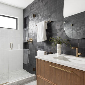
The primary bedroom and bathroom are the showstoppers of this phase! Unused and awkwardly located closets in both the bedroom and bathroom were removed to make way for additional square-footage in the bath and replaced with a sizable and functional reach-in closet in the bedroom. A dated and cramped shower stall was removed in favor for an expansive step in shower spanning the width of the bathroom and a new transom window washes the room in natural light. While the previous bathroom was only able to accommodate a single vanity, the new layout allowed us to create double matching vanities mirrored across from each other - a much appreciated addition for a primary bath. Floating walnut vanities boast impressive storage and are capped with tower cabinets with hidden outlets for charging and storing electronic bathroom tools. While the color palette is restrained - black, white, gray, and brown - the result is a timelessly modern and masculine space that is at once striking and warm. Modern geometric patterns play with each other throughout the material selections.
167