
Search results for "Traffic spaces" in Home Design Ideas
 Drury Design
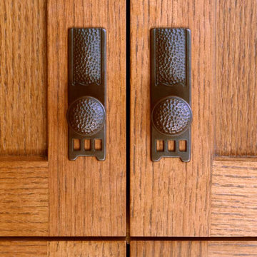
The 100-year old home’s kitchen was old and just didn’t function well. A peninsula in the middle of the main part of the kitchen blocked the path from the back door. This forced the homeowners to mostly use an odd, U-shaped corner of the kitchen.
Design objectives:
-Add an island
-Wow-factor design
-Incorporate arts and crafts with a touch of Mid-century modern style
-Allow for a better work triangle when cooking
-Create a seamless path coming into the home from the backdoor
-Make all the countertops in the space 36” high (the old kitchen had different base cabinet heights)
Design challenges to be solved:
-Island design
-Where to place the sink and dishwasher
-The family’s main entrance into the home is a back door located within the kitchen space. Samantha needed to find a way to make an unobstructed path through the kitchen to the outside
-A large eating area connected to the kitchen felt slightly misplaced – Samantha wanted to bring the kitchen and materials more into this area
-The client does not like appliance garages/cabinets to the counter. The more countertop space, the better!
Design solutions:
-Adding the right island made all the difference! Now the family has a couple of seats within the kitchen space. -Multiple walkways facilitate traffic flow.
-Multiple pantry cabinets (both shallow and deep) are placed throughout the space. A couple of pantry cabinets were even added to the back door wall and wrap around into the breakfast nook to give the kitchen a feel of extending into the adjoining eating area.
-Upper wall cabinets with clear glass offer extra lighting and the opportunity for the client to display her beautiful vases and plates. They add and an airy feel to the space.
-The kitchen had two large existing windows that were ideal for a sink placement. The window closest to the back door made the most sense due to the fact that the other window was in the corner. Now that the sink had a place, we needed to worry about the dishwasher. Samantha didn’t want the dishwasher to be in the way of people coming in the back door – it’s now in the island right across from the sink.
-The homeowners love Motawi Tile. Some fantastic pieces are placed within the backsplash throughout the kitchen. -Larger tiles with borders make for nice accent pieces over the rangetop and by the bar/beverage area.
-The adjacent area for eating is a gorgeous nook with massive windows. We added a built-in furniture-style banquette with additional lower storage cabinets in the same finish. It’s a great way to connect and blend the two areas into what now feels like one big space!
 Precision Wallpaper Experts
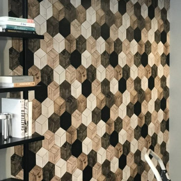
Expert commercial wallpaper fitting services engineered for corporate offices, luxury retail spaces, hospitality venues, healthcare facilities, and high-traffic commercial environments. Specializing in the heavy-duty installation of high-performance wallcoverings that combine structural durability, safety compliance, and sophisticated design aesthetics.
As a master commercial wallpaper fitter and technical specialist, every project is executed in full compliance with commercial building standards while minimizing disruption to daily business operations. Our comprehensive technical workflow includes thorough substrate evaluation, wall repair and smoothing, specialized moisture-barrier surface priming, heavy-duty adhesive application, and vertical laser-plumb calibration across expansive wall spans. Handling advanced commercial materials—including Type II and Type III vinyls, acoustic wall fabrics, dry-erase coverings, natural wood veneers, and custom corporate murals—we deliver zero-tolerance seam matching, razor-sharp edge trimming around fixtures and reveals, and a flawless, long-lasting finish built for high-wear utility and executive appeal.

 Paule Bourbonnais Design
The dining table adjoined to the working island saves the space normally dedicated to traffic. Thus, each cubic foot is maximized and gives a larger look to the room. A large 60 "x60" photo is highlighted thanks to the Dimensions Plus frame. Original Verner Panton chairs purchased from EQ3 complement the decor. | La table à manger juxtaposée à l'îlot de travail permet d'économiser l'espace normalement dédier à la circulation. Ainsi, chaque pied cube est maximisé et donne une allure plus vaste à la pièce. Une grande photo de 60"x60" est mise en valeur grâce à l'encadrement de Dimensions Plus. Les chaises originales de Verner Panton achetées chez EQ3, agrémentent le décor.
Photos : *reference design
Find the right local pro for your project
 Tom Brzoskwinia
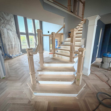
This White Oak Rift & Quartered flooring project in Streamwood, Illinois showcases the clean grain, natural character, and timeless appearance of premium White Oak hardwood. Tom & Peter Flooring professionally installed and finished the flooring, along with a complete staircase transformation, to create a beautiful and durable interior designed to last for years.
We’re excited to showcase this recently completed project for our wonderful clients, Alexa and Jimmy. From the hardwood flooring to the staircase, every element was carefully selected and expertly installed to create a finished space that feels timeless, elevated, and custom-built.
Custom White Oak Double Herringbone Flooring
The centerpiece of this Streamwood flooring project is beautiful 3″ x 22″ White Oak Rift & Quartered hardwood flooring from Graf Custom Hardwood, installed in a custom double herringbone pattern.
The combination of natural White Oak and the classic herringbone layout brings warmth, character, and a sophisticated architectural feel to the home. Rift & Quartered White Oak is especially beautiful because of its distinctive grain pattern and refined appearance, making it an excellent choice for custom hardwood flooring installations.
To complete the look, we created a custom stain color and finished the floors with Bona Traffic HD Satin, providing a beautiful low-sheen appearance along with the durability needed for everyday living.
 Powell Construction
The kitchen is a modern galley style with a generous 4-person island. It is centered around the 48” professional-grade range that is accented by a statement tile inlay and an elegant custom range hood. In lieu of upper cabinetry, our designer added large windows on either side of the range to brighten the space and showcase the rural forest views. We love the symmetry this brings to the design. On the far end of the island, we utilized a countertop remnant to create a nook for the pet’s bowls. Here the family dog can enjoy his meals out of the line of traffic.
The colors of the kitchen are a transitional spin on contrasts. The island’s perfect shade of navy blue complements the warmth of the natural maple cabinetry. White quartz with subtle grey veining was introduced on the island to keep its surface light and bright, connecting the kitchen with the airiness of the dining area & living area. On the perimeter of the kitchen, a black quartz mimicking soapstone grounds the lighter maple cabinetry and is accented by the black windows, cabinet hardware, tile, and sconces above the windows. For the floors we choose a light grey slate tile that pairs well with the dove grey backsplash. To carry the navy blue of the island into the rest of the kitchen, we selected blue pendants for the island, and designed a striking focal point behind the range with a decorative, blue tile.
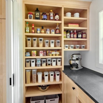
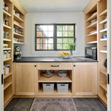
New exterior French doors lead to a side porch where these homeowners can sit and enjoy the great outdoors. At the other end of the kitchen, we created a spacious walk-in pantry. Glass pocket doors perfectly frame the pantry and mimic the exterior French doors, anchoring the kitchen with symmetry at the two ends. The walk-in pantry features ample open adjustable shelving, closed storage, and a large countertop. Appliances like the microwave, stand mixer, and coffee maker have designated alcoves on the sides of the pantry so that they aren’t crowding or cluttering the valuable counter space in the kitchen. It’s a beautiful space for the homeowners to style, while being functional for the surplus storage needs.
 Wisconsin Building Supply
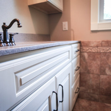
The upper hall closet was moved back over the top of the stairway to accommodate moving the bathroom door over 15" to create a longer vanity for the guest bath upstairs. The door's hinging was changed to have the door open in front of the shower and toward the vanity.
The banjo vanity top allows for additional countertop space as well as a more balanced feel with adding small wall cabinets on either side of the sink. This provides storage space for the guest's amenities without having to use valuable countertop space.
The tiled shower with built in shampoo alcove was used to maximize the space in the shower, since an acrylic shower interior is 3" less.
To make this bathroom feel more spacious, yet warm and inviting, the client chose Dura Supreme's antique white with espresso glaze.

 Pool Environments, Inc.
The client purchased this property with grand plans of renovating the entire place; from top to bottom, and from inside to outside. And while the inside canvas was very generous and even somewhat forgiving, the outside space would be anything but.
We wanted to squeeze in as much seating space as possible in their limited courtyard area, without encroaching on the already compact-sized pool. The first and most obvious solution was to get rid of the trees and shrubs that separated this house from its zero-lot-line neighbor. With the addition of Lueder limestone slabs, this alone would free up nearly 120 additional square feet, which happened to be the perfect amount of space for a mobile gas fire pit and sectional sofa. And all of this would make for the perfect place to enjoy the afternoon sunset with the implementation of a custom-built metal pergola standing above it all.
The next problem we saw was that around the patio area, there were too many levels of steps and stairs, which meant that it would have been difficult to have any sort of traditional furniture arrangement. Randy knew that it only made sense to bring in a wood deck that could be mated to the highest level of the patio, thus creating gaining the most continuous amount of flat space that the client was wanting. But even so, that flat space would be limited to a tight "L-shape" around the pool. And knowing this, the client decided that the larger space would be more valuable to them than the spa, so they opted to have a portion of the deck built over it in order to allow for a more generous amount of patio space.
And with the edge of the patio/deck dropping off almost 2 feet to the waterline, it now created the perfect opportunity to have a visually compelling raised wall that could be adorned with different hues of plank-shaped tiles. From inside the pool, the varying shades of brown were a great accent to the wood deck that sat just above.
However, the true visual crowning jewel of this project would end up being the raised back wall along the fence, fully encased in a large format, 24x24 slate grey tile, complete with a custom stainless steel, square-tube scupper bank, installed at just the right height to create the perfect amount of water noise.
But Randy wasn't done just yet. With two entirely new entertaining areas opened up at opposite ends of the pool, the only thing left to do now was to connect them. Knowing that he nor the client wanted to eliminate any more water space, he decided to bring a new traffic pattern right into the pool by way of two "floating", Lueder limestone stepper pads. It would be a visually perfect union of both pool and walking spaces.
The existing steps and walkways were then cut away and replaced with matching Lueder limestone caps and steppers. All remaining gaps were then filled with Mexican beach pebble, which helped to promote a very "zen-like" feel in this outdoor space.
The interior of the pool was coated with Wet Edge Primerastone "Blue Pacific Coast" plaster, and lit up with Pentair GloBrite LED pool lights.
In the end, the client ended up gaining the additional entertaining and seating space that they needed, and the updated, modern feel that they loved.
Sponsored
Columbus, OH

Structural Remodeling
Franklin County's Heavy Timber Specialists | Best of Houzz 2020!

 Visual Jill Inc.
Photography by Peter Lyons
Example of a transitional living room design in San Francisco
Example of a transitional living room design in San Francisco

 Michael Nash Design, Build & Homes
Young couple with two youngsters lived in 1970 Rambler in Arlington. As their kids growing and their nanny moving in, they all needed more space, bigger kitchen and better backyard space for kids to play.
Existing kitchen was 10’x10’ adjacent to dining room of about the same size
Old cabinets, vinyl floor and olive green appliances no longer made this kitchen a happy place to come home to
The back wall of solid block and brick and interior plaster walls where all big challenges to get rid of and opening up the place
A narrow hallway leading to bedroom was one of their major concerns and tough to get through. As the traffic path to get to the kitchen has been difficult
In few consultation session we all agreed on bumping the entire kitchen and dining room back wall and move the kitchen into new addition
This required breaking through a massive amount of cinder block and brick, leveling a majority of backyard to accomplish the desired grade level for addition and back deck
In past the only way out to backyard was through a single door of back stairway and it has been a big problem for them
With a new angle wall we have placed a large French door leading kitchen into back deck area
The old hallway wall has came down and gotten wider and new path from front to open floor plan kitchen and dining room was put in place
Another big challenge for this job was to run heating and cooling as well as plumbing into a kitchen area
The new kitchen had tall cabinets a beautiful cherry finish with a large bay window over sink area leading lot of light form back side.
New island with seating contributed to addition work space and more storage
Lot of recessed lights and a stone back splash made the project even more attractive
New wood flooring was put in place and entire Living, Dining room and kitchen was sanded and refinished to unify the space and make a seamless connection
A big wooded deck on the entire back was a place for kids to play and couple to retire and grill on their afternoons
 Powell Construction
The kitchen is a modern galley style with a generous 4-person island. It is centered around the 48” professional-grade range that is accented by a statement tile inlay and an elegant custom range hood. In lieu of upper cabinetry, our designer added large windows on either side of the range to brighten the space and showcase the rural forest views. We love the symmetry this brings to the design. On the far end of the island, we utilized a countertop remnant to create a nook for the pet’s bowls. Here the family dog can enjoy his meals out of the line of traffic.
The colors of the kitchen are a transitional spin on contrasts. The island’s perfect shade of navy blue complements the warmth of the natural maple cabinetry. White quartz with subtle grey veining was introduced on the island to keep its surface light and bright, connecting the kitchen with the airiness of the dining area & living area. On the perimeter of the kitchen, a black quartz mimicking soapstone grounds the lighter maple cabinetry and is accented by the black windows, cabinet hardware, tile, and sconces above the windows. For the floors we choose a light grey slate tile that pairs well with the dove grey backsplash. To carry the navy blue of the island into the rest of the kitchen, we selected blue pendants for the island, and designed a striking focal point behind the range with a decorative, blue tile.
New exterior French doors lead to a side porch where these homeowners can sit and enjoy the great outdoors. At the other end of the kitchen, we created a spacious walk-in pantry. Glass pocket doors perfectly frame the pantry and mimic the exterior French doors, anchoring the kitchen with symmetry at the two ends. The walk-in pantry features ample open adjustable shelving, closed storage, and a large countertop. Appliances like the microwave, stand mixer, and coffee maker have designated alcoves on the sides of the pantry so that they aren’t crowding or cluttering the valuable counter space in the kitchen. It’s a beautiful space for the homeowners to style, while being functional for the surplus storage needs.
 Aloha Kitchen, Bath & Design
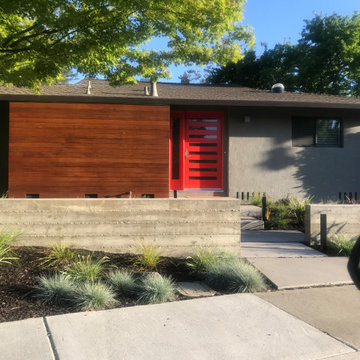
California modern rancher. Blend of warm and cool tones and material balance this space. Outdoor environment is low water use and drought resistant but still has greenery and inviting to hang out.
In the kitchen we removed the walls that made up the tiny closet of a kitchen that was in the corner under the skylight and was able to hide the ceiling height differences at the small desk area and oven cabinets and keep the skylight. The effect is a wide-open concept with the least amount of construction possible.
For the kitchen layout, we created a cozy zone for the chef to work in the corner without any cross traffic, seating area around the outside of the island keeps guest out of the work area but still close and part of the process. The warming drawer in the island positioned for proximity to the "buffet line" at the island when entertaining. On the dining end of the kitchen there is a coffee and wine bar. Coffee bar is hidden behind the metal roll up door, and the wine and liquor bar are to the left and both share the sink in the middle, making it a functional and useful space from the morning until the evening. I like to call this bar "Start and Stop" ha-ha. Even though this space is very open and airy, it has a ton of storage including underneath the seating area at the island and the little workstation, which is open and uncluttered, has lots of storage nestled in the wall and underneath the counter and hides any CPU and wires neatly.
In the master bath, we updated all the colors and finishes in a clean modern European style with large format porcelain tiles and repurposed a small useless closet (with a window in it) to a second vanity for extra counter space and linen storage. Plus, we added storage over the toilet in the water closet and an updated door and casing into the walk-in closet with frosted glass panels so that at night the light in the closet glowing in those panels can act as a night light.
 Michael Nash Design, Build & Homes
2013 CHRYSALIS AWARD NATIONAL WINNER, KITCHEN REMODEL $50,000 TO $75,000
“Crowded and disturbing” is how the woman of the house described this kitchen. A big peninsula with a huge range hood blocked the kitchen off from the breakfast room, a chimney style wall blocked off another side of the space and the doorways were too narrow. The result was a cramped feel with no traffic flow and a lack of usable storage.
To remedy these issues, the remodeling plan called for regrouping all tall kitchen elements into a low visibility wall, eliminating the peninsula and then creating a natural path through the space using a middle island.
Relocating the stove against the room’s back wall allowed the installation of a beautiful wood mantel hood and improved the work triangle. The side walls house beautiful custom white cabinets; one side housing the pantry, refrigerator and double wall ovens, the other the kitchen sink and dishwasher.
The center island features a mahogany wood countertop and provides plenty of workspace above and storage below. Contrasting with the glazed cabinets, the woodwork is a highlight of the project and a key part of delivering on the homeowner’s desire for a bright, clean kitchen.
They installed exotic mahogany floors to complement center wood Island. The floors also had created a casual ambiance, especially against the soft lemon chiffon wall paint. The ultimate French country style kitchen was completed by furnishing the old breakfast area with casual seating rather than a formal table.
 Talon Construction Inc.
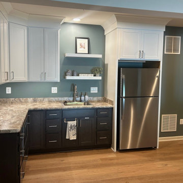
Basement Remodel with Snack Bar-Style Kitchenette
Talon Construction Inc. transformed this Frederick, Maryland basement into a warm and multifunctional living space centered around a thoughtfully designed snack bar-style kitchenette. The goal for the design was to create a space that’s both functional and inviting, without overpowering the overall basement layout.
At the heart of the renovation is the kitchenette, featuring Mantra Cabinetry finished with sleek brushed nickel hardware. These elements were selected for their clean lines and durability, blending seamlessly into the aesthetic of the home. The cabinetry offers ample storage, while the countertops provide plenty of space for everything from preparing casual snacks to crafting complete meals. Whether it’s sharing a glass of wine or popping popcorn for a movie night, this space was designed to accommodate it all.
Above the kitchenette sink, two floating shelves add both functionality and style to the space. Strategically placed, the floating shelves offer easy access to everyday essentials—perfect for displaying glassware, decorative dishes, or small plants that add a personal touch. Their clean, minimalist design enhances the open feel of the kitchenette, while the lack of visible brackets maintains a streamlined, contemporary look.
Set against the backdrop of the backsplash, these shelves not only provide storage but also serve as a subtle focal point that draws the eye upward, adding depth and dimension to the overall design.
To add warmth and continuity throughout the basement, luxury vinyl plank (LVP) flooring was installed. Its natural wood look brings in texture and durability while standing up to the demands of a high-traffic family space. Above, recessed lighting ensures the area remains bright and welcoming, day or night.
The adjacent family room area offers a comfortable space to relax and entertain, effortlessly flowing from the kitchenette. The textures and finishes throughout reflect a modern yet elegant design language that harmonizes with the rest of the home, creating a cohesive, upscale look.
This design build remodel is a perfect example of how Talon Construction can take a basement from basic to beautiful—with intentional design, high-quality materials, and a focus on livability.
Sponsored
Columbus, OH
Free consultation for landscape design!

Peabody Landscape Group
Franklin County's Reliable Landscape Design & Contracting
 Hillcrest Construction
These clients reached out to Hillcrest Construction when their family began out-growing their Phoenixville-area home. Through a comprehensive design phase, opportunities to add square footage were identified along with a reorganization of the typical traffic flow throughout the house.
All household traffic into the hastily-designed, existing family room bump-out addition was funneled through a 3’ berth within the kitchen making meal prep and other kitchen activities somewhat similar to a shift at a PA turnpike toll booth. In the existing bump-out addition, the family room was relatively tight and the dining room barely fit the 6-person dining table. Access to the backyard was somewhat obstructed by the necessary furniture and the kitchen alone didn’t satisfy storage needs beyond a quick trip to the grocery store. The home’s existing front door was the only front entrance, and without a foyer or mudroom, the front formal room often doubled as a drop-zone for groceries, bookbags, and other on-the-go items.
Hillcrest Construction designed a remedy to both address the function and flow issues along with adding square footage via a 150 sq ft addition to the family room and converting the garage into a mudroom entry and walk-through pantry.
-
The project’s addition was not especially large but was able to facilitate a new pathway to the home’s rear family room. The existing brick wall at the bottom of the second-floor staircase was opened up and created a new, natural flow from the second-floor bedrooms to the front formal room, and into the rear family hang-out space- all without having to cut through the often busy kitchen. The dining room area was relocated to remove it from the pathway to the door to the backyard. Additionally, free and clear access to the rear yard was established for both two-legged and four-legged friends.
The existing chunky slider door was removed and in its place was fabricated and installed a custom centerpiece that included a new gas fireplace insert with custom brick surround, two side towers for display items and choice vinyl, and two base cabinets with metal-grated doors to house a subwoofer, wifi equipment, and other stow-away items. The black walnut countertops and mantle pop from the white cabinetry, and the wall-mounted TV with soundbar complete the central A/V hub. The custom cabs and tops were designed and built at Hillcrest’s custom shop.
The farmhouse appeal was completed with distressed engineered hardwood floors and craftsman-style window and door trim throughout.
-
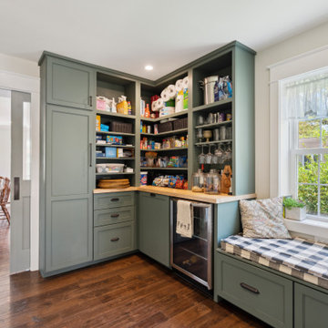
Another major component of the project was the conversion of the garage into a pantry+mudroom+everyday entry.
The clients had used their smallish garage for storage of outdoor yard and recreational equipment. With those storage needs being addressed at the exterior, the space was transformed into a custom pantry and mudroom. The floor level within the space was raised to meet the rest of the house and insulated appropriately. A newly installed pocket door divided the dining room area from the designed-to-spec pantry/beverage center. The pantry was designed to house dry storage, cleaning supplies, and dry bar supplies when the cleaning and shopping are complete. A window seat with doggie supply storage below was worked into the design to accommodate the existing elevation of the original garage window.
A coat closet and a small set of steps divide the pantry from the mudroom entry. The mudroom entry is marked with a striking combo of the herringbone thin-brick flooring and a custom hutch. Kids returning home from school have a designated spot to hang their coats and bookbags with two deep drawers for shoes. A custom cherry bench top adds a punctuation of warmth. The entry door and window replaced the old overhead garage doors to create the daily-used informal entry off the driveway.
With the house being such a favorable area, and the clients not looking to pull up roots, Hillcrest Construction facilitated a collaborative experience and comprehensive plan to change the house for the better and make it a home to grow within.
 The Jack + Mare | Portland Design & Build
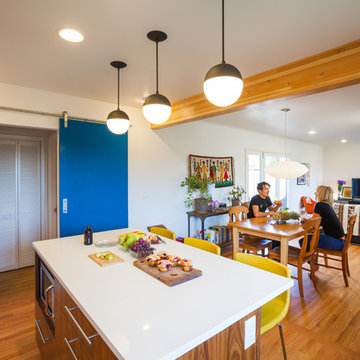
The Jack + Mare worked with the homeowners of this cool mid-century inspired kitchen from schematic design all the way through construction.
The existing kitchen was demolished all the way to studs, subfloor and ceiling joists and completely rebuilt with custom cabinets, solid oak flooring, task and ambient lighting, new electrical/plumbing, counter-to-ceiling wall tile, new beam (took down wall between living/kitchen), new window and colorful barn door.
The final design maximized storage, increased counter space, improved traffic flow, connected kitchen to adjacent living room (by removing existing wall), and improved the social aspect of the kitchen.
The kitchen is now efficient, beautiful, full of light and a happy place to call home!
Features: custom walnut cabinets (designed by The J+M), tile backsplash, new lighting plan (LED can lights, under-cabinet LED lights, Cedar+Moss pendants with LED bulbs), quartz countertops, new Marvin window with new trim, pantry with pull out shelves, glass upper cabinet (with puck LED) to feature antique glass-ware, island with microwave under counter, island seating.
photo credit: Jason Quigley
 Michael Nash Design, Build & Homes
2012 NARI CAPITAL COTY, FINALIST AWARD WINNER, RESIDENTIAL KITCHEN UNDER $50,000
The kitchen in this colonial was in desperate need of remodeling. A galley kitchen located between the family room and dining room, connected only by narrow doorways, it wasn’t conducive to this family’s busy lifestyle.
The 20-foot wide bearing wall that separated the kitchen from family room was the first thing to go. Then, windows facing the back deck were removed, the header was enlarged and French doors were installed for easy access to the deck.
The sink and dishwasher were relocated to the new island which also provides additional storage, and importantly, more seating. Pendant lighting combines with recessed lighting to brighten the space.
Light-colored, painted cabinetry and complementing granite counters run floor to ceiling with glass display cabinetry installed as uppers. Upscale appliances complete the amenities.
The homeowners greatly enjoy their much larger kitchen with its open floor plan and improved traffic flow.

 ZeroEnergy Design
OVERVIEW
Set into a mature Boston area neighborhood, this sophisticated 2900SF home offers efficient use of space, expression through form, and myriad of green features.
MULTI-GENERATIONAL LIVING
Designed to accommodate three family generations, paired living spaces on the first and second levels are architecturally expressed on the facade by window systems that wrap the front corners of the house. Included are two kitchens, two living areas, an office for two, and two master suites.
CURB APPEAL
The home includes both modern form and materials, using durable cedar and through-colored fiber cement siding, permeable parking with an electric charging station, and an acrylic overhang to shelter foot traffic from rain.
FEATURE STAIR
An open stair with resin treads and glass rails winds from the basement to the third floor, channeling natural light through all the home’s levels.
LEVEL ONE
The first floor kitchen opens to the living and dining space, offering a grand piano and wall of south facing glass. A master suite and private ‘home office for two’ complete the level.
LEVEL TWO
The second floor includes another open concept living, dining, and kitchen space, with kitchen sink views over the green roof. A full bath, bedroom and reading nook are perfect for the children.
LEVEL THREE
The third floor provides the second master suite, with separate sink and wardrobe area, plus a private roofdeck.
ENERGY
The super insulated home features air-tight construction, continuous exterior insulation, and triple-glazed windows. The walls and basement feature foam-free cavity & exterior insulation. On the rooftop, a solar electric system helps offset energy consumption.
WATER
Cisterns capture stormwater and connect to a drip irrigation system. Inside the home, consumption is limited with high efficiency fixtures and appliances.
TEAM
Architecture & Mechanical Design – ZeroEnergy Design
Contractor – Aedi Construction
Photos – Eric Roth Photography
Sponsored
Columbus, OH

Hope Restoration & General Contracting
Columbus Design-Build, Kitchen & Bath Remodeling, Historic Renovations

 Main Line Kitchen Design
 is a unique business model! We are a group of skilled Kitchen Designers each with many years of experience planning kitchens around the Delaware Valley. And we are cabinet dealers for 8 nationally distributed cabinet lines much like traditional showrooms.
Unlike full showrooms open to the general public, Main Line Kitchen Design works only by appointment. Appointments can be scheduled days, nights, and weekends either in your home or in our office and selection center. During office appointments we display clients kitchens on a flat screen TV and help them look through 100’s of sample doorstyles, almost a thousand sample finish blocks and sample kitchen cabinets. During home visits we can bring samples, take measurements, and make design changes on laptops showing you what your kitchen can look like in the very room being renovated. This is more convenient for our customers and it eliminates the expense of staffing and maintaining a larger space that is open to walk in traffic. We pass the significant savings on to our customers and so we sell cabinetry for less than other dealers, even home centers like Lowes and The Home Depot.
 Ashton Renovations
This renovation focused on improving flow, function, and safety for a growing family with a newborn, while also enhancing the home’s exterior presence.
Inside, interior walls were removed to open up the main living areas, creating better sightlines, improved natural light, and a more connected layout for everyday family life. The reconfigured space feels brighter, more spacious, and better suited to modern living.
Two bathrooms were renovated as part of the project:
A powder room was updated with clean, modern finishes and luxury vinyl flooring, chosen for its durability, comfort underfoot, and easy maintenance.
The main bathroom was refreshed to balance practicality with a refined, timeless look.
Special attention was given to the stairway, where upgrades were made with safety and comfort in mind—an important consideration for a household with a newborn. Improved finishes and details help make this high-traffic area both functional and visually cohesive with the rest of the home.
The project also included exterior improvements, enhancing curb appeal and tying the updated interior to a refreshed, cohesive exterior look.
Overall, this renovation blends thoughtful planning, durable materials, and family-friendly design to create a home that works beautifully now and well into the future.
 Charles Vincent George Architects, Inc.
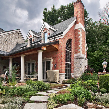
This 5,523-square-foot French Country residence offers a modern twist on classic European elegance. Located on a prominent corner lot near downtown Naperville, this home blends timeless style with contemporary living. The open-concept main floor flows seamlessly, highlighted by a stunning glass stair tower showcasing the custom curved staircase. A spacious, wrap-around patio provides ample seating to enjoy the vibrant pedestrian traffic of the nearby downtown area. Interior details include groin vaulted hallways on both levels, creating a sense of character and warmth throughout the home. The south-facing Orangerie, bathed in natural light from floor-to-ceiling windows, evokes the charm of a Parisian salon with its classic checkerboard floor and comfortable lounge furniture. The great room, anchored by a transitional fireplace with a black onyx full-height mantel, connects effortlessly to the kitchen and its expansive window-lined back counter and island, creating a generous and inviting living space. The property also includes an attached two-car garage and a detached one-car garage.
201