
Search results for "Two factor" in Home Design Ideas
 Drury Design
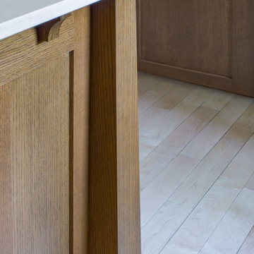
The 100-year old home’s kitchen was old and just didn’t function well. A peninsula in the middle of the main part of the kitchen blocked the path from the back door. This forced the homeowners to mostly use an odd, U-shaped corner of the kitchen.
Design objectives:
-Add an island
-Wow-factor design
-Incorporate arts and crafts with a touch of Mid-century modern style
-Allow for a better work triangle when cooking
-Create a seamless path coming into the home from the backdoor
-Make all the countertops in the space 36” high (the old kitchen had different base cabinet heights)
Design challenges to be solved:
-Island design
-Where to place the sink and dishwasher
-The family’s main entrance into the home is a back door located within the kitchen space. Samantha needed to find a way to make an unobstructed path through the kitchen to the outside
-A large eating area connected to the kitchen felt slightly misplaced – Samantha wanted to bring the kitchen and materials more into this area
-The client does not like appliance garages/cabinets to the counter. The more countertop space, the better!
Design solutions:
-Adding the right island made all the difference! Now the family has a couple of seats within the kitchen space. -Multiple walkways facilitate traffic flow.
-Multiple pantry cabinets (both shallow and deep) are placed throughout the space. A couple of pantry cabinets were even added to the back door wall and wrap around into the breakfast nook to give the kitchen a feel of extending into the adjoining eating area.
-Upper wall cabinets with clear glass offer extra lighting and the opportunity for the client to display her beautiful vases and plates. They add and an airy feel to the space.
-The kitchen had two large existing windows that were ideal for a sink placement. The window closest to the back door made the most sense due to the fact that the other window was in the corner. Now that the sink had a place, we needed to worry about the dishwasher. Samantha didn’t want the dishwasher to be in the way of people coming in the back door – it’s now in the island right across from the sink.
-The homeowners love Motawi Tile. Some fantastic pieces are placed within the backsplash throughout the kitchen. -Larger tiles with borders make for nice accent pieces over the rangetop and by the bar/beverage area.
-The adjacent area for eating is a gorgeous nook with massive windows. We added a built-in furniture-style banquette with additional lower storage cabinets in the same finish. It’s a great way to connect and blend the two areas into what now feels like one big space!
 Drury Design
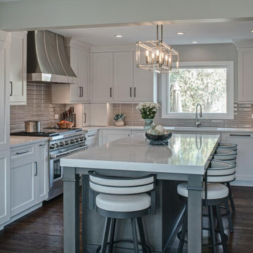
Design objectives for the remodel were aimed at giving the kitchen a larger feel, more room for cooking and extra seating for entertaining:
-Island with seating
-Space for a larger range/cooking area
-More storage with cabinets to the ceiling
-Making the original dining room blend with the kitchen so it all feels like one space
Design challenges to be solved:
-Making the header between the kitchen and the old dining room make sense as we combined the two spaces
-Avoid feeling crammed – a large island with seating still needed space for people walking around the space
-Refrigerator location – the header and window placements needed to stay, so finding a new and functional place for the fridge was a priority
-Add a large hood for wow-factor appeal
Design solutions fell into place as the overall layout came together:
-A large island to seat their four-person family comfortably. -Seating on two sides of the island improves conversation and has a great look.
-Knocking out a dining room wall gave us more room for the island. The leftover part of the dining was perfect for a dry bar/beverage area.
-The refrigerator needed to blend in and also be easily accessible. We removed the built-in pantry and used this space to house the refrigerator/freezer. Then we added tall pantry cabinets throughout the kitchen to make up for the loss of space.
-A large metal hood broke up the space and made for a fun statement piece
The new space is perfect for family time when the kids are back. It’s more conducive for being together, hanging out together, and entertaining with different friend groups together… the family simply spends more time together when they’re together in their new space.
“It’s the design and the openness,” the mom says. “Everybody loves it and gathers around the island all the time. It’s the lighting, too – it’s brighter in here. It’s just more open. We love it!”
 Horizon Interior Design
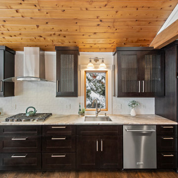
As a busy family of four with two boys and three cats, this client was ready for a kitchen remodel that made family life easier. With dated finishes, appliances, cabinetry, counters, and an oversized laundry room that could be better used as kitchen space, there were many aspects they wanted to change.
They had five different flooring surfaces within the line of sight, kept bumping into each other in the congested hallway, wanted to move their cooktop to the perimeter of their island rather than in the middle, hated their refrigerator location, and didn’t like having an island with two heights. Good thing they came to Horizon Interior Design, where we developed solutions for every problem!
We ran hardwood flooring throughout the main level to make it feel uniform and cohesive, opened up the hallway, and decreased the size of the laundry room to significantly extend their kitchen space and remove congestion in their hallway. We added more functional pull-out shelves to their pantry to replace the original rickety, narrow shelving and placed their refrigerator and cooktop on the perimeter wall, allowing for a large island with a solid surface and a decorative range hood.
We reduced the size of their kitchen windows to allow for more upper cabinetry space and added a granite waterfall feature on the island for a wow factor while placing the counter stools in such a way that they didn't block up main walkways. Dark cabinetry tied in nicely with the knots in the pine ceiling, and white tile backsplash brightened up the space beautifully. Our new kitchen layout meant the family had a nicer view while walking down the stairs, rather than staring at the top of kitchen cabinets.
Gugel Photography
Find the right local pro for your project
 Thompson Remodeling
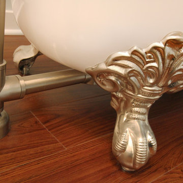
For 39 years, the owners of this four bedroom home lived with a cramped bathroom that hardly deserved to be called a master bath. Its limited space allowed only one user at a time, lacked counterspace, and was severely outdated.
The homeowners had specific needs and a very clear vision for their remodeled bath, which included:
- Enlarging the existing space to make it suitable for two to use
- A claw foot tub for daily baths
- A spa shower
- Plenty of counterspace and storage
- A modern European aesthetic
- “Bling factor”
The new design is the ultimate marriage of function and style. To start, the space from a seldom used spare bedroom was captured. A custom floating vanity provides much needed counterspace and storage. Multiple light sources provide task, ambient light and natural light.
A claw foot tub serves as the focal point and inspiration for the rest of the finishes. A crystal chandelier and wall sconces add an elegant “bling factor”. The curves of the vessel sinks balance nicely with the straight lines of the vanity. A spa shower provides a soothing option for days when the owner opts for a faster bathing option.
 House of Meraki
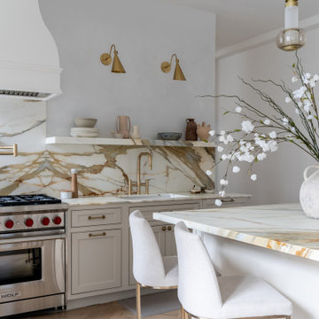
Taking on this pre-war building renovation was the ultimate design challenge. We combined two units into one massive home. By moving the dining table into the great room, we were able to double the size of the kitchen, allowing for a large island in the center of the space. The wolf range topped with a custom hood was on the utilitary side of the kitchen, next the the shaws sink and House of Rohl faucet. The Calacatta Paonazzo marble from Artistic tile in a honed finished continued from the counters to the backsplash and floating shelf, serving the wow factor this light kitchen deserved. On the opposite wall, floor to ceiling custom cabinetry housed a coffee station and ample storage. There’s even a reading nook window seat, perfect for morning coffee. The two glass blown pendants from Gabriel Scott float on top of the island while the Hudson Valley sconces illuminate the marble shelf. Lead designer, Stevi Fourouli added the final touch by painting lime-wash on the walls to accentuate the old-world feeling of this building.
 Wood Anchor
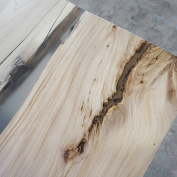
We were contacted by a business owner from Calgary to build a unique conference room table. One that had some wow factor.
What we came up with was adding two flowing “rivers” of clear resin to showcase 3 Elm slab live edges.
To ensure maximum leg room while having a modern industrial feel free came up with a new leg design called the “Dagny”.
A new take on using flat-bar steel. Elegant yet bold!
Details: 10′ long x 4′ wide x 1 1/2″ thick x 30″ tall reclaimed Elm conference table, featuring two clear resin “rivers”. Natural Elm wood colour, finished with OSMO Hardwax Polyx Oil. Bllack powder coated Dagny leg.
2016 © Ray Chan Photo, All Rights Reserved
 Wood Anchor
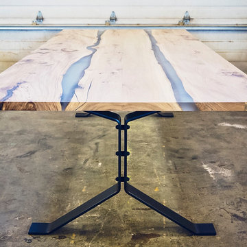
We were contacted by a business owner from Calgary to build a unique conference room table. One that had some wow factor.
What we came up with was adding two flowing “rivers” of clear resin to showcase 3 Elm slab live edges.
To ensure maximum leg room while having a modern industrial feel free came up with a new leg design called the “Dagny”.
A new take on using flat-bar steel. Elegant yet bold!
Details: 10′ long x 4′ wide x 1 1/2″ thick x 30″ tall reclaimed Elm conference table, featuring two clear resin “rivers”. Natural Elm wood colour, finished with OSMO Hardwax Polyx Oil. Bllack powder coated Dagny leg.
2016 © Ray Chan Photo, All Rights Reserved

 Giuselle Bathrooms
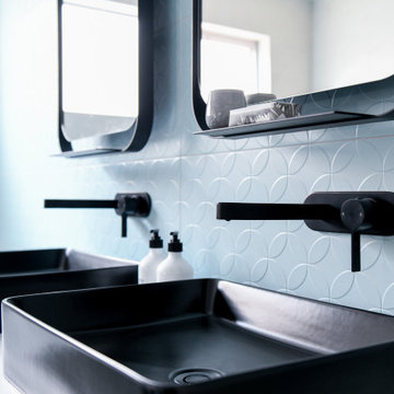
This contemporary bathroom definitely has an instant wow factor. One of the highlights is made to order feature tiles in teal that add a splash of fresh colour into otherwise monochrome colour scheme. Another cool highlight is matte black tapware and accessories that are bold and elegant. The matte black finish is right on trend and adds a touch of cool to the visual appeal of the bathroom.
The black theme continues with dual vessel basins in matte black. Having two basins in the bathroom is a little luxury that allows two people to use the sinks simultaneously without delaying the grooming process. The black vessel sinks also make a statement with a lux, hotel-like vibe. Architectural dual mirrors with matte black frames create a focal point with their sleek shape.
The black floor tiles compliment the black taps and accessories and create a perfect backdrop for a stunning freestanding bath. Practical and stylish, the wall hung vanity with Caesarstone top and timber finish makes the bathroom feel lighter and more spacious
 Drury Design
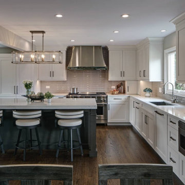
Design objectives for the remodel were aimed at giving the kitchen a larger feel, more room for cooking and extra seating for entertaining:
-Island with seating
-Space for a larger range/cooking area
-More storage with cabinets to the ceiling
-Making the original dining room blend with the kitchen so it all feels like one space
Design challenges to be solved:
-Making the header between the kitchen and the old dining room make sense as we combined the two spaces
-Avoid feeling crammed – a large island with seating still needed space for people walking around the space
-Refrigerator location – the header and window placements needed to stay, so finding a new and functional place for the fridge was a priority
-Add a large hood for wow-factor appeal
Design solutions fell into place as the overall layout came together:
-A large island to seat their four-person family comfortably. -Seating on two sides of the island improves conversation and has a great look.
-Knocking out a dining room wall gave us more room for the island. The leftover part of the dining was perfect for a dry bar/beverage area.
-The refrigerator needed to blend in and also be easily accessible. We removed the built-in pantry and used this space to house the refrigerator/freezer. Then we added tall pantry cabinets throughout the kitchen to make up for the loss of space.
-A large metal hood broke up the space and made for a fun statement piece
The new space is perfect for family time when the kids are back. It’s more conducive for being together, hanging out together, and entertaining with different friend groups together… the family simply spends more time together when they’re together in their new space.
“It’s the design and the openness,” the mom says. “Everybody loves it and gathers around the island all the time. It’s the lighting, too – it’s brighter in here. It’s just more open. We love it!”
 Drury Design
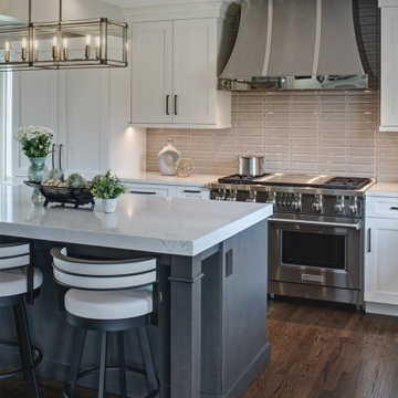
Design objectives for the remodel were aimed at giving the kitchen a larger feel, more room for cooking and extra seating for entertaining:
-Island with seating
-Space for a larger range/cooking area
-More storage with cabinets to the ceiling
-Making the original dining room blend with the kitchen so it all feels like one space
Design challenges to be solved:
-Making the header between the kitchen and the old dining room make sense as we combined the two spaces
-Avoid feeling crammed – a large island with seating still needed space for people walking around the space
-Refrigerator location – the header and window placements needed to stay, so finding a new and functional place for the fridge was a priority
-Add a large hood for wow-factor appeal
Design solutions fell into place as the overall layout came together:
-A large island to seat their four-person family comfortably. -Seating on two sides of the island improves conversation and has a great look.
-Knocking out a dining room wall gave us more room for the island. The leftover part of the dining was perfect for a dry bar/beverage area.
-The refrigerator needed to blend in and also be easily accessible. We removed the built-in pantry and used this space to house the refrigerator/freezer. Then we added tall pantry cabinets throughout the kitchen to make up for the loss of space.
-A large metal hood broke up the space and made for a fun statement piece
The new space is perfect for family time when the kids are back. It’s more conducive for being together, hanging out together, and entertaining with different friend groups together… the family simply spends more time together when they’re together in their new space.
“It’s the design and the openness,” the mom says. “Everybody loves it and gathers around the island all the time. It’s the lighting, too – it’s brighter in here. It’s just more open. We love it!”
 Freeman Corbin
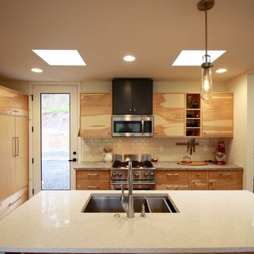
Kitchen features frameless euro style cabinets with an 1/8th inch reveal. Quartz countertop, Floors are radiant heated stained concrete. subway backsplash. Two skylights above provide lots of natural light. Pantry is equipped with high tech shelving system for maximum storage. Two edison bulb pendants provide a fitting mood for the modern rustic aesthetic.
The Corbin Residence is an owner designed/built high efficiency home with high tech features in a modern rustic aesthetic. The home features a high insulation factor, high mass radiant floor heating system, Passive gain with maximum solar exposure and window placement. All Led lighting and high efficiency appliances. Skylights and large 8'x 12' patio doors throughout the house provide large amounts of natural lighting.
 Khoury Design
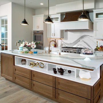
This elegant transitional style kitchen is a focal point of any home. It hosts shaker-style white painted cabinets with a large stained walnut island that hosts two sinks. The beautiful quartz countertop complements the two-color tone scheme with its backsplash and adds a wow factor to this beautiful kitchen.
 Khoury Design
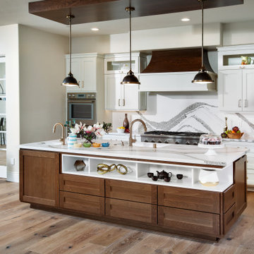
This elegant transitional style kitchen is a focal point of any home. It hosts shaker-style white painted cabinets with a large stained walnut island that hosts two sinks. The beautiful quartz countertop complements the two-color tone scheme with its backsplash and adds a wow factor to this beautiful kitchen.

 Giuselle Bathrooms
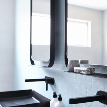
This contemporary bathroom definitely has an instant wow factor. One of the highlights is made to order feature tiles in teal that add a splash of fresh colour into otherwise monochrome colour scheme. Another cool highlight is matte black tapware and accessories that are bold and elegant. The matte black finish is right on trend and adds a touch of cool to the visual appeal of the bathroom.
The black theme continues with dual vessel basins in matte black. Having two basins in the bathroom is a little luxury that allows two people to use the sinks simultaneously without delaying the grooming process. The black vessel sinks also make a statement with a lux, hotel-like vibe. Architectural dual mirrors with matte black frames create a focal point with their sleek shape.
The black floor tiles compliment the black taps and accessories and create a perfect backdrop for a stunning freestanding bath. Practical and stylish, the wall hung vanity with Caesarstone top and timber finish makes the bathroom feel lighter and more spacious
 Old Country Ceramic Tile
Florida Tile
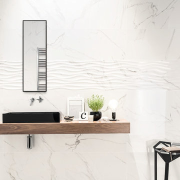
From the exquisite beauty of Calacatta marble emerges PreciousHDP, a collection from Florida Tile that captures the
essence of the most sought after natural stone in the world. Inspired by the unique marked graphics in the Italian
stone, PreciousHDP is a distinct expression of refined taste.
Intense grey and brown veins stand out from a crystalline white background endowing it with a depth and movement
that enlivens spaces. The random pattern, the structured surfaces of the decors, and the natural and polished finishes
are elements that elevate any atmosphere – classical or modern.
Rectified, porcelain floor tiles in a natural finish are available in 12x24, 24x24, and 18x36. Rectified, ceramic wall tiles in
a polished finish are available in 5x14, 14x27, and 14x39. Two mosaics: a 12x12 ceramic wall tile showcasing a modern
mix of the polished and matte finishes combined in an elongated hexagon pattern, and a 12x12 herringbone pattern
in natural finish suitable for wall or floor, provide endless design options.
PreciousHDP also features a 14x27 Curl ceramic wall deco with a chic, three-dimensional wave pattern in a polished
finish, adding a bold twist to the classic Calacatta stone look. A full package of trims including bullnose for floor and
wall, corners, and a chair rail and stop in a polished finish complete the collection.
With the exception of select trim, decorative and ceramic pieces, PreciousHDP is made in the USA of 40% pre-consumer
recycled content, is GREENGUARD® and Porcelain Tile certified
 Gallery KBNY
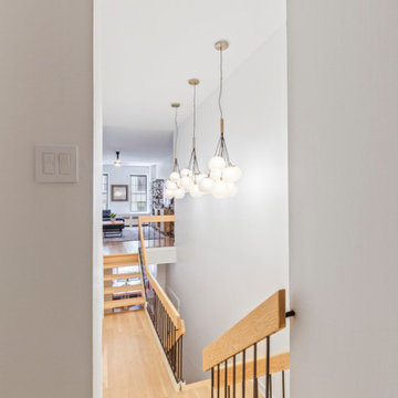
Our clients occupied the first two floors of this Manhattan townhouse, converted to condos with coveted access to the outdoors via a patio. The overall space had been well-maintained, but was dated and didn't necessarily reflect the aesthetic of our clients. Our goal was to brighten the home with character alongside modern elements.
In addition to a full kitchen renovation, this Manhattan townhouse renovation included installing new flooring; retiling and installing new fixtures in the bathroom and powder room; painting the walls; updating the staircase; renovating all the doors, including closets and to the back patio; and installing new lighting fixtures.
EYE-CATCHING KITCHEN
The kitchen in this Manhattan townhouse renovation is a galley-style space attached to the dining room. We wanted to connect the two in a more cohesive manner, so we built custom banquette seating benches in the dining room, with the table in the center acting as both a connector and divider.
Light wainscoting on the base of the walls and wallpaper above contrast against the bright orange benches and ultra-modern light fixture. Gray Shaker-style cabinets and a true herringbone backsplash are paired with a farmhouse sink set in white quartz countertops for a contemporary take on farmhouse style.
TOWNHOUSE CHARACTER
For the aesthetic in this Manhattan townhouse, we combined elements of a variety of design styles: farmhouse in the kitchen, transitional in the bathroom, touches of modern throughout. But the one factor shared by all is the charm of character. Retaining and refining that classic character was important to our clients.
Our extensive experience in renovating townhouses and brownstones in New York, including our gut renovation of this landmarked townhome in Hudson Square and this brownstone in Bed-Stuy, we were able to provide our clients with the confidence and clarity needed when entering these types of highly specific renovation projects.
SOME HIGHLIGHTS
- New select white oak flooring throughout
- White gloss penny tiles and black grout in the powder room
- Wraparound built-in banquette seating in the dining room
- Newly exposed brick wall in hallway leading out to patio, painted white for fresh contrast
Thinking about renovating your townhouse? We are a design-and-build firm with a full-scale approach that handles every single aspect of your townhouse renovation, from filing permits to sourcing materials and everything in between. Contact us today to find out how you can benefit from our expertise in remodeling New York City townhomes and brownstones.
 Drury Design
The 100-year old home’s kitchen was old and just didn’t function well. A peninsula in the middle of the main part of the kitchen blocked the path from the back door. This forced the homeowners to mostly use an odd, U-shaped corner of the kitchen.
Design objectives:
-Add an island
-Wow-factor design
-Incorporate arts and crafts with a touch of Mid-century modern style
-Allow for a better work triangle when cooking
-Create a seamless path coming into the home from the backdoor
-Make all the countertops in the space 36” high (the old kitchen had different base cabinet heights)
Design challenges to be solved:
-Island design
-Where to place the sink and dishwasher
-The family’s main entrance into the home is a back door located within the kitchen space. Samantha needed to find a way to make an unobstructed path through the kitchen to the outside
-A large eating area connected to the kitchen felt slightly misplaced – Samantha wanted to bring the kitchen and materials more into this area
-The client does not like appliance garages/cabinets to the counter. The more countertop space, the better!
Design solutions:
-Adding the right island made all the difference! Now the family has a couple of seats within the kitchen space. -Multiple walkways facilitate traffic flow.
-Multiple pantry cabinets (both shallow and deep) are placed throughout the space. A couple of pantry cabinets were even added to the back door wall and wrap around into the breakfast nook to give the kitchen a feel of extending into the adjoining eating area.
-Upper wall cabinets with clear glass offer extra lighting and the opportunity for the client to display her beautiful vases and plates. They add and an airy feel to the space.
-The kitchen had two large existing windows that were ideal for a sink placement. The window closest to the back door made the most sense due to the fact that the other window was in the corner. Now that the sink had a place, we needed to worry about the dishwasher. Samantha didn’t want the dishwasher to be in the way of people coming in the back door – it’s now in the island right across from the sink.
-The homeowners love Motawi Tile. Some fantastic pieces are placed within the backsplash throughout the kitchen. -Larger tiles with borders make for nice accent pieces over the rangetop and by the bar/beverage area.
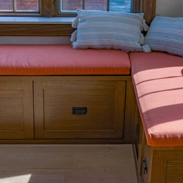
-The adjacent area for eating is a gorgeous nook with massive windows. We added a built-in furniture-style banquette with additional lower storage cabinets in the same finish. It’s a great way to connect and blend the two areas into what now feels like one big space!
Sponsored
Fredericksburg, OH

High Point Cabinets
Columbus' Experienced Custom Cabinet Builder | 4x Best of Houzz Winner

 safe ZOnea
If you’re active on GardenWeb sharing plant photos, asking for advice, tracking seasonal progress you already understand how much detail goes into gardening. Soil pH, rainfall, emerging leaves, bloom counts, fertilizer schedules it adds up fast. But all that rich information often remains buried in posts, lists or memory. What if you could visualize that data and turn it into clear quick insights? That’s where a graph maker becomes a game-changer for your gardening workflow.
1. Why garden data belongs on a graph
On GardenWeb, you’ll find forums for everything from perennial care, vegetable gardening, patios, herbs, even cooking and craft projects. While plant lovers share observations and ask questions, many track progress manually in spreadsheets or memory. A graph maker flips that around:
Instead of a list of numbers (e.g., “Soil test: pH 6.4 in May, 6.1 in October”), you get a line graph showing the decline over time.
Instead of guessing which plant bloomed most, you see a bar chart comparing counts across plants.
Instead of manually calculating average rainfall effect, you plot scatter points of bloom count vs. rainfall.
By turning your data into visuals, you’re not just recording—you’re analysing, learning and improving. For GardenWeb users this means smarter decisions: Which fertilizer actually improves bloom count? Which shady spot recovers slower? A graph maker gives clarity.
2. What is a graph maker and how to use one
A graph maker is a web tool or software that lets you input raw data (numbers, dates, categories) and output visual charts like line graphs, bar charts, scatter plots, etc. It might allow you to import a spreadsheet, select chart type, customize colours, label axes, and export the image for your blog, forum post or personal log.
Here’s how you could apply it for gardening:
Log blooms per week for each rose plant.
Using the graph maker, choose line graph to track changes over weeks.
Label your y-axis “Number of Blooms”, x-axis “Week of Year”.
Add colour lines for each plant for easy comparison.
Export as PNG and embed it in a GardenWeb forum post: “See bloom trend for my ‘Peace’ vs ‘Knock Out’ roses”.
This isn’t just pretty-to-look-at: it makes the trend obvious, invites discussion (“Hey, your ‘Knock Out’ line dips after week 28—what changed?”) and helps you refine your routine.
3. Use these specific scenarios on GardenWeb
A. Soil pH and plant health tracking
After multiple tests you have pH values over time and bloom results. Upload both datasets into the graph maker, produce a dual-axis line graph: soil pH on one axis, bloom count on the other. Post your findings in the “Soil, Fertility & Nutrients” forum and get feedback.
B. Seasonal pest or disease appearance
Record number of aphids spotted each month and whether you used treatment. A bar chart via the graph maker can show pre- and post-treatment figures. Then ask the “Insect & Disease Control” forum for advice based on your visual data.
C. Yield comparison between varieties
You grow two zucchini varieties. You keep weekly yield in pounds. Use the graph maker for a side-by-side bar chart. Share in the “Vegetable Gardening” forum: “Which was better this year? See the chart”.
D. Rainfall vs growth rate
You log weekly rainfall and growth (in cm) of your tomato plants. Use scatter plot in graph maker. If a pattern emerges, you’re ready to post: “Is my growth plateau due to drought? Chart shows a clear correlation.”
4. Why this elevates your GardenWeb contributions
When you post with a chart made by a graph maker, you’re doing more than asking or showing off. You’re investigating. You’re analysing. You invite the community to give feedback on data, not just anecdotes. That elevates the discussion. Instead of “My plant died, any ideas?” you post “See this graph of pH drop and bloom count—what might be the limiting factor?” High-quality visuals raise your post’s value and garner more thoughtful responses.
Plus, your posts become useful references for others: someone else can say, “Cool graphic, can you share your data sheet?” You build credibility and help the forum become a learning hub—not just a Q&A board.
5. Tips for using a graph maker effectively in the GardenWeb context
Keep it simple: One chart, one insight. Don’t overcrowd.
Label clearly: Titles, axis labels, units (e.g., cm/week, mg/L, °F).
Use readable colours: Avoid faint tones that vanish on mobile.
Annotate when needed: Add notes like “Fertiliser switched week 12” or “Shade cloth added”.
Provide context in your post: Don’t leave the chart alone—write a few sentences explaining what it shows and what you’re seeking.
Embed carefully: Make sure your image displays properly in GardenWeb; check mobile view.
Share raw data: If possible link to your spreadsheet so others can replicate or comment.
Be open to feedback: The chart invites questions; embrace them.
6. Possible pitfalls and how to avoid them
Bad data = bad chart: If your measurements aren’t consistent, your graph will mislead. Use standardized data collection.
Too much complexity: Multi-axis charts, too many variables—confusing. Stick to one or two variables.
Overlooking mobile viewers: Many GardenWeb users browse via phones. Use large fonts and simple visuals.
Ignoring the narrative: Chart alone won’t answer. Explain what it means and what you need.
Outdated charts: If you update your data annually, keep your visuals current or label them clearly as “2024 data”.
7. Final thoughts
On GardenWeb you’ll find a vibrant community of gardeners, DIYers, cooks and design lovers.Using a graph maker for your posts and progress turns your experience from casual hobby-logging into smart data-driven gardening. You’ll not only learn more—your peers will learn more, too.
So next time you log your plant growth, record your yield, test your soil or track pests—don’t just note it. Plot it. Use a graph maker. Share it in the forum. Let your garden tell the story, and let the community help you write the next chapter.

 Thompson Remodeling
For 39 years, the owners of this four bedroom home lived with a cramped bathroom that hardly deserved to be called a master bath. Its limited space allowed only one user at a time, lacked counterspace, and was severely outdated.
The homeowners had specific needs and a very clear vision for their remodeled bath, which included:
- Enlarging the existing space to make it suitable for two to use
- A claw foot tub for daily baths
- A spa shower
- Plenty of counterspace and storage
- A modern European aesthetic
- “Bling factor”
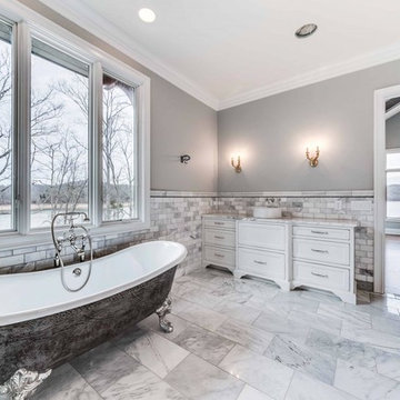
The new design is the ultimate marriage of function and style. To start, the space from a seldom used spare bedroom was captured. A custom floating vanity provides much needed counterspace and storage. Multiple light sources provide task, ambient light and natural light.
A claw foot tub serves as the focal point and inspiration for the rest of the finishes. A crystal chandelier and wall sconces add an elegant “bling factor”. The curves of the vessel sinks balance nicely with the straight lines of the vanity. A spa shower provides a soothing option for days when the owner opts for a faster bathing option.
45