
Search results for "Typical client" in Home Design Ideas

 Stephanie Charest Interior Design
We completed this kitchen renovation for a SW. Calgary couple and as you’ll see, it was a much needed update after their 20+ years in the home.
Clearly the look of the cabinets needed to be brought up to date, but function was on the top of the list for this client. She enjoys cooking and often hosts several friends over for canning and other big cooking parties so countertop space was a priority. Seeing as they also host large family gatherings, the cook didn’t want to feel abandoned in the kitchen when everyone else was in the next room so opening up the space was crucial.
Here is what we did to change the way this space works for them…
We revised the layout of the appliances and cabinets and relocated the plumbing so she could look out the window while she stood at the sink. Taking the cabinets up to the ceiling also gave them more storage as does the large pantry next to the fridge. An island wouldn’t fit, so we added a peninsula which gave them a spot to sit to have their morning coffee and a significant amount of additional counter space. By removing the walls between the kitchen and dining room it eliminated a small hallway that separated the kitchen and dining room and allowed for an open concept in their 1960’s home.
To add visual interest to the space and to define the dining room, we added a coffered celing. Now, typically a coffered ceiling is done when you have three or four walls to anchor it in. It was a bit of a risk to add a “floating” coffered ceiling! However, it turned out beautifully. It wasn’t without it issues but I’m glad we added this element as it wouldn’t have been as interesting with a typical flat ceiling.
In the dining room, a buffet was added for additional storage as well as new drapery panels, lighting and furniture. The peacock blue end chairs are stunning! Without that punch of color the dining room just wouldn’t be as outstanding. They are so lovely and really pushed the client out of her comfort zone – but she loves them and is glad she trusted us with that design decision.
The result is a much more usable space that is also classic in style and just darn pretty to look at and be in! And I know this client is enjoying her new kitchen day to day and on special family occasions.
Adrian Shellard Photography
 mackmiller design+build
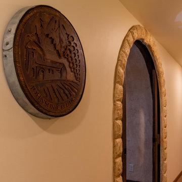
Our clients live in a typical, traditional suburban home. One homeowner had been collecting wine and requested a dedicated room for storing, tasting and entertaining that felt as if he were in a California wine cellar. Our design team created a room with Old World touches including a dramatic arched entrance bordered by decorative faux stone quoins. The doorway has two dark wood and glass doors. Key features include two built-in dual zone, wine refrigerators, a flagstone look floor, mural on the back wall with an arch that looks as if there is a wine cellar behind it. Furnishings include a custom made, circular epoxy table with a live edge, 4 bar stools, two upholstered chairs and end table. Rough-hewn look beams adorn the ceilings and the walls and ceilings are hand troweled plaster with a glaze.
 Lim Design Studio, Inc
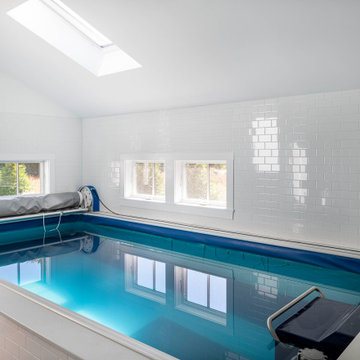
Located just outside of Boston, this home was built from the ground up to serve a bustling working family. The home contains a work/office space for client visits and an asymmetrical floor plan that distinguishes itself from typical New England vernacular. The entry sequence creates an enfilade to the main living spaces of the house. Smaller programmatic spaces such as the indoor pool, office, mud room, and staircase are kept to the perimeter of the main living areas on the lower floor. Upstairs, the stair ends at a reading nook and crafts area for children. Project featured in The Boston Globe. Completed in 2020. Photography by Sabrina Cole Quinn.
Find the right local pro for your project

 Scottsdale Design Center
Park Place was a great opportunity to design something different and unique in Arizona. The typical interiors of an Arizona home in this area are usually heavy, Tuscan inspired, and darker in color. Our client was looking for a home that is light and airy, but that still fits in the desert landscape. [Designer Caroline Tyler DeCesare, DeCesare Design Group] -- Living Kitchen, Located in suite 107 + 115-117 of the SDC

 CDH Designs LLC
Typical of many bi-level homes built in the 1970's, this house featured a separate kitchen and dining room... both SMALL. The kitchen was dimly lit, with dark oak cabinets, green countertops, and a dated vinyl floor. The wall between the rooms was removed and doorways to the living room were widened. The soffit above the cabinets was also torn out. This brand new space also features hardwood floors and upgraded lighting. Custom Gunstock maple cabinets fit the client's style while offering plenty of storage. Quartz countertops and a light-colored porcelain backsplash add additional light to the room.
CDH Designs
15 East 4th St
Emporium, PA 15834
 Stephanie Charest Interior Design
We completed this kitchen renovation for a SW. Calgary couple and as you’ll see, it was a much needed update after their 20+ years in the home.
Clearly the look of the cabinets needed to be brought up to date, but function was on the top of the list for this client. She enjoys cooking and often hosts several friends over for canning and other big cooking parties so countertop space was a priority. Seeing as they also host large family gatherings, the cook didn’t want to feel abandoned in the kitchen when everyone else was in the next room so opening up the space was crucial.
Here is what we did to change the way this space works for them…
We revised the layout of the appliances and cabinets and relocated the plumbing so she could look out the window while she stood at the sink. Taking the cabinets up to the ceiling also gave them more storage as does the large pantry next to the fridge. An island wouldn’t fit, so we added a peninsula which gave them a spot to sit to have their morning coffee and a significant amount of additional counter space. By removing the walls between the kitchen and dining room it eliminated a small hallway that separated the kitchen and dining room and allowed for an open concept in their 1960’s home.
To add visual interest to the space and to define the dining room, we added a coffered celing. Now, typically a coffered ceiling is done when you have three or four walls to anchor it in. It was a bit of a risk to add a “floating” coffered ceiling! However, it turned out beautifully. It wasn’t without it issues but I’m glad we added this element as it wouldn’t have been as interesting with a typical flat ceiling.
In the dining room, a buffet was added for additional storage as well as new drapery panels, lighting and furniture. The peacock blue end chairs are stunning! Without that punch of color the dining room just wouldn’t be as outstanding. They are so lovely and really pushed the client out of her comfort zone – but she loves them and is glad she trusted us with that design decision.
The result is a much more usable space that is also classic in style and just darn pretty to look at and be in! And I know this client is enjoying her new kitchen day to day and on special family occasions.
Adrian Shellard Photography

 Studio Dearborn
A young colonial in the heart of Rye New York had everything going for it, except a dark and poorly laid out kitchen. The clients tapped Sarah Robertson of Studio Dearborn to help them layout a new kitchen in their challenging, dog leg shaped room. A small breakfast peninsula and working island helped pull together the oddly shaped kitchen into a streamlined, light filled space with all the storage amenities typical of a Studio Dearborn kitchen. The bar area, with undercounter refrigeration for wine and beverages, also features a locking cabinet for liquor and open wine storage. Desk area has file drawer and Docking Drawer charging drawer. Countertops: White Macauba, Rye Marble and Stone, Rye NY. Hardware: Studio Pulls from Hickory Hardware. Sinks: Kraus. Lighting: Currey & Co. Faucet: Kohler Artifacts Backsplash tile: Casablanca Tile and Stone, Harrison NY. Photography: Adam Kane Macchia
Sponsored
Columbus, OH

Snider & Metcalf Interior Design, LTD
Leading Interior Designers in Columbus, Ohio & Ponte Vedra, Florida

 Redbud Design
This overgrown, rectangular yard in San Francisco is home to a young couple, their 3-year-old daughter, and twins that were on the way. Typical of many San Francisco yards, it is accessed from the back deck down a long set of stairs. The client wanted to be able to spend quality time in the yard with her two new babies and toddler. The design includes a play structure, a covered sand box, a small raised planter for playing in the dirt. Due to the limited space, several trellises were added to the side and back fence so that vines could add color surrounding the new play area.
Covering an existing concrete pad with cut Connecticut Bluestone enhanced the adult seating area and was surrounded by low maintenance colorful planting beds. A simple but beautiful walkway of stones set in lose pebbles connects these two use areas. Custom lattice was added onto the underside of the deck to hide the large utility area. The existing deck and stairs were repaired and refurbished to improve it’s look and longevity.
The clients were very happy with the end result which came in on time and budget just as the twin girls were born.

 Melissa Hill Home Design
We loved this project! The transformation was incredible. Our client came to us asking for a master bedroom that created a space for them to retreat to at the end of a very busy day. They moved into this beautiful estate overlooking a Connecticut vineyard that yearned for a design to compliment the architecture of the home, yet personalize the transitional taste of this young couple. We wanted to bring them elements that included clean lines with some updated tradition. Gray has been the new neutral in design lately but to set it aside from the typical use of this hue, a favorite by many today, we added a touch of gold for warmth and elegance. The client's desire for a place to read and relax allowed for a seating area where they can transition to a doorway that leads them out to a beautiful stone veranda. We are excited as they are able to enjoy the start of a beautiful home redesign with a space that starts and ends their day in understated luxury.
Custom designed by Hartley and Hill Design. All materials and furnishings in this space are available through Hartley and Hill Design. www.hartleyandhilldesign.com 888-639-0639

 Nashville Modern Cabinetry
This completely customized kitchen was built to perfection with the collaboration of our clients interior designer and contractor.
Typical 1/8" spacing between all doors, drawer fronts and built in appliances made for a clean, contemporary look. The 9-step custom textured finish process on the doors allowed us to match perfectly the sample supplied by the interior designer. And the walnut veneer island was a nice contrasting accent to the painted cabinets.
This highly customized kitchen also included special features like the Aventos door lift hardware and Hafele Magic Corner II blind corner pullout. Similarly we included a butlers pantry and bar as well as an upstairs bar. Special bathroom features included a mens bath vanity, women's bath vanity, guest bath vanity, powder room and upstairs bath.
 Stephanie Charest Interior Design
We completed this kitchen renovation for a SW. Calgary couple and as you’ll see, it was a much needed update after their 20+ years in the home.
Clearly the look of the cabinets needed to be brought up to date, but function was on the top of the list for this client. She enjoys cooking and often hosts several friends over for canning and other big cooking parties so countertop space was a priority. Seeing as they also host large family gatherings, the cook didn’t want to feel abandoned in the kitchen when everyone else was in the next room so opening up the space was crucial.
Here is what we did to change the way this space works for them…
We revised the layout of the appliances and cabinets and relocated the plumbing so she could look out the window while she stood at the sink. Taking the cabinets up to the ceiling also gave them more storage as does the large pantry next to the fridge. An island wouldn’t fit, so we added a peninsula which gave them a spot to sit to have their morning coffee and a significant amount of additional counter space. By removing the walls between the kitchen and dining room it eliminated a small hallway that separated the kitchen and dining room and allowed for an open concept in their 1960’s home.
To add visual interest to the space and to define the dining room, we added a coffered celing. Now, typically a coffered ceiling is done when you have three or four walls to anchor it in. It was a bit of a risk to add a “floating” coffered ceiling! However, it turned out beautifully. It wasn’t without it issues but I’m glad we added this element as it wouldn’t have been as interesting with a typical flat ceiling.
In the dining room, a buffet was added for additional storage as well as new drapery panels, lighting and furniture. The peacock blue end chairs are stunning! Without that punch of color the dining room just wouldn’t be as outstanding. They are so lovely and really pushed the client out of her comfort zone – but she loves them and is glad she trusted us with that design decision.
The result is a much more usable space that is also classic in style and just darn pretty to look at and be in! And I know this client is enjoying her new kitchen day to day and on special family occasions.
Adrian Shellard Photography
 The Cultural Landscape Foundation
Sunday, June 28, 3:30 to 5:00pm | Potomac, MD
Family Retreat by Lila Fendrick and Doug Stookey of Lila Fendrick Landscape Architecture and Garden Design
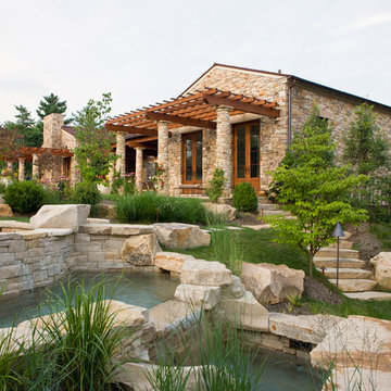
The landscape architects incorporated an adjoining lot to create this delightful family retreat where the clients spend time with their two sons growing vegetables, swimming, playing in splash pools, soaking in the hot tub, hiding in a below-grade fort, and running through a maze of paths formed by towering shrubs. The height differential between the owner’s house and the crest of the new lot presented opportunities for linking the two lots. The landscape architect designed dramatic lawn steps up to the new pool and pool house complex, designing tiers of waterfalls around a sunken spa, terracing the site with playfully hidden paths, and concealing a lower level parking area and garage. The project uses locally sourced Western Maryland stone on the pool house/guest house and Delaware River Jacks for the pebble paving. Utah-sourced quartzite-sandstone boulders reflect the clients’ appreciation for rugged western American landscapes. The variety of materials, linked by color and texture, and the unusual programming create a place of retreat and fun that feels far from the typical Washington, DC, area backyard. Photo by Gordon Beall
 Studio Dearborn
c 2014 Sarah Robertson
Transitional single-wall dark wood floor eat-in kitchen photo in New York with a farmhouse sink, shaker cabinets, gray cabinets, marble countertops, gray backsplash, cement tile backsplash, stainless steel appliances, gray walls and an island
Transitional single-wall dark wood floor eat-in kitchen photo in New York with a farmhouse sink, shaker cabinets, gray cabinets, marble countertops, gray backsplash, cement tile backsplash, stainless steel appliances, gray walls and an island
Sponsored
Columbus, OH
Snider & Metcalf Interior Design, LTD
Leading Interior Designers in Columbus, Ohio & Ponte Vedra, Florida

 Susan Muschweck Interior Design, LLC
This 100 year old, Federalist style home in the East End of Pittsburgh, was due for an update. The house sported original cabinetry and plumbing. The project included the entire house, to some degree, and some rooms, the kitchen, for instance, was a total gut job. Engineered hardwood was added to the rooms where old tar linoleum was installed, allowing for the original red oak to compliment these rooms easily.
The master bathroom had previously undergone a minor remodel and I updated the entire house with new, mostly saturated, paint color by Benjamin Moore. My client had quite a nice collection of Baker furniture and upscale area rugs, and I took my cues from those pieces that were incorporated within the new design.
My client has increased the value of his home substantially, and has recently upgraded the small exterior courtyard area with lovely perennials and new pavers and a fire pit; elements that are typically not found in a small city lot. The newly rennovated courtyard is a gathering spot for many outdoor parties that my client is famous for his hosting.

 Rebecca Quandt Interiors
Storing pots and pans is a typical struggle for most people. Stacking them provides the frustration of finding a place to store the lids. By adding pull-out drawers inside this 30” cabinet adjacent to the range, the Client has access to all of their cooking tools in reaching distance without having to rearrange the cabinet every time. And the lids? They fit right on top of their matching pot.
Rebecca Quandt
 Stephanie Charest Interior Design
We completed this kitchen renovation for a SW. Calgary couple and as you’ll see, it was a much needed update after their 20+ years in the home.
Clearly the look of the cabinets needed to be brought up to date, but function was on the top of the list for this client. She enjoys cooking and often hosts several friends over for canning and other big cooking parties so countertop space was a priority. Seeing as they also host large family gatherings, the cook didn’t want to feel abandoned in the kitchen when everyone else was in the next room so opening up the space was crucial.
Here is what we did to change the way this space works for them…
We revised the layout of the appliances and cabinets and relocated the plumbing so she could look out the window while she stood at the sink. Taking the cabinets up to the ceiling also gave them more storage as does the large pantry next to the fridge. An island wouldn’t fit, so we added a peninsula which gave them a spot to sit to have their morning coffee and a significant amount of additional counter space. By removing the walls between the kitchen and dining room it eliminated a small hallway that separated the kitchen and dining room and allowed for an open concept in their 1960’s home.
To add visual interest to the space and to define the dining room, we added a coffered celing. Now, typically a coffered ceiling is done when you have three or four walls to anchor it in. It was a bit of a risk to add a “floating” coffered ceiling! However, it turned out beautifully. It wasn’t without it issues but I’m glad we added this element as it wouldn’t have been as interesting with a typical flat ceiling.
In the dining room, a buffet was added for additional storage as well as new drapery panels, lighting and furniture. The peacock blue end chairs are stunning! Without that punch of color the dining room just wouldn’t be as outstanding. They are so lovely and really pushed the client out of her comfort zone – but she loves them and is glad she trusted us with that design decision.
The result is a much more usable space that is also classic in style and just darn pretty to look at and be in! And I know this client is enjoying her new kitchen day to day and on special family occasions.
Adrian Shellard Photography
 The Cultural Landscape Foundation
Sunday, June 28, 3:30 to 5:00pm | Potomac, MD
Family Retreat by Lila Fendrick and Doug Stookey of Lila Fendrick Landscape Architecture and Garden Design
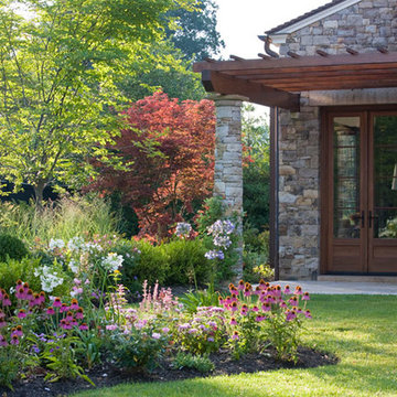
The landscape architects incorporated an adjoining lot to create this delightful family retreat where the clients spend time with their two sons growing vegetables, swimming, playing in splash pools, soaking in the hot tub, hiding in a below-grade fort, and running through a maze of paths formed by towering shrubs. The height differential between the owner’s house and the crest of the new lot presented opportunities for linking the two lots. The landscape architect designed dramatic lawn steps up to the new pool and pool house complex, designing tiers of waterfalls around a sunken spa, terracing the site with playfully hidden paths, and concealing a lower level parking area and garage. The project uses locally sourced Western Maryland stone on the pool house/guest house and Delaware River Jacks for the pebble paving. Utah-sourced quartzite-sandstone boulders reflect the clients’ appreciation for rugged western American landscapes. The variety of materials, linked by color and texture, and the unusual programming create a place of retreat and fun that feels far from the typical Washington, DC, area backyard. Photo by Gordon Beall
Sponsored
Columbus, OH
Snider & Metcalf Interior Design, LTD
Leading Interior Designers in Columbus, Ohio & Ponte Vedra, Florida
 The Cultural Landscape Foundation
Sunday, June 28, 3:30 to 5:00pm | Potomac, MD
Family Retreat by Lila Fendrick and Doug Stookey of Lila Fendrick Landscape Architecture and Garden Design
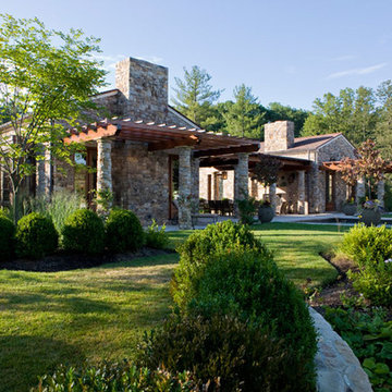
The landscape architects incorporated an adjoining lot to create this delightful family retreat where the clients spend time with their two sons growing vegetables, swimming, playing in splash pools, soaking in the hot tub, hiding in a below-grade fort, and running through a maze of paths formed by towering shrubs. The height differential between the owner’s house and the crest of the new lot presented opportunities for linking the two lots. The landscape architect designed dramatic lawn steps up to the new pool and pool house complex, designing tiers of waterfalls around a sunken spa, terracing the site with playfully hidden paths, and concealing a lower level parking area and garage. The project uses locally sourced Western Maryland stone on the pool house/guest house and Delaware River Jacks for the pebble paving. Utah-sourced quartzite-sandstone boulders reflect the clients’ appreciation for rugged western American landscapes. The variety of materials, linked by color and texture, and the unusual programming create a place of retreat and fun that feels far from the typical Washington, DC, area backyard. Photo by Gordon Beall
 CDH Designs LLC
Typical of many bi-level homes built in the 1970's, this house featured a separate kitchen and dining room... both SMALL. The kitchen was dimly lit, with dark oak cabinets, green countertops, and a dated vinyl floor. The wall between the rooms was removed and doorways to the living room were widened. The soffit above the cabinets was also torn out. This brand new space also features hardwood floors and upgraded lighting. Custom Gunstock maple cabinets fit the client's style while offering plenty of storage. Quartz countertops and a light-colored porcelain backsplash add additional light to the room.
CDH Designs
15 East 4th St
Emporium, PA 15834

 Middleton Inc.
Oakridge
Project Title: Oakridge
Project Type: Full House Remodel
Client Type: Builder
Overview: We were commissioned by our clients over at Housekick to create a set of design plans and provide our standard visualization package. The crew over at Housekick builds/renovates and sells over forty houses a year in the Raleigh Triangle area, so having an efficient construction process and the ability to pre-sell their properties is crucial to their business model. Because of our extensive experience with interior design, real estate, and construction projects, they rely on us to come up with complete design plans from start to finish and then use these to build and pre-sell their projects.
Original Conditions: This typical 1970’s choppy split-level house was e “functionally obsolete,” had three bedrooms, two baths, and no real master suite before we got our hands on it.
Changes: Upon completion, the home had four bedrooms, three full baths, a full master suite, and an open floorplan with modern architectural details.
The Result: Because of our design plans and visualizations, our clients were able to create a stunning property that was functionally current, appealed to the correct demographic, and wowed potential buyers resulting in the home selling before it ever hit the market!
58