
Search results for "Typical client" in Home Design Ideas

 Middleton Inc.
Project Type: Full House Remodel
Client Type: Builder
Overview: We were commissioned by our clients over at Housekick to create a set of design plans and provide our standard visualization package. The crew over at Housekick builds/renovates and sells over forty houses a year in the Raleigh Triangle area, so having an efficient construction process and the ability to pre-sell their properties is crucial to their business model. Because of our extensive experience with interior design, real estate, and construction projects, they rely on us to come up with complete design plans from start to finish and then use these to build and pre-sell their projects.
Original Conditions: This typical 1970’s choppy split-level house was e “functionally obsolete,” had three bedrooms, two baths, and no real master suite before we got our hands on it.
Changes: Upon completion, the home had four bedrooms, three full baths, a full master suite, and an open floorplan with modern architectural details.
The Result: Because of our design plans and visualizations, our clients were able to create a stunning property that was functionally current, appealed to the correct demographic, and wowed potential buyers resulting in the home selling before it ever hit the market!
 Middleton Inc.
Project Type: Full House Remodel
Client Type: Builder
Overview: We were commissioned by our clients over at Housekick to create a set of design plans and provide our standard visualization package. The crew over at Housekick builds/renovates and sells over forty houses a year in the Raleigh Triangle area, so having an efficient construction process and the ability to pre-sell their properties is crucial to their business model. Because of our extensive experience with interior design, real estate, and construction projects, they rely on us to come up with complete design plans from start to finish and then use these to build and pre-sell their projects.
Original Conditions: This typical 1970’s choppy split-level house was e “functionally obsolete,” had three bedrooms, two baths, and no real master suite before we got our hands on it.
Changes: Upon completion, the home had four bedrooms, three full baths, a full master suite, and an open floorplan with modern architectural details.
The Result: Because of our design plans and visualizations, our clients were able to create a stunning property that was functionally current, appealed to the correct demographic, and wowed potential buyers resulting in the home selling before it ever hit the market!
 Middleton Inc.
Project Type: Full House Remodel
Client Type: Builder
Overview: We were commissioned by our clients over at Housekick to create a set of design plans and provide our standard visualization package. The crew over at Housekick builds/renovates and sells over forty houses a year in the Raleigh Triangle area, so having an efficient construction process and the ability to pre-sell their properties is crucial to their business model. Because of our extensive experience with interior design, real estate, and construction projects, they rely on us to come up with complete design plans from start to finish and then use these to build and pre-sell their projects.
Original Conditions: This typical 1970’s choppy split-level house was e “functionally obsolete,” had three bedrooms, two baths, and no real master suite before we got our hands on it.
Changes: Upon completion, the home had four bedrooms, three full baths, a full master suite, and an open floorplan with modern architectural details.
The Result: Because of our design plans and visualizations, our clients were able to create a stunning property that was functionally current, appealed to the correct demographic, and wowed potential buyers resulting in the home selling before it ever hit the market!
Find the right local pro for your project
 Middleton Inc.
Oakridge
Project Title: Oakridge
Project Type: Full House Remodel
Client Type: Builder
Overview: We were commissioned by our clients over at Housekick to create a set of design plans and provide our standard visualization package. The crew over at Housekick builds/renovates and sells over forty houses a year in the Raleigh Triangle area, so having an efficient construction process and the ability to pre-sell their properties is crucial to their business model. Because of our extensive experience with interior design, real estate, and construction projects, they rely on us to come up with complete design plans from start to finish and then use these to build and pre-sell their projects.
Original Conditions: This typical 1970’s choppy split-level house was e “functionally obsolete,” had three bedrooms, two baths, and no real master suite before we got our hands on it.
Changes: Upon completion, the home had four bedrooms, three full baths, a full master suite, and an open floorplan with modern architectural details.
The Result: Because of our design plans and visualizations, our clients were able to create a stunning property that was functionally current, appealed to the correct demographic, and wowed potential buyers resulting in the home selling before it ever hit the market!
 The Cultural Landscape Foundation
Sunday, June 28, 3:30 to 5:00pm | Potomac, MD
Family Retreat by Lila Fendrick and Doug Stookey of Lila Fendrick Landscape Architecture and Garden Design
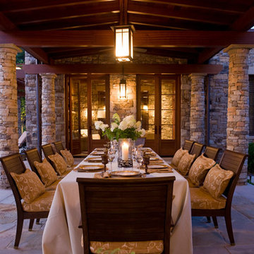
The landscape architects incorporated an adjoining lot to create this delightful family retreat where the clients spend time with their two sons growing vegetables, swimming, playing in splash pools, soaking in the hot tub, hiding in a below-grade fort, and running through a maze of paths formed by towering shrubs. The height differential between the owner’s house and the crest of the new lot presented opportunities for linking the two lots. The landscape architect designed dramatic lawn steps up to the new pool and pool house complex, designing tiers of waterfalls around a sunken spa, terracing the site with playfully hidden paths, and concealing a lower level parking area and garage. The project uses locally sourced Western Maryland stone on the pool house/guest house and Delaware River Jacks for the pebble paving. Utah-sourced quartzite-sandstone boulders reflect the clients’ appreciation for rugged western American landscapes. The variety of materials, linked by color and texture, and the unusual programming create a place of retreat and fun that feels far from the typical Washington, DC, area backyard. Photo by Gordon Beall

 DCI Home Improvements
With the influx of construction in west Pasco during the late 60’s and 70’s, we saw a plethora of 2 and 3 bedroom homes being constructed with little or no attention paid to the existing bathrooms and kitchens in the homes. Homes on the water were no exception. Typically they were built to just be a functional space, but rarely did they ever accomplish this. We had the opportunity to renovate a gentleman’s master bathroom in the Westport area of Port Richey. It was a story that started off with the client having a tale of an unscrupulous contractor that he hired to perform his renovation project and things took a turn and lets just say they didn’t pan out. The client approached us to see what we could do. We never had the opportunity to see the bathroom in its original state as the tear out had already been taken care of, somewhat, by the previous contractor. We listened to what the client wanted to do with the space and devised a plan. We enlarged the shower area, adding specialty items like a wall niche, heated mirror, rain head shower, and of course a custom glass enclosure. To the main portion of the bathroom we were able to add a larger vanity with waterfall faucet, large framed mirror, and new lighting. New floor tile, wall tile, and accessories rounded out this build.
 The Cultural Landscape Foundation
Sunday, June 28, 3:30 to 5:00pm | Potomac, MD
Family Retreat by Lila Fendrick and Doug Stookey of Lila Fendrick Landscape Architecture and Garden Design
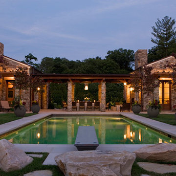
The landscape architects incorporated an adjoining lot to create this delightful family retreat where the clients spend time with their two sons growing vegetables, swimming, playing in splash pools, soaking in the hot tub, hiding in a below-grade fort, and running through a maze of paths formed by towering shrubs. The height differential between the owner’s house and the crest of the new lot presented opportunities for linking the two lots. The landscape architect designed dramatic lawn steps up to the new pool and pool house complex, designing tiers of waterfalls around a sunken spa, terracing the site with playfully hidden paths, and concealing a lower level parking area and garage. The project uses locally sourced Western Maryland stone on the pool house/guest house and Delaware River Jacks for the pebble paving. Utah-sourced quartzite-sandstone boulders reflect the clients’ appreciation for rugged western American landscapes. The variety of materials, linked by color and texture, and the unusual programming create a place of retreat and fun that feels far from the typical Washington, DC, area backyard. Photo by Gordon Beall
Sponsored
Columbus, OH

Snider & Metcalf Interior Design, LTD
Leading Interior Designers in Columbus, Ohio & Ponte Vedra, Florida

 Melissa Hill Home Design
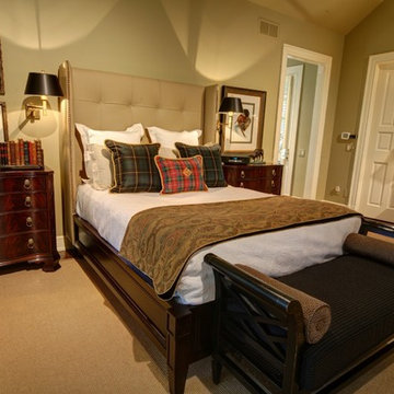
We loved this project! The transformation was incredible. Our client came to us asking for a master bedroom that created a space for them to retreat to at the end of a very busy day. They moved into this beautiful estate overlooking a Connecticut vineyard that yearned for a design to compliment the architecture of the home, yet personalize the transitional taste of this young couple. We wanted to bring them elements that included clean lines with some updated tradition. Gray has been the new neutral in design lately but to set it aside from the typical use of this hue, a favorite by many today, we added a touch of gold for warmth and elegance. The client's desire for a place to read and relax allowed for a seating area where they can transition to a doorway that leads them out to a beautiful stone veranda. We are excited as they are able to enjoy the start of a beautiful home redesign with a space that starts and ends their day in understated luxury.
Custom designed by Hartley and Hill Design. All materials and furnishings in this space are available through Hartley and Hill Design. www.hartleyandhilldesign.com 888-639-0639

 Constantine Design Group, Inc.
This typical late 20th Century home located in Zionsville, IN had a "compartmentalized" living area that separated kitchen, dining and entertaining areas from one another. Desiring a more open and "flowing"floor plan for their growing modern family, these clients hired Architect Lee Constantine to solve their needs. By removing center interior load-bearing walls, Constantine was able to connect the various living spaces within the 1st floor area. Additionally, a small rear addition was included that added dimension to the kitchen and better accommodated a large center island used as a "work zone" as well as for seating family & guests. Dad's 'home office" needs were addressed with a small area adjacent to the kitchen "hub" defined with pocket doors enabling it to be concealed and somewhat more private when necessary. Space was also "carved" from within the existing Garage creating a Mud Room that provides a "transition" area for organizing and collecting the family's "stuff" outside of the "living areas".
 DCI Home Improvements
With the influx of construction in west Pasco during the late 60’s and 70’s, we saw a plethora of 2 and 3 bedroom homes being constructed with little or no attention paid to the existing bathrooms and kitchens in the homes. Homes on the water were no exception. Typically they were built to just be a functional space, but rarely did they ever accomplish this. We had the opportunity to renovate a gentleman’s master bathroom in the Westport area of Port Richey. It was a story that started off with the client having a tale of an unscrupulous contractor that he hired to perform his renovation project and things took a turn and lets just say they didn’t pan out. The client approached us to see what we could do. We never had the opportunity to see the bathroom in its original state as the tear out had already been taken care of, somewhat, by the previous contractor. We listened to what the client wanted to do with the space and devised a plan. We enlarged the shower area, adding specialty items like a wall niche, heated mirror, rain head shower, and of course a custom glass enclosure. To the main portion of the bathroom we were able to add a larger vanity with waterfall faucet, large framed mirror, and new lighting. New floor tile, wall tile, and accessories rounded out this build.

 Nashville Modern Cabinetry
This completely customized kitchen was built to perfection with the collaboration of our clients interior designer and contractor.
Typical 1/8" spacing between all doors, drawer fronts and built in appliances made for a clean, contemporary look. The 9-step custom textured finish process on the doors allowed us to match perfectly the sample supplied by the interior designer. And the walnut veneer island was a nice contrasting accent to the painted cabinets.
This highly customized kitchen also included special features like the Aventos door lift hardware and Hafele Magic Corner II blind corner pullout. Similarly we included a butlers pantry and bar as well as an upstairs bar. Special bathroom features included a mens bath vanity, women's bath vanity, guest bath vanity, powder room and upstairs bath.

 Redbud Design
This overgrown, rectangular yard in San Francisco is home to a young couple, their 3-year-old daughter, and twins that were on the way. Typical of many San Francisco yards, it is accessed from the back deck down a long set of stairs. The client wanted to be able to spend quality time in the yard with her two new babies and toddler. The design includes a play structure, a covered sand box, a small raised planter for playing in the dirt. Due to the limited space, several trellises were added to the side and back fence so that vines could add color surrounding the new play area.
Covering an existing concrete pad with cut Connecticut Bluestone enhanced the adult seating area and was surrounded by low maintenance colorful planting beds. A simple but beautiful walkway of stones set in lose pebbles connects these two use areas. Custom lattice was added onto the underside of the deck to hide the large utility area. The existing deck and stairs were repaired and refurbished to improve it’s look and longevity.
The clients were very happy with the end result which came in on time and budget just as the twin girls were born.
 Redbud Design
This overgrown, rectangular yard in San Francisco is home to a young couple, their 3-year-old daughter, and twins that were on the way. Typical of many San Francisco yards, it is accessed from the back deck down a long set of stairs. The client wanted to be able to spend quality time in the yard with her two new babies and toddler. The design includes a play structure, a covered sand box, a small raised planter for playing in the dirt. Due to the limited space, several trellises were added to the side and back fence so that vines could add color surrounding the new play area.
Covering an existing concrete pad with cut Connecticut Bluestone enhanced the adult seating area and was surrounded by low maintenance colorful planting beds. A simple but beautiful walkway of stones set in lose pebbles connects these two use areas. Custom lattice was added onto the underside of the deck to hide the large utility area. The existing deck and stairs were repaired and refurbished to improve it’s look and longevity.
The clients were very happy with the end result which came in on time and budget just as the twin girls were born.
Sponsored
Columbus, OH

Wannemacher Interiors
Customized Award-Winning Interior Design Solutions in Franklin Cnty OH

 Brittanys Design
This space was your typical builder designed bathroom with a large drop-in tub the clients wanted removed. The custom medallion tile centered in the space provides the unique eye catching appeal it lacked. The warmth of the pallet maintains the traditional feel which relates beautifully to the rest of the house keeping this space from feeling too updated or trendy.
They also requested easy to maintain materials. We selected Cambria Quartz countertops, custom Corian shower walls and heated ceramic tile floors.
 lavish
When a professional office space needs to make a lasting impression on clients and create an inspiring environment for staff, the design details matter just as much as they do at home. This thoughtful commercial interior refresh transformed a dated, purely functional office into a warm, sophisticated, and beautifully layered space — one that feels more like a high-end boutique or luxury residence than a typical workplace.
The guiding philosophy throughout was clear: every space, no matter how utilitarian its purpose, deserves intentional design. From the reception corridor to the staff break room, from the client restrooms to the storage corridor, each area received careful attention to finish, color, and texture.
Restrooms Reimagined
The two client-facing restrooms were the most dramatic transformations in the project. Rather than the builder-grade wallpaper and basic fixtures typically found in commercial spaces, both were treated as true design moments.
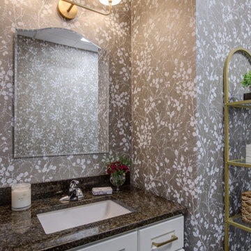
The first features floor-to-ceiling wallpaper in a rich taupe with a delicate white botanical branch pattern, creating an immersive, jewel-box feel. A white shaker vanity with dark granite countertop grounds the space, while an arched frameless mirror and brushed gold wall sconce add glamour. A tall gold and glass etagere serves as both decorative storage and a sculptural element, styled with woven baskets, greenery, and stacked accessories. Framed landscape watercolor art adds a serene, organic note, and a freestanding brass toilet paper holder elevates a typically overlooked detail.
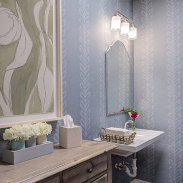
The second restroom takes an entirely different but equally compelling direction — soft, dusty blue-grey grasscloth-style wallpaper printed with a tone-on-tone chevron leaf stripe wraps every wall, creating a calm, spa-like atmosphere. A weathered wood console provides casual charm beneath a large-scale botanical tulip artwork in sage and cream. The wall-mount sink with exposed plumbing adds an intentional, editorial touch. An arched mirror with a sleek multi-bulb bar sconce in brushed nickel completes the look, while a pair of sculptural brass branch wall sculptures mounted directly to the wallpaper serve as unexpected, memorable art.
Storage Made Beautiful
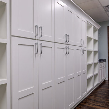
The internal storage corridor received a full wall of custom floor-to-ceiling white shaker cabinetry with chrome pulls, flanked by open shelving sections for accessible display and storage. Clean, crisp, and highly organized — this space proves that even a purely functional corridor can be architectural and refined.
The Break Room & Kitchenette
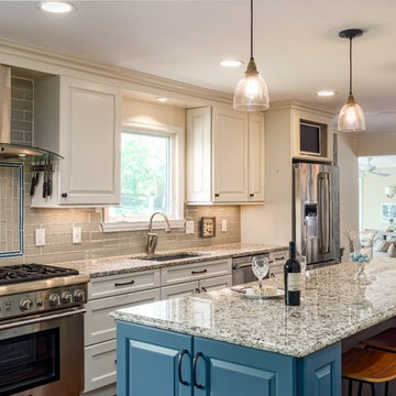
The staff break room was updated with white shaker cabinetry, light speckled granite countertops, stainless appliances — including a French door refrigerator, dishwasher, and over-counter microwave — and warm sage green walls that bring a restful, refreshing energy to the space. Dark hardwood luxury vinyl plank flooring runs throughout the room, warming the look considerably. A round walnut dining table with upholstered chairs creates a proper gathering space for the team, and framed landscape oil art in an ornate gold frame adds a touch of collected character to the room.
Reception & Corridor Details
The reception and corridor spaces were treated with deep navy blue paint — bold, sophisticated, and unexpected in a commercial setting. A large abstract landscape painting in warm blues, blush, and gold hangs in a gilded frame against the navy wall, making an immediate statement. A brass and lucite table lamp sits on a floating brass-trimmed shelf alongside a sculptural art object, creating a vignette that communicates creativity and intentionality from the moment clients arrive.
The result is a professional environment that communicates confidence, taste, and care — one that clients will remember long after their visit, and one that staff will genuinely enjoy working in every day.
 lavish
When a professional office space needs to make a lasting impression on clients and create an inspiring environment for staff, the design details matter just as much as they do at home. This thoughtful commercial interior refresh transformed a dated, purely functional office into a warm, sophisticated, and beautifully layered space — one that feels more like a high-end boutique or luxury residence than a typical workplace.
The guiding philosophy throughout was clear: every space, no matter how utilitarian its purpose, deserves intentional design. From the reception corridor to the staff break room, from the client restrooms to the storage corridor, each area received careful attention to finish, color, and texture.
Restrooms Reimagined
The two client-facing restrooms were the most dramatic transformations in the project. Rather than the builder-grade wallpaper and basic fixtures typically found in commercial spaces, both were treated as true design moments.
The first features floor-to-ceiling wallpaper in a rich taupe with a delicate white botanical branch pattern, creating an immersive, jewel-box feel. A white shaker vanity with dark granite countertop grounds the space, while an arched frameless mirror and brushed gold wall sconce add glamour. A tall gold and glass etagere serves as both decorative storage and a sculptural element, styled with woven baskets, greenery, and stacked accessories. Framed landscape watercolor art adds a serene, organic note, and a freestanding brass toilet paper holder elevates a typically overlooked detail.
The second restroom takes an entirely different but equally compelling direction — soft, dusty blue-grey grasscloth-style wallpaper printed with a tone-on-tone chevron leaf stripe wraps every wall, creating a calm, spa-like atmosphere. A weathered wood console provides casual charm beneath a large-scale botanical tulip artwork in sage and cream. The wall-mount sink with exposed plumbing adds an intentional, editorial touch. An arched mirror with a sleek multi-bulb bar sconce in brushed nickel completes the look, while a pair of sculptural brass branch wall sculptures mounted directly to the wallpaper serve as unexpected, memorable art.
Storage Made Beautiful
The internal storage corridor received a full wall of custom floor-to-ceiling white shaker cabinetry with chrome pulls, flanked by open shelving sections for accessible display and storage. Clean, crisp, and highly organized — this space proves that even a purely functional corridor can be architectural and refined.
The Break Room & Kitchenette
The staff break room was updated with white shaker cabinetry, light speckled granite countertops, stainless appliances — including a French door refrigerator, dishwasher, and over-counter microwave — and warm sage green walls that bring a restful, refreshing energy to the space. Dark hardwood luxury vinyl plank flooring runs throughout the room, warming the look considerably. A round walnut dining table with upholstered chairs creates a proper gathering space for the team, and framed landscape oil art in an ornate gold frame adds a touch of collected character to the room.
Reception & Corridor Details
The reception and corridor spaces were treated with deep navy blue paint — bold, sophisticated, and unexpected in a commercial setting. A large abstract landscape painting in warm blues, blush, and gold hangs in a gilded frame against the navy wall, making an immediate statement. A brass and lucite table lamp sits on a floating brass-trimmed shelf alongside a sculptural art object, creating a vignette that communicates creativity and intentionality from the moment clients arrive.
The result is a professional environment that communicates confidence, taste, and care — one that clients will remember long after their visit, and one that staff will genuinely enjoy working in every day.
 lavish
When a professional office space needs to make a lasting impression on clients and create an inspiring environment for staff, the design details matter just as much as they do at home. This thoughtful commercial interior refresh transformed a dated, purely functional office into a warm, sophisticated, and beautifully layered space — one that feels more like a high-end boutique or luxury residence than a typical workplace.
The guiding philosophy throughout was clear: every space, no matter how utilitarian its purpose, deserves intentional design. From the reception corridor to the staff break room, from the client restrooms to the storage corridor, each area received careful attention to finish, color, and texture.
Restrooms Reimagined
The two client-facing restrooms were the most dramatic transformations in the project. Rather than the builder-grade wallpaper and basic fixtures typically found in commercial spaces, both were treated as true design moments.
The first features floor-to-ceiling wallpaper in a rich taupe with a delicate white botanical branch pattern, creating an immersive, jewel-box feel. A white shaker vanity with dark granite countertop grounds the space, while an arched frameless mirror and brushed gold wall sconce add glamour. A tall gold and glass etagere serves as both decorative storage and a sculptural element, styled with woven baskets, greenery, and stacked accessories. Framed landscape watercolor art adds a serene, organic note, and a freestanding brass toilet paper holder elevates a typically overlooked detail.
The second restroom takes an entirely different but equally compelling direction — soft, dusty blue-grey grasscloth-style wallpaper printed with a tone-on-tone chevron leaf stripe wraps every wall, creating a calm, spa-like atmosphere. A weathered wood console provides casual charm beneath a large-scale botanical tulip artwork in sage and cream. The wall-mount sink with exposed plumbing adds an intentional, editorial touch. An arched mirror with a sleek multi-bulb bar sconce in brushed nickel completes the look, while a pair of sculptural brass branch wall sculptures mounted directly to the wallpaper serve as unexpected, memorable art.
Storage Made Beautiful
The internal storage corridor received a full wall of custom floor-to-ceiling white shaker cabinetry with chrome pulls, flanked by open shelving sections for accessible display and storage. Clean, crisp, and highly organized — this space proves that even a purely functional corridor can be architectural and refined.
The Break Room & Kitchenette
The staff break room was updated with white shaker cabinetry, light speckled granite countertops, stainless appliances — including a French door refrigerator, dishwasher, and over-counter microwave — and warm sage green walls that bring a restful, refreshing energy to the space. Dark hardwood luxury vinyl plank flooring runs throughout the room, warming the look considerably. A round walnut dining table with upholstered chairs creates a proper gathering space for the team, and framed landscape oil art in an ornate gold frame adds a touch of collected character to the room.
Reception & Corridor Details
The reception and corridor spaces were treated with deep navy blue paint — bold, sophisticated, and unexpected in a commercial setting. A large abstract landscape painting in warm blues, blush, and gold hangs in a gilded frame against the navy wall, making an immediate statement. A brass and lucite table lamp sits on a floating brass-trimmed shelf alongside a sculptural art object, creating a vignette that communicates creativity and intentionality from the moment clients arrive.
The result is a professional environment that communicates confidence, taste, and care — one that clients will remember long after their visit, and one that staff will genuinely enjoy working in every day.
Sponsored
Columbus, OH

Trish Takacs Design
Award Winning & Highly Skilled Kitchen & Bath Designer in Columbus
 lavish
When a professional office space needs to make a lasting impression on clients and create an inspiring environment for staff, the design details matter just as much as they do at home. This thoughtful commercial interior refresh transformed a dated, purely functional office into a warm, sophisticated, and beautifully layered space — one that feels more like a high-end boutique or luxury residence than a typical workplace.
The guiding philosophy throughout was clear: every space, no matter how utilitarian its purpose, deserves intentional design. From the reception corridor to the staff break room, from the client restrooms to the storage corridor, each area received careful attention to finish, color, and texture.
Restrooms Reimagined
The two client-facing restrooms were the most dramatic transformations in the project. Rather than the builder-grade wallpaper and basic fixtures typically found in commercial spaces, both were treated as true design moments.
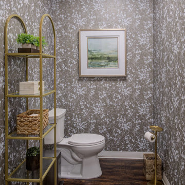
The first features floor-to-ceiling wallpaper in a rich taupe with a delicate white botanical branch pattern, creating an immersive, jewel-box feel. A white shaker vanity with dark granite countertop grounds the space, while an arched frameless mirror and brushed gold wall sconce add glamour. A tall gold and glass etagere serves as both decorative storage and a sculptural element, styled with woven baskets, greenery, and stacked accessories. Framed landscape watercolor art adds a serene, organic note, and a freestanding brass toilet paper holder elevates a typically overlooked detail.
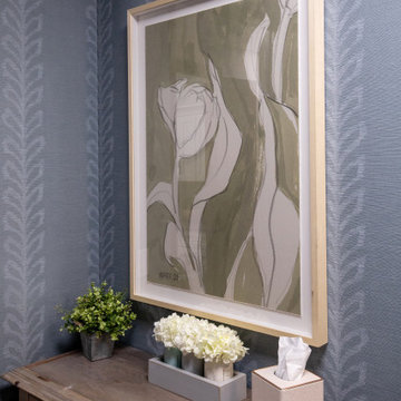
The second restroom takes an entirely different but equally compelling direction — soft, dusty blue-grey grasscloth-style wallpaper printed with a tone-on-tone chevron leaf stripe wraps every wall, creating a calm, spa-like atmosphere. A weathered wood console provides casual charm beneath a large-scale botanical tulip artwork in sage and cream. The wall-mount sink with exposed plumbing adds an intentional, editorial touch. An arched mirror with a sleek multi-bulb bar sconce in brushed nickel completes the look, while a pair of sculptural brass branch wall sculptures mounted directly to the wallpaper serve as unexpected, memorable art.
Storage Made Beautiful
The internal storage corridor received a full wall of custom floor-to-ceiling white shaker cabinetry with chrome pulls, flanked by open shelving sections for accessible display and storage. Clean, crisp, and highly organized — this space proves that even a purely functional corridor can be architectural and refined.
The Break Room & Kitchenette
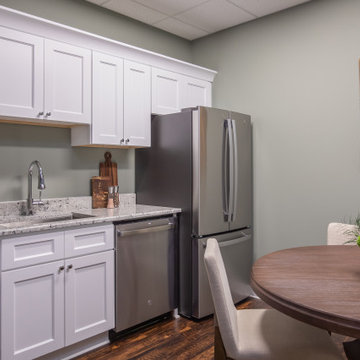
The staff break room was updated with white shaker cabinetry, light speckled granite countertops, stainless appliances — including a French door refrigerator, dishwasher, and over-counter microwave — and warm sage green walls that bring a restful, refreshing energy to the space. Dark hardwood luxury vinyl plank flooring runs throughout the room, warming the look considerably. A round walnut dining table with upholstered chairs creates a proper gathering space for the team, and framed landscape oil art in an ornate gold frame adds a touch of collected character to the room.
Reception & Corridor Details
The reception and corridor spaces were treated with deep navy blue paint — bold, sophisticated, and unexpected in a commercial setting. A large abstract landscape painting in warm blues, blush, and gold hangs in a gilded frame against the navy wall, making an immediate statement. A brass and lucite table lamp sits on a floating brass-trimmed shelf alongside a sculptural art object, creating a vignette that communicates creativity and intentionality from the moment clients arrive.
The result is a professional environment that communicates confidence, taste, and care — one that clients will remember long after their visit, and one that staff will genuinely enjoy working in every day.
 lavish
When a professional office space needs to make a lasting impression on clients and create an inspiring environment for staff, the design details matter just as much as they do at home. This thoughtful commercial interior refresh transformed a dated, purely functional office into a warm, sophisticated, and beautifully layered space — one that feels more like a high-end boutique or luxury residence than a typical workplace.
The guiding philosophy throughout was clear: every space, no matter how utilitarian its purpose, deserves intentional design. From the reception corridor to the staff break room, from the client restrooms to the storage corridor, each area received careful attention to finish, color, and texture.
Restrooms Reimagined
The two client-facing restrooms were the most dramatic transformations in the project. Rather than the builder-grade wallpaper and basic fixtures typically found in commercial spaces, both were treated as true design moments.
The first features floor-to-ceiling wallpaper in a rich taupe with a delicate white botanical branch pattern, creating an immersive, jewel-box feel. A white shaker vanity with dark granite countertop grounds the space, while an arched frameless mirror and brushed gold wall sconce add glamour. A tall gold and glass etagere serves as both decorative storage and a sculptural element, styled with woven baskets, greenery, and stacked accessories. Framed landscape watercolor art adds a serene, organic note, and a freestanding brass toilet paper holder elevates a typically overlooked detail.
The second restroom takes an entirely different but equally compelling direction — soft, dusty blue-grey grasscloth-style wallpaper printed with a tone-on-tone chevron leaf stripe wraps every wall, creating a calm, spa-like atmosphere. A weathered wood console provides casual charm beneath a large-scale botanical tulip artwork in sage and cream. The wall-mount sink with exposed plumbing adds an intentional, editorial touch. An arched mirror with a sleek multi-bulb bar sconce in brushed nickel completes the look, while a pair of sculptural brass branch wall sculptures mounted directly to the wallpaper serve as unexpected, memorable art.
Storage Made Beautiful
The internal storage corridor received a full wall of custom floor-to-ceiling white shaker cabinetry with chrome pulls, flanked by open shelving sections for accessible display and storage. Clean, crisp, and highly organized — this space proves that even a purely functional corridor can be architectural and refined.
The Break Room & Kitchenette
The staff break room was updated with white shaker cabinetry, light speckled granite countertops, stainless appliances — including a French door refrigerator, dishwasher, and over-counter microwave — and warm sage green walls that bring a restful, refreshing energy to the space. Dark hardwood luxury vinyl plank flooring runs throughout the room, warming the look considerably. A round walnut dining table with upholstered chairs creates a proper gathering space for the team, and framed landscape oil art in an ornate gold frame adds a touch of collected character to the room.
Reception & Corridor Details
The reception and corridor spaces were treated with deep navy blue paint — bold, sophisticated, and unexpected in a commercial setting. A large abstract landscape painting in warm blues, blush, and gold hangs in a gilded frame against the navy wall, making an immediate statement. A brass and lucite table lamp sits on a floating brass-trimmed shelf alongside a sculptural art object, creating a vignette that communicates creativity and intentionality from the moment clients arrive.
The result is a professional environment that communicates confidence, taste, and care — one that clients will remember long after their visit, and one that staff will genuinely enjoy working in every day.
 lavish
When a professional office space needs to make a lasting impression on clients and create an inspiring environment for staff, the design details matter just as much as they do at home. This thoughtful commercial interior refresh transformed a dated, purely functional office into a warm, sophisticated, and beautifully layered space — one that feels more like a high-end boutique or luxury residence than a typical workplace.
The guiding philosophy throughout was clear: every space, no matter how utilitarian its purpose, deserves intentional design. From the reception corridor to the staff break room, from the client restrooms to the storage corridor, each area received careful attention to finish, color, and texture.
Restrooms Reimagined
The two client-facing restrooms were the most dramatic transformations in the project. Rather than the builder-grade wallpaper and basic fixtures typically found in commercial spaces, both were treated as true design moments.
The first features floor-to-ceiling wallpaper in a rich taupe with a delicate white botanical branch pattern, creating an immersive, jewel-box feel. A white shaker vanity with dark granite countertop grounds the space, while an arched frameless mirror and brushed gold wall sconce add glamour. A tall gold and glass etagere serves as both decorative storage and a sculptural element, styled with woven baskets, greenery, and stacked accessories. Framed landscape watercolor art adds a serene, organic note, and a freestanding brass toilet paper holder elevates a typically overlooked detail.
The second restroom takes an entirely different but equally compelling direction — soft, dusty blue-grey grasscloth-style wallpaper printed with a tone-on-tone chevron leaf stripe wraps every wall, creating a calm, spa-like atmosphere. A weathered wood console provides casual charm beneath a large-scale botanical tulip artwork in sage and cream. The wall-mount sink with exposed plumbing adds an intentional, editorial touch. An arched mirror with a sleek multi-bulb bar sconce in brushed nickel completes the look, while a pair of sculptural brass branch wall sculptures mounted directly to the wallpaper serve as unexpected, memorable art.
Storage Made Beautiful
The internal storage corridor received a full wall of custom floor-to-ceiling white shaker cabinetry with chrome pulls, flanked by open shelving sections for accessible display and storage. Clean, crisp, and highly organized — this space proves that even a purely functional corridor can be architectural and refined.
The Break Room & Kitchenette
The staff break room was updated with white shaker cabinetry, light speckled granite countertops, stainless appliances — including a French door refrigerator, dishwasher, and over-counter microwave — and warm sage green walls that bring a restful, refreshing energy to the space. Dark hardwood luxury vinyl plank flooring runs throughout the room, warming the look considerably. A round walnut dining table with upholstered chairs creates a proper gathering space for the team, and framed landscape oil art in an ornate gold frame adds a touch of collected character to the room.
Reception & Corridor Details
The reception and corridor spaces were treated with deep navy blue paint — bold, sophisticated, and unexpected in a commercial setting. A large abstract landscape painting in warm blues, blush, and gold hangs in a gilded frame against the navy wall, making an immediate statement. A brass and lucite table lamp sits on a floating brass-trimmed shelf alongside a sculptural art object, creating a vignette that communicates creativity and intentionality from the moment clients arrive.
The result is a professional environment that communicates confidence, taste, and care — one that clients will remember long after their visit, and one that staff will genuinely enjoy working in every day.
60