
Search results for "Typical client" in Home Design Ideas

 Paredes-Grube Architecture
This unified split-level home maintains the original layout of a split-level while retaining the appearance of a 2-story colonial. The trend of straying away from the split-level appearance has become a popular one among clients in Bergen County and all of Northern New Jersey. Typically addition to homes like this one include a full new level which acts as the entire master suite. Gable dormers and architectural elements disguise the home and make them unrecognizable as a split-level to most, while retaining an unique aesthetic.
 John Rogers Design
It is always a pleasure to work with a classic architectural firm like Jack Arnold Homes Tulsa, OK. Jack is an exceptional architect and this was my first opportunity to light one of his projects.
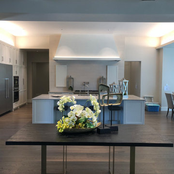
I was contracted by DES of Rogers, AR to create a lighting design plan for this contemporary residence in Tulsa, OK. The client requested I only create lighting design plans for the public areas of the house. That is typical when a client wants to reduce the lighting design fee expense.
The interior architecture has very clean lines and I did not want to clutter the ceiling with recessed cans. I wanted to use the ceilings as a light reflector. The kitchen upper cabinets did not go to the ceiling so I used the upper cabinets to house linear LEDs to reflect light off the ceiling. To balance that light I suggested the owner add a shelf extension to the breakfast room ceiling for installation of another linear LED. This balanced the LED up-lights in the kitchen and lit the room. This allowed me to add accent lighting to feature the architecture.
I did the same up-lighting technique in the living room with sleek contemporary wall sconces to light the ceiling wooden beams. The reflected ceiling light accents the wood beams and minimizes the need for recessed cans to light the room. The recessed lighting is used to accent art, furnishings and architectural features.
Credits:
Architect: Jack Arnold Homes Tulsa, OK
http://jackarnold.com
Builder: Glen Rogers / Rogers & Associates Inc.
http://glenrogershomes.com
Client : DES Rogers Ar. https://www.des3s.com/
 A+ Home Improvements, LLC
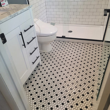
Talk about a huge change in appearance! The larger shower nearly doubled the enclosure size. The new space now has a clean, modern look, and we loved being a part of the transformation!
Sometimes a bathroom only provides a certain amount of space with no logical way of making the room larger. While you can typically make a space larger, this kind of project can be cost prohibitive. Our clients faced that challenge with their master bathroom. While coming up with a game plan, they decided that installing a larger shower would definitely help the cause.
Our client chose an awesome black and white penny tile for the floor that paired perfectly with the other fixture selections and subway tile. Matte black finishes provide a clean, sleek look to any bathroom. We completed the new master bathroom with a vanity, shower door and other fixtures.
Always feel free to think outside of the box when imagining your next project. Give A+ Home Improvements a call to get your project started today!! We look forward to working with you.
Find the right local pro for your project

 Kala Interior Design
The breathtaking ocean views influenced the dramatic redesign of this water-front Poipu condo. The outdated condo was completely remodeled to allow full appreciation of the surrounding views, bring in a fresh new color palette, and modernize and update everything from the electrical wiring to the new luxury bath towels. The clients wanted the condo to feel “fun, happy, and cheerful,” and to stand apart from the typical vacation rental on Kauai. They wanted to turn this condo into the ultimate “beach house” that felt just as luxurious as the gorgeous natural surroundings.
Fresh white ship-lap walls set the backdrop for this modern beach style, which is further enhanced with bold stripes, natural textures, and ocean-themed decor. The palette of cobalt, aqua and lichen green is fresh and vibrant against the neutral backdrop. Trina Turk’s “Peacock Print” was the inspiration fabric for the living and dining room. The print is so lively, colorful, and modern, and was the perfect place to start.
Every custom detail was thoughtfully chosen to bring a sense of luxury and originality to the space. While some elements are whimsical, such as the playful octopus art & fish-themed fabric, other elements are sophisticated and classic, to help keep the design grounded.
Special features include a custom-made “Moroccan Fish Scale” tile backsplash in the kitchen, crushed marble counter tops with oyster shells and float glass, and blue glass pendant lights, reminiscent of water bubbles.

 Advance Design Studio, Ltd.
Jennifer and Dan have lived in their Deer Park Illinois home for 15 years, slowly making minor fixes like painting and decorating; but they had a new plan for their kitchen the entire time. An awkwardly placed garage door, and an island cooktop with a terrible downdraft made a full-scale kitchen remodel an absolute must. Jennifer had many ideas in mind and wanted to work with a company that could provide high-end work, while partnering with a designer that would tailor the kitchen to her ideas.
She was intrigued by the phrase “Common Sense Remodeling” in Advance Design’s feature she discovered while perusing an issue of the community’s Quintessential Barrington Magazine. Doing further research on the company’s website, as she looked through project profiles and read about Advance Design’s “Common Sense Remodeling” philosophy, she promptly scheduled an appointment to see if the people and ideas she read about were truly who they said they were. The more she read, the more she knew that the “Common Sense” approach to remodeling they described was exactly the type of company she was looking for.
The partnership was sealed after an initial consultation with Owner Todd Jurs and Project Designer Michelle Lecinski. They displayed a combination of friendliness, professionalism and respect that was unmatched by any of the other companies Jennifer talked to. She knew that with Advance Design, she would be able to retain the vision that she had in mind with high-quality craftsmanship.
“I reached out to Advance Design because of the ‘Common Sense Remodeling’ tagline,” Jennifer said. “That’s what lingered for me”. “Advance Design was the most respectful- of the house and of my design ideas, and the most professional of the handful of companies that looked at my project”.
Soon after the meeting Jennifer began working with Michelle on the project design. They quickly developed chemistry. Jennifer loved how Michelle researched and located every detail that Jennifer wanted for the kitchen. Between the two of them, every concept and idea was worked through and perfected. “Jennifer had definite ideas about what she wanted the new kitchen to look like, she just didn’t know how to bring it all together. We worked together really well to make her ideas into the practical reality necessary for a well-functioning kitchen, with the look and feel that she had envisioned”, says Michelle.
“Michelle was wonderful in using the CAD system she would show me new drawings every time we changed the layout while working through the design,” Jennifer said. “She was a really wonderful partner in execution, she made sure everything happened quickly and easily.”
The finished design drew out elements of Jennifer’s style and personality. The pair call the look “sophisticated farmhouse” to describe the kitchen renovation to family and friends. The result was a beautifully crafted, authentic-feeling space that satisfied Jennifer’s dreams 15 years in the making. The whole project consisted of a kitchen remodel, mudroom upgrade with powder room, and garage entry relocation. “The projects I personally like the best, are the ones that put the client’s dreams on display,” Project Designer Michelle said. “And this is one of those projects.”
The main focal point of the kitchen is custom zinc and brass ventilation hood with a vintage sheen, which was hand made to order by a small company in Indiana named Vogler Metalworking. “It’s like sculpture, a true work of art”, says Jennifer. Your eye is immediately drawn towards this elegant yet practical hood that eliminated the home’s downdraft problem and added a striking conversation piece at the same time. The carpenters had to use special gloves when transporting and installing it, so they didn’t smudge it with fingerprints. The beautiful hood centers proudly over the stunning black enamel and brass LaCornue Range. “I had a friend who had a LaCornue range and after learning how easy it was to cook perfect meals, I was convinced I wanted to have one”, says Jennifer. This unique, breathtaking combination anchors the entire kitchen and is apparent immediately as you walk into the great room the surrounds the space.
DuraSupreme Crestwood cabinets with a Kendall Panel add function and sophistication. A custom gray paint color paired with a storm blue was developed so that the new kitchen looked like it belonged to the existing space. Unlacquered brass faucets and hardware were important to Jennifer because she wanted the living finishes to age over time. Remarkable brass diamond mesh cabinet door inserts imported from the UK continue to add this one-of-a-kind kitchen renovation; giving it a “you won’t see this everywhere” quality. The use of old railcar flooring for the coffee bar countertop and reclaimed oak for the open shelving gives an authenticity to the space uncommon in kitchens today.
Jennifer and Michelle fell in love with the Limestone Grey Stone while they were investigating unique island countertop ideas. They liked the fact that the limestone as a living finish will age and change over time. Calcutta Miel Quartz countertops made for an excellent pairing around the perimeter, as it’s durable and perfect for cooking preparations. A textured white subway tile backsplash that runs to the ceiling keeps your eye moving towards the open shelving, and to the main focal point of the stunning range hood combination.
“The kitchen functions beautifully, and it’s gorgeous,” beams Jennifer as she gestures with both hands while smiling ear to ear. “The most important thing was I wanted a kitchen that had a wonderful flow, cooked beautiful meals and was a great gathering place for family and friends, and this space does that perfectly! Beauty wise, it turned out exactly how I had envisioned. I felt the function part was the hardest part, and that was nailed”!
Relocating the garage entry to the new mudroom was a huge priority and has finally separated the family’s arriving home functions from their kitchen. Now coats and shoes and bags have their own area for dropping once members arrive home. Matching gray DuraSupreme cabinetry helped create gorgeous, purposeful lockers for the family. A reclaimed vintage sink and custom wall paper were added to the tiny powder room to beautify the once previously only functional space. Advance Design was even able to create a custom space for their dog to sleep while the family is away.
“It was unbelievable that a project of this size was completed in such a short time, and I think that’s because of the large amount of planning and preparation that went into it,” Jennifer marveled, “When we started, we were ready, and everything was prepared”.
When it came to execution, Project Manager Justin Davis and his crew were quick, accessible, and organized. Projects like this kitchen are typically completed in as little as 8-10 weeks. Jennifer’s kitchen however despite the relocation of some challenging HVAC in a soffit and moving of an exterior door was completed remarkably fast in part because the team was working with an existing tile floor that ran throughout the first floor that the client really loved.
“You get to know these people really well because they’re living in your house while you’re living in your house. They were so fast and really good, it didn’t take as long as even planned” reported Jennifer. “I would text Justin and he always responded almost immediately. I got to know all the guys who were working in our house and they were all wonderful people”.
Details in a customized kitchen like this one require skill and care from the people who install it. “All the guys on the job were skilled at what the did. I wanted small details like little feet to look like furniture, that is where their carpentry skill came in to make these all perfect”, said Jennifer. “The tile guys were wonderful. They even let me determine how I wanted the texture with the grout to appear for a salt and pepper look; now that is a very skilled trade person making it custom”.
In Jennifer’s interview, she continued to reference Advance Design’s “Common Sense Remodeling”, so I took a minute to ask her exactly what that phrase meant to her and how it played out in her experience with her project and the Advance Design team. Here is what she said: “I was intrigued about Common Sense Remodeling and in my head that there would be clear costs and prices, great communication between the design team, the execution team and me”, said Jennifer. They did deliver on that, it was so clear about the cost breakdown, what I could expect from everyone who came to my house, and everything that we had ordered. That to me is the Common Sense”!
It’s great to see a client take literally our assertion that a well-planned remodeling project is simply “Common Sense”! She anticipated each step of the way would be clear, concise, and predictable, all the while protecting the outcome due to the careful upfront planning. “Advance Design delivered on their ‘Common Sense Remodeling’ promise,” Jennifer said. “From the design team, to the execution team - everything was straight forward like I imagined. The project turned out exactly how I envisioned, I enjoyed this process and absolutely would recommend Advance Design Studio to anyone.”
 Paredes-Grube Architecture
This unified split-level home maintains the original layout of a split-level while retaining the appearance of a 2-story colonial. The trend of straying away from the split-level appearance has become a popular one among clients in Bergen County and all of Northern New Jersey. Typically addition to homes like this one include a full new level which acts as the entire master suite. Gable dormers and architectural elements disguise the home and make them unrecognizable as a split-level to most, while retaining an unique aesthetic.

 Cara Woodhouse Interiors LLC
© Robert Granoff Photography
Bedroom - contemporary bedroom idea in New York with white walls
Bedroom - contemporary bedroom idea in New York with white walls
Sponsored
Columbus, OH

Wannemacher Interiors
Customized Award-Winning Interior Design Solutions in Franklin Cnty OH

 Altura Architects
Photography by Keith Isaacs
Mid-sized 1950s l-shaped light wood floor and beige floor kitchen photo with an undermount sink, flat-panel cabinets, gray cabinets, stainless steel appliances, an island, gray countertops and white backsplash
Mid-sized 1950s l-shaped light wood floor and beige floor kitchen photo with an undermount sink, flat-panel cabinets, gray cabinets, stainless steel appliances, an island, gray countertops and white backsplash

 J.P. Hoffman Design Build
This project hits very close to home for us. Not your typical office space, we re-purposed a 19th century carriage barn into our office and workshop. With no heat, minimum electricity and few windows (most of which were broken), a priority for CEO and Designer Jason Hoffman was to create a space that honors its historic architecture, era and purpose but still offers elements of understated sophistication.
The building is nearly 140 years old, built before many of the trees towering around it had begun growing. It was originally built as a simple, Victorian carriage barn, used to store the family’s horse and buggy. Later, it housed 2,000 chickens when the Owners worked the property as their farm. Then, for many years, it was storage space. Today, it couples as a workshop for our carpentry team, building custom projects and storing equipment, as well as an office loft space ready to welcome clients, visitors and trade partners. We added a small addition onto the existing barn to offer a separate entry way for the office. New stairs and an entrance to the workshop provides for a small, yet inviting foyer space.
From the beginning, even is it’s dark state, Jason loved the ambiance of the old hay loft with its unfinished, darker toned timbers. He knew he wanted to find a way to refinish the space with a focus on those timbers, evident in the statement they make when walking up the stairs. On the exterior, the building received new siding, a new roof and even a new foundation which is a story for another post. Inside, we added skylights, larger windows and a French door, with a small balcony. Along with heat, electricity, WiFi and office furniture, we’re ready for visitors!

 Melissa Hill Home Design
We loved this project! The transformation was incredible. Our client came to us asking for a master bedroom that created a space for them to retreat to at the end of a very busy day. They moved into this beautiful estate overlooking a Connecticut vineyard that yearned for a design to compliment the architecture of the home, yet personalize the transitional taste of this young couple. We wanted to bring them elements that included clean lines with some updated tradition. Gray has been the new neutral in design lately but to set it aside from the typical use of this hue, a favorite by many today, we added a touch of gold for warmth and elegance. The client's desire for a place to read and relax allowed for a seating area where they can transition to a doorway that leads them out to a beautiful stone veranda. We are excited as they are able to enjoy the start of a beautiful home redesign with a space that starts and ends their day in understated luxury.
Custom designed by Hartley and Hill Design. All materials and furnishings in this space are available through Hartley and Hill Design. www.hartleyandhilldesign.com 888-639-0639

 The Foxy Garden
This is one colorful lawn replacement! It's hard not to stare as your drive by. We replaced artificial turf with a pollinator friendly, drought tolerant garden. The clients wanted the unusual and a garden they could make cut arrangements the year around with flowers and foliage. The mad foliage color brightens the house in what is typically a foggy neighborhood. There is also an Asian Pear shoe horned in that we plan to espalier on the front of the house. Also a lemon and lime although they are too small to see so far. And this is just a baby garden! It's been in for about 6 months in this picture so its got plenty of time to evolve its already explosive personality.

 Nashville Modern Cabinetry
This completely customized kitchen was built to perfection with the collaboration of our clients interior designer and contractor.
Typical 1/8" spacing between all doors, drawer fronts and built in appliances made for a clean, contemporary look. The 9-step custom textured finish process on the doors allowed us to match perfectly the sample supplied by the interior designer. And the walnut veneer island was a nice contrasting accent to the painted cabinets.
This highly customized kitchen also included special features like the Aventos door lift hardware and Hafele Magic Corner II blind corner pullout. Similarly we included a butlers pantry and bar as well as an upstairs bar. Special bathroom features included a mens bath vanity, women's bath vanity, guest bath vanity, powder room and upstairs bath.

 Redbud Design
This overgrown, rectangular yard in San Francisco is home to a young couple, their 3-year-old daughter, and twins that were on the way. Typical of many San Francisco yards, it is accessed from the back deck down a long set of stairs. The client wanted to be able to spend quality time in the yard with her two new babies and toddler. The design includes a play structure, a covered sand box, a small raised planter for playing in the dirt. Due to the limited space, several trellises were added to the side and back fence so that vines could add color surrounding the new play area.
Covering an existing concrete pad with cut Connecticut Bluestone enhanced the adult seating area and was surrounded by low maintenance colorful planting beds. A simple but beautiful walkway of stones set in lose pebbles connects these two use areas. Custom lattice was added onto the underside of the deck to hide the large utility area. The existing deck and stairs were repaired and refurbished to improve it’s look and longevity.
The clients were very happy with the end result which came in on time and budget just as the twin girls were born.
Sponsored
Columbus, OH

Snider & Metcalf Interior Design, LTD
Leading Interior Designers in Columbus, Ohio & Ponte Vedra, Florida
 J.P. Hoffman Design Build
This project hits very close to home for us. Not your typical office space, we re-purposed a 19th century carriage barn into our office and workshop. With no heat, minimum electricity and few windows (most of which were broken), a priority for CEO and Designer Jason Hoffman was to create a space that honors its historic architecture, era and purpose but still offers elements of understated sophistication.
The building is nearly 140 years old, built before many of the trees towering around it had begun growing. It was originally built as a simple, Victorian carriage barn, used to store the family’s horse and buggy. Later, it housed 2,000 chickens when the Owners worked the property as their farm. Then, for many years, it was storage space. Today, it couples as a workshop for our carpentry team, building custom projects and storing equipment, as well as an office loft space ready to welcome clients, visitors and trade partners. We added a small addition onto the existing barn to offer a separate entry way for the office. New stairs and an entrance to the workshop provides for a small, yet inviting foyer space.
From the beginning, even is it’s dark state, Jason loved the ambiance of the old hay loft with its unfinished, darker toned timbers. He knew he wanted to find a way to refinish the space with a focus on those timbers, evident in the statement they make when walking up the stairs. On the exterior, the building received new siding, a new roof and even a new foundation which is a story for another post. Inside, we added skylights, larger windows and a French door, with a small balcony. Along with heat, electricity, WiFi and office furniture, we’re ready for visitors!
 Heidi Reis / Abode Agency LLC
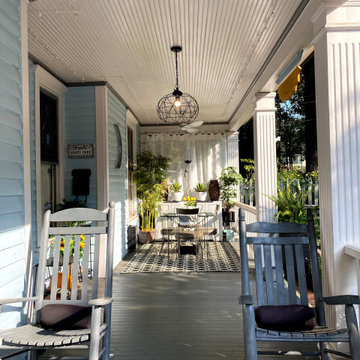
This porch, located in Grant Park, had been the same for many years with typical rocking chairs and a couch. The client wanted to make it feel more like an outdoor room and add much needed storage for gardening tools, an outdoor dining option, and a better flow for seating and conversation.
My thought was to add plants to provide a more cozy feel, along with the rugs, which are made from recycled plastic and easy to clean. To add curtains on the north and south sides of the porch; this reduces rain entry, wind exposure, and adds privacy.
This renovation was designed by Heidi Reis of Abode Agency LLC who serves clients in Atlanta including but not limited to Intown neighborhoods such as: Grant Park, Inman Park, Midtown, Kirkwood, Candler Park, Lindberg area, Martin Manor, Brookhaven, Buckhead, Decatur, and Avondale Estates.
For more information on working with Heidi Reis, click here: https://www.AbodeAgency.Net/

 Studio Dearborn
A young colonial in the heart of Rye New York had everything going for it, except a dark and poorly laid out kitchen. The clients tapped Sarah Robertson of Studio Dearborn to help them layout a new kitchen in their challenging, dog leg shaped room. A small breakfast peninsula and working island helped pull together the oddly shaped kitchen into a streamlined, light filled space with all the storage amenities typical of a Studio Dearborn kitchen. The bar area, with undercounter refrigeration for wine and beverages, also features a locking cabinet for liquor and open wine storage. Desk area has file drawer and Docking Drawer charging drawer. Countertops: White Macauba, Rye Marble and Stone, Rye NY. Hardware: Studio Pulls from Hickory Hardware. Sinks: Kraus. Lighting: Currey & Co. Faucet: Kohler Artifacts Backsplash tile: Casablanca Tile and Stone, Harrison NY. Photography: Adam Kane Macchia
 Redbud Design
This overgrown, rectangular yard in San Francisco is home to a young couple, their 3-year-old daughter, and twins that were on the way. Typical of many San Francisco yards, it is accessed from the back deck down a long set of stairs. The client wanted to be able to spend quality time in the yard with her two new babies and toddler. The design includes a play structure, a covered sand box, a small raised planter for playing in the dirt. Due to the limited space, several trellises were added to the side and back fence so that vines could add color surrounding the new play area.
Covering an existing concrete pad with cut Connecticut Bluestone enhanced the adult seating area and was surrounded by low maintenance colorful planting beds. A simple but beautiful walkway of stones set in lose pebbles connects these two use areas. Custom lattice was added onto the underside of the deck to hide the large utility area. The existing deck and stairs were repaired and refurbished to improve it’s look and longevity.
The clients were very happy with the end result which came in on time and budget just as the twin girls were born.
Sponsored
Columbus, OH
Snider & Metcalf Interior Design, LTD
Leading Interior Designers in Columbus, Ohio & Ponte Vedra, Florida

 GAVIN GREEN HOME DESIGN LLC
modern industrial outdoor seating with exposed wooden beams, custom faux gloss silver ceiling tiles, custom-made rustic wooden table & chairs, large-scale windows, bronze stair railing, and industrial LED light
 Joni Spear Interior Design
When clients in Williamsburg, Va. Purchased a brick ranch, built in the late 80’s They knew they were in for a total gut rehab. The kitchen had been updated but consisted of reddish stained oak cabinets, Corian counters, and soffits galore. The room was separated by a peninsula with a cook top, creating a U-shaped configuration. It was not only dated but separated the room from the breakfast area. One wall consisted of wall ovens, a pantry, and a built-in desk space. Although, we were constrained to a tight budget, they specifically requested the house not have a traditional colonial vibe, common to the locality. Once we convinced the husband that it was paramount to remove walls, we were able to reimagine the space. The wall ovens were replaced with a single range, the refrigerator was placed on the same wall as the sink and the soffits were removed. With a tight budget, custom cabinets were not an option. Instead, they purchased stock cabinets that were painted a cool gray and the new island is stained in a natural finish .
Typically, I don’t recycle products amongst clients, but these pendants have proven otherwise. After installing them in my own kitchen, I’ve had 3 other client requests for the same pair. Obviously, they don’t disappoint as they are the crown jewels of the kitchen.
 Tile Doctor Ltd
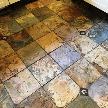
I recently visited a client living in the market town of Woodstock in Oxfordshire to rejuvenate a fantastic multi-coloured Slate floor that had been hidden under several years’ worth of dirt in their kitchen. Slate is a typically hard-wearing tile used for flooring high traffic areas of houses and public buildings but does need sealing to bring out its best features and in this case the sealer had long since worn off and dirt had become ingrained in the stone.
My first task in the cleaning process was to mix a strong solution of Tile Doctor Pro-Clean, which is a strong alkaline cleaner safe to use on Tile and Stone, and NanoTech HBU (Heavy Build-up Remover), which is a particularly powerful product that uses nano-sized particles to tackle muck in areas of the stone where typical cleaners simply can’t reach. I spread this solution across the floor and left it to seep into the stone, to get underneath and lift out the ingrained dirt.
After allowing the solution adequate time to dwell, I scrubbed the floor with a carbon brush to gradually reveal the fantastic natural colours of the Slate hidden beneath. Following this, I rinsed the entire floor several times with clean water, before soaking up the resulting soiled residue with a wet vacuum.
The next part of the cleaning process entailed paying particular attention to the grout lines. I used Tile Doctor Grout Clean-Up to scrub the grout lines and also to treat a small amount of efflorescence. The resulting residue was promptly extracted with the wet vacuum and I finished by giving the whole floor a rinse with Tile Doctor pH Neutral Tile Cleaner. This is a day to day tile cleaning product which is recommended for stone floors, many supermarket tile cleaning products are only suitable for ceramic tiles due to their acidic formula and can damage a floor over years of use so you should always read the label. I then left the floor to dry completely overnight.
On day two, the Slate tiled floor was dry and ready to seal. The floor had to be completely dry, as any excess moisture has the potential to the damage the performance of the sealer. Since my client had specifically requested a matte finish, I opted to use Tile Doctor Colour Grow. Colour Grow is an impregnating sealer that provides durable surface protection from within while also enhancing all of the natural mineral shades.
My client was very pleased with the results, particularly as they hadn’t realised they had such a great looking floor in their house when they had first purchased it!
Barry Woodward
Oxfordshire Tile Doctor
63