
Search results for "Typically highly" in Home Design Ideas
 lavish
When a professional office space needs to make a lasting impression on clients and create an inspiring environment for staff, the design details matter just as much as they do at home. This thoughtful commercial interior refresh transformed a dated, purely functional office into a warm, sophisticated, and beautifully layered space — one that feels more like a high-end boutique or luxury residence than a typical workplace.
The guiding philosophy throughout was clear: every space, no matter how utilitarian its purpose, deserves intentional design. From the reception corridor to the staff break room, from the client restrooms to the storage corridor, each area received careful attention to finish, color, and texture.
Restrooms Reimagined
The two client-facing restrooms were the most dramatic transformations in the project. Rather than the builder-grade wallpaper and basic fixtures typically found in commercial spaces, both were treated as true design moments.
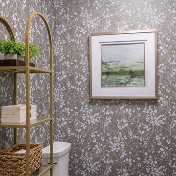
The first features floor-to-ceiling wallpaper in a rich taupe with a delicate white botanical branch pattern, creating an immersive, jewel-box feel. A white shaker vanity with dark granite countertop grounds the space, while an arched frameless mirror and brushed gold wall sconce add glamour. A tall gold and glass etagere serves as both decorative storage and a sculptural element, styled with woven baskets, greenery, and stacked accessories. Framed landscape watercolor art adds a serene, organic note, and a freestanding brass toilet paper holder elevates a typically overlooked detail.
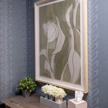
The second restroom takes an entirely different but equally compelling direction — soft, dusty blue-grey grasscloth-style wallpaper printed with a tone-on-tone chevron leaf stripe wraps every wall, creating a calm, spa-like atmosphere. A weathered wood console provides casual charm beneath a large-scale botanical tulip artwork in sage and cream. The wall-mount sink with exposed plumbing adds an intentional, editorial touch. An arched mirror with a sleek multi-bulb bar sconce in brushed nickel completes the look, while a pair of sculptural brass branch wall sculptures mounted directly to the wallpaper serve as unexpected, memorable art.
Storage Made Beautiful
The internal storage corridor received a full wall of custom floor-to-ceiling white shaker cabinetry with chrome pulls, flanked by open shelving sections for accessible display and storage. Clean, crisp, and highly organized — this space proves that even a purely functional corridor can be architectural and refined.
The Break Room & Kitchenette
The staff break room was updated with white shaker cabinetry, light speckled granite countertops, stainless appliances — including a French door refrigerator, dishwasher, and over-counter microwave — and warm sage green walls that bring a restful, refreshing energy to the space. Dark hardwood luxury vinyl plank flooring runs throughout the room, warming the look considerably. A round walnut dining table with upholstered chairs creates a proper gathering space for the team, and framed landscape oil art in an ornate gold frame adds a touch of collected character to the room.
Reception & Corridor Details
The reception and corridor spaces were treated with deep navy blue paint — bold, sophisticated, and unexpected in a commercial setting. A large abstract landscape painting in warm blues, blush, and gold hangs in a gilded frame against the navy wall, making an immediate statement. A brass and lucite table lamp sits on a floating brass-trimmed shelf alongside a sculptural art object, creating a vignette that communicates creativity and intentionality from the moment clients arrive.
The result is a professional environment that communicates confidence, taste, and care — one that clients will remember long after their visit, and one that staff will genuinely enjoy working in every day.

 lavish
When a professional office space needs to make a lasting impression on clients and create an inspiring environment for staff, the design details matter just as much as they do at home. This thoughtful commercial interior refresh transformed a dated, purely functional office into a warm, sophisticated, and beautifully layered space — one that feels more like a high-end boutique or luxury residence than a typical workplace.
The guiding philosophy throughout was clear: every space, no matter how utilitarian its purpose, deserves intentional design. From the reception corridor to the staff break room, from the client restrooms to the storage corridor, each area received careful attention to finish, color, and texture.
Restrooms Reimagined
The two client-facing restrooms were the most dramatic transformations in the project. Rather than the builder-grade wallpaper and basic fixtures typically found in commercial spaces, both were treated as true design moments.
The first features floor-to-ceiling wallpaper in a rich taupe with a delicate white botanical branch pattern, creating an immersive, jewel-box feel. A white shaker vanity with dark granite countertop grounds the space, while an arched frameless mirror and brushed gold wall sconce add glamour. A tall gold and glass etagere serves as both decorative storage and a sculptural element, styled with woven baskets, greenery, and stacked accessories. Framed landscape watercolor art adds a serene, organic note, and a freestanding brass toilet paper holder elevates a typically overlooked detail.
The second restroom takes an entirely different but equally compelling direction — soft, dusty blue-grey grasscloth-style wallpaper printed with a tone-on-tone chevron leaf stripe wraps every wall, creating a calm, spa-like atmosphere. A weathered wood console provides casual charm beneath a large-scale botanical tulip artwork in sage and cream. The wall-mount sink with exposed plumbing adds an intentional, editorial touch. An arched mirror with a sleek multi-bulb bar sconce in brushed nickel completes the look, while a pair of sculptural brass branch wall sculptures mounted directly to the wallpaper serve as unexpected, memorable art.
Storage Made Beautiful
The internal storage corridor received a full wall of custom floor-to-ceiling white shaker cabinetry with chrome pulls, flanked by open shelving sections for accessible display and storage. Clean, crisp, and highly organized — this space proves that even a purely functional corridor can be architectural and refined.
The Break Room & Kitchenette
The staff break room was updated with white shaker cabinetry, light speckled granite countertops, stainless appliances — including a French door refrigerator, dishwasher, and over-counter microwave — and warm sage green walls that bring a restful, refreshing energy to the space. Dark hardwood luxury vinyl plank flooring runs throughout the room, warming the look considerably. A round walnut dining table with upholstered chairs creates a proper gathering space for the team, and framed landscape oil art in an ornate gold frame adds a touch of collected character to the room.
Reception & Corridor Details
The reception and corridor spaces were treated with deep navy blue paint — bold, sophisticated, and unexpected in a commercial setting. A large abstract landscape painting in warm blues, blush, and gold hangs in a gilded frame against the navy wall, making an immediate statement. A brass and lucite table lamp sits on a floating brass-trimmed shelf alongside a sculptural art object, creating a vignette that communicates creativity and intentionality from the moment clients arrive.
The result is a professional environment that communicates confidence, taste, and care — one that clients will remember long after their visit, and one that staff will genuinely enjoy working in every day.
Find the right local pro for your project
 Pineapple House Interior Design
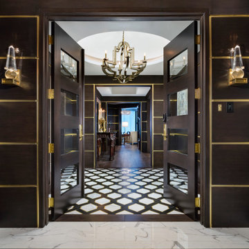
-Renovation of waterfront high-rise residence
-To contrast with sunny environment and light pallet typical of beach homes, we darken and create drama in the elevator lobby, foyer and gallery
-For visual unity, the three contiguous passageways employ coffee-stained wood walls accented with horizontal brass bands, but they're differentiated using unique floors and ceilings
-We design and fabricate glass paneled, double entry doors in unit’s innermost area, the elevator lobby, making doors fire-rated to satisfy necessary codes
-Doors eight glass panels allow natural light to filter from outdoors into core of the building
 A Top En-counter
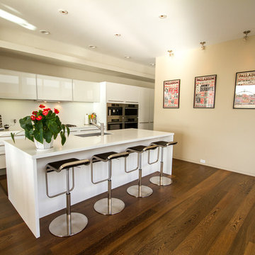
A Top En-counter fabricated and installed Dupont Corian in this gorgeous custom home in Naples, CA designed by Architect Jim Choate. Photo's taken by Twinfolkcreative.com. Geary Smith - Coldwell Banker Beachside listed and sold this home for 5.3 million
 lavish
When a professional office space needs to make a lasting impression on clients and create an inspiring environment for staff, the design details matter just as much as they do at home. This thoughtful commercial interior refresh transformed a dated, purely functional office into a warm, sophisticated, and beautifully layered space — one that feels more like a high-end boutique or luxury residence than a typical workplace.
The guiding philosophy throughout was clear: every space, no matter how utilitarian its purpose, deserves intentional design. From the reception corridor to the staff break room, from the client restrooms to the storage corridor, each area received careful attention to finish, color, and texture.
Restrooms Reimagined
The two client-facing restrooms were the most dramatic transformations in the project. Rather than the builder-grade wallpaper and basic fixtures typically found in commercial spaces, both were treated as true design moments.
The first features floor-to-ceiling wallpaper in a rich taupe with a delicate white botanical branch pattern, creating an immersive, jewel-box feel. A white shaker vanity with dark granite countertop grounds the space, while an arched frameless mirror and brushed gold wall sconce add glamour. A tall gold and glass etagere serves as both decorative storage and a sculptural element, styled with woven baskets, greenery, and stacked accessories. Framed landscape watercolor art adds a serene, organic note, and a freestanding brass toilet paper holder elevates a typically overlooked detail.
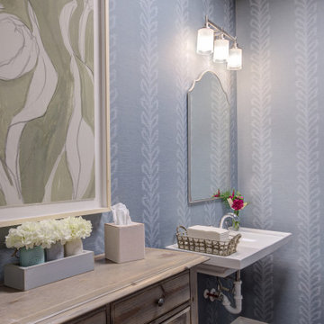
The second restroom takes an entirely different but equally compelling direction — soft, dusty blue-grey grasscloth-style wallpaper printed with a tone-on-tone chevron leaf stripe wraps every wall, creating a calm, spa-like atmosphere. A weathered wood console provides casual charm beneath a large-scale botanical tulip artwork in sage and cream. The wall-mount sink with exposed plumbing adds an intentional, editorial touch. An arched mirror with a sleek multi-bulb bar sconce in brushed nickel completes the look, while a pair of sculptural brass branch wall sculptures mounted directly to the wallpaper serve as unexpected, memorable art.
Storage Made Beautiful
The internal storage corridor received a full wall of custom floor-to-ceiling white shaker cabinetry with chrome pulls, flanked by open shelving sections for accessible display and storage. Clean, crisp, and highly organized — this space proves that even a purely functional corridor can be architectural and refined.
The Break Room & Kitchenette
The staff break room was updated with white shaker cabinetry, light speckled granite countertops, stainless appliances — including a French door refrigerator, dishwasher, and over-counter microwave — and warm sage green walls that bring a restful, refreshing energy to the space. Dark hardwood luxury vinyl plank flooring runs throughout the room, warming the look considerably. A round walnut dining table with upholstered chairs creates a proper gathering space for the team, and framed landscape oil art in an ornate gold frame adds a touch of collected character to the room.
Reception & Corridor Details
The reception and corridor spaces were treated with deep navy blue paint — bold, sophisticated, and unexpected in a commercial setting. A large abstract landscape painting in warm blues, blush, and gold hangs in a gilded frame against the navy wall, making an immediate statement. A brass and lucite table lamp sits on a floating brass-trimmed shelf alongside a sculptural art object, creating a vignette that communicates creativity and intentionality from the moment clients arrive.
The result is a professional environment that communicates confidence, taste, and care — one that clients will remember long after their visit, and one that staff will genuinely enjoy working in every day.


Sponsored
Columbus, OH

Structural Remodeling
Franklin County's Heavy Timber Specialists | Best of Houzz 2020!

 Dynamic Garage Door
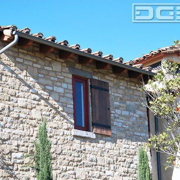
Dynamic Garage Door specializes in Tuscan Architectural beautification in the Newport Beach, CA through our custom designed and hand made architectural shutters, garden gates and garage doors. This Newport-Mesa Tuscan home was exquisitely decorated with a combination of custom gates, decorative shutters and balcony barn door style shutters all handcrafted out of authentic, century-old reclaimed barn wood specifically harvested for this custom project.
Beginning with the balcony shutters which actually slide from side to side like a real barn door we worked a charming rustic shutter design that would typically be seen in the Tuscan Riviera. We opted for sliding shutters as the balcony spacing limited the swing action of even bi-folding shutters. Incorporating real barn door hardware railing and crowing it behind the faux reclaimed wood beam made an excellent statement while adding functional shutters that can be shut close for comfort during the summer morning when the sun beats down into the master suite. The four shutter leafs are decorated with real hand forged dummy straps that were hammered and crafted by hand to achieve that gorgeous rustic charm typical of Tuscan architecture. The reclaimed barn wood from a century-old barn gives off a timeless appearance that increase in characters as the years go by. Because rustic barn wood has already aged beautifully over hundreds of years, the next century will only increase its authentically gorgeous appearance. The culmination of this project has been a meticulous collaborative input of our in-house head designer and the clients themselves. Although the completion of this project is lengthy and intricate, the results speak volumes and the wait simply justifies the outcome.
The rest of thew windows on this Tuscan home have been accessorized with rustic barn wood as well and accentuated with our custom designed and handmade dummy iron hinge straps. Our dummy hardware is so authentically done in the same tradition used for hundreds of years in Europe to create shutter hardware that looks authentic and functional although it is only decorative. The details of our custom shutters is evident in the slightest of details including the bolts used to hold the shutter straps in place. Each of the shutter also has a decorative ring pull with a hand-hammered back plate which enhances the appearance of true functional shutters and defining that authentic Tuscan look.
The beauty of this Tuscan home is visible throughout the entire property including the garden gates, garage doors and entry door. Again, for the garden gates, we went with rustic barn wood carefully crafted to preserve the original surface that has aged over hundreds of years but building the gates on galvanized steel frames that will ensure structural durability for the next few hundred years. The gates are highly secure, sound and can definitely hold back a crowd with authentic rustic charm. Don't be fooled with the simple-looking gate design. It is quite intricate with its 45 degree angle cuts around the perimeter of the trim which deviates water away from crevices that would otherwise make the gates vulnerable to the accumulation of moisture from the elements, sprinkler system or simply air humidity since the home is located near the ocean. Each one of the garden gates is equipped with European style mortise lock mechanisms and roller catches. Dynamic Garage Door gates are not your typical garden gates, they are truly made with quality and durability in mind as well as aesthetic attention to detail. Everything, from the hardware used, the core steel frame and overlay material used is hand selected and approved individually for maximum beauty and timeless appreciation.
At Dynamic Garage Door, we specialize in multiple facet projects that include garden gates, driveway gates as well as barn doors and shutters. It is very important because these are the accessories that can make or break the beauty and continuity of your home's architectural style and authenticity.
Increase your curb appeal and home value with Dynamic Garage Door's gates, shutters and automatic custom garage doors. Our in-house designers would love to speak with you today!
Design Consultation Center: (855) 343-3667
 41 West
Here's what our clients from this project had to say:
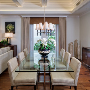
We LOVE coming home to our newly remodeled and beautiful 41 West designed and built home! It was such a pleasure working with BJ Barone and especially Paul Widhalm and the entire 41 West team. Everyone in the organization is incredibly professional and extremely responsive. Personal service and strong attention to the client and details are hallmarks of the 41 West construction experience. Paul was with us every step of the way as was Ed Jordon (Gary David Designs), a 41 West highly recommended designer. When we were looking to build our dream home, we needed a builder who listened and understood how to bring our ideas and dreams to life. They succeeded this with the utmost honesty, integrity and quality!
41 West has exceeded our expectations every step of the way, and we have been overwhelmingly impressed in all aspects of the project. It has been an absolute pleasure working with such devoted, conscientious, professionals with expertise in their specific fields. Paul sets the tone for excellence and this level of dedication carries through the project. We so appreciated their commitment to perfection...So much so that we also hired them for two more remodeling projects.
We love our home and would highly recommend 41 West to anyone considering building or remodeling a home.
 Smith & Ragsdale Interior Design
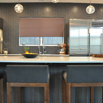
While this new home had an architecturally striking exterior, the home’s interior fell short in terms of true functionality and overall style. The most critical element in this renovation was the kitchen and dining area, which needed careful attention to bring it to the level that suited the home and the homeowners.
As a graduate of Culinary Institute of America, our client wanted a kitchen that “feels like a restaurant, with the warmth of a home kitchen,” where guests can gather over great food, great wine, and truly feel comfortable in the open concept home. Although it follows a typical chef’s galley layout, the unique design solutions and unusual materials set it apart from the typical kitchen design.
Polished countertops, laminated and stainless cabinets fronts, and professional appliances are complemented by the introduction of wood, glass, and blackened metal – materials introduced in the overall design of the house. Unique features include a wall clad in walnut for dangling heavy pots and utensils; a floating, sculptural walnut countertop piece housing an herb garden; an open pantry that serves as a coffee bar and wine station; and a hanging chalkboard that hides a water heater closet and features different coffee offerings available to guests.
The dining area addition, enclosed by windows, continues to vivify the organic elements and brings in ample natural light, enhancing the darker finishes and creating additional warmth.
Photography by Ira Montgomery
 Cape Associates, Inc.
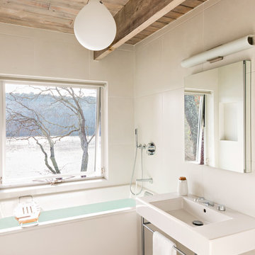
Overthinking a situation isn’t always a bad thing, particularly when the home in question is one in which the past is suddenly meeting the present. Originally designed by Finnish architect Olav Hammarstrom in 1952 for fellow architect Eero Saarinen, this unique home recently received its first transformation in decades. Still in its 1950s skin, it was completely gutted, inside and out. It was a serious undertaking, as the homeowner wanted modern upgrades, while keeping an eye toward retaining the home’s 1950s charm. She had a vision for her home, and she stuck to it from beginning to end.
Perched on a rise of land and overlooking the tranquil Wellfleet Herring Pond, the home initially appears split, with the guest house on the left, and the main house of the right, but both ends are connected with a breezeway. The original home’s bones were in good shape, but many upgrades and replacements were necessary to bring the house up to date.
New siding, roofing, gutters, insulation and mechanical systems were all replaced. Doors and windows with metal frames were custom made by a company in Long Island that fabricates doors for office buildings. Modern heating and cooling systems were added, and the three bathrooms were all updated. The footprint of the home remained unchanged. Inside, the only expansion was more closet space.
The attention to detail in retaining the 50s-style look took a lot of online searching, from handles and knobs to lighting fixtures, with bits and pieces arriving from all over the world, including a doorstop from New Zealand. The homeowner selected many of the fixtures herself, while a very detail-oriented foreman exhaustively researched as well, looking for just the right piece for each and every location.
High-end appliances were purchased to modernize the kitchen and all of the old cabinetry was removed, replaced and refaced with NUVACOR, a versatile surfacing material that not only provided a sleek, modern look, but added convenience and ease of use.
Bare, wood-beamed ceilings throughout give a nod to the home’s natural surroundings, while the main living area (formerly a fisherman’s cabin), with a brick fireplace, was completely trimmed in walnut, while multiple windows of varying sizes welcome sunlight to brighten the home. Here, the sheetrock ceiling with faux rafters provides an interesting and room-brightening feature.
Behind the house sits the serene pond, which can now be enjoyed from the stunning new deck. Here, decking material was not laid out side by side, as it typically is but, instead, meticulously laid out on edge, creating an unusual and eye-catching effect. A railing of tempered glass panels allows unobstructed views of the surrounding natural beauty, and keeps consistent with the open, airy feel of the place. A new outdoor shower is accessible via the deck and left open to the wilderness and the pond below, completing the bold yet sophisticated feeling of this retro-modern home.
 LeichtUSA
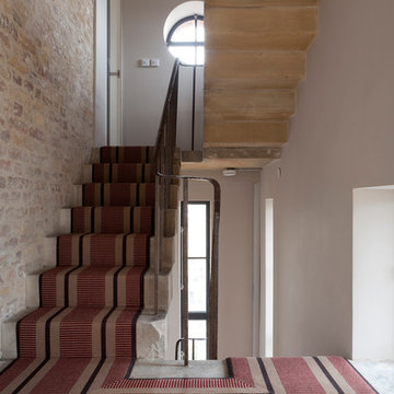
Attractive living as an architectural experiment: a 136-year-old water tower, a listed building with a spectacular 360-degree panorama view over the City of London. The task, to transform it into a superior residence, initially seemed an absolute impossibility. But when the owners came across architect Mike Collier, they had found a partner who was to make the impossible possible. The tower, which had been empty for decades, underwent radical renovation work and was extended by a four-storey cube containing kitchen, dining and living room - connected by glazed tunnels and a lift shaft. The kitchen, realised by Enclosure Interiors in Tunbridge Wells, Kent, with furniture from LEICHT is the very heart of living in this new building.
Shiny white matt-lacquered kitchen fronts (AVANCE-LR), tone-on-tone with the worktops, reflect the light in the room and thus create expanse and openness. The surface of the handle-less kitchen fronts has a horizontal relief embossing; depending on the light incidence, this results in a vitally structured surface. The free-standing preparation isle with its vertical side panels with a seamlessly integrated sink represents the transition between kitchen and living room. The fronts of the floor units facing the dining table were extended to the floor to do away with the plinth typical of most kitchens. Ceiling-high tall units on the wall provide plenty of storage space; the electrical appliances are integrated here invisible to the eye. Floor units on a high plinth which thus appear to be floating form the actual cooking centre within the kitchen, attached to the wall. A range of handle-less wall units concludes the glazed niche at the top.
LEICHT international: “Architecture and kitchen” in the centre of London. www.LeichtUSA.com


 Advance Design Studio, Ltd.
Jennifer and Dan have lived in their Deer Park Illinois home for 15 years, slowly making minor fixes like painting and decorating; but they had a new plan for their kitchen the entire time. An awkwardly placed garage door, and an island cooktop with a terrible downdraft made a full-scale kitchen remodel an absolute must. Jennifer had many ideas in mind and wanted to work with a company that could provide high-end work, while partnering with a designer that would tailor the kitchen to her ideas.
She was intrigued by the phrase “Common Sense Remodeling” in Advance Design’s feature she discovered while perusing an issue of the community’s Quintessential Barrington Magazine. Doing further research on the company’s website, as she looked through project profiles and read about Advance Design’s “Common Sense Remodeling” philosophy, she promptly scheduled an appointment to see if the people and ideas she read about were truly who they said they were. The more she read, the more she knew that the “Common Sense” approach to remodeling they described was exactly the type of company she was looking for.
The partnership was sealed after an initial consultation with Owner Todd Jurs and Project Designer Michelle Lecinski. They displayed a combination of friendliness, professionalism and respect that was unmatched by any of the other companies Jennifer talked to. She knew that with Advance Design, she would be able to retain the vision that she had in mind with high-quality craftsmanship.
“I reached out to Advance Design because of the ‘Common Sense Remodeling’ tagline,” Jennifer said. “That’s what lingered for me”. “Advance Design was the most respectful- of the house and of my design ideas, and the most professional of the handful of companies that looked at my project”.
Soon after the meeting Jennifer began working with Michelle on the project design. They quickly developed chemistry. Jennifer loved how Michelle researched and located every detail that Jennifer wanted for the kitchen. Between the two of them, every concept and idea was worked through and perfected. “Jennifer had definite ideas about what she wanted the new kitchen to look like, she just didn’t know how to bring it all together. We worked together really well to make her ideas into the practical reality necessary for a well-functioning kitchen, with the look and feel that she had envisioned”, says Michelle.
“Michelle was wonderful in using the CAD system she would show me new drawings every time we changed the layout while working through the design,” Jennifer said. “She was a really wonderful partner in execution, she made sure everything happened quickly and easily.”
The finished design drew out elements of Jennifer’s style and personality. The pair call the look “sophisticated farmhouse” to describe the kitchen renovation to family and friends. The result was a beautifully crafted, authentic-feeling space that satisfied Jennifer’s dreams 15 years in the making. The whole project consisted of a kitchen remodel, mudroom upgrade with powder room, and garage entry relocation. “The projects I personally like the best, are the ones that put the client’s dreams on display,” Project Designer Michelle said. “And this is one of those projects.”
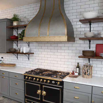
The main focal point of the kitchen is custom zinc and brass ventilation hood with a vintage sheen, which was hand made to order by a small company in Indiana named Vogler Metalworking. “It’s like sculpture, a true work of art”, says Jennifer. Your eye is immediately drawn towards this elegant yet practical hood that eliminated the home’s downdraft problem and added a striking conversation piece at the same time. The carpenters had to use special gloves when transporting and installing it, so they didn’t smudge it with fingerprints. The beautiful hood centers proudly over the stunning black enamel and brass LaCornue Range. “I had a friend who had a LaCornue range and after learning how easy it was to cook perfect meals, I was convinced I wanted to have one”, says Jennifer. This unique, breathtaking combination anchors the entire kitchen and is apparent immediately as you walk into the great room the surrounds the space.
DuraSupreme Crestwood cabinets with a Kendall Panel add function and sophistication. A custom gray paint color paired with a storm blue was developed so that the new kitchen looked like it belonged to the existing space. Unlacquered brass faucets and hardware were important to Jennifer because she wanted the living finishes to age over time. Remarkable brass diamond mesh cabinet door inserts imported from the UK continue to add this one-of-a-kind kitchen renovation; giving it a “you won’t see this everywhere” quality. The use of old railcar flooring for the coffee bar countertop and reclaimed oak for the open shelving gives an authenticity to the space uncommon in kitchens today.
Jennifer and Michelle fell in love with the Limestone Grey Stone while they were investigating unique island countertop ideas. They liked the fact that the limestone as a living finish will age and change over time. Calcutta Miel Quartz countertops made for an excellent pairing around the perimeter, as it’s durable and perfect for cooking preparations. A textured white subway tile backsplash that runs to the ceiling keeps your eye moving towards the open shelving, and to the main focal point of the stunning range hood combination.
“The kitchen functions beautifully, and it’s gorgeous,” beams Jennifer as she gestures with both hands while smiling ear to ear. “The most important thing was I wanted a kitchen that had a wonderful flow, cooked beautiful meals and was a great gathering place for family and friends, and this space does that perfectly! Beauty wise, it turned out exactly how I had envisioned. I felt the function part was the hardest part, and that was nailed”!
Relocating the garage entry to the new mudroom was a huge priority and has finally separated the family’s arriving home functions from their kitchen. Now coats and shoes and bags have their own area for dropping once members arrive home. Matching gray DuraSupreme cabinetry helped create gorgeous, purposeful lockers for the family. A reclaimed vintage sink and custom wall paper were added to the tiny powder room to beautify the once previously only functional space. Advance Design was even able to create a custom space for their dog to sleep while the family is away.
“It was unbelievable that a project of this size was completed in such a short time, and I think that’s because of the large amount of planning and preparation that went into it,” Jennifer marveled, “When we started, we were ready, and everything was prepared”.
When it came to execution, Project Manager Justin Davis and his crew were quick, accessible, and organized. Projects like this kitchen are typically completed in as little as 8-10 weeks. Jennifer’s kitchen however despite the relocation of some challenging HVAC in a soffit and moving of an exterior door was completed remarkably fast in part because the team was working with an existing tile floor that ran throughout the first floor that the client really loved.
“You get to know these people really well because they’re living in your house while you’re living in your house. They were so fast and really good, it didn’t take as long as even planned” reported Jennifer. “I would text Justin and he always responded almost immediately. I got to know all the guys who were working in our house and they were all wonderful people”.
Details in a customized kitchen like this one require skill and care from the people who install it. “All the guys on the job were skilled at what the did. I wanted small details like little feet to look like furniture, that is where their carpentry skill came in to make these all perfect”, said Jennifer. “The tile guys were wonderful. They even let me determine how I wanted the texture with the grout to appear for a salt and pepper look; now that is a very skilled trade person making it custom”.
In Jennifer’s interview, she continued to reference Advance Design’s “Common Sense Remodeling”, so I took a minute to ask her exactly what that phrase meant to her and how it played out in her experience with her project and the Advance Design team. Here is what she said: “I was intrigued about Common Sense Remodeling and in my head that there would be clear costs and prices, great communication between the design team, the execution team and me”, said Jennifer. They did deliver on that, it was so clear about the cost breakdown, what I could expect from everyone who came to my house, and everything that we had ordered. That to me is the Common Sense”!
It’s great to see a client take literally our assertion that a well-planned remodeling project is simply “Common Sense”! She anticipated each step of the way would be clear, concise, and predictable, all the while protecting the outcome due to the careful upfront planning. “Advance Design delivered on their ‘Common Sense Remodeling’ promise,” Jennifer said. “From the design team, to the execution team - everything was straight forward like I imagined. The project turned out exactly how I envisioned, I enjoyed this process and absolutely would recommend Advance Design Studio to anyone.”
 ZeroEnergy Design
This LEED Platinum certified house reflects the homeowner's desire for an exceptionally healthy and comfortable living environment, within a traditional neighborhood.
INFILL SITE. The family, who moved from another area of Wellesley, sought out this property to be within walking distance of the high school and downtown area. An existing structure on the tight lot was removed to make way for the new home. 84% of the construction waste, from both the previous structure and the new home, was diverted from a landfill. ZED designed to preserve the existing mature trees on the perimeter of the property to minimize site impacts, and to maintain the character of the neighborhood as well as privacy on the site.
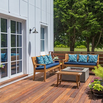
EXTERIOR EXPRESSION. The street facade of the home relates to the local New England vernacular. The rear uses contemporary language, a nod to the family’s Californian roots, to incorporate a roof deck, solar panels, outdoor living space, and the backyard swimming pool. ZED’s careful planning avoided to the need to face the garage doors towards the street, a common syndrome of a narrow lot.
THOUGHTFUL SPACE. Homes with dual entries can often result in duplicate and unused spaces. In this home, the everyday and formal entry areas are one and the same; the front and garage doors share the entry program of coat closets, mudroom storage with bench for removing your shoes, and a laundry room with generous closets for the children's sporting equipment. The entry area leads directly to the living space, encompassing the kitchen, dining and sitting area areas in an L-shaped open plan arrangement. The kitchen is placed at the south-west corner of the space to allow for a strong connection to the dining, sitting and outdoor living spaces. A fire pit on the deck satisfies the family’s desire for an open flame while a sealed gas fireplace is used indoors - ZED’s preference after omitting gas burning appliances completely from an airtight home. A small study, with a window seat, is conveniently located just off of the living space. A first floor guest bedroom includes an accessible bathroom for aging visitors and can be used as a master suite to accommodate aging in place.
HEALTHY LIVING. The client requested a home that was easy to clean and would provide a respite from seasonal allergies and common contaminants that are found in many indoor spaces. ZED selected easy to clean solid surface flooring throughout, provided ample space for cleaning supplies on each floor, and designed a mechanical system with ventilation that provides a constant supply of fresh outdoor air. ZED selected durable materials, finishes, cabinetry, and casework with low or no volatile organic compounds (VOCs) and no added urea formaldehyde.
YEAR-ROUND COMFORT. The home is super insulated and air-tight, paired with high performance triple-paned windows, to ensure it is draft-free throughout the winter (even when in front of the large windows and doors). ZED designed a right-sized heating and cooling system to pair with the thermally improved building enclosure to ensure year-round comfort. The glazing on the home maximizes passive solar gains, and facilitates cross ventilation and daylighting.
ENERGY EFFICIENT. As one of the most energy efficient houses built to date in Wellesley, the home highlights a practical solution for Massachusetts. First, the building enclosure reduces the largest energy requirement for typical houses (heating). Super-insulation, exceptional air sealing, a thermally broken wall assembly, triple pane windows, and passive solar gain combine for a sizable heating load reduction. Second, within the house only efficient systems consume energy. These include an air source heat pump for heating & cooling, a heat pump hot water heater, LED lighting, energy recovery ventilation, and high efficiency appliances. Lastly, photovoltaics provide renewable energy help offset energy consumption. The result is an 89% reduction in energy use compared to a similar brand new home built to code requirements.
RESILIENT. The home will fare well in extreme weather events. During a winter power outage, heat loss will be very slow due to the super-insulated and airtight envelope– taking multiple days to drop to 60 degrees even with no heat source. An engineered drainage system, paired with careful the detailing of the foundation, will help to keep the finished basement dry. A generator will provide full operation of the all-electric house during a power outage.
OVERALL. The home is a reflection of the family goals and an expression of their values, beautifully enabling health, comfort, safety, resilience, and utility, all while respecting the planet.
ZED - Architect & Mechanical Designer
Bevilacqua Builders Inc - Contractor
Creative Land & Water Engineering - Civil Engineering
Barbara Peterson Landscape - Landscape Design
Nest & Company - Interior Furnishings
Eric Roth Photography - Photography
 Zola European Windows
Located in, Summit Park, Park City UT lies one of the most efficient houses in the country. The Summit Haus – designed and built by Chris Price of PCD+B, is an exploration in design and construction of advanced high performance housing. Seeing a rising demand for sustainable housing along with rising Carbon emissions leading to global warming, this house strives to show that sensible, good design can create spaces adequate for today’s housing demands while adhering to strict standards. The house was designed to meet the very rigid Passiv House rating system – 90% more efficient than a typical home in the area.
The house itself was intended to nestle neatly into the 45 degree sloped site and to take full advantage of the limited solar access and views. The views range from short, highly wooded views to a long corridor out towards the Uinta Mountain range towards the east. The house was designed and built based off Passiv Haus standards, and the framing and ventilation became critical elements to maintain such minimal energy requirements.
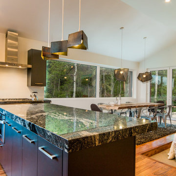
Zola triple-pane, tilt-and-turn Thermo uPVC windows contribute substantially to the home’s energy efficiency, and takes advantage of the beautiful surrounding of the location, including forrest views from the deck off of the kitchen.
Photographer: City Home Collective
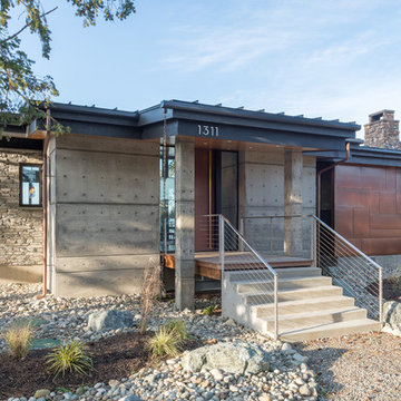
 Dan Nelson, Designs Northwest Architects
Entryway. Photography by Lucas Henning.
Small modern gray one-story concrete house exterior idea in Seattle with a shed roof and a metal roof
Small modern gray one-story concrete house exterior idea in Seattle with a shed roof and a metal roof
Sponsored
Columbus, OH
Structural Remodeling
Franklin County's Heavy Timber Specialists | Best of Houzz 2020!
 Dresner Design | Chicago Custom Kitchens Cabinets
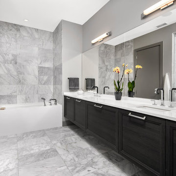
Dresner Design possesses the expertise to design cutting edge, cost-effective kitchens, baths and closets for developer’s multi-unit projects. They were recently part of the design team for The Ronsley, River North's best new luxury condominium development.
This former industrial timber loft building was transformed into an incredible 41-unit building, and Dresner Design was hired to design both the kitchens and baths using Italian cabinetry from Stosa Cucine.
Challenges:
All the units were the same but with varying configurations. The goal was to make all the units feel and look the same but each of the layouts was different- making 30 layouts in all.
Concept:
The kitchens and baths were designed to be sleek and modern, blending in with the loft style. The kitchen islands fabricated with wood compliments the wood ceilings and beams typical of loft living. White kitchens are always timeless and the Ronsley used the most beautiful and high-end cabinetry made of 100% lacquer.
Photography by Jim Tschetter
 Crafted Custom Homes + Renovations
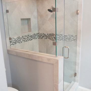
While we typically focus on high end homes, this small 1980's house in Stafford sold for under $200,000. We did a remodel and make ready for the homeowner prior to listing so they could take advantage of our hot market. This house is proof that good design can make inexpensive material selections look really good, and that you don't have to spend a fortune on a nice remodel.
Floors: Emser Tile 6x24 Heritage Walnut
Backsplash: Emser Tile 6x6 Ancient Tumbled Travertine
Backsplash Insert: Emser Tile Lucente Grazia Mosaic 5/8"
Bath Floors: Emser Tile 18x18 St Moritz Silver
Bath Insert: Emser Tile Lucente Grazia Linear
Kitchen Granite: Diamond Arrow
Master Bath Granite: Diamond Arrow
Guest Bath Granite: White Galaxy
Wall Paint: PPG Grey Marble
Trim Paint: PPG Arctic Cotton
Ceiling Paint: PPG Arctic Cotton
All Photos by Curtis Lawson

29