
Search results for "Uncovered" in Home Design Ideas
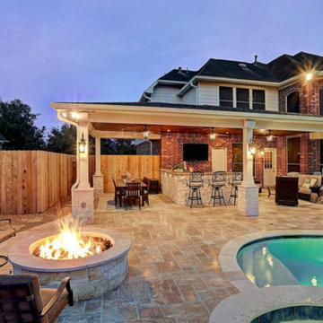
 TCP Custom Outdoor Living
After image
T&G Wood ceilings, columns and beams finished in Hardi and painted with Sherwin Williams 30year Super Paint, Austin white limestone on firepit, columns and kitchen, Giallo Ornamental 3cm granite, RCS 30" Pro Cutlass Grill & Accessories and a Hoshizaki ice machine to produce "Sonic ice", Travertine Tile floor, HUGE custom outdoor gas firepit with austin white limestone and travertine paver capstone. Dimmable recessed cans and sconces and low voltage lighting under the 15' of kitchen bartop.
 Sunset Builders
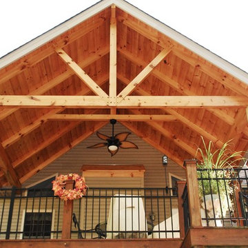
Our customer had a large, uncovered deck, almost the length of the home. They wanted to add a partial covering to have some shade and protection from the elements. While the house has vinyl siding, they opted to go for the upgraded timber frame roof. The ceiling of the deck cover is tongue and groove pine. The timbers are pine as well. This rustic cover made a wonderful addition to their home, complimenting the existing character of the deck.
 User
UserEvery home improvement project can feel like going into battle, but the sweet taste of victory is enough to make it worthwhile. If you ever feel intimidated by homes and gardens in magazines, don’t fret – you can turn your home into a beautiful beacon with easy curb appeal updates! Kevin and Annette Klingel are some of our favorite weekend warriors, and their latest project proves that anything is possible when it comes to dressing up your front garden. The Klingels recently gave their home and front garden a major renovation and entered their photos in the Window Box Contest. When we saw the gorgeous before and after pictures, we knew we had to get the inside scoop on their process and uncover their best curb appeal ideas.
Curb Appeal – Before and After
Before the renovation, the Klingels had a charming South Bend, Indiana rambler that was tidy and traditional, if a little unassuming. Deciding it was time for a much-needed update, the Klingels replaced their old green roof with a black barrel roof to match the style of their home. They also made a needed replacement and changed out the sidewalk and front stoop to a new version in classic black.
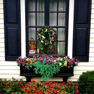
After those dramatic changes, the Klingels just couldn’t stop! Loving the contrast between the new black roof and stoop and their cream house, they painted their shutters black. And here’s where we come in – Annette wanted to incorporate her love of flowers into the new home design and found the perfect planters and window boxes to match the shutters. They purchased ten black window boxes in a classic and chic design to put around their outside windows. The Klingels also used tall black planters around the entrance to the house. The window boxes and planters each received the same plant treatment – red, yellow, and orange impatiens with flowing ferns for a bright punch of color. Paired with hanging baskets and a few other accents, the Klingels house is now a masterpiece.
From Drab to Fab
The Klingels love their warm and inviting new front entrance, and the neighbors do too. Instead of getting overlooked, their house now stands out and is the star of their busy street, where it is seen by lots of people everyday. They have received tons of compliments about their new look – a crisp and clean front garden that stays true to the style of the home and neighborhood.
The Klingels’ curb appeal update wasn’t without its challenges, but the end product is amazing, and as Annette says, definitely worth the time. The Klingels recommend starting with the necessary replacements and finding beautiful matching pieces to add curb appeal. With a little patience, elbow grease, and the help of a great garden supply store like Hooks & Lattice, you too can have the home of your dreams.
Photos: Kevin & Annette Klingel
Find the right local pro for your project

 Boyce Design + Build
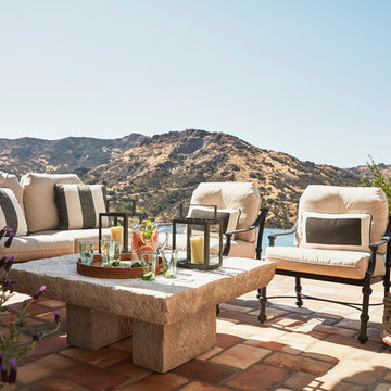
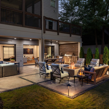
Two large panoramic doors forge an immediate connection between the interior and exterior spaces and instantly doubles our client’s entertaining space. A stunning combination of covered and uncovered outdoor rooms include a dining area with ample seating conveniently located near the custom stacked stone outdoor kitchen and prep area with sleek concrete countertops, privacy screen walls and high-end appliances. The designated TV/lounge area offers additional covered seating and is the perfect spot for relaxing or watching your favorite movie or sports team. The contemporary elements our clients desired are evident in the patio area with its large custom concrete slabs and modern slate chip borders. The impressive custom concrete fire pit is the focal point for the open patio and offers a seating arrangement with plenty of space to enjoy the company of family and friends.

 Kathleen Jennison
An Arts & Crafts Bungalow is one of my favorite styles of homes. We have quite a few of them in our Stockton Mid-Town area. And when C&L called us to help them remodel their 1923 American Bungalow, I was beyond thrilled.
As per usual, when we get a new inquiry, we quickly Google the project location while we are talking to you on the phone. My excitement escalated when I saw the Google Earth Image of the sweet Sage Green bungalow in Mid-Town Stockton. "Yes, we would be interested in working with you," I said trying to keep my cool.
But what made it even better was meeting C&L and touring their home, because they are the nicest young couple, eager to make their home period perfect. Unfortunately, it had been slightly molested by some bad house-flippers, and we needed to bring the bathroom back to it "roots."
We knew we had to banish the hideous brown tile and cheap vanity quickly. But C&L complained about the condensation problems and the constant fight with mold. This immediately told me that improper remodeling had occurred and we needed to remedy that right away.
The Before: Frustrations with a Botched Remodel
The bathroom needed to be brought back to period appropriate design with all the functionality of a modern bathroom. We thought of things like marble countertop, white mosaic floor tiles, white subway tile, board and batten molding, and of course a fabulous wallpaper.
This small (and only) bathroom on a tight budget required a little bit of design sleuthing to figure out how we could get the proper look and feel. Our goal was to determine where to splurge and where to economize and how to complete the remodel as quickly as possible because C&L would have to move out while construction was going on.
The Process: Hard Work to Remedy Design and Function
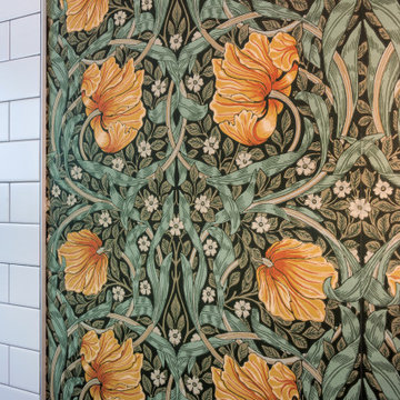
During our initial design study, (which included 2 hours in the owners’ home), we noticed framed images of William Morris Arts and Crafts textile patterns and knew this would be our design inspiration. We presented C&L with three options and they quickly selected the Pimpernel Design Concept.
We had originally selected the Black and Olive colors with a black vanity, mirror, and black and white floor tile. C&L liked it but weren’t quite sure about the black, We went back to the drawing board and decided the William & Co Pimpernel Wallpaper in Bayleaf and Manilla color with a softer gray painted vanity and mirror and white floor tile was more to their liking.
After the Design Concept was approved, we went to work securing the building permit, procuring all the elements, and scheduling our trusted tradesmen to perform the work.
We did uncover some shoddy work by the flippers such as live electrical wires hidden behind the wall, plumbing venting cut-off and buried in the walls (hence the constant dampness), the tub barely balancing on two fence boards across the floor joist, and no insulation on the exterior wall.
All of the previous blunders were fixed and the bathroom put back to its previous glory. We could feel the house thanking us for making it pretty again.
The After Reveal: Cohesive Design Decisions
We selected a simple white subway tile for the tub/shower. This is always classic and in keeping with the style of the house.
We selected a pre-fab vanity and mirror, but they look rich with the quartz countertop. There is much more storage in this small vanity than you would think.
The Transformation: A Period Perfect Refresh
We began the remodel just as the pandemic reared and stay-in-place orders went into effect. As C&L were already moved out and living with relatives, we got the go-ahead from city officials to get the work done (after all, how can you shelter in place without a bathroom?).
All our tradesmen were scheduled to work so that only one crew was on the job site at a time. We stayed on the original schedule with only a one week delay.
The end result is the sweetest little bathroom I've ever seen (and I can't wait to start work on C&L's kitchen next).
Thank you for joining me in this project transformation. I hope this inspired you to think about being creative with your design projects, determining what works best in keeping with the architecture of your space, and carefully assessing how you can have the best life in your home.
 David Charlez Designs
Landmark Photography
Inspiration for a cottage home design remodel in Minneapolis
Inspiration for a cottage home design remodel in Minneapolis
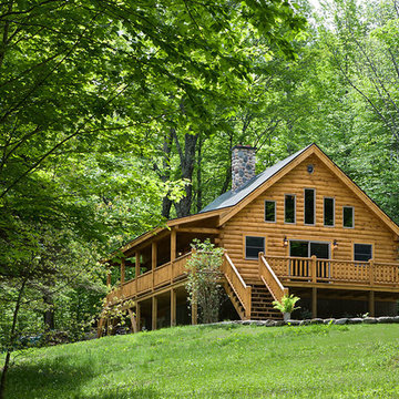
 Coventry Log Homes
Modified from the Swiftwater model this plan is distinguished by its large windowed shed dormer creating more space available to the loft.
http://www.coventryloghomes.com/ourDesigns/tradesmanSeries/Ascutney/model.html
Photo Credit: Roger Wade

 Simply Home Decorating
This beautiful North Vancouver home belongs to a nature-loving and health-conscious couple, Emma and Vince (names changed), their two young children, and their dog, Jasper. When they contacted us about renovating and furnishing their kitchen and family room, we walked in and saw a world of potential waiting to be uncovered.
Before: Larkhall Crescent Home:
Like many original North Vancouver homes, the interior was definitely dated. We encountered late ‘80s finishes in powder pink and teal green, old carpet, and a kitchen that wasn’t maximized to suit this family’s modern-day lifestyle. However, the size of the rooms offered us a ton of space with which to get creative.
Knowing our clients’ love of cooking, need for work spaces (Emma and Vince both work remotely), and growing family, we developed a design concept that would increase usable space, optimize storage, and create intimacy in this large area. As for the style, we were inspired by their European roots, inventing a new and modern take on “Belgian Farmhouse” style. Now, the home is truly one-of-a-kind.
After: Warm & Cozy Family Room:
Fresh, bright, and comfortable, this living area has been transformed! We started with the fireplace as a focal point, selecting aged brick tiles for added texture and a crisp wood mantle. The taupe-coloured sectional infuses the room with visual warmth and serves the added purpose of separating the family room from the kitchen.
Emma and Vince were also keen on using non-toxic materials in their home, and we were happy to oblige. To meet their needs, we sourced natural wood elements and sought out Canadian-made products - that adhere to high health standards - whenever possible.
Look closer at the elements of this space, and you will find this stunning, honeycomb-patterned rug in earthy gold, beige, and charcoal tones. It’s plush to the touch and full of visual texture that brings this room’s colour palette together. We sourced these two-tone chairs with caning, petrified wood side table, black sconces, and botanical prints in greyscale from local artist, Heather Johnston.
We topped off the space with this dark wood and rattan console that offers storage facing the kitchen and presents an opportunity to display cherished items. The result is a cozy lounging space brimming with comfort and functionality. It’s perfect for enjoying quality family time, or Emma can simply slide the coffee table away to make room for her morning yoga practice.
Now, let’s turn around and give some attention to the kitchen. Do you remember what the original kitchen looked like? If not, scroll back up, because the transformation is shocking…
Moody & Welcoming Kitchen for Healthy Living:
This kitchen looks very different from how it started, right? Though we didn’t touch any walls, the kitchen has almost doubled in usable space! We created a long, extended island with storage, an outlet for small appliances, and seating for comfortable prep, after-school snacking, or mingling among friends.
On the other side of the island, the family has even more storage and an integrated dishwasher within easy reach of the sink, perfect for quick clean-up. From this angle, you can also see the expansive custom Shaker cabinetry in white and the integrated double ovens. These facilitate their cooking experience and gave us the opportunity to add an additional surprise…
A coffee garage station and more hidden storage! Keeping these items located along the perimeter allows them to be accessed by the family or their guests without someone getting under the cook’s feet. These are the little details that make everyday life easier and more enjoyable.
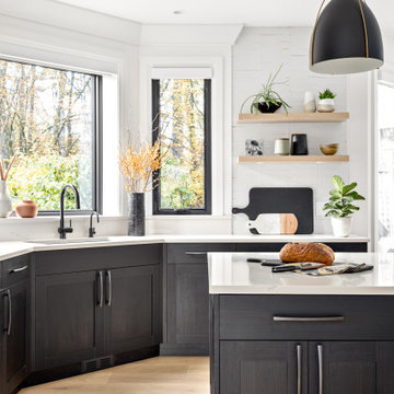
Moving deeper into the kitchen, the seamless induction cooktop topped with a freestanding concealed hood fan commands attention in a soft yet prominent way. The natural wood accent mirrors the fireplace mantle, and the choice of off-black wood-grain cabinets not only continues our black-and-white colour palette but adds a sense of depth and contrast. The corner sink is located to the right and perfectly positioned with a view of their thriving backyard.
To invite more of this family’s character into the space, we mixed metals for interest — matte black, dark pewter, and warm brass — and created open shelves in white oak for their plants and decor. You can also glimpse the tumbled edge of the backsplash tile, which echoes the rustic brick of the fireplace. It adds that farmhouse charm while still feeling timeless and sophisticated.
Last but not least, we designed this dining banquette in the bay window (with integrated bench storage, of course), where the family can share a meal together, the kids can do homework, or Emma and Vince can work and enjoy a change of scenery from their offices. Like the other spaces in the home, it was designed to be beautiful, multi-functional, and long-lasting.
Praise from Our Clients:
It is clear that we love this home, but what did our clients have to say?
“Lori is a visionary and masters execution to the finest detail all at the same time. When she first met us to know more about who we are and how we live, she could right away envision how we could use the space in our kitchen and living room…The results exceeded our expectations.
Lori and her team were also a delight to work with — coordination with all the trades, fast problem-solving, regular updates, professional and friendly attitude of her entire team — made it the dream team. Thank you SHD for making our space so beautiful!”
In turn, we are so grateful for this family’s trust, their open communication, and for being wonderful people with whom to work. (So, thank you!)
 Hays + Ewing Design Studio
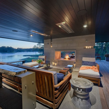
Example of a large minimalist backyard deck design in Other with a fire pit and a roof extension
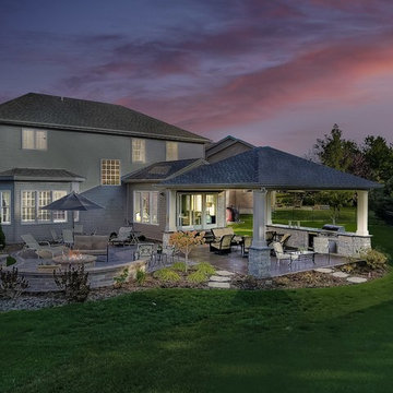
 Bellas Landscaping
Covered Patio with Built in Grill and Fire Pit
Inspiration for a mid-sized timeless backyard concrete paver patio remodel in Chicago with a fire pit and a roof extension
Inspiration for a mid-sized timeless backyard concrete paver patio remodel in Chicago with a fire pit and a roof extension
 Tindall Architecture Workshop
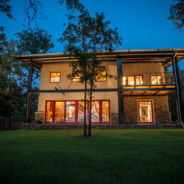
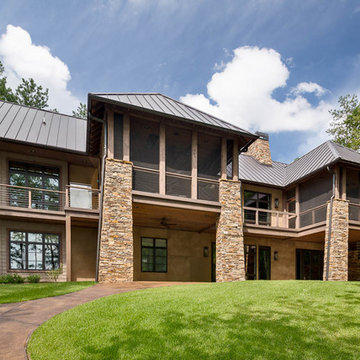
Photo by Firewater Photography. Designed during previous position as Residential Studio Director and Project Architect at LS3P Associates Ltd.
Large rustic beige two-story stucco gable roof idea in Other
Large rustic beige two-story stucco gable roof idea in Other
 De La Paz Masonry
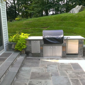
Inspiration for a mid-sized modern backyard stone patio kitchen remodel in New York with no cover
 Red House Design Build
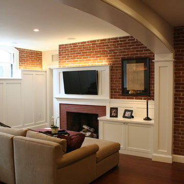
In the late 50’s, this basement was cut up into a dental office with tiny exam rooms. Red House Custom Building designed a space that could be used as a home gym & media room. Upon demolition, we uncovered an original, structural arch and a wonderful brick foundation that highlighted the home’s original detailing and substantial structure. These were reincorporated into the new design. The arched window on the left was stripped and restored to original working order. The fireplace was one of four original to the home.
Harold T. Merriman was the original owner of home, and the homeowners found some of his works on the third floor of the house. He sketched a plat of lots surrounding the property in 1899. At the completion of the project, the homeowners had it framed, and it now hangs in the room above the A/V cabinet.
High paneled wainscot in the basement perfectly mimics the late 1800’s, battered paneling found under several wall layers during demo. The LED accent lighting was installed behind the top cap of the wainscot to highlight the mixing of new and old while bringing a warm glow to the room.
Photo by Grace Lentini.
Instagram: @redhousedesignbuild
 SpaceCraft Architecture
Greg Premu Photography
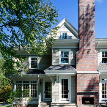
Inspiration for a large timeless gray three-story wood gable roof remodel in Boston
Inspiration for a large timeless gray three-story wood gable roof remodel in Boston
 Atlanta Building Company
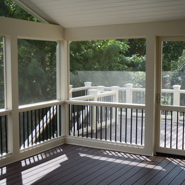
Mid-sized elegant screened-in back porch photo in Atlanta with a roof extension
 Anna Addison Photography
Photo: Anna Addison Photography © 2013 Houzz
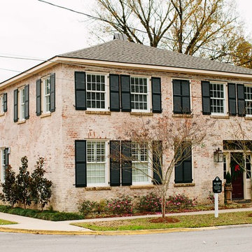
Traditional exterior home idea in New Orleans
Traditional exterior home idea in New Orleans
 Adams + Beasley Associates
Eric Roth Photography
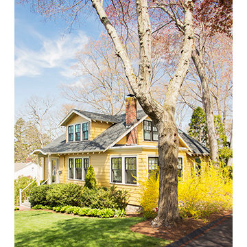
Example of a small arts and crafts yellow two-story wood exterior home design in Boston
Example of a small arts and crafts yellow two-story wood exterior home design in Boston
33