
Search results for "Underutilized" in Home Design Ideas
 Katie Hutchison Studio
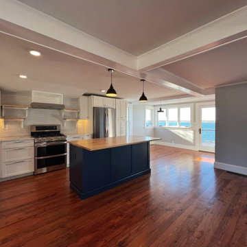
When the owner of this petite c. 1910 cottage in Riverside, RI first considered purchasing it, he fell for its charming front façade and the stunning rear water views. But it needed work. The weather-worn, water-facing back of the house was in dire need of attention. The first-floor kitchen/living/dining areas were cramped. There was no first-floor bathroom, and the second-floor bathroom was a fright. Most surprisingly, there was no rear-facing deck off the kitchen or living areas to allow for outdoor living along the Providence River.
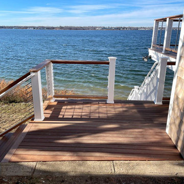
In collaboration with the homeowner, KHS proposed a number of renovations and additions. The first priority was a new cantilevered rear deck off an expanded kitchen/dining area and reconstructed sunroom, which was brought up to the main floor level. The cantilever of the deck prevents the need for awkwardly tall supporting posts that could potentially be undermined by a future storm event or rising sea level.
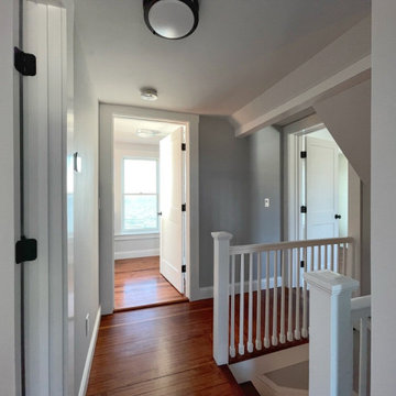
To gain more first-floor living space, KHS also proposed capturing the corner of the wrapping front porch as interior kitchen space in order to create a more generous open kitchen/dining/living area, while having minimal impact on how the cottage appears from the curb. Underutilized space in the existing mudroom was also reconfigured to contain a modest full bath and laundry closet. Upstairs, a new full bath was created in an addition between existing bedrooms. It can be accessed from both the master bedroom and the stair hall. Additional closets were added, too.
New windows and doors, new heart pine flooring stained to resemble the patina of old pine flooring that remained upstairs, new tile and countertops, new cabinetry, new plumbing and lighting fixtures, as well as a new color palette complete the updated look. Upgraded insulation in areas exposed during the construction and augmented HVAC systems also greatly improved indoor comfort. Today, the cottage continues to charm while also accommodating modern amenities and features.
 Lucian Design
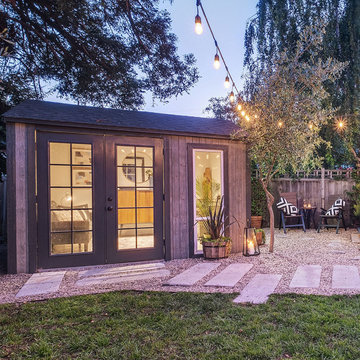
This quiet 10' x 12' storage shed, situated beneath a giant Redwood tree, was a premium example of underutilized space. Lucian Design was the right team to transform the rough building into a private office.
We added power to the structure, in addition to heat and a thermostat, and all new windows, French doors, sheetrock, flooring, baseboards, and new lighting. On the exterior, we added distressed wood siding to create a rustic look, and new trim.
 Josh Housdan Design
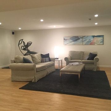
The owners of this single-family home in Washington, DC’s Kalorama neighborhood wanted to renovate their underutilized basement, which was previously used for only used for storage. We added a bedroom, full bathroom, a storage room, a workshop area, wine storage, and an open living room and kitchenette area.
Find the right local pro for your project
 Bennett Contracting, Inc.
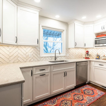
When a young, growing family in Delmar decided they wanted to expand and update their kitchen for a better use of space, they wasted no time in giving our team at Bennett a call. Project Manager, Tony Cicchino, and Designer, Keri Kannan, worked together to revamp the space to fit this growing family’s needs. The underutilized formal dining room had its walls knocked down to open the space with the kitchen and create a more efficient flow through the home with unobstructed pathways. Our Lead Carpenter, Kyle, expanded the U-shaped layout and added a new centered island for additional storage. The new space has a traditional look with a farmhouse flare. The darker LVP flooring was a perfect contrast to the already existing oak floors and white cabinetry. If you look close enough, you can see the new support beam that was installed where the wall was knocked down and expertly blended in with island lights to make it less visible. What a fabulous facelift for our treasured clients!
 Katie Hutchison Studio
When the owner of this petite c. 1910 cottage in Riverside, RI first considered purchasing it, he fell for its charming front façade and the stunning rear water views. But it needed work. The weather-worn, water-facing back of the house was in dire need of attention. The first-floor kitchen/living/dining areas were cramped. There was no first-floor bathroom, and the second-floor bathroom was a fright. Most surprisingly, there was no rear-facing deck off the kitchen or living areas to allow for outdoor living along the Providence River.
In collaboration with the homeowner, KHS proposed a number of renovations and additions. The first priority was a new cantilevered rear deck off an expanded kitchen/dining area and reconstructed sunroom, which was brought up to the main floor level. The cantilever of the deck prevents the need for awkwardly tall supporting posts that could potentially be undermined by a future storm event or rising sea level.
To gain more first-floor living space, KHS also proposed capturing the corner of the wrapping front porch as interior kitchen space in order to create a more generous open kitchen/dining/living area, while having minimal impact on how the cottage appears from the curb. Underutilized space in the existing mudroom was also reconfigured to contain a modest full bath and laundry closet. Upstairs, a new full bath was created in an addition between existing bedrooms. It can be accessed from both the master bedroom and the stair hall. Additional closets were added, too.
New windows and doors, new heart pine flooring stained to resemble the patina of old pine flooring that remained upstairs, new tile and countertops, new cabinetry, new plumbing and lighting fixtures, as well as a new color palette complete the updated look. Upgraded insulation in areas exposed during the construction and augmented HVAC systems also greatly improved indoor comfort. Today, the cottage continues to charm while also accommodating modern amenities and features.
 Harth Builders
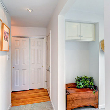
The existing combined mudroom and laundry in this home was actually too large previously. There was a lot of wasted space which was underutilized. By sectioning the room into multiple spaces with usable closets we achieved a more functional layout for our clients.
Photography Credit: Mike Irby
 Katie Hutchison Studio
When the owner of this petite c. 1910 cottage in Riverside, RI first considered purchasing it, he fell for its charming front façade and the stunning rear water views. But it needed work. The weather-worn, water-facing back of the house was in dire need of attention. The first-floor kitchen/living/dining areas were cramped. There was no first-floor bathroom, and the second-floor bathroom was a fright. Most surprisingly, there was no rear-facing deck off the kitchen or living areas to allow for outdoor living along the Providence River.
In collaboration with the homeowner, KHS proposed a number of renovations and additions. The first priority was a new cantilevered rear deck off an expanded kitchen/dining area and reconstructed sunroom, which was brought up to the main floor level. The cantilever of the deck prevents the need for awkwardly tall supporting posts that could potentially be undermined by a future storm event or rising sea level.
To gain more first-floor living space, KHS also proposed capturing the corner of the wrapping front porch as interior kitchen space in order to create a more generous open kitchen/dining/living area, while having minimal impact on how the cottage appears from the curb. Underutilized space in the existing mudroom was also reconfigured to contain a modest full bath and laundry closet. Upstairs, a new full bath was created in an addition between existing bedrooms. It can be accessed from both the master bedroom and the stair hall. Additional closets were added, too.
New windows and doors, new heart pine flooring stained to resemble the patina of old pine flooring that remained upstairs, new tile and countertops, new cabinetry, new plumbing and lighting fixtures, as well as a new color palette complete the updated look. Upgraded insulation in areas exposed during the construction and augmented HVAC systems also greatly improved indoor comfort. Today, the cottage continues to charm while also accommodating modern amenities and features.
 Woodsmith Construction Inc
Transforming this long-standing home on Bradgate Rd required more than a simple update—it called for a careful balance between renewal, structure, and respect for what was already there.
The existing brick bungalow had strong bones, but the exterior was deteriorating, the carport was underutilized, and key interior spaces no longer supported the homeowners’ needs. Having lived in the home for decades, the goal wasn’t to start over—it was to rework the home into a more functional, comfortable space that could support the years ahead.
The scope included a full exterior masonry refresh, where the front layer of brick was removed and replaced while maintaining the integrity of the original structure. The carport was fully enclosed and integrated into the home as a garage, and a new roof tied everything together with consistent detailing and long-term performance in mind.
Inside, the layout was carefully reworked to introduce a new primary ensuite and completely renovate the main bathroom. Plumbing, mechanical, and electrical systems were updated throughout, with a focus on accessibility, ease of use, and everyday comfort.
The result is a home that feels both familiar and elevated—where thoughtful construction and refined design come together to support long-term living without compromising character.
 From David Designs
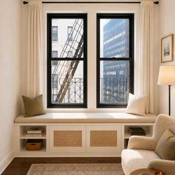
This custom reading nook was designed to transform an underutilized alcove into a functional architectural feature within a Manhattan apartment. A built-in window seat with integrated storage, cane-front radiator covers, and custom millwork creates a comfortable place to read, relax, or enjoy the city views. Framed by black steel windows, warm wood flooring, and soft neutral finishes, the space blends timeless craftsmanship with practical everyday living.
 Catherine Rose Design & CO.
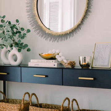
An underutilized space has been transformed into something beautiful yet function. As a family of three each child now has a basket for shoes while mom and dad can keep mail, keys, and the daily needs hidden! A stylish space to greet both family members and guests.
 TVL Creative Ltd.
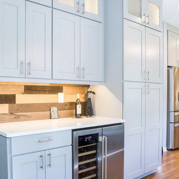
This project is an incredible transformation and the perfect example of successful style mixing! This client, and now a good friend of TVL (as they all become), is a wonderfully eclectic and adventurous one with immense interest in texture play, pops of color, and unique applications. Our scope in this home included a full kitchen renovation, main level powder room renovation, and a master bathroom overhaul. Taking just over a year to complete from the first design phases to final photos, this project was so insanely fun and packs an amazing amount of fun details and lively surprises. The original kitchen was large and fairly functional. However, the cabinetry was dated, the lighting was inefficient and frankly ugly, and the space was lacking personality in general. Our client desired maximized storage and a more personalized aesthetic. The existing cabinets were short and left the nice height of the space under-utilized. We integrated new gray shaker cabinets from Waypoint Living Spaces and ran them to the ceiling to really exaggerate the height of the space and to maximize usable storage as much as possible. The upper cabinets are glass and lit from within, offering display space or functional storage as the client needs. The central feature of this space is the large cobalt blue range from Viking as well as the custom made reclaimed wood range hood floating above. The backsplash along this entire wall is vertical slab of marble look quartz from Pental Surfaces. This matches the expanse of the same countertop that wraps the room. Flanking the range, we installed cobalt blue lantern penny tile from Merola Tile for a playful texture that adds visual interest and class to the entire room. We upgraded the lighting in the ceiling, under the cabinets, and within cabinets--we also installed accent sconces over each window on the sink wall to create cozy and functional illumination. The deep, textured front Whitehaven apron sink is a dramatic nod to the farmhouse aesthetic from KOHLER, and it's paired with the bold and industrial inspired Tournant faucet, also from Kohler. We finalized this space with other gorgeous appliances, a super sexy dining table and chair set from Room & Board, the Paxton dining light from Pottery Barn and a small bar area and pantry on the far end of the space. In the small powder room on the main level, we converted a drab builder-grade space into a super cute, rustic-inspired washroom. We utilized the Bonner vanity from Signature Hardware and paired this with the cute Ashfield faucet from Pfister. The most unique statements in this room include the water-drop light over the vanity from Shades Of Light, the copper-look porcelain floor tile from Pental Surfaces and the gorgeous Cashmere colored Tresham toilet from Kohler. Up in the master bathroom, elegance abounds. Using the same footprint, we upgraded everything in this space to reflect the client's desire for a more bright, patterned and pretty space. Starting at the entry, we installed a custom reclaimed plank barn door with bold large format hardware from Rustica Hardware. In the bathroom, the custom slate blue vanity from Tharp Cabinet Company is an eye catching statement piece. This is paired with gorgeous hardware from Amerock, vessel sinks from Kohler, and Purist faucets also from Kohler. We replaced the old built-in bathtub with a new freestanding soaker from Signature Hardware. The floor tile is a bold, graphic porcelain tile with a classic color scheme. The shower was upgraded with new tile and fixtures throughout: new clear glass, gorgeous distressed subway tile from the Castle line from TileBar, and a sophisticated shower panel from Vigo. We finalized the space with a small crystal chandelier and soft gray paint. This project is a stunning conversion and we are so thrilled that our client can enjoy these personalized spaces for years to come.
 Klopf Architecture
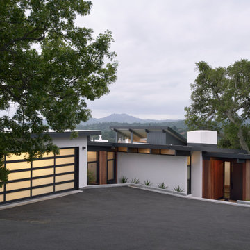
Set in a quiet neighborhood and framed by mature trees, this residence presented a unique opportunity: to thoughtfully evolve a custom mid-century modern home into a space that supports the everyday rhythms of a growing family. With a deep respect for the home’s original architecture, Klopf Architecture reimagined the house to better meet the needs of its owners—introducing functional improvements while preserving the spirit and character of its mid-century roots.
The clients approached Klopf Architecture with a clear vision: refresh their home while seamlessly integrating new programmatic elements. Key goals included clarifying and enhancing the entry sequence; connecting the detached garage to the main house with a practical yet architecturally intentional intervention; adding functional spaces such as a mudroom and laundry room; expanding and remodeling the primary suite’s bathroom and closet; and creating a more engaging outdoor space that capitalized on the site’s impressive views, featuring a fire pit and outdoor kitchen.
As a couple with distinct yet complementary perspectives—one focused on modern functionality and technology, and the other dedicated to preserving the home’s architectural integrity—their collaboration with Klopf Architecture resulted in a solution that harmonized both ideals. Their shared commitment to improving the livability of their home led to a design dialogue rooted in balance. This dynamic partnership shaped the direction of the renovation, ensuring that every decision honored the spirit of the original home while aligning with the practical needs of their growing family.
Designing within the constraints of the sloped site posed one of the project’s central challenges. The detached garage sat at a higher elevation than the main house, requiring a solution that ensured architectural and geometric compatibility between the two structures. Rather than create a purely utilitarian link, Klopf Architecture introduced an intentional connection that contributes to the overall architectural language. A notable pinch point in the plan—where differing geometries converged—was treated as a hinge point, turning a potentially awkward juncture into an architectural feature. This area now functions as both a transition and a moment of design interest that unifies the overall plan.
The design also addressed the underutilized outdoor area, which was located in a shadowed portion of the site with geometrical limitations. A new connection to the rear deck was created in this same area, making the outdoor space more useful and inviting. Klopf Architecture introduced carefully positioned openings and spatial improvements that forged a strong visual and functional connection between indoor and outdoor spaces. The outdoor area now reads as a deliberate extension of the home, embracing natural light and emphasizing the dramatic views.
Working through multiple design iterations, Klopf Architecture crafted a solution that preserved the architectural language of the original home while supporting the functional needs of modern life. The garage-to-house connection became more than a passage—it evolved into an architectural moment of transition. A new mudroom and laundry space enhanced convenience without compromising the clean lines of the design. The primary suite was expanded to create a private, serene retreat. The reimagined backyard, complete with fire pit and kitchen, now plays a vital role in the family’s daily routine and social life.
Outcomes and Lasting Impact
The result is a home that balances heritage with contemporary design, technical precision with design sensibility. The redesign not only met the clients’ initial goals but also exceeded expectations in its ability to seamlessly blend past and present, function and beauty, making the outdoor kitchen a favorite gathering place.
Beyond aesthetics, the renovation has significantly improved daily life for the family. The newly integrated garage connection has streamlined routines, providing a seamless transition between arriving home, storing belongings, and entering the main living spaces. The expanded primary suite offers a retreat-like atmosphere, creating a private space to unwind at the end of the day. The redesigned outdoor areas have also become an extension of their lifestyle—whether it's casual family dinners around the fire pit, entertaining friends in the outdoor kitchen, or simply enjoying the view from the reimagined backyard.
Through a thoughtful and strategic approach, the house has been successfully evolved into a home that remains true to its mid-century modern roots while enhancing livability, functionality, and the overall quality of life for the modern-day owners.
Klopf Architecture Team: Geoffrey Campen, Fernanda Bernardes
Architectural Interior Design: Klopf Architecture
Structural Engineer: Base Design Inc.
Contractor: Golden Snail Builders
Photography: Mariko Reed
Year Completed:2022
 H2D Architecture + Design
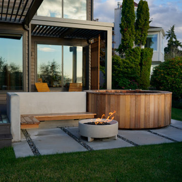
The homeowners of this Mukilteo residence partnered with H2D Architecture + Design to transform their underutilized rear deck into a highly functional outdoor living environment. The existing deck was refinished and reconfigured to create a more useable area for gathering, seamlessly extending the interior living space to the outdoors. A Struxure pergola was introduced to provide adjustable shade and light filtration, allowing the space to adapt to changing weather and seasons. Beyond the deck, the design steps down to a thoughtfully composed concrete paver patio anchored by a custom round wood hot tub, creating a warm and tactile focal point. Surrounding this feature, a built-in bench establishes a zone for relaxation and socializing, while a fire pit adds both ambiance and year-round usability. A custom screen wall was integrated to provide privacy and subtle enclosure without sacrificing openness, helping to define the space while maintaining visual connections to the landscape. The combination of multi-level seating, integrated elements, and carefully considered materials results in a cohesive outdoor retreat that supports a variety of uses.
+ Architecture + Design: H2D Architecture + Design
+ Builder: Bradley J. Rodgers Remodelling
+ Photography: Thomas Vincent
 Moss Building & Design
The MOSS design team sat down with the homeowners and went through every single option. With COVID and the distance from the job site to the MOSS office, most sessions were virtual and set to align with the clients’ work schedules. The homeowners felt all of their ideas were brought to life and the design team added interesting pieces and ideas they really liked.
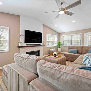
Early in the design process, they decided a focus wall would be amazing. The client loves shiplap but didn’t want anything that looked too country. Our designer and project manager worked together to create a fireplace wall that combined tile, shiplap and a custom mantel for a result that has become one of the most gorgeous parts of the remodel.
With young, active kids, the clients needed a space that could serve as a dump zone for backpacks and sports gear. Combining an underutilized carport shed and a low-functioning pantry resulted in a beautiful, very useful mudroom.
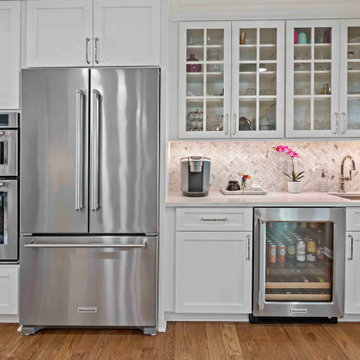
The homeowners expressed that one of the most exciting parts of the process was working with the designers and coming up with new ideas. For example, there was an odd area on one side of the kitchen and our designer suggested making it a double-door pantry. The client’s jaw dropped because she never envisioned having enough storage space to conceal all of her appliances and backstock. She said “It is one of those surprises that came through the design process that we were not expecting and is now one of our favorite parts of the kitchen. We wanted out-of-the-box thinking and that’s what we got.”
 Klopf Architecture
Set in a quiet neighborhood and framed by mature trees, this residence presented a unique opportunity: to thoughtfully evolve a custom mid-century modern home into a space that supports the everyday rhythms of a growing family. With a deep respect for the home’s original architecture, Klopf Architecture reimagined the house to better meet the needs of its owners—introducing functional improvements while preserving the spirit and character of its mid-century roots.
The clients approached Klopf Architecture with a clear vision: refresh their home while seamlessly integrating new programmatic elements. Key goals included clarifying and enhancing the entry sequence; connecting the detached garage to the main house with a practical yet architecturally intentional intervention; adding functional spaces such as a mudroom and laundry room; expanding and remodeling the primary suite’s bathroom and closet; and creating a more engaging outdoor space that capitalized on the site’s impressive views, featuring a fire pit and outdoor kitchen.
As a couple with distinct yet complementary perspectives—one focused on modern functionality and technology, and the other dedicated to preserving the home’s architectural integrity—their collaboration with Klopf Architecture resulted in a solution that harmonized both ideals. Their shared commitment to improving the livability of their home led to a design dialogue rooted in balance. This dynamic partnership shaped the direction of the renovation, ensuring that every decision honored the spirit of the original home while aligning with the practical needs of their growing family.
Designing within the constraints of the sloped site posed one of the project’s central challenges. The detached garage sat at a higher elevation than the main house, requiring a solution that ensured architectural and geometric compatibility between the two structures. Rather than create a purely utilitarian link, Klopf Architecture introduced an intentional connection that contributes to the overall architectural language. A notable pinch point in the plan—where differing geometries converged—was treated as a hinge point, turning a potentially awkward juncture into an architectural feature. This area now functions as both a transition and a moment of design interest that unifies the overall plan.
The design also addressed the underutilized outdoor area, which was located in a shadowed portion of the site with geometrical limitations. A new connection to the rear deck was created in this same area, making the outdoor space more useful and inviting. Klopf Architecture introduced carefully positioned openings and spatial improvements that forged a strong visual and functional connection between indoor and outdoor spaces. The outdoor area now reads as a deliberate extension of the home, embracing natural light and emphasizing the dramatic views.
Working through multiple design iterations, Klopf Architecture crafted a solution that preserved the architectural language of the original home while supporting the functional needs of modern life. The garage-to-house connection became more than a passage—it evolved into an architectural moment of transition. A new mudroom and laundry space enhanced convenience without compromising the clean lines of the design. The primary suite was expanded to create a private, serene retreat. The reimagined backyard, complete with fire pit and kitchen, now plays a vital role in the family’s daily routine and social life.
Outcomes and Lasting Impact
The result is a home that balances heritage with contemporary design, technical precision with design sensibility. The redesign not only met the clients’ initial goals but also exceeded expectations in its ability to seamlessly blend past and present, function and beauty, making the outdoor kitchen a favorite gathering place.
Beyond aesthetics, the renovation has significantly improved daily life for the family. The newly integrated garage connection has streamlined routines, providing a seamless transition between arriving home, storing belongings, and entering the main living spaces. The expanded primary suite offers a retreat-like atmosphere, creating a private space to unwind at the end of the day. The redesigned outdoor areas have also become an extension of their lifestyle—whether it's casual family dinners around the fire pit, entertaining friends in the outdoor kitchen, or simply enjoying the view from the reimagined backyard.
Through a thoughtful and strategic approach, the house has been successfully evolved into a home that remains true to its mid-century modern roots while enhancing livability, functionality, and the overall quality of life for the modern-day owners.
Klopf Architecture Team: Geoffrey Campen, Fernanda Bernardes
Architectural Interior Design: Klopf Architecture
Structural Engineer: Base Design Inc.
Contractor: Golden Snail Builders
Photography: Mariko Reed
Year Completed:2022
 B4 Architecture LLC
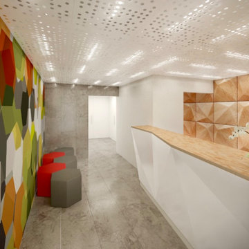
At the time when purchased by our client, the existing space located on the cellar, was not-functional, underutilized and very unwelcoming Doctor’s office. Working closely with the client to understand their needs, we were able to check “all the boxes” on the wish list, as well as professional requirements, so the client ended up with very efficient modern-looking NYC dental office. We had a chance to create a space that is a blend of efficient design, contemporary finishes and cutting-edge technology.
 Renovisions
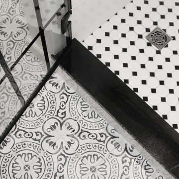
Perectly balanced, this dramatic black and white bathroom is a stunner. Thoughtful design was top of mind for these clients as they approached the Renovisions team to help narrow down their choices and bring it to life. Finding balance while mixing darker, heavier black finishes and lighter, white finishes was the task at hand and the goal was to create a modern look with an industrial/rustic feel.
The challenge on this project was incorporating all the desired elements and products in a tight spatial constraint of 9’ x 7.5’. The clients biggest concern in the old bathroom was inadequate storage, tired and under-utilized bathtub and they also needed an additional sink for their two daughters who often share this space. Renovisions recommended removing the wall between the shower and closet to gain additional floor space as you enter the bath, while providing wall space for the three towel bars.
Collaborating with the clients and searching to find the right fixtures paid off nicely. This newly remodeled Renovision accommodated two rectangular sinks, a walk-in shower with hand-held shower, wall-mounted shower head and two soft spray body jets. The oil-rubbed bronze fixtures not only provided a luxurious spa experience, but also added warmth and softness to the vintage feel. The glass shower enclosure is trimmed in a matte black grid that boasts an industrial aesthetic with retro feel while delivering modernistic function. It’s unique in appearance while allowing the chic white subway and black and white diamond tile to peek through.
The beautifully designed cabinetry in a matte black painted finish provides plenty of storage. This smart configuration included two banks of three drawers for toiletries and accessories, two towers with adjustable shelves for towels and two ‘garage’ doors for hair dryers.
Another unique design detail to capture attention was the black and white curvy geometric floor tile which plays off the straight lines of the cabinets and square grids of the shower enclosure.
The clients are thrilled with the results and their modern, high-contrast styled digs – a true customized relaxation sanctuary for the entire family.
 Moss Building & Design
The MOSS design team sat down with the homeowners and went through every single option. With COVID and the distance from the job site to the MOSS office, most sessions were virtual and set to align with the clients’ work schedules. The homeowners felt all of their ideas were brought to life and the design team added interesting pieces and ideas they really liked.
Early in the design process, they decided a focus wall would be amazing. The client loves shiplap but didn’t want anything that looked too country. Our designer and project manager worked together to create a fireplace wall that combined tile, shiplap and a custom mantel for a result that has become one of the most gorgeous parts of the remodel.
With young, active kids, the clients needed a space that could serve as a dump zone for backpacks and sports gear. Combining an underutilized carport shed and a low-functioning pantry resulted in a beautiful, very useful mudroom.
The homeowners expressed that one of the most exciting parts of the process was working with the designers and coming up with new ideas. For example, there was an odd area on one side of the kitchen and our designer suggested making it a double-door pantry. The client’s jaw dropped because she never envisioned having enough storage space to conceal all of her appliances and backstock. She said “It is one of those surprises that came through the design process that we were not expecting and is now one of our favorite parts of the kitchen. We wanted out-of-the-box thinking and that’s what we got.”
 LBK Design Build
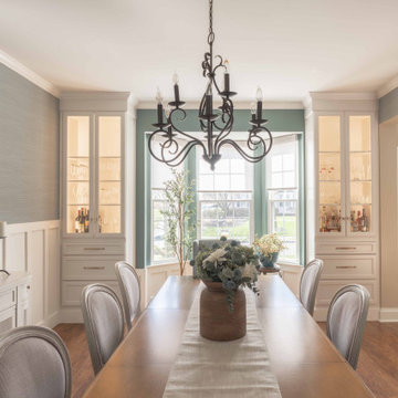
This renovation focused on improving functionality, storage, and overall flow while creating a more refined and cohesive aesthetic throughout the primary bathroom, mudroom, laundry area, and powder room. The design introduces custom built-ins, enhanced organization, updated fixtures, and durable materials while replacing dated finishes with a cleaner, more contemporary look. The project also reimagines underutilized spaces to better support the homeowners’ daily routines.
 Morris Black Designs
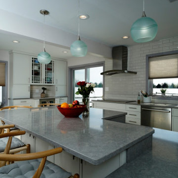
This home had a wood, contemporary kitchen, and a wall separating it from an under-utilized space. For the new Blanco contemporary kitchen, the wall was removed to open up the space and more cabinetry was added, along with updated high-end appliances and quartz countertops.
19