
Search results for "Unhappy" in Home Design Ideas
 Sosna Inc
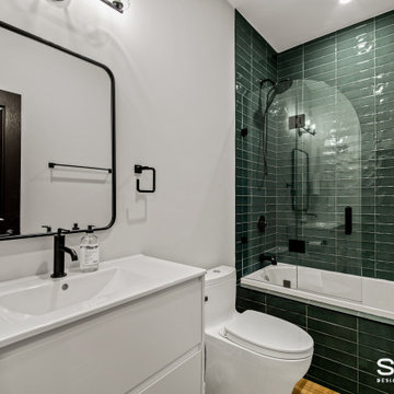
The client, a single man in his thirties, was unhappy with his dark, closed-off home. He wanted a space for entertaining but lacked a functional kitchen and dining area. The master bathroom also felt cramped and outdated.
To address these issues, we focused on creating an open-concept kitchen with a dedicated entertainment zone and a multifunctional island. We also updated the master bathroom with a walk-in shower and floating vanity. Additionally, we modernized the front entrance and mudroom with improved storage solutions.
Key features of the renovation include:
Open-concept kitchen: Removed the wall between the kitchen and dining room to create a more spacious and inviting area.
Entertainment zone: Added a stylish bar area and a space for a large TV to create a dedicated space for socializing and watching TV.
Multifunctional island: Designed a large island that can be used for food preparation, casual dining, and socializing.
Ample storage: Incorporated custom cabinets and drawers to keep the kitchen organized and clutter-free.
Master bathroom renovation: Installed a spacious walk-in shower and a floating vanity to create a more modern and spa-like feel.
Front entrance and mudroom update: Modernized the entrance with updated fixtures and added clever storage solutions.
The final result is a stylish and functional home that perfectly reflects the client's personality and lifestyle.
 Custom Design & Construction
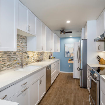
This Playa Del Rey, CA. design / build project began after our client had a terrible flood ruin her kitchen. In truth, she had been unhappy with her galley kitchen prior to the flood. She felt it was dark and deep with poor air conditioning circulating through it. She enjoys entertaining and hosting dinner parties and felt that this was the perfect opportunity to reimagine her galley kitchen into a space that would reflect her lifestyle. Since this is a condominium, we decided the best way to open up the floorplan was to wrap the counter around the wall into the dining area and make the peninsula the same height as the work surface. The result is an open kitchen with extensive counter space. Keeping it light and bright was important but she also wanted some texture and color too. The stacked stone backsplash has slivers of glass that reflect the light. Her vineyard palette was tied into the backsplash and accented by the painted walls. The floating glass shelves are highlighted with LED lights on a dimmer switch. We were able to space plan to incorporate her wine rack into the peninsula. We reconfigured the HVAC vent so more air circulated into the far end of the kitchen and added a ceiling fan. This project also included replacing the carpet and 12X12 beige tile with some “wood look” porcelain tile throughout the first floor. Since the powder room was receiving new flooring our client decided to add the powder room project which included giving it a deep plum paint job and a new chocolate cherry vanity. The white quartz counter and crystal hardware balance the dark hues in the wall and vanity.
 Casa Bella Colors
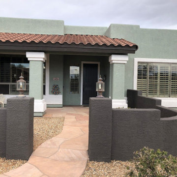
This homeowner was ready to sell her house, literally. She especially was unhappy with the previous exterior colors. After the fresh new paint colors went up, she fell in love. I specified SW color of the year 2022, SW 9130 Evergreen Fog for the body, and SW@ 7020 Black Fox for the fascia, pony wall & front door. When I specified Black Fox for the backyard cinder block wall she freaked! Eventually, she took a leap of faith and absolutely loved it! The contrast of the vegetation & foliage in the forefront of the wall is striking!!!
Find the right local pro for your project
 Sosna Inc
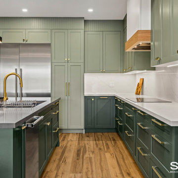
The client, a single man in his thirties, was unhappy with his dark, closed-off home. He wanted a space for entertaining but lacked a functional kitchen and dining area. The master bathroom also felt cramped and outdated.
To address these issues, we focused on creating an open-concept kitchen with a dedicated entertainment zone and a multifunctional island. We also updated the master bathroom with a walk-in shower and floating vanity. Additionally, we modernized the front entrance and mudroom with improved storage solutions.
Key features of the renovation include:
Open-concept kitchen: Removed the wall between the kitchen and dining room to create a more spacious and inviting area.
Entertainment zone: Added a stylish bar area and a space for a large TV to create a dedicated space for socializing and watching TV.
Multifunctional island: Designed a large island that can be used for food preparation, casual dining, and socializing.
Ample storage: Incorporated custom cabinets and drawers to keep the kitchen organized and clutter-free.
Master bathroom renovation: Installed a spacious walk-in shower and a floating vanity to create a more modern and spa-like feel.
Front entrance and mudroom update: Modernized the entrance with updated fixtures and added clever storage solutions.
The final result is a stylish and functional home that perfectly reflects the client's personality and lifestyle.
 Frits de Vries Architect Ltd.
Ema Peter Photography
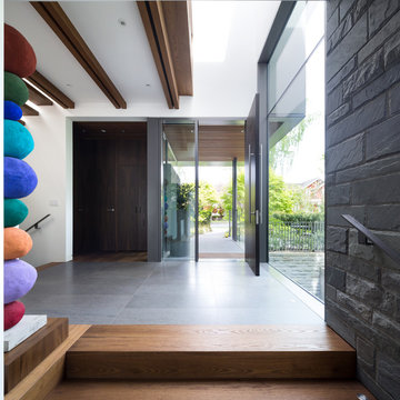
Mid-sized trendy porcelain tile and gray floor entryway photo in Vancouver with white walls and a dark wood front door
Mid-sized trendy porcelain tile and gray floor entryway photo in Vancouver with white walls and a dark wood front door
 Horizon Interior Design
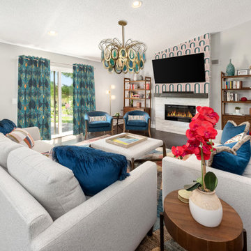
A young couple living in Rochester Hills were unhappy with their living room and dining room space, feeling like they didn’t truly reflect their taste, personality, or lifestyle. So, they came to Horizon Interior Design for help!
They wanted new furnishings and décor that matched their taste and would feel more inviting for friends and family, allowing them to host holiday gatherings comfortably. Another issue they had was unused space at the end of their room, which they weren’t sure what to do with, and a severe lack of storage space and spots to display their collection of décor and photos.
As a record collector and music lover, it made sense to transform the dead space at the end of their living room into a music lounge area with two lounge chairs and a space for a vintage record player. We also incorporated Irish wall art and an ottoman tray from their home city in Ireland.
Drawn to the simplicity of mid-century modern design, we added lovely pops of color into the space with a bright rug, chairs, and pillows. We also added a beautiful set of bookcases with closed storage to flank the fireplace and add more display space. We also added an extension dining table, sectional, and accent chairs to accommodate large family gatherings. Now the space perfectly mirrored this couple and their tastes.
 User
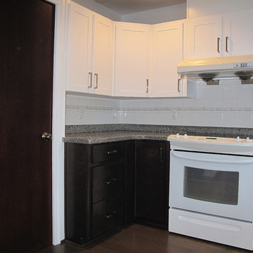
UserThe client was unhappy with her existing oak cabinet exteriors that were restained a number of years ago. Aside from the door style being outdated, the colour was washing/wearing off.
The client chose to update the kitchen by refacing the upper cabinets in Stain White (solid colour) veneer and using Shaker style doors. The lower cabinets were refaced in Cherry veneer in a Milano stain with the same Shaker door. Drawer fronts are solid Cherry slab style. We also installed new Amerock 5 inch Brushed Nickel handles and Blum SoftClose hinges were used throughout.
To increase the storage efficiency we added 8 new pot drawers to the lower cabinets left and right of the stove, and to the left of sink area. Finally, to add more functionality to the existing kitchen layout, a new 48 inch tall bookcase cabinet was added to replace the existing glass curio display case to the left of the sink.
 Custom Concepts Construction Inc.
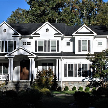
Front view image shows the street view of the home in Bethesda, Maryland. The siding was replaced with James Hardie fiber cement lap siding. Arctic White Hardie ColorPlus factory finish was used. The siding texture is "Cedarmill". The window trim is a 4" picture frame w/ a 3.25" crown molding header detail. The installation was completed by Custom Concepts Construction, Inc. Our siding company is an Elite Preferred siding Contractor in the James Hardie installation program.
 Tile Doctor Ltd
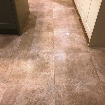
This request came from a client who lives in the Newcastle district of Jesmond who was unhappy with the appearance of their Textured Porcelain floor tiles. The problem was that the Porcelain Tiles were grouted in whilst the underfloor heating was switched on. This resulted in the grout drying out quicker than expected and the tiler struggled to get the excess grout off the tiles. To rectify the problem, the tiler tried to get the dried grout off with acid, but it didn’t work, and the floor was left looking dark and dull. Unable to rectify the problem the client was left with a disappointing pale floor and had searched around the internet for a solution.
Normally grout smears like these (aka Grout Haze) can be removed with an acidic product and Tile Doctor sell Grout Clean-up specially for this purpose. However, some grouts contain acid resistant polymers which need to broken down first. Fortunately, we have a solution for everything tile related and the system we use does not affect the main grout lines only the excess grout. I called in to do a site visit and having surveyed the problem I was confident it could resolved, I gave them a price for the work and agreed a date to return to do the job.
My first task was to spray the tiles with Tile Doctor Remove and Go, this was left to soak into the tile for around ten minutes before being scrubbed in. Remove and Go is a coatings remover that is safe to use on tile and grout; normally we use it to remove old sealers but in this case I applied it to break down the polymers. To work the product into the tile I use a buffing machine fitted with a black scrubbing pad, the mechanical advantage this gives makes the job a lot quicker. Then the slurry generated is rinsed off with water and removed with a wet vacuum. The floor was then left to dry for 30 minutes.
We were then able to remove the excess grout which was done by applying Tile Doctor Grout Clean-Up which I mentioned earlier. The process was the same, i.e. using the buffing machine and a wet vacuum to scrub the floor and extract the soil. The floor was rinsed with water to remove any trace of the products used and dried as much as possible using the wet vacuum. The underfloor heating really helped at this point to dry out the floor.
Once the floor was fully dry including the grout lines a single thin coat of Tile Doctor Colour Grow sealer was applied. The tiles were textured porcelain, so the dirt gets trapped into the textured surface if it is not sealed. We usually find one coat of Tile Doctor Colour Grow is more than enough for this, anything that hadn’t soaked in after three to five minutes was then polished off with clean dry cloths.
The client was very happy with the floor and pleased that the excess grout had been cleaned up and the floor looked as it should. Before leaving I recommended the use a pH Neutral tile cleaner for general cleaning such as Tile Doctor Neutral Tile Cleaner. There is no point sealing the tiles only to have it stripped off later with the use of a bleach based cleaner.
Raf Barrett
Tyneside Tile Doctor
 Lori Delisle Interior Design & Decorating
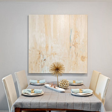
My clients were really unhappy with their kitchen table but with 2 small children they were not excited about investing in something new quite yet. We showed them how the placement of a very large piece of art over their table, and a table cloth and chair covers to mask the worn state of their current set for grown up time can elevate their old table to all new heights.
 Renovisions
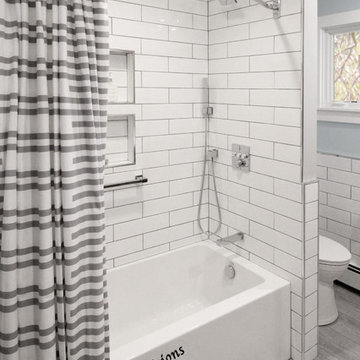
When these Canton, MA homeowners desired to upgrade their childrens’ bathroom, they were referred to Renovisions who were grateful to accept the task. The clients were unhappy with the existing cramped floor plan, lack of storage, old and drafty windows, outdated fixtures and overall lackluster aesthetic.
Renovisions designed the new room to not only meet the client’s goals, but exceeded them abundantly. Mobility in the space was limited due to the door swing into the room. Renovisions recommended replacing the currenmt door with a pocket door in an arch-top beaded design to match the nearby bedroom doors, while also upgrading the hallway linen closet with new shelving and same styled door.
Renovisions also increased the layout by borrowing space from the adjacent dining room. There is now more room for the handsome, quartered-mahogany wall-hung vanity with linen tower.
Since the homeowners requested a contemporary look, the design team focused on choosing more modern products including a soaking tub, minimalistic square designed shower heads, tub filler, single lever faucet and a large rectangular sink. The white quartz countertop with wide veining and waterfall edge, along with the striking larger format subway tile finished with square edge chrome profiles contribute to the clean aethetic and modern appeal.
From the sleek porcelain plank floor tile, new double-mulled Marvin casement windows and recessed lighting that provides just the right amount of light, the end result: a one-of-a-kind bathroom, a unique and modern ‘Revitalized Room’.
 Kitchen Solvers of Bellevue
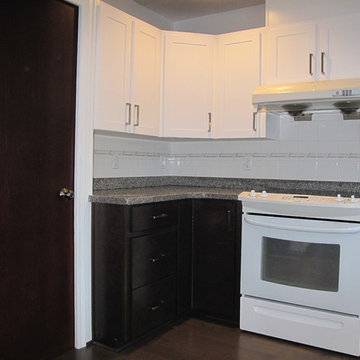
The client was unhappy with her existing oak cabinet exteriors that were restained a number of years ago. Aside from the door style being outdated, the colour was washing/wearing off.
The client chose to update the kitchen by refacing the upper cabinets in Stain White (solid colour) veneer and using Shaker style doors. The lower cabinets were refaced in Cherry veneer in a Milano stain with the same Shaker door. Drawer fronts are solid Cherry slab style. We also installed new Amerock 5 inch Brushed Nickel handles and Blum SoftClose hinges were used throughout.
To increase the storage efficiency we added 8 new pot drawers to the lower cabinets left and right of the stove, and to the left of sink area. Finally, to add more functionality to the existing kitchen layout, a new 48 inch tall bookcase cabinet was added to replace the existing glass curio display case to the left of the sink.
 Hyde Park Renovations
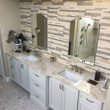
This remodel consisted of re-doing a master bathroom and a secondary bath. Our customer was unhappy with the outdated style of the original cabinetry and fixtures in the home.
The foundation of this project started with all-wood cabinets from Woodland Cabinetry. We updated the countertops with Diana Royal marble and accented the backsplash with a linear travertine tile from Tar-Mak USA. We tackled the bathtub by removing the outdated oval jet tub and replacing it with a brand new rectangular jetted tub from Mirabelle. We re-built the tub deck to a more appealing size and replaced the tile decking for a slab of marble. Both showers had the enclosures updated with new glass. To finish off the renovation our customer selected the Arendal pull from Top Knobs as her hardware.
 Wilsonville Carpet & Tile
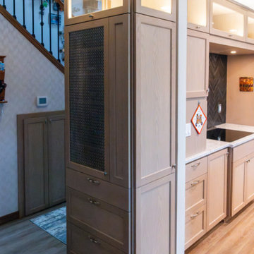
Our client was unhappy with the layout of her kitchen and was looking for a simplified layout with cabinetry for collectables as well as better storage for appliances. We worked with this client to create a footprint that she would love with a sleek, modern look.
 Charlie Allen Renovations, Inc.
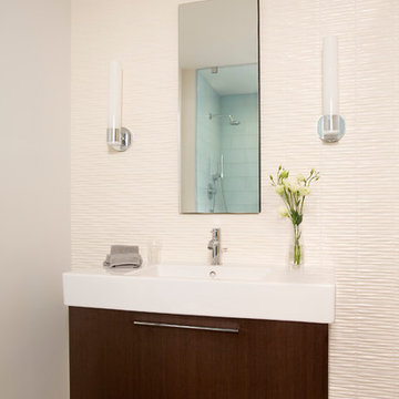
The owners of this nineteenth century condo had been unhappy with a previous bathroom renovation nearly twenty years before and decided that it was time to do something about it. They asked us to gut the entire room and start over.
We began by addressing the functionality of the space. Neither of the homeowners used their bathtub very often, and agreed that a large walk-in shower would provide a better use of space. They preferred the clean lines of a stationary glass panel extending all the way to the ceiling as the only divide between the shower and the room. To provide a curbless shower transition, we flush framed the shower area as low as possible. With an eye to future needs we installed blocking in the wall just outside the shower entrance to someday support a grab bar. Two recessed lights in the shower provide additional lighting, and azure Lucien glass tiles on the shower wall offer a splash of color. A Hans Grohe showerhead with separate hand held unit rounds out the luxurious shower experience.
Because the bathroom had not featured enough storage, we replaced an existing pedestal sink with an elegant Duravit wall sink with vanity drawer storage. A tall mirrored Robern medicine cabinet provides additional space for toiletries and bathroom necessities.
Vincent Wolf’s elegant Waves in Birch matte tile along one wall, with tall, tapered vanity lights on either side of the medicine cabinet, complete the graceful design of this bathroom.
Photo by Shelly Harrison
 Custom Design & Construction
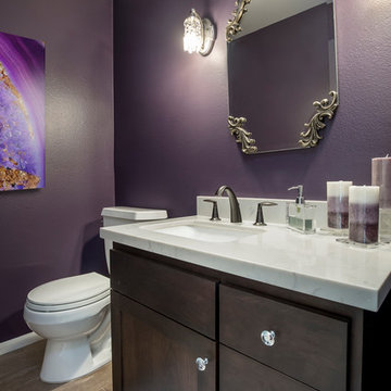
This Playa Del Rey, CA. design / build project began after our client had a terrible flood ruin her kitchen. In truth, she had been unhappy with her galley kitchen prior to the flood. She felt it was dark and deep with poor air conditioning circulating through it. She enjoys entertaining and hosting dinner parties and felt that this was the perfect opportunity to reimagine her galley kitchen into a space that would reflect her lifestyle. Since this is a condominium, we decided the best way to open up the floorplan was to wrap the counter around the wall into the dining area and make the peninsula the same height as the work surface. The result is an open kitchen with extensive counter space. Keeping it light and bright was important but she also wanted some texture and color too. The stacked stone backsplash has slivers of glass that reflect the light. Her vineyard palette was tied into the backsplash and accented by the painted walls. The floating glass shelves are highlighted with LED lights on a dimmer switch. We were able to space plan to incorporate her wine rack into the peninsula. We reconfigured the HVAC vent so more air circulated into the far end of the kitchen and added a ceiling fan. This project also included replacing the carpet and 12X12 beige tile with some “wood look” porcelain tile throughout the first floor. Since the powder room was receiving new flooring our client decided to add the powder room project which included giving it a deep plum paint job and a new chocolate cherry vanity. The white quartz counter and crystal hardware balance the dark hues in the wall and vanity.
 Tracey Stephens Design, LLC
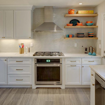
The wife travels often for business and loves to cook with her daughter when at home. She was desperately unhappy with the old kitchen. The clients report the new design is an “incredibly spacious masterpiece that brings a whole new purpose and meaning to our kitchen. We now have FOUR countertop workspaces when we previously had one cramped and tiny one. We love the clean and simple design, with neutrals and pops of color.”
 Kitchen Solvers of Bellevue
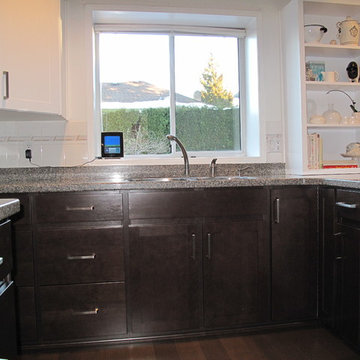
The client was unhappy with her existing oak cabinet exteriors that were restained a number of years ago. Aside from the door style being outdated, the colour was washing/wearing off.
The client chose to update the kitchen by refacing the upper cabinets in Stain White (solid colour) veneer and using Shaker style doors. The lower cabinets were refaced in Cherry veneer in a Milano stain with the same Shaker door. Drawer fronts are solid Cherry slab style. We also installed new Amerock 5 inch Brushed Nickel handles and Blum SoftClose hinges were used throughout.
To increase the storage efficiency we added 8 new pot drawers to the lower cabinets left and right of the stove, and to the left of sink area. Finally, to add more functionality to the existing kitchen layout, a new 48 inch tall bookcase cabinet was added to replace the existing glass curio display case to the left of the sink.
 User
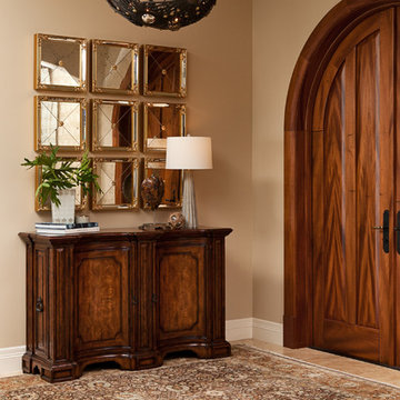
User"Transitional" -- what exactly does this term mean? Especially, when describing interior design. Transitional style design, usually means that you have characteristics of both modern and traditional in your space. You kind of fall in that even middle ground between both styles.
For this dining room, our client was just that. However, she wasn't aware of it. She was trying to pair multiple traditional elements together, but it left her feeling unhappy. The space was feeling dark, filled with heavy furniture and nothing was popping or even uplifting. She knew she liked to mix patterns and textures, but was also unsure of how to achieve that.
As I looked around her home, I realized that their art collection definitely leaned more on the modern and colorful side of the spectrum. This was a big indicator to me, she wasn't fully traditional at all, she was more transitional! That was my que, and we got to work and this is the result.
Native House Photography
 Fresh Start Contracting
Ken Kotch Photography
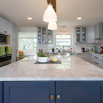
Inspiration for a large contemporary l-shaped medium tone wood floor open concept kitchen remodel in Boston with a drop-in sink, shaker cabinets, white cabinets, marble countertops, white backsplash, ceramic backsplash, stainless steel appliances and an island
Inspiration for a large contemporary l-shaped medium tone wood floor open concept kitchen remodel in Boston with a drop-in sink, shaker cabinets, white cabinets, marble countertops, white backsplash, ceramic backsplash, stainless steel appliances and an island
11