
Search results for "Unique challenges" in Home Design Ideas
 Sogno Design Group
Michele Lee Wilson
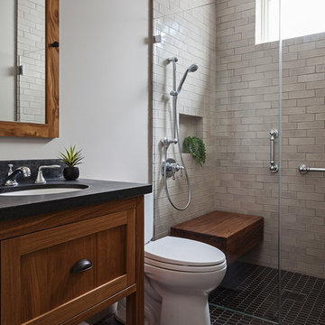
Walk-in shower - mid-sized craftsman 3/4 beige tile and subway tile ceramic tile and black floor walk-in shower idea in San Francisco with recessed-panel cabinets, dark wood cabinets, a two-piece toilet, white walls, an undermount sink and soapstone countertops
Walk-in shower - mid-sized craftsman 3/4 beige tile and subway tile ceramic tile and black floor walk-in shower idea in San Francisco with recessed-panel cabinets, dark wood cabinets, a two-piece toilet, white walls, an undermount sink and soapstone countertops
 Nathan Taylor for Obelisk Home
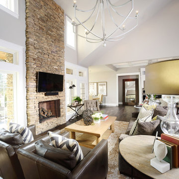
Preliminary architecture renderings were given to Obelisk Home with a challenge. The homeowners needed us to create an unusual but family friendly home, but also a home-based business functioning environment. Working with the architect, modifications were made to incorporate the desired functions for the family. Starting with the exterior, including landscape design, stone, brick and window selections a one-of-a-kind home was created. Every detail of the interior was created with the homeowner and the Obelisk Home design team.
Furnishings, art, accessories, and lighting were provided through Obelisk Home. We were challenged to incorporate existing furniture. So the team repurposed, re-finished and worked these items into the new plan. Custom paint colors and upholstery were purposely blended to add cohesion. Custom light fixtures were designed and manufactured for the main living areas giving the entire home a unique and personal feel.
Photos by Jeremy Mason McGraw
 Dado Interior Design
Location: Denver, CO, USA
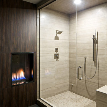
THE CHALLENGE: Transform an outdated, uninspired condo into a unique, forward thinking home, while dealing with a limited capacity to remodel due to the buildings’ high-rise architectural restrictions.
THE SOLUTION: Warm wood clad walls were added throughout the home, creating architectural interest, as well as a sense of unity. Soft, textured furnishing was selected to elevate the home’s sophistication, while attention to layout and detail ensures its functionality.
Dado Interior Design
DAVID LAUER PHOTOGRAPHY
Find the right local pro for your project
 DesignARC
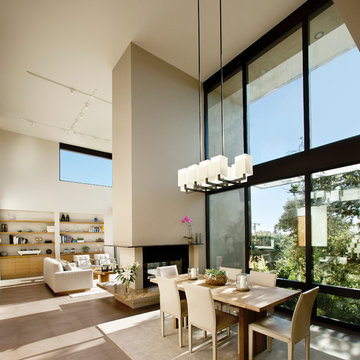
The Tice Residences replace a run-down and aging duplex with two separate, modern, Santa Barbara homes. Although the unique creek-side site (which the client’s original home looked toward across a small ravine) proposed significant challenges, the clients were certain they wanted to live on the lush “Riviera” hillside.
The challenges presented were ultimately overcome through a thorough and careful study of site conditions. With an extremely efficient use of space and strategic placement of windows and decks, privacy is maintained while affording expansive views from each home to the creek, downtown Santa Barbara and Pacific Ocean beyond. Both homes appear to have far more openness than their compact lots afford.
The solution strikes a balance between enclosure and openness. Walls and landscape elements divide and protect two private domains, and are in turn, carefully penetrated to reveal views.
Both homes are variations on one consistent theme: elegant composition of contemporary, “warm” materials; strong roof planes punctuated by vertical masses; and floating decks. The project forms an intimate connection with its setting by using site-excavated stone, terracing landscape planters with native plantings, and utilizing the shade provided by its ancient Riviera Oak trees.
2012 AIA Santa Barbara Chapter Merit Award
Jim Bartsch Photography
 DesignARC
The Tice Residences replace a run-down and aging duplex with two separate, modern, Santa Barbara homes. Although the unique creek-side site (which the client’s original home looked toward across a small ravine) proposed significant challenges, the clients were certain they wanted to live on the lush “Riviera” hillside.
The challenges presented were ultimately overcome through a thorough and careful study of site conditions. With an extremely efficient use of space and strategic placement of windows and decks, privacy is maintained while affording expansive views from each home to the creek, downtown Santa Barbara and Pacific Ocean beyond. Both homes appear to have far more openness than their compact lots afford.
The solution strikes a balance between enclosure and openness. Walls and landscape elements divide and protect two private domains, and are in turn, carefully penetrated to reveal views.
Both homes are variations on one consistent theme: elegant composition of contemporary, “warm” materials; strong roof planes punctuated by vertical masses; and floating decks. The project forms an intimate connection with its setting by using site-excavated stone, terracing landscape planters with native plantings, and utilizing the shade provided by its ancient Riviera Oak trees.
2012 AIA Santa Barbara Chapter Merit Award
Jim Bartsch Photography




 FineLine Kitchens, Inc.
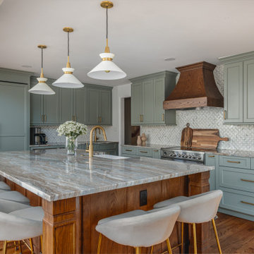
Hi everyone, I'm Sarah and Ogun we are here with fine line kitchens. So we are a couple working together. I do the interior design and remodeling of the space material selection meeting with the clients. And I handled operations outside, you know meaning all the construction work that is taking place the inside. The houses that we work in. I handle all the aspects of the construction, so today's project is very special. We're in Vienna and the client had a very big family. It's a family of seven that lives here. So we had a few aspects that we needed to keep in mind while designing this one. Having everybody be able to sit on the island. So we wanted plenty of seating all the way around. We didn't want anybody standing or anything like that. So what we did is we maximize the space. The center island is the biggest part of the kitchen. We use a natural stone to kind of give it a beautiful texture versus quartz. It's kind of standard white or kind of fabricated, so I wanted something very natural. We did this because I took my inspiration from the outside, so the inspiration if you look at the view right in front of me is there are so many greens there's a lot of brass accents and I wanted to bring this. Into this kitchen while designing it for my clients. She is very warm very. She wanted a very homey, comfy kind of look for the kitchen. So that's what we did today. As you can see, the cabinets are sage green, very light, so I still think it's a neutral, but it's a lighter color that again brings the outside in and we combine that with the oak right behind me so it's a slightly warm oak. It's not very dark. It's not very light. It's a medium brown and the same color went on the island. To kind of tie these two in and the backsplash, my favorite part is where you can see a little bit of design. It is, in my opinion still classic, but includes a pattern so the outside part is as we said in the beginning, is handled by my husband. I'd like him to speak a little bit about that. Thanks, Sarah, I want to talk to you guys a little bit about the construction part of this project. Originally this kitchen was located mostly in this area. They had their stove there sing. It was more of a peninsula layout in Sarah's and the customer vision they wanted. They wanted to get rid of the peninsula and they want to be able to have a huge island that can at least sit seven people because they're familiar with seven. So we wanted to make sure that we can achieve this design and bring it to life so that they can be happy with this layout. Some of the challenges we had, the house, the home being, you know, old home. There were a lot of you know the older electrical and plumbing that had to be replaced. We had to relocate the stove from here to this area. Over here we had put a nice foot fan that we had to relocate all the ductwork and the plumbing. Was being on the peninsula area. We had to relocate it to the center islands. So we achieved all this and kind of like bring it to bring in this kitchen up to date it looks beautiful. That's true, so yes, the old layout did not function for my clients because everything was kind of gathered on one side of the kitchen. So there was like a peninsula right there. So the end of this island kind of continued straight. And that was just the L shape. Kind of where everything was and there used to be another big table here, so they were using only kind of half of the space. So like I said at the beginning, our vision was to kind of feed everybody at the island, create some symmetry. 'cause I love that. So as you can see behind me, this is kind of the focal point symmetrical. Everything is kind of even we wanted to also panel the fridge here so it mimics the pantry and another size. So when you're looking at it, it is bringing again that symmetry back again. I hope you enjoyed this kitchen and this video and I'll see you soon. So how do you think this project turned out? It's nice. I like the color. I think it turned out nice. It's kind of like a little bit different color than what we always do. So I realize. Are you giving me a little bit of credit here that I did something different? Are you proud? I'm so proud of you. Other than that I like it. That they have kind of like a two sink. So if this was our kitchen, if we ever like you can have your own. I can have mine if we ever get into a fight then this can be like my own kitchen. Why are we gonna bring in a fight right now? So I'm cooking anyway. You're grilling most of the time, So what are you even talking about? My kitchen? That's my kitchen. You can just take the small sink. That's fine. It's always good to have your own space right there, so anyways. Thank you guys for watching. We hope to see you soon and if you have any questions please click the link below. It'll lead you to our website, house, YouTube and all of the social media is so nice to have you guys. We'll see you soon. Thanks bye bye-bye.
 Ryan Siphers Photography
Photograph by Ryan Siphers Photography
Architects: De Jesus Architecture & Design
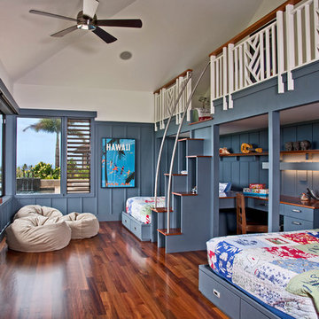
Kids' room - tropical medium tone wood floor and brown floor kids' room idea in Hawaii with blue walls
Kids' room - tropical medium tone wood floor and brown floor kids' room idea in Hawaii with blue walls

 Advance Design Studio, Ltd.
Jennifer and Dan have lived in their Deer Park Illinois home for 15 years, slowly making minor fixes like painting and decorating; but they had a new plan for their kitchen the entire time. An awkwardly placed garage door, and an island cooktop with a terrible downdraft made a full-scale kitchen remodel an absolute must. Jennifer had many ideas in mind and wanted to work with a company that could provide high-end work, while partnering with a designer that would tailor the kitchen to her ideas.
She was intrigued by the phrase “Common Sense Remodeling” in Advance Design’s feature she discovered while perusing an issue of the community’s Quintessential Barrington Magazine. Doing further research on the company’s website, as she looked through project profiles and read about Advance Design’s “Common Sense Remodeling” philosophy, she promptly scheduled an appointment to see if the people and ideas she read about were truly who they said they were. The more she read, the more she knew that the “Common Sense” approach to remodeling they described was exactly the type of company she was looking for.
The partnership was sealed after an initial consultation with Owner Todd Jurs and Project Designer Michelle Lecinski. They displayed a combination of friendliness, professionalism and respect that was unmatched by any of the other companies Jennifer talked to. She knew that with Advance Design, she would be able to retain the vision that she had in mind with high-quality craftsmanship.
“I reached out to Advance Design because of the ‘Common Sense Remodeling’ tagline,” Jennifer said. “That’s what lingered for me”. “Advance Design was the most respectful- of the house and of my design ideas, and the most professional of the handful of companies that looked at my project”.
Soon after the meeting Jennifer began working with Michelle on the project design. They quickly developed chemistry. Jennifer loved how Michelle researched and located every detail that Jennifer wanted for the kitchen. Between the two of them, every concept and idea was worked through and perfected. “Jennifer had definite ideas about what she wanted the new kitchen to look like, she just didn’t know how to bring it all together. We worked together really well to make her ideas into the practical reality necessary for a well-functioning kitchen, with the look and feel that she had envisioned”, says Michelle.
“Michelle was wonderful in using the CAD system she would show me new drawings every time we changed the layout while working through the design,” Jennifer said. “She was a really wonderful partner in execution, she made sure everything happened quickly and easily.”
The finished design drew out elements of Jennifer’s style and personality. The pair call the look “sophisticated farmhouse” to describe the kitchen renovation to family and friends. The result was a beautifully crafted, authentic-feeling space that satisfied Jennifer’s dreams 15 years in the making. The whole project consisted of a kitchen remodel, mudroom upgrade with powder room, and garage entry relocation. “The projects I personally like the best, are the ones that put the client’s dreams on display,” Project Designer Michelle said. “And this is one of those projects.”
The main focal point of the kitchen is custom zinc and brass ventilation hood with a vintage sheen, which was hand made to order by a small company in Indiana named Vogler Metalworking. “It’s like sculpture, a true work of art”, says Jennifer. Your eye is immediately drawn towards this elegant yet practical hood that eliminated the home’s downdraft problem and added a striking conversation piece at the same time. The carpenters had to use special gloves when transporting and installing it, so they didn’t smudge it with fingerprints. The beautiful hood centers proudly over the stunning black enamel and brass LaCornue Range. “I had a friend who had a LaCornue range and after learning how easy it was to cook perfect meals, I was convinced I wanted to have one”, says Jennifer. This unique, breathtaking combination anchors the entire kitchen and is apparent immediately as you walk into the great room the surrounds the space.
DuraSupreme Crestwood cabinets with a Kendall Panel add function and sophistication. A custom gray paint color paired with a storm blue was developed so that the new kitchen looked like it belonged to the existing space. Unlacquered brass faucets and hardware were important to Jennifer because she wanted the living finishes to age over time. Remarkable brass diamond mesh cabinet door inserts imported from the UK continue to add this one-of-a-kind kitchen renovation; giving it a “you won’t see this everywhere” quality. The use of old railcar flooring for the coffee bar countertop and reclaimed oak for the open shelving gives an authenticity to the space uncommon in kitchens today.
Jennifer and Michelle fell in love with the Limestone Grey Stone while they were investigating unique island countertop ideas. They liked the fact that the limestone as a living finish will age and change over time. Calcutta Miel Quartz countertops made for an excellent pairing around the perimeter, as it’s durable and perfect for cooking preparations. A textured white subway tile backsplash that runs to the ceiling keeps your eye moving towards the open shelving, and to the main focal point of the stunning range hood combination.
“The kitchen functions beautifully, and it’s gorgeous,” beams Jennifer as she gestures with both hands while smiling ear to ear. “The most important thing was I wanted a kitchen that had a wonderful flow, cooked beautiful meals and was a great gathering place for family and friends, and this space does that perfectly! Beauty wise, it turned out exactly how I had envisioned. I felt the function part was the hardest part, and that was nailed”!
Relocating the garage entry to the new mudroom was a huge priority and has finally separated the family’s arriving home functions from their kitchen. Now coats and shoes and bags have their own area for dropping once members arrive home. Matching gray DuraSupreme cabinetry helped create gorgeous, purposeful lockers for the family. A reclaimed vintage sink and custom wall paper were added to the tiny powder room to beautify the once previously only functional space. Advance Design was even able to create a custom space for their dog to sleep while the family is away.
“It was unbelievable that a project of this size was completed in such a short time, and I think that’s because of the large amount of planning and preparation that went into it,” Jennifer marveled, “When we started, we were ready, and everything was prepared”.
When it came to execution, Project Manager Justin Davis and his crew were quick, accessible, and organized. Projects like this kitchen are typically completed in as little as 8-10 weeks. Jennifer’s kitchen however despite the relocation of some challenging HVAC in a soffit and moving of an exterior door was completed remarkably fast in part because the team was working with an existing tile floor that ran throughout the first floor that the client really loved.
“You get to know these people really well because they’re living in your house while you’re living in your house. They were so fast and really good, it didn’t take as long as even planned” reported Jennifer. “I would text Justin and he always responded almost immediately. I got to know all the guys who were working in our house and they were all wonderful people”.
Details in a customized kitchen like this one require skill and care from the people who install it. “All the guys on the job were skilled at what the did. I wanted small details like little feet to look like furniture, that is where their carpentry skill came in to make these all perfect”, said Jennifer. “The tile guys were wonderful. They even let me determine how I wanted the texture with the grout to appear for a salt and pepper look; now that is a very skilled trade person making it custom”.
In Jennifer’s interview, she continued to reference Advance Design’s “Common Sense Remodeling”, so I took a minute to ask her exactly what that phrase meant to her and how it played out in her experience with her project and the Advance Design team. Here is what she said: “I was intrigued about Common Sense Remodeling and in my head that there would be clear costs and prices, great communication between the design team, the execution team and me”, said Jennifer. They did deliver on that, it was so clear about the cost breakdown, what I could expect from everyone who came to my house, and everything that we had ordered. That to me is the Common Sense”!
It’s great to see a client take literally our assertion that a well-planned remodeling project is simply “Common Sense”! She anticipated each step of the way would be clear, concise, and predictable, all the while protecting the outcome due to the careful upfront planning. “Advance Design delivered on their ‘Common Sense Remodeling’ promise,” Jennifer said. “From the design team, to the execution team - everything was straight forward like I imagined. The project turned out exactly how I envisioned, I enjoyed this process and absolutely would recommend Advance Design Studio to anyone.”
 TINEKE TRIGGS
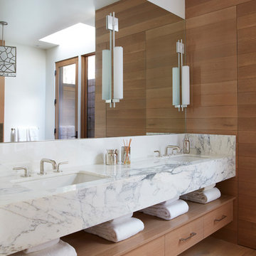
Inspiration for a mid-sized contemporary master medium tone wood floor and brown floor bathroom remodel in San Francisco with flat-panel cabinets, medium tone wood cabinets, brown walls, an undermount sink and marble countertops

 User
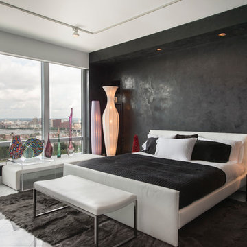
UserLocated in one of the Ritz residential towers in Boston, the project was a complete renovation. The design and scope of work included the entire residence from marble flooring throughout, to movement of walls, new kitchen, bathrooms, all furnishings, lighting, closets, artwork and accessories. Smart home sound and wifi integration throughout including concealed electronic window treatments.
The challenge for the final project design was multifaceted. First and foremost to maintain a light, sheer appearance in the main open areas, while having a considerable amount of seating for living, dining and entertaining purposes. All the while giving an inviting peaceful feel,
and never interfering with the view which was of course the piece de resistance throughout.
Bringing a unique, individual feeling to each of the private rooms to surprise and stimulate the eye while navigating through the residence was also a priority and great pleasure to work on, while incorporating small details within each room to bind the flow from area to area which would not be necessarily obvious to the eye, but palpable in our minds in a very suttle manner. The combination of luxurious textures throughout brought a third dimension into the environments, and one of the many aspects that made the project so exceptionally unique, and a true pleasure to have created. Reach us www.themorsoncollection.com
Photography by Elevin Studio.

 TKS Design Group
Free ebook, Creating the Ideal Kitchen. DOWNLOAD NOW
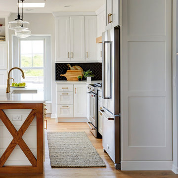
Our clients came to us looking to do some updates to their new condo unit primarily in the kitchen and living room. The couple has a lifelong love of Arts and Crafts and Modernism, and are the co-founders of PrairieMod, an online retailer that offers timeless modern lifestyle through American made, handcrafted, and exclusively designed products. So, having such a design savvy client was super exciting for us, especially since the couple had many unique pieces of pottery and furniture to provide inspiration for the design.
The condo is a large, sunny top floor unit, with a large open feel. The existing kitchen was a peninsula which housed the sink, and they wanted to change that out to an island, relocating the new sink there as well. This can sometimes be tricky with all the plumbing for the building potentially running up through one stack. After consulting with our contractor team, it was determined that our plan would likely work and after confirmation at demo, we pushed on.
The new kitchen is a simple L-shaped space, featuring several storage devices for trash, trays dividers and roll out shelving. To keep the budget in check, we used semi-custom cabinetry, but added custom details including a shiplap hood with white oak detail that plays off the oak “X” endcaps at the island, as well as some of the couple’s existing white oak furniture. We also mixed metals with gold hardware and plumbing and matte black lighting that plays well with the unique black herringbone backsplash and metal barstools. New weathered oak flooring throughout the unit provides a nice soft backdrop for all the updates. We wanted to take the cabinets to the ceiling to obtain as much storage as possible, but an angled soffit on two of the walls provided a bit of a challenge. We asked our carpenter to field modify a few of the wall cabinets where necessary and now the space is truly custom.
Part of the project also included a new fireplace design including a custom mantle that houses a built-in sound bar and a Panasonic Frame TV, that doubles as hanging artwork when not in use. The TV is mounted flush to the wall, and there are different finishes for the frame available. The TV can display works of art or family photos while not in use. We repeated the black herringbone tile for the fireplace surround here and installed bookshelves on either side for storage and media components.
Designed by: Susan Klimala, CKD, CBD
Photography by: Michael Alan Kaskel
For more information on kitchen and bath design ideas go to: www.kitchenstudio-ge.com
 Carolina V. Gentry, RID
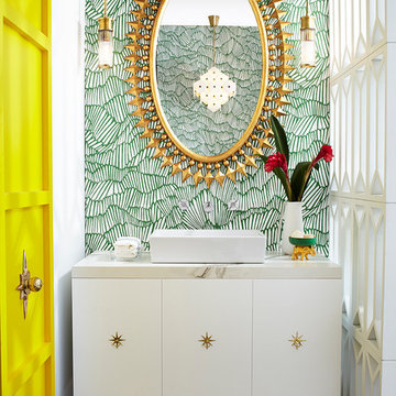
Timeless Palm Springs glamour meets modern in Pulp Design Studios' bathroom design created for the DXV Design Panel 2016. The design is one of four created by an elite group of celebrated designers for DXV's national ad campaign. Faced with the challenge of creating a beautiful space from nothing but an empty stage, Beth and Carolina paired mid-century touches with bursts of colors and organic patterns. The result is glamorous with touches of quirky fun -- the definition of splendid living.
 MH2G
MH2GMH2G
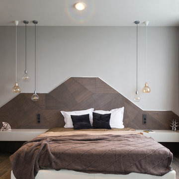
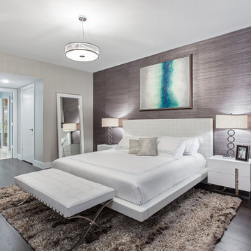
Inspiration for a large modern master bedroom remodel in Miami with multicolored walls and engineered wood floors
Inspiration for a large modern master bedroom remodel in Miami with multicolored walls and engineered wood floors
 Bobbi Alderfer/Lifestyle Design
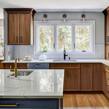
Adding lighting above the sink is always a must but finding a unique and stylish way to do it can be a challenge. These 3 wall sconces fill the space with the perfect amount of light and balance the windows well. Mixing metal finishes was something this client was on board with and they all work together here.

 Cummings Architecture + Interiors
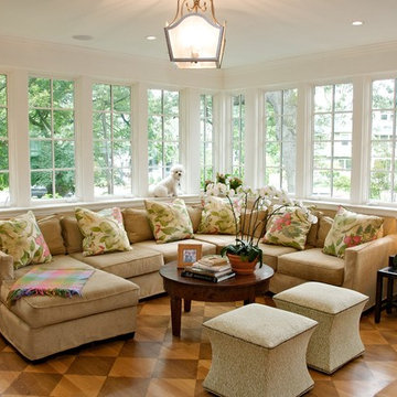
Designing additions for Victorian homes is a challenging task. The architects and builders who designed and built these homes were masters in their craft. No detail of design or proportion went unattended. Cummings Architects is often approached to work on these types of projects because of their unwavering dedication to ensure structural and aesthetic continuity both inside and out.
Upon meeting the owner of this stately home in Winchester, Massachusetts, Mathew immediately began sketching a beautifully detail drawing of a design for a family room with an upstairs master suite. Though the initial ideas were just rough concepts, the client could already see that Mathew’s vision for the house would blend the new space seamlessly into the fabric of the turn of the century home.
In the finished design, expanses of glass stretch along the lines of the living room, letting in an expansive amount of light and creating a sense of openness. The exterior walls and interior trims were designed to create an environment that merged the indoors and outdoors into a single comfortable space. The family enjoys this new room so much, that is has become their primary living space, making the original sitting rooms in the home a bit jealous.
Photo Credit: Cydney Ambrose

 CHRISTOPHER STROM ARCHITECTS
Eye-Land: Named for the expansive white oak savanna views, this beautiful 5,200-square foot family home offers seamless indoor/outdoor living with five bedrooms and three baths, and space for two more bedrooms and a bathroom.
The site posed unique design challenges. The home was ultimately nestled into the hillside, instead of placed on top of the hill, so that it didn’t dominate the dramatic landscape. The openness of the savanna exposes all sides of the house to the public, which required creative use of form and materials. The home’s one-and-a-half story form pays tribute to the site’s farming history. The simplicity of the gable roof puts a modern edge on a traditional form, and the exterior color palette is limited to black tones to strike a stunning contrast to the golden savanna.
The main public spaces have oversized south-facing windows and easy access to an outdoor terrace with views overlooking a protected wetland. The connection to the land is further strengthened by strategically placed windows that allow for views from the kitchen to the driveway and auto court to see visitors approach and children play. There is a formal living room adjacent to the front entry for entertaining and a separate family room that opens to the kitchen for immediate family to gather before and after mealtime.
 DiMauro Architects, Inc.
Photography: Nat Rea
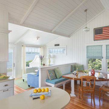
Inspiration for a coastal medium tone wood floor great room remodel in Providence with white cabinets and an island
Inspiration for a coastal medium tone wood floor great room remodel in Providence with white cabinets and an island
2