
Search results for "Unique challenges" in Home Design Ideas
 Cummings Architecture + Interiors
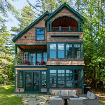
Situated on the edge of New Hampshire’s beautiful Lake Sunapee, this Craftsman-style shingle lake house peeks out from the towering pine trees that surround it. When the clients approached Cummings Architects, the lot consisted of 3 run-down buildings. The challenge was to create something that enhanced the property without overshadowing the landscape, while adhering to the strict zoning regulations that come with waterfront construction. The result is a design that encompassed all of the clients’ dreams and blends seamlessly into the gorgeous, forested lake-shore, as if the property was meant to have this house all along.
The ground floor of the main house is a spacious open concept that flows out to the stone patio area with fire pit. Wood flooring and natural fir bead-board ceilings pay homage to the trees and rugged landscape that surround the home. The gorgeous views are also captured in the upstairs living areas and third floor tower deck. The carriage house structure holds a cozy guest space with additional lake views, so that extended family and friends can all enjoy this vacation retreat together. Photo by Eric Roth
 Drewett Works
Above and Beyond is the third residence in a four-home collection in Paradise Valley, Arizona. Originally the site of the abandoned Kachina Elementary School, the infill community, appropriately named Kachina Estates, embraces the remarkable views of Camelback Mountain.
Nestled into an acre sized pie shaped cul-de-sac lot, the lot geometry and front facing view orientation created a remarkable privacy challenge and influenced the forward facing facade and massing. An iconic, stone-clad massing wall element rests within an oversized south-facing fenestration, creating separation and privacy while affording views “above and beyond.”
Above and Beyond has Mid-Century DNA married with a larger sense of mass and scale. The pool pavilion bridges from the main residence to a guest casita which visually completes the need for protection and privacy from street and solar exposure.
The pie-shaped lot which tapered to the south created a challenge to harvest south light. This was one of the largest spatial organization influencers for the design. The design undulates to embrace south sun and organically creates remarkable outdoor living spaces.
This modernist home has a palate of granite and limestone wall cladding, plaster, and a painted metal fascia. The wall cladding seamlessly enters and exits the architecture affording interior and exterior continuity.
Kachina Estates was named an Award of Merit winner at the 2019 Gold Nugget Awards in the category of Best Residential Detached Collection of the Year. The annual awards ceremony was held at the Pacific Coast Builders Conference in San Francisco, CA in May 2019.
Project Details: Above and Beyond
Architecture: Drewett Works
Developer/Builder: Bedbrock Developers
Interior Design: Est Est
Land Planner/Civil Engineer: CVL Consultants
Photography: Dino Tonn and Steven Thompson
Awards:
Gold Nugget Award of Merit - Kachina Estates - Residential Detached Collection of the Year
 FineLine Kitchens, Inc.
Our designer has achieved a stylish look by combining dark cabinets and light-colored marbles.
Find the right local pro for your project
 TKP Architects
David Patterson Photography
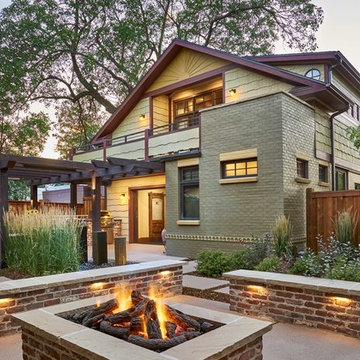
Example of a large arts and crafts yellow brick gable roof design in Denver with a shingle roof
Example of a large arts and crafts yellow brick gable roof design in Denver with a shingle roof
 Vetter Architects
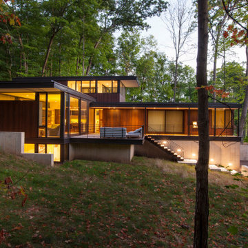
The client’s request was quite common - a typical 2800 sf builder home with 3 bedrooms, 2 baths, living space, and den. However, their desire was for this to be “anything but common.” The result is an innovative update on the production home for the modern era, and serves as a direct counterpoint to the neighborhood and its more conventional suburban housing stock, which focus views to the backyard and seeks to nullify the unique qualities and challenges of topography and the natural environment.
The Terraced House cautiously steps down the site’s steep topography, resulting in a more nuanced approach to site development than cutting and filling that is so common in the builder homes of the area. The compact house opens up in very focused views that capture the natural wooded setting, while masking the sounds and views of the directly adjacent roadway. The main living spaces face this major roadway, effectively flipping the typical orientation of a suburban home, and the main entrance pulls visitors up to the second floor and halfway through the site, providing a sense of procession and privacy absent in the typical suburban home.
Clad in a custom rain screen that reflects the wood of the surrounding landscape - while providing a glimpse into the interior tones that are used. The stepping “wood boxes” rest on a series of concrete walls that organize the site, retain the earth, and - in conjunction with the wood veneer panels - provide a subtle organic texture to the composition.
The interior spaces wrap around an interior knuckle that houses public zones and vertical circulation - allowing more private spaces to exist at the edges of the building. The windows get larger and more frequent as they ascend the building, culminating in the upstairs bedrooms that occupy the site like a tree house - giving views in all directions.
The Terraced House imports urban qualities to the suburban neighborhood and seeks to elevate the typical approach to production home construction, while being more in tune with modern family living patterns.
Overview:
Elm Grove
Size:
2,800 sf,
3 bedrooms, 2 bathrooms
Completion Date:
September 2014
Services:
Architecture, Landscape Architecture
Interior Consultants: Amy Carman Design
 Advance Design Studio, Ltd.
This 1930's Barrington Hills farmhouse was in need of some TLC when it was purchased by this southern family of five who planned to make it their new home. The renovation taken on by Advance Design Studio's designer Scott Christensen and master carpenter Justin Davis included a custom porch, custom built in cabinetry in the living room and children's bedrooms, 2 children's on-suite baths, a guest powder room, a fabulous new master bath with custom closet and makeup area, a new upstairs laundry room, a workout basement, a mud room, new flooring and custom wainscot stairs with planked walls and ceilings throughout the home.
The home's original mechanicals were in dire need of updating, so HVAC, plumbing and electrical were all replaced with newer materials and equipment. A dramatic change to the exterior took place with the addition of a quaint standing seam metal roofed farmhouse porch perfect for sipping lemonade on a lazy hot summer day.
In addition to the changes to the home, a guest house on the property underwent a major transformation as well. Newly outfitted with updated gas and electric, a new stacking washer/dryer space was created along with an updated bath complete with a glass enclosed shower, something the bath did not previously have. A beautiful kitchenette with ample cabinetry space, refrigeration and a sink was transformed as well to provide all the comforts of home for guests visiting at the classic cottage retreat.
The biggest design challenge was to keep in line with the charm the old home possessed, all the while giving the family all the convenience and efficiency of modern functioning amenities. One of the most interesting uses of material was the porcelain "wood-looking" tile used in all the baths and most of the home's common areas. All the efficiency of porcelain tile, with the nostalgic look and feel of worn and weathered hardwood floors. The home’s casual entry has an 8" rustic antique barn wood look porcelain tile in a rich brown to create a warm and welcoming first impression.
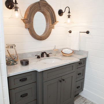
Painted distressed cabinetry in muted shades of gray/green was used in the powder room to bring out the rustic feel of the space which was accentuated with wood planked walls and ceilings. Fresh white painted shaker cabinetry was used throughout the rest of the rooms, accentuated by bright chrome fixtures and muted pastel tones to create a calm and relaxing feeling throughout the home.
Custom cabinetry was designed and built by Advance Design specifically for a large 70” TV in the living room, for each of the children’s bedroom’s built in storage, custom closets, and book shelves, and for a mudroom fit with custom niches for each family member by name.
The ample master bath was fitted with double vanity areas in white. A generous shower with a bench features classic white subway tiles and light blue/green glass accents, as well as a large free standing soaking tub nestled under a window with double sconces to dim while relaxing in a luxurious bath. A custom classic white bookcase for plush towels greets you as you enter the sanctuary bath.
 Bertazzoni
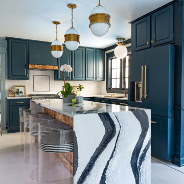
A Bertazzoni Master Series Range in matte black acts as a unifying element in this stunning kitchen, designed by interior designer, Jewel Marlowe, as part of the Fall 2019 edition of One Room Challenge. Blue cabinetry, a marbled waterfall island, brass fixtures and custom burled accents come together to create a glam look.

 Maddie G Designs / Shop Maddie G
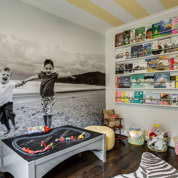
We turned a small unused room in the back of this house into a playroom for young children. Highlights include custom photo wallpaper (which is adhesive backed and can be peeled away without wall damage), a custom book wall and a wall system allowing easy rotation of kids' art.
Credit: Maddie G Designs
 Amanda Martocchio Architecture
Michael Moran/OTTO photography
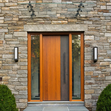
We took a predictable suburban spec house and transformed it into a unique home of enduring value and family-centered design. The existing footprint was expanded where it needed it most: in the family and kitchen area, creating a large square room with open views to a protected nature preserve abutting the property. An unexpected glass canopy and teak entry door are clues that what lies beyond is hardly commonplace.
The design challenge was to infuse modern-day functionality and architectural quality into a spec house. Working in partnership with Gary Cruz Studio, we designed the pared down, art-filled interiors with the goal of creating comfortable, purposeful living environments. We also sought to integrate the existing pool and rear deck into the overall building design, extending the usable space outside as a screened-in porch, a dining terrace, and a seating area around a stone fire pit.
 Uptic Studios
Oliver Irwin Photography
www.oliveriphoto.com
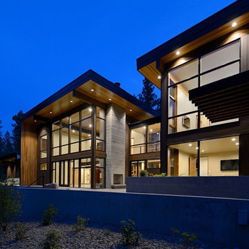
Park Lane Residence is a single family house designed in a unique, northwest modern style. The goal of the project is to create a space that allows the family to entertain their guests in a welcoming one-of-a-kind environment. Uptic Studios took into consideration the relation between the exterior and interior spaces creating a smooth transition with an open concept design and celebrating the natural environment. The Clean geometry and contrast in materials creates an integrative design that is both artistic, functional and in harmony with its surroundings. Uptic Studios provided the privacy needed, while also opening the space to the surrounding environment with large floor to ceiling windows. The large overhangs and trellises reduce solar exposure in the summer, while provides protection from the elements and letting in daylight in the winter. The crisp hardwood, metal and stone blends the exterior with the beautiful surrounding nature.

 SGDI - Sarah Gallop Design Inc.
The objective was to create a warm neutral space to later customize to a specific colour palate/preference of the end user for this new construction home being built to sell. A high-end contemporary feel was requested to attract buyers in the area. An impressive kitchen that exuded high class and made an impact on guests as they entered the home, without being overbearing. The space offers an appealing open floorplan conducive to entertaining with indoor-outdoor flow.
Due to the spec nature of this house, the home had to remain appealing to the builder, while keeping a broad audience of potential buyers in mind. The challenge lay in creating a unique look, with visually interesting materials and finishes, while not being so unique that potential owners couldn’t envision making it their own. The focus on key elements elevates the look, while other features blend and offer support to these striking components. As the home was built for sale, profitability was important; materials were sourced at best value, while retaining high-end appeal. Adaptations to the home’s original design plan improve flow and usability within the kitchen-greatroom. The client desired a rich dark finish. The chosen colours tie the kitchen to the rest of the home (creating unity as combination, colours and materials, is repeated throughout).
Photos- Paul Grdina
 Fredman Design Group
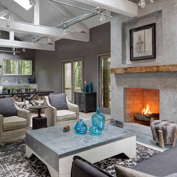
The juxtaposition of raw, weathered and finished woods with sleek whites, mixed metals and soft textured elements strike a fabulous balance between industrial, rustic and glamorous – exactly what the designers envisioned for this dream retreat. This unique home’s design combines recycled shipping containers with traditional stick-building methods and resulted in a luxury hybrid home, inside and out. The design team was particularly challenged with overcoming various preconceived notions about containers to truly create something new, luxurious and sustainable.
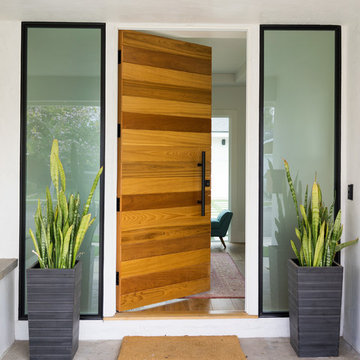
 Eric Aust Architect
Lane Dittoe Photographs
[FIXE] design house interors
Mid-sized mid-century modern white one-story stucco house exterior photo in Orange County with a hip roof and a shingle roof
Mid-sized mid-century modern white one-story stucco house exterior photo in Orange County with a hip roof and a shingle roof


 Landmark Building Inc
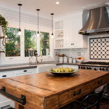
Complete Kitchen remodel, only thing that remained from original kitchen is hardwood floor. Focal point behind gas range is waterjet marble insert. Reclaimed wood island.
Builder- Landmark Building Inc.
Designer- KK Design Koncepts
 Drewett Works
Located near the base of Scottsdale landmark Pinnacle Peak, the Desert Prairie is surrounded by distant peaks as well as boulder conservation easements. This 30,710 square foot site was unique in terrain and shape and was in close proximity to adjacent properties. These unique challenges initiated a truly unique piece of architecture.
Planning of this residence was very complex as it weaved among the boulders. The owners were agnostic regarding style, yet wanted a warm palate with clean lines. The arrival point of the design journey was a desert interpretation of a prairie-styled home. The materials meet the surrounding desert with great harmony. Copper, undulating limestone, and Madre Perla quartzite all blend into a low-slung and highly protected home.
Located in Estancia Golf Club, the 5,325 square foot (conditioned) residence has been featured in Luxe Interiors + Design’s September/October 2018 issue. Additionally, the home has received numerous design awards.
Desert Prairie // Project Details
Architecture: Drewett Works
Builder: Argue Custom Homes
Interior Design: Lindsey Schultz Design
Interior Furnishings: Ownby Design
Landscape Architect: Greey|Pickett
Photography: Werner Segarra
 Drewett Works
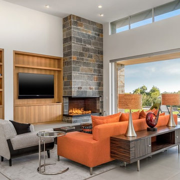
The unique opportunity and challenge for the Joshua Tree project was to enable the architecture to prioritize views. Set in the valley between Mummy and Camelback mountains, two iconic landforms located in Paradise Valley, Arizona, this lot “has it all” regarding views. The challenge was answered with what we refer to as the desert pavilion.
This highly penetrated piece of architecture carefully maintains a one-room deep composition. This allows each space to leverage the majestic mountain views. The material palette is executed in a panelized massing composition. The home, spawned from mid-century modern DNA, opens seamlessly to exterior living spaces providing for the ultimate in indoor/outdoor living.
Project Details:
Architecture: Drewett Works, Scottsdale, AZ // C.P. Drewett, AIA, NCARB // www.drewettworks.com
Builder: Bedbrock Developers, Paradise Valley, AZ // http://www.bedbrock.com
Interior Designer: Est Est, Scottsdale, AZ // http://www.estestinc.com
Photographer: Michael Duerinckx, Phoenix, AZ // www.inckx.com
 User
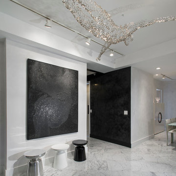
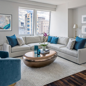
UserLocated in one of the Ritz residential towers in Boston, the project was a complete renovation. The design and scope of work included the entire residence from marble flooring throughout, to movement of walls, new kitchen, bathrooms, all furnishings, lighting, closets, artwork and accessories. Smart home sound and wifi integration throughout including concealed electronic window treatments.
The challenge for the final project design was multifaceted. First and foremost to maintain a light, sheer appearance in the main open areas, while having a considerable amount of seating for living, dining and entertaining purposes. All the while giving an inviting peaceful feel,
and never interfering with the view which was of course the piece de resistance throughout.
Bringing a unique, individual feeling to each of the private rooms to surprise and stimulate the eye while navigating through the residence was also a priority and great pleasure to work on, while incorporating small details within each room to bind the flow from area to area which would not be necessarily obvious to the eye, but palpable in our minds in a very suttle manner. The combination of luxurious textures throughout brought a third dimension into the environments, and one of the many aspects that made the project so exceptionally unique, and a true pleasure to have created. Reach us www.themorsoncollection.com
Photography by Elevin Studio.

 Décor Aid
When a family living in Singapore decided to purchase a New York City pied-à-terre, they settled on the historic Langham Place, a 60-floor building along 5th Ave which features a mixture of permanent residencies and 5-star hotel suites. Immediately after purchasing the condo, they reached out to Decor Aid, and tasked us with designing a home that would reflect their jet-setting lifestyle and chic sensibility.
Book Your Free In-Home Consultation
Connecting to the historic Tiffany Building at 404 5th Ave, the exterior of Langham Place is a combination of highly contemporary architecture and 1920’s art deco design. And with this highly unique architecture, came highly angular, outward leaning floor-to-ceiling windows, which would prove to be our biggest design challenge.
One of the apartment’s quirks was negotiating an uneven balance of natural light throughout the space. Parts of the apartment, such one of the kids’ bedrooms, feature floor-to-ceiling windows and an abundance of natural light, while other areas, such as one corner of the living room, receive little natural light.
By sourcing a combination of contemporary, low-profile furniture pieces and metallic accents, we were able to compensate for apartment’s pockets of darkness. A low-profile beige sectional from Room & Board was an obvious choice, which we complemented with a lucite console and a bronze Riverstone coffee table from Mitchell Gold+Bob Williams.
Circular tables were placed throughout the apartment in order to establish a design scheme that would be easy to walk through. A marble tulip table from Sit Down New York provides an opulent dining room space, without crowding the floor plan. The finishing touches include a sumptuous swivel chair from Safavieh, to create a sleek, welcoming vacation home for this international client.

 TKS Design Group
Download our free ebook, Creating the Ideal Kitchen. DOWNLOAD NOW
For many, extra time at home during COVID left them wanting more from their homes. Whether you realized the shortcomings of your space or simply wanted to combat boredom, a well-designed and functional home was no longer a want, it became a need. Tina found herself wanting more from her Old Irving Park home and reached out to The Kitchen Studio about adding function to her kitchen to make the most of the available real estate.
At the end of the day, there is nothing better than returning home to a bright and happy space you love. And this kitchen wasn’t that for Tina. Dark and dated, with a palette from the past and features that didn’t make the most of the available square footage, this remodel required vision and a fresh approach to the space. Lead designer, Stephanie Cole’s main design goal was better flow, while adding greater functionality with organized storage, accessible open shelving, and an overall sense of cohesion with the adjoining family room.
The original kitchen featured a large pizza oven, which was rarely used, yet its footprint limited storage space. The nearby pantry had become a catch-all, lacking the organization needed in the home. The initial plan was to keep the pizza oven, but eventually Tina realized she preferred the design possibilities that came from removing this cumbersome feature, with the goal of adding function throughout the upgraded and elevated space. Eliminating the pantry added square footage and length to the kitchen for greater function and more storage. This redesigned space reflects how she lives and uses her home, as well as her love for entertaining.
The kitchen features a classic, clean, and timeless palette. White cabinetry, with brass and bronze finishes, contrasts with rich wood flooring, and lets the large, deep blue island in Woodland’s custom color Harbor – a neutral, yet statement color – draw your eye.
The kitchen was the main priority. In addition to updating and elevating this space, Tina wanted to maximize what her home had to offer. From moving the location of the patio door and eliminating a window to removing an existing closet in the mudroom and the cluttered pantry, the kitchen footprint grew. Once the floorplan was set, it was time to bring cohesion to her home, creating connection between the kitchen and surrounding spaces.
The color palette carries into the mudroom, where we added beautiful new cabinetry, practical bench seating, and accessible hooks, perfect for guests and everyday living. The nearby bar continues the aesthetic, with stunning Carrara marble subway tile, hints of brass and bronze, and a design that further captures the vibe of the kitchen.
Every home has its unique design challenges. But with a fresh perspective and a bit of creativity, there is always a way to give the client exactly what they want [and need]. In this particular kitchen, the existing soffits and high slanted ceilings added a layer of complexity to the lighting layout and upper perimeter cabinets.
While a space needs to look good, it also needs to function well. This meant making the most of the height of the room and accounting for the varied ceiling features, while also giving Tina everything she wanted and more. Pendants and task lighting paired with an abundance of natural light amplify the bright aesthetic. The cabinetry layout and design compliments the soffits with subtle profile details that bring everything together. The tile selections add visual interest, drawing the eye to the focal area above the range. Glass-doored cabinets further customize the space and give the illusion of even more height within the room.
While her family may be grown and out of the house, Tina was focused on adding function without sacrificing a stunning aesthetic and dreamy finishes that make the kitchen the gathering place of any home. It was time to love her kitchen again, and if you’re wondering what she loves most, it’s the niche with glass door cabinetry and open shelving for display paired with the marble mosaic backsplash over the range and complimenting hood. Each of these features is a stunning point of interest within the kitchen – both brag-worthy additions to a perimeter layout that previously felt limited and lacking.
Whether your remodel is the result of special needs in your home or simply the excitement of focusing your energy on creating a fun new aesthetic, we are here for it. We love a good challenge because there is always a way to make a space better – adding function and beauty simultaneously.
 User
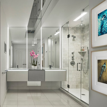
UserThe challenge of merging contemporary design with a classic traditional interior is emblematic of the vitality experienced in the evolution of Philadelphia’s urban fabric. The design of this Center City apartment engages a rich discourse between the new and the existing, focusing on areas of the residence that contradicted the new owners’ aesthetic and lifestyle.
The elevator opens to the center of the spacious living area that includes the foyer, kitchen and living room. The serene, geometric character of the foyer enhances the sense of arrival – offering a moment to contemplate the owners’ art, the interplay of the old and the new, and the subtleties of light.
The kitchen, while fully functional, willingly and quietly participates in the composition. Symmetry and asymmetry are seamlessly woven.
The depth and endurance of daily experiences are the ingredients that transform architecture into a vital framework for living. As it relates to a home, the framework requires a resonate balance of comfort and drama, achieved here with a cast of dynamic materials and details that subtly collaborate in simple composition.
Barry Halkin and Todd Mason Photography
5