
Search results for "Unique challenges" in Home Design Ideas


 Renovisions
To create a unique kitchen, we take inspiration from the personality of our clients; it’s a collaborative effort to develop the exact look and feel that best suits their lifestyles.
The challenge of this kitchen was to re-build the existing kitchen and adjoining full bath, creating a much better flow with plenty of storage for this active family (as they often entertain seaside).
The two-toned cabinetry in both white and laguna blue reflected a true beach-feel adorned with a terrific choice of starfish and shell shaped hardware to draw attention to this creative and beautifully transformed seaside kitchen.
We remind our clients that in order to be unique, do something unique! And this is nicely demonstrated in both the layout, color scheme and backsplash design details. Our client selected several hand painted decorative ocean creatures for the backsplash, drawing from colors in the room, and this created a truly unique conversation piece!
A glint of sparkle from the white quartz countertops brings you closer to the beach in this impressive oceanfront home.
From flooring to ceiling, we created a picture perfect beautiful beach house kitchen that is not only functional but provides a relaxed and inviting feel for these seaside owners.

 KohlMark Architects and Builders
The design of this home was driven by the owners’ desire for a three-bedroom waterfront home that showcased the spectacular views and park-like setting. As nature lovers, they wanted their home to be organic, minimize any environmental impact on the sensitive site and embrace nature.
This unique home is sited on a high ridge with a 45° slope to the water on the right and a deep ravine on the left. The five-acre site is completely wooded and tree preservation was a major emphasis. Very few trees were removed and special care was taken to protect the trees and environment throughout the project. To further minimize disturbance, grades were not changed and the home was designed to take full advantage of the site’s natural topography. Oak from the home site was re-purposed for the mantle, powder room counter and select furniture.
The visually powerful twin pavilions were born from the need for level ground and parking on an otherwise challenging site. Fill dirt excavated from the main home provided the foundation. All structures are anchored with a natural stone base and exterior materials include timber framing, fir ceilings, shingle siding, a partial metal roof and corten steel walls. Stone, wood, metal and glass transition the exterior to the interior and large wood windows flood the home with light and showcase the setting. Interior finishes include reclaimed heart pine floors, Douglas fir trim, dry-stacked stone, rustic cherry cabinets and soapstone counters.
Exterior spaces include a timber-framed porch, stone patio with fire pit and commanding views of the Occoquan reservoir. A second porch overlooks the ravine and a breezeway connects the garage to the home.
Numerous energy-saving features have been incorporated, including LED lighting, on-demand gas water heating and special insulation. Smart technology helps manage and control the entire house.
Greg Hadley Photography
Find the right local pro for your project

 Hammer & Hand
From stripping the floors down to the original Douglas Fir floors to repositioning cabinets and fitting a unique lighting fixture, this kitchen remodeling project was full of interesting challenges. The home owner collaborated with bright designlab and Hammer & Hand to create a dream kitchen perfect for a growing family. The kitchen features an elegant mix of white, steel, and wood. Photography by bright designlab.

 SGDI - Sarah Gallop Design Inc.
The objective was to create a warm neutral space to later customize to a specific colour palate/preference of the end user for this new construction home being built to sell. A high-end contemporary feel was requested to attract buyers in the area. An impressive kitchen that exuded high class and made an impact on guests as they entered the home, without being overbearing. The space offers an appealing open floorplan conducive to entertaining with indoor-outdoor flow.
Due to the spec nature of this house, the home had to remain appealing to the builder, while keeping a broad audience of potential buyers in mind. The challenge lay in creating a unique look, with visually interesting materials and finishes, while not being so unique that potential owners couldn’t envision making it their own. The focus on key elements elevates the look, while other features blend and offer support to these striking components. As the home was built for sale, profitability was important; materials were sourced at best value, while retaining high-end appeal. Adaptations to the home’s original design plan improve flow and usability within the kitchen-greatroom. The client desired a rich dark finish. The chosen colours tie the kitchen to the rest of the home (creating unity as combination, colours and materials, is repeated throughout).
Photos- Paul Grdina

 Dream Homes Inc.
Timberframe homes are Unique. There are challenges with lighting, and air supply, among others. But the warm richness of all the wood cannot be denied! Working from the drawing stage with the architect insured success here.
 Coveted Haus
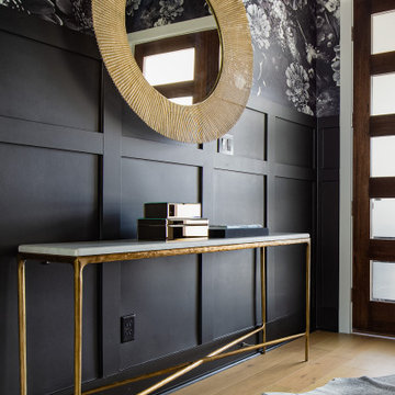
Challenge: create a show-stopping entrance client’s guests will never forget.
Managed outside sub-contractors and project managed lighting schedule. Hand selected all room finishes, furnishings and accessories.



 Shelley Starr Interior Design
Challenging design for such a unique shaped kitchen.
Inspiration for a mid-sized contemporary kitchen remodel in Los Angeles with raised-panel cabinets, beige cabinets, marble countertops, white backsplash, paneled appliances and an island
Inspiration for a mid-sized contemporary kitchen remodel in Los Angeles with raised-panel cabinets, beige cabinets, marble countertops, white backsplash, paneled appliances and an island

 User
UserMaster bathroom suite with a unique layout was a challenge due to the large windows and a small nook. The almost freestanding shower with a mosaic column is a showpiece in this room. Vaulted ceiling and beams add an open airy feeling to this one-of-a-kind master bathroom.
 User
UserLocated in one of the Ritz residential towers in Boston, the project was a complete renovation. The design and scope of work included the entire residence from marble flooring throughout, to movement of walls, new kitchen, bathrooms, all furnishings, lighting, closets, artwork and accessories. Smart home sound and wifi integration throughout including concealed electronic window treatments.
The challenge for the final project design was multifaceted. First and foremost to maintain a light, sheer appearance in the main open areas, while having a considerable amount of seating for living, dining and entertaining purposes. All the while giving an inviting peaceful feel,
and never interfering with the view which was of course the piece de resistance throughout.
Bringing a unique, individual feeling to each of the private rooms to surprise and stimulate the eye while navigating through the residence was also a priority and great pleasure to work on, while incorporating small details within each room to bind the flow from area to area which would not be necessarily obvious to the eye, but palpable in our minds in a very suttle manner. The combination of luxurious textures throughout brought a third dimension into the environments, and one of the many aspects that made the project so exceptionally unique, and a true pleasure to have created. Reach us www.themorsoncollection.com
Photography by Elevin Studio.
 User
UserMaster bathroom suite with a unique layout was a challenge due to the large windows and a small nook. The almost freestanding shower with a mosaic column is a showpiece in this room. Vaulted ceiling and beams add an open airy feeling to this one-of-a-kind master bathroom.

 TKS Design Group
This project was completed for clients who wanted a comfortable, accessible 1ST floor bathroom for their grown daughter to use during visits to their home as well as a nicely-appointed space for any guest. Their daughter has some accessibility challenges so the bathroom was also designed with that in mind.
The original space worked fairly well in some ways, but we were able to tweak a few features to make the space even easier to maneuver through. We started by making the entry to the shower flush so that there is no curb to step over. In addition, although there was an existing oversized seat in the shower, it was way too deep and not comfortable to sit on and just wasted space. We made the shower a little smaller and then provided a fold down teak seat that is slip resistant, warm and comfortable to sit on and can flip down only when needed. Thus we were able to create some additional storage by way of open shelving to the left of the shower area. The open shelving matches the wood vanity and allows a spot for the homeowners to display heirlooms as well as practical storage for things like towels and other bath necessities.
We carefully measured all the existing heights and locations of countertops, toilet seat, and grab bars to make sure that we did not undo the things that were already working well. We added some additional hidden grab bars or “grabcessories” at the toilet paper holder and shower shelf for an extra layer of assurance. Large format, slip-resistant floor tile was added eliminating as many grout lines as possible making the surface less prone to tripping. We used a wood look tile as an accent on the walls, and open storage in the vanity allowing for easy access for clean towels. Bronze fixtures and frameless glass shower doors add an elegant yet homey feel that was important for the homeowner. A pivot mirror allows adjustability for different users.
If you are interested in designing a bathroom featuring “Living In Place” or accessibility features, give us a call to find out more. Susan Klimala, CKBD, is a Certified Aging In Place Specialist (CAPS) and particularly enjoys helping her clients with unique needs in the context of beautifully designed spaces.
Designed by: Susan Klimala, CKD, CBD
Photography by: Michael Alan Kaskel

 AIBD - American Institute of Building Design
The client’s coastal New England roots inspired this Shingle style design for a lakefront lot. With a background in interior design, her ideas strongly influenced the process, presenting both challenge and reward in executing her exact vision. Vintage coastal style grounds a thoroughly modern open floor plan, designed to house a busy family with three active children. A primary focus was the kitchen, and more importantly, the butler’s pantry tucked behind it. Flowing logically from the garage entry and mudroom, and with two access points from the main kitchen, it fulfills the utilitarian functions of storage and prep, leaving the main kitchen free to shine as an integral part of the open living area.
An ARDA for Custom Home Design goes to
Royal Oaks Design
Designer: Kieran Liebl
From: Oakdale, Minnesota


 Botanical Concerns LLC
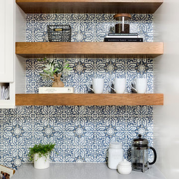
This new construction is situated on a steep hill leading down to Lake Austin. Working around the terrain and large septic fields presented unique challenges.
 Kimberlee Marie Interiors
It’s always a blessing when your clients become friends - and that’s exactly what blossomed out of this two-phase remodel (along with three transformed spaces!). These clients were such a joy to work with and made what, at times, was a challenging job feel seamless. This project consisted of two phases, the first being a reconfiguration and update of their master bathroom, guest bathroom, and hallway closets, and the second a kitchen remodel.
In keeping with the style of the home, we decided to run with what we called “traditional with farmhouse charm” – warm wood tones, cement tile, traditional patterns, and you can’t forget the pops of color! The master bathroom airs on the masculine side with a mostly black, white, and wood color palette, while the powder room is very feminine with pastel colors.
When the bathroom projects were wrapped, it didn’t take long before we moved on to the kitchen. The kitchen already had a nice flow, so we didn’t need to move any plumbing or appliances. Instead, we just gave it the facelift it deserved! We wanted to continue the farmhouse charm and landed on a gorgeous terracotta and ceramic hand-painted tile for the backsplash, concrete look-alike quartz countertops, and two-toned cabinets while keeping the existing hardwood floors. We also removed some upper cabinets that blocked the view from the kitchen into the dining and living room area, resulting in a coveted open concept floor plan.
Our clients have always loved to entertain, but now with the remodel complete, they are hosting more than ever, enjoying every second they have in their home.
 Renovisions
To create a unique kitchen, we take inspiration from the personality of our clients; it’s a collaborative effort to develop the exact look and feel that best suits their lifestyles.
The challenge of this kitchen was to re-build the existing kitchen and adjoining full bath, creating a much better flow with plenty of storage for this active family (as they often entertain seaside).
The two-toned cabinetry in both white and laguna blue reflected a true beach-feel adorned with a terrific choice of starfish and shell shaped hardware to draw attention to this creative and beautifully transformed seaside kitchen.
We remind our clients that in order to be unique, do something unique! And this is nicely demonstrated in both the layout, color scheme and backsplash design details. Our client selected several hand painted decorative ocean creatures for the backsplash, drawing from colors in the room, and this created a truly unique conversation piece!
A glint of sparkle from the white quartz countertops brings you closer to the beach in this impressive oceanfront home.
From flooring to ceiling, we created a picture perfect beautiful beach house kitchen that is not only functional but provides a relaxed and inviting feel for these seaside owners.
 SGDI - Sarah Gallop Design Inc.
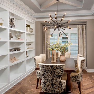
The objective was to create a warm neutral space to later customize to a specific colour palate/preference of the end user for this new construction home being built to sell. A high-end contemporary feel was requested to attract buyers in the area. An impressive kitchen that exuded high class and made an impact on guests as they entered the home, without being overbearing. The space offers an appealing open floorplan conducive to entertaining with indoor-outdoor flow.
Due to the spec nature of this house, the home had to remain appealing to the builder, while keeping a broad audience of potential buyers in mind. The challenge lay in creating a unique look, with visually interesting materials and finishes, while not being so unique that potential owners couldn’t envision making it their own. The focus on key elements elevates the look, while other features blend and offer support to these striking components. As the home was built for sale, profitability was important; materials were sourced at best value, while retaining high-end appeal. Adaptations to the home’s original design plan improve flow and usability within the kitchen-greatroom. The client desired a rich dark finish. The chosen colours tie the kitchen to the rest of the home (creating unity as combination, colours and materials, is repeated throughout).
Photos- Paul Grdina


 First Option Design Build LLC
paul zimmerman photo...
When the Homeowner said she wanted no back splash, I was challenged to have the counter top inserted into the drywall so we would have a seamless transition from the counter to the walls.
Such a nice clean look! I am thrilled with this unique result...

 Decorations Lucullus
For Decorations Lucullus it’s always about listening to the client, but when the project is a historical property, it is about listening carefully to the spirit of the rooms as well. All style is part alchemy, a bit of conjuring and nerves of steel to accept what is honestly appropriate. These lovely old rooms had lived a very grand past. Miraculously the owner was open to the challenge of trying, just for fun, to see if that past could be recaptured without compromising present-day comforts. We all learned in the process that the old can be as luxuriously commodious as anything the “modern” can promise.

 Neal's Design Remodel
The primary style of this new lounge space could be classified as an American-style pub, with the rustic quality of a prohibition-era speakeasy balanced by the masculine look of a Victorian-era men’s lounge. The wet bar was designed as three casual sections distributed along the two window walls. Custom counters were created by combining antiqued copper on the surface and riveted iron strapping on the edges. The ceiling was opened up, peaking at 12', and the framing was finished with reclaimed wood, converting the vaulted space into a pyramid for a four-walled cathedral ceiling.
Neals Design Remodel
Robin Victor Goetz
23