
Search results for "Unique challenges" in Home Design Ideas
 Ed Kriskywicz Construction Design, Inc.
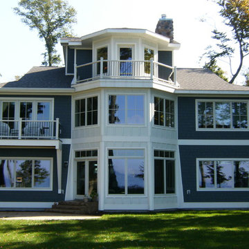
Full west elevation, our challenges were to keep the cottage under the local required zoning height of 35’ and still squeeze in the client's wish to have a viewing tower.
 UpperKey
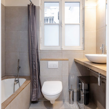
In some older Parisian apartment buildings, the bathroom may be located at the end of a long and narrow hallway, separate from the other rooms in the apartment. This arrangement can pose some challenges, such as the need to traverse a long distance to access the bathroom and the potential for privacy issues. However, it can also create a sense of separation and privacy, with the bathroom acting as a peaceful retreat from the rest of the apartment. Despite the challenges posed by this unique layout, Parisians have found ways to make the most of their bathroom facilities, adapting to the quirks and idiosyncrasies of their apartment buildings and finding creative and practical solutions to the challenges they present.
 TKS Design Group
This project was completed for clients who wanted a comfortable, accessible 1ST floor bathroom for their grown daughter to use during visits to their home as well as a nicely-appointed space for any guest. Their daughter has some accessibility challenges so the bathroom was also designed with that in mind.
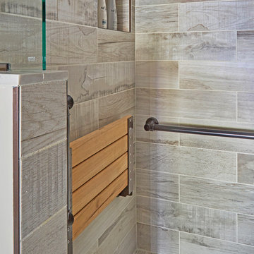
The original space worked fairly well in some ways, but we were able to tweak a few features to make the space even easier to maneuver through. We started by making the entry to the shower flush so that there is no curb to step over. In addition, although there was an existing oversized seat in the shower, it was way too deep and not comfortable to sit on and just wasted space. We made the shower a little smaller and then provided a fold down teak seat that is slip resistant, warm and comfortable to sit on and can flip down only when needed. Thus we were able to create some additional storage by way of open shelving to the left of the shower area. The open shelving matches the wood vanity and allows a spot for the homeowners to display heirlooms as well as practical storage for things like towels and other bath necessities.
We carefully measured all the existing heights and locations of countertops, toilet seat, and grab bars to make sure that we did not undo the things that were already working well. We added some additional hidden grab bars or “grabcessories” at the toilet paper holder and shower shelf for an extra layer of assurance. Large format, slip-resistant floor tile was added eliminating as many grout lines as possible making the surface less prone to tripping. We used a wood look tile as an accent on the walls, and open storage in the vanity allowing for easy access for clean towels. Bronze fixtures and frameless glass shower doors add an elegant yet homey feel that was important for the homeowner. A pivot mirror allows adjustability for different users.
If you are interested in designing a bathroom featuring “Living In Place” or accessibility features, give us a call to find out more. Susan Klimala, CKBD, is a Certified Aging In Place Specialist (CAPS) and particularly enjoys helping her clients with unique needs in the context of beautifully designed spaces.
Designed by: Susan Klimala, CKD, CBD
Photography by: Michael Alan Kaskel
Find the right local pro for your project
 Brent Hyland
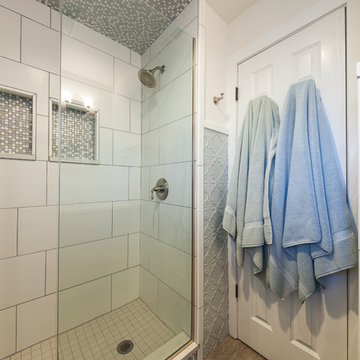
We love coming across a space in dire need of updating, with a few unique challenges, and fabulous clients! Our favorite part of this master bath remodel was tiling the shower enclosure and the beautiful tile wainscoting.
 Coveted Haus
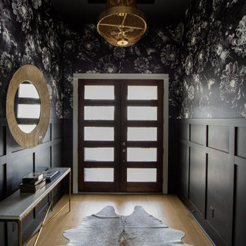
Challenge: create a show-stopping entrance client’s guests will never forget.
Managed outside sub-contractors and project managed lighting schedule. Hand selected all room finishes, furnishings and accessories.
 Vetter Architects
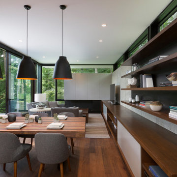
The client’s request was quite common - a typical 2800 sf builder home with 3 bedrooms, 2 baths, living space, and den. However, their desire was for this to be “anything but common.” The result is an innovative update on the production home for the modern era, and serves as a direct counterpoint to the neighborhood and its more conventional suburban housing stock, which focus views to the backyard and seeks to nullify the unique qualities and challenges of topography and the natural environment.
The Terraced House cautiously steps down the site’s steep topography, resulting in a more nuanced approach to site development than cutting and filling that is so common in the builder homes of the area. The compact house opens up in very focused views that capture the natural wooded setting, while masking the sounds and views of the directly adjacent roadway. The main living spaces face this major roadway, effectively flipping the typical orientation of a suburban home, and the main entrance pulls visitors up to the second floor and halfway through the site, providing a sense of procession and privacy absent in the typical suburban home.
Clad in a custom rain screen that reflects the wood of the surrounding landscape - while providing a glimpse into the interior tones that are used. The stepping “wood boxes” rest on a series of concrete walls that organize the site, retain the earth, and - in conjunction with the wood veneer panels - provide a subtle organic texture to the composition.
The interior spaces wrap around an interior knuckle that houses public zones and vertical circulation - allowing more private spaces to exist at the edges of the building. The windows get larger and more frequent as they ascend the building, culminating in the upstairs bedrooms that occupy the site like a tree house - giving views in all directions.
The Terraced House imports urban qualities to the suburban neighborhood and seeks to elevate the typical approach to production home construction, while being more in tune with modern family living patterns.
Overview:
Elm Grove
Size:
2,800 sf,
3 bedrooms, 2 bathrooms
Completion Date:
September 2014
Services:
Architecture, Landscape Architecture
Interior Consultants: Amy Carman Design
 Koncept Design + Build
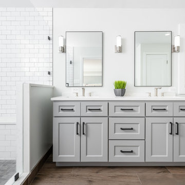
Inspiration for a mid-sized transitional 3/4 white tile and subway tile brown floor alcove shower remodel in DC Metro with recessed-panel cabinets, gray cabinets, a two-piece toilet, white walls, an undermount sink, a hinged shower door, white countertops and quartz countertops


 Orren Pickell Building Group
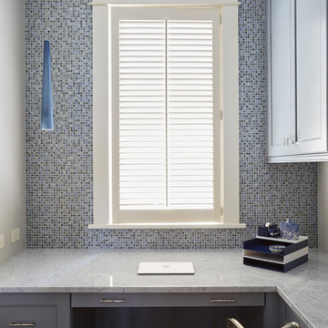
A home office off the kitchen can be concealed with a pocket door. Gray-painted maple Wood-Mode cabinetry complements the kitchen finishes but makes the space unique.
**Project Overview**
A small, quiet, efficient office space for one that is perfect for sorting mail and paying bills. Though small it has a great deal of natural light and views out the front of the house of the lush landscaping and wildlife. A pocket door makes the office disappear when it's time to entertain.
**What Makes This Project Unique?**
Small yet incredibly functional, this desk space is a comfortable, quiet place to catch up on home management tasks. Filled with natural light and offering a view of lush landscaping, the compact space is light and airy. To keep it from feeling cramped or crowded, we complemented warm gray-painted maple cabinetry with light countertops and tile. Taller ceilings allow ample storage, including full-height open storage, to manage all of the papers, files and extras that find their way into the home.
**Design Challenges**
While the office was intentionally designed into a tiny nook off the kitchen and pantry, we didn't want it to feel small for the people using it. By keeping the color palette light, taking cabinetry to the ceiling, incorporating open storage and maximizing natural light, the space feels cozy, and larger than it actually is.
Photo by MIke Kaskel.
 MossCreek
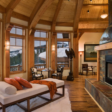
Located overlooking the ski resorts of Big Sky, Montana, this MossCreek custom designed mountain home responded to a challenging site, and the desire to showcase a stunning timber frame element.
Utilizing the topography to its fullest extent, the designers of MossCreek provided their clients with beautiful views of the slopes, unique living spaces, and even a secluded grotto complete with indoor pool.
This is truly a magnificent, and very livable home for family and friends.
Photos: R. Wade
 Kimberlee Marie Interiors
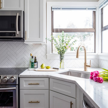
When my clients purchased this charming 1940's home in the Seattle neighborhood of Wedgwood, they were amazed by how intact the original kitchen was. It was like a perfect time capsule. The color palette was avocado green and buttercream yellow. The highlights were an original retro built-in banquette and vintage oven! The challenge we faced (besides the awesome but dated finishes) was the closed floor plan typical in this era of homes and the lack of storage. So, we opened the kitchen to the adjacent dining and living room, bringing it up to speed with modern-day living. In opening it up, we also walled off a doorway that went from the kitchen to the hallway, but it was completely unnecessary and allowed us to gain an entire wall of cabinets that didn't exist previously.
For the finishes, we kept it classic with mostly gray and white but brought in a little flare and interest with the herringbone backsplash and brushed brass finishes because who doesn't love a little gold? Also, we added color with the finishing details like the rug and countertop decor because those things are a great way to add interest and warmth to a space and can be easily changed when it's time for a fresh new look.
 Sleeping Dog Properties, Inc.
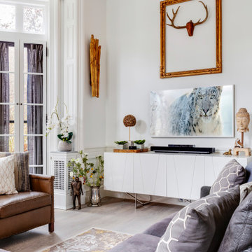
For this project, our Boston design-build team worked closely with a pair of keen-eyed clients to bring their unique vision to life. The main challenge throughout was deciding how to make the most out of the relatively small 990 ft² we had to work with.
 George Clemens Architecture
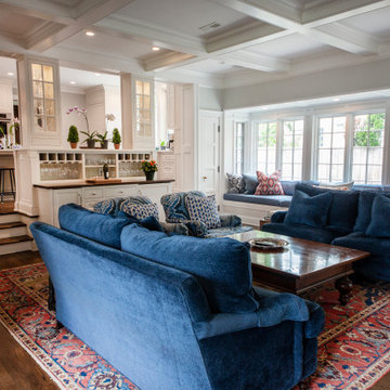
Renovation of this remarkable 1936 Monte Copper Tudor demonstrates how we sensitively transform historic homes to beautifully perform in contemporary life. The challenge was to connect first floor spaces, including the kitchen; dining room; and a lower family room added in a previous addition. The family room received thoughtful and appropriate detailing along with a graceful and functional two-sided bar element linking it with the kitchen. The kitchen was expanded and reimagined with a seamless addition. Diagonal views and openings allow all the rooms to function as a connected whole.
 Nadler Cabinet Services Inc.
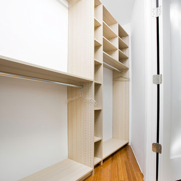
This area posed a unique challenge with it's narrow dimensions and sharp angles. We were able to work with this shape and create drawers, shelves, hanging rods and shoe storage.

 TVL Creative Ltd.
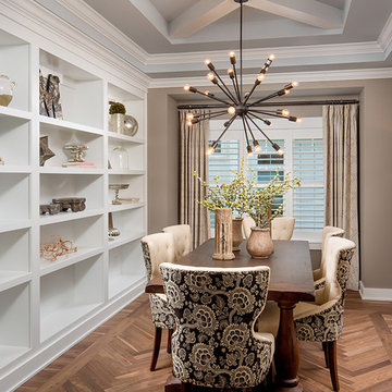
This project was such an incredible design opportunity, and instilled inspiration and excitement at every turn! Our amazing clients came to us with the challenge of converting their beloved family home into a welcoming haven for all members of the family. At the time that we met our clients, they were struggling with the difficult personal decision of the fate of the home. Their father/father-in-law had passed away and their mother/mother-in-law had recently been admitted into a nursing facility and was fighting Alzheimer’s. Resistant to loss of the home now that both parents were out of it, our clients purchased the home to keep in in the family. Despite their permanent home currently being in New Jersey, these clients dedicated themselves to keeping and revitalizing the house. We were moved by the story and became immediately passionate about bringing this dream to life.
The home was built by the parents of our clients and was only ever owned by them, making this a truly special space to the family. Our goal was to revitalize the home and to bring new energy into every room without losing the special characteristics that were original to the home when it was built. In this way, we were able to develop a house that maintains its own unique personality while offering a space of welcoming neutrality for all members of the family to enjoy over time.
The renovation touched every part of the home: the exterior, foyer, kitchen, living room, sun room, garage, six bedrooms, three bathrooms, the laundry room, and everything in between. The focus was to develop a style that carried consistently from space to space, but allowed for unique expression in the small details in every room.
Starting at the entry, we renovated the front door and entry point to offer more presence and to bring more of the mid-century vibe to the home’s exterior. We integrated a new modern front door, cedar shingle accents, new exterior paint, and gorgeous contemporary house numbers that really allow the home to stand out. Just inside the entry, we renovated the foyer to create a playful entry point worthy of attention. Cement look tile adorns the foyer floor, and we’ve added new lighting and upgraded the entry coat storage.
Upon entering the home, one will immediately be captivated by the stunning kitchen just off the entry. We transformed this space in just about every way. While the footprint of the home ultimately remained almost identical, the aesthetics were completely turned on their head. We re-worked the kitchen to maximize storage and to create an informal dining area that is great for casual hosting or morning coffee.
We removed the entry to the garage that was once in the informal dining, and created a peninsula in its place that offers a unique division between the kitchen/informal dining and the formal dining and living areas. The simple light warm light gray cabinetry offers a bit of traditional elegance, along with the marble backsplash and quartz countertops. We extended the original wood flooring into the kitchen and stained all floors to match for a warmth that truly resonates through all spaces. We upgraded appliances, added lighting everywhere, and finished the space with some gorgeous mid century furniture pieces.
In the formal dining and living room, we really focused on maintaining the original marble fireplace as a focal point. We cleaned the marble, repaired the mortar, and refinished the original fireplace screen to give a new sleek look in black. We then integrated a new gas insert for modern heating and painted the upper portion in a rich navy blue; an accent that is carried through the home consistently as a nod to our client’s love of the color.
The former entry into the old covered porch is now an elegant glass door leading to a stunning finished sunroom. This room was completely upgraded as well. We wrapped the entire space in cozy white shiplap to keep a casual feel with brightness. We tiled the floor with large format concrete look tile, and painted the old brick fireplace a bright white. We installed a new gas burning unit, and integrated transitional style lighting to bring warmth and elegance into the space. The new black-frame windows are adorned with decorative shades that feature hand-sketched bird prints, and we’ve created a dedicated garden-ware “nook” for our client who loves to work in the yard. The far end of this space is completed with two oversized chaise loungers and overhead lights…the most perfect little reading nook!
Just off the dining room, we created an entirely new space to the home: a mudroom. The clients lacked this space and desperately needed a landing spot upon entering the home from the garage. We uniquely planned existing space in the garage to utilize for this purpose, and were able to create a small but functional entry point without losing the ability to park cars in the garage. This new space features cement-look tile, gorgeous deep brown cabinetry, and plenty of storage for all the small items one might need to store while moving in and out of the home.
The remainder of the upstairs level includes massive renovations to the guest hall bathroom and guest bedroom, upstairs master bed/bath suite, and a third bedroom that we converted into a home office for the client.
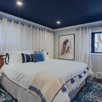
Some of the largest transformations were made in the basement, where unfinished space and lack of light were converted into gloriously lit, cozy, finished spaces. Our first task was to convert the massive basement living room into the new master bedroom for our clients. We removed existing built-ins, created an entirely new walk-in closet, painted the old brick fireplace, installed a new gas unit, added carpet, introduced new lighting, replaced windows, and upgraded every part of the aesthetic appearance. One of the most incredible features of this space is the custom double sliding barn door made by a Denver artisan. This space is truly a retreat for our clients!
We also completely transformed the laundry room, back storage room, basement master bathroom, and two bedrooms.
This home’s massive scope and ever-evolving challenges were thrilling and exciting to work with, and the result is absolutely amazing. At the end of the day, this home offers a look and feel that the clients love. Above all, though, the clients feel the spirit of their family home and have a welcoming environment for all members of the family to enjoy for years to come.
 Southernwind Pools Inc.
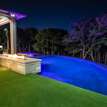
Where architectural demands meet a luxurious and stunning concept – This award-winning project, located in Lucas, Texas, is a perfect reflection of creative design solutions for a challenging space to work with. This negative edge pool features a unique hybrid shape with a massive drop into the basin.
There are floating steps separating the pool and spa. Both of these elements overflow down the side as you walk down them. The dark tile and interior are an intentional look to create a reflective pond-type feel with the canopy of trees standing above them.
This project presented many challenges that were solved with a creative perspective on the design and complements this stunning home in a perfect way.
 AquaTerra Outdoors
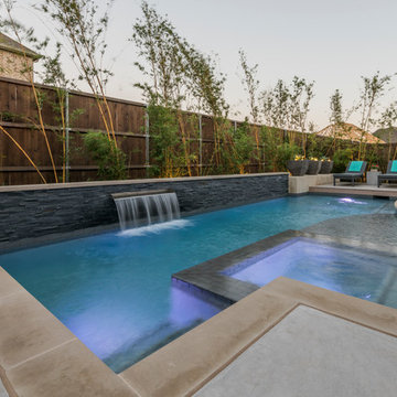
AquaTerra Outdoors was hired to bring life to the outdoors of the new home. When it came time to design the space we were challenged with the tight space of the backyard. We worked through the concepts and we were able to incorporate a new pool with spa, custom water feature wall, Ipe wood deck, outdoor kitchen, custom steel and Ipe wood shade arbor and fire pit. We also designed and installed all the landscaping including the custom steel planter.
Photography: Wade Griffith
 Studio Miel
Photography: Stacy Zarin Goldberg
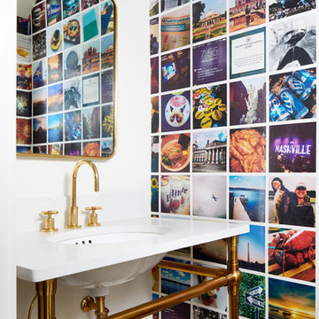
Small trendy porcelain tile and brown floor powder room photo in DC Metro with multicolored walls, quartz countertops, an undermount sink and white countertops
Small trendy porcelain tile and brown floor powder room photo in DC Metro with multicolored walls, quartz countertops, an undermount sink and white countertops

 Southernwind Pools Inc.
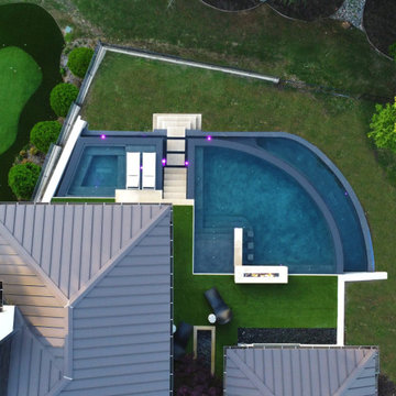
Where architectural demands meet a luxurious and stunning concept – This award-winning project, located in Lucas, Texas, is a perfect reflection of creative design solutions for a challenging space to work with. This negative edge pool features a unique hybrid shape with a massive drop into the basin.
There are floating steps separating the pool and spa. Both of these elements overflow down the side as you walk down them. The dark tile and interior are an intentional look to create a reflective pond-type feel with the canopy of trees standing above them.
This project presented many challenges that were solved with a creative perspective on the design and complements this stunning home in a perfect way.
 Unique Home Solutions Inc.
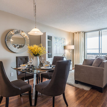
This studio apartment is 380 square feet. Basically one room for the living room, dining room and bedroom. It was challenging as walkways needed to be created and the colours within each living area needed to match to obtain a peaceful feeling as you walked into the unit.
If you are trying to sell or rent out units in your building, give us a call. We can provide furniture within your budget or you can rent it from us. Call Joanne Vroom 514-222-5553.
Unique Home Solutions Inc. has been in business since 2006.
 Drewett Works
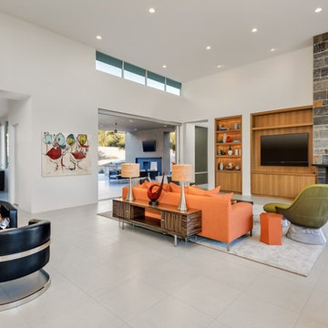
The unique opportunity and challenge for the Joshua Tree project was to enable the architecture to prioritize views. Set in the valley between Mummy and Camelback mountains, two iconic landforms located in Paradise Valley, Arizona, this lot “has it all” regarding views. The challenge was answered with what we refer to as the desert pavilion.
This highly penetrated piece of architecture carefully maintains a one-room deep composition. This allows each space to leverage the majestic mountain views. The material palette is executed in a panelized massing composition. The home, spawned from mid-century modern DNA, opens seamlessly to exterior living spaces providing for the ultimate in indoor/outdoor living.
Project Details:
Architecture: Drewett Works, Scottsdale, AZ // C.P. Drewett, AIA, NCARB // www.drewettworks.com
Builder: Bedbrock Developers, Paradise Valley, AZ // http://www.bedbrock.com
Interior Designer: Est Est, Scottsdale, AZ // http://www.estestinc.com
Photographer: Michael Duerinckx, Phoenix, AZ // www.inckx.com
22