
Search results for "Unity's" in Home Design Ideas
 Battle Associates, Architects
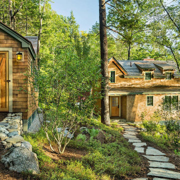
Outbuildings grow out of their particular function and context. Design maintains unity with the main house and yet creates interesting elements to the Outbuilding itself, treating it like an accent piece.
 Battle Associates, Architects
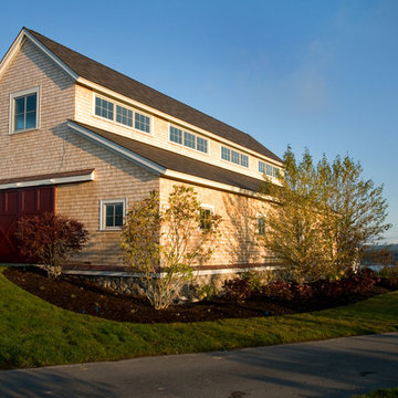
Outbuildings grow out of their particular function and context. Design maintains unity with the main house and yet creates interesting elements to the outbuildings itself, treating it like an accent piece.
 Visual Thesis
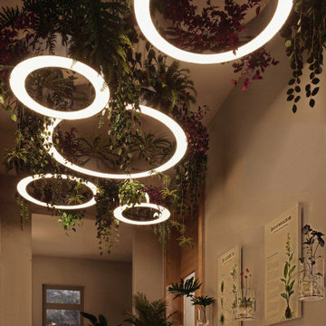
Nexus is a site-specific plant installation that explores the question of the relationship between plants and humans in an urban context. The sculpture consists of five steel rings of various diameters that serve as supports for different types of hanging plants and also support the illumination system of the entrance hall. This striking installation sets the atmosphere for a series of informative panels highlighting the company’s vision, the importance of the relationship between humans and nature, and how this connection can benefit contemporary urban spaces dominated by concrete. The circle—an endless figure without beginning or end—evokes the idea of unity and totality. The set of rings represents a constellation of relationships, an interconnection. Nature and humanity intertwine, redefining urban harmony.
Find the right local pro for your project
 dRemodeling Design-Build
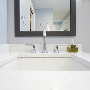
When looking for ways to tie in a contrasting space with many components, such as a bathroom vanity, stainless steel hardware is a great option. Capturing the colors, textures, and materiality of its surroundings, stainless steel can help blend these components, creating unity within the space. It also makes for a great accent!
 Moss Building & Design
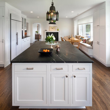
Upon entering the home from the screened porch, MOSS installed floor to ceiling semi-custom cabinetry to be used as a sort of butler’s pantry to store kitchen items, additional entertainment ware, guests’ coats, cleaning equipment and supplies, and more. The use of the unique green tone was a beautiful touch as the color green is used throughout the home’s updated décor and brings a sense of unity to the overall space. Immediately off the long hallway is the home’s kitchen, which was completely updated. Square footage was not affected but MOSS re-designed the space so that it could be used in a more functional manner. A massive kitchen island with a beautiful soapstone countertop dominates the room. Semi-custom white cabinetry lines the perimeters. New large windows provide an incredible view of the yard. Finally, a seating area with built-ins was added to supply more space for seating and for the dining room table to be moved from the center of the kitchen, previously, to the side. The kitchen also features a beautiful fireplace which had its wooden surround updated. The home’s sunroom, located next to the kitchen, was previously a few feet lower than the rest of the home. To bring a better flow to the space, MOSS raised the entire floor of the room up to meet the rest of the main level. Stunningly, the hardwood floor matches to a “T”. In the home’s living room and office, full wall built-ins were added, allowing the homeowners to display their favorite books on topics ranging from art to history, as well as showcasing statues and art sculptures and other items that are meaningful to their family. The living room fireplace’s stone and wooden surrounds were updated by MOSS as well.
 Hansell Design
CLASSICALLY MODERN HAVEN BY THE HILLS
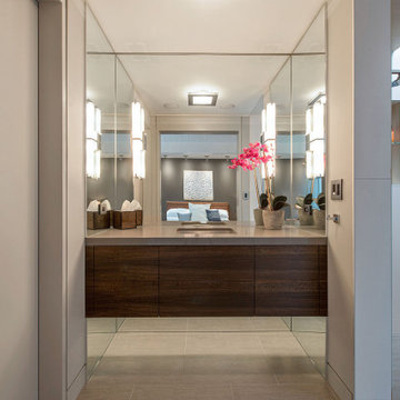
A mid-century Eichler renovation, optimized for sunlight and the vistas of the valley. Structural adaptations allow for extensive glazing, achieving seamless integration of the landscape to create unity and spatial flow.
 Mark Brand Architecture
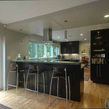
Our clients for this Silicon Valley remodel wanted us to enlarge their existing kitchen by expanding into their adjacent dinette and family room area and address heat and glare issues caused by the afternoon sun at the rear of the residence. Our remodel eventually addressed almost all of the ground floor rooms. In addition we coordinated the addition of new windows throughout the house and “refreshed” the front entry and rear façade. We expanded the kitchen into the dinette area by creating an informal bar area to replace their existing dinette area. We increased indoor-outdoor flow by creating a wall of French doors and windows at the rear which included solar shading integrated into the rear wall by means of a system of interior wall panels defined by carefully laid out reveals. We created a dropped ceiling between the kitchen and the family room to define the bar counter area. A new, minimalist fireplace design replaced the existing brick fireplace. Wenge-colored cabinets and soft putty-colored walls in the dining/family room create a serene overall unity to the space. At the front entry, new doors, hardware and lighting brought this Mid-century rancher into the 21st Century. Photos by Mark Brand.
Sponsored
Columbus, OH

Snider & Metcalf Interior Design, LTD
Leading Interior Designers in Columbus, Ohio & Ponte Vedra, Florida
 Advance Design Studio, Ltd.
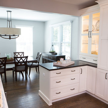
Jackie and Sean loved the Algonquin neighborhood they lived in with the peaceful neighborhood and the close proximity to work and school. What they didn’t love was how outdated their home had become. With a cramped kitchen and an unused dining room, they decided a remodel was the perfect solution to their problem. They would be able to continue to live in the area they loved, while at the same time they could have the dream home they envisioned.
After a thorough search, Jackie came across Advance Design Studio. She was impressed by all of the positive reviews she saw on the internet and saw herself identifying with all of the project stories she saw on the website. Once they met with designer Scott Christensen and owner Todd Jurs, they knew Advance Design was the right company to make their dreams a reality.
The project consisted of four main areas: the kitchen/dining/powder room, the laundry room, the master bathroom, and the kid’s bathroom. They wanted to expand the kitchen into the seldom used dining room and add a large island for hosting parties and family gatherings. They also wanted new hardwood flooring throughout the first level. The laundry room needed to be more functional, and all three bathrooms were in dire need of updating.
The closed off kitchen was opened up to create a sweeping space between the new eating area and the much larger kitchen. A handsome dry bar complete with a beverage refrigerator and lighted glass door cabinetry makes an elegant transition across from a peninsula area filled with storage. An additional decorative cabinet lighting up elegant dishware through the mullioned glass sits directly across from the drybar.
An expansive island was critical to the kitchen plans. Jackie, Sean and Scott worked closely together to create just the right details for their design. They wanted the island to be functional in addition to being the centerpiece of the room. Added storage for the kid’s school supplies was hidden behind cabinet doors so the children could do their schoolwork right at the island, and a microwave drawer glides open with the touch of a finger hidden inconspicuously within the island space. The easy to care for Cambria Britannica Quartz island top with its sweeping grey and white marble look perched atop hand-carved Craftsman corbels was absolutely what they were hoping for, blending both beauty and function perfectly.
Adding a nice contrast to the brightness of the quartz and the white cabinetry, Kodiak - Leather granite countertops were used to balance the light and dark tones of the space. Dura Supreme Classic White painted cabinets grace the perimeter, while Maple Poppy Seed stained cabinets with a beautiful soft grey woodgrain were used in the beverage center and island. The two tones compliment the large space balancing it out nicely creating interest and elegance with the simple Craftsman style full overlay doors.
A deep warm Barnwood White Oak flooring was added throughout the lower level. The new floor brings additional contrast to the bright kitchen and provides unity with the now open floorplan as it rolls in to the foyer and family room. Final details like the show-stopping lunar like duo light fixtures complete the space and intermix expertly with crisscross details of the glass door mullions, the island bar seating and even accessories in the space.
The small cluttered laundry room needed more space and more storage. With a busy family it seemed to overflow daily and did not have anywhere to hide the families “in and out stuff.” Scott designed the new space with a stackable washer and dryer and much more efficiently organized cabinetry. Doing laundry is now (almost!) a pleasure and keeping everyone’s “stuff” hidden, but readily accessible is now a snap.
The master bath was not a place where the couple enjoyed spending time getting ready for their day. The tub almost never was used, so removing it made it possible to build an extra-large shower, replacing the small cramped cube of the previous shower they hated. Clean, horizontal lines softly draw your eye around the space with porcelain tile called Driftwood Sea spray. Full overlay cabinetry in a soft white vanity with double sinks makes getting ready for the day much more convenient for the busy couple.
Long floor planks made of porcelain tile mimic real hardwood floors in a soft grey to compliment the shower, but with the ease and care of a tile surface. Cambrian Black Granite counters with a matte finish and under mount porcelain sinks with handsome brushed chrome hardware complete the handsome space. A real bonus in any master bath; a custom built in storage nook was tucked in the corner of the space for linens and heavenly storage.
The kid’s bath was in sad shape because it was original to the house. To keep the budget in control, the tub which was in great condition was retained, but focus was on the new large brick style porcelain charcoal tile on the floor, crisp white new Craftsman style cabinetry with pretty furniture details on the corner base, a striking granite top with white under mount porcelain sinks and fresh hardware and faucets. Some beautiful soft grey wood mirrors to match mom and dads were custom sized and placed under new lighting, and 4 hooks were smartly arranged down the wall for kids’ towels.
This couple was determined not to move, and made their house their dream home. Not only does their home function greatly now, but Jackie says, “When the neighbors come to visit, they’re asking if they can “steal” the design”! The added functionality, elegance, and open floor plan were exactly what this family needed in order to stay.
Advance Design Studio, Joe Nowak
 WSM Craft
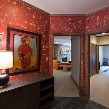
Embracing the notion of commissioning artists and hiring a General Contractor in a single stroke, the new owners of this Grove Park condo hired WSM Craft to create a space to showcase their collection of contemporary folk art. The entire home is trimmed in repurposed wood from the WNC Livestock Market, which continues to become headboards, custom cabinetry, mosaic wall installations, and the mantle for the massive stone fireplace. The sliding barn door is outfitted with hand forged ironwork, and faux finish painting adorns walls, doors, and cabinetry and furnishings, creating a seamless unity between the built space and the décor.
Michael Oppenheim Photography
 Alair Homes Clemson
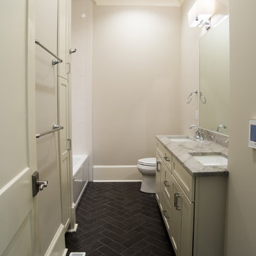
Located in the coveted West End of downtown Greenville, SC, Park Place on Hudson St. brings new living to old Greenville. Just a half-mile from Flour Field, a short walk to the Swamp Rabbit Trail, and steps away from the future Unity Park, this community is ideal for families young and old. The craftsman style town home community consists of twenty-three units, thirteen with 3 beds/2.5 baths and ten with 2 beds/2.5baths.
The design concept they came up with was simple – three separate buildings with two basic floors plans that were fully customizable. Each unit came standard with an elevator, hardwood floors, high-end Kitchen Aid appliances, Moen plumbing fixtures, tile showers, granite countertops, wood shelving in all closets, LED recessed lighting in all rooms, private balconies with built-in grill stations and large sliding glass doors. While the outside craftsman design with large front and back porches was set by the city, the interiors were fully customizable. The homeowners would meet with a designer at the Park Place on Hudson Showroom to pick from a selection of standard options, all items that would go in their home. From cabinets to door handles, from tile to paint colors, there was virtually no interior feature that the owners did not have the option to choose. They also had the ability to fully customize their unit with upgrades by meeting with each vendor individually and selecting the products for their home – some of the owners even choose to re-design the floor plans to better fit their lifestyle.
 Beckwith Group
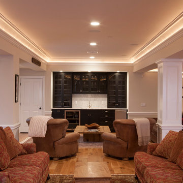
An overall view of the sitting area and family room shows the scale and continuation of the cove lighting and architectural details around the entire space. These horizontal elements work to visually relate the open spaces together, giving them a sense of unity. - Photo Credit: David A. Beckwith
 SGDI - Sarah Gallop Design Inc.
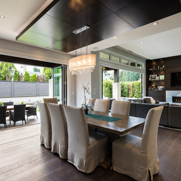
The objective was to create a warm neutral space to later customize to a specific colour palate/preference of the end user for this new construction home being built to sell. A high-end contemporary feel was requested to attract buyers in the area. An impressive kitchen that exuded high class and made an impact on guests as they entered the home, without being overbearing. The space offers an appealing open floorplan conducive to entertaining with indoor-outdoor flow.
Due to the spec nature of this house, the home had to remain appealing to the builder, while keeping a broad audience of potential buyers in mind. The challenge lay in creating a unique look, with visually interesting materials and finishes, while not being so unique that potential owners couldn’t envision making it their own. The focus on key elements elevates the look, while other features blend and offer support to these striking components. As the home was built for sale, profitability was important; materials were sourced at best value, while retaining high-end appeal. Adaptations to the home’s original design plan improve flow and usability within the kitchen-greatroom. The client desired a rich dark finish. The chosen colours tie the kitchen to the rest of the home (creating unity as combination, colours and materials, is repeated throughout).
Photos- Paul Grdina
 Lake County Flooring
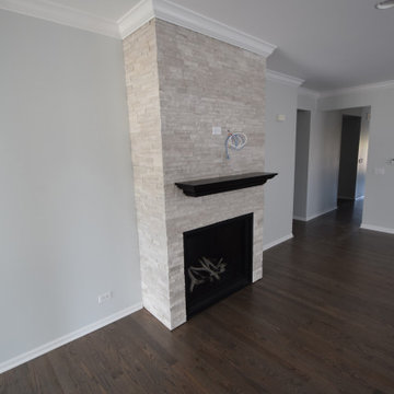
This Grayslake Project Features:
Hardwood in Duraseal Grey in the Kitchen and Family Room, Eleganza Coastline Monterrey Flooring in the Master Bathroom, Ovations Stone Ford Tile in the Hall Bathroom, & Mohawk Carpet in True Unity in the Bedroom

Sponsored
Sunbury, OH

J.Holderby - Renovations
Franklin County's Leading General Contractors - 2X Best of Houzz!
 Crystorama Lighting
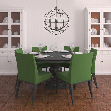
The Solaris Collection, often referred to as a sculpture for the home, was inspired by art work at MOMA in New York. The Solaris is reminiscent of a globe, a symbol of unity and continuity; simple yet not ordinary.

 Remodeling Contractors
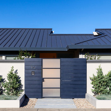
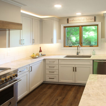
West Des Moines two story homes create challenges for homeowners with layouts including small rooms that don’t seem to flow together. The family that lives in this home found that entertaining and gathering in the kitchen was almost impossible with the current layout and asked for an addition to solve the problem. After listening to the challenges of that they faced and working with the homeowners, a new solution emerged without an addition, reducing the overall budget and allowing the whole main floor to be updated.
By removing the wall between the kitchen and dinning room, the team was able to design an island for family and friends to congregate around. Then by flanking the island with a large commercial range surrounded by a custom backsplash and custom hood a picture perfect kitchen was born. Lastly by repeating elements within the range hood, island and fireplace, the team was able to create unity throughout the space. This visually makes the space feel larger and feels like the addition was built
 Greenbrook Design Center
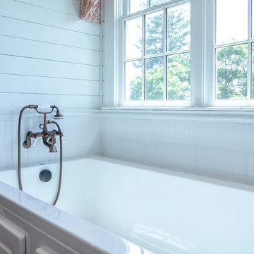
This Jack and Jill master bathroom is a very unique space. The painted cabinets are different than the others used in the house but they still have a traditional/transitional style. The shiplap throughout the house gives the whole house a sense of unity.


 SGDI - Sarah Gallop Design Inc.
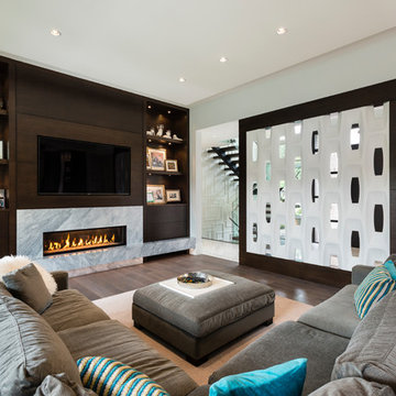
The objective was to create a warm neutral space to later customize to a specific colour palate/preference of the end user for this new construction home being built to sell. A high-end contemporary feel was requested to attract buyers in the area. An impressive kitchen that exuded high class and made an impact on guests as they entered the home, without being overbearing. The space offers an appealing open floorplan conducive to entertaining with indoor-outdoor flow.
Due to the spec nature of this house, the home had to remain appealing to the builder, while keeping a broad audience of potential buyers in mind. The challenge lay in creating a unique look, with visually interesting materials and finishes, while not being so unique that potential owners couldn’t envision making it their own. The focus on key elements elevates the look, while other features blend and offer support to these striking components. As the home was built for sale, profitability was important; materials were sourced at best value, while retaining high-end appeal. Adaptations to the home’s original design plan improve flow and usability within the kitchen-greatroom. The client desired a rich dark finish. The chosen colours tie the kitchen to the rest of the home (creating unity as combination, colours and materials, is repeated throughout).
Photos- Paul Grdina
 projetsinterieur.fr
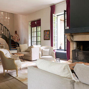
The french style is most of the time the XVIII th century style. Here, I mixed it with the modern style of the carpet and the dark color on the wall.
The cheminée, a very present element of the living-room had to be redesign as the look was too old, the dark color allowed to make a unity in this big room.
 Alair Homes Clemson
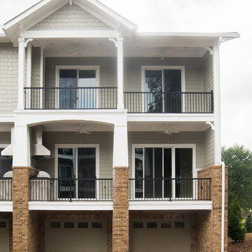
Located in the coveted West End of downtown Greenville, SC, Park Place on Hudson St. brings new living to old Greenville. Just a half-mile from Flour Field, a short walk to the Swamp Rabbit Trail, and steps away from the future Unity Park, this community is ideal for families young and old. The craftsman style town home community consists of twenty-three units, thirteen with 3 beds/2.5 baths and ten with 2 beds/2.5baths.
The design concept they came up with was simple – three separate buildings with two basic floors plans that were fully customizable. Each unit came standard with an elevator, hardwood floors, high-end Kitchen Aid appliances, Moen plumbing fixtures, tile showers, granite countertops, wood shelving in all closets, LED recessed lighting in all rooms, private balconies with built-in grill stations and large sliding glass doors. While the outside craftsman design with large front and back porches was set by the city, the interiors were fully customizable. The homeowners would meet with a designer at the Park Place on Hudson Showroom to pick from a selection of standard options, all items that would go in their home. From cabinets to door handles, from tile to paint colors, there was virtually no interior feature that the owners did not have the option to choose. They also had the ability to fully customize their unit with upgrades by meeting with each vendor individually and selecting the products for their home – some of the owners even choose to re-design the floor plans to better fit their lifestyle.
80