
Search results for "Unusable" in Home Design Ideas
 Castle Building & Remodeling
These repeat clients came back to Castle to do a kitchen refresh. The kitchen refresh replaced the appliances to new panel-ready appliances, painted the cabinetry and upgraded the countertops. The new space utilizes a bright and interesting blue/green island color that compliments the warm wood walnut hardwood floors that were refinished as well. Brass and black accents were added in new fixtures and hardware.
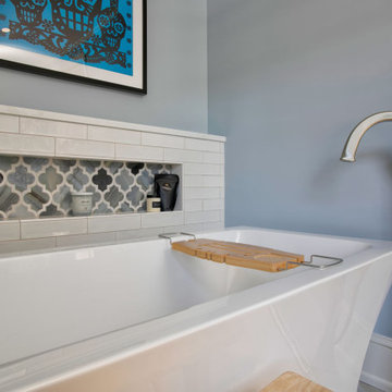
The primary bathroom remodel mostly kept the same layout but converted an old dated and unused corner tub to a new modernized freestanding soaking tub. The black granite and darker colors of the original 90’s bathroom were replaced with luxurious brighter and more transitional materials like white tiles, marble accents and a travertine style floor. A rich warm wood vanity compliments the cool colors from the marble accents and the plumbing fixtures offer a high end, more traditional feel.
 Kowalske Kitchen & Bath
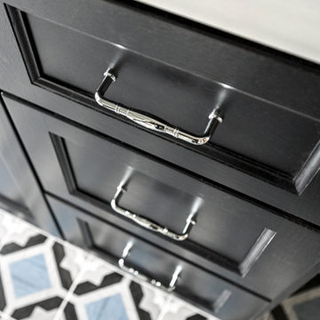
The design of this Milwaukee bathroom remodel fits this 1930s home with a built-in linen cabinet, a leaded glass window, 3 arched doorways, and historic trim, doors and door knobs. This 1930s bathroom remodel in Milwaukee’s Story Hill neighborhood includes accessibility features including grab bars, a walk-in shower and a handheld showerhead.
The goals of this project:
+ Maintain the historic charm of the 1930s bathroom
+ Design with accessibility features for aging in place
Highlights of this Milwaukee Bathroom Remodel:
Walk-In Shower & Bathtub – The homeowners wanted their bathroom to include accessibility features. We added grab bars and reinforced some areas for future grab bars if needed. The walk-in shower has a minimal threshold and a handheld showerhead for easy use.
Heated Floors & Built-In Linen Cabinet – A built-in linen cabinet had been deteriorating over the years and was partly unusable because of the radiator being in the way. We removed the radiator and installed electric floors as the heat source. We also refaced, painted and added roll outs behind the bottom doors of the cabinet.
New Vanity – The homeowners needed more storage and countertop space so we replaced the pedestal sink with a vanity. A traditional style faucet fixture looks similar to what you would have originally seen in this 1930s home. The countertop is quartz that looks like a classic marble without the maintenance of marble. A traditional profile edge gives it an elevated look. A new medicine cabinet over the sink also provides storage in a bathroom the entire family uses.
Arched Doorways – This bathroom features three arched doorways – one in the entryway, one over the bathtub and one near the toilet. Our team carefully worked around the arches, as It was important to keep these architectural elements.
Tilework – The patterned floor tile is a fresh take on the traditional black and white historical bathrooms. It pairs seamlessly with the traditional subway tile walls and hexagon shower floor tile.
Historic Design Elements – Custom doors and trim match the existing in the home, as well as door knobs. It was important to salvage and clean up the leaded glass window and keep the existing arches. Bead board walls, cabinet hardware and overhead lighting were carefully selected to fit the period of the home.
 ADU Specialist Bay Area
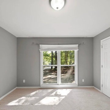
Down to the smallest detail, we completed this Burlingame garage conversion by transforming an unused garage into a stunning, modern living space. We focused on a sleek design with smooth gray walls, soft carpeted flooring, and large double-pane windows that flood the room with natural light. As part of the Burlingame garage conversion design and transformation, we added integrated HVAC, smooth drywall finishes, and a practical closet space. Our garage conversion contractors in Burlingame ensure every detail matches your vision, creating a stylish and functional space.
Burlingame Garage Conversion - https://www.aduspecialistbayarea.com/garage-conversion/burlingame/
Find the right local pro for your project
 Lagois Design Build Renovate
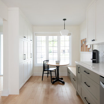
Step into a cozy and inviting atmosphere – a Hygge-inspired Scandinavian kitchen that is sure to warm the heart and bring the family closer together. Previously closed off and isolated from the rest of the home and family, we opened up walls between the kitchen and dining room and created an open-concept space that encourages togetherness and shared moments. Goodbye to isolation and hello to a kitchen that not only looks stunning but also fosters a sense of unity and connection.
The front of the home now has a full glass door as well as a full glass side panel to allow more light into the front entrance. The homeowners needed more storage, so we created a floor-to-ceiling bank of pantry cupboards in an unused part of the eat-in kitchen, and we also created more storage under the bench.
The removal of the wall was a little challenging because it was a load-bearing wall. We needed to add a full-span beam around to the back of the home and have it installed in one piece. We had to reroute the mechanical systems, a bulkhead and mechanical chase now to hide the beam and the plumbing.
The selections and colours – light cabinetry with sage-coloured lower cabinets, white countertops and natural maple hardwood – add to the beautiful open feeling the homeowners wanted. The original kitchen had dated finishes and was tired looking. The peninsula and meal-homework-and-crafts nook make the perfect setting for a young family.
 Fisher Heck Architects
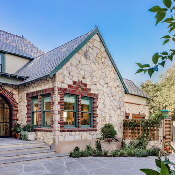
It’s not uncommon for the primary bedroom to be an upper floor in an older home. Such was the case with Park House and as the owners were getting older, the desire to walk up a full flight of stairs multiple times a day was starting to become undesirable. The owners wanted to find away to create a new primary bedroom suite on the main floor of the house, which would allow the upstairs rooms to be dedicated for guests. The existing home had a 2-car garage attached to the rear façade, and was fed by a large expansive concrete driveway and lawn area. Both areas were largely unused, but afforded enough space for a new addition to be added to the house, and then a separate garage structure built adjacent to it. Our team developed a couple of sketch floor plan options on how such as an addition could work alongside a separate new garage structure. One of the goals for the project was that it had to feel like it belonged with the house in that it couldn’t be jarringly modern.
The result is a new rear addition that harmoniously blends in with the existing home that provides a large tranquil bedroom with a spa-like bathroom on the main floor. In addition, a new rear entry vestibule was designed as a transition point between new and old, while also providing space for an adjacent laundry room. The new addition also provided an opportunity to create an enclosed private courtyard with lush landscaping and enough space for large family gatherings.
 Laubri Creations
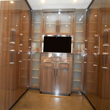
By utilizing an unused bedroom, these homeowners gained a large walk in closet, and sitting area. Big enough to introduce a 3 sided fireplace. A daring mix of finishes, woods, & textures paid off. Cabinetry ranges from high gloss PET, textured faux wood, and even knotty alder. Floating night stands where continued up the walls to frame a one of a kind headboard. Glossy closet cabinets shouts luxury. By using Cambria quartz in a Minera design as a counter top, tub deck & shower sills, all those different cabinet styles were brought harmoniously together. Gorgeous.
 Bistany Design®
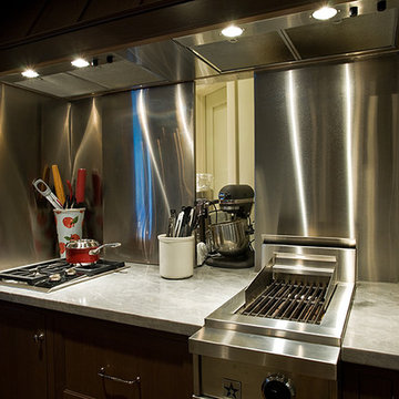
A small unused closet behind this space was utilized for an appliance garage with sliding stainless doors to hide small appliances.
Eat-in kitchen - transitional u-shaped medium tone wood floor and brown floor eat-in kitchen idea in Charlotte with a farmhouse sink, recessed-panel cabinets, blue cabinets, granite countertops, gray backsplash, ceramic backsplash, stainless steel appliances and an island
Eat-in kitchen - transitional u-shaped medium tone wood floor and brown floor eat-in kitchen idea in Charlotte with a farmhouse sink, recessed-panel cabinets, blue cabinets, granite countertops, gray backsplash, ceramic backsplash, stainless steel appliances and an island
 Labra Design Build
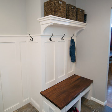
This mudroom got custom cabinetry all around integrated with shaker style wainscoting paneling. A hidden panel opens up to exposed bonus storage space in and otherwise unused space in the wall. One leg of the bench integrates a heat vent that used to be in a closet wall.
 U.S. Builders
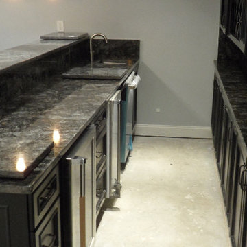
Basements & Cellars. Finishing Ideas!
Turn your basement spaces into smart areas dedicated to leisure, hobbies, play areas, or entertainment. Unfinished basements are usually a headache for home and business owners, not just because of the waste of space and precious square footage, but because unused basements are more likely to deteriorate, accumulate humidity, mold, allergens, and endanger the overall foundations and structures when there is lack of maintenance.
Improve and transform your space into an additional guest room, a custom-designed home office, a bar or an an entertainment room; add closets and storage space or contact us to help you with more ideas to give your basement a good make over!
 Kowalske Kitchen & Bath
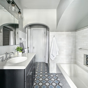
The design of this Milwaukee bathroom remodel fits this 1930s home with a built-in linen cabinet, a leaded glass window, 3 arched doorways, and historic trim, doors and door knobs. This 1930s bathroom remodel in Milwaukee’s Story Hill neighborhood includes accessibility features including grab bars, a walk-in shower and a handheld showerhead.
The goals of this project:
+ Maintain the historic charm of the 1930s bathroom
+ Design with accessibility features for aging in place
Highlights of this Milwaukee Bathroom Remodel:
Walk-In Shower & Bathtub – The homeowners wanted their bathroom to include accessibility features. We added grab bars and reinforced some areas for future grab bars if needed. The walk-in shower has a minimal threshold and a handheld showerhead for easy use.
Heated Floors & Built-In Linen Cabinet – A built-in linen cabinet had been deteriorating over the years and was partly unusable because of the radiator being in the way. We removed the radiator and installed electric floors as the heat source. We also refaced, painted and added roll outs behind the bottom doors of the cabinet.
New Vanity – The homeowners needed more storage and countertop space so we replaced the pedestal sink with a vanity. A traditional style faucet fixture looks similar to what you would have originally seen in this 1930s home. The countertop is quartz that looks like a classic marble without the maintenance of marble. A traditional profile edge gives it an elevated look. A new medicine cabinet over the sink also provides storage in a bathroom the entire family uses.
Arched Doorways – This bathroom features three arched doorways – one in the entryway, one over the bathtub and one near the toilet. Our team carefully worked around the arches, as It was important to keep these architectural elements.
Tilework – The patterned floor tile is a fresh take on the traditional black and white historical bathrooms. It pairs seamlessly with the traditional subway tile walls and hexagon shower floor tile.
Historic Design Elements – Custom doors and trim match the existing in the home, as well as door knobs. It was important to salvage and clean up the leaded glass window and keep the existing arches. Bead board walls, cabinet hardware and overhead lighting were carefully selected to fit the period of the home.
 Wills Company
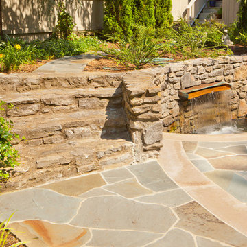
A dated and unused pool is transformed into an outdoor oasis that can be enjoyed year round. Ridley Wills worked with his client to make the space inviting and elegant. The house seemed to double in size!
 Cochrane Floors & More
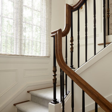
This 80's style ensuite remodel featured some big changes to create some much wanted space. In addition, the log and awkwardly short vanity was replaced with a two elegant pedestal sinks separated by a well designed custom cabinet with LOADS of upper storage space that's easy to access. The unused corner tub was replaced with a quaint sitting bench beneath the large windows for the family feline to enjoy and to offer some large blanket & pillow storage for the adjoining Master suite. The stunning rustic vinyl planks were installed right over top of old lino for minimal down time and a smaller height transition to the bedroom threshold. A traditional beadboard wainscoting with tall base trim replaced an again golden oak and brightened up the entire space. The acrylic bathroom stall was expanded and finished with a stunning carrara style porcelain tile that brought a touch of elegance back into the design. Overall, the new space fits better with the client's antique collection and vintage decor for a seamless and functional space where they feel relaxed and inspired.
 Fergus Garber Architects
Enlarging and reconfiguring this endearing 100 year old Palo Alto cottage gives the home a new life in the twenty-first century.
When it comes to architecture and interior design, character and charm go a long way, but natural light, spaciousness, and fluidity are just as essential to creating a home. Over the course of design process, the FGA team explored inventive ways to maximize this 1920s Palo Alto home’s potential while maintaining its historic perspective. The new design connects, modernizes, and functionalizes the floor plan and cleans up outdated 1960s renovations. To achieve this, a new second wing was added to the original structure using the same French Tudor and half-timber style. The U-shaped courtyard configuration now creates a quaint centralized patio area easily accessible by French doors on both wings. The new wing houses a ground floor family room directly off the kitchen and an enlarged private master suite above. To take advantage of existing interior space, the second floor was reimagined by clearing out a warren of small, dark servant rooms. An unused elevator shaft was also removed affording larger, brighter, and more cohesive spaces on the ground floor and a cleaner, simplified exterior roof line that enhances the home's appearance from the street.
 Robertson Kitchens
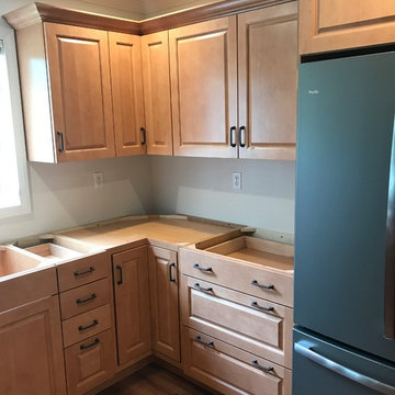
This job is still waiting for the countertops and finishing touches. We removed the soffits and made a better use of space of the area where an unused desk was located. Brookhaven cabinets were used with a light maple stain.
 San Luis Kitchen Co.
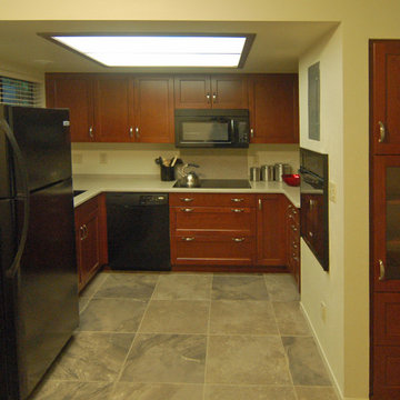
Using Brookhaven cabinetry, this small condo kitchen was severely lacking in storage and counter space. We remedied that by moving the oven into the wall cavity below the existing electrical panel. The we added storage and display space facing the dining area -- again using the previously unused space inside the wall. We added nice deep drawers under the cooktop, a lazy susan and additional drawers in what had been a dead corner.
Wood-Mode Fine Custom Cabinetry: Brookhaven's Winfield
 Integrated Home Improvement
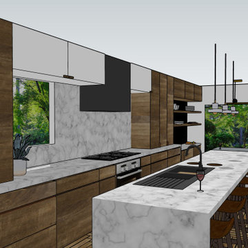
This client was looking to design a mid-century modern kitchen with an industrial touch that would feel bigger and improve its workflow by changing the layout. Additionally, the client was looking to change the laundry room to make it less crowded and more functional. We placed the previously unused pantry in an area, between the kitchen and the powder bathroom on the other side of the wall, increasing their pantry space from very small to 32 SF. We moved the fridge, sink, and cook-top to increase proximity to each other and improve workflow. We still used some of the space from the old pantry to hold spices and other essential cooking ingredients in an accessible-for-cooking area next to the fridge. We opened up the countertop to be a straight line all the way to their dining room, instead of the "L" they had before, which made the space feel smaller. We changed the orientation of their dining room table. We turned their bar, which they were not so keen on, into a wine rack. We created a buffet space in their dining room.
 Dale Cohen Designstudio
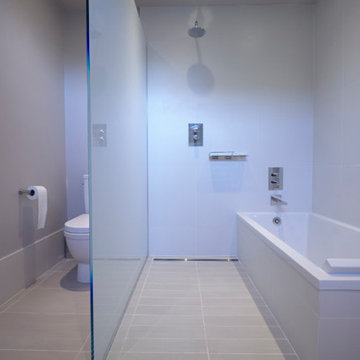
Asked by her client to review a typically mundane South Hampton ‘50s saltbox because “the last designer they talked to said they would have to add on to make the house anything,” Ms. Cohen approached the renovation in exactly the opposite manner. To refine the small building footprint, precise architectural gestures were used with a series of finely calibrated moments make the space more gracious and welcoming. Architectural acts were bold in concept but not in actual construction work; such as capturing the car garage to add a hyper modern sunroom/den along with a powder room and laundry. Reconfiguring one side of the house’s roofline to manipulate the space into a sensational master suite saved the north side of the house from remaining an un-useful attic space. This inner sanctum of bedroom and master bath is reminiscent of a Hampton’s beachscape in all its elegance and minimalism. The only square footage actually added was a tiny 4X4 corner as an addition to the front entry, oddly an essential piece of real estate to make an actual vestibule. All these refinements make for a crafted, articulate result rather than bowing to the bigger is better theme, which is more prevalent in the Hamptons.
The function of the plan and the accompanying finishes are impressive. The Jack and Jill bathroom, an invention of the American post-war housing boom, was outfitted in handsome walnut Duravit vanity cabinets and neutral finishes. The master bath, with its expansive skylights, might be mistaken for a conceptual art installation due to its evocative marble countertop in striped ethereal hues. Finally, Ms. Cohen uses wallpaper like a museum curator, hanging an iconic Knoll pattern to punctuate the dining/media space.
Each room in the house was sculpted via a palette of watercolor blue of varying saturations. Fabrics were culled from the greats of modernist textiles, Maharam’s Quatrefoil pattern in blue and Knoll classic Sway pattern in sea shades. The blue on white “beach” scheme runs from a soft cotton candy sky in the girl’s room to an immersive David Sutherland Park Bark wallpaper in the powder room. This intellectual inquiry as to what are the true colors at the beach belays the sophistication that surpasses the usual nautical curse of the average beach house. Out of the corner of your eye, in almost every quadrant of the house, is a burst of colorful expression and delight; this serves as Ms. Cohen’s painterly gift to the client.
Ms. Cohen’s hidden strength is her ability to choreograph a seating area. Whether it is a formal living room or the ultimate hang out spot, each space has the right amount of distance, intimacy and dare I say intrigue to make the arrangements inviting. Each conversation, because it really looks like a fine chat can be had, has an elegant side table ready for duty and all tête-à-têtes are regulated to a sumptuous area rugs. Habitants in Ms. Cohen’s world only work through deep discourse.
 CITYDESKSTUDIO, Inc.
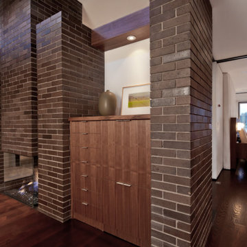
This home enjoys stunning views of Sweeney Lake from almost anywhere in the home; however it was in need of repair and a significant reorganization of the plan to take full advantage of site. The project is about the complete restoration and rethinking of this vintage 1965 mid-century gem. The house is deceivingly large with a full finished lower level and an indoor pool room; however it lived cramped and broken up. The entry was uninviting and small, the poolroom unused and poorly heated, the kitchen undersized, and the bedrooms and baths poorly accessed.
Our task was to open up the home through the rethinking of the floor plan and the introduction of a new central axis connecting and organizing the homes functions and spaces around view corridors and existing or new focal points. The home had beautiful features to build upon; the central brick fireplace, the raised roofs over the living and pool rooms, and the view to the lake itself. A fully redone exterior and interior preserve the homes proportion and scale, while at the same time bring greater connection to the site and a much needed clarity to the homes organization.
Project Team:
Ben Awes AIA, Principal-In-Charge
Bob Ganser AIA
Christian Dean AIA
Nate Dodge
 Urban Oasis Landscape Design
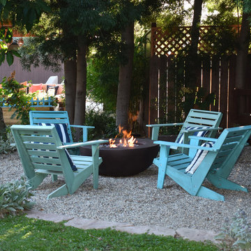
An unused shady corner has become a favorite place to relax. During the day the mature trees shelter one from the sun and at night the fire bowl keeps things warm.
 E_ Designs
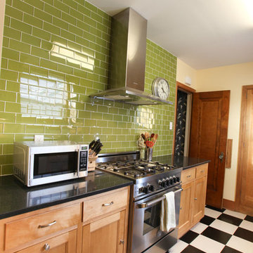
This 1931 South Minneapolis kitchen was in dire need of more storage and function. While preserving the original cabinets and checker board floors, we decided to open up the space to the large unused back entry. New custom cabinetry was designed to match the existing cabinets and all new custom recycled glass countertops were installed. A custom bar table was designed with recycled glass tops for additional eat-in seating. A new Kohler cast-iron sink and Kohler faucet were installed. All new knobs and pulls finished off the cabinetry. White subway tile was installed on the sink wall with dark grout to mimic the checker board floors and a large accent glass wall was designed to highlight the modern stove and appliances. The new design was able to maintain some existing elements while bringing forward the homeowners personal retro flare.
Photography: Hannah Lloyd
117