
Search results for "Unusable" in Home Design Ideas
 Kitchen Solvers of Jacksonville
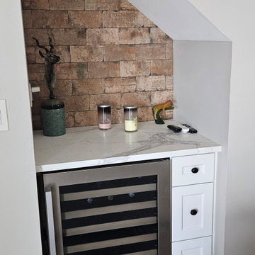
This customer had a challenging shotgun style kitchen with a bay window and unused space and a refrigerator that stuck out into the room. The challenge was to make the best use of the space without it feeling crowded. The sink and dishwasher were relocated to the unused area, freeing up the snack bar area and creating storage beneath. On the refrigerator wall, a bank of three tall custom depth pantry cabinets were made slightly more shallow as they stepped back, to open up the space at the back of the room. A wall separating the kitchen from the dining and living room was cut back at the entrance of the kitchen to further open up the room. The microwave was moved from over the cooktop and replaced with a working hood. A bench seat was added to the bay window for storage and seating. The new cabinets were done in a shaker Ogee door in a Stratus SuperMatte from our Kitchen Solvers Legacy Collection. We also added a new Calacatta Infiniti quartz countertop and a red brick backsplash. The finished kitchen is much more usable and has plenty of storage.
 My House Design|Build|Team
After living in their home for over 18 years, the homeowners loved the architectural potential of their home, and needed a refresh to meet their current family needs.
They now had two kids in college and wanted to focus on entertaining.
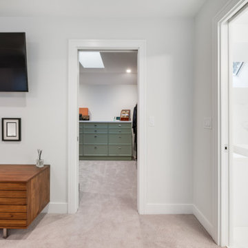
The key projects in the home included a new dramatic living room, the white kitchen renovation, a new personalized man-cave for the husband, and a large walk-in closet with custom height drawer storage for the wife.
Throughout the rooms in this renovation, we added pops of gold and glamour, yet kept the home cozy and livable.
We utilized cohesive design elements throughout the home including ship-lap texture and detailing throughout the kitchen, new mudroom, wok kitchen, living room, and master bedroom.
Project Highlights: White Kitchen Renovation
In this white kitchen renovation, we removed the old wooden shaker-style kitchen cabinetry and replaced them with all new white and grey cabinets, and white marble counter tops. Expertly hidden behind some of these cabinets is the family’s new walk-in pantry.
The original space had a small, awkward-shaped kitchen island that was so small it was barely functional or convenient for more than one person to sit at. We gave the homeowners a much larger kitchen island, with a beveled edge, that now has more than enough space for eating, socializing, or doing work. With a large overhang counter top on one side, there is now room for several backless bar stools tucked under the island. You’ll also notice glitters of gold inside the two over-sized lighting fixtures suspended over the island.
We created the homeowners a small wok kitchen just off of their new white kitchen renovation. In the main kitchen, we added a ceramic flat cook top and subtle white exhaust hood with an elegant rose-gold trim. Behind it, a white/grey mosaic back splash acts as a wall accent to provide some dimension to the otherwise solid white space. Surrounding the range hood are two large wall cabinets with clear doors to provide extra storage without adding bulk to the newly opened room.
The adjacent dining room was also updated to include a long, contemporary dining table with comfortable seating for eight (ten if you want to get cozy). We replaced the low-hanging run-of-the-mill chandelier with a higher, more modern style made of gold and glass. Behind it all is a new dark grey accent wall with a paneled design to add dimension and depth to the new brighter room.
Brightening the Living Room
In addition to the white kitchen renovations, the living room got a much needed update too.
The original high ceilings were so high they were unusable for decor or artwork, and a fireplace was mostly unused.
We installed a large dark grey paneled accent wall (to match the new accent wall in the new formal dining room nearby), to make better use of the space in a stylish, artful way.
In the middle of the room, a stunning minimalist hanging chandelier adds a pop of gold and elegance to the new space.
If you’re looking to change up the colour scheme in your home, or make a transformation from dated to like the white kitchen renovation we did in this Surrey home, let us take a look. Schedule a complimentary consultation with the My House Design/Build Team today.
 Remodeling by Classic Homes
After finding a great neighborhood nestled in charming Keizer, Oregon, our clients went about leaving their mark on their new home.
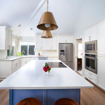
The kitchen was just too cramped and dark with the wood stained cabinets. We snagged a little unused space in the rarely used formal dining room and pushed the face of the cabinets, oven, and microwave flush with the wall. Trading unused space in the formal dining room gained us nearly two feet of prime work area in the kitchen.
With the space issue resolved we tackled brightening up the area. Replacing the black appliances with stainless steel KitchenAid microwave, oven, and a french door bottom mount fridge really helped. The full height Daltile Rittenhouse 3”x6” subway tile backsplash in Biscuit with Oyster Grey grout helped keep the kitchen bright while adding enough color to keep it from feeling “institutional”.
The two-tone quartz, Basix Portabello on the outer counter tops and Polarstone Pietra Danae on the island, along with the sleek Blanco Biscotti undermount sink add form and function. Being able to wipe the counter tops directly into the sink is a joy everyone should experience. We added a custom wine bar and the Navy Blue statement island to make this kitchen really stand out. The result was very happy clients who love spending time in their home.
Find the right local pro for your project
 River Valley Landscapes
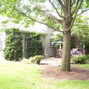
Before - After many years of having no outdoor living space and dealing with overgrown plants and trees the owner’s decided it was time to revitalize their backyard. They knew they wanted a large sitting area with a wood burning fireplace, room for outdoor dining and a place for the grill. A connecting walk would be needed to get guests from the driveway to the outdoor space. Last but not least, the owners wanted the ability to and a reason for stepping out of their unusable patio doors.
The designers decided from the start the fireplace would be the prominent feature and focal point for the entire project. A large fireplace accented with sitting walls and arbors was positioned to anchor the corner of the patio. Stone was chosen to set the fireplace apart as its own element. Brick was used for the sitting walls and brick accents were added to the fireplace to tie into the house. An inlaid herringbone brick detail was incorporated above the stone mantle to simulate artwork which is typically found above indoor fireplaces. Flagstone was used for the wall caps and hearth to match the patio and thicker flagstone tread stock was used for the mantle and top. The arbors were added to visually balance the pergolas at the opposite side of the patio.
For the patio the designers created a series of offset spaces to help subtly divide the space into two areas, sitting and dining. Two large existing trees also help dictate the shape of the patio. Cut flagstone was chosen for the surface bordered by a double soldier edge of brick. The brick edging also surrounds a decorative gravel area topped with an urn fountain which provides a secondary focal point and the sound of water. Large flagstone treads were used for the steps leading to the previously unused patio doors. Opposite the fireplace a short walk leads to a square transition area with a statue chosen by the owner. The statue provides a strong focal point when entering from the driveway. A longer walk leads from this space along the house to the driveway.
The pergolas and arbors were designed by the landscape designer as part of this project but were ultimately contracted separately by the owner. The larger square pergola was intended as an area for a bench or two separate from the main patio. The longer pergola was added later in the design phase to help provide shade to the interior of the house. The arbors at the fireplace were added to balance out the wood elements at the opposite side while adding additional architectural interest to the fireplace.
While this project was predominantly hardscaping, planting and lighting were also incorporated into the design. Several large existing trees were retained and serious of smaller understory trees were added to help enclose the space. The designer’s took advantage of the large trees to place down lights on the branches to achieve a moonlight effect at night. Additional lighting was used on the pergola, to accent focal points, to up light the smaller trees and around the patio. Massed planting of Japanese forest grass provides bold foliage color for the shady garden. A mulch path leads off behind the fireplace to another garden and a secluded area ideal for a bench or small table and chairs. Additional plantings were added along the rear property line to screen and unsightly fence.
This project has obviously completely changed the way the owners use their backyard. They now have a seamless transition from indoors to outdoors with the use of the patio doors. The large patio allows for entertaining small gatherings outdoors for the first time. The fireplace has definitely become the primary gathering place for family and friends.
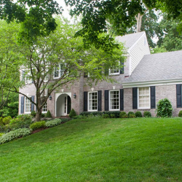
 D. A. Dunlevy
A challenging landscape transforms into the ideal family space.
Having a sloped, unusable backyard isn’t a deterrent for the designers of D. A. Dunlevy. This residential project required moving a great deal of the property’s soil in order to create usable space for entertaining, relaxing, and sports. By cutting into the existing hill and adding a retaining wall, we were able to create a large green space that allowed the kids to play lacrosse. A custom flagstone patio, stone firepit, and outdoor furnishings were designed along with custom plantings to provide the perfect place for entertaining friends and family. To complete the design of this lovely property, a flagstone walkway and additional plantings were installed in the front of the house. The weeping redbud was used as a focal point in the landscape design.
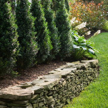 D. A. Dunlevy
A challenging landscape transforms into the ideal family space.
Having a sloped, unusable backyard isn’t a deterrent for the designers of D. A. Dunlevy. This residential project required moving a great deal of the property’s soil in order to create usable space for entertaining, relaxing, and sports. By cutting into the existing hill and adding a retaining wall, we were able to create a large green space that allowed the kids to play lacrosse. A custom flagstone patio, stone firepit, and outdoor furnishings were designed along with custom plantings to provide the perfect place for entertaining friends and family. To complete the design of this lovely property, a flagstone walkway and additional plantings were installed in the front of the house. The weeping redbud was used as a focal point in the landscape design.
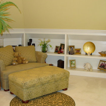
 Designs by Desiree
Making use of an unused space. Turned into a multifunctional space. It is an area to read and the chair 1/2 is a twin sleep sofa for extra sleeping. The ottoman has storage for the bed linens and pillows.
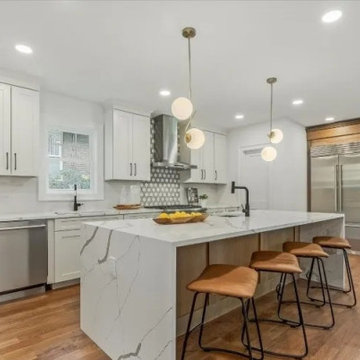
 John M Monchak Architect LLC
by taking over unused exterior space in the too-narrow backyard, as well as an undersized powder room and unused, too-small corner entrance, the size of the kitchen was increased by half, allowing for a spacious island where none was possible before.
 MS Budd Construction
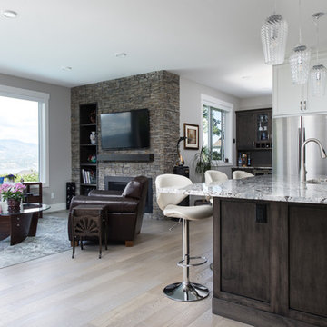
This 17-year- old home was trendsetting at the time it was built. It was the first house constructed in its subdivision. Today, it’s nonfunctional for the growing
family’s needs. The kitchen is dated with inefficient lighting and space and mom dreams of new appliances, a pantry and an inviting gathering place for family to
congregate. Add a bar nook off the kitchen and the family hub is complete. Make your way to the master bedroom and through to the ensuite, it’s evident this room needed a facelift. With the main floor bathroom next to the ensuite, this was an ideal space to expand. Relocate the dreary main bathroom to an unused bedroom, the results? Astonishing! One last space to update – an extremely small laundry room and the job is complete.
Due to extensive changes to reconfigure and update the open concept living area we removed the entire ceiling to replace the wiring, install new insulation, vapour barrier and lighting all to current building standard codes.
Moving the main bathroom to an unused bedroom was an efficient use of space. This also allowed us to use the main bath to extend the master ensuite.
In the new ensuite we created a unique tub/shower room with extensive use of tile.
In the master bedroom, there was a need for more closet space so a new walk-in closet was created.
The new spacious main bathroom now had room for a soaker tub and large walk-in shower.
We removed the eighties style 3 sided glass fireplace that interfered with flow from living room to dining room. A new rock feature wall with fireplace was created giving the room warmth and style.
For style and design flow, there was a considerable amount of tile used throughout using common colour and composition.
Windows on the view side were reconfigured by adding more windows that were larger, more energy efficient and now captured the outdoors.
Environmentally - LED lighting was added throughout, insulation was upgraded, energy efficient appliances replaced the old and UV windows were installed.
 Medallion Cabinetry
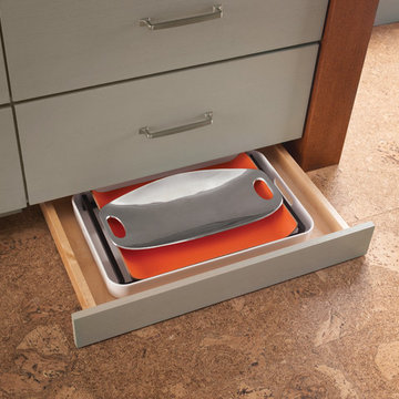
Simple modern is the design title for this open forum kitchen layout featuring our Silverline series cabinetry; giving you a designer look with exceptional value.
 Drury Design
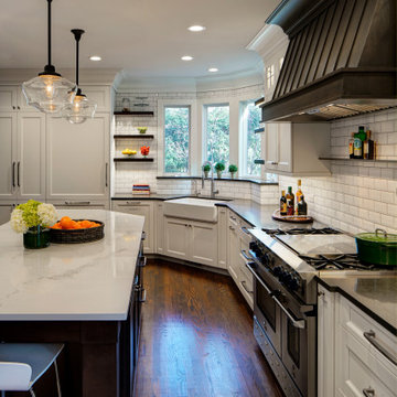
A low bay window and a second unnecessary door to the backyard limited options for reworking the layout. The solution was to replace the window with a new unit that would offer a great spot for a new farm sink. Eliminating the unused back door enabled us to locate a large new pantry and fridge in its place. (A second door to the backyard remained intact).
Connecting the kitchen to the dining room was also a priority. A wide new cased opening makes the dining and kitchen flow beautifully, allowing the cook to chat with guests.
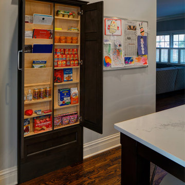
New gourmet appliances and a large island offer all the amenities an avid cook could want. On the seating side of the island, lap drawers keep school supplies handy. A tall “between the studs” cabinet offers dedicated storage for kids snacks and a handy spot for mail and school info, so the counters stay free of papers. A charging drawer also helps keep the kitchen tidy.
The palette for the new kitchen features fresh white perimeter cabinets, with a contrasting dark stained island, open shelves, and custom hood.
The homeowners could not be happier with their new kitchen, which has gone from almost unusable to being the true heart of their home!
 Gayler Design Build
Like many homes today with unused dining room/living spaces, this homeowner had a plan to repurpose her unused dining space by creating an open concept large cooks’ kitchen/dining area.
The new design included removing a wall between the existing kitchen and dining room to enlarge the kitchen space. A new wall was built with a corner walk-in pantry for additional storage. A large island was designed into the kitchen with room for additional seating, more cabinetry space and a wine refrigerator. To improve the flow in the room, we also created a new entry into the kitchen.
To create ample seating, space was designated for a dining room table and an island bar. The dropped ceiling in the kitchen was raised and a new window was added to open up the space and let in more natural light. To accommodate the homeowner’s hutch, additional room was added along the outer wall of the kitchen. For beauty and aesthetics, a new powder-coated steel stair railing was installed to guide people from the entry to the upper floor. The stair case risers were completed with a contrasting white and dark wood finish and matching posts were added to the island bar area.
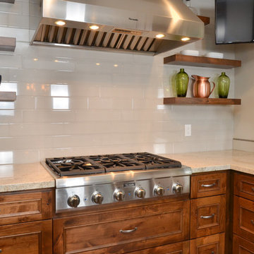
Knotty Alder cabinets and a New World stain complete this Rustic Napa-inspired look. The light color counter tops are Kashmire Cream granite. The contrast between the dark cabinets with beautiful visible grain detail and light countertops gives this kitchen a timeless, rustic feel. The Blanco apron front sink, in white SiliGranite material is surrounded by antique nickel finish faucets and Antique Pewter hardware. The steel posts are powder coated to match the Antique Nickel faucets. Behind the cooktop in 4” x 16” Pumice color Portcelain tile, is a full height-tiled backsplash—a perfect backdrop for floating shelves that match the cabinets. Beautiful!
 Drury Design
A low bay window and a second unnecessary door to the backyard limited options for reworking the layout. The solution was to replace the window with a new unit that would offer a great spot for a new farm sink. Eliminating the unused back door enabled us to locate a large new pantry and fridge in its place. (A second door to the backyard remained intact).
Connecting the kitchen to the dining room was also a priority. A wide new cased opening makes the dining and kitchen flow beautifully, allowing the cook to chat with guests.
New gourmet appliances and a large island offer all the amenities an avid cook could want. On the seating side of the island, lap drawers keep school supplies handy. A tall “between the studs” cabinet offers dedicated storage for kids snacks and a handy spot for mail and school info, so the counters stay free of papers. A charging drawer also helps keep the kitchen tidy.
The palette for the new kitchen features fresh white perimeter cabinets, with a contrasting dark stained island, open shelves, and custom hood.
The homeowners could not be happier with their new kitchen, which has gone from almost unusable to being the true heart of their home!
 McAdams Remodeling & Design
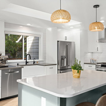
The previous kitchen had cherry cabinets, and even with a skylight and the extra daylight provided by the Nanawall, it appeared dark and slightly dated. The granite countertops were not their style and the rounded edge to the island cut into their living room. There was dead space in the kitchen outside of Joanne’s cycling room, that could have offered a small eating area, but the couple didn’t need it. The flooring had a hard transition between the kitchen and the unused space, and the color was darker than the Sam and Joanne preferred.
The newly remodeled kitchen is light and bright with a white subway tile backsplash and new engineered flooring in the color Norwich. The couple chose Maple cabinets painted white from Omega Cabinetry in a Blair door style with concrete countertops – a unique choice for our clients. The contrasting island was painted in a Dusty Miller color and featured Beckington quartz countertops in a more traditional shape than the previous. New stainless-steel appliances were installed along with a white fireclay farmhouse sink for a clean, bright look. The previously unused space near Joanne’s bike room was reclaimed for additional pantry storage and a business center. A new window was installed above the desk area for more light. Finally, consistent wood floors were installed throughout offering a cohesive look, while the new Fir front door provided a gorgeous first impression.
 720tengle
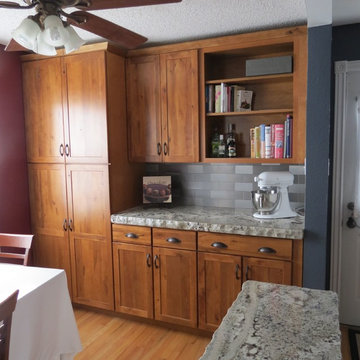
Making use of an empty wall, I installed this entire new wall of cabinets and gained additional countertop space as well. It's the best part of the remodel. And all the lower cabinets have roll-out shelves.
 Gayler Design Build
Like many homes today with unused dining room/living spaces, this homeowner had a plan to repurpose her unused dining space by creating an open concept large cooks’ kitchen/dining area.
The new design included removing a wall between the existing kitchen and dining room to enlarge the kitchen space. A new wall was built with a corner walk-in pantry for additional storage. A large island was designed into the kitchen with room for additional seating, more cabinetry space and a wine refrigerator. To improve the flow in the room, we also created a new entry into the kitchen.
To create ample seating, space was designated for a dining room table and an island bar. The dropped ceiling in the kitchen was raised and a new window was added to open up the space and let in more natural light. To accommodate the homeowner’s hutch, additional room was added along the outer wall of the kitchen. For beauty and aesthetics, a new powder-coated steel stair railing was installed to guide people from the entry to the upper floor. The stair case risers were completed with a contrasting white and dark wood finish and matching posts were added to the island bar area.
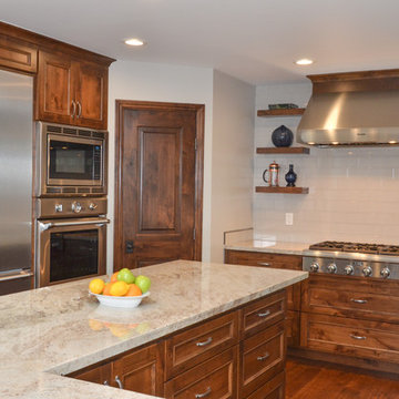
Knotty Alder cabinets and a New World stain complete this Rustic Napa-inspired look. The light color counter tops are Kashmire Cream granite. The contrast between the dark cabinets with beautiful visible grain detail and light countertops gives this kitchen a timeless, rustic feel. The Blanco apron front sink, in white SiliGranite material is surrounded by antique nickel finish faucets and Antique Pewter hardware. The steel posts are powder coated to match the Antique Nickel faucets. Behind the cooktop in 4” x 16” Pumice color Portcelain tile, is a full height-tiled backsplash—a perfect backdrop for floating shelves that match the cabinets. Beautiful!
 Regan Baker Design Inc.
Intentional. Elevated. Artisanal.
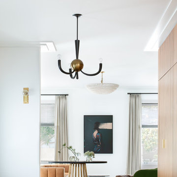
With three children under the age of 5, our clients were starting to feel the confines of their Pacific Heights home when the expansive 1902 Italianate across the street went on the market. After learning the home had been recently remodeled, they jumped at the chance to purchase a move-in ready property. We worked with them to infuse the already refined, elegant living areas with subtle edginess and handcrafted details, and also helped them reimagine unused space to delight their little ones.
Elevated furnishings on the main floor complement the home’s existing high ceilings, modern brass bannisters and extensive walnut cabinetry. In the living room, sumptuous emerald upholstery on a velvet side chair balances the deep wood tones of the existing baby grand. Minimally and intentionally accessorized, the room feels formal but still retains a sharp edge—on the walls moody portraiture gets irreverent with a bold paint stroke, and on the the etagere, jagged crystals and metallic sculpture feel rugged and unapologetic. Throughout the main floor handcrafted, textured notes are everywhere—a nubby jute rug underlies inviting sofas in the family room and a half-moon mirror in the living room mixes geometric lines with flax-colored fringe.
On the home’s lower level, we repurposed an unused wine cellar into a well-stocked craft room, with a custom chalkboard, art-display area and thoughtful storage. In the adjoining space, we installed a custom climbing wall and filled the balance of the room with low sofas, plush area rugs, poufs and storage baskets, creating the perfect space for active play or a quiet reading session. The bold colors and playful attitudes apparent in these spaces are echoed upstairs in each of the children’s imaginative bedrooms.
Architect + Developer: McMahon Architects + Studio, Photographer: Suzanna Scott Photography
 Cabinet Magic Inc.
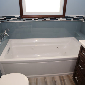
We took this empty, long unused Master Bath and took it from ugly and unusable to Stunning and a relaxing escape! All glass tile with custom inlays and pencil borders. Custom built vanity with a matching stained entry door. Frameless shower door. Tile flooring and a jacuzzi tub to take you away!
 Jarrett Design
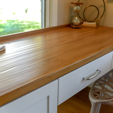
When this young family of four and their aging dog, Bernie, moved into their new home, it was evident that changes needed to be made for the house to work for them. The kitchen was cramped and crowded and didn’t allow for the large family gatherings they enjoyed hosting. Without a mudroom between the garage and kitchen, there was no place to drop groceries, schoolbags, coats or boots. And an unused dining room sat empty, save for the furniture. We immediately set out to open up walls and make better use of the space. A mudroom was added, outfitted with cabinetry lockers for jackets and schoolbags with room for baskets for shoes under the bench. A glass pocket door was installed to let the light flow from the window on the front of the house into the adjacent kitchen. In the kitchen, we took advantage of the unused dining room and broke through the wall creating one large, open plan, kitchen and family room. An expansive island was installed to provide seating in the kitchen and give sight lines from the sink to the family room from which to keep an eye on the littles while they played. A desk area was also created in front of one of the windows, giving great light for homework and crafts. While the floor-to-ceiling windows in the dining room kept us to a galley kitchen layout, their dog, Bernie was thankful we maintained his views of the park-like setting in the backyard.
 Gayler Design Build
Like many homes today with unused dining room/living spaces, this homeowner had a plan to repurpose her unused dining space by creating an open concept large cooks’ kitchen/dining area.
The new design included removing a wall between the existing kitchen and dining room to enlarge the kitchen space. A new wall was built with a corner walk-in pantry for additional storage. A large island was designed into the kitchen with room for additional seating, more cabinetry space and a wine refrigerator. To improve the flow in the room, we also created a new entry into the kitchen.
To create ample seating, space was designated for a dining room table and an island bar. The dropped ceiling in the kitchen was raised and a new window was added to open up the space and let in more natural light. To accommodate the homeowner’s hutch, additional room was added along the outer wall of the kitchen. For beauty and aesthetics, a new powder-coated steel stair railing was installed to guide people from the entry to the upper floor. The stair case risers were completed with a contrasting white and dark wood finish and matching posts were added to the island bar area.
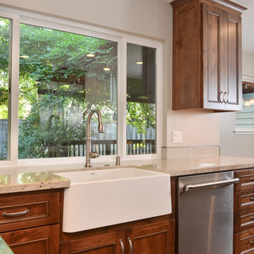
Knotty Alder cabinets and a New World stain complete this Rustic Napa-inspired look. The light color counter tops are Kashmire Cream granite. The contrast between the dark cabinets with beautiful visible grain detail and light countertops gives this kitchen a timeless, rustic feel. The Blanco apron front sink, in white SiliGranite material is surrounded by antique nickel finish faucets and Antique Pewter hardware. The steel posts are powder coated to match the Antique Nickel faucets. Behind the cooktop in 4” x 16” Pumice color Portcelain tile, is a full height-tiled backsplash—a perfect backdrop for floating shelves that match the cabinets. Beautiful!
30