
Search results for "Unusable" in Home Design Ideas
 Metropolis Drafting and Construction Inc
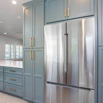
In a classic traditional home in the heart of Valley Village a new young family was moving in.
The goal was to preserve the traditional feel but to get the modern comfort of a new and functional kitchen.
The first thing we did was to relocate the sink for the unusable corner to the vast open space of the bay window once reserved for the tiny breakfast nook.
The wall to the dining room was removed to create a greater sensation of space with a peninsula to act as an additional breakfast bar and large surface for prep/cooking.
The remainder of the wall was taken over by large floor to ceiling pantries and a fridge enclosed in the middle for the built-in feeling.
only two upper cabinets with floating shelves in between assist in the spacious feeling of this once tight galley kitchen.
The custom-made hood from Hoodsly was stained to match the new shelves and once installed additional molding was installed above to cover the gap between it and the ceiling.
The Teal color of the cabinets with the white quartz, limestone look tile flooring and white ceramic subway tile are a great contrast to the warm colors of the natural wood of the shelves and hood finish.
The final touch was the brushed gold plumbing fixtures and pull to compliment the stained maple wood.
 123 Remodeling Inc.
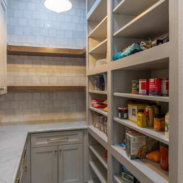
Kitchen was fully updated with a large, central island and more open concept. Quartzite countertops, brass hardware and designer lighting. We updated the built ins around their fireplace, added a large sliding glass door and tied the spaces together with contrasting trim throughout that coordinates with the new cabinetry. When we initially walked the home, there was no mudroom or pantry. We took an unused front living space and created a new entry from the garage and a large, functional mudroom, and added a hidden pantry.
 db Landscaping LLC
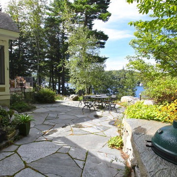
After sitting on the market for three years, this property was purchased by a visionary client who understood that the right landscape designer could turn the unusable landscape into highly comfortable outdoor spaces. db Landscaping LLC designed a series of tiered outdoor living spaces, gardens, and access to the lake that responded to the steep lakeshore terrain of the property. Larger areas for entertaining were complimented by smaller, more intimate spaces for relaxing. The new landscape incorporated lake views and water access while utilizing environmentally responsible materials such as aged local stone and drought tolerant native plants. Storm-water runoff was also engineered to mitigate erosion and allow water to return to the ground rather than entering the lake directly. The resulting outdoor rooms and gardens were balanced, relaxing, and in harmony with the surrounding landscape.
Find the right local pro for your project
 Clear Creek Landscapes
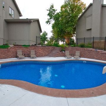
Anchor Highland Retaining Wall, Low Maintenance Landscape Design, Reclaimed brick pavers used to create path and drain for pool deck. Pool Slide.
This yard was unusable before we started. There were several other contractors who visited the site and said a pool can't be built and walked away... Homeowners were happy with the outcome.

 Alegre Construction Group
New wet bar and refrigerator area created by transforming previously unused space into functional cabinetry, additional storage, and expanded countertop workspace.
 Criner Remodeling
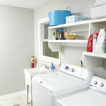
Unused space was taken from the master bedroom to make a larger, more functional laundry room. A new utility sink was installed as well as custom shelves, clothes rods, and storage cabinets. Granite tops, luxury sheet vinyl floors, and fresh paint finish off the space.

 Infinite Home
Our clients wanted this room to feel inviting and practical. By replacing the carpet with the same hardwood floors found in the rest of the home, we were able to create a sense of warmth and continuity. The fireplace mantel was painted Benjamin Moore Swiss Coffee, giving it new life as a focal point, while the built-in cabinetry was updated to reflect the cabinets in the kitchen. We refreshed the walls, trim, and millwork with a fresh coat of paint, instantly brightening the room and creating a clean, cohesive backdrop.
We started by designing a spacious, glass-enclosed shower finished in a
porcelain marble-style tile and accented with modern brushed brass fixtures and a built-in niche for everyday convenience. While our clients loved having a double vanity, they also wanted a little more breathing room to get ready. To create that separation, we utilized an unused area of the bathroom—relocating the toilet into its own private enclosure and expanding the vanity wall for a more open layout.
The warm wood base of the vanity now adds an inviting, organic touch, while the Kichler Aviv wall sconces add sleek visual interest to the room. Now their bathroom feels calm, refreshing, and timeless.
 Foran Interior Design
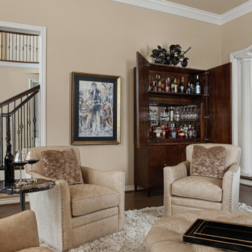
This was a little used living room that was turn into the favorite room in the house. The room was designed to be a music/wine lounge. We used four comfortable chairs facing each other for great conversation. The chairs have quilted leather seats and down silk velvet pillows. The artsy fireplace screen appears to be floating on their black granite hearth. The beautiful spot tables have petrified wood tops.
This client wanted to update their home to light and Modern from dark and Old World.
The whole house was painted in a light color and the wood floor and stair railing were refinished in a brown/grey stain.. We also made the rooms more useable. We changed the unused living room into a music/wine lounge.
The kitchen cabinets were painted off white and we put in new counter tops, backsplash, lighting, bar stools and hardware. The rest of the home was also updated.
 Saikley Architects
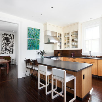
This beautiful 1881 Alameda Victorian cottage, wonderfully embodying the Transitional Gothic-Eastlake era, had most of its original features intact. Our clients, one of whom is a painter, wanted to preserve the beauty of the historic home while modernizing its flow and function.
From several small rooms, we created a bright, open artist’s studio. We dug out the basement for a large workshop, extending a new run of stair in keeping with the existing original staircase. While keeping the bones of the house intact, we combined small spaces into large rooms, closed off doorways that were in awkward places, removed unused chimneys, changed the circulation through the house for ease and good sightlines, and made new high doorways that work gracefully with the eleven foot high ceilings. We removed inconsistent picture railings to give wall space for the clients’ art collection and to enhance the height of the rooms. From a poorly laid out kitchen and adjunct utility rooms, we made a large kitchen and family room with nine-foot-high glass doors to a new large deck. A tall wood screen at one end of the deck, fire pit, and seating give the sense of an outdoor room, overlooking the owners’ intensively planted garden. A previous mismatched addition at the side of the house was removed and a cozy outdoor living space made where morning light is received. The original house was segmented into small spaces; the new open design lends itself to the clients’ lifestyle of entertaining groups of people, working from home, and enjoying indoor-outdoor living.
Photography by Kurt Manley.
https://saikleyarchitects.com/portfolio/artists-victorian/
 Metropolis Drafting and Construction Inc
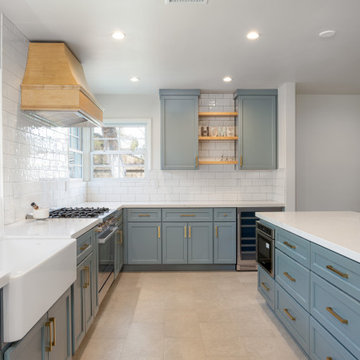
In a classic traditional home in the heart of Valley Village a new young family was moving in.
The goal was to preserve the traditional feel but to get the modern comfort of a new and functional kitchen.
The first thing we did was to relocate the sink for the unusable corner to the vast open space of the bay window once reserved for the tiny breakfast nook.
The wall to the dining room was removed to create a greater sensation of space with a peninsula to act as an additional breakfast bar and large surface for prep/cooking.
The remainder of the wall was taken over by large floor to ceiling pantries and a fridge enclosed in the middle for the built-in feeling.
only two upper cabinets with floating shelves in between assist in the spacious feeling of this once tight galley kitchen.
The custom-made hood from Hoodsly was stained to match the new shelves and once installed additional molding was installed above to cover the gap between it and the ceiling.
The Teal color of the cabinets with the white quartz, limestone look tile flooring and white ceramic subway tile are a great contrast to the warm colors of the natural wood of the shelves and hood finish.
The final touch was the brushed gold plumbing fixtures and pull to compliment the stained maple wood.
 TVL Creative Ltd.
Cramped kitchen be gone! That was the project motto and top priority. The goal was to transform the current layout from multiple smaller spaces into a connected whole that would activate the main level for our clients, a young family of four.
The biggest obstacle was the wall dividing the kitchen and the dining room. Removing this wall was central to opening up and integrating the main living spaces, but the existing ductwork that ran right through the center of the wall posed a design challenge, er design opportunity. The resulting design solution features a central pantry that captures the ductwork and provides valuable storage- especially when compared to the original kitchen's 18" wide pantry cabinet. The pantry also anchors the kitchen island and serves as a visual separation of space between the kitchen and homework area.
Through our design development process, we learned the formal living room was of no service to their lifestyle and therefore space they rarely spent time in. With that in mind, we proposed to eliminate the unused living room and make it the new dining room. Relocating the dining room to this space inherently felt right given the soaring ceiling and ample room for holiday dinners and celebrations. The new dining room was spacious enough for us to incorporate a conversational seating area in the warm, south-facing window alcove.
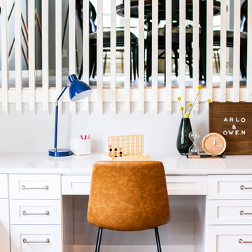
Now what to do with the old dining room?! To answer that question we took inspiration from our clients' shared profession in education and developed a craft area/homework station for both of their boys. The semi-custom cabinetry of the desk area carries over to the adjacent wall and forms window bench base with storage that we topped with butcher block for a touch of warmth. While the boys are young, the bench drawers are the perfect place for a stash of toys close to the kitchen.
The kitchen begins just beyond the window seat with their refrigerator enclosure. Opposite the refrigerator is the new pantry with twenty linear feet of shelving and space for brooms and a stick vacuum. Extending from the backside of the pantry the kitchen island design incorporates counter seating on the family room side and a cabinetry configuration on the kitchen side with drawer storage, a trashcan center, farmhouse sink, and dishwasher.
We took careful time in design and execution to align the range and sink because while it might seem like a small detail, it plays an important role in supporting the symmetrical configuration of the back wall of the kitchen. The rear wall design utilizes an appliance garage mirrors the visual impact of the refrigerator enclosure and helps keep the now open kitchen tidy. Between the appliance garage and refrigerator enclosure is the cooking zone with 30" of cabinetry and work surface on either side of the range, a chimney style vent hood, and a bold graphic tile backsplash.
The backsplash is just one of many personal touches we added to the space to reflect our client's modern eclectic style and love of color. Swooping lines of the mid-mod style barstools compliment the pendants and backsplash pattern. A pop of vibrant green on the frame of the pantry door adds a fresh wash of color to an otherwise neutral space. The big show stopper is the custom charcoal gray and copper chevron wall installation in the dining room. This was an idea our clients softly suggested, and we excitedly embraced the opportunity. It is also a kickass solution to the head-scratching design dilemma of how to fill a large and lofty wall.
We are so grateful to bring this design to life for our clients and now dear friends.
 New Age Design & Build
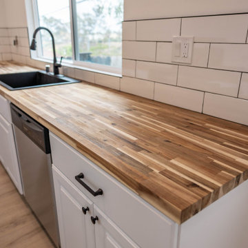
A bright, modern, and fully functional ADU designed to maximize every square foot. This project features an open living space, full kitchen with stainless steel appliances, bathroom, in-unit stacked washer and dryer, mini-split heating and cooling, durable wood-look flooring, and plenty of natural light.
A great example of how unused backyard space can be transformed into a comfortable, independent living space—perfect for family, guests, or rental income.
 C2 | Studio Landscape Architecture
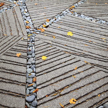
This project was a portion of a larger remodeling of a classic mid-century deck house in Weston, MA. The primary areas of focus for the landscape were an interior courtyard and rear terrace, both of which were overgrown and unused. In order to keep within budget limitations, our strategy consisted largely of editing the existing plants on site and reusing the best ones, maintaining existing groupings where appropriate. In keeping with the arts and crafts style of the home with its exposed beams and attention to detail, we implemented a simpler palette of rich materials with well-articulated detailing for a more pared-down contemporary aesthetic.
Scott Carman
 Drury Design
THE SETUP
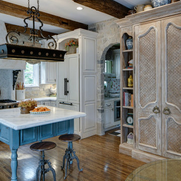
Imagine how thrilled Diana was when she was approached about designing a kitchen for a client who is an avid traveler and Francophile. ‘French-country’ is a very specific category of traditional design that combines French provincial elegance with rustic comforts. The look draws on soothing hues, antique accents and a wonderful fusion of polished and relic’d finishes.
Her client wanted to feel like she was in the south of France every time she walked into her kitchen. She wanted real honed marble counters, vintage finishes and authentic heavy stone walls like you’d find in a 400-year old château in Les Baux-de-Provence.
Diana’s mission: capture the client’s vision, design it and utilize Drury Design’s sourcing and building expertise to bring it to life.
Design Objectives:
Create the feel of an authentic vintage French-country kitchen
Include natural materials that would have been used in an old French château
Add a second oven
Omit an unused desk area in favor of a large, tall pantry armoire
THE REMODEL
Design Challenges:
Finding real stone for the walls, and the craftsmen to install it
Accommodate for the thickness of the stones
Replicating château beam architecture
Replicating authentic French-country finishes
Find a spot for a new steam oven
Design Solutions:
Source and sort true stone. Utilize veteran craftsmen to apply to the walls using old-world techniques
Furr out interior window casings to adjust for the thicker stone walls
Source true reclaimed beams
Utilize veteran craftsmen for authentic finishes and distressing for the island, tall pantry armoire and stucco hood
Modify the butler’s pantry base cabinet to accommodate the new steam oven
THE RENEWED SPACE
Before we started work on her new French-country kitchen, the homeowner told us the kitchen that came with the house was “not my kitchen.”
“I felt like a stranger,” she told us during the photoshoot. “It wasn’t my color, it wasn’t my texture. It wasn’t my style… I didn’t have my stamp on it.”
And now?
“I love the fact that my family can come in here, wrap their arms around it and feel comfortable,” she said. “It’s like a big hug.”
 KBF Design Gallery
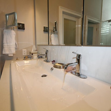
Removing the unused bathtub made way for a gorgeous built-in storage hutch and marble double shower. The wall behind the vanity is tiled in the same marble. The mirror above the vanity is a Robern mirror, which offers interior 5" deep glass shelving, mirrored back, and electrical outlets.
 Landwell Design + Build Co.
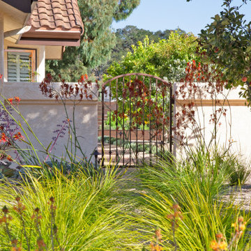
The landscape around this Mediterranean style home was transformed from barren and unusable to a warm and inviting outdoor space, cohesive with the existing architecture and aesthetic of the property. The front yard renovation included the construction of stucco landscape walls to create a front courtyard, with a dimensional cut flagstone patio with ground cover joints, a stucco fire pit, a "floating" composite bench, an urn converted into a recirculating water feature, landscape lighting, drought-tolerant planting, and Palomino gravel. Another stucco wall with a powder-coated steel gate was built at the entry to the backyard, connecting to a stucco column and steel fence along the property line. The backyard was developed into an outdoor living space with custom concrete flat work, dimensional cut flagstone pavers, a bocce ball court, horizontal board screening panels, and Mediterranean-style tile and stucco water feature, a second gas fire pit, capped seat walls, an outdoor shower screen, raised garden beds, a trash can enclosure, trellis, climate-appropriate plantings, low voltage lighting, mulch, and more!
 Shepel Homes - Kitchen and Bath
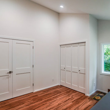
In this home addition construction project, we converted an unused deck into a space that is more functional and practical.
This room addition which includes its own bathroom now stands on what was previously an empty deck on the main floor. The room features water-resistant vinyl flooring while the bathroom’s highlight is the beautiful shower tilework made of dark grey ShadeLines tiles from the Sant’Agostino Shadebox collection.
 Kowalske Kitchen & Bath
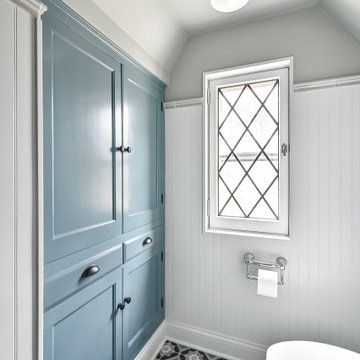
The design of this Milwaukee bathroom remodel fits this 1930s home with a built-in linen cabinet, a leaded glass window, 3 arched doorways, and historic trim, doors and door knobs. This 1930s bathroom remodel in Milwaukee’s Story Hill neighborhood includes accessibility features including grab bars, a walk-in shower and a handheld showerhead.
The goals of this project:
+ Maintain the historic charm of the 1930s bathroom
+ Design with accessibility features for aging in place
Highlights of this Milwaukee Bathroom Remodel:
Walk-In Shower & Bathtub – The homeowners wanted their bathroom to include accessibility features. We added grab bars and reinforced some areas for future grab bars if needed. The walk-in shower has a minimal threshold and a handheld showerhead for easy use.
Heated Floors & Built-In Linen Cabinet – A built-in linen cabinet had been deteriorating over the years and was partly unusable because of the radiator being in the way. We removed the radiator and installed electric floors as the heat source. We also refaced, painted and added roll outs behind the bottom doors of the cabinet.
New Vanity – The homeowners needed more storage and countertop space so we replaced the pedestal sink with a vanity. A traditional style faucet fixture looks similar to what you would have originally seen in this 1930s home. The countertop is quartz that looks like a classic marble without the maintenance of marble. A traditional profile edge gives it an elevated look. A new medicine cabinet over the sink also provides storage in a bathroom the entire family uses.
Arched Doorways – This bathroom features three arched doorways – one in the entryway, one over the bathtub and one near the toilet. Our team carefully worked around the arches, as It was important to keep these architectural elements.
Tilework – The patterned floor tile is a fresh take on the traditional black and white historical bathrooms. It pairs seamlessly with the traditional subway tile walls and hexagon shower floor tile.
Historic Design Elements – Custom doors and trim match the existing in the home, as well as door knobs. It was important to salvage and clean up the leaded glass window and keep the existing arches. Bead board walls, cabinet hardware and overhead lighting were carefully selected to fit the period of the home.
 Whitney Design Studios
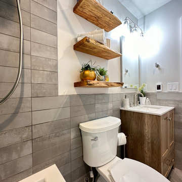
This new modern Mediterranean inspired bathroom addition was created out of previously unused space. An existing underused closet & 3 feet of an awkward kitchenette area were used to create the much needed new full bathroom. The design style grew out of the Mediterranean and Moroccan travels of the family. The side shower wall tiles were continued into the room to create a seamless wainscoting. Natural woods and other rustic materials work in harmony to create interest through texture and dynamic pattern. Since this was a central interior bathroom, a sun tunnel was added to provide natural light. The overall feel is a tranquil easy vibe.
 Jami Abbadessa
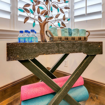
This family was referred to me by another of my clients. They requested that I help them with their 2 daughter’s loft area. At the time, it was uninviting, didn’t get much use and there was unused space in the existing layout, which wasn’t conducive to gathering. They gave me a great canvas to start with: wood floors, dark moldings and clean white walls. I had a couple of things I had to incorporate into the design plan which were: a wall mounted TV with speakers and an elliptical machine. I came up with a floor plan that tied all the areas of the loft together and made the space more inviting. New furniture was purchased and I layered in decor and accessories that now make it feel like a youthful, but not too young, cool hang out space.
83