
Search results for "Updates" in Home Design Ideas
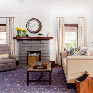
Living room - traditional dark wood floor living room idea in San Francisco with white walls, a standard fireplace and a brick fireplace
 Milgard Windows & Doors
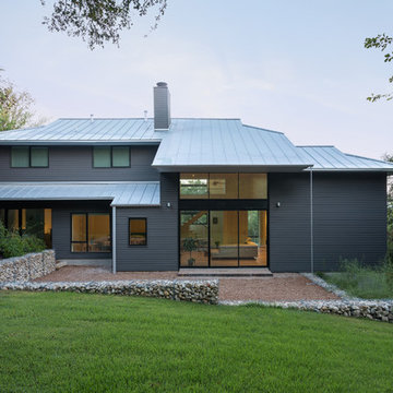
The Kiguchi family moved into their Austin, Texas home in 1994. Built in the 1980’s as part of a neighborhood development, they happily raised their family here but longed for something more contemporary. Once they became empty nesters, they decided it was time for a major remodel. After spending many years visiting Austin AIA Home Tours that highlight contemporary residential architecture, they had a lot of ideas and in 2013 were ready to interview architects and get their renovation underway.
The project turned into a major remodel due to an unstable foundation. Architects Ben Arbib and Ed Hughey, of Arbib Hughey Design were hired to solve the structural issue and look for inspiration in the bones of the house, which sat on top of a hillside and was surrounded by great views.
Unfortunately, with the old floor plan, the beautiful views were hidden by small windows that were poorly placed. In order to bring more natural light into the house the window sizes and configurations had to be addressed, all while keeping in mind the homeowners desire for a modern look and feel.
To achieve a more contemporary and sophisticated front of house, a new entry was designed that included removing a two-story bay window and porch. The entrance of the home also became more integrated with the landscape creating a template for new foliage to be planted. Older exterior materials were updated to incorporate a more muted palette of colors with a metal roof, dark grey siding in the back and white stucco in the front. Deep eaves were added over many of the new large windows for clean lines and sun protection.
“Inside it was about opening up the floor plan, expanding the views throughout the house, and updating the material palette to get a modern look that was also warm and inviting,” said Ben from Arbib Hughey Design. “Prior to the remodel, the house had the typical separation of rooms. We removed the walls between them and changed all of the windows to Milgard Thermally Improved Aluminum to connect the inside with the outside. No matter where you are you get nice views and natural light.”
The architects wanted to create some drama, which they accomplished with the window placement and opening up the interior floor plan to an open concept approach. Cabinetry was used to help delineate intimate spaces. To add warmth to an all-white living room, white-washed oak wood floors were installed and pine planks were used around the fireplace. The large windows served as artwork bringing the color of nature into the space.
An octagon shaped, elevated dining room, (named “the turret”), had a big impact on the design of the house. They architects rounded the corners and added larger window openings overlooking a new sunken garden. The great room was also softened by rounding out the corners and that circular theme continued throughout the house, being picked up in skylight wells and kitchen cabinetry. A staircase leading to a catwalk was added and the result was a two-story window wall that flooded the home with natural light.
When asked why Milgard® Thermally Improved Aluminum windows were selected, the architectural team listed many reasons:
1) Aesthetics: “We liked the slim profiles and narrow sightlines. The window frames never get in the way of the view and that was important to us. They also have a very contemporary look that went well with our design.”
2) Options: “We liked that we could get large sliding doors that matched the windows, giving us a very cohesive look and feel throughout the project.”
3) Cost Effective: “Milgard windows are affordable. You get a good product at a good price.”
4) Custom Sizes: “Milgard windows are customizable, which allowed us to get the right window for each location.”
Ready to take on your own traditional to modern home remodeling project? Arbib Hughey Design advises, “Work with a good architect. That means picking a team that is creative, communicative, listens well and is responsive. We think it’s important for an architect to listen to their clients and give them something they want, not something the architect thinks they should have. At the same time you want an architect who is willing and able to think outside the box and offer up design options that you may not have considered. Design is about a lot of back and forth, trying out ideas, getting feedback and trying again.”
The home was completely transformed into a unique, contemporary house perfectly integrated with its site. Internally the home has a natural flow for the occupants and externally it is integrated with the surroundings taking advantage of great natural light. As a side note, it was highly praised as part of the Austin AIA homes tour.
 Lorin Hill, Architect
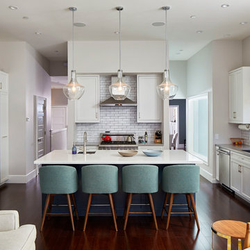
A newly purchased single family home on a quiet street in Noe Valley undergoes a significant transformation to enlarge, reconfigure and renovate it to suit the needs of the new owners. This includes a rear yard addition on three levels, to effectively double the size of the existing home. The renovation respected the understated Victorian / Edwardian detailing, while incorporating a more modern aesthetic focused on natural light and indoor-outdoor living into the new spaces.
Photos by John Bedell Photography
Interior Design by Stephanie Klein
Find the right local pro for your project
 Century 21 Tri-Cities
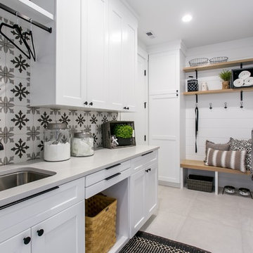
Inspiration for a farmhouse gray floor laundry room remodel in Seattle with an undermount sink, shaker cabinets, white cabinets, white walls, a side-by-side washer/dryer and white countertops
 CMC Design Studio LLC
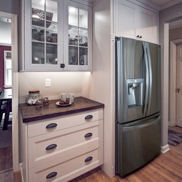
Newlyweds had just moved into their new home and immediately wanted to update their kitchen which is located in the center of the household, lacking any natural light source of its own. To make matters worse, the cabinets in place were dark red with black countertops. Not the picture of brightness they were looking for. To increase the amount of light reflected throughout the kitchen, we incorporated some of the following updates:
1. Replaced the solo ceiling light with 4 recessed cans
2. Updated the florescent undercabinet lights with new LED strips
3. Installed custom white cabinets topped with Silestone’s new Artic Ocean white countertops
4. Updated the dark glass pendants over the bar with larger, clear glass pendants that spoke more to the history of the home
5. Painted the walls a soft gray to compliment the palette
The original kitchen layout was updated to eliminate the existing soffits and open the visual feel of the space. A large white farm sink now centers the natural wood bar area, inviting guests to sit and gather for ballgames and celebrations. Glass tile and USB ports at charging sites complete the space for the family to grow over the years.
Photo by Stockwell Media
 TKS Design Group
Download our free ebook, Creating the Ideal Kitchen. DOWNLOAD NOW
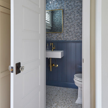
The homeowners came to us looking to update the kitchen in their historic 1897 home. The home had gone through an extensive renovation several years earlier that added a master bedroom suite and updates to the front façade. The kitchen however was not part of that update and a prior 1990’s update had left much to be desired. The client is an avid cook, and it was just not very functional for the family.
The original kitchen was very choppy and included a large eat in area that took up more than its fair share of the space. On the wish list was a place where the family could comfortably congregate, that was easy and to cook in, that feels lived in and in check with the rest of the home’s décor. They also wanted a space that was not cluttered and dark – a happy, light and airy room. A small powder room off the space also needed some attention so we set out to include that in the remodel as well.
See that arch in the neighboring dining room? The homeowner really wanted to make the opening to the dining room an arch to match, so we incorporated that into the design.
Another unfortunate eyesore was the state of the ceiling and soffits. Turns out it was just a series of shortcuts from the prior renovation, and we were surprised and delighted that we were easily able to flatten out almost the entire ceiling with a couple of little reworks.
Other changes we made were to add new windows that were appropriate to the new design, which included moving the sink window over slightly to give the work zone more breathing room. We also adjusted the height of the windows in what was previously the eat-in area that were too low for a countertop to work. We tried to keep an old island in the plan since it was a well-loved vintage find, but the tradeoff for the function of the new island was not worth it in the end. We hope the old found a new home, perhaps as a potting table.
Designed by: Susan Klimala, CKD, CBD
Photography by: Michael Kaskel
For more information on kitchen and bath design ideas go to: www.kitchenstudio-ge.com
 Saikley Architects
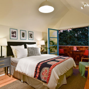
We updated this 1907 two-story family home for re-sale. We added modern design elements and amenities while retaining the home’s original charm in the layout and key details. The aim was to optimize the value of the property for a prospective buyer, within a reasonable budget.
New French doors from kitchen and a rear bedroom open out to a new bi-level deck that allows good sight lines, functional outdoor living space, and easy access to a garden full of mature fruit trees. French doors from an upstairs bedroom open out to a private high deck overlooking the garden. The garage has been converted to a family room that opens to the garden.
The bathrooms and kitchen were remodeled the kitchen with simple, light, classic materials and contemporary lighting fixtures. New windows and skylights flood the spaces with light. Stained wood windows and doors at the kitchen pick up on the original stained wood of the other living spaces.
New redwood picture molding was created for the living room where traces in the plaster suggested that picture molding has originally been. A sweet corner window seat at the living room was restored. At a downstairs bedroom we created a new plate rail and other redwood trim matching the original at the dining room. The original dining room hutch and woodwork were restored and a new mantel built for the fireplace.
We built deep shelves into space carved out of the attic next to upstairs bedrooms and added other built-ins for character and usefulness. Storage was created in nooks throughout the house. A small room off the kitchen was set up for efficient laundry and pantry space.
We provided the future owner of the house with plans showing design possibilities for expanding the house and creating a master suite with upstairs roof dormers and a small addition downstairs. The proposed design would optimize the house for current use while respecting the original integrity of the house.
Photography: John Hayes, Open Homes Photography
https://saikleyarchitects.com/portfolio/classic-craftsman-update/
Sponsored
Columbus, OH

Snider & Metcalf Interior Design, LTD
Leading Interior Designers in Columbus, Ohio & Ponte Vedra, Florida

 TVL Creative Ltd.
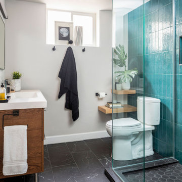
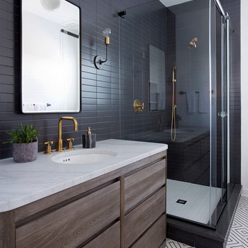
This project was not only full of many bathrooms but also many different aesthetics. The goals were fourfold, create a new master suite, update the basement bath, add a new powder bath and my favorite, make them all completely different aesthetics.
Primary Bath-This was originally a small 60SF full bath sandwiched in between closets and walls of built-in cabinetry that blossomed into a 130SF, five-piece primary suite. This room was to be focused on a transitional aesthetic that would be adorned with Calcutta gold marble, gold fixtures and matte black geometric tile arrangements.
Powder Bath-A new addition to the home leans more on the traditional side of the transitional movement using moody blues and greens accented with brass. A fun play was the asymmetry of the 3-light sconce brings the aesthetic more to the modern side of transitional. My favorite element in the space, however, is the green, pink black and white deco tile on the floor whose colors are reflected in the details of the Australian wallpaper.
Hall Bath-Looking to touch on the home's 70's roots, we went for a mid-mod fresh update. Black Calcutta floors, linear-stacked porcelain tile, mixed woods and strong black and white accents. The green tile may be the star but the matte white ribbed tiles in the shower and behind the vanity are the true unsung heroes.
 threshold interiors
This cute cottage, one block from the beach, had not been updated in over 20 years. The homeowners finally decided that it was time to renovate after scrapping the idea of tearing the home down and starting over. Amazingly, they were able to give this house a fresh start with our input. We completed a full kitchen renovation and addition and updated 4 of their bathrooms. We added all new light fixtures, furniture, wallpaper, flooring, window treatments and tile. The mix of metals and wood brings a fresh vibe to the home. We loved working on this project and are so happy with the outcome!
Photographed by: James Salomon
 Nicole Arnold Interiors
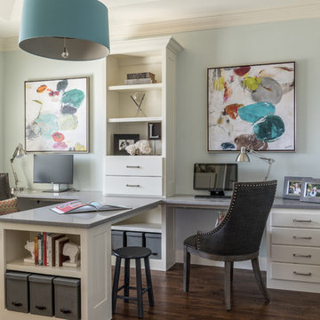
See this beautiful young family's home in Murphy come to life. Once grey and mostly monochromatic, we were hired to bring color, life and purposeful functionality to several spaces. A family study was created to include loads of color, workstations for four, and plenty of storage. The dining and family rooms were updated by infusing color, transitional wall decor and furnishings with beautiful, yet sustainable fabrics. The master bath was reinvented with new granite counter tops, art and accessories to give it some additional personality.
Our most recent update includes a multi-functional teen hang out space and a private loft that serves as an executive’s work-from-home office, mediation area and a place for this busy mom to escape and relax.
 Jennifer Ott Design
Whit Preston, Photographer
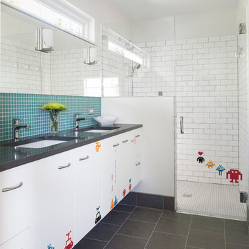
1950s kids' blue tile and mosaic tile gray floor walk-in shower photo in Austin with flat-panel cabinets, white cabinets, white walls and gray countertops
1950s kids' blue tile and mosaic tile gray floor walk-in shower photo in Austin with flat-panel cabinets, white cabinets, white walls and gray countertops
 Awad + Koontz Architects Builders
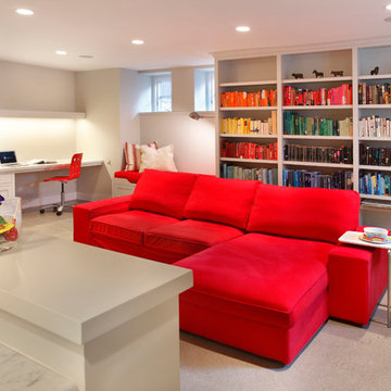
Beautiful updated basement remodel in Kenwood neighborhood to create a bright beautiful space to spend time with family
Example of a trendy look-out carpeted basement design in Minneapolis with white walls and no fireplace
Example of a trendy look-out carpeted basement design in Minneapolis with white walls and no fireplace
 AXIS Productions
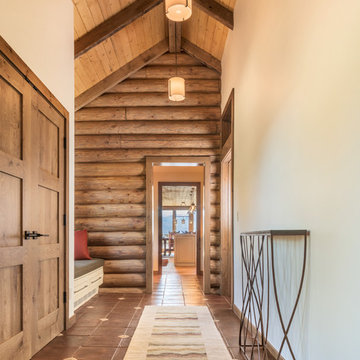
by enclosing a covered porch, an elegant mudroom was created that connects the garage to the existing laundry area. The existing home was a log kit home. The logs were sandblasted and stained to look more current. The log wall used to be the outside wall of the home.
WoodStone Inc, General Contractor
Home Interiors, Cortney McDougal, Interior Design
Draper White Photography

 The Fox Group
Scott Davis Photography
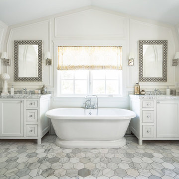
Example of a classic master freestanding bathtub design in Salt Lake City with shaker cabinets, white cabinets and white walls
Example of a classic master freestanding bathtub design in Salt Lake City with shaker cabinets, white cabinets and white walls
 Klopf Architecture
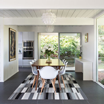
The owners dreamed of an Eichler remodel they would live in forever. Their vision was contemporary and open. Klopf Architecture would design, and reconfigure bathrooms/laundry areas and upgrade systems to be more efficient. This talented executive mother of five decorated and furnished the home herself.
Architecture: Klopf Architecture
Contractor: Flegel Construction
Photography © 2014 Mariko Reed
Location: Burlingame, CA
Year completed: 2014
 Camilla Molders Design
Residential Interior Design & Decoration project by Camilla Molders Design
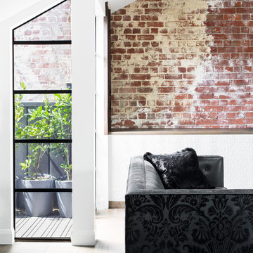
Large urban formal medium tone wood floor living room photo in Melbourne with white walls
Large urban formal medium tone wood floor living room photo in Melbourne with white walls
 Form Collective
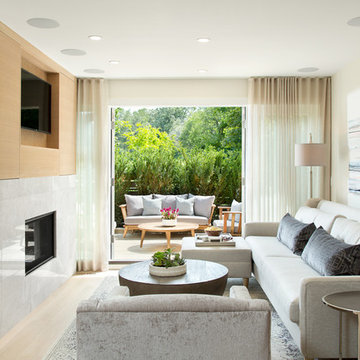
Inspiration for a small transitional open concept light wood floor and beige floor living room remodel in Vancouver with white walls, a ribbon fireplace, a stone fireplace and a media wall
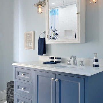
 Jane Lockhart Design
The children’s bathroom is designed to grow with the children. It’s kid-friendly but not childish looking. Photographed Arnal Photography. Wall Colour: Silver Gray 2131-60 by Benjamin Moore. Vanity by Trillium Kitchens & Baths.
45