
Search results for "Valuable opportunity" in Home Design Ideas

 TVL Creative Ltd.
Cramped kitchen be gone! That was the project motto and top priority. The goal was to transform the current layout from multiple smaller spaces into a connected whole that would activate the main level for our clients, a young family of four.
The biggest obstacle was the wall dividing the kitchen and the dining room. Removing this wall was central to opening up and integrating the main living spaces, but the existing ductwork that ran right through the center of the wall posed a design challenge, er design opportunity. The resulting design solution features a central pantry that captures the ductwork and provides valuable storage- especially when compared to the original kitchen's 18" wide pantry cabinet. The pantry also anchors the kitchen island and serves as a visual separation of space between the kitchen and homework area.
Through our design development process, we learned the formal living room was of no service to their lifestyle and therefore space they rarely spent time in. With that in mind, we proposed to eliminate the unused living room and make it the new dining room. Relocating the dining room to this space inherently felt right given the soaring ceiling and ample room for holiday dinners and celebrations. The new dining room was spacious enough for us to incorporate a conversational seating area in the warm, south-facing window alcove.
Now what to do with the old dining room?! To answer that question we took inspiration from our clients' shared profession in education and developed a craft area/homework station for both of their boys. The semi-custom cabinetry of the desk area carries over to the adjacent wall and forms window bench base with storage that we topped with butcher block for a touch of warmth. While the boys are young, the bench drawers are the perfect place for a stash of toys close to the kitchen.
The kitchen begins just beyond the window seat with their refrigerator enclosure. Opposite the refrigerator is the new pantry with twenty linear feet of shelving and space for brooms and a stick vacuum. Extending from the backside of the pantry the kitchen island design incorporates counter seating on the family room side and a cabinetry configuration on the kitchen side with drawer storage, a trashcan center, farmhouse sink, and dishwasher.
We took careful time in design and execution to align the range and sink because while it might seem like a small detail, it plays an important role in supporting the symmetrical configuration of the back wall of the kitchen. The rear wall design utilizes an appliance garage mirrors the visual impact of the refrigerator enclosure and helps keep the now open kitchen tidy. Between the appliance garage and refrigerator enclosure is the cooking zone with 30" of cabinetry and work surface on either side of the range, a chimney style vent hood, and a bold graphic tile backsplash.
The backsplash is just one of many personal touches we added to the space to reflect our client's modern eclectic style and love of color. Swooping lines of the mid-mod style barstools compliment the pendants and backsplash pattern. A pop of vibrant green on the frame of the pantry door adds a fresh wash of color to an otherwise neutral space. The big show stopper is the custom charcoal gray and copper chevron wall installation in the dining room. This was an idea our clients softly suggested, and we excitedly embraced the opportunity. It is also a kickass solution to the head-scratching design dilemma of how to fill a large and lofty wall.
We are so grateful to bring this design to life for our clients and now dear friends.
 TVL Creative Ltd.
Cramped kitchen be gone! That was the project motto and top priority. The goal was to transform the current layout from multiple smaller spaces into a connected whole that would activate the main level for our clients, a young family of four.
The biggest obstacle was the wall dividing the kitchen and the dining room. Removing this wall was central to opening up and integrating the main living spaces, but the existing ductwork that ran right through the center of the wall posed a design challenge, er design opportunity. The resulting design solution features a central pantry that captures the ductwork and provides valuable storage- especially when compared to the original kitchen's 18" wide pantry cabinet. The pantry also anchors the kitchen island and serves as a visual separation of space between the kitchen and homework area.
Through our design development process, we learned the formal living room was of no service to their lifestyle and therefore space they rarely spent time in. With that in mind, we proposed to eliminate the unused living room and make it the new dining room. Relocating the dining room to this space inherently felt right given the soaring ceiling and ample room for holiday dinners and celebrations. The new dining room was spacious enough for us to incorporate a conversational seating area in the warm, south-facing window alcove.
Now what to do with the old dining room?! To answer that question we took inspiration from our clients' shared profession in education and developed a craft area/homework station for both of their boys. The semi-custom cabinetry of the desk area carries over to the adjacent wall and forms window bench base with storage that we topped with butcher block for a touch of warmth. While the boys are young, the bench drawers are the perfect place for a stash of toys close to the kitchen.
The kitchen begins just beyond the window seat with their refrigerator enclosure. Opposite the refrigerator is the new pantry with twenty linear feet of shelving and space for brooms and a stick vacuum. Extending from the backside of the pantry the kitchen island design incorporates counter seating on the family room side and a cabinetry configuration on the kitchen side with drawer storage, a trashcan center, farmhouse sink, and dishwasher.
We took careful time in design and execution to align the range and sink because while it might seem like a small detail, it plays an important role in supporting the symmetrical configuration of the back wall of the kitchen. The rear wall design utilizes an appliance garage mirrors the visual impact of the refrigerator enclosure and helps keep the now open kitchen tidy. Between the appliance garage and refrigerator enclosure is the cooking zone with 30" of cabinetry and work surface on either side of the range, a chimney style vent hood, and a bold graphic tile backsplash.
The backsplash is just one of many personal touches we added to the space to reflect our client's modern eclectic style and love of color. Swooping lines of the mid-mod style barstools compliment the pendants and backsplash pattern. A pop of vibrant green on the frame of the pantry door adds a fresh wash of color to an otherwise neutral space. The big show stopper is the custom charcoal gray and copper chevron wall installation in the dining room. This was an idea our clients softly suggested, and we excitedly embraced the opportunity. It is also a kickass solution to the head-scratching design dilemma of how to fill a large and lofty wall.
We are so grateful to bring this design to life for our clients and now dear friends.
 TVL Creative Ltd.
Cramped kitchen be gone! That was the project motto and top priority. The goal was to transform the current layout from multiple smaller spaces into a connected whole that would activate the main level for our clients, a young family of four.
The biggest obstacle was the wall dividing the kitchen and the dining room. Removing this wall was central to opening up and integrating the main living spaces, but the existing ductwork that ran right through the center of the wall posed a design challenge, er design opportunity. The resulting design solution features a central pantry that captures the ductwork and provides valuable storage- especially when compared to the original kitchen's 18" wide pantry cabinet. The pantry also anchors the kitchen island and serves as a visual separation of space between the kitchen and homework area.
Through our design development process, we learned the formal living room was of no service to their lifestyle and therefore space they rarely spent time in. With that in mind, we proposed to eliminate the unused living room and make it the new dining room. Relocating the dining room to this space inherently felt right given the soaring ceiling and ample room for holiday dinners and celebrations. The new dining room was spacious enough for us to incorporate a conversational seating area in the warm, south-facing window alcove.
Now what to do with the old dining room?! To answer that question we took inspiration from our clients' shared profession in education and developed a craft area/homework station for both of their boys. The semi-custom cabinetry of the desk area carries over to the adjacent wall and forms window bench base with storage that we topped with butcher block for a touch of warmth. While the boys are young, the bench drawers are the perfect place for a stash of toys close to the kitchen.
The kitchen begins just beyond the window seat with their refrigerator enclosure. Opposite the refrigerator is the new pantry with twenty linear feet of shelving and space for brooms and a stick vacuum. Extending from the backside of the pantry the kitchen island design incorporates counter seating on the family room side and a cabinetry configuration on the kitchen side with drawer storage, a trashcan center, farmhouse sink, and dishwasher.
We took careful time in design and execution to align the range and sink because while it might seem like a small detail, it plays an important role in supporting the symmetrical configuration of the back wall of the kitchen. The rear wall design utilizes an appliance garage mirrors the visual impact of the refrigerator enclosure and helps keep the now open kitchen tidy. Between the appliance garage and refrigerator enclosure is the cooking zone with 30" of cabinetry and work surface on either side of the range, a chimney style vent hood, and a bold graphic tile backsplash.
The backsplash is just one of many personal touches we added to the space to reflect our client's modern eclectic style and love of color. Swooping lines of the mid-mod style barstools compliment the pendants and backsplash pattern. A pop of vibrant green on the frame of the pantry door adds a fresh wash of color to an otherwise neutral space. The big show stopper is the custom charcoal gray and copper chevron wall installation in the dining room. This was an idea our clients softly suggested, and we excitedly embraced the opportunity. It is also a kickass solution to the head-scratching design dilemma of how to fill a large and lofty wall.
We are so grateful to bring this design to life for our clients and now dear friends.
Find the right local pro for your project
 TVL Creative Ltd.
Cramped kitchen be gone! That was the project motto and top priority. The goal was to transform the current layout from multiple smaller spaces into a connected whole that would activate the main level for our clients, a young family of four.
The biggest obstacle was the wall dividing the kitchen and the dining room. Removing this wall was central to opening up and integrating the main living spaces, but the existing ductwork that ran right through the center of the wall posed a design challenge, er design opportunity. The resulting design solution features a central pantry that captures the ductwork and provides valuable storage- especially when compared to the original kitchen's 18" wide pantry cabinet. The pantry also anchors the kitchen island and serves as a visual separation of space between the kitchen and homework area.
Through our design development process, we learned the formal living room was of no service to their lifestyle and therefore space they rarely spent time in. With that in mind, we proposed to eliminate the unused living room and make it the new dining room. Relocating the dining room to this space inherently felt right given the soaring ceiling and ample room for holiday dinners and celebrations. The new dining room was spacious enough for us to incorporate a conversational seating area in the warm, south-facing window alcove.
Now what to do with the old dining room?! To answer that question we took inspiration from our clients' shared profession in education and developed a craft area/homework station for both of their boys. The semi-custom cabinetry of the desk area carries over to the adjacent wall and forms window bench base with storage that we topped with butcher block for a touch of warmth. While the boys are young, the bench drawers are the perfect place for a stash of toys close to the kitchen.
The kitchen begins just beyond the window seat with their refrigerator enclosure. Opposite the refrigerator is the new pantry with twenty linear feet of shelving and space for brooms and a stick vacuum. Extending from the backside of the pantry the kitchen island design incorporates counter seating on the family room side and a cabinetry configuration on the kitchen side with drawer storage, a trashcan center, farmhouse sink, and dishwasher.
We took careful time in design and execution to align the range and sink because while it might seem like a small detail, it plays an important role in supporting the symmetrical configuration of the back wall of the kitchen. The rear wall design utilizes an appliance garage mirrors the visual impact of the refrigerator enclosure and helps keep the now open kitchen tidy. Between the appliance garage and refrigerator enclosure is the cooking zone with 30" of cabinetry and work surface on either side of the range, a chimney style vent hood, and a bold graphic tile backsplash.
The backsplash is just one of many personal touches we added to the space to reflect our client's modern eclectic style and love of color. Swooping lines of the mid-mod style barstools compliment the pendants and backsplash pattern. A pop of vibrant green on the frame of the pantry door adds a fresh wash of color to an otherwise neutral space. The big show stopper is the custom charcoal gray and copper chevron wall installation in the dining room. This was an idea our clients softly suggested, and we excitedly embraced the opportunity. It is also a kickass solution to the head-scratching design dilemma of how to fill a large and lofty wall.
We are so grateful to bring this design to life for our clients and now dear friends.
 TVL Creative Ltd.
Cramped kitchen be gone! That was the project motto and top priority. The goal was to transform the current layout from multiple smaller spaces into a connected whole that would activate the main level for our clients, a young family of four.
The biggest obstacle was the wall dividing the kitchen and the dining room. Removing this wall was central to opening up and integrating the main living spaces, but the existing ductwork that ran right through the center of the wall posed a design challenge, er design opportunity. The resulting design solution features a central pantry that captures the ductwork and provides valuable storage- especially when compared to the original kitchen's 18" wide pantry cabinet. The pantry also anchors the kitchen island and serves as a visual separation of space between the kitchen and homework area.
Through our design development process, we learned the formal living room was of no service to their lifestyle and therefore space they rarely spent time in. With that in mind, we proposed to eliminate the unused living room and make it the new dining room. Relocating the dining room to this space inherently felt right given the soaring ceiling and ample room for holiday dinners and celebrations. The new dining room was spacious enough for us to incorporate a conversational seating area in the warm, south-facing window alcove.
Now what to do with the old dining room?! To answer that question we took inspiration from our clients' shared profession in education and developed a craft area/homework station for both of their boys. The semi-custom cabinetry of the desk area carries over to the adjacent wall and forms window bench base with storage that we topped with butcher block for a touch of warmth. While the boys are young, the bench drawers are the perfect place for a stash of toys close to the kitchen.
The kitchen begins just beyond the window seat with their refrigerator enclosure. Opposite the refrigerator is the new pantry with twenty linear feet of shelving and space for brooms and a stick vacuum. Extending from the backside of the pantry the kitchen island design incorporates counter seating on the family room side and a cabinetry configuration on the kitchen side with drawer storage, a trashcan center, farmhouse sink, and dishwasher.
We took careful time in design and execution to align the range and sink because while it might seem like a small detail, it plays an important role in supporting the symmetrical configuration of the back wall of the kitchen. The rear wall design utilizes an appliance garage mirrors the visual impact of the refrigerator enclosure and helps keep the now open kitchen tidy. Between the appliance garage and refrigerator enclosure is the cooking zone with 30" of cabinetry and work surface on either side of the range, a chimney style vent hood, and a bold graphic tile backsplash.
The backsplash is just one of many personal touches we added to the space to reflect our client's modern eclectic style and love of color. Swooping lines of the mid-mod style barstools compliment the pendants and backsplash pattern. A pop of vibrant green on the frame of the pantry door adds a fresh wash of color to an otherwise neutral space. The big show stopper is the custom charcoal gray and copper chevron wall installation in the dining room. This was an idea our clients softly suggested, and we excitedly embraced the opportunity. It is also a kickass solution to the head-scratching design dilemma of how to fill a large and lofty wall.
We are so grateful to bring this design to life for our clients and now dear friends.
 TVL Creative Ltd.
Cramped kitchen be gone! That was the project motto and top priority. The goal was to transform the current layout from multiple smaller spaces into a connected whole that would activate the main level for our clients, a young family of four.
The biggest obstacle was the wall dividing the kitchen and the dining room. Removing this wall was central to opening up and integrating the main living spaces, but the existing ductwork that ran right through the center of the wall posed a design challenge, er design opportunity. The resulting design solution features a central pantry that captures the ductwork and provides valuable storage- especially when compared to the original kitchen's 18" wide pantry cabinet. The pantry also anchors the kitchen island and serves as a visual separation of space between the kitchen and homework area.
Through our design development process, we learned the formal living room was of no service to their lifestyle and therefore space they rarely spent time in. With that in mind, we proposed to eliminate the unused living room and make it the new dining room. Relocating the dining room to this space inherently felt right given the soaring ceiling and ample room for holiday dinners and celebrations. The new dining room was spacious enough for us to incorporate a conversational seating area in the warm, south-facing window alcove.
Now what to do with the old dining room?! To answer that question we took inspiration from our clients' shared profession in education and developed a craft area/homework station for both of their boys. The semi-custom cabinetry of the desk area carries over to the adjacent wall and forms window bench base with storage that we topped with butcher block for a touch of warmth. While the boys are young, the bench drawers are the perfect place for a stash of toys close to the kitchen.
The kitchen begins just beyond the window seat with their refrigerator enclosure. Opposite the refrigerator is the new pantry with twenty linear feet of shelving and space for brooms and a stick vacuum. Extending from the backside of the pantry the kitchen island design incorporates counter seating on the family room side and a cabinetry configuration on the kitchen side with drawer storage, a trashcan center, farmhouse sink, and dishwasher.
We took careful time in design and execution to align the range and sink because while it might seem like a small detail, it plays an important role in supporting the symmetrical configuration of the back wall of the kitchen. The rear wall design utilizes an appliance garage mirrors the visual impact of the refrigerator enclosure and helps keep the now open kitchen tidy. Between the appliance garage and refrigerator enclosure is the cooking zone with 30" of cabinetry and work surface on either side of the range, a chimney style vent hood, and a bold graphic tile backsplash.
The backsplash is just one of many personal touches we added to the space to reflect our client's modern eclectic style and love of color. Swooping lines of the mid-mod style barstools compliment the pendants and backsplash pattern. A pop of vibrant green on the frame of the pantry door adds a fresh wash of color to an otherwise neutral space. The big show stopper is the custom charcoal gray and copper chevron wall installation in the dining room. This was an idea our clients softly suggested, and we excitedly embraced the opportunity. It is also a kickass solution to the head-scratching design dilemma of how to fill a large and lofty wall.
We are so grateful to bring this design to life for our clients and now dear friends.

 Trilogy Construction Company
Great glass scallop tile detail. This tile is bordered by slabs of white marble.
Bathroom - modern bathroom idea in Miami
Bathroom - modern bathroom idea in Miami
 Taragano Design and Build
Taragano Design & Build completed this second story addition in
Berkeley, California.
Going up rather than out was the only real option. The lot leaves
almost no room to extend at grade without consuming the rear yard,
which on a property this size is the most valuable space the house
has. Building over the existing footprint added the square footage
and left the yard intact.
Adding a floor to a house built in this era means the existing
structure has to carry a load it was never designed for. Framing
and foundation both get evaluated before anything is drawn, and
what the engineering finds determines whether the project is
feasible at all. That work happens during design, not after
permits.
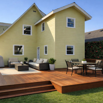
The roof was the visible decision. Rather than square off the new
floor and cap it flat, a cross gable was run to match the pitch and
form of the original. From the yard the house reads as a Craftsman
that was always two stories, which is the difference between an
addition and an obvious addition.
The deck was built in two levels stepping down to the lawn. Holding
the outer platform low keeps the yard usable from the house without
a rail cutting the sight line, and the step gives the seating and
dining areas separation without a wall.
Licensed general contractor, CSLB #1143420. Diamond Certified.

 Jack Calderone
This bedroom and full bathroom are part of an adventuresome project my wife and I embarked upon to create a complete apartment in the basement of our townhouse. We designed a floor plan that creatively and efficiently used all of the 385-square-foot-space, without sacrificing beauty, comfort or function – and all without breaking the bank! To maximize our budget, we did the work ourselves and added everything from thrift store finds to DIY wall art to bring it all together.
A partial double closet bar adds a little extra space while still leaving room for longer hanging clothes.
 Drury Design
The Setup
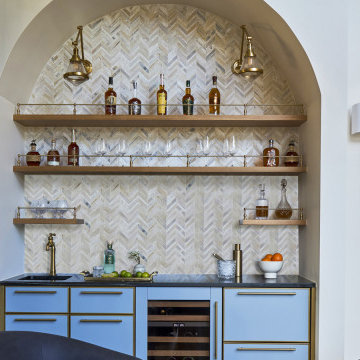
Situated between the front kitchen and the home’s primary living spaces, this bar was originally conceived as a modest bistro-style nook – a place to sit, watch TV, and enjoy a drink. As the design process evolved, both the homeowners and the design team recognized an opportunity to let the bar become something more: a visually compelling focal point that anchors circulation through the home while offering a distinct moment of hospitality.
Set within an arched recess and framed by a partial glass wall, the bar is visible from much of the public area of the home. Its location places it directly along the natural path between the kitchen, dining room, and family room, making it both highly accessible and impossible to ignore. From the outset, the goal was to ensure the bar felt intentional and complete – not an afterthought – while still complementing the adjacent kitchens rather than competing with them.
Design objectives:
Create a fully functional wet bar with refrigeration, ice, sink, waste storage, and liquor storage
Allow the bar to feel visually distinct while remaining cohesive with the surrounding spaces
Introduce color and character in a controlled, intentional way
Design the bar as a focal point within a highly visible circulation zone
Balance everyday usability with refined, layered design details
Design challenges to be solved:
Fitting a complete wet bar – including refrigeration, ice, sink, storage, and waste — into a base cabinetry run measuring under eight feet wide
Determining which appliances and storage functions were essential once upper cabinetry was eliminated
Providing adequate task lighting while also highlighting bottles and glassware on open shelving
Introducing texture and visual interest within the arched recess without overdesigning a compact space
Giving the bar a distinct identity that complements – but does not compete with – the adjacent kitchens
Design solutions:
Designing fully custom base cabinetry that prioritized core bar functions and used every inch efficiently, including split cabinetry and compact waste storage
Selecting a drawer-style refrigeration unit that combines refrigeration and freezer capabilities, allowing ice storage without sacrificing valuable width
Layering lighting with integrated LED strip lighting above and below the shelves, paired with decorative articulating fixtures to support both display and task lighting
Using a chevron-patterned natural stone tile backsplash to introduce movement, texture, and subtle color variation while keeping surrounding surfaces intentionally restrained
Specifying metal cabinetry in a soft blue tone with integrated brass framing to establish a distinctive visual identity that harmonizes with the home’s broader palette
A Space That Works on Its Own — and Within the Whole
Though compact in size, the bar carries significant visual and functional weight within the home. It stands confidently on its own as a richly detailed, fully functional destination, while also flowing naturally into the adjacent kitchens and living spaces. The result is a bar that feels purposeful rather than ornamental – a space designed to be used daily, noticed often, and appreciated over time.

 Familia Windows
Small trendy 3/4 multicolored tile and pebble tile corner shower photo in Denver with shaker cabinets, white cabinets, beige walls, an undermount sink and marble countertops

 Valentini Kids Furniture Brooklyn NY
Italian Kids Bedroom Set WEB-16 by SPAR
Made in Italy by Spar
WEB Junior by Spar is an Italian kids bedroom furniture collection that is remarkable for its innovative modern solutions that help not only safe so valuable space, but get maximum out of every inch of your kids room. Modern technologies, brilliant design and outstanding quality are met within this collection, giving you endless opportunities for color and size customization, so you could realize all your individuality and meet all the requirements. WEB Bedroom line by Spar thinks about you and your lovely kids, or teenagers, providing designer bedroom solutions for all occasions, making your child's room awesome for everything: sleeping, studying and playing. WEB Junior Bedroom Furniture collection is here to realize all your biggest dreams and take care of your kids!
All the pieces can be mixed & matched from one set to another and are available in a variety of sizes and colors. Please contact our office regarding customization of this kids bedroom set.
The starting price is for the "As Shown" kids bedroom set WEB 16 that includes the following items:
1 Twin Size Upholstered Bed (bed fits US standard Twin size mattress 39" x 75")
1 2-Drawer Nightstand (on wheels)
1 Desk
2 Horizontal Hanging Door-Units W45.7"
1 Sliding Door Wardrobe (2 Doors)
Please Note: Room/Bed decorative accessories and the mattress are not included in the price.
MATERIAL/CONSTRUCTION:
E1-Class ecological panels, which are produced exclusively trough a wood recycling production process
Used lacquers conform to the norm 71/3 (toys directive)
Structure: 18 mm thick melamine-coated particle board
Shelves: 25mm thick melamine-coated particle board
Back panels: medium density coated fibreboard 5mm thick
Doors: 18 mm thick melamine-coated particle board finished on 4 sides
Hardware: metal runners with self-closing system and double stop; adjustable self closing hinges; quick-mount and braking systems
Dimensions:
Twin Size Bed: W49" x D91.3" x H35.4" (internal 39" x 75" US Standard)
Full Size Bed: W64" x D91.3" x H35.4" (internal 54" x 75" US Standard)
Nightstand: W35.6" x D16.5" x H17"
Desk: W59" x D25.6" x H30"
Horizontal Hanging Door-Unit: W45.7" x D13.7" x H12.7"
Sliding Door Wardrobe: W92" x D23.6" x H89.8" or H102.4"

 Pool Environments, Inc.
The client purchased this property with grand plans of renovating the entire place; from top to bottom, and from inside to outside. And while the inside canvas was very generous and even somewhat forgiving, the outside space would be anything but.
We wanted to squeeze in as much seating space as possible in their limited courtyard area, without encroaching on the already compact-sized pool. The first and most obvious solution was to get rid of the trees and shrubs that separated this house from its zero-lot-line neighbor. With the addition of Lueder limestone slabs, this alone would free up nearly 120 additional square feet, which happened to be the perfect amount of space for a mobile gas fire pit and sectional sofa. And all of this would make for the perfect place to enjoy the afternoon sunset with the implementation of a custom-built metal pergola standing above it all.
The next problem we saw was that around the patio area, there were too many levels of steps and stairs, which meant that it would have been difficult to have any sort of traditional furniture arrangement. Randy knew that it only made sense to bring in a wood deck that could be mated to the highest level of the patio, thus creating gaining the most continuous amount of flat space that the client was wanting. But even so, that flat space would be limited to a tight "L-shape" around the pool. And knowing this, the client decided that the larger space would be more valuable to them than the spa, so they opted to have a portion of the deck built over it in order to allow for a more generous amount of patio space.
And with the edge of the patio/deck dropping off almost 2 feet to the waterline, it now created the perfect opportunity to have a visually compelling raised wall that could be adorned with different hues of plank-shaped tiles. From inside the pool, the varying shades of brown were a great accent to the wood deck that sat just above.
However, the true visual crowning jewel of this project would end up being the raised back wall along the fence, fully encased in a large format, 24x24 slate grey tile, complete with a custom stainless steel, square-tube scupper bank, installed at just the right height to create the perfect amount of water noise.
But Randy wasn't done just yet. With two entirely new entertaining areas opened up at opposite ends of the pool, the only thing left to do now was to connect them. Knowing that he nor the client wanted to eliminate any more water space, he decided to bring a new traffic pattern right into the pool by way of two "floating", Lueder limestone stepper pads. It would be a visually perfect union of both pool and walking spaces.
The existing steps and walkways were then cut away and replaced with matching Lueder limestone caps and steppers. All remaining gaps were then filled with Mexican beach pebble, which helped to promote a very "zen-like" feel in this outdoor space.
The interior of the pool was coated with Wet Edge Primerastone "Blue Pacific Coast" plaster, and lit up with Pentair GloBrite LED pool lights.
In the end, the client ended up gaining the additional entertaining and seating space that they needed, and the updated, modern feel that they loved.

 Village Home Stores
Full-overlay Rustic Beech cabinets in the "Charleston" door style and "Briarwood" finish.
Village Home Stores
Example of a large mountain style kitchen design in Chicago
Example of a large mountain style kitchen design in Chicago

 B Street Design
Custom Fireclay Tile, Limestone
Tub/shower combo - large mediterranean beige tile and limestone tile limestone floor and beige floor tub/shower combo idea with recessed-panel cabinets, brown cabinets, a two-piece toilet, beige walls, an undermount sink and limestone countertops
Tub/shower combo - large mediterranean beige tile and limestone tile limestone floor and beige floor tub/shower combo idea with recessed-panel cabinets, brown cabinets, a two-piece toilet, beige walls, an undermount sink and limestone countertops
 Home Improvements
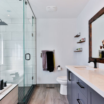
Embarking on a bathroom remodeling project is an exciting endeavor that can greatly enhance the functionality, aesthetics, and value of your home. However, finding a reliable and skilled contractor in a bustling city like Los Angeles can be a daunting task. To simplify the process and ensure a successful bathroom renovation, we have compiled a comprehensive guide on how to find a reputable bathroom remodeling contractor in Los Angeles, California.
Start with Online Research:
The first step in your quest for a reliable contractor is to conduct thorough online research. Utilize search engines like Google to find bathroom remodeling contractors in Los Angeles. Be sure to include specific keywords such as "bathroom remodeling," "contractor," and "Los Angeles" to refine your search results.
Check Online Directories and Review Platforms:
Explore online directories and review platforms like Yelp, Angie's List, and Houzz to find a curated list of bathroom remodeling contractors in Los Angeles. These platforms often provide detailed information about contractors, including customer reviews, ratings, project photos, and contact details. Assess the overall rating and read through multiple reviews to gauge the contractor's reputation and reliability.
Seek Recommendations:
Ask friends, family, neighbors, and colleagues who have recently undergone a bathroom remodeling project in Los Angeles for recommendations. Personal referrals can provide valuable insights and firsthand experiences that online research may not uncover. Inquire about the contractor's professionalism, craftsmanship, adherence to timelines, and overall satisfaction with the project.
Verify Credentials and Licensing:
Once you have shortlisted potential contractors, it is crucial to verify their credentials and licensing. Check if they are licensed by the Contractors State License Board (CSLB) in California. A valid license ensures that the contractor meets the state's requirements and regulations. Additionally, inquire about their insurance coverage to protect against any potential liabilities during the remodeling process.
Evaluate Experience and Expertise:
Assess the experience and expertise of the contractors on your list. Look for contractors who specialize in bathroom remodeling and have a proven track record of successful projects. Review their portfolios or ask for references to see examples of their previous work. A skilled contractor should be able to handle a variety of bathroom designs and styles, and provide creative solutions to meet your specific needs.
Schedule In-Person Consultations:
Arrange in-person consultations with the shortlisted contractors. Use this opportunity to discuss your remodeling goals, budget, timeline, and any specific requirements you may have. A reputable contractor will listen attentively, provide insights, and offer suggestions based on their expertise. Pay attention to their communication style, professionalism, and responsiveness, as these qualities are crucial for a smooth working relationship.
Request Detailed Quotes and Contracts:
Ask the contractors for detailed written quotes that outline the project's scope, materials, labor costs, and any additional expenses. A comprehensive quote will help you compare the estimates provided by different contractors effectively. Once you have selected a contractor, ensure that you have a detailed contract in place that covers all aspects of the project, including timelines, payment schedules, warranties, and dispute resolution processes.
Seek Permits and Building Code Compliance:
Bathroom remodeling projects often require permits and adherence to building codes. A reputable contractor will be familiar with the local building regulations in Los Angeles and should handle the permit application process on your behalf. Verify that the contractor will obtain the necessary permits and ensure that all work is compliant with local codes and regulations.
Conclusion:
Finding a bathroom remodeling contractor in Los Angeles, California, may seem overwhelming, but by following these guidelines, you can streamline the process and select a contractor who meets your expectations. Conduct thorough online research, seek recommendations, verify credentials, evaluate experience, and schedule in-person consultations to make an informed decision.


 The Decorating Therapist
When these homeowners needed new appliances, they used the opportunity to elevate their kitchen with a luxury partial remodel rooted in timeless Old World Mediterranean design. Since they had no plans to move, the goal was to create a more refined, functional kitchen that felt warm, intentional, and beautifully integrated with the existing home. By preserving the perimeter cabinetry and tile flooring, every new design decision was carefully selected to create a cohesive, custom-looking kitchen renovation.
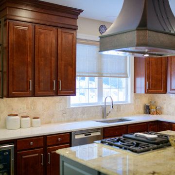
To enhance the existing cherry-stained cabinetry and eliminate the dust-collecting gap above the wall cabinets, we added 12 inches of layered crown molding, professionally stained to match the dark cherry finish. This created a seamless built-in appearance and added architectural richness to the luxury kitchen design. A bronze and glass multi-shelf display unit extended the visual line of the wall cabinetry, while a new 24-inch-deep cabinet above the refrigerator improved storage. The base cabinetry was also expanded with a beverage refrigerator and upgraded rollout drawers for more efficient, everyday kitchen functionality.
Because the original island cabinetry was not functioning well for the homeowners, it was replaced with a custom kitchen island designed for beauty, storage, and performance. The new island cabinets were painted in an elegant gray-green finish, creating a refined contrast with the dark cherry perimeter cabinetry. Slender pullouts flanking the range keep spices and utensils organized within easy reach, while relocating the microwave below the island freed valuable counter space. On the seating side, tile was added beneath the island to protect the cabinetry from scuffs, creating a durable, thoughtful detail that supports everyday entertaining.
A major luxury kitchen upgrade was replacing the failing island downdraft ventilation with a powerful ceiling-mounted statement hood. Custom made in hammered aged copper with graceful lines and dark bronze detailing, the ventilation hood became the dramatic focal point of the kitchen while complementing the cherry cabinetry and enhancing the Old World Mediterranean aesthetic.
The homeowners had always disliked their double-bowl sink, so it was replaced with a large single workstation sink that dramatically improved prep, cleanup, and daily usability. The double wall ovens were upgraded to a steam oven and convection oven, while the lower drawer was replaced with a warming drawer that quickly became the client’s favorite and most-used appliance. These premium appliance upgrades brought modern performance into the timeless kitchen renovation.
For the first time, the kitchen gained a backsplash, adding another layer of texture, polish, and luxury detail. A warm neutral polished marble tile in a large arabesque pattern offered a subtle nod to Mediterranean design while softening the transition between the dark cherry cabinetry, painted island, and updated appliances.
The final finishing touch was replacing the outdated hardware. The original small round knobs on the 48-inch-tall wall cabinets were swapped for antique pewter linear pulls with an aged, muted finish, reinforcing the Old World kitchen style while giving the cabinetry a more tailored, elevated look.
Every detail in this luxury kitchen remodel was chosen to refine the space, improve flow, and enhance functionality while making the new elements feel original to the home. The result is a warm, inviting, Old World Mediterranean kitchen that feels timeless, highly tailored, and beautifully suited to homeowners who love to cook and entertain.

 Closet Factory (Fort Lauderdale)
Our daily routine begins and ends in the closet, so we believe it should be a place of peace, organization and beauty. When it comes to the custom design of one of the most personal rooms in your home, we want to transform your closet and make space for everything. With an inspired closet design you are able to easily find what you need, take charge of your morning routine, and discover a feeling of harmony to carry you throughout your day.

 Bella Tile and Stone
Mid-sized transitional enclosed light wood floor and beige floor family room photo with white walls, a standard fireplace, a tile fireplace and no tv
6