
Search results for "Viewing restricted" in Home Design Ideas
 Dynia Architects
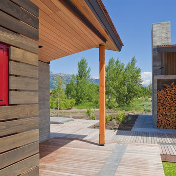
Located near the foot of the Teton Mountains, the site and a modest program led to placing the main house and guest quarters in separate buildings configured to form outdoor spaces. With mountains rising to the northwest and a stream cutting through the southeast corner of the lot, this placement of the main house and guest cabin distinctly responds to the two scales of the site. The public and private wings of the main house define a courtyard, which is visually enclosed by the prominence of the mountains beyond. At a more intimate scale, the garden walls of the main house and guest cabin create a private entry court.
A concrete wall, which extends into the landscape marks the entrance and defines the circulation of the main house. Public spaces open off this axis toward the views to the mountains. Secondary spaces branch off to the north and south forming the private wing of the main house and the guest cabin. With regulation restricting the roof forms, the structural trusses are shaped to lift the ceiling planes toward light and the views of the landscape.
A.I.A Wyoming Chapter Design Award of Citation 2017
Project Year: 2008
 Brooks + Scarpa Architects
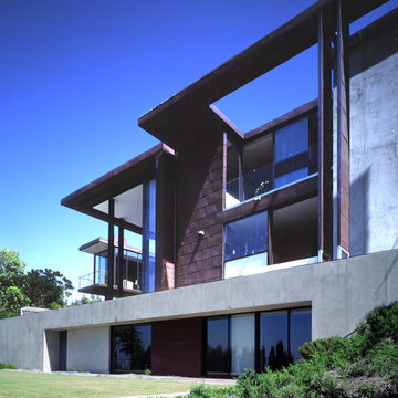
Description: In early 1994, the architects began work on the project and while in construction (demolition, grading and foundations) the owner, due to circumstances beyond his control, halted all construction of the project. Seven years later the owner returned to the architects and asked them to complete the partially constructed house. Due to code changes, city ordinances and a wide variety of obstacles it was determined that the house was unable to be completed as originally designed.
After much consideration the client asked the architect if it were possible to alter/remodel the partially constructed house, which was a remodel/addition to a 1970’s ranch style house, into a project that fit into current zoning and structural codes. The owner also requested that the house’s footprint and partially constructed foundations remain to avoid the need for further entitlements and delays on an already long overdue and difficult hillside site.
The architects’ main challenge was how to alter the design that reflected an outdated philosophical approach to architecture that was nearly a decade old. How could the house be re-conceived reflecting the architect and client’s maturity on a ten-year-old footprint?
The answer was to remove almost all of the previously proposed existing interior walls and transform the existing footprint into a pavilion-like structure that allows the site to in a sense “pass through the house”. This allowed the client to take better advantage of a limited and restricted building area while capturing extraordinary panoramic views of the San Fernando Valley and Hollywood Hills. Large 22-foot high custom sliding glass doors allow the interior and exterior to become one. Even the studio is separated from the house and connected only by an exterior bridge. Private spaces are treated as loft-like spaces capturing volume and views while maintaining privacy.
Limestone floors extend from inside to outside and into the lap pool that runs the entire length of the house creating a horizon line at the edge of the view. Other natural materials such as board formed concrete, copper, steel and cherry provides softness to the objects that seem to float within the interior volume. By placing objects and materials "outside the frame," a new frame of reference deepens our sense of perception. Art does not reproduce what we see; rather it makes us see.
 Tobin Dougherty Architects
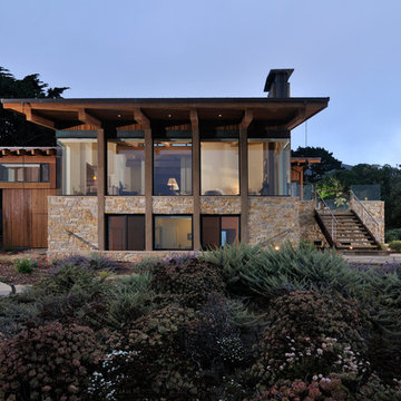
The original structure at Yankee Point was a simple 1970s home with “good bones.” Unfortunately, it was also a case where less-than-poetic considerations threatened to eclipse design. Setbacks, height and footprint restrictions and other building regulations had boxed in the renovation to the point where there was literally nowhere left to build. Fortunately, the house sat 6' above grade on the ocean side. With some three-dimensional ingenuity, this ultimately provided ample space to add a new full height lower level without exceeding stringent lot coverage limitations. Today, upon entering the residence, you catch a quick glimpse of the ocean views and of the cascading roof lines designed to echo the motions of ocean waves beyond. The space opens up as you move toward the ocean to reveal a panoramic view.
Find the right local pro for your project
 Brooks + Scarpa Architects
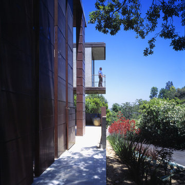
Description: In early 1994, the architects began work on the project and while in construction (demolition, grading and foundations) the owner, due to circumstances beyond his control, halted all construction of the project. Seven years later the owner returned to the architects and asked them to complete the partially constructed house. Due to code changes, city ordinances and a wide variety of obstacles it was determined that the house was unable to be completed as originally designed.
After much consideration the client asked the architect if it were possible to alter/remodel the partially constructed house, which was a remodel/addition to a 1970’s ranch style house, into a project that fit into current zoning and structural codes. The owner also requested that the house’s footprint and partially constructed foundations remain to avoid the need for further entitlements and delays on an already long overdue and difficult hillside site.
The architects’ main challenge was how to alter the design that reflected an outdated philosophical approach to architecture that was nearly a decade old. How could the house be re-conceived reflecting the architect and client’s maturity on a ten-year-old footprint?
The answer was to remove almost all of the previously proposed existing interior walls and transform the existing footprint into a pavilion-like structure that allows the site to in a sense “pass through the house”. This allowed the client to take better advantage of a limited and restricted building area while capturing extraordinary panoramic views of the San Fernando Valley and Hollywood Hills. Large 22-foot high custom sliding glass doors allow the interior and exterior to become one. Even the studio is separated from the house and connected only by an exterior bridge. Private spaces are treated as loft-like spaces capturing volume and views while maintaining privacy.
Limestone floors extend from inside to outside and into the lap pool that runs the entire length of the house creating a horizon line at the edge of the view. Other natural materials such as board formed concrete, copper, steel and cherry provides softness to the objects that seem to float within the interior volume. By placing objects and materials "outside the frame," a new frame of reference deepens our sense of perception. Art does not reproduce what we see; rather it makes us see.
 George Gekas Design
George Gekas Design
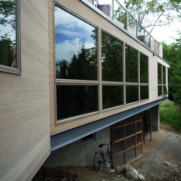
Inspiration for a modern exterior home remodel in Portland Maine
Inspiration for a modern exterior home remodel in Portland Maine
 James Martin Associates
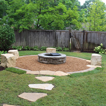
Request Free Quote For fireplace and fire pit locations, minimum setbacks are set from property lines and the home. Restrictions are determined by each municipality’s zoning administration. The setbacks are for safety, yet also provide an opportunity for a surrounding garden setting.
 Dynia Architects
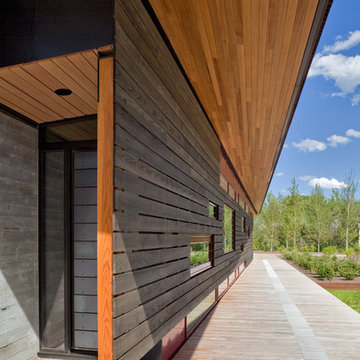
Located near the foot of the Teton Mountains, the site and a modest program led to placing the main house and guest quarters in separate buildings configured to form outdoor spaces. With mountains rising to the northwest and a stream cutting through the southeast corner of the lot, this placement of the main house and guest cabin distinctly responds to the two scales of the site. The public and private wings of the main house define a courtyard, which is visually enclosed by the prominence of the mountains beyond. At a more intimate scale, the garden walls of the main house and guest cabin create a private entry court.
A concrete wall, which extends into the landscape marks the entrance and defines the circulation of the main house. Public spaces open off this axis toward the views to the mountains. Secondary spaces branch off to the north and south forming the private wing of the main house and the guest cabin. With regulation restricting the roof forms, the structural trusses are shaped to lift the ceiling planes toward light and the views of the landscape.
A.I.A Wyoming Chapter Design Award of Citation 2017
Project Year: 2008
Sponsored
Westerville, OH

Custom Home Works
Franklin County's Award-Winning Design, Build and Remodeling Expert
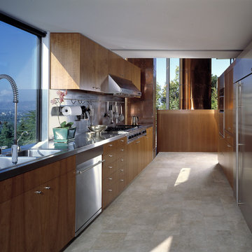 Brooks + Scarpa Architects
Description: In early 1994, the architects began work on the project and while in construction (demolition, grading and foundations) the owner, due to circumstances beyond his control, halted all construction of the project. Seven years later the owner returned to the architects and asked them to complete the partially constructed house. Due to code changes, city ordinances and a wide variety of obstacles it was determined that the house was unable to be completed as originally designed.
After much consideration the client asked the architect if it were possible to alter/remodel the partially constructed house, which was a remodel/addition to a 1970’s ranch style house, into a project that fit into current zoning and structural codes. The owner also requested that the house’s footprint and partially constructed foundations remain to avoid the need for further entitlements and delays on an already long overdue and difficult hillside site.
The architects’ main challenge was how to alter the design that reflected an outdated philosophical approach to architecture that was nearly a decade old. How could the house be re-conceived reflecting the architect and client’s maturity on a ten-year-old footprint?
The answer was to remove almost all of the previously proposed existing interior walls and transform the existing footprint into a pavilion-like structure that allows the site to in a sense “pass through the house”. This allowed the client to take better advantage of a limited and restricted building area while capturing extraordinary panoramic views of the San Fernando Valley and Hollywood Hills. Large 22-foot high custom sliding glass doors allow the interior and exterior to become one. Even the studio is separated from the house and connected only by an exterior bridge. Private spaces are treated as loft-like spaces capturing volume and views while maintaining privacy.
Limestone floors extend from inside to outside and into the lap pool that runs the entire length of the house creating a horizon line at the edge of the view. Other natural materials such as board formed concrete, copper, steel and cherry provides softness to the objects that seem to float within the interior volume. By placing objects and materials "outside the frame," a new frame of reference deepens our sense of perception. Art does not reproduce what we see; rather it makes us see.
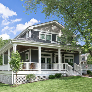
 12/12 Architects & Planners
Existing brick ranch, total gut of first floor with second floor addition on corner lot with tight setback restrictions. Relocated front door, new southern plantation style porch and French doors.
Photos by Kmiecik Imagery.
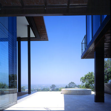 Brooks + Scarpa Architects
Description: In early 1994, the architects began work on the project and while in construction (demolition, grading and foundations) the owner, due to circumstances beyond his control, halted all construction of the project. Seven years later the owner returned to the architects and asked them to complete the partially constructed house. Due to code changes, city ordinances and a wide variety of obstacles it was determined that the house was unable to be completed as originally designed.
After much consideration the client asked the architect if it were possible to alter/remodel the partially constructed house, which was a remodel/addition to a 1970’s ranch style house, into a project that fit into current zoning and structural codes. The owner also requested that the house’s footprint and partially constructed foundations remain to avoid the need for further entitlements and delays on an already long overdue and difficult hillside site.
The architects’ main challenge was how to alter the design that reflected an outdated philosophical approach to architecture that was nearly a decade old. How could the house be re-conceived reflecting the architect and client’s maturity on a ten-year-old footprint?
The answer was to remove almost all of the previously proposed existing interior walls and transform the existing footprint into a pavilion-like structure that allows the site to in a sense “pass through the house”. This allowed the client to take better advantage of a limited and restricted building area while capturing extraordinary panoramic views of the San Fernando Valley and Hollywood Hills. Large 22-foot high custom sliding glass doors allow the interior and exterior to become one. Even the studio is separated from the house and connected only by an exterior bridge. Private spaces are treated as loft-like spaces capturing volume and views while maintaining privacy.
Limestone floors extend from inside to outside and into the lap pool that runs the entire length of the house creating a horizon line at the edge of the view. Other natural materials such as board formed concrete, copper, steel and cherry provides softness to the objects that seem to float within the interior volume. By placing objects and materials "outside the frame," a new frame of reference deepens our sense of perception. Art does not reproduce what we see; rather it makes us see.
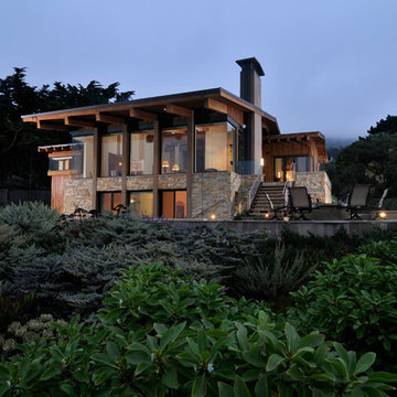 Tobin Dougherty Architects
The original structure at Yankee Point was a simple 1970s home with “good bones.” Unfortunately, it was also a case where less-than-poetic considerations threatened to eclipse design. Setbacks, height and footprint restrictions and other building regulations had boxed in the renovation to the point where there was literally nowhere left to build. Fortunately, the house sat 6' above grade on the ocean side. With some three-dimensional ingenuity, this ultimately provided ample space to add a new full height lower level without exceeding stringent lot coverage limitations. Today, upon entering the residence, you catch a quick glimpse of the ocean views and of the cascading roof lines designed to echo the motions of ocean waves beyond. The space opens up as you move toward the ocean to reveal a panoramic view.
 Pocci Design Group
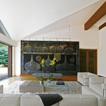
One of the biggest challenges of this remodel was fitting the client’s massive 15’ x 9’ oil painting into a room with a low ceiling and west wall that angled sharply downwards, and designing lighting which could fit into the tight space allowed. Further complicating matters were the strict code restrictions on building height.
The roof-line was raised and the wall elevated within very tight guidelines. Numerous calculations and research went into specifying and installing the light fixtures, and ultimately there was only a 1” tolerance between the light fixture and ceiling for it to adequately light the painting.
 12/12 Architects & Planners
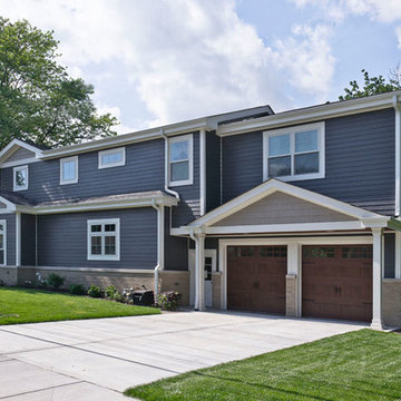
Existing brick ranch, total gut of first floor with second floor addition on corner lot with tight setback restrictions. Relocated front door, new southern plantation style porch and French doors.
Photos by Kmiecik Imagery.

Sponsored
Columbus, OH
Free consultation for landscape design!

Peabody Landscape Group
Franklin County's Reliable Landscape Design & Contracting

 Brooks + Scarpa Architects
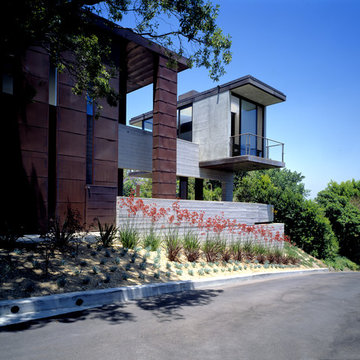
Description: In early 1994, the architects began work on the project and while in construction (demolition, grading and foundations) the owner, due to circumstances beyond his control, halted all construction of the project. Seven years later the owner returned to the architects and asked them to complete the partially constructed house. Due to code changes, city ordinances and a wide variety of obstacles it was determined that the house was unable to be completed as originally designed.
After much consideration the client asked the architect if it were possible to alter/remodel the partially constructed house, which was a remodel/addition to a 1970’s ranch style house, into a project that fit into current zoning and structural codes. The owner also requested that the house’s footprint and partially constructed foundations remain to avoid the need for further entitlements and delays on an already long overdue and difficult hillside site.
The architects’ main challenge was how to alter the design that reflected an outdated philosophical approach to architecture that was nearly a decade old. How could the house be re-conceived reflecting the architect and client’s maturity on a ten-year-old footprint?
The answer was to remove almost all of the previously proposed existing interior walls and transform the existing footprint into a pavilion-like structure that allows the site to in a sense “pass through the house”. This allowed the client to take better advantage of a limited and restricted building area while capturing extraordinary panoramic views of the San Fernando Valley and Hollywood Hills. Large 22-foot high custom sliding glass doors allow the interior and exterior to become one. Even the studio is separated from the house and connected only by an exterior bridge. Private spaces are treated as loft-like spaces capturing volume and views while maintaining privacy.
Limestone floors extend from inside to outside and into the lap pool that runs the entire length of the house creating a horizon line at the edge of the view. Other natural materials such as board formed concrete, copper, steel and cherry provides softness to the objects that seem to float within the interior volume. By placing objects and materials "outside the frame," a new frame of reference deepens our sense of perception. Art does not reproduce what we see; rather it makes us see.
 H2D Architecture + Design
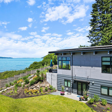
Located in the Perrinville neighborhood of Edmonds, this waterfront project began as a vision for a large addition and attached garage and evolved into a substantial partial rebuild of the existing home. The design goals centered on expanding and modernizing the residence while responding thoughtfully to the site’s sensitive environmental conditions, including a stream, steep slope, and the Puget Sound shoreline with associated buffers. Careful planning ensured compliance with critical area restrictions while maximizing sweeping water views and strengthening the home’s connection to its remarkable setting. The reimagined main floor was designed as an open, light-filled great room organized around a large kitchen and generous entertaining spaces. Expansive glass doors and a dramatic wall of windows frame views of the Puget Sound, creating a seamless indoor–outdoor connection and allowing natural light to fill the interior. A new addition is designed with a two-car garage at the lower level and a primary suite above, designed as a private retreat with elevated views and refined finishes. Sustainability and efficiency were also central goals: the existing foundation and main floor system were salvaged and reused, while rebuilt walls support a modern double shed roofline constructed with SIP panels (Structurally Insulated Panels) over exposed wood beams. The result is a cohesive, contemporary home that balances environmental sensitivity, performance, and waterfront living.
+ Architecture: H2D Architecture + Design
+ Interior Design: H2D Architecture + Design
www.h2darchitects.com
+ Built by: Carlisle Classic Homes
+ Photography: Anastasiya Homes
 IQnewswire
The End of the Ultra-Slim Wedding Suit
For several years, men’s formalwear was dominated by narrow lapels, short jackets and trousers cut close to the leg. The style created a sharp outline, but it often left little room for sitting, dancing or eating comfortably. Current tailoring is moving towards a more balanced shape, with cleaner shoulders, a defined waist and trousers that follow the leg without gripping it.This change does not mean that wedding suits have become oversized. The newer approach sits between skinny and loose. It keeps the structure expected of formal clothing while allowing the cloth to hang properly. For grooms, that balance is useful during a day that may involve a ceremony, photographs, dinner and several hours on the dance floor.
Look For Shape Rather Than Tightness
A well-fitted suit should create a clear outline without relying on tension. Collections of Marc Darcy suits include tailored three-piece designs, checks and textured fabrics that suit the current preference for visible structure and considered proportions.
The jacket should sit close enough to define the waist, but the front button should fasten without pulling the cloth into an X-shaped crease. At the shoulders, the seam should finish close to the natural shoulder point. Extra width can make the jacket look borrowed, while a shoulder that is too narrow may cause the upper sleeve to collapse.
Fit should be assessed while moving as well as standing. Reach forward, sit down and raise both arms. A tailored jacket will never feel like casual sportswear, but it should allow the groom to carry out ordinary movements without sharp restriction across the back or chest.
Give The Jacket Enough Length
Very short suit jackets became common alongside skinny trousers, but they can disrupt the proportions of a three-piece outfit. If the jacket finishes too high, the waistcoat may appear longer than the outer layer and the trousers may look as though they begin too low.
A more traditional jacket length usually covers most of the seat and divides the body more evenly. This can make the legs appear longer without shortening the jacket excessively. The correct length depends on height and body proportions, so two men wearing the same chest size may still need different jacket lengths.
View the suit from the back and side rather than relying on a front-facing mirror. The vents should lie flat, and the hem should not lift away from the body. A side photograph can reveal an unbalanced jacket more clearly than the changing-room mirror.
Choose Trousers That Fall Cleanly
The move away from very tight tailoring is most noticeable in suit trousers. A modern tailored leg can still be neat at the ankle, but it should provide enough room through the seat and thigh for the fabric to fall without horizontal lines.
Trouser pockets offer a useful fit check. If they pull open while standing, the waist or hips may be too tight. The fly should lie flat, and the waistband should remain in place without depending on an overtightened belt. Higher-rise trousers can work particularly well with a waistcoat because they reduce the chance of shirt fabric appearing between the two pieces.
The hem should make gentle contact with the shoe rather than gathering heavily around it. A short hem can work with narrow trousers but taking it too far may make the suit look dated once the current cropped style moves on. A slight break is easier to wear with different formal shoes and tends to look balanced in full-length wedding photographs.
Let The Waistcoat Support the Silhouette
A waistcoat adds structure through the centre of the outfit, but only when it fits correctly. It should lie flat against the shirt and cover the trouser waistband. Tightening the back strap cannot correct a waistcoat that is the wrong size or too short.
Current three-piece styling often places greater emphasis on the waistcoat. Double-breasted designs, contrasting fabrics and wider openings can distinguish the groom without requiring a brightly coloured jacket. When the groom removes the jacket later, the waistcoat keeps the outfit looking complete.
Allow room for a full meal and several hours of wear. A waistcoat that feels acceptably close during a brief fitting may become uncomfortable at dinner. Sit down with every button fastened and check whether the lower edge presses into the waist or causes the front to bow.
Use Stronger Lapels Carefully
Wider notch and peak lapels are returning after years of extremely narrow designs. A broader lapel can frame the shirt and tie, balance the shoulders and give the jacket a more formal character. Peak lapels create a particularly strong line on double-breasted jackets and evening suits.
The lapel width should still suit the wearer. A very broad lapel can overwhelm a smaller frame, while an extremely narrow one may look out of proportion on a broad chest. The shirt collar, tie width and lapel should relate to one another without matching exactly.
A wider lapel also leaves less need for decorative extras. A simple buttonhole flower or plain pocket square may be enough. Large lapel pins can crowd the upper part of the jacket, especially when the cloth already contains a check.
Avoid Buying According to the Size Label Alone
The same labelled size can fit differently across designs because cut, fabric and construction affect the garment. Begin with accurate chest, waist, inside-leg and approximate jacket-length measurements. Compare those figures with the retailer’s size information rather than ordering the size worn in another brand without checking.
If the jacket fits at the shoulders but needs slight shaping through the waist, a tailor can often make the adjustment. Sleeves and trouser hems are also commonly altered. Major changes to the shoulder line or jacket length are more difficult and may not be economical.
Do not choose the smallest size that can be fastened. A suit that looks tight in the fitting room is unlikely to become more comfortable during a long wedding day. Cloth should skim the body and return to a clean position after movement.
Balance a checked suit with simple styling
Texture and checks remain popular in wedding tailoring, particularly for country houses, converted barns and traditional venues. These fabrics already add depth to the outfit, so the cut should remain controlled and the accessories relatively quiet.
A plain white, pale blue or cream shirt gives a checked suit a clear foundation. Choose a tie from one of the secondary colours in the cloth rather than introducing another strong pattern. A white pocket square works when the suit contains several shades and does not need further decoration.
Shoes should support the proportions of the trousers. A very slim shoe may appear too small beneath a fuller hem, while a heavy casual sole can pull attention away from the tailoring. Oxfords, Derbies and refined brogues usually provide enough visual weight without looking bulky.
Coordinate the wedding party without forcing one fit
Matching groomsmen suits can become difficult when every member of the party has a different build. Insisting on an identical close fit may leave some men comfortable and others visibly restricted. A better approach is to keep the cloth, colour and main design consistent while adjusting jacket and trouser sizes for each person.
The groom can stand apart through a waistcoat, lapel shape or accessory rather than wearing a suit cut much tighter than everyone else. This creates a connection across the group without treating one silhouette as suitable for every body.
Arrange fittings early enough to identify size and alteration issues. Group orders should be checked well before the wedding, particularly when trousers need hemming or jackets require sleeve adjustments. Each person should try the complete outfit with the intended shirt and shoes.
Judge the suit by the whole day
A wedding fitting often lasts less than half an hour, while the suit may be worn for twelve hours or more. Comfort should therefore be tested under realistic conditions. Sit for several minutes, walk upstairs and check the waistband after moving around.
Pay attention to the parts that cannot be seen clearly in a mirror. The collar should remain close to the shirt at the back of the neck. Jacket vents should not pull apart, and the trouser seat should follow the body without sagging or strain.
The current move towards balanced tailoring gives grooms more room to choose clothes that look formal without feeling restrictive. Clean shoulders, a shaped jacket and trousers with a natural fall will outlast extreme proportions. A suit that allows the groom to stand, sit and celebrate comfortably is also more likely to look composed in photographs taken throughout the day.

Sponsored
Westerville, OH
Custom Home Works
Franklin County's Award-Winning Design, Build and Remodeling Expert
 Dynia Architects
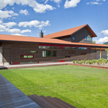
Located near the foot of the Teton Mountains, the site and a modest program led to placing the main house and guest quarters in separate buildings configured to form outdoor spaces. With mountains rising to the northwest and a stream cutting through the southeast corner of the lot, this placement of the main house and guest cabin distinctly responds to the two scales of the site. The public and private wings of the main house define a courtyard, which is visually enclosed by the prominence of the mountains beyond. At a more intimate scale, the garden walls of the main house and guest cabin create a private entry court.
A concrete wall, which extends into the landscape marks the entrance and defines the circulation of the main house. Public spaces open off this axis toward the views to the mountains. Secondary spaces branch off to the north and south forming the private wing of the main house and the guest cabin. With regulation restricting the roof forms, the structural trusses are shaped to lift the ceiling planes toward light and the views of the landscape.
A.I.A Wyoming Chapter Design Award of Citation 2017
Project Year: 2008
 JRML Associates, Inc.
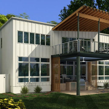
The existing home, designed and built in the early ’70’s, was contemporary in style. Two lengthy barrel skylights bathed the interior in daylight. Ribbons of windows provided unobstructed river views. JRML was commissioned to redesign the second floor, expand the library, and add a covered balcony with dining and entertainment below. View and outdoor experience were paramount. Local ordinances restricted new construction to the existing patio size. Angling the library wall and edge-mounting the cable rail increased the balcony’s floor area. Oversizing the sliding glass door maintained the river views. Existing patios, steps and new grill station were resurfaced for a matte look. The earthy color palette, Douglas fir rafters, beam and slatted privacy panels blend with the landscape. Motorized screens exclude insects. The roof and balcony, supported on the most minimal column and beam sizes lend the composition an open, streamlined aesthetic.
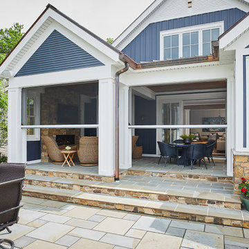
 Visbeen Architects
This cozy lake cottage skillfully incorporates a number of features that would normally be restricted to a larger home design. A glance of the exterior reveals a simple story and a half gable running the length of the home, enveloping the majority of the interior spaces. To the rear, a pair of gables with copper roofing flanks a covered dining area that connects to a screened porch. Inside, a linear foyer reveals a generous staircase with cascading landing. Further back, a centrally placed kitchen is connected to all of the other main level entertaining spaces through expansive cased openings. A private study serves as the perfect buffer between the homes master suite and living room. Despite its small footprint, the master suite manages to incorporate several closets, built-ins, and adjacent master bath complete with a soaker tub flanked by separate enclosures for shower and water closet. Upstairs, a generous double vanity bathroom is shared by a bunkroom, exercise space, and private bedroom. The bunkroom is configured to provide sleeping accommodations for up to 4 people. The rear facing exercise has great views of the rear yard through a set of windows that overlook the copper roof of the screened porch below.
Builder: DeVries & Onderlinde Builders
Interior Designer: Vision Interiors by Visbeen
Photographer: Ashley Avila Photography
13