
Search results for "Visual elements" in Home Design Ideas
 KS Designs LLC
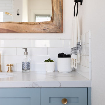
This guest bath has a light and airy feel with an organic element and pop of color. The custom vanity is in a midtown jade aqua-green PPG paint Holy Glen. It provides ample storage while giving contrast to the white and brass elements. A playful use of mixed metal finishes gives the bathroom an up-dated look. The 3 light sconce is gold and black with glass globes that tie the gold cross handle plumbing fixtures and matte black hardware and bathroom accessories together. The quartz countertop has gold veining that adds additional warmth to the space. The acacia wood framed mirror with a natural interior edge gives the bathroom an organic warm feel that carries into the curb-less shower through the use of warn toned river rock. White subway tile in an offset pattern is used on all three walls in the shower and carried over to the vanity backsplash. The shower has a tall niche with quartz shelves providing lots of space for storing shower necessities. The river rock from the shower floor is carried to the back of the niche to add visual interest to the white subway shower wall as well as a black Schluter edge detail. The shower has a frameless glass rolling shower door with matte black hardware to give the this smaller bathroom an open feel and allow the natural light in. There is a gold handheld shower fixture with a cross handle detail that looks amazing against the white subway tile wall. The white Sherwin Williams Snowbound walls are the perfect backdrop to showcase the design elements of the bathroom.
Photography by LifeCreated.
 River Valley Landscapes
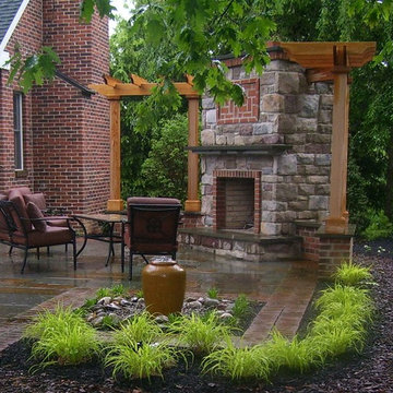
 After many years of having no outdoor living space and dealing with overgrown plants and trees the owner’s decided it was time to revitalize their backyard. They knew they wanted a large sitting area with a wood burning fireplace, room for outdoor dining and a place for the grill. A connecting walk would be needed to get guests from the driveway to the outdoor space. Last but not least, the owners wanted the ability to and a reason for stepping out of their unusable patio doors.
The designers decided from the start the fireplace would be the prominent feature and focal point for the entire project. A large fireplace accented with sitting walls and arbors was positioned to anchor the corner of the patio. Stone was chosen to set the fireplace apart as its own element. Brick was used for the sitting walls and brick accents were added to the fireplace to tie into the house. An inlaid herringbone brick detail was incorporated above the stone mantle to simulate artwork which is typically found above indoor fireplaces. Flagstone was used for the wall caps and hearth to match the patio and thicker flagstone tread stock was used for the mantle and top. The arbors were added to visually balance the pergolas at the opposite side of the patio.
For the patio the designers created a series of offset spaces to help subtly divide the space into two areas, sitting and dining. Two large existing trees also help dictate the shape of the patio. Cut flagstone was chosen for the surface bordered by a double soldier edge of brick. The brick edging also surrounds a decorative gravel area topped with an urn fountain which provides a secondary focal point and the sound of water. Large flagstone treads were used for the steps leading to the previously unused patio doors. Opposite the fireplace a short walk leads to a square transition area with a statue chosen by the owner. The statue provides a strong focal point when entering from the driveway. A longer walk leads from this space along the house to the driveway.
The pergolas and arbors were designed by the landscape designer as part of this project but were ultimately contracted separately by the owner. The larger square pergola was intended as an area for a bench or two separate from the main patio. The longer pergola was added later in the design phase to help provide shade to the interior of the house. The arbors at the fireplace were added to balance out the wood elements at the opposite side while adding additional architectural interest to the fireplace.
While this project was predominantly hardscaping, planting and lighting were also incorporated into the design. Several large existing trees were retained and serious of smaller understory trees were added to help enclose the space. The designer’s took advantage of the large trees to place down lights on the branches to achieve a moonlight effect at night. Additional lighting was used on the pergola, to accent focal points, to up light the smaller trees and around the patio. Massed planting of Japanese forest grass provides bold foliage color for the shady garden. A mulch path leads off behind the fireplace to another garden and a secluded area ideal for a bench or small table and chairs. Additional plantings were added along the rear property line to screen and unsightly fence.
This project has obviously completely changed the way the owners use their backyard. They now have a seamless transition from indoors to outdoors with the use of the patio doors. The large patio allows for entertaining small gatherings outdoors for the first time. The fireplace has definitely become the primary gathering place for family and friends.
 Burdge & Associates Architects
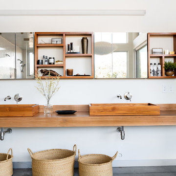
Malibu Modern Farmhouse by Burdge & Associates Architects in Malibu, California.
Interiors by Alexander Design
Fiore Landscaping
Photos by Tessa Neustadt
Find the right local pro for your project
 Kitchen Magic
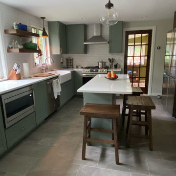
Brining the outdoors with a combination of Celadon Green and Walnut. Open shelving and a farmsink add to the kitchen's charms.
Example of a huge transitional galley eat-in kitchen design in Boston with an island
Example of a huge transitional galley eat-in kitchen design in Boston with an island


 CHRISTIAN DEAN ARCHITECTURE, LLC
Photo by: Chad Holder
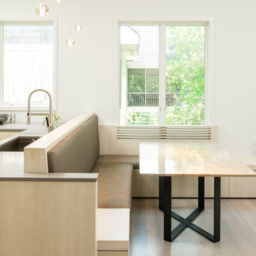
Kitchen - scandinavian kitchen idea in Minneapolis
Kitchen - scandinavian kitchen idea in Minneapolis
 Lanson B. Jones & Co, Inc.
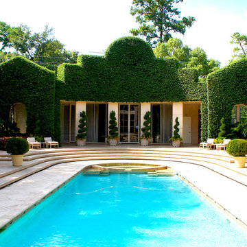
The backyard boasts an ornate, poolside retreat. Container grown Italian cypress and spiral juniper add interesting visual elements and a grand, ivy-covered wall give the space a geometric, art deco appeal. Ivy arches, carved columns, and sharply pruned boxwood spheres create a stunning, yet cohesive, impact.
Sponsored
Columbus, OH

Trish Takacs Design
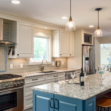
Award Winning & Highly Skilled Kitchen & Bath Designer in Columbus
 Windhill+Co.
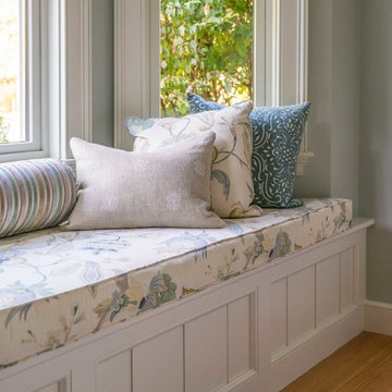
We gave this rather dated farmhouse some dramatic upgrades that brought together the feminine with the masculine, combining rustic wood with softer elements. In terms of style her tastes leaned toward traditional and elegant and his toward the rustic and outdoorsy. The result was the perfect fit for this family of 4 plus 2 dogs and their very special farmhouse in Ipswich, MA. Character details create a visual statement, showcasing the melding of both rustic and traditional elements without too much formality. The new master suite is one of the most potent examples of the blending of styles. The bath, with white carrara honed marble countertops and backsplash, beaded wainscoting, matching pale green vanities with make-up table offset by the black center cabinet expand function of the space exquisitely while the salvaged rustic beams create an eye-catching contrast that picks up on the earthy tones of the wood. The luxurious walk-in shower drenched in white carrara floor and wall tile replaced the obsolete Jacuzzi tub. Wardrobe care and organization is a joy in the massive walk-in closet complete with custom gliding library ladder to access the additional storage above. The space serves double duty as a peaceful laundry room complete with roll-out ironing center. The cozy reading nook now graces the bay-window-with-a-view and storage abounds with a surplus of built-ins including bookcases and in-home entertainment center. You can’t help but feel pampered the moment you step into this ensuite. The pantry, with its painted barn door, slate floor, custom shelving and black walnut countertop provide much needed storage designed to fit the family’s needs precisely, including a pull out bin for dog food. During this phase of the project, the powder room was relocated and treated to a reclaimed wood vanity with reclaimed white oak countertop along with custom vessel soapstone sink and wide board paneling. Design elements effectively married rustic and traditional styles and the home now has the character to match the country setting and the improved layout and storage the family so desperately needed. And did you see the barn? Photo credit: Eric Roth
 Advance Design Studio, Ltd.
Our clients in Tower Lakes, IL, needed more storage and functionality from their kitchen. They were primarily focused on finding the right combination of cabinets, shelves, and drawers that fit all their cookware, flatware, and appliances. They wanted a brighter, bigger space with a natural cooking flow and plenty of storage. Soffits and crown molding needed to be removed to make the kitchen feel larger. Redesign elements included: relocating the fridge, adding a baking station and coffee bar, and placing the microwave in the kitchen island.
Advance Design Studio’s Claudia Pop offered functional, creative, and unique solutions to the homeowners’ problems. Our clients wanted a unique kitchen that was not completely white, a balance of design and function. Claudia offered functional, creative, and unique solutions to Chad and Karen’s kitchen design challenges. The first thing to go was soffits. Today, most kitchens can benefit from the added height and space; removing soffits is nearly always step one. Steely gray-blue was the color of choice for a freshly unique look bringing a sophisticated-looking space to wrap around the fresh new kitchen. Cherry cabinetry in a true brown stain compliments the stormy accents with sharp contrasting white Cambria quartz top balancing out the space with a dramatic flair.
“We wanted something unique and special in this space, something none of the neighbors would have,” said Claudia.
The dramatic veined Cambria countertops continue upward into a backsplash behind three complimentary open shelves. These countertops provide visual texture and movement in the kitchen. The kitchen includes two larder cabinets for both the coffee bar and baking station. The kitchen is now functional and unique in design.
“When we design a new kitchen space, as designers, we are always looking for ways to balance interesting design elements with practical functionality,” Claudia said. “This kitchen’s new design is not only way more functional but is stunning in a way a piece of art can catch one’s attention.”
Decorative mullions with mirrored inserts sit atop dual sentinel pantries flanking the new refrigerator, while a 48″ dual fuel Wolf range replaced the island cooktop and double oven. The new microwave is cleverly hidden within the island, eliminating the cluttered counter and attention-grabbing wall of stainless steel from the previous space.
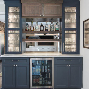
The family room was completely renovated, including a beautifully functional entertainment bar with the same combination of woods and stone as the kitchen and coffee bar. Mesh inserts instead of plain glass add visual texture while revealing pristine glassware. Handcrafted built-ins surround the fireplace.
The beautiful and efficient design created by designer Claudia transitioned directly to the installation team seamlessly, much like the basement project experience Chad and Karen enjoyed previously.
“We definitely will and have recommended Advance Design Studio to friends who are looking to embark on a project small or large,” Karen said.
“Everything that was designed and built exactly how we envisioned it, and we are really enjoying it to its full potential,” Karen said.
Our award-winning design team would love to create a beautiful, functional, and spacious place for you and your family. With our “Common Sense Remodeling” approach, the process of renovating your home has never been easier. Contact us today at 847-665-1711 or schedule an appointment.
 The Artisans Group, Inc.
Winner of the 2018 Tour of Homes Best Remodel, this whole house re-design of a 1963 Bennet & Johnson mid-century raised ranch home is a beautiful example of the magic we can weave through the application of more sustainable modern design principles to existing spaces.
We worked closely with our client on extensive updates to create a modernized MCM gem.
Extensive alterations include:
- a completely redesigned floor plan to promote a more intuitive flow throughout
- vaulted the ceilings over the great room to create an amazing entrance and feeling of inspired openness
- redesigned entry and driveway to be more inviting and welcoming as well as to experientially set the mid-century modern stage
- the removal of a visually disruptive load bearing central wall and chimney system that formerly partitioned the homes’ entry, dining, kitchen and living rooms from each other
- added clerestory windows above the new kitchen to accentuate the new vaulted ceiling line and create a greater visual continuation of indoor to outdoor space
- drastically increased the access to natural light by increasing window sizes and opening up the floor plan
- placed natural wood elements throughout to provide a calming palette and cohesive Pacific Northwest feel
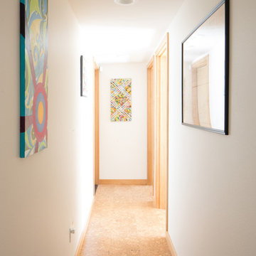
- incorporated Universal Design principles to make the home Aging In Place ready with wide hallways and accessible spaces, including single-floor living if needed
- moved and completely redesigned the stairway to work for the home’s occupants and be a part of the cohesive design aesthetic
- mixed custom tile layouts with more traditional tiling to create fun and playful visual experiences
- custom designed and sourced MCM specific elements such as the entry screen, cabinetry and lighting
- development of the downstairs for potential future use by an assisted living caretaker
- energy efficiency upgrades seamlessly woven in with much improved insulation, ductless mini splits and solar gain
 The Artisans Group, Inc.
Winner of the 2018 Tour of Homes Best Remodel, this whole house re-design of a 1963 Bennet & Johnson mid-century raised ranch home is a beautiful example of the magic we can weave through the application of more sustainable modern design principles to existing spaces.
We worked closely with our client on extensive updates to create a modernized MCM gem.
Extensive alterations include:
- a completely redesigned floor plan to promote a more intuitive flow throughout
- vaulted the ceilings over the great room to create an amazing entrance and feeling of inspired openness
- redesigned entry and driveway to be more inviting and welcoming as well as to experientially set the mid-century modern stage
- the removal of a visually disruptive load bearing central wall and chimney system that formerly partitioned the homes’ entry, dining, kitchen and living rooms from each other
- added clerestory windows above the new kitchen to accentuate the new vaulted ceiling line and create a greater visual continuation of indoor to outdoor space
- drastically increased the access to natural light by increasing window sizes and opening up the floor plan
- placed natural wood elements throughout to provide a calming palette and cohesive Pacific Northwest feel
- incorporated Universal Design principles to make the home Aging In Place ready with wide hallways and accessible spaces, including single-floor living if needed
- moved and completely redesigned the stairway to work for the home’s occupants and be a part of the cohesive design aesthetic
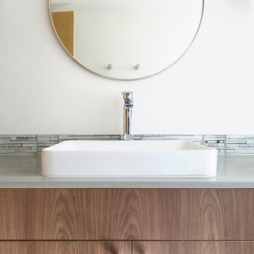
- mixed custom tile layouts with more traditional tiling to create fun and playful visual experiences
- custom designed and sourced MCM specific elements such as the entry screen, cabinetry and lighting
- development of the downstairs for potential future use by an assisted living caretaker
- energy efficiency upgrades seamlessly woven in with much improved insulation, ductless mini splits and solar gain
 Windhill+Co.
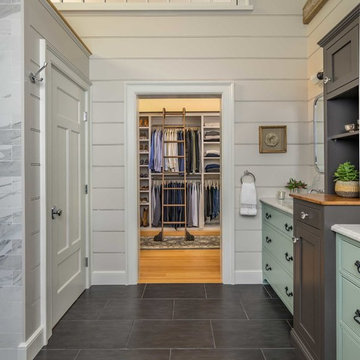
We gave this rather dated farmhouse some dramatic upgrades that brought together the feminine with the masculine, combining rustic wood with softer elements. In terms of style her tastes leaned toward traditional and elegant and his toward the rustic and outdoorsy. The result was the perfect fit for this family of 4 plus 2 dogs and their very special farmhouse in Ipswich, MA. Character details create a visual statement, showcasing the melding of both rustic and traditional elements without too much formality. The new master suite is one of the most potent examples of the blending of styles. The bath, with white carrara honed marble countertops and backsplash, beaded wainscoting, matching pale green vanities with make-up table offset by the black center cabinet expand function of the space exquisitely while the salvaged rustic beams create an eye-catching contrast that picks up on the earthy tones of the wood. The luxurious walk-in shower drenched in white carrara floor and wall tile replaced the obsolete Jacuzzi tub. Wardrobe care and organization is a joy in the massive walk-in closet complete with custom gliding library ladder to access the additional storage above. The space serves double duty as a peaceful laundry room complete with roll-out ironing center. The cozy reading nook now graces the bay-window-with-a-view and storage abounds with a surplus of built-ins including bookcases and in-home entertainment center. You can’t help but feel pampered the moment you step into this ensuite. The pantry, with its painted barn door, slate floor, custom shelving and black walnut countertop provide much needed storage designed to fit the family’s needs precisely, including a pull out bin for dog food. During this phase of the project, the powder room was relocated and treated to a reclaimed wood vanity with reclaimed white oak countertop along with custom vessel soapstone sink and wide board paneling. Design elements effectively married rustic and traditional styles and the home now has the character to match the country setting and the improved layout and storage the family so desperately needed. And did you see the barn? Photo credit: Eric Roth


Sponsored
Columbus, OH

Wannemacher Interiors
Customized Award-Winning Interior Design Solutions in Franklin Cnty OH
 kul grilles
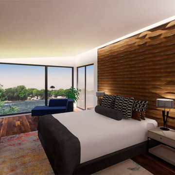
In this master bedroom design by Buffie Architects, luxury and serenity intertwine to create a tranquil oasis that exudes elegance and comfort.
The master bedroom boasts a spacious and well-appointed layout, meticulously crafted to provide a haven for relaxation. The color palette chosen for the space is soothing and timeless, consisting of neutral tones that contribute to a sense of tranquility. Soft hues of cream and beige dominate the room, creating a serene ambiance that promotes restful sleep and relaxation.
The focal point of the room is the luxurious bed, positioned against a feature wall. The bed is adorned with plush bedding, inviting occupants to sink into its comfort and unwind. The headboard adds a touch of opulence and serves as a striking visual element. It is designed with clean lines and subtle detailing, perfectly blending modern aesthetics with timeless elegance.
Large windows invite natural light to flood the room, accentuating the airiness and creating a connection to the outdoors. This balance of natural light and privacy enhances the overall ambience of the space.
The flooring, in a warm and rich tone, adds depth and character to the room. It provides a solid foundation for the overall design while exuding a sense of comfort underfoot.
Noteworthy in this design is the presence of kul grilles vent cover, tastefully integrated into the room. These vent covers, with their sleek and modern design, seamlessly blend with the overall aesthetic. They serve a practical purpose by ensuring efficient air circulation, while also adding a touch of refinement to the room.
This master bedroom design by Buffie Architects showcases a harmonious blend of luxury, comfort, and timeless elegance. The carefully chosen color palette, luxurious bed, and attention to detail create an inviting sanctuary for relaxation and rejuvenation. The integration of kul grilles vent cover not only serves a functional purpose but also adds a touch of sophistication to the overall design. This master bedroom is a testament to the architect's commitment to creating a serene and stylish retreat within the home.
 User
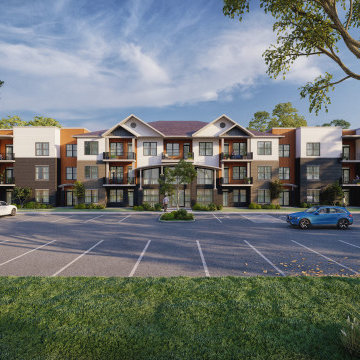
User3d architectural visualization has visualized a residential apartment in Chicago, Illinois. The studio used a variety of software, including 3ds Max, V-Ray, and Photoshop. The finished product is a realistic and accurate representation of the proposed Residential Apartments. The 3D visualisation help's you to convince the local authorities to approve the project. Yantram 3d architectural design services created Residential Apartments in Chicago, Illinois. Here you can see the exterior of an amazing residential apartment and a beautiful garden where you can enjoy your morning exercise or do some yoga. There is a huge parking area and also a thoroughfare where you can walk or you can use a bicycle.
3d architectural visualization communicates your clients' proposed designs and beautifully tells their story with realistic elements such as carpets, furniture, paintings, and lights can also be added and their effects can be observed in detail. Yantram 3d architectural design services provide clients with clear and concise images that depict their ideas for the design of a space and allow you to see your project from every angle and make changes before construction even begins.
For More Visit: https://www.yantramstudio.com/
 Fabco Sanctuary
The architect and designer Guy Derwent was approached by his client with a clear and compelling brief: to completely transform a grand Victorian terrace house they were planning to renovate. The client envisioned something far beyond a standard renovation – this was to be a bold and dramatic reimagining of a family home that could grow with them over time.
With the property having remained largely untouched for more than fifty years, the architects saw an opportunity to unlock its potential and deliver a contemporary design that would contrast beautifully with its Victorian heritage.
The existing layout consisted of a series of small, disconnected rooms to the rear of the house. To respond to the client’s need for openness and flexibility, the architect proposed a radical restructuring of the ground floor:
The rear rooms were completely removed
Suspended timber floors were lowered by up to two metres to align with the garden
Two bold extensions were added
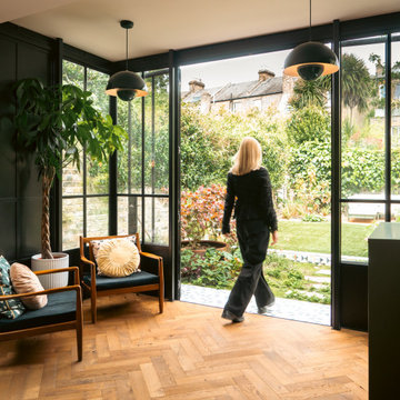
The first extension filled in the side return with a London stock brick facade and a glazed roof, while the second – a striking black steel and glass pavilion was glazed on three sides and placed along the garden elevation.
This new pavilion redefined the building’s relationship with the garden. Its steel-framed glazing created a seamless dialogue between interior and exterior, offering a sense of immersion in the surrounding landscape.
At the heart of the plan sits a dramatic, five-metre-tall dining space that acts as a transition from the original entrance hall into the new addition. A large, circular cast-glass window, framed in steel, provides a visual and spatial link between old and new, allowing light and movement to travel through the depth of the home.
Throughout the project, a series of black metal elements were introduced as sculptural interventions – each marking moments of transformation within the house. These included the bespoke steel framed circular window, a custom metal staircase, a cylindrical support column, and the striking steel and glass garden pavilion. Together, they formed a coherent architectural language that underscored the project’s bold intent.
Our steel windows and doors played a vital role in delivering the project’s vision. The architects chose steel for its refined sight lines and distinctive material character, which helped bridge the gap between the historical context of the building and the bold new additions.
The black steel frames provided a crisp contrast to the pale London stock brick and added definition to the glazed pavilion, reinforcing the sense of architectural precision. In particular, the fine steel profiles of the garden room allowed the extension to feel both lightweight and immersive, blurring the boundary between the house and its garden.
The architect drew inspiration from the Bauhaus Movement, particularly the work of Walter Gropius, whose approach to functional beauty and industrial materials informed the design of the garden pavilion.
Here, our glazing system was used not just for transparency, but as an expressive architectural element. The carefully proportioned panels help to conceal the roof thickness and reinforce the pavilion’s industrial yet abstract character – a deliberate nod to product design and modernist detailing.
Sustainability was an important factor in the selection of materials. Our steel systems, made from 99% recycled content and 100% recyclable, aligned with the project’s broader environmental goals.
The architects noted that this commitment to material longevity and circularity was central to their decision to use steel. The durability and recyclability of the windows and doors ensured the project met both aesthetic and ethical criteria.
This London terrace house now stands as a celebration of contrast – between heritage and innovation, solidity and transparency, tradition and transformation. Our steel windows and doors were not simply components; they were essential tools in crafting a home that is as bold and expressive as it is functional.
The result is a home designed for modern family life, where light, space, and materiality come together in perfect harmony.
 Cypress Homes, Inc.
Sunroom - transitional light wood floor sunroom idea with no fireplace and a standard ceiling
Sponsored
Columbus, OH

Snider & Metcalf Interior Design, LTD
Leading Interior Designers in Columbus, Ohio & Ponte Vedra, Florida
 R.S. Walsh Landscaping, Inc.
This British Colonial theme new residence sits atop the ridgeline on the west end of Sanibel Island overlooking the Gulf. Carefully manicured dune and beach access offer breathtaking views from the main and upper patios of the residence to the beach and the sunset.
A lush, tropical entry runs the length of each side property line from the road, along each side of the house, to the CCCL line and provides a dense privacy barrier from the beach access path along the east property line. Tropical bamboo, white bird of paradise, traveler palms, dwarf leaf clusia and relocated native trees and shrubs make up the dense buffer.
In the front of the residence a specimen multi-stem Sylvester Date Palm anchors the center drive island while stately royal palms, foxtail palms and multi-stem adonidia palms accent the foundation of the residence. Curved coconut palms march down the driveway to the street. Individual theme gardens were created in the side yards which include a Moon Garden, Fruit Garden, Butterfly Garden, Wetland Garden, Tropical Garden and Bamboo Garden.
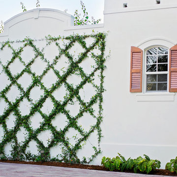
Architectural garden elements include a Walpole garden gate, arbor and mail box with a custom house name sign attached. As one walks the many different specimen gardens, large concrete garden benches from Curry & Co. offer a place to pause while botanical plant label stakes indicate plant species and origin. A California style espalier wall with confederate jasmine vine softens the back side of the pool wall, which is visible upon the entrance to the garages and espalier on the pool side wall for trellis bougainvillea offer vertical elements to connect the house and the landscape with tropical vegetation and color.
This ideal client had a specific idea for their property which we were able to visualize and bring to reality.
 Simply Home Decorating
This penthouse condo in Raven Woods is home to an adventurous, nature-loving couple. With their children grown and starting families of their own, Jeremy and Cynthia (names changed) chose to downsize their livable space and “upsize” in quality and luxury.
The couple hired us to help them achieve several well-defined goals: feeling immersed and connected to nature, having warm and welcoming spaces to host their family and friends, and selecting pieces that would support local makers and artisans. (If you know me, you know that nature, connection, and community are some of my most important values, personally and professionally — the perfect fit!)
Using our comprehensive design process, we spent months designing, procuring, and installing their new, long-time home. The resulting spaces are breathtaking, creating a daily living experience that is full of serenity and bliss.
Welcoming & Bright Home with Forest Views:
Ahhh… can you imagine coming home to a space as bright and soothing as this one? To find inspiration for this home’s interiors, we needed to look no further than out the windows, where mountain views greet us to the north and the ocean beckons from the south.
Paying homage to their locale, we curated a colour palette of subtle blues and grays, warm-toned woods, and natural materials, all set against a crisp, white backdrop. These help us create a seamless visual transition between the interior and exterior. Let’s start our tour in the living area…
A Cozy Living Area with Warmth & Dimension:
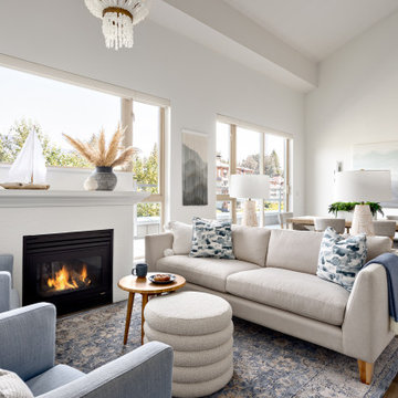
In the living area, the fireplace was the starting point for the design, as it determined the size of the space and the scale of our furnishings. To keep this area feeling cozy but not crowded, we selected this soft ottoman to serve as a table surface with a tray or as additional seating when Jeremy and Cynthia host guests. (Multi-purpose items are one of the 5 elements of The Simple Home.)
Additional textures — the sofa, upholstered swivel chairs, pillows, and ceramic wall art reminiscent of sand dollars — offer further depth and dimension in this simple yet layered space. The result is a cozy living room area perfect for a relaxing read on an overcast day or a social evening by the fire.
While daunting at first, this home’s small and open footprint offered a special opportunity for us to design thoughtful “zones”. To create a defined living space, we used an area rug to establish a border and situated the larger seating (the sofa) on the right. Its visual weight serves as a grounding barrier that naturally separates the living and dining areas.
Overhead, the centrally located brass and glass chandelier serves as another focal point, making the entire living area feel like one unit. Last but not least…
Styled with tall decorative lamps, this light oak and rattan console sits just behind the sofa, creating an additional visual barrier between the living and dining areas. We styled it with accessories that complement the overall palette, and it has the added benefit of providing storage right where Jeremy and Cynthia need it, the dining area.
An Art-Infused Dining Area:
The dining area is warm, woodsy, and filled with locally sourced art that Jeremy and Cynthia love. Next to the console is a custom textile piece from Vancouver artist, With Strings Attached, that mimics the scenic, mountain backdrop. The blue hues of the piece work in harmony with the warm wood dining table, cool gray upholstered chairs, and neutral stools at the kitchen bar.
On the other side of the space, is Jeremy’s and Cynthia’s favourite piece, a commissioned work of art by local maker, Katie Napier. Carefully positioned in a central location and framed by two modern sconces, this piece captures the feel of gentle waters on a misty day and evokes calm.
Other curated pieces include this rectangular vessel centrepiece by sculptural artist, Martha Sturdy, bearing a stunning moss arrangement by Soul Roots Moss Art. As this couple can attest, a treasured memento or piece of art can transform your space and your mood, transporting you to a relaxed and peaceful state.
A Bedroom Full of Light & Texture:
This beautiful bedroom is another manifestation of Jeremy and Cynthia’s favourite experiences: hiking the rainforest trails and enjoying the spray of the sea. The blue-and-green branching pattern found in the window treatments and pillows ground the space, while bright turquoise lamps — akin to sea glass — infuse the room with a touch of coastal vibrance.
Similar to the living area, we added comfort through texture and warm tones, incorporating oak end tables, natural woven wall decor above the headboard, knitted ottomans at the foot of the bed, a textured duvet, and an extra plush area rug.
A Loft Inspired by Flora & Fauna:
For the loft space, we moved away from coastal elements and decided to ground the space in the more earthy elements of nature: flora and fauna. We selected an umber-hued sofa complemented by floral decorative pillows and walls adorned with botanical prints by Heather Johnston.
This multi-purpose space serves as a reprieve for our clients to read, practice yoga, and relax. Alternatively, a Frame TV intentionally meant to blend as art allows the space to function as a secondary entertainment space or a place for their granddaughter to play and sleep over.
Praise from Our Clients:
This home’s small footprint pushed us to be more resourceful in our furniture sourcing and more creative in our space planning. The result is a home as livable, beautiful, and intentional as any larger home would be. Most importantly, Jeremy and Cynthia love it!
“Lori listened to our love of nature and designed our condo reflecting that love. It is beautiful, serene, and welcoming. We couldn't be happier.”
If you’re ready to uncover the hidden potential in your home, that is what we do best. Contact us here or download our complimentary guide below to discover more.
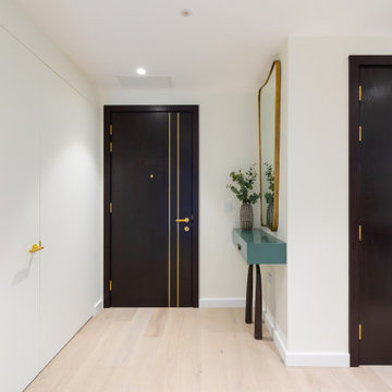
 Ezyjamb
The striking black and gold finishings are contrasted by the EzyJamb openings which don't draw attention away from these visual elements.
Minimalist entryway photo in London
Minimalist entryway photo in London
34