
Search results for "Visually expanded" in Home Design Ideas
 Crystal Kitchen + Bath
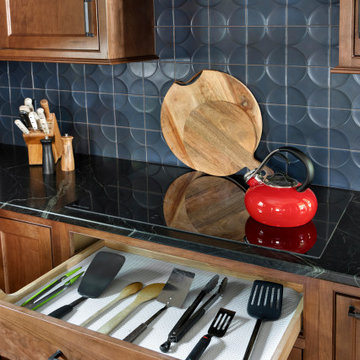
The goal for this 1939 Tudor-style story-and-a-half home was to create a kitchen that offered the conveniences, storage, and performance of a modern workspace while preserving the warmth, craftsmanship, and vintage charm that made the home special. The client, an avid home cook, wanted the room to feel as though it had always belonged to the house, with thoughtful upgrades that respected the original architecture rather than competing with it. Just as important, she needed a more efficient layout with enough storage for small appliances, so everyday cooking would no longer require carrying items up from the lower level.
Several existing conditions shaped the design approach. The kitchen retained original, amber-stained birch woodwork that the client wished to keep, and the compact footprint was interrupted by six doorways and two windows, none of which were to be moved, altered, or replaced. A previous flooring update had left the door casings undercut too short, creating visible gaps where the casing met the floor. The existing vintage 40-inch range also lacked proper ventilation, yet the client wished to accommodate a refrigerator, dishwasher, cooktop, double ovens, built-in microwave, and effective venting above the cooktop into the new kitchen layout.
To honor the original millwork, beaded inset-style cherry cabinetry was selected in a soft, hand-rubbed finish that will deepen over time and develop a natural patina. Charcoal-gray soapstone countertops complement the cabinetry while reinforcing the historic character of the home with an organic, timeworn texture. The former breakfast nook was transformed into a butler’s pantry, adding valuable base cabinet storage and expanded work surfaces for frequently used small appliances. Also in the butler’s pantry, a single upper cabinet was paired with open shelves to give an open, airy feeling while adding character and practical storage. A classic single-bowl apron-front workstation sink contributes both period-appropriate character and practical prep and cleanup function.
Because the home’s openings were such a defining feature, the design worked within the existing architecture instead of altering it. Custom plinth blocks were created for each doorway to extend the original casing gracefully down to the new natural red oak flooring, resolving the earlier construction issue while adding a detail that feels authentic to the age of the house. Despite the number of door and window openings, the new layout provides a significantly more functional, built-in kitchen with an improved work triangle for serious cooking.
Appliance placement was carefully planned to deliver the requested performance without overwhelming the small room. Three cooking functions (double ovens & microwave) were consolidated into one location with a GE Café double oven featuring Advantium Technology, while the client’s compact 31-inch refrigerator was reused to preserve space. A sleek 30-inch induction cooktop provides efficient cooking, and a Vent-A-Hood ARS ductless vent hood supplies needed ventilation without requiring a duct run to the exterior.
The finish palette balances richness, texture, and historical sensitivity. A deeply textured navy backsplash tile adds depth and dramatic shadow play against the soapstone, while wallpaper in the back entry echoes the tile’s geometric pattern to visually connect the adjoining spaces. Oil-rubbed bronze cabinet hardware and light fixtures enhance the warmth of the cherry cabinetry and complete the antique-inspired feel.
Lighting was layered to make the compact kitchen brighter, more useful, and more inviting. Vintage-style semi-flush ceiling fixtures establish the overall tone, while dimmable puck lights highlight select areas and undercabinet task lighting keeps work surfaces well illuminated.
The completed kitchen now feels both highly functional and deeply rooted in the home’s history. Rich cherry cabinetry, velvety soapstone, natural red oak flooring, navy tile, bronze accents, and carefully preserved birch trim work together to create a warm, cohesive space that celebrates timeless craftsmanship. By increasing storage, improving workflow, integrating modern appliances, and respecting the Tudor home’s original character, the design achieves the client’s vision: a kitchen that feels personal, practical, historically appropriate, and as though it has always been there.
 Sha Studio Inc.
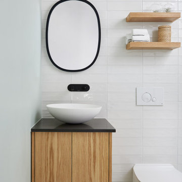
A 'slow-designed' bathroom that places importance on using sustainable materials while supporting the community at large. It is our belief that beautiful bathrooms don't have to cost our earth. Our goal with this project was to use materials that were kinder to our planet while still offering a design impact through aesthetics. We scouted for tile suppliers who are conscious of their environmental impact and found a Canadian maker of the terrazzo tile. It is a mix of marble, granite and natural stone aggregate hand cast in a cement base. We then paired that with a ceramic tile, one of the most eco-friendly options and partnered with local tradespeople to craft this highly functional and statement-making bathroom.
 Crystal Kitchen + Bath
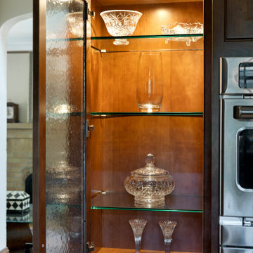
The goal for this 1939 Tudor-style story-and-a-half home was to create a kitchen that offered the conveniences, storage, and performance of a modern workspace while preserving the warmth, craftsmanship, and vintage charm that made the home special. The client, an avid home cook, wanted the room to feel as though it had always belonged to the house, with thoughtful upgrades that respected the original architecture rather than competing with it. Just as important, she needed a more efficient layout with enough storage for small appliances, so everyday cooking would no longer require carrying items up from the lower level.
Several existing conditions shaped the design approach. The kitchen retained original, amber-stained birch woodwork that the client wished to keep, and the compact footprint was interrupted by six doorways and two windows, none of which were to be moved, altered, or replaced. A previous flooring update had left the door casings undercut too short, creating visible gaps where the casing met the floor. The existing vintage 40-inch range also lacked proper ventilation, yet the client wished to accommodate a refrigerator, dishwasher, cooktop, double ovens, built-in microwave, and effective venting above the cooktop into the new kitchen layout.
To honor the original millwork, beaded inset-style cherry cabinetry was selected in a soft, hand-rubbed finish that will deepen over time and develop a natural patina. Charcoal-gray soapstone countertops complement the cabinetry while reinforcing the historic character of the home with an organic, timeworn texture. The former breakfast nook was transformed into a butler’s pantry, adding valuable base cabinet storage and expanded work surfaces for frequently used small appliances. Also in the butler’s pantry, a single upper cabinet was paired with open shelves to give an open, airy feeling while adding character and practical storage. A classic single-bowl apron-front workstation sink contributes both period-appropriate character and practical prep and cleanup function.
Because the home’s openings were such a defining feature, the design worked within the existing architecture instead of altering it. Custom plinth blocks were created for each doorway to extend the original casing gracefully down to the new natural red oak flooring, resolving the earlier construction issue while adding a detail that feels authentic to the age of the house. Despite the number of door and window openings, the new layout provides a significantly more functional, built-in kitchen with an improved work triangle for serious cooking.
Appliance placement was carefully planned to deliver the requested performance without overwhelming the small room. Three cooking functions (double ovens & microwave) were consolidated into one location with a GE Café double oven featuring Advantium Technology, while the client’s compact 31-inch refrigerator was reused to preserve space. A sleek 30-inch induction cooktop provides efficient cooking, and a Vent-A-Hood ARS ductless vent hood supplies needed ventilation without requiring a duct run to the exterior.
The finish palette balances richness, texture, and historical sensitivity. A deeply textured navy backsplash tile adds depth and dramatic shadow play against the soapstone, while wallpaper in the back entry echoes the tile’s geometric pattern to visually connect the adjoining spaces. Oil-rubbed bronze cabinet hardware and light fixtures enhance the warmth of the cherry cabinetry and complete the antique-inspired feel.
Lighting was layered to make the compact kitchen brighter, more useful, and more inviting. Vintage-style semi-flush ceiling fixtures establish the overall tone, while dimmable puck lights highlight select areas and undercabinet task lighting keeps work surfaces well illuminated.
The completed kitchen now feels both highly functional and deeply rooted in the home’s history. Rich cherry cabinetry, velvety soapstone, natural red oak flooring, navy tile, bronze accents, and carefully preserved birch trim work together to create a warm, cohesive space that celebrates timeless craftsmanship. By increasing storage, improving workflow, integrating modern appliances, and respecting the Tudor home’s original character, the design achieves the client’s vision: a kitchen that feels personal, practical, historically appropriate, and as though it has always been there.
Find the right local pro for your project
 The Amendola Group, Inc.
This Gristmill Lane project’s stunning pool and patio area showcase exceptional masonry craftsmanship. Expanding the area’s use long into the late fall season, an outdoor fireplace and large pavilion area feature stonework chosen to complement the home. An intricate paver walkway greets guests to the home while hinting at the visual surprises that await.
 Michael Nash Design, Build & Homes
Built in the early 1950s, this small urban townhouse is located in North Old Town Alexandria in an area currently undergoing major redevelopment. The neighborhood is popular with, and affordable for, young people and families, and very convenient to Washington, DC.
In its heyday, the townhouse touted a stately brick exterior, plaster walls, tongue and groove wood flooring and beautiful wooden staircase. Sixty years later, however, the homeowners were faced with crumbling masonry, sagging floors, a double layer of wallpaper over the plaster walls, a crumbling staircase, a dysfunctional kitchen and small, dark second floor rooms. Additionally, the basement had a low ceiling, moldy and cinder block walls, no plumbing and a large boiler taking up most of the space.
The homeowners’ goal was to restore the exterior’s historic look while creating an interior up-to-date for the 21st Century. To turn their vision into reality, they turned to Michael Nash Design, Build & Homes.
Design Solutions
To maintain the townhome’s historic exterior, the Michael Nash team carefully removed, salvaged, restored and reused existing brick masonry. Matching fascia boards and windows were combined with existing windows to complete the exterior renovation.
All interior walls were gutted and reframed. New electrical work, new insulation and new drywall were installed. Much of the home’s original trim was salvaged and reused, as was a piece of art glass, all to keep a bit of the past in the renovation.
The sagging subfloors were fixed, new hard wood floors were installed and a new staircase and railing were designed in a style similar to the original.
The solid wall between the kitchen and the dining room was removed, plumbing was relocated for a new sink location and the kitchen got expanded with an island into the dining room. Closet and plumbing stacks were relocated to allow a new space for fridge. Stainless steel appliances, granite countertops and custom cabinetry highlight the new modern kitchen.
The plan called for redesigning the three bedrooms on the second floor to allow a larger bathroom, walk-in closet and wider hallways. In addition to new roofing, a large skylight was installed to allow natural light into the bathroom and the upper hallway.
The basement was totally revamped. New plumbing was put in place for a full bathroom, laundry room and a den. New e-grass window was installed in the basement to bring this basement up to current building codes.
This homeowners love the neighborhood and now their home gives them the opportunity to stay in the same location.
 Klopf Architecture
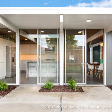
Joseph Eichler developed his moderately priced houses for the mass-market starting in 1949. His homes were designed using affordable materials and simple construction techniques. Nearly 70 years later these homes are in need of updating and remodeling an Eichler home today can become an imposing and costly project if you’re not careful. For this project the clients, who had undergone several previous house renovations, were determined to stick with an established budget from the beginning. Klopf Architecture helped them modernize their Eichler with a premium appearance on a reasonable budget.
The clients challenged the Klopf team to create a design that had a high-end feel and nicely done while adhering to their budget. That meant not all of the initial project scope could be built. Like many other Eichler homes, the original floor plan did not meet the family’s needs leaving them feeling disconnected from one room to another. While an early goal was to expand the house into a carport and create a larger garage, it did not survive the contractor pricing phase of the project.
The goals that did survive through to the end of the project included blurring some of the boundaries and opening up some of the spaces, making them more functional and creating a smoother flow in the house. The Klopf team joined the former separate kitchen and formal living room into one large space and shift the dining room where it is now connected to the kitchen. Klopf swapped the family room to the front alongside the living room, so the spaces feel more cohesive and are now better suited for family activities. The functional layout of the master bathroom was changed to include a large, curbless shower.
Installing a complete IKEA kitchen including cabinets, countertops, appliances, light fixtures, and furnishings was key to staying within budget. Bath fixtures in this house are also exclusively IKEA. Klopf Architecture has designed many homes using IKEA products, which are quite compatible offering an affordable, contemporary take on Eichler homes. The clients saved additional money from the simplicity and availability of IKEA products and by orchestrating the orders and purchases themselves. Following each construction meeting, the clients would make a run to IKEA and purchase items, pick up needed spare parts, and bring them back right away to stay ahead of the contractor’s schedule and minimize the chance of delays and bottlenecks.
Klopf balanced material selections by retaining some of the original woodwork and simply refinishing the mahogany paneling. They were able to retain the original windows and sliding doors which were still in good shape, avoiding some of the most costly replacement expenses. Additionally interior doors were simply refinished and the exterior siding cleaned up and repainted. Formerly dark interiors are now illuminated with new slimmer semi-recessed lighting eliminating the need for costly roof work.
Attention to design details allowed the Klopf team to ensure the house ended up with a high quality feel. Key visual elements were strictly aligned and Klopf worked with the clients to select a unified materials palette throughout the spaces so the house flows seamlessly together. Aligning the tile layout with the trusses and keeping it level with the concrete slab outside allowed them to achieve a level of quality that may otherwise be missed.
The clients were able to keep their budget on track by determining clear goals and making critical decisions upfront, choosing materials and furnishings wisely, working with the right design and construction teams in place and to a large part, their willingness to participate throughout the process. In the end the clients were much happier with their reconfigured Eichler home and Klopf Architecture managed to keep their remodeling costs to about $325/sf – a good amount below the average Bay Area Eichler remodel.
Project Team: John Klopf, Angela Todorova, Sherry Tan
Contractor: Keycon Construction
Structural Engineer: Sezen & Moon
Photography: Sabrina Huang
Year Completed: 2020
 Kitchen Magic
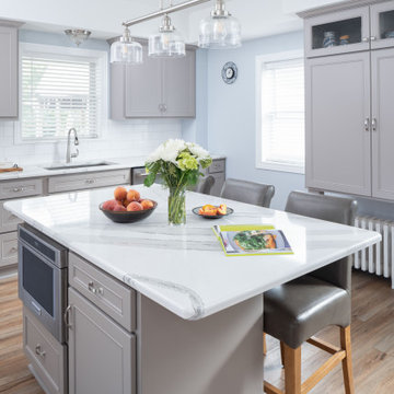
Oak wood cabinets went against the grain for this homeowner. Previously, the former kitchen yielded a yawn-worthy amount of neutral sub-par wood grains. Now, the new remodel is enveloped in warm, inviting taupe hues. Going from woodgrain to flat color instantly infuses a clean, fresh palette. The combination of flat color in a warm tone offers the same warmth of wood.
From traditional to a modern minimalist sensibility, the homeowners refaced existing cabinets in Prestige Statesman Beaded Edge style doors are accented with satin nickel hardware. Additionally, the homeowners knew refacing was an excellent choice. Refacing offers a quicker solution to transform sturdy existing cabinetry to a brand-new effect.
As for the countertops, Cambria Quartz in Brittanicca brings a fresh, rich effect with a simple cream swirl to coordinate perfectly with the stone-hued cabinetry. A round over edge brings a minimalistic look to make a designer statement. The Brittanicca pattern in engineered quartz suggests the look of marble yet offers significantly more durability and antimicrobial properties.
Meanwhile, a solution for the underused space over the kitchen radiator was needed, adding that the area now serves as a highly functional pantry. The custom pantry was the "icing on the cake," particularly with glass front doors, to create a focal point. In all, the design choice also works to expand the kitchen visually.


 The Amendola Group, Inc.
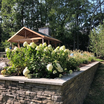
This Gristmill Lane project’s stunning pool and patio area showcase exceptional masonry craftsmanship. Expanding the area’s use long into the late fall season, an outdoor fireplace and large pavilion area feature stonework chosen to complement the home. An intricate paver walkway greets guests to the home while hinting at the visual surprises that await.
 Summit Landscape
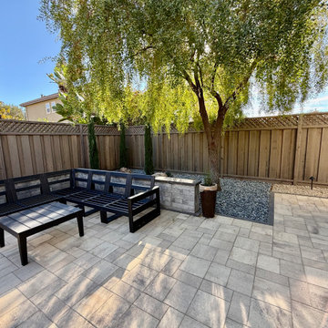
A messy corner with over crowding trees and shrubs turned into a rock garden. Expanded patio into a previously blank space. L shaped free standing wall provides visual barrier and coziness in the seating area.
 Drury Design
THE SETUP
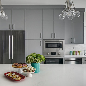
Multiple ovens, multiple workspaces, multiple sinks – when you think about it, non-jewish kitchens have been adapting the criteria of kosher kitchens for years.
Gladys’ clients in West Rogers Park are Orthodox Jewish. The house they bought already had a kosher kitchen – it just wasn’t done that well. It needed some more things to be duplicated for the dairy side and the meat side. Plus, it was dark and the configuration wasn’t very conducive for a family of eight.
It was time for a remodel.
Design Objectives
Improve kosher kitchen
Add more storage in the island
Better lighting
More open, lighter feel
Change the wood floor in the kitchen to tile
THE REMODEL
Design Challenges
- We had originally planned on removing a wing wall by the breakfast area. During demolition, we learned it contained a support beam.
- The kitchen is a substantial size, but having two sinks, dishwashers, and ovens presented a challenge – how do we fit it all in and make it flow with the storage still accessible near the work areas?
Where do you stop the materials for the new space? - -- The right tile, paint, lighting, etc. would be needed to make the remodeled area cohesive with the rest of the main floor.
- An existing column limited cabinet options and thus, storage capacity. Could we conceal it without disrupting the cabinetry flow?
Design Solutions
- We had to keep the wing wall, but decided to continue the tile on the sides of the cabinets and maintain the height of the tile to line up with the rest of the backsplash. This actually presented a very nice and cohesive look, especially since the opposite side has a wing wall to the left of the refrigerator.
- We used “L-shaped” corner sinks instead of the rectangular ones set on an angle. This gave us more of the legs of the triangles versus the hypotenuse, which allowed for the two dishwashers, and the pullout utensil canisters and spice pullouts while still keeping the 3-drawer cabinets on either side of the range (by the sinks). The old island had the recess for stools which the family never used. By extending the width of the island 6” and utilizing this leg space, we were able to fit 18”-deep cabinets on this side – adding lots of accessible storage. The family can now work simultaneously on the dairy side (the side with the fridge) and the meat side (opposite) without getting in each other’s way. We separated the cooking by using the range oven for the meat and a built-in microwave in the base cabinet. The wall oven with built-in microwave on top is for dairy.
- Corner sinks opened up the middle area for a wider range – we went from a 30” to a 36”. Removing all the wall cabinets (on the range wall) made a big difference. That opened up the entire space while adding some visual impact. (Not pictured: We also made the cabinets directly opposite the range wall tall and removed the countertop, resulting in more room for rollouts and even more storage!) The kitchen now has more storage than it did before.
- We ended up painting the ceiling of the kitchen into the hallway that leads to the foyer. The living and dining rooms were separated by a soffit, so that became a natural boundary. We kept the tile in the kitchen by stopping it short of the hallway and lining it up with the pantry wall. This creates a border between the breakfast area and family room. The rest of the existing wood floors were refinished to refresh and make the hue darker. We also painted a dark accent wall and carried it into the breakfast area to make the rooms look deeper.
- The in-the-way column housed plumbing and couldn’t be moved. We still built cabinets in that spot – we just had to build a chase inside it to conceal the pipes. There was still plenty of room for new storage. We also took the cabinets all the way to the ceiling. The continuous tall cabinets added a functional elegance to the space.
THE RENEWED SPACE
The client’s long-awaited dream of a better kosher kitchen has finally been achieved, beautifully combining enhanced storage solutions with adherence to the family’s orthodox dietary laws. The kitchen’s standout feature, an expanded island, now offers a spacious and efficient workspace. This allows several family members to cook together comfortably, without the inconvenience of bumping into each other, ensuring a harmonious and productive cooking environment.
 ASF Interiors, LLC
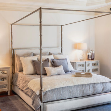
Soft hues of gray-blue blended with soft creams brought this room to a happier state. A Bernhardt canopy bed made with heavy, metal post draws the eyes upward and expands the space tremendously.
 Ground One Landscape Design + Build
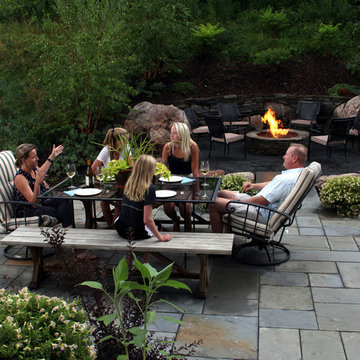
Ground One designed and built a deck off the back of the house for casual sitting, mirroring the house’s front porch. This deck and the screened porch steps descend to a patio terrace. To expand the entertaining space and accommodate the setback restrictions for a permitted gas firepit, we excavated the lot’s back slope to gain bonus space and create a rustic campfire spot. Large boulders found on the site during house construction are incorporated into a retaining wall. Colonial bluestone fills the gaps between these large accent stones and surrounds the firepit. Additional boulders hold up the patio and a slab of bluestone bridges the terrace and patio, preserving the overall drainage pattern. Bluestone is the common thread throughout the project, but it is used in different forms; clean lines closer to the house transition to a more weathered look as you move toward the natural area. The swale is a variety of boulder sizes and river rock to create a more visually-compelling creekbed.
The firepit patio is comfortable for just two people, but can also accommodate a larger group. It is close to the dining space, but physical separation allows for entertaining in different configurations: pre-dinner cocktails around the fire, a roaring flame as backdrop during dinner, kids roasting marshmallows while the adults linger within sight at the dining table, or the gang huddled around a bonfire.
 The Decorating Therapist
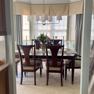
The connection between the kitchen and dining room was a key focus of this luxury home renovation. Originally, the passage measured just 28 inches wide, with the refrigerator partially obstructing the opening, creating a cramped bottleneck that made it difficult for two people to pass comfortably. Expanding this doorway was one of the homeowner's highest priorities for improving both everyday living and entertaining.
The redesigned 42-inch-wide opening dramatically enhances circulation, accessibility, and the visual flow between the kitchen and dining room. The wider entry creates a more open, inviting transition that supports effortless entertaining while allowing the two spaces to function as a cohesive whole. This thoughtful space-planning improvement not only increases comfort and convenience but also contributes to the home's elevated, luxury aesthetic by making the floor plan feel more spacious, connected, and welcoming.

Sponsored
Columbus, OH

Snider & Metcalf Interior Design, LTD
Leading Interior Designers in Columbus, Ohio & Ponte Vedra, Florida
 Brittanys Design
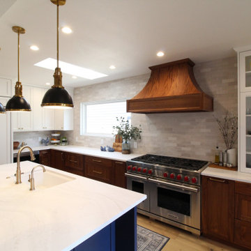
Client’s were seeking a luminous, coastal-inspired kitchen that honored Puget Sound views, the clients required a high-functioning space for an expanding family, including four adult children and future in-laws. The plan prioritizes abundant storage, intuitive cooking and cleanup zones, and seamless guest circulation that preserves the workflow. Custom walnut base cabinetry lends resilience, warmth, and visual depth, balanced by honed quartz and airy wall cabinetry. Navy island cabinetry, nautical fixtures, and a mixed hue backsplash evoke the shoreline without feeling overly thematic.
 Klopf Architecture
Malibu Glass Box House by Klopf Architecture
Following the devastating Woolsey Fire of 2018, the site in Malibu offered a unique opportunity to rebuild not just a home, but a new architectural composition that highlighted the property’s potential while navigating strict fire-rebuild codes in the area. Designed by Klopf Architecture, this project embraced a set of limitations and translated them into an architectural asset.
The city’s fire-rebuild process required the new structure to remain close to the original footprint, size and bulk, a constraint that ultimately clarified the architectural direction. Perched near the front of a long, narrow lot, the new home frames and overlooks a private, park-like rear expanse, an uncommon luxury especially in this part of Malibu .
Without a fixed program, the design process allowed for a different kind of creative focus allowing Klopf Architecture the opportunity to explore how a modernist home could best respond to this site. The team approached the project not with a list of requirements, but with a question: How might a modernist live here? What spatial qualities would inspire calm, connection, and a sense of wonder in this setting? The process became less about problem-solving and more about architectural storytelling—letting the site, the light, and the principles of modern design guide the form and flow of the home.
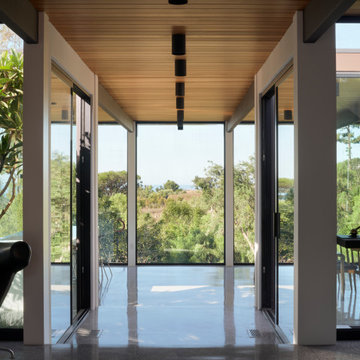
The response emerged in the form of a glass-box pavilion, an open, Mid-Century Modern inspired living, dining, and kitchen space that floats at the edge of the property’s natural descent. Connected to the more enclosed, private areas of the home by a glass-walled hallway, the living pavilion becomes a distinct centerpiece of the design. It opens on all four sides to the landscape with decks and patios on the flanks, an internal garden and water feature to the north, and a dramatic unguarded view of the expansive backyard and ocean horizon to the south.
Because of the mandated footprint, careful planning was required to ensure every space could still engage with light, landscape, or both. Strategic voids in the form of atriums and courtyards allow daylight to filter deep into the home’s core, while offering moments of surprise and retreat. These design gestures allow natural light to filter deep into the interior, creating a sense of brightness and openness throughout the day. At the same time, they expand the perceptual boundaries between inside and out, making the home feel more expansive while anchoring its connection to the surrounding landscape.
The siting of the house is what gives it its unique character. Rather than receding into the backyard like the neighboring homes, the house holds a slight prominence. From the central living pavilion, stepping down into the landscape feels more like entering a secluded park where a separate existing accessory structure, trail, and recreational areas await. The home’s modest street presence gives way to this unfolding drama of space, view, and nature.
Fire-resilient materials and assemblies are integrated seamlessly throughout including triple-pane glazing, under-slab and roof insulation, and locally sourced fire-rated cladding ensure the house not only meets Calfornia’s rigorous wildland-urban interface (WUI) standards, but feels effortlessly aligned with them. While technical decisions like fire-hardening and mechanical systems presented some construction challenges, particularly around the cantilevered glass box, the team found a functional compromise that preserved the integrity of the design.
Inside, a restrained palette and exposed post and beam design celebrate the ethos of mid-century modernism. A central circulation spine extends from the entry to the rear glass wall, offering a continuous visual link from street to ocean. Spaces such as the library and office, though more intimate in scale, are never cut off from nature as each opens to its own unique courtyard or garden view.
Though born out of a strict regulatory framework and developed without a specific client, the rebuild design unfolded with remarkable clarity. Grounded in site logic, refined by limitations and an emphasis on timeless spatial relationships – light, proportion, and a strong connection to nature, the resulting design feels both effortless and uplifting. The home lives lightly on the land, opens generously to its surroundings, and strikes a careful balance between privacy, openness, and calm. For Klopf Architecture, it stands as a compelling case study in how site, code, and circumstantial constraints can inspire enduring, modernist architecture. With years of experience reimagining mid-century modern design for how people live today, the firm took the project’s limitations as an opportunity. The result is a home shaped by open, flowing spaces, strong indoor-outdoor connections, and a calm, clear sense of structure. It’s a good reminder that even with strict constraints, there’s still room for architecture to breathe—and for modernism to keep moving forward.
Klopf Architecture project team: Geoff Campen, John Klopf, AIA, and Sherry Tan
Structural Engineer: ZFA
Contractor: Maison D’Artiste
Photography: ©2025 Mariko Reed
Year Completed: 2023
 Moto Designshop
Over the years, this Gladwyne home suffered numerous piecemeal renovations and modifications, and was in dire need of a cohesive vision. Seeing past this, the new owners purchased the property because of the home’s unique siting on the land. Abutting the eastern property line, they noticed the potential of a proper renovation which would unify the home and create expansive views across the 2 acre site to the west.
Our office was commissioned to create a cohesive design which emphasized these ideas. This completed master bedroom and bathroom suite, marks the end of the first renovation phase. The master suite was expanded and focused around a new 16’ window overlooking the property. The bed is flanked at both sides with a sitting area and custom casework. The perpendicular floor boards define the space and pull the eye into the closet/bath. A composition of reflections distort boundaries, pulling outside inward and provide an evolving seasonal experience.
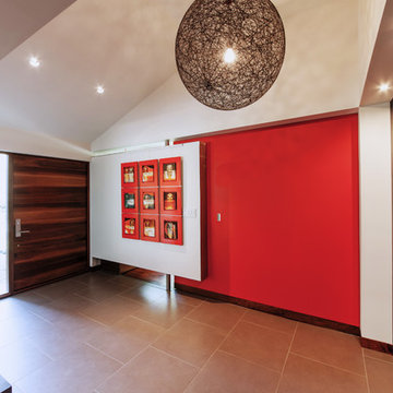
For the lower floor renovation, the client requested the removal of all dividing walls to make the space as visually open as possible. To do this, the entire 2nd floor was temporarily propped up while the 1st floor structure was removed and a strategically designed new structural steel frame system was installed. The remaining central bearing wall also stabilizes the custom stair treads while the guardrails suspend the opposite end from the ceiling. The floor to ceiling glazing opens the views of the sprawling grounds and provides a casual sitting area. A sliding bright red wall divides the office / family room area and the rough sawn wood cabinetry maintain a handmade warm character to the contemporary design.
 Interlocking Concrete Pavement Institute
2018 HNA Awards Honorable Mention - Outdoor Living Features
Contractor: Artisan Exteriors
Producer: CST Pavers
Designer: Joey Hafner
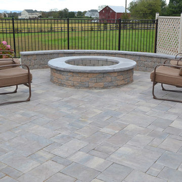
Design: Slate pavers, in a rich Sierra Blend, coupled with Versa-Lok Standard wall units to create multiple outdoor living spaces; masterfully meeting the entertainment requirements of the homeowner. Pavers and wall units, through use of color and texture, provided both definition and an effortless flow – creating a true outdoor oasis.
Quality of Construction and Craftsmanship: Expert workmanship is showcased in the precise paver and wall integration with the pool, spa and outdoor living features. Having a large entertainment space was a must for the homeowners, so the team carved out elevated areas to separate spaces for the pool deck, stage, spa and outdoor kitchen.
Compatibility with Related Construction Materials and Systems: The pool and coping were in great condition but the existing aggregate concrete pool deck was dangerously damaged. Paver and wall units were selected to replace, complement and expand the outdoor living space. Curved steps, coming off the home’s morning room, were added for visual integration and a welcoming element.
Construction Innovation: Vents and basement windows provided several obstacles to construction. To accommodate, designers opted to incorporate a raised patio on a pressure treated lumber frame and utilize the Silca System. To capitalize on the elevation, a portable spa was incorporated into the raised patio.
Overall Excellence: What began as a refurbishment of an existing swimming pool; evolved into a total backyard transformation. Slate pavers and Versa-Lok wall units helped create an outdoor paradise for family and entertainment use with a new pool deck, raised fire pit, raised stage to host musicians, outdoor kitchen and more.
 Infinite Home
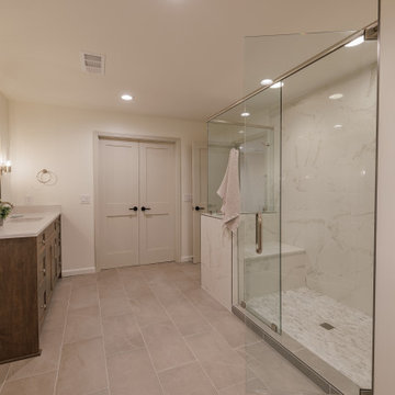
The master bathroom needed to feel like a true retreat—a space where our clients could unwind and start or end their day feeling relaxed. The existing layout wasn’t giving them that sense of calm, so we reimagined the space to make it both functional and serene.
We started by designing a spacious, glass-enclosed shower finished in a
porcelain marble-style tile and accented with modern brushed brass fixtures and a built-in niche for everyday convenience. While our clients loved having a double vanity, they also wanted a little more breathing room to get ready. To create that separation, we utilized an unused area of the bathroom—relocating the toilet into its own private enclosure and expanding the vanity wall for a more open layout.
The warm wood base of the vanity now adds an inviting, organic touch, while the Kichler Aviv wall sconces add sleek visual interest to the room. Now their bathroom feels calm, refreshing, and timeless.
 Modern Outdoor
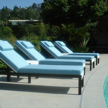
Casual yet elegant, the Etra Collection by Modern Outdoor offers a modern aesthetic that is constructed for outdoor use while being suitable for indoor settings. Etra’s visual inspiration is derived from its architectural-based frame system. Designed using structural angle steel that is mitered and ground, a clean and seamless surface gives Etra its pure appeal.
Frame Options:
• 304 stainless steel that is brushed and electropolished
• marine-grade 316 stainless steel that is brushed and electropolished for use within one mile of salt air, available for an upcharge
• powder coated carbon steel in our standard silver finish
• custom powder coat colors, available for an upcharge
Surface Options:
• sustainably harvested ipe – a beautiful South American hardwood that is three times as dense as teak — naturally resistant to rot, insects, UV exposure, ice, salt, abrasion and splintering – all without the need for toxic chemicals — considered a 25+ year wood
• marine-grade polyboard – a UV stabilized high-density polyethylene material that is non-corrosive and chip resistant – available in six colors for expanded design choices
Fabric Options:
• six standard colors of 100% solution dyed acrylic treated for outdoor use are offered
• custom fabrics and COM service are also available
Cushion Options:
• our standard foam cushions are made from outdoor appropriate high-resiliency (HR) foam
• for clients that prefer less maintenance, a flow-through foam that allows water and moisture to escape the cushion is also available for an upcharge
Etra is a full-breadth line with dining, bar height, lounge, cafe, patio and pool setting pieces included. The pieces are readily customizable for individual client needs.
 ASF Interiors, LLC
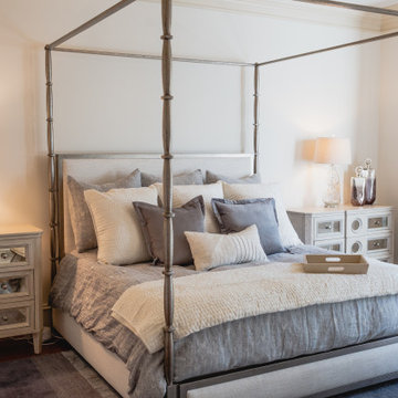
Soft hues of gray-blue blended with soft creams brought this room to a happier state. A Bernhardt canopy bed made with heavy, metal post draws the eyes upward and expands the space tremendously.
73