
Search results for "Visually expanded" in Home Design Ideas
 Vanity Art LLC
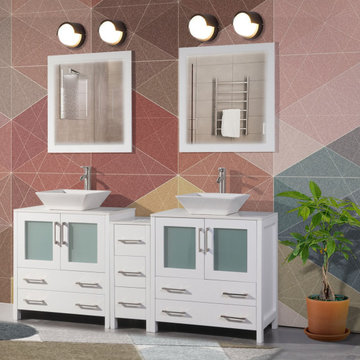
Adding storage to a tiny bathroom is one of the best ways to hide clutter. It also creates a visually larger, more expansive bathroom. This bathroom vanity features smart drawers and shelving that make use of every square inch in the cabinet. Nothing brightens and expands a small space better than a mirror. This vanity set includes a mirror to add style and also create a bigger bathroom effect. The single/double sink elegant bathroom vanity set has ample storage capacity and high-cost performance which fits perfectly with any bathroom decor.
Features:
Soft-closing doors and drawers prevent slamming
Full-width storage shelf, ideal for towels and accessories
Rectangular and practical white ceramic vessel sink
Dove-Tailed Drawers
Brushed nickel handles/hardware
Constructed of high-quality oak wood
Rich and durable finish
Dripless edge profile
 EAG Studio
Refined Continuity: Bridging Classical Architecture and Modern Living
This comprehensive remodel of a grand Cow Hollow residence reimagines a historically expressive envelope through a lens of contemporary livability, precision detailing, and material restraint. The design approach carefully balances the home’s classical proportions and ornamental heritage with a refined, modern sensibility—evident in the disciplined palette of warm neutrals, soft plasters, pale oak flooring, and tailored millwork. Circulation has been clarified and subtly expanded to enhance spatial flow, while openings are leveraged to capture light, garden outlooks, and distant water views. Throughout, architectural interventions are executed with a high level of craft, ensuring that new insertions—whether cabinetry, railings, or apertures—read as seamless continuations of the original structure rather than applied elements.
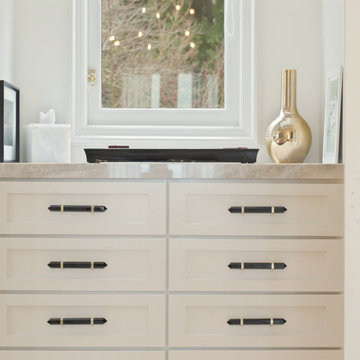
The kitchen serves as the operational and visual anchor of the home, conceived as a sculptural yet highly functional environment. Custom rift-cut cabinetry, softened through a desaturated finish, is paired with honed stone surfaces and integrated brass hardware to create a quiet, tactile richness. A monolithic island establishes a central gathering point, while perimeter work zones are carefully layered with concealed storage, integrated appliances, and open, backlit shelving that elevates everyday objects into curated displays. The adjacent bar and entertaining areas extend this language, reinforcing a cohesive hospitality-driven program. In parallel, the primary bathroom is designed as a serene, spa-like retreat, where bookmatched stone, frameless glass enclosures, and finely detailed metalwork converge. The composition prioritizes symmetry, clarity, and light—balancing generous volumes with intimate moments through integrated lighting, custom vanities, and a restrained material hierarchy.
The library and ancillary living spaces introduce a more intimate scale, anchored by bespoke built-ins that combine closed storage with illuminated display niches, creating depth and rhythm along the walls. Here, material transitions and furniture integration are handled with particular nuance, allowing the architecture to support both quiet retreat and social gathering. A continuous language of custom railings—executed in refined metal profiles—threads through the interior and extends outward, where the exterior gate and garden elements have been reinterpreted to align with the home’s renewed identity. The entry sequence is now defined by a calibrated interplay of solidity and transparency, with sculptural metalwork and landscape integration establishing a sense of arrival that is both secure and elegant. Collectively, the project reflects a holistic transformation—one that elevates performance, livability, and aesthetic clarity while preserving the inherent dignity of the original architecture.
 Az Custom Landscapes LLC
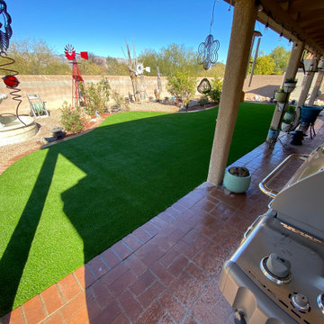
This ground-level, wide-angle photograph captures a premium residential artificial grass installation in Tucson, Arizona, designed and completed by Az Custom Landscapes LLC. The project showcases a clean and vibrant outdoor living solution designed to thrive in the desert heat while dramatically lowering water usage.
The focal point is a lush, high-density synthetic turf lawn featuring a striking, custom-curved layout. The entire lawn is meticulously framed by a flush, red brick paver border that follows the sweeping organic lines of the landscape, creating a beautiful visual transition between the vibrant green turf and the surrounding decorative river rock and native plantings.
Running parallel to the synthetic grass is a covered backyard patio supported by classic Southwestern stucco pillars. This mud-free, pet-friendly turf integration seamlessly expands the home's usable outdoor entertainment space, providing a perfectly manicured lawn year-round without the need for mowing, fertilizing, or traditional irrigation.
Find the right local pro for your project
 VESTA
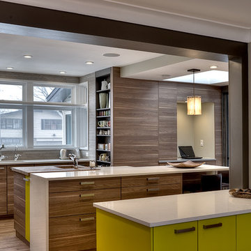
VESTAThis home is located in the in the heart of Northcenter and situated on an oversized lot with a tremendous view of a landscaped backyard garden. The client’s desire was to open the back kitchen wall to take advantage of the garden view and to incorporate the kitchen into the rest of the home. By adding a 3’-0” deep addition at the sink wall and increasing the overall size of the windows, Vesta was able to expand the views and to open the floor plan to create a functional island. The island in turn, added space for food prep & prep sink along with casual seating. By removing the adjoining Dining Room wall, Vesta created an open floor plan that enhanced the Owners everyday living experiences. The new Dining Buffet added storageand a visual break while maintaining the open feel. By using warm horizontal walnut tones, it allowed a reference back to the original mid-century feel of the décor of the home. Adding playful highlights of apple green, we took advantage of a palette that brought the natural outside elements back into the environment.
 Harmony Design Northwest
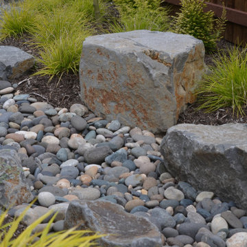
Transforming the blank canvas of a basic builder’s backyard into a captivating retreat, we turned a grass-dominated space into an effortlessly elegant low-maintenance haven with a distinct Asian flair. At the heart of this metamorphosis is the expanded patio and walkway, featuring offset architectural pavers that not only captivate the eye but also contribute to a dynamic sense of flow throughout the elongated backyard.
A key focal point is the thoughtfully designed rain garden, adorned with strategically placed boulders that manages stormwater runoff in an aesthetically pleasing way.
The carefully curated plant palette plays a pivotal role in achieving the desired aesthetic. The deliberate choice of low grasses and foliage-forward perennials, coupled with the inclusion of small evergreen plants and vibrant Japanese maples, creates a harmonious blend of colors, shapes, and sizes. This contrasting arrangement not only ensures visual interest year-round but also infuses the space with a timeless allure inspired by Asian design principles.
The result is a backyard oasis that transcends the ordinary, offering a serene escape with minimal upkeep requirements. The strategic combination of hardscape elements, lush greenery, and carefully selected plants transforms this space into a sanctuary where the beauty of nature meets the sophistication of thoughtful design.
 Nar Design Group
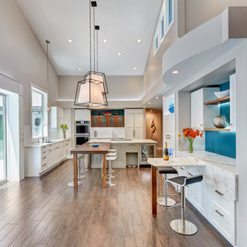
This home remodel is a celebration of curves and light. Starting from humble beginnings as a basic builder ranch style house, the design challenge was maximizing natural light throughout and providing the unique contemporary style the client’s craved.
The Entry offers a spectacular first impression and sets the tone with a large skylight and an illuminated curved wall covered in a wavy pattern Porcelanosa tile.
The chic entertaining kitchen was designed to celebrate a public lifestyle and plenty of entertaining. Celebrating height with a robust amount of interior architectural details, this dynamic kitchen still gives one that cozy feeling of home sweet home. The large “L” shaped island accommodates 7 for seating. Large pendants over the kitchen table and sink provide additional task lighting and whimsy. The Dekton “puzzle” countertop connection was designed to aid the transition between the two color countertops and is one of the homeowner’s favorite details. The built-in bistro table provides additional seating and flows easily into the Living Room.
A curved wall in the Living Room showcases a contemporary linear fireplace and tv which is tucked away in a niche. Placing the fireplace and furniture arrangement at an angle allowed for more natural walkway areas that communicated with the exterior doors and the kitchen working areas.
The dining room’s open plan is perfect for small groups and expands easily for larger events. Raising the ceiling created visual interest and bringing the pop of teal from the Kitchen cabinets ties the space together. A built-in buffet provides ample storage and display.
The Sitting Room (also called the Piano room for its previous life as such) is adjacent to the Kitchen and allows for easy conversation between chef and guests. It captures the homeowner’s chic sense of style and joie de vivre.
 Klopf Architecture
Malibu Glass Box House by Klopf Architecture
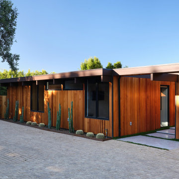
Following the devastating Woolsey Fire of 2018, the site in Malibu offered a unique opportunity to rebuild not just a home, but a new architectural composition that highlighted the property’s potential while navigating strict fire-rebuild codes in the area. Designed by Klopf Architecture, this project embraced a set of limitations and translated them into an architectural asset.
The city’s fire-rebuild process required the new structure to remain close to the original footprint, size and bulk, a constraint that ultimately clarified the architectural direction. Perched near the front of a long, narrow lot, the new home frames and overlooks a private, park-like rear expanse, an uncommon luxury especially in this part of Malibu .
Without a fixed program, the design process allowed for a different kind of creative focus allowing Klopf Architecture the opportunity to explore how a modernist home could best respond to this site. The team approached the project not with a list of requirements, but with a question: How might a modernist live here? What spatial qualities would inspire calm, connection, and a sense of wonder in this setting? The process became less about problem-solving and more about architectural storytelling—letting the site, the light, and the principles of modern design guide the form and flow of the home.
The response emerged in the form of a glass-box pavilion, an open, Mid-Century Modern inspired living, dining, and kitchen space that floats at the edge of the property’s natural descent. Connected to the more enclosed, private areas of the home by a glass-walled hallway, the living pavilion becomes a distinct centerpiece of the design. It opens on all four sides to the landscape with decks and patios on the flanks, an internal garden and water feature to the north, and a dramatic unguarded view of the expansive backyard and ocean horizon to the south.
Because of the mandated footprint, careful planning was required to ensure every space could still engage with light, landscape, or both. Strategic voids in the form of atriums and courtyards allow daylight to filter deep into the home’s core, while offering moments of surprise and retreat. These design gestures allow natural light to filter deep into the interior, creating a sense of brightness and openness throughout the day. At the same time, they expand the perceptual boundaries between inside and out, making the home feel more expansive while anchoring its connection to the surrounding landscape.
The siting of the house is what gives it its unique character. Rather than receding into the backyard like the neighboring homes, the house holds a slight prominence. From the central living pavilion, stepping down into the landscape feels more like entering a secluded park where a separate existing accessory structure, trail, and recreational areas await. The home’s modest street presence gives way to this unfolding drama of space, view, and nature.
Fire-resilient materials and assemblies are integrated seamlessly throughout including triple-pane glazing, under-slab and roof insulation, and locally sourced fire-rated cladding ensure the house not only meets Calfornia’s rigorous wildland-urban interface (WUI) standards, but feels effortlessly aligned with them. While technical decisions like fire-hardening and mechanical systems presented some construction challenges, particularly around the cantilevered glass box, the team found a functional compromise that preserved the integrity of the design.
Inside, a restrained palette and exposed post and beam design celebrate the ethos of mid-century modernism. A central circulation spine extends from the entry to the rear glass wall, offering a continuous visual link from street to ocean. Spaces such as the library and office, though more intimate in scale, are never cut off from nature as each opens to its own unique courtyard or garden view.
Though born out of a strict regulatory framework and developed without a specific client, the rebuild design unfolded with remarkable clarity. Grounded in site logic, refined by limitations and an emphasis on timeless spatial relationships – light, proportion, and a strong connection to nature, the resulting design feels both effortless and uplifting. The home lives lightly on the land, opens generously to its surroundings, and strikes a careful balance between privacy, openness, and calm. For Klopf Architecture, it stands as a compelling case study in how site, code, and circumstantial constraints can inspire enduring, modernist architecture. With years of experience reimagining mid-century modern design for how people live today, the firm took the project’s limitations as an opportunity. The result is a home shaped by open, flowing spaces, strong indoor-outdoor connections, and a calm, clear sense of structure. It’s a good reminder that even with strict constraints, there’s still room for architecture to breathe—and for modernism to keep moving forward.
Klopf Architecture project team: Geoff Campen, John Klopf, AIA, and Sherry Tan
Structural Engineer: ZFA
Contractor: Maison D’Artiste
Photography: ©2025 Mariko Reed
Year Completed: 2023

Sponsored
Columbus, OH

Snider & Metcalf Interior Design, LTD
Leading Interior Designers in Columbus, Ohio & Ponte Vedra, Florida
 JandB Kitchen Designs
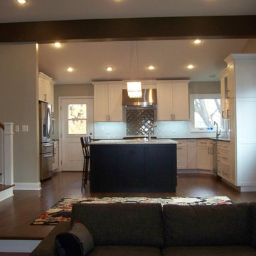
WE DID EXTENSIVE STRUCTURAL MODS. IN THIS KITCHEN.....REMOVED WALL (WHERE BEAM IS) SEPARATING KITCHEN FROM D/R.....THEN EXPANDED INTO D/R AREA!.....TREMENDOUSLY OPENED UP VISUAL AS YOU ENTER HOUSE.....REAR DOOR USED TO BE WINDOWS.....NOW IT OPENS UP TO RAISED DECK.....THERE WERE SEVERAL SOFFITS IN KITCHEN THAT MADE IT SEEM SO MUCH SMALLER AND HID FLOW OF CATHEDRAL CEILING.....TOOK EM ALL OUT!.....NOTE ISLAND WITH DIFFERENT CAB. COLOR AND DIFFERENT TOP.....HOW ABOUT THE CHANDELIER IN THE KITCHEN!!
 Infinite Home
A Kitchen Made for Gathering
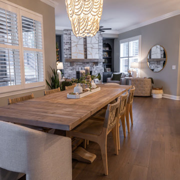
The kitchen was already a well-loved space, so instead of starting from scratch, we gave it a thoughtful refresh by refinishing the existing cabinets, making a few modifications, and updating the color for a fresh, elevated look. To add extra dimension and warmth, we installed cubbies with LED lighting above the cabinets; this not only served to give the space some visual variety but also helped open the space up and give it a more airy feeling when you walk in. The island was expanded to create more space for gathering. To tie it all together, we paired the perfect countertop stone with a mosaic backsplash that adds timeless character.
 Infinite Home
A Kitchen Made for Gathering
The kitchen was already a well-loved space, so instead of starting from scratch, we gave it a thoughtful refresh by refinishing the existing cabinets, making a few modifications, and updating the color for a fresh, elevated look. To add extra dimension and warmth, we installed cubbies with LED lighting above the cabinets; this not only served to give the space some visual variety but also helped open the space up and give it a more airy feeling when you walk in. The island was expanded to create more space for gathering. To tie it all together, we paired the perfect countertop stone with a mosaic backsplash that adds timeless character.
 M-Squared Contracting Inc.
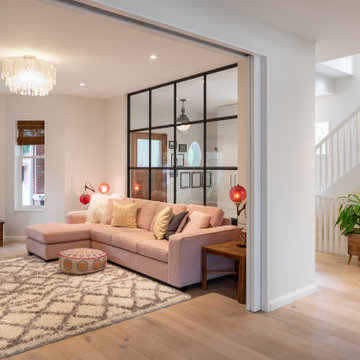
A truly special property located in a sought after Toronto neighbourhood, this large family home renovation sought to retain the charm and history of the house in a contemporary way. The full scale underpin and large rear addition served to bring in natural light and expand the possibilities of the spaces. A vaulted third floor contains the master bedroom and bathroom with a cozy library/lounge that walks out to the third floor deck - revealing views of the downtown skyline. A soft inviting palate permeates the home but is juxtaposed with punches of colour, pattern and texture. The interior design playfully combines original parts of the home with vintage elements as well as glass and steel and millwork to divide spaces for working, relaxing and entertaining. An enormous sliding glass door opens the main floor to the sprawling rear deck and pool/hot tub area seamlessly. Across the lawn - the garage clad with reclaimed barnboard from the old structure has been newly build and fully rough-in for a potential future laneway house.
 DSC DesignWorks
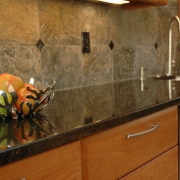
This thirty year old duplex was awkwardly designed from in'ts conception. Initially divided into many smaller spaces, we opened the kitchen up into the family room and visually, as well as functionally, expanded the size of the house. The kitchen and the entertainment center were build with solid cherry faces and plenty of room for storage.
 CHRISTOPHER STROM ARCHITECTS
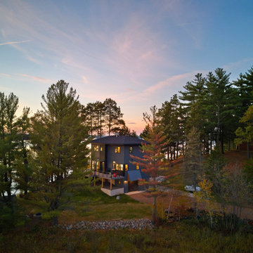
Sommerhus is a private retreat for two empty-nesters. The clients purchased the previous cabin after falling in love with its location on a private, lakefront peninsula. However, this beautiful site was a challenging site to build on, due to its position sandwiched between the lake and protected wet land. The clients disliked the old cabin because it could only be used in the summer months, due to its lack of both insulation and heat. In addition, it was too small for their needs. They wanted to build a new, larger retreat, but were met with yet another constraint: the new cabin would be limited to the previous cabin’s small footprint. Thus, they decided to approach an architect to design their dream cabin.
As the clients described, “We visited Denmark for a family wedding in 2015, and while biking near Gilleleje, a fishing village on the Baltic Sea, we fell in love with the aesthetic of ‘Sommerhus’: dark exteriors, clean, simple lines, and lots of windows.” We set out to design a cabin that fit this aesthetic while also meeting the site’s constraints.
The clients were committed to keeping all existing trees on their site. In addition, zoning codes required the new retreat to stay within the previous cabin's small footprint. Thus, to maximize the square footage of the cabin without removing trees or expanding the footprint, the new structure had to grow vertically. At the same time, the clients wanted to be good neighbors. To them, this meant that their cabin should disappear into the woods, especially when viewed from the lake. To accomplish both these requests, the architect selected a dark exterior metal façade that would visually retreat into the trees. The metal siding is a modern, low-maintenance, and cost-effective solution, especially when compared to traditional wood siding. Warm wood on the soffits of the large roof overhang contrast with the metal siding. Sommerhus's resulting exterior is just as the clients’ requested: boldly modern yet respectful of the serene surroundings.
The homeowners desired a beach-house-inspired interior, full of light and warmth, in contrast to the dark exterior. As the homeowner explained, “I wanted it to feel like a porch inside.” To achieve this, the living room has two walls of sliding glass doors that connect to the wrap-around porch. This creates a beautiful, indoor-outdoor living space. The crisp and bright kitchen also connects to the porch with the window that opens to an outdoor counter - perfect for passing food and drinks to those lounging on the porch. The kitchen is open to the rest of the first-floor entertaining space, and brings a playful, beach-house feel to the cabin.
After the completion of the project, the homeowners remarked, “Working with Christopher and Eric [of CSA] was a wonderful experience. We absolutely love our home, and each season on the lake is more special than the last.”


 Christopher D. Marshall Architect, LLC
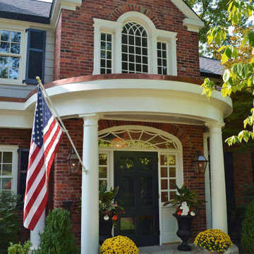
The existing entry hall was narrow, and uninviting. The front porch was bland. The solution was to expand the entry hall out four feet with a two story piece that allowed for a new straight run of stairs, a larger foyer at the entry door with sidelights and a fanlight window above. A Palladian window was added at the stair landing with a window seat.. A new semi circular porch with a stone floor marks the main entry for the house.
Existing Dining Room bay had a low ceiling which separated it from the main room. We removed the old bay and added a taller rectangular bay window with engaged columns to complement the entry porch.
The new dining bay, front porch and new vertical brick element fit the scale of the large front facade and most importantly give it visual delight!
 Stacey Kocevar Designs, LLC
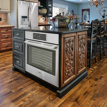
By removing the wall between the kitchen & dining room, as well as the walls of the dining room, which created a hallway, provided the large space to expand the kitchen into. Also, by taking the soffits out, allowed us to take the cabinetry to the ceiling, which provided additional cabinet storage, as well as "visual height" to the space. The homeowner brought incredibly unique and special elements that she wanted incorporated into the overall design of the space, such as two antique French carved wood panels, an antique "Arms of France" fireback, as well as the 60" Round dining table, which was custom modified to the exact height needed for the top to rest on the island countertop. This warm and inviting space can comfortably seat 8, in addition to their formal dining room. Another focal point of the kitchen space came in the form of the custom hutch that was created from matching the island cabinetry, as well as the cherry base cabinets, with the wood countertop. The "X" mullion doors flanking the open cookbook storage space and plate rack, show off its contents with interior LED tape lights. The base of the hutch also conceals two Thermador refrigerator drawers, which are easily accessed as family and friends come in from the pool, though the new sliding glass doors that were installed where a large window was previously. All of the unique, existing, new, and custom elements came together better than we had even hoped; creating a warm and inviting space that feels like it has always been a part of this beautiful home.
 Aleto Construction Group
Looking for more space to entertain guests, our homeowners asked us to help transform their longtime dream into reality. Their “must-haves” included a large gathering room for entertaining and hosting events, and a primary bedroom suite in which to relax. The bedroom suite with walk in closet and private bath was designed with both elegance and functionality in mind. A washer / dryer closet was enclosed in the bathroom to make laundry day a breeze. The kitchen received added sparkle with minor alterations. By widening the entrance from the original kitchen/breakfast room to the addition we created a new space that flowed seamlessly from the existing house, appearing original to the home. We visually connected the new and existing spaces with wide-plank flooring for a cohesive look. Their spacious yard was well-configured for an addition at the back of the home; however, landscape preparation required storm water management before undertaking construction. Outdoor living was enhanced with a two-level deck, accessible from both the primary suite and living room. A covered roof on the upper level created a cozy space to watch the game on tv, dine outside, or enjoy a summer storm, shielded from the rain. The uncovered lower deck level was designed for outdoor entertainment, well suited for a future firepit. Delighted with the realization of their vision, our homeowners have expanded their indoor/outdoor living space by 90%.
 Jordan Design Build Group
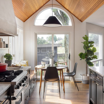
Expanding and updating the kitchen was our top priority – the new layout was designed to straddle the original house and the addition, creating work zones rather than the traditional work triangle. The modified galley layout more than doubled their countertop area and storage space. Extending the kitchen into the addition took full advantage of the vaulted ceilings and light-filled space. To improve flow and connectivity, we opened up a wall between the old kitchen and the front entry hall providing a straight path from front door to the new mudroom/drop zone and kitchen beyond. A door from the dining room into the kitchen was shifted to allow for a more generous kitchen.
The beautifully veined Calacatta Eiffel quartz counters and backsplash provide visual contrast with the black cabinetry and keep the space from feeling too heavy. A continuous ledge and floating shelves replace traditional uppers for a more open and modern feel. Stained wood is used throughout, from the bench top, to shelving, trim and custom millwork; it brings in a natural element and helps unite all of the spaces. A hood with a custom Venetian plaster finish is flanked by vintage inspired sconces and provides a stunning focal point in the room. A deep nook is home to a ‘bubble box’ that dispenses cold sparkling or still water on demand – the marble tile backsplash further differentiates this beverage zone. The brushed brass hardware stands out against the dark cabinets and adds a touch of warmth. With seating for three at the counter and the inclusion of a breakfast area banquette (with drawers), the home is ideal for family time and relaxed gatherings with friends.

Sponsored
Columbus, OH
Snider & Metcalf Interior Design, LTD
Leading Interior Designers in Columbus, Ohio & Ponte Vedra, Florida
 Kinsella Kitchens & Baths
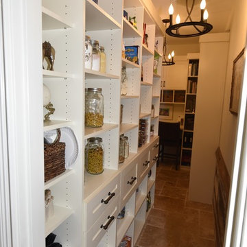
The owner wanted to change the interior of their home from mid-90s transitional to a French/Tuscan eclectic/farm/rustic look. She had a photo of the perfect look, so we incorporated elements from the picture in different ways. Adding reclaimed wood to the family room opening, and repeating the element on the custom range hood, adding stone veneer and a banquette to the turret-shaped breakfast nook, wrought iron details, a hint of cerulean blue in the open cabinet sections, rustic random size tile floor, and other visual elements. Custom color paint and glaze cabinetry provides a serene background. We needed to make space for a lot of appliances--Sub Zero 36" all-refrigerator, Sub Zero drawer freezer (island), oven, steam oven, warming drawer, microwave and coffee system--didn't allow for much cabinetry in the room, so we made every inch count in the kitchen, and expanded the pantry to a walk-through, and included a mini office. This is the kitchen-side entry to the walk-through pantry. Reclaimed paneling on the right wall is the same as the ceiling detail in the family room. Shelving on this side of the room holds dry goods and other prep-foods, while the balance of the room has small appliances, a full-size refrig/freezer, and a mini office.
 RoomService 360
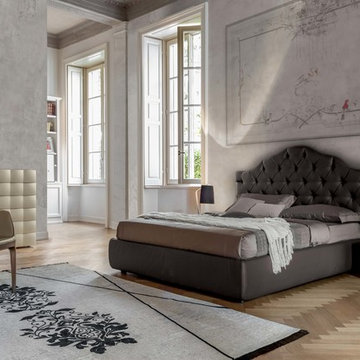
Founded in 1975 by Gianni Tonin, the Italian modern furniture company Tonin Casa has long been viewed by European designers as one of the best interior design firms in the business, but it is only within the last five years that the company expanded their market outside Italy. As an authorized dealer of Tonin Casa contemporary furnishings, room service 360° is able to offer an extensive line of Tonin Casa designs.
Tonin Casa furniture features a wide range of distinctive styles to ensure the right selection for any contemporary home. The room service 360° collection includes a broad array of chairs, nightstands, consoles, television stands, dining tables, coffee tables and mirrors. Quality materials, including an extensive use of tempered glass, mark Tonin Casa furnishings with style and sophistication.
Tonin Casa modern furniture combines style and function by merging modern technology with the Italian tradition of innovative style and quality craftsmanship. Each piece complements homes styled in the modern style, yet each piece offers visual style on its own as well, with imaginative designs that are sure to add a note of distinction to any contemporary home.
 Drury Design
THE SETUP
Multiple ovens, multiple workspaces, multiple sinks – when you think about it, non-jewish kitchens have been adapting the criteria of kosher kitchens for years.
Gladys’ clients in West Rogers Park are Orthodox Jewish. The house they bought already had a kosher kitchen – it just wasn’t done that well. It needed some more things to be duplicated for the dairy side and the meat side. Plus, it was dark and the configuration wasn’t very conducive for a family of eight.
It was time for a remodel.
Design Objectives
Improve kosher kitchen
Add more storage in the island
Better lighting
More open, lighter feel
Change the wood floor in the kitchen to tile
THE REMODEL
Design Challenges
- We had originally planned on removing a wing wall by the breakfast area. During demolition, we learned it contained a support beam.
- The kitchen is a substantial size, but having two sinks, dishwashers, and ovens presented a challenge – how do we fit it all in and make it flow with the storage still accessible near the work areas?
Where do you stop the materials for the new space? - -- The right tile, paint, lighting, etc. would be needed to make the remodeled area cohesive with the rest of the main floor.
- An existing column limited cabinet options and thus, storage capacity. Could we conceal it without disrupting the cabinetry flow?
Design Solutions
- We had to keep the wing wall, but decided to continue the tile on the sides of the cabinets and maintain the height of the tile to line up with the rest of the backsplash. This actually presented a very nice and cohesive look, especially since the opposite side has a wing wall to the left of the refrigerator.
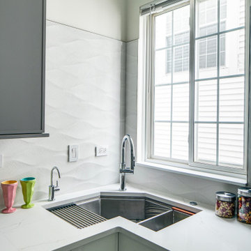
- We used “L-shaped” corner sinks instead of the rectangular ones set on an angle. This gave us more of the legs of the triangles versus the hypotenuse, which allowed for the two dishwashers, and the pullout utensil canisters and spice pullouts while still keeping the 3-drawer cabinets on either side of the range (by the sinks). The old island had the recess for stools which the family never used. By extending the width of the island 6” and utilizing this leg space, we were able to fit 18”-deep cabinets on this side – adding lots of accessible storage. The family can now work simultaneously on the dairy side (the side with the fridge) and the meat side (opposite) without getting in each other’s way. We separated the cooking by using the range oven for the meat and a built-in microwave in the base cabinet. The wall oven with built-in microwave on top is for dairy.
- Corner sinks opened up the middle area for a wider range – we went from a 30” to a 36”. Removing all the wall cabinets (on the range wall) made a big difference. That opened up the entire space while adding some visual impact. (Not pictured: We also made the cabinets directly opposite the range wall tall and removed the countertop, resulting in more room for rollouts and even more storage!) The kitchen now has more storage than it did before.
- We ended up painting the ceiling of the kitchen into the hallway that leads to the foyer. The living and dining rooms were separated by a soffit, so that became a natural boundary. We kept the tile in the kitchen by stopping it short of the hallway and lining it up with the pantry wall. This creates a border between the breakfast area and family room. The rest of the existing wood floors were refinished to refresh and make the hue darker. We also painted a dark accent wall and carried it into the breakfast area to make the rooms look deeper.
- The in-the-way column housed plumbing and couldn’t be moved. We still built cabinets in that spot – we just had to build a chase inside it to conceal the pipes. There was still plenty of room for new storage. We also took the cabinets all the way to the ceiling. The continuous tall cabinets added a functional elegance to the space.
THE RENEWED SPACE
The client’s long-awaited dream of a better kosher kitchen has finally been achieved, beautifully combining enhanced storage solutions with adherence to the family’s orthodox dietary laws. The kitchen’s standout feature, an expanded island, now offers a spacious and efficient workspace. This allows several family members to cook together comfortably, without the inconvenience of bumping into each other, ensuring a harmonious and productive cooking environment.
70