
Search results for "Visually expanded" in Home Design Ideas
 Deep River Partners
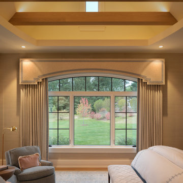
Fulfilling a vision of the future to gather an expanding family, the open home is designed for multi-generational use, while also supporting the everyday lifestyle of the two homeowners. The home is flush with natural light and expansive views of the landscape in an established Wisconsin village. Charming European homes, rich with interesting details and fine millwork, inspired the design for the Modern European Residence. The theming is rooted in historical European style, but modernized through simple architectural shapes and clean lines that steer focus to the beautifully aligned details. Ceiling beams, wallpaper treatments, rugs and furnishings create definition to each space, and fabrics and patterns stand out as visual interest and subtle additions of color. A brighter look is achieved through a clean neutral color palette of quality natural materials in warm whites and lighter woods, contrasting with color and patterned elements. The transitional background creates a modern twist on a traditional home that delivers the desired formal house with comfortable elegance.
 Modern Outdoor
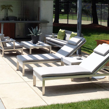
Casual yet elegant, the Etra Collection by Modern Outdoor offers a modern aesthetic that is constructed for outdoor use while being suitable for indoor settings. Etra’s visual inspiration is derived from its architectural-based frame system. Designed using structural angle steel that is mitered and ground, a clean and seamless surface gives Etra its pure appeal.
Frame Options:
• 304 stainless steel that is brushed and electropolished
• marine-grade 316 stainless steel that is brushed and electropolished for use within one mile of salt air, available for an upcharge
• powder coated carbon steel in our standard silver finish
• custom powder coat colors, available for an upcharge
Surface Options:
• sustainably harvested ipe – a beautiful South American hardwood that is three times as dense as teak — naturally resistant to rot, insects, UV exposure, ice, salt, abrasion and splintering – all without the need for toxic chemicals — considered a 25+ year wood
• marine-grade polyboard – a UV stabilized high-density polyethylene material that is non-corrosive and chip resistant – available in six colors for expanded design choices
Fabric Options:
• six standard colors of 100% solution dyed acrylic treated for outdoor use are offered
• custom fabrics and COM service are also available
Cushion Options:
• our standard foam cushions are made from outdoor appropriate high-resiliency (HR) foam
• for clients that prefer less maintenance, a flow-through foam that allows water and moisture to escape the cushion is also available for an upcharge
Etra is a full-breadth line with dining, bar height, lounge, cafe, patio and pool setting pieces included. The pieces are readily customizable for individual client needs.
 Capital Kitchen & Bath
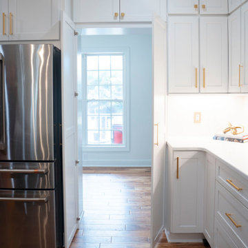
This kitchen remodel is the definition of elevated everyday living, where clean lines, warm textures, and intentional function come together in a space designed to truly perform.
The quartz countertops & full height backsplash give the entire kitchen a clean, luminous feel while providing durable, low-maintenance performance for real everyday living.
A large statement island was created by expanding the kitchen footprint and eliminating the unused formal dining room. The island adds generous prep space, comfortable seating, and the perfect gathering spot for morning coffee or evening entertaining.
Tucked seamlessly into the cabinetry is a hidden walk-in pantry with wet bar & storage galore, keeping the kitchen's visual lines beautifully uncluttered.
And for effortless hosting, a dedicated beverage station- in the kitchen- featuring an ice maker and refrigerator creates a functional mini-hub for drinks, snacks, and celebrations.
Modern. Functional. Timeless. This is more than a kitchen remodel, it’s a space designed to make daily life feel beautiful and effortless.
Find the right local pro for your project
 LiLu Interiors
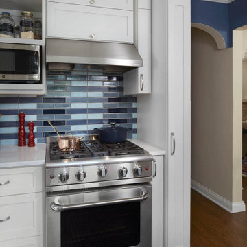
When LiLu was called on by a long-time client to help remodel her kitchen in a charming 1930s St. Paul home, the Design Team knew the space needed to be expanded, lightened, and brightened. First they removed the wall separating the kitchen and dining room. A breakfast bar was added and the window seat was refreshed to offer more inviting places for people to mingle. Crown molding and recessed lighting were installed to create visual height. All the cabinets were painted a light gray, with bold pops of blue, orange, and even some indigo throughout. And yet what makes this kitchen a perfect fit for our home cook client are the storage spaces unique positioned throughout. From shelving above that houses our client’s many cookbooks, to the custom cabinets that hideaway appliances and cookware alike, every detail was considered when making this kitchen both useful and unique.
-----
Project designed by Minneapolis interior design studio LiLu Interiors. They serve the Minneapolis-St. Paul area including Wayzata, Edina, and Rochester, and they travel to the far-flung destinations that their upscale clientele own second homes in.
------
For more about LiLu Interiors, click here: https://www.liluinteriors.com/
-----
To learn more about this project, click here:
https://www.liluinteriors.com/blog/portfolio-items/culinary-delight/
 Ground One Landscape Design + Build
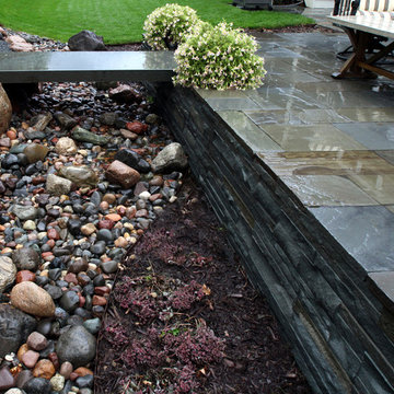
Ground One designed and built a deck off the back of the house for casual sitting, mirroring the house’s front porch. This deck and the screened porch steps descend to a patio terrace. To expand the entertaining space and accommodate the setback restrictions for a permitted gas firepit, we excavated the lot’s back slope to gain bonus space and create a rustic campfire spot. Large boulders found on the site during house construction are incorporated into a retaining wall. Colonial bluestone fills the gaps between these large accent stones and surrounds the firepit. Additional boulders hold up the patio and a slab of bluestone bridges the terrace and patio, preserving the overall drainage pattern. Bluestone is the common thread throughout the project, but it is used in different forms; clean lines closer to the house transition to a more weathered look as you move toward the natural area. The swale is a variety of boulder sizes and river rock to create a more visually-compelling creekbed.
The firepit patio is comfortable for just two people, but can also accommodate a larger group. It is close to the dining space, but physical separation allows for entertaining in different configurations: pre-dinner cocktails around the fire, a roaring flame as backdrop during dinner, kids roasting marshmallows while the adults linger within sight at the dining table, or the gang huddled around a bonfire.
 Klopf Architecture
Malibu Glass Box House by Klopf Architecture
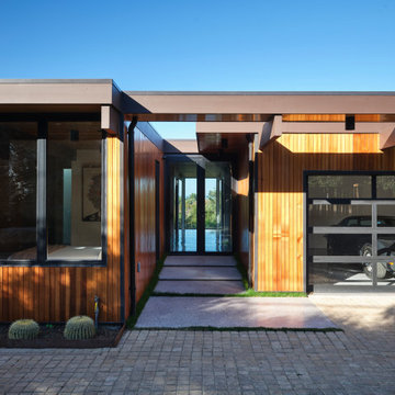
Following the devastating Woolsey Fire of 2018, the site in Malibu offered a unique opportunity to rebuild not just a home, but a new architectural composition that highlighted the property’s potential while navigating strict fire-rebuild codes in the area. Designed by Klopf Architecture, this project embraced a set of limitations and translated them into an architectural asset.
The city’s fire-rebuild process required the new structure to remain close to the original footprint, size and bulk, a constraint that ultimately clarified the architectural direction. Perched near the front of a long, narrow lot, the new home frames and overlooks a private, park-like rear expanse, an uncommon luxury especially in this part of Malibu .
Without a fixed program, the design process allowed for a different kind of creative focus allowing Klopf Architecture the opportunity to explore how a modernist home could best respond to this site. The team approached the project not with a list of requirements, but with a question: How might a modernist live here? What spatial qualities would inspire calm, connection, and a sense of wonder in this setting? The process became less about problem-solving and more about architectural storytelling—letting the site, the light, and the principles of modern design guide the form and flow of the home.
The response emerged in the form of a glass-box pavilion, an open, Mid-Century Modern inspired living, dining, and kitchen space that floats at the edge of the property’s natural descent. Connected to the more enclosed, private areas of the home by a glass-walled hallway, the living pavilion becomes a distinct centerpiece of the design. It opens on all four sides to the landscape with decks and patios on the flanks, an internal garden and water feature to the north, and a dramatic unguarded view of the expansive backyard and ocean horizon to the south.
Because of the mandated footprint, careful planning was required to ensure every space could still engage with light, landscape, or both. Strategic voids in the form of atriums and courtyards allow daylight to filter deep into the home’s core, while offering moments of surprise and retreat. These design gestures allow natural light to filter deep into the interior, creating a sense of brightness and openness throughout the day. At the same time, they expand the perceptual boundaries between inside and out, making the home feel more expansive while anchoring its connection to the surrounding landscape.
The siting of the house is what gives it its unique character. Rather than receding into the backyard like the neighboring homes, the house holds a slight prominence. From the central living pavilion, stepping down into the landscape feels more like entering a secluded park where a separate existing accessory structure, trail, and recreational areas await. The home’s modest street presence gives way to this unfolding drama of space, view, and nature.
Fire-resilient materials and assemblies are integrated seamlessly throughout including triple-pane glazing, under-slab and roof insulation, and locally sourced fire-rated cladding ensure the house not only meets Calfornia’s rigorous wildland-urban interface (WUI) standards, but feels effortlessly aligned with them. While technical decisions like fire-hardening and mechanical systems presented some construction challenges, particularly around the cantilevered glass box, the team found a functional compromise that preserved the integrity of the design.
Inside, a restrained palette and exposed post and beam design celebrate the ethos of mid-century modernism. A central circulation spine extends from the entry to the rear glass wall, offering a continuous visual link from street to ocean. Spaces such as the library and office, though more intimate in scale, are never cut off from nature as each opens to its own unique courtyard or garden view.
Though born out of a strict regulatory framework and developed without a specific client, the rebuild design unfolded with remarkable clarity. Grounded in site logic, refined by limitations and an emphasis on timeless spatial relationships – light, proportion, and a strong connection to nature, the resulting design feels both effortless and uplifting. The home lives lightly on the land, opens generously to its surroundings, and strikes a careful balance between privacy, openness, and calm. For Klopf Architecture, it stands as a compelling case study in how site, code, and circumstantial constraints can inspire enduring, modernist architecture. With years of experience reimagining mid-century modern design for how people live today, the firm took the project’s limitations as an opportunity. The result is a home shaped by open, flowing spaces, strong indoor-outdoor connections, and a calm, clear sense of structure. It’s a good reminder that even with strict constraints, there’s still room for architecture to breathe—and for modernism to keep moving forward.
Klopf Architecture project team: Geoff Campen, John Klopf, AIA, and Sherry Tan
Structural Engineer: ZFA
Contractor: Maison D’Artiste
Photography: ©2025 Mariko Reed
Year Completed: 2023
 Walczak Design And Build
This long-time family home was ready for a thoughtful evolution. Originally built years ago, the homeowners came to us seeking a comprehensive renovation that better reflected how they live today — entertaining frequently, welcoming their grown children home for holidays and summers, and desiring spaces that feel elevated, functional, and deeply personal. What began as a kitchen and bath update ultimately became a whole-home transformation, touching every floor — from the main living level to the bedroom floor and even the attic.
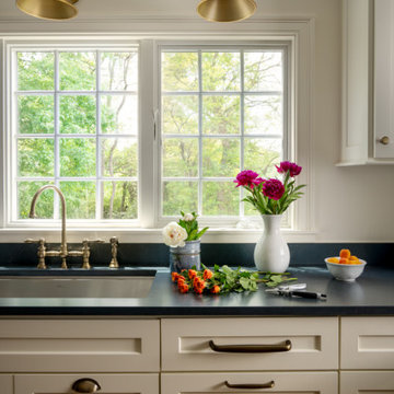
On the first floor, we completed a full gut renovation and thoughtful reconfiguration of the layout. Walls were removed — including a former pantry and powder room — to dramatically improve sightlines and flow between the kitchen and living room. The kitchen footprint was expanded to accommodate a generously sized island designed for gathering. A two-tone cabinetry palette establishes subtle zoning: Farrow & Ball Stiffkey Blue anchors the island and refrigerator surround, while White Tie brightens the perimeter cabinetry. Paneled appliances conceal the dishwasher and trash, while a stainless refrigerator adds balance and contrast. Antique brass hardware and oversized statement pendants layer in warmth and charm. Inside the cabinetry, custom storage solutions — from built-in spice racks and pull-out trays to a dedicated Tupperware drawer with lid dividers — ensure everything has its place.
The former dining room was reimagined as a full-service butler’s pantry, complete with a second prep sink, paneled beverage drawers, an ice maker, glass display cabinetry, and abundant storage. Two built-in desks and a bench create a flexible zone for puzzles, homework, or casual seating. By relocating coffee and cocktail service to this dedicated space, the main kitchen remains uncluttered — even during large gatherings.
The powder room was thoughtfully relocated to support the new layout and transformed into a jewel-box moment for guests. Schumacher’s Romantic Bosphorus mural wallpaper creates a hand-painted, immersive experience. A custom console vanity with a Carrara marble top and backsplash pairs beautifully with an antique brass wall-mounted faucet, layered with warm lighting and brass finishes for an unforgettable impression.
Beyond the kitchen, we opened up the living room and installed a custom bi-fold door system that seamlessly connects the interior to the screened-in porch, enhancing indoor-outdoor living. A bespoke music room was also created on the main level, complete with integrated soundproofing and custom cabinetry designed to house instruments, sheet music, a piano, and a concealed sound system — allowing the family’s love of music to be fully supported without visual clutter. Throughout the home, existing hardwood floors were refinished, and new decorative lighting and upgraded recessed lighting were installed to elevate both ambiance and functionality.
On the bedroom floor, every space received a refresh. Each bedroom was thoughtfully updated with custom wallpaper and wall coverings, while the shared bathroom was fully renovated to incorporate a highly functional laundry area. Durable finishes, smart storage solutions, and a clean layout ensure it works seamlessly for adult children when home while still serving daily needs year-round.
The primary bathroom was transformed into a serene retreat designed for daily restoration. A soft neutral palette and layered materials create a calming environment, while half of the space functions as a wet room where the tub and shower share one expansive area. Porcelain tile with a Calacatta marble look delivers timeless elegance without the maintenance of natural stone. Champagne Bronze fixtures complement natural cherry cabinetry — a nod to the homeowner’s passion for woodworking — and thoughtful recessed niches provide clean, hidden storage.
Even the attic was elevated to support modern living. Previously underutilized, the space was upgraded to serve as a dedicated home office for the homeowner, who works there daily. Improved lighting, finishes, and function transformed it into a productive and comfortable retreat tucked away from the main living areas.
Integrated technology plays a key role throughout the home. A Control4 smart home automation system was implemented to seamlessly manage sound, lighting, and comfort. Custom blinds, drapery, and upholstery were carefully coordinated and fabricated to complement each space, adding softness and cohesion from room to room.
This project represents more than a renovation — it is a full reimagining of how the home supports gathering, creativity, comfort, and daily life. Every floor was thoughtfully considered. Every space was elevated. And the result is a sophisticated yet welcoming home designed to serve this family beautifully for years to come.


 Lara Hontzias Interior Design
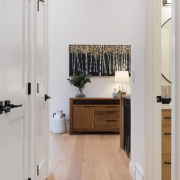
A bungalow with a series of small rooms was opened up and a new roof system was added to allow for a vaulted ceiling in the main areas. The spaces were greatly expanded and allows for greater interaction between family and visiting friends. An enclosed stair case was opened up and moved to a more central location to offer the opportunity for a larger kitchen and open visual point from the front of the house to the back.
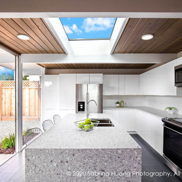 Klopf Architecture
Joseph Eichler developed his moderately priced houses for the mass-market starting in 1949. His homes were designed using affordable materials and simple construction techniques. Nearly 70 years later these homes are in need of updating and remodeling an Eichler home today can become an imposing and costly project if you’re not careful. For this project the clients, who had undergone several previous house renovations, were determined to stick with an established budget from the beginning. Klopf Architecture helped them modernize their Eichler with a premium appearance on a reasonable budget.
The clients challenged the Klopf team to create a design that had a high-end feel and nicely done while adhering to their budget. That meant not all of the initial project scope could be built. Like many other Eichler homes, the original floor plan did not meet the family’s needs leaving them feeling disconnected from one room to another. While an early goal was to expand the house into a carport and create a larger garage, it did not survive the contractor pricing phase of the project.
The goals that did survive through to the end of the project included blurring some of the boundaries and opening up some of the spaces, making them more functional and creating a smoother flow in the house. The Klopf team joined the former separate kitchen and formal living room into one large space and shift the dining room where it is now connected to the kitchen. Klopf swapped the family room to the front alongside the living room, so the spaces feel more cohesive and are now better suited for family activities. The functional layout of the master bathroom was changed to include a large, curbless shower.
Installing a complete IKEA kitchen including cabinets, countertops, appliances, light fixtures, and furnishings was key to staying within budget. Bath fixtures in this house are also exclusively IKEA. Klopf Architecture has designed many homes using IKEA products, which are quite compatible offering an affordable, contemporary take on Eichler homes. The clients saved additional money from the simplicity and availability of IKEA products and by orchestrating the orders and purchases themselves. Following each construction meeting, the clients would make a run to IKEA and purchase items, pick up needed spare parts, and bring them back right away to stay ahead of the contractor’s schedule and minimize the chance of delays and bottlenecks.
Klopf balanced material selections by retaining some of the original woodwork and simply refinishing the mahogany paneling. They were able to retain the original windows and sliding doors which were still in good shape, avoiding some of the most costly replacement expenses. Additionally interior doors were simply refinished and the exterior siding cleaned up and repainted. Formerly dark interiors are now illuminated with new slimmer semi-recessed lighting eliminating the need for costly roof work.
Attention to design details allowed the Klopf team to ensure the house ended up with a high quality feel. Key visual elements were strictly aligned and Klopf worked with the clients to select a unified materials palette throughout the spaces so the house flows seamlessly together. Aligning the tile layout with the trusses and keeping it level with the concrete slab outside allowed them to achieve a level of quality that may otherwise be missed.
The clients were able to keep their budget on track by determining clear goals and making critical decisions upfront, choosing materials and furnishings wisely, working with the right design and construction teams in place and to a large part, their willingness to participate throughout the process. In the end the clients were much happier with their reconfigured Eichler home and Klopf Architecture managed to keep their remodeling costs to about $325/sf – a good amount below the average Bay Area Eichler remodel.
Project Team: John Klopf, Angela Todorova, Sherry Tan
Contractor: Keycon Construction
Structural Engineer: Sezen & Moon
Photography: Sabrina Huang
Year Completed: 2020
 Stacy Whiting Interiors
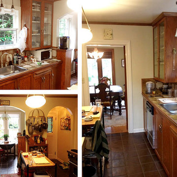
Brought a fresh look to this 1920's Magnolia home that was in need of a kitchen remodel. The kitchen layout was expanded to use the existing space more efficiently. The layout included bar seating at the peninsula, painted cabinetry, granite countertops, and modern appliances made this kitchen stunning and functional. White oak flooring was installed throughout the main floor to tie the spaces together visually.
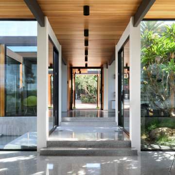 Klopf Architecture
Malibu Glass Box House by Klopf Architecture
Following the devastating Woolsey Fire of 2018, the site in Malibu offered a unique opportunity to rebuild not just a home, but a new architectural composition that highlighted the property’s potential while navigating strict fire-rebuild codes in the area. Designed by Klopf Architecture, this project embraced a set of limitations and translated them into an architectural asset.
The city’s fire-rebuild process required the new structure to remain close to the original footprint, size and bulk, a constraint that ultimately clarified the architectural direction. Perched near the front of a long, narrow lot, the new home frames and overlooks a private, park-like rear expanse, an uncommon luxury especially in this part of Malibu .
Without a fixed program, the design process allowed for a different kind of creative focus allowing Klopf Architecture the opportunity to explore how a modernist home could best respond to this site. The team approached the project not with a list of requirements, but with a question: How might a modernist live here? What spatial qualities would inspire calm, connection, and a sense of wonder in this setting? The process became less about problem-solving and more about architectural storytelling—letting the site, the light, and the principles of modern design guide the form and flow of the home.
The response emerged in the form of a glass-box pavilion, an open, Mid-Century Modern inspired living, dining, and kitchen space that floats at the edge of the property’s natural descent. Connected to the more enclosed, private areas of the home by a glass-walled hallway, the living pavilion becomes a distinct centerpiece of the design. It opens on all four sides to the landscape with decks and patios on the flanks, an internal garden and water feature to the north, and a dramatic unguarded view of the expansive backyard and ocean horizon to the south.
Because of the mandated footprint, careful planning was required to ensure every space could still engage with light, landscape, or both. Strategic voids in the form of atriums and courtyards allow daylight to filter deep into the home’s core, while offering moments of surprise and retreat. These design gestures allow natural light to filter deep into the interior, creating a sense of brightness and openness throughout the day. At the same time, they expand the perceptual boundaries between inside and out, making the home feel more expansive while anchoring its connection to the surrounding landscape.
The siting of the house is what gives it its unique character. Rather than receding into the backyard like the neighboring homes, the house holds a slight prominence. From the central living pavilion, stepping down into the landscape feels more like entering a secluded park where a separate existing accessory structure, trail, and recreational areas await. The home’s modest street presence gives way to this unfolding drama of space, view, and nature.
Fire-resilient materials and assemblies are integrated seamlessly throughout including triple-pane glazing, under-slab and roof insulation, and locally sourced fire-rated cladding ensure the house not only meets Calfornia’s rigorous wildland-urban interface (WUI) standards, but feels effortlessly aligned with them. While technical decisions like fire-hardening and mechanical systems presented some construction challenges, particularly around the cantilevered glass box, the team found a functional compromise that preserved the integrity of the design.
Inside, a restrained palette and exposed post and beam design celebrate the ethos of mid-century modernism. A central circulation spine extends from the entry to the rear glass wall, offering a continuous visual link from street to ocean. Spaces such as the library and office, though more intimate in scale, are never cut off from nature as each opens to its own unique courtyard or garden view.
Though born out of a strict regulatory framework and developed without a specific client, the rebuild design unfolded with remarkable clarity. Grounded in site logic, refined by limitations and an emphasis on timeless spatial relationships – light, proportion, and a strong connection to nature, the resulting design feels both effortless and uplifting. The home lives lightly on the land, opens generously to its surroundings, and strikes a careful balance between privacy, openness, and calm. For Klopf Architecture, it stands as a compelling case study in how site, code, and circumstantial constraints can inspire enduring, modernist architecture. With years of experience reimagining mid-century modern design for how people live today, the firm took the project’s limitations as an opportunity. The result is a home shaped by open, flowing spaces, strong indoor-outdoor connections, and a calm, clear sense of structure. It’s a good reminder that even with strict constraints, there’s still room for architecture to breathe—and for modernism to keep moving forward.
Klopf Architecture project team: Geoff Campen, John Klopf, AIA, and Sherry Tan
Structural Engineer: ZFA
Contractor: Maison D’Artiste
Photography: ©2025 Mariko Reed
Year Completed: 2023
 MAC Reno Design Build LTD ( MAC Renovations)
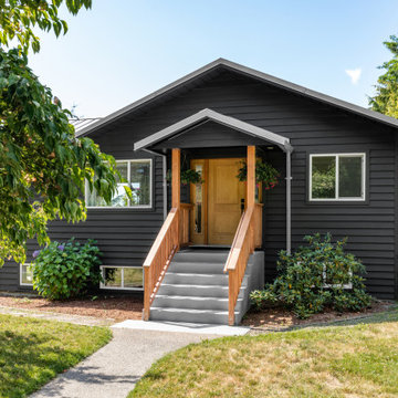
Embrace a 1940 farmhouse where rustic charm and modern elegance coexist in perfect harmony for the family of 5.
We harmonized the home’s robust heritage with modern design, revealing a custom entry that leads to a new primary suite, visually enhancing the façade while expanding the living space. The redesign extends into a vibrant open floor plan to enhance family interactions.
The heart of the home kitchen hosts soft white cabinetry and natural light to dance on warm wood accents and an inviting island.
The bathroom is adorned with dark, dramatic hues complemented by the warmth of wood and marble.
 Gerarden Fabrication & Design
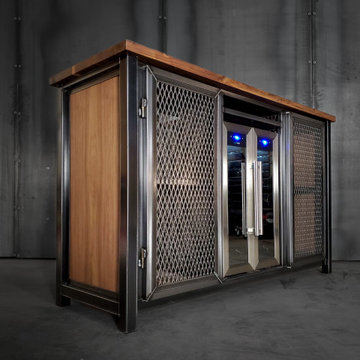
This custom-fabricated industrial beverage center combines rugged durability with specialized entertainment functionality. Constructed with a heavy-duty, dark welded steel skeleton, the piece is finished with warm, solid wood side panels and a substantial wood countertop, creating a sophisticated contrast against the raw structural metal.
Designed to serve as a compact, high-end entertainment hub, the console features a centralized, illuminated wine cooler integrated directly into the steel frame. The flanking storage compartments are enclosed by custom-welded steel doors featuring industrial expanded metal mesh, which provide bold visual texture while ensuring proper ventilation for the internal equipment. Every detail, from the robust steel door frames to the premium barrel hinges, reinforces the architectural craftsmanship and durability of this bespoke entertainment piece.
 Lori Ramsay Design
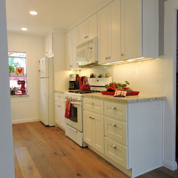
This lovely kitchen lives larger than it's compact square footage. By removing the wall to the right side of the kitchen and expanding the cabinets along that wall we created additional storage as well as a visual opening of the small kitchen.
 Nar Design Group
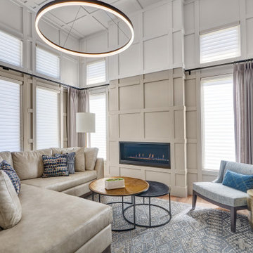
This cozy gathering space in the heart of Davis, CA takes cues from traditional millwork concepts done in a contemporary way.
Accented with light taupe, the grid panel design on the walls adds dimension to the otherwise flat surfaces. A brighter white above celebrates the room’s high ceilings, offering a sense of expanded vertical space and deeper relaxation.
Along the adjacent wall, bench seating wraps around to the front entry, where drawers provide shoe-storage by the front door. A built-in bookcase complements the overall design. A sectional with chaise hides a sleeper sofa. Multiple tables of different sizes and shapes support a variety of activities, whether catching up over coffee, playing a game of chess, or simply enjoying a good book by the fire. Custom drapery wraps around the room, and the curtains between the living room and dining room can be closed for privacy. Petite framed arm-chairs visually divide the living room from the dining room.
In the dining room, a similar arch can be found to the one in the kitchen. A built-in buffet and china cabinet have been finished in a combination of walnut and anegre woods, enriching the space with earthly color. Inspired by the client’s artwork, vibrant hues of teal, emerald, and cobalt were selected for the accessories, uniting the entire gathering space.
 Crystal Kitchen + Bath
The goal for this 1939 Tudor-style story-and-a-half home was to create a kitchen that offered the conveniences, storage, and performance of a modern workspace while preserving the warmth, craftsmanship, and vintage charm that made the home special. The client, an avid home cook, wanted the room to feel as though it had always belonged to the house, with thoughtful upgrades that respected the original architecture rather than competing with it. Just as important, she needed a more efficient layout with enough storage for small appliances, so everyday cooking would no longer require carrying items up from the lower level.
Several existing conditions shaped the design approach. The kitchen retained original, amber-stained birch woodwork that the client wished to keep, and the compact footprint was interrupted by six doorways and two windows, none of which were to be moved, altered, or replaced. A previous flooring update had left the door casings undercut too short, creating visible gaps where the casing met the floor. The existing vintage 40-inch range also lacked proper ventilation, yet the client wished to accommodate a refrigerator, dishwasher, cooktop, double ovens, built-in microwave, and effective venting above the cooktop into the new kitchen layout.
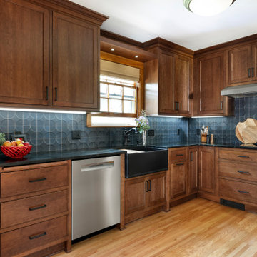
To honor the original millwork, beaded inset-style cherry cabinetry was selected in a soft, hand-rubbed finish that will deepen over time and develop a natural patina. Charcoal-gray soapstone countertops complement the cabinetry while reinforcing the historic character of the home with an organic, timeworn texture. The former breakfast nook was transformed into a butler’s pantry, adding valuable base cabinet storage and expanded work surfaces for frequently used small appliances. Also in the butler’s pantry, a single upper cabinet was paired with open shelves to give an open, airy feeling while adding character and practical storage. A classic single-bowl apron-front workstation sink contributes both period-appropriate character and practical prep and cleanup function.
Because the home’s openings were such a defining feature, the design worked within the existing architecture instead of altering it. Custom plinth blocks were created for each doorway to extend the original casing gracefully down to the new natural red oak flooring, resolving the earlier construction issue while adding a detail that feels authentic to the age of the house. Despite the number of door and window openings, the new layout provides a significantly more functional, built-in kitchen with an improved work triangle for serious cooking.
Appliance placement was carefully planned to deliver the requested performance without overwhelming the small room. Three cooking functions (double ovens & microwave) were consolidated into one location with a GE Café double oven featuring Advantium Technology, while the client’s compact 31-inch refrigerator was reused to preserve space. A sleek 30-inch induction cooktop provides efficient cooking, and a Vent-A-Hood ARS ductless vent hood supplies needed ventilation without requiring a duct run to the exterior.
The finish palette balances richness, texture, and historical sensitivity. A deeply textured navy backsplash tile adds depth and dramatic shadow play against the soapstone, while wallpaper in the back entry echoes the tile’s geometric pattern to visually connect the adjoining spaces. Oil-rubbed bronze cabinet hardware and light fixtures enhance the warmth of the cherry cabinetry and complete the antique-inspired feel.
Lighting was layered to make the compact kitchen brighter, more useful, and more inviting. Vintage-style semi-flush ceiling fixtures establish the overall tone, while dimmable puck lights highlight select areas and undercabinet task lighting keeps work surfaces well illuminated.
The completed kitchen now feels both highly functional and deeply rooted in the home’s history. Rich cherry cabinetry, velvety soapstone, natural red oak flooring, navy tile, bronze accents, and carefully preserved birch trim work together to create a warm, cohesive space that celebrates timeless craftsmanship. By increasing storage, improving workflow, integrating modern appliances, and respecting the Tudor home’s original character, the design achieves the client’s vision: a kitchen that feels personal, practical, historically appropriate, and as though it has always been there.
 Powell Construction
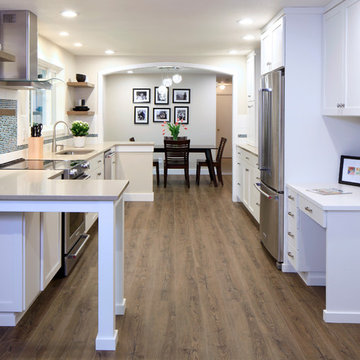
This one-of-a-kind kitchen was a fairly extensive remodel. Originally a tiny and cramped kitchen, we worked with the homeowners to design a space that is much larger and more functional. The new design shows off the contemporary style of the homeowners and meets their needs for both day-to-day living and entertaining.
Before the remodel, the kitchen was connected to the dining room by a narrow door opening. This constriction was exacerbated by the presence of the wall oven at that same opening. On the other side of the kitchen, a family room wasn’t visually well connected to the kitchen, and there was wasted floor space between the two rooms. Overall the kitchen felt severely cramped, lacked adequate storage and was poorly connected to the adjacent spaces.
Our new design made the kitchen far more functional for cooking, and better related it to the dining and family rooms. We enlarged the work area by expanding into the formerly wasted space, consolidated cooking and cleanup functions into roomy work areas, and installed all new custom cabinets.
On the family room side of the kitchen, a work counter allows for sitting and in-kitchen dining. A separate desk area completes the layout of the kitchen space.
The result is a central hub of the home that functions very well for cooking needs, but also pulls adjacent rooms together to form a cohesive whole. Plenty of storage, fresh low maintenance finishes and bright lighting make the remodel a welcome update to this family’s home!
Sponsored
Columbus, OH

Snider & Metcalf Interior Design, LTD
Leading Interior Designers in Columbus, Ohio & Ponte Vedra, Florida
 Crystal Kitchen + Bath
The goal for this 1939 Tudor-style story-and-a-half home was to create a kitchen that offered the conveniences, storage, and performance of a modern workspace while preserving the warmth, craftsmanship, and vintage charm that made the home special. The client, an avid home cook, wanted the room to feel as though it had always belonged to the house, with thoughtful upgrades that respected the original architecture rather than competing with it. Just as important, she needed a more efficient layout with enough storage for small appliances, so everyday cooking would no longer require carrying items up from the lower level.
Several existing conditions shaped the design approach. The kitchen retained original, amber-stained birch woodwork that the client wished to keep, and the compact footprint was interrupted by six doorways and two windows, none of which were to be moved, altered, or replaced. A previous flooring update had left the door casings undercut too short, creating visible gaps where the casing met the floor. The existing vintage 40-inch range also lacked proper ventilation, yet the client wished to accommodate a refrigerator, dishwasher, cooktop, double ovens, built-in microwave, and effective venting above the cooktop into the new kitchen layout.
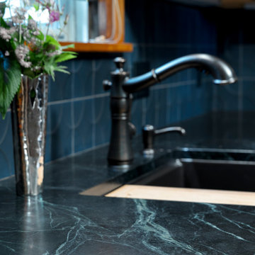
To honor the original millwork, beaded inset-style cherry cabinetry was selected in a soft, hand-rubbed finish that will deepen over time and develop a natural patina. Charcoal-gray soapstone countertops complement the cabinetry while reinforcing the historic character of the home with an organic, timeworn texture. The former breakfast nook was transformed into a butler’s pantry, adding valuable base cabinet storage and expanded work surfaces for frequently used small appliances. Also in the butler’s pantry, a single upper cabinet was paired with open shelves to give an open, airy feeling while adding character and practical storage. A classic single-bowl apron-front workstation sink contributes both period-appropriate character and practical prep and cleanup function.
Because the home’s openings were such a defining feature, the design worked within the existing architecture instead of altering it. Custom plinth blocks were created for each doorway to extend the original casing gracefully down to the new natural red oak flooring, resolving the earlier construction issue while adding a detail that feels authentic to the age of the house. Despite the number of door and window openings, the new layout provides a significantly more functional, built-in kitchen with an improved work triangle for serious cooking.
Appliance placement was carefully planned to deliver the requested performance without overwhelming the small room. Three cooking functions (double ovens & microwave) were consolidated into one location with a GE Café double oven featuring Advantium Technology, while the client’s compact 31-inch refrigerator was reused to preserve space. A sleek 30-inch induction cooktop provides efficient cooking, and a Vent-A-Hood ARS ductless vent hood supplies needed ventilation without requiring a duct run to the exterior.
The finish palette balances richness, texture, and historical sensitivity. A deeply textured navy backsplash tile adds depth and dramatic shadow play against the soapstone, while wallpaper in the back entry echoes the tile’s geometric pattern to visually connect the adjoining spaces. Oil-rubbed bronze cabinet hardware and light fixtures enhance the warmth of the cherry cabinetry and complete the antique-inspired feel.
Lighting was layered to make the compact kitchen brighter, more useful, and more inviting. Vintage-style semi-flush ceiling fixtures establish the overall tone, while dimmable puck lights highlight select areas and undercabinet task lighting keeps work surfaces well illuminated.
The completed kitchen now feels both highly functional and deeply rooted in the home’s history. Rich cherry cabinetry, velvety soapstone, natural red oak flooring, navy tile, bronze accents, and carefully preserved birch trim work together to create a warm, cohesive space that celebrates timeless craftsmanship. By increasing storage, improving workflow, integrating modern appliances, and respecting the Tudor home’s original character, the design achieves the client’s vision: a kitchen that feels personal, practical, historically appropriate, and as though it has always been there.
 Tulsa Design Therapy
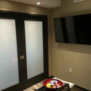
Guest bedroom was transformed into a multi-purpose room: exercise, office, guest sleeping with Murphy Bed. The large walk-in closet is used for audio visual servers and smart home equipment. The pocket doors open to the main living room to expand the space for daily living.
 Drury Design
The Setup
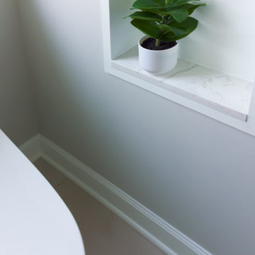
For this primary bathroom project, the homeowners wanted to transform their large, T-shaped bathroom into a functional, multi-purpose sanctuary. The existing layout was inefficient, with a bulky built-in tub, a closed-off shower, and an awkward footprint that limited practical use.
This remodel also presented a unique challenge – the homeowners wanted to use the space for workouts as well. The design needed to maximize the large open area in the middle of the T, providing enough room for yoga and light free-weight exercises while maintaining the bathroom’s aesthetic and functionality.
Design objectives:
Expand and brighten the shower area without major layout changes
Replace the oversized built-in tub with a sleek freestanding alternative
Create a flexible space for workouts while maintaining the bathroom’s design integrity
Address cold flooring with added comfort solutions
Enhance lighting for both beauty and functionality
Incorporate storage for workout equipment and everyday essentials
Integrate natural elements to accommodate the homeowners’ love of plants
The Remodel
Design challenges to be solved:
Shower Expansion – The homeowners want a more open, spa-like shower but don’t want to dramatically alter the footprint.
Workout Integration – Balancing fitness functionality with a serene bathroom design will require creative layout adjustments.
Storage Solutions – With workout gear to stow away, the space needs discrete and versatile storage options.
Lighting – Enhancing both natural and artificial lighting to brighten the large space.
Cold Floors – Positioned above the garage, the bathroom tends to feel colder than the adjacent primary bedroom. A solution is needed to add warmth and comfort during use, without the need to reconfigure the home’s overall heating system.
The Renewed Space
Design solutions:
Spa-Like Shower Expansion – Removing a wall and replacing it with glass transformed the shower into an open, airy retreat, allowing natural light to flow freely through the space. A curved black river rock floor and neutral linear wall tiles add warmth and texture, while carefully placed niche lighting enhances the tranquil, luxurious atmosphere.
Workout-Friendly Layout – A custom full-length mirror was strategically placed to accommodate multiple uses, creating a fitness studio-like experience for yoga or light weight training. The mirror’s size and positioning allow for clear visibility during workouts, while also enhancing the room by adding light and a greater sense of depth.
Custom Storage Solutions – A custom cabinet with a wood top was crafted to discreetly store workout equipment, preserving the clean, open feel of the space. Its design not only enhances functionality but also creates a sense of symmetry, bringing visual balance and cohesion to the overall layout.
Enhanced Lighting – Replacing the shower wall with glass, installing a full-length mirror, and incorporating vanity mirrors with built-in lighting dramatically brighten the space. LED strip lighting under the cabinets, along the tub half wall, and in both the side and shower niches adds layered illumination, enhancing both function and ambiance.
Heated Floors – Installing heated flooring provides consistent warmth and comfort year-round, enhancing the space for both workouts and daily routines. A European-style towel warmer brings additional warmth and a touch of luxury, elevating the overall experience.
Final Thoughts:
This transformed bathroom blends luxury with intentional design. By addressing the homeowners’ needs – from workout flexibility to spa-inspired details – the space now serves multiple purposes without compromise. The warm cabinetry, black accents and thoughtful lighting tie the design together, while the curved textures and plant-friendly ledge add a personalized touch. This bathroom is now a bright, welcoming sanctuary for daily routines and mindful moments.
75