
Search results for "Warm undertones" in Home Design Ideas
 DJK Custom Homes
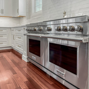
This modern transitional kitchen brings together bold design and everyday functionality with a striking U-shape layout anchored by an oversized quartz island. The island’s marble-look surface offers ample prep space and seating for casual dining, making it the centerpiece for both cooking and entertaining.
Custom cabinetry blends timeless white shaker doors with dramatic black accents, including a show-stopping custom range hood detailed with gold inlay. Glass-front uppers and a bar area with a geometric backsplash add depth, storage, and display opportunities.
Appliances are chef-caliber, featuring a professional-grade Wolf range, Sub-Zero refrigerator, double ovens, built-in microwave, wine fridge, and a full stainless package that ties seamlessly into the cabinetry design.
The space is elevated by statement lighting with oversized lantern pendants, polished nickel hardware, and a detailed coffered ceiling with crown molding. Underfoot, rich hardwood floors with warm cherry undertones balance the cool contrast of black and white, infusing warmth into the space.
Every element in this kitchen is crafted for luxury living, from the expansive work zones to the layering of textures and finishes, making it equally functional for daily use and unforgettable for entertaining.
 DJK Custom Homes
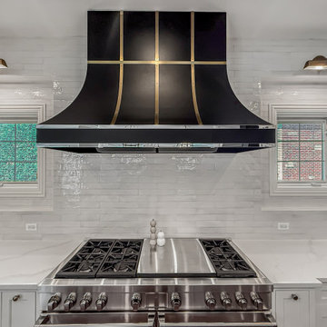
This modern transitional kitchen brings together bold design and everyday functionality with a striking U-shape layout anchored by an oversized quartz island. The island’s marble-look surface offers ample prep space and seating for casual dining, making it the centerpiece for both cooking and entertaining.
Custom cabinetry blends timeless white shaker doors with dramatic black accents, including a show-stopping custom range hood detailed with gold inlay. Glass-front uppers and a bar area with a geometric backsplash add depth, storage, and display opportunities.
Appliances are chef-caliber, featuring a professional-grade Wolf range, Sub-Zero refrigerator, double ovens, built-in microwave, wine fridge, and a full stainless package that ties seamlessly into the cabinetry design.
The space is elevated by statement lighting with oversized lantern pendants, polished nickel hardware, and a detailed coffered ceiling with crown molding. Underfoot, rich hardwood floors with warm cherry undertones balance the cool contrast of black and white, infusing warmth into the space.
Every element in this kitchen is crafted for luxury living, from the expansive work zones to the layering of textures and finishes, making it equally functional for daily use and unforgettable for entertaining.
 Pinnacle Design & Remodeling
We love finishing basements and this one was no exception. Creating a new family friendly space from dark and dingy is always so rewarding.
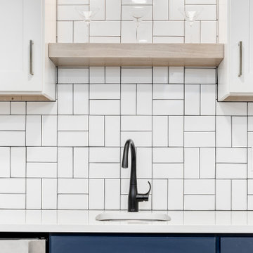
Tschida Construction facilitated the construction end and we made sure even though it was a small space, we had some big style. The slat stairwell feature males the space feel more open and spacious and the artisan tile in a basketweave pattern elevates the space.
Installing luxury vinyl plank on the floor in a warm brown undertone and light wall color also makes the space feel less basement and a more open and airy.
Find the right local pro for your project
 DJK Custom Homes
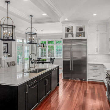
This modern transitional kitchen brings together bold design and everyday functionality with a striking U-shape layout anchored by an oversized quartz island. The island’s marble-look surface offers ample prep space and seating for casual dining, making it the centerpiece for both cooking and entertaining.
Custom cabinetry blends timeless white shaker doors with dramatic black accents, including a show-stopping custom range hood detailed with gold inlay. Glass-front uppers and a bar area with a geometric backsplash add depth, storage, and display opportunities.
Appliances are chef-caliber, featuring a professional-grade Wolf range, Sub-Zero refrigerator, double ovens, built-in microwave, wine fridge, and a full stainless package that ties seamlessly into the cabinetry design.
The space is elevated by statement lighting with oversized lantern pendants, polished nickel hardware, and a detailed coffered ceiling with crown molding. Underfoot, rich hardwood floors with warm cherry undertones balance the cool contrast of black and white, infusing warmth into the space.
Every element in this kitchen is crafted for luxury living, from the expansive work zones to the layering of textures and finishes, making it equally functional for daily use and unforgettable for entertaining.
 Carlisle Wide Plank Floors
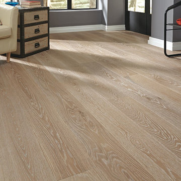
Create the perfect foundation for your home decor with Weathered Windmill, from the Casual Collection, featuring prefinished wood flooring with eye catching grain lines, and smooth creamy hues that blend with warm, nutty undertones.
 DJK Custom Homes
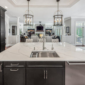
This modern transitional kitchen brings together bold design and everyday functionality with a striking U-shape layout anchored by an oversized quartz island. The island’s marble-look surface offers ample prep space and seating for casual dining, making it the centerpiece for both cooking and entertaining.
Custom cabinetry blends timeless white shaker doors with dramatic black accents, including a show-stopping custom range hood detailed with gold inlay. Glass-front uppers and a bar area with a geometric backsplash add depth, storage, and display opportunities.
Appliances are chef-caliber, featuring a professional-grade Wolf range, Sub-Zero refrigerator, double ovens, built-in microwave, wine fridge, and a full stainless package that ties seamlessly into the cabinetry design.
The space is elevated by statement lighting with oversized lantern pendants, polished nickel hardware, and a detailed coffered ceiling with crown molding. Underfoot, rich hardwood floors with warm cherry undertones balance the cool contrast of black and white, infusing warmth into the space.
Every element in this kitchen is crafted for luxury living, from the expansive work zones to the layering of textures and finishes, making it equally functional for daily use and unforgettable for entertaining.

 Design Loft Company
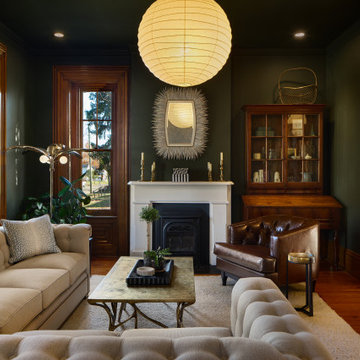
This project features a clean, bright, and airy design that blends modern simplicity with warm, organic elements. Anchored by rift-cut white oak cabinetry and natural quartzite surfaces, the space is elevated by soft contrast, polished metallic fixtures, and a handmade Heath Ceramics backsplash. Its soft rustic look and subtle accent color enrich the room's ambiance, creating beautiful color transitions as the light changes throughout the day.
Sponsored
Columbus, OH

Wannemacher Interiors
Customized Award-Winning Interior Design Solutions in Franklin Cnty OH
 Signature Designs Kitchen | Bath | Interiors
Black and White bathroom with forest green vanity cabinets.
Home design - farmhouse home design idea in Denver
Home design - farmhouse home design idea in Denver
 Design Me By Mahlah
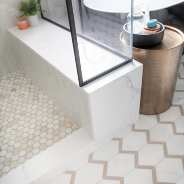
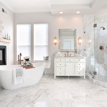
This beautiful white and gray marble floor and shower tile inspired the design for this bright and spa-like master bathroom. Gold sparkling flecks throughout the tile add warmth to an otherwise cool palette. Luxe gold fixtures pick up those gold details. Warmth and soft contrast were added through the butternut wood mantel and matching shelves for the toilet room. Our details are the mosaic side table, towels, mercury glass vases, and marble accessories.
The bath tub was a must! Truly a treat to enjoy a bath by the fire in this romantic space. The corner shower has ample space and luxury. Leaf motif marble tile are used in the shower floor. Patterns and colors are connected throughout the space for a cohesive, warm, and bright space.
 Goyal Development LLC
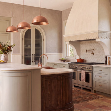
 luxury kitchen with warm European character, blending French and Italian courtyard influences with soft organic forms and timeless materials. The space features a rounded kitchen island, curved architectural lines, an arched range hood, and an arched pantry door that give the room a sculptural, custom-designed feel. Copper pendant lighting adds warmth above the island, while terracotta flooring, sandstone accents, repurposed materials, and handcrafted tile details create depth and authenticity. The palette mixes cream, taupe, mushroom, sage, and chocolate brown with subtle rust undertones, producing an inviting, elevated atmosphere. Limewash paint, Venetian plaster, and vintage-inspired cabinetry complete the space with a refined old-world yet livable aesthetic.
 Sharmaine K. Nelson
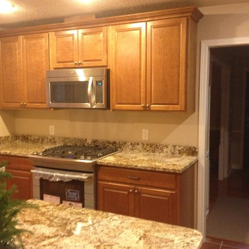
Traditional kitchen uses warm, cinnamon maple undertones, and a neutral, taupe color palette.
 Goyal Development LLC
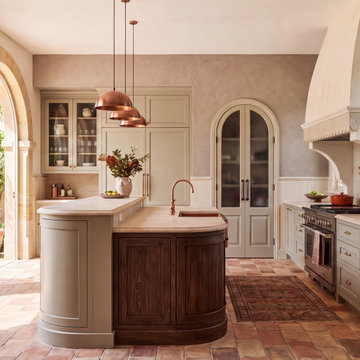
 luxury kitchen with warm European character, blending French and Italian courtyard influences with soft organic forms and timeless materials. The space features a rounded kitchen island, curved architectural lines, an arched range hood, and an arched pantry door that give the room a sculptural, custom-designed feel. Copper pendant lighting adds warmth above the island, while terracotta flooring, sandstone accents, repurposed materials, and handcrafted tile details create depth and authenticity. The palette mixes cream, taupe, mushroom, sage, and chocolate brown with subtle rust undertones, producing an inviting, elevated atmosphere. Limewash paint, Venetian plaster, and vintage-inspired cabinetry complete the space with a refined old-world yet livable aesthetic.
 Ridge Painting & Restoration
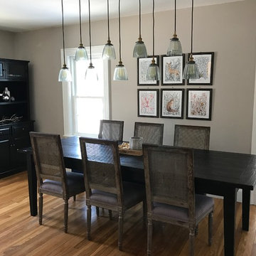
We used Restoration Hardware's Stone paint in the dining room. It has a warm, slightly pink undertone that complements the natural wood floors,
Inspiration for a mid-sized transitional light wood floor and brown floor enclosed dining room remodel in Boston with beige walls and no fireplace
Inspiration for a mid-sized transitional light wood floor and brown floor enclosed dining room remodel in Boston with beige walls and no fireplace


 Fox Interiors
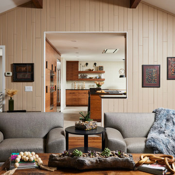
Example of a large transitional open concept medium tone wood floor, brown floor, exposed beam and wall paneling living room design in Minneapolis with a bar, beige walls, a standard fireplace and a stone fireplace
 Advance Design Studio, Ltd.
After six years of living in their Huntley IL home, Chris and Meghan were tired of their dark, dingy, outdated kitchen and it was finally time for a long-anticipated change. “The kitchen is the place where we live, it’s where we do everything,” Meghan said. “It was important that it be a space where we wanted to be.” Meghan loves cooking and enjoys including their girls in healthy meal prepping, this led them to want a brighter, more enjoyable kitchen with increased functionality and improved storage.
For Chris especially, the laundry room was an entirely dysfunctional eyesore. “We had a washer and a dryer, but it was all kind-of cobbled together!” Chris said. “There were always laundry piles everywhere, we weren’t really sure what we wanted to do in there, but it was time for us to make a change.” The mess of the space was stressful every time they walked in the door from the garage each day. Kids’ backpacks and shoes piled up haphazardly in the makeshift boot-bench closet left the family feeling disorganized and stressed. They needed space for folding clothes and locker cubbies to help keep the family organized.
Having known Christine and Todd in the Huntley community for years, Chris and Meghan were familiar with their work. “We already trusted them personally and having seen their projects for years we knew they did top notch work. After we reviewed the initial round of designs, we knew that hiring them was definitely the right choice,” Meghan and Chris said. Although Chris had done a lot of work in their home himself, the kitchen and laundry room renovation was such a large undertaking that he didn’t want to steal time away from his family to spend what would surely be many long weekends doing the job himself. “That would not have been a wise choice for us,” Chris laughed.
“Our designer, Michelle was very, very, easy to work with; anything we wanted to see or weren’t sure about, she went above and beyond to make this easy for us. She was easy to get hold of and always quick to respond,” the couple said. Michelle pulled ideas that mirrored the couple’s taste and style and was adept at directing the couple to limited choices that didn’t overwhelm them and kept the process moving. “I have a hard time making decisions. Michelle made the decision-making process so easy. I loved how she listened to what I liked and then presented three great options for me to choose from,” Meghan said.
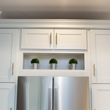
The main objectives for the kitchen were better storage solutions, they wanted the space to reflect their lifestyle and taste, and they wanted it to last for years with low maintenance. One of the first steps in creating a more functional kitchen was relocating the refrigerator, creating an improved workflow for the busy family.
“We didn’t know that we could even move the refrigerator to a new location where it is now, that was something that we never would have thought of,” Chris said. “The new refrigerator location makes the kitchen feel so much bigger. We didn’t add any space, but our whole kitchen with the new design just seems like it’s so much larger than before!” Meghan said.
The perimeter mist colored cabinets helped warm and brighten the entire room, while the graphite colored cabinets on the island added contrast. Using this fresh, clean color palette satisfied the couple’s desire for a bright space that was the exact opposite of what they had before. Organization accessories were also added to the cabinets such as a spice drawer tray and roll outs to create hidden convenience.
“I absolutely love the hidden spices – it makes cooking so much more enjoyable!” Chris said. “And all the pull outs, and the double trash bin, who would think you could get so excited about organization!” the couple said in unison.
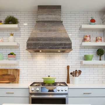
One thing they hated in their original kitchen was how dark the space felt. Added lighting on the ceiling with the new light fixtures combined with the lighter cabinetry colors throughout solved this problem. “Our new kitchen has this warm, almost cozy feeling that our old kitchen never had, it’s just a space that I love spending my time in now,” Meghan said. The light airy feeling was accentuated with the use of floating white shelves on either side of the decorative range hood. “We have so much cabinetry space, the new design is amazing we actually have more storage space than we will ever need,” Meghan said.
The island was extended to create more work surface and added space for stool seating. “The new island changes how we live. Now the kids can be in the kitchen with us, doing homework, eating breakfast, and the three of us have special dinners there when Chris is working late,” Meghan said.
The Carrara Marmi Quartz countertops were chosen because they are, not only beautiful, but are made from hard-working material that doesn’t require maintenance. The white subway tile backsplash that wraps to the ceiling behind the focal point cooktop range/hood compliments the crisp white countertops perfectly, while brushed brass hardware and light fixtures keep the design fresh and new.
The couple had a few fears at the beginning of the project, as most homeowners do. Their biggest fear was being out of their kitchen and laundry room for an extended time. The crew made it very easy for the family to work in a limited space keeping the washer and dryer hooked up the majority of the time, and also getting appliances working with minimal downtime.
“They above and beyond accommodated us to get us through the process,” Meghan said. “They did a great job making sure we were as comfortable as possible throughout the process,” Chris added.
“Our project manager DJ did a great job. He was very good at updating us on schedule changes, getting guys in as quickly as possible. Everyone that stepped in the house was nice and did great work,” said Chris. They thought Advance’s carpenter was phenomenal and were impressed when he took a conceptual idea from a photograph and worked with designer Michelle to create a one of a kind range/hood that has become the topic of conversation with friends and family who visit the new kitchen. “He was in our house literally every day for several weeks. He was easy to work with and good at what he did,” Meghan and Chris said.
The focal point of the kitchen; a hand-crafted, custom-built ventilation hood was clad with handpicked reclaimed barnwood. Advance Design’s carpenter built the framework and the cladding to create a one-of-a-kind design element that the couple loves.
“I think it was especially fun for him to create something unique from scratch, showcasing his talent in this area,” Meghan said. “I love that my kitchen is not like everyone else’s. I got to pick out the wood on my hood and watch it being built and was able to choose what pieces of wood went where on it. It’s totally unique.”
Red Oak flooring was toothed-in throughout the kitchen and the rest of the first floor anywhere changes were made. Then the whole floor was refinished to tone down the orange undertones in the existing floor stain, ultimately changing the color complexion of the entire first floor. The result is a completely new feeling to the entire home.
Renovating the laundry room was extremely important to Meghan and Chris, but they had trouble visualizing what the possibilities were for the seemingly small space. Michelle produced beautiful 3D illustrations that helped them envision the space in a whole new way.
“I must have told Michelle 100 times that I am a visual person, seeing the designs in 3D made it so easy to make decisions and see what we could really do with our space,” Meghan said.
A dividing wall and doorway were removed between the existing laundry room and hallway formerly containing a coat closet, providing space to design specialized graphite colored cabinetry matching the kitchen island to house custom storage cubbies for each family member. Adding the tall utility cabinetry in the new laundry area helped solve the storage issue, tucking away cleaning supplies, household items, and even the cat got its own cubby.
“I love how everything is now hidden in its own space. I can’t tell you how much I hated coming home and seeing everything sitting around on counters,” Chris said.
Electrical outlets were planned for the inside of utility cabinets, so devices could charge in hidden locations. Stacking the washer and dryer allowed for wider countertop space to provide a folding area and a special space for clothes to hang. “The way I do laundry has been completely transformed! I can actually fold clothes and hang them now right out of the washer and dryer,” Meghan said.
“The end result in the kitchen and the laundry/mud room was an updated light and bright space, with a smarter work flow that better meets the needs of this family,” Michelle said.
“I would totally recommend Advance Design,” Meghan said. “Sometimes I sit and just look at my kitchen and laundry room and think ‘Wow, I can’t believe I get to live here!’ It’s an understatement to say we love our new space.”
 Advance Design Studio, Ltd.
After six years of living in their Huntley IL home, Chris and Meghan were tired of their dark, dingy, outdated kitchen and it was finally time for a long-anticipated change. “The kitchen is the place where we live, it’s where we do everything,” Meghan said. “It was important that it be a space where we wanted to be.” Meghan loves cooking and enjoys including their girls in healthy meal prepping, this led them to want a brighter, more enjoyable kitchen with increased functionality and improved storage.
For Chris especially, the laundry room was an entirely dysfunctional eyesore. “We had a washer and a dryer, but it was all kind-of cobbled together!” Chris said. “There were always laundry piles everywhere, we weren’t really sure what we wanted to do in there, but it was time for us to make a change.” The mess of the space was stressful every time they walked in the door from the garage each day. Kids’ backpacks and shoes piled up haphazardly in the makeshift boot-bench closet left the family feeling disorganized and stressed. They needed space for folding clothes and locker cubbies to help keep the family organized.
Having known Christine and Todd in the Huntley community for years, Chris and Meghan were familiar with their work. “We already trusted them personally and having seen their projects for years we knew they did top notch work. After we reviewed the initial round of designs, we knew that hiring them was definitely the right choice,” Meghan and Chris said. Although Chris had done a lot of work in their home himself, the kitchen and laundry room renovation was such a large undertaking that he didn’t want to steal time away from his family to spend what would surely be many long weekends doing the job himself. “That would not have been a wise choice for us,” Chris laughed.
“Our designer, Michelle was very, very, easy to work with; anything we wanted to see or weren’t sure about, she went above and beyond to make this easy for us. She was easy to get hold of and always quick to respond,” the couple said. Michelle pulled ideas that mirrored the couple’s taste and style and was adept at directing the couple to limited choices that didn’t overwhelm them and kept the process moving. “I have a hard time making decisions. Michelle made the decision-making process so easy. I loved how she listened to what I liked and then presented three great options for me to choose from,” Meghan said.
The main objectives for the kitchen were better storage solutions, they wanted the space to reflect their lifestyle and taste, and they wanted it to last for years with low maintenance. One of the first steps in creating a more functional kitchen was relocating the refrigerator, creating an improved workflow for the busy family.
“We didn’t know that we could even move the refrigerator to a new location where it is now, that was something that we never would have thought of,” Chris said. “The new refrigerator location makes the kitchen feel so much bigger. We didn’t add any space, but our whole kitchen with the new design just seems like it’s so much larger than before!” Meghan said.
The perimeter mist colored cabinets helped warm and brighten the entire room, while the graphite colored cabinets on the island added contrast. Using this fresh, clean color palette satisfied the couple’s desire for a bright space that was the exact opposite of what they had before. Organization accessories were also added to the cabinets such as a spice drawer tray and roll outs to create hidden convenience.
“I absolutely love the hidden spices – it makes cooking so much more enjoyable!” Chris said. “And all the pull outs, and the double trash bin, who would think you could get so excited about organization!” the couple said in unison.
One thing they hated in their original kitchen was how dark the space felt. Added lighting on the ceiling with the new light fixtures combined with the lighter cabinetry colors throughout solved this problem. “Our new kitchen has this warm, almost cozy feeling that our old kitchen never had, it’s just a space that I love spending my time in now,” Meghan said. The light airy feeling was accentuated with the use of floating white shelves on either side of the decorative range hood. “We have so much cabinetry space, the new design is amazing we actually have more storage space than we will ever need,” Meghan said.
The island was extended to create more work surface and added space for stool seating. “The new island changes how we live. Now the kids can be in the kitchen with us, doing homework, eating breakfast, and the three of us have special dinners there when Chris is working late,” Meghan said.
The Carrara Marmi Quartz countertops were chosen because they are, not only beautiful, but are made from hard-working material that doesn’t require maintenance. The white subway tile backsplash that wraps to the ceiling behind the focal point cooktop range/hood compliments the crisp white countertops perfectly, while brushed brass hardware and light fixtures keep the design fresh and new.
The couple had a few fears at the beginning of the project, as most homeowners do. Their biggest fear was being out of their kitchen and laundry room for an extended time. The crew made it very easy for the family to work in a limited space keeping the washer and dryer hooked up the majority of the time, and also getting appliances working with minimal downtime.
“They above and beyond accommodated us to get us through the process,” Meghan said. “They did a great job making sure we were as comfortable as possible throughout the process,” Chris added.
“Our project manager DJ did a great job. He was very good at updating us on schedule changes, getting guys in as quickly as possible. Everyone that stepped in the house was nice and did great work,” said Chris. They thought Advance’s carpenter was phenomenal and were impressed when he took a conceptual idea from a photograph and worked with designer Michelle to create a one of a kind range/hood that has become the topic of conversation with friends and family who visit the new kitchen. “He was in our house literally every day for several weeks. He was easy to work with and good at what he did,” Meghan and Chris said.
The focal point of the kitchen; a hand-crafted, custom-built ventilation hood was clad with handpicked reclaimed barnwood. Advance Design’s carpenter built the framework and the cladding to create a one-of-a-kind design element that the couple loves.
“I think it was especially fun for him to create something unique from scratch, showcasing his talent in this area,” Meghan said. “I love that my kitchen is not like everyone else’s. I got to pick out the wood on my hood and watch it being built and was able to choose what pieces of wood went where on it. It’s totally unique.”
Red Oak flooring was toothed-in throughout the kitchen and the rest of the first floor anywhere changes were made. Then the whole floor was refinished to tone down the orange undertones in the existing floor stain, ultimately changing the color complexion of the entire first floor. The result is a completely new feeling to the entire home.
Renovating the laundry room was extremely important to Meghan and Chris, but they had trouble visualizing what the possibilities were for the seemingly small space. Michelle produced beautiful 3D illustrations that helped them envision the space in a whole new way.
“I must have told Michelle 100 times that I am a visual person, seeing the designs in 3D made it so easy to make decisions and see what we could really do with our space,” Meghan said.
A dividing wall and doorway were removed between the existing laundry room and hallway formerly containing a coat closet, providing space to design specialized graphite colored cabinetry matching the kitchen island to house custom storage cubbies for each family member. Adding the tall utility cabinetry in the new laundry area helped solve the storage issue, tucking away cleaning supplies, household items, and even the cat got its own cubby.
“I love how everything is now hidden in its own space. I can’t tell you how much I hated coming home and seeing everything sitting around on counters,” Chris said.
Electrical outlets were planned for the inside of utility cabinets, so devices could charge in hidden locations. Stacking the washer and dryer allowed for wider countertop space to provide a folding area and a special space for clothes to hang. “The way I do laundry has been completely transformed! I can actually fold clothes and hang them now right out of the washer and dryer,” Meghan said.
“The end result in the kitchen and the laundry/mud room was an updated light and bright space, with a smarter work flow that better meets the needs of this family,” Michelle said.
“I would totally recommend Advance Design,” Meghan said. “Sometimes I sit and just look at my kitchen and laundry room and think ‘Wow, I can’t believe I get to live here!’ It’s an understatement to say we love our new space.”


Sponsored
Delaware, OH

Buckeye Basements, Inc.
Central Ohio's Basement Finishing ExpertsBest Of Houzz '13-'21
 Creative Floors
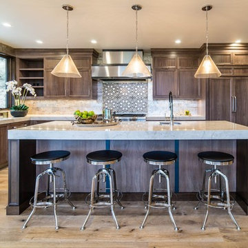
Wide-Plank European wood with a soft wire brushing. This wood has a slight grey undertone while keeping the natural warm brown tones throughout.
Mid-sized transitional l-shaped light wood floor eat-in kitchen photo in Denver with an undermount sink, shaker cabinets, medium tone wood cabinets, marble countertops, multicolored backsplash, stone tile backsplash, stainless steel appliances and an island
Mid-sized transitional l-shaped light wood floor eat-in kitchen photo in Denver with an undermount sink, shaker cabinets, medium tone wood cabinets, marble countertops, multicolored backsplash, stone tile backsplash, stainless steel appliances and an island

 safe ZOnea
Ask a kitchen designer in Chicago which countertop question comes up most and you will hear the same answer: white or off-white quartz, and which shade. Homeowners walk into showrooms with a photo saved on their phone, usually a bright, veined slab from a magazine spread, and leave an hour later realizing there are a dozen versions of that same look. The confusion is not about taste. It is about the fact that "white quartz" covers a huge range of patterns, undertones, and price points, and nobody explains the differences before the sale.
Older bungalows and newer builds alike are getting stripped of their dated laminate and butcher block in favor of quartz, and the reasons are practical rather than trendy. Quartz does not need sealing, resists the kind of staining that granite can suffer over decades, and holds up to the freeze-thaw humidity swings that Chicago basements and kitchens go through every year. Once a homeowner commits to quartz, though, the real decision starts: which white, and does the pattern justify the difference in cost.
This piece walks through three specific slabs that keep showing up in Chicago renovation projects, why designers reach for them in different rooms, and what actually separates a flat white surface from one with real depth. None of this requires a design background to follow. It is mostly about paying attention to how a slab behaves under kitchen lighting, how busy the vending gets, and how it photographs versus how it looks in person.
Why White Quartz Took Over Chicago Kitchens
Ten years ago, granite dominated Chicago kitchen remodels almost by default. It was durable, it looked expensive, and every fabricator in the metro area carried a wide range of colors. Quartz has since taken over that position, and the shift happened faster than most contractors expected. Engineered stone gave homeowners a more predictable surface, since natural granite varies slab to slab while quartz is manufactured to a consistent pattern batch after batch.
The other driver is light. Chicago winters are long and gray, and a lot of kitchens, especially in older two-flats and courtyard buildings, do not get much direct sun. A dark granite countertop in a dim kitchen can make the whole room feel smaller. White and light-toned quartz reflects what little natural light comes through the windows, and it makes a galley kitchen or a north-facing space feel noticeably brighter without touching the cabinetry or the layout.
There is also a resale argument that local real estate agents bring up constantly. White quartz photographs well for listings, reads as updated and low-maintenance to buyers touring in person, and does not compete visually with whatever cabinet color the next owner might prefer. It is a safer bet than a bold veined marble look or a colored quartz that might feel dated in five years.
Arctic White and the Cost Question
Among the flatter, more uniform whites, arctic white quartz price comes up constantly in budget conversations because the slab sits at a more approachable point than the heavily veined Italian-marble-inspired patterns. It reads as clean and bright without the busy movement that some homeowners find overwhelming in a small kitchen. Fabricators in the Chicago area tend to keep it in stock precisely because demand stays steady across both new construction and remodel projects.
Part of what keeps this slab affordable relative to its heavily patterned cousins comes down to manufacturing complexity. A quartz surface with minimal veining and a consistent white base is simpler to produce at scale than one that mimics the irregular, high-contrast movement of natural Calacatta marble. That production difference shows up directly in what a homeowner pays per square foot, and it is worth asking a fabricator to walk through that pricing before assuming every white quartz costs the same.
Homeowners planning a full kitchen, including an island, backsplash, and perimeter counters, often use a flatter white like this specifically because it lets other elements carry the visual interest. A patterned tile backsplash or a bold cabinet color reads more clearly against a calm countertop than against one already fighting for attention with heavy veining. Designers frequently pair simpler whites with statement lighting fixtures for exactly this reason.
What Makes Calacatta Patterns Different
Calacatta refers to a family of marble originally quarried in Italy, known for a bright white background broken up by bold, often gold-toned veining that moves in thick, dramatic streaks rather than thin gray lines. Natural Calacatta marble is soft, porous, and expensive to maintain, which is exactly why quartz manufacturers spent years developing engineered versions that replicate the look without the upkeep headaches.
The challenge with any Calacatta-style quartz is getting the veining to look organic instead of printed. Early generations of engineered stone struggled with repetitive patterns that gave away the fact the slab was manufactured rather than cut from actual marble. Modern digital printing and layering techniques have closed that gap considerably, and the better Calacatta-inspired quartz lines now vary the veining across each slab batch so two counters in the same kitchen do not look identical.
Chicago designers gravitate toward Calacatta patterns for kitchens that function as the visual centerpiece of an open floor plan, which describes a large share of the gut renovations happening in neighborhoods like Lincoln Park, Roscoe Village, and the North Shore suburbs. When the kitchen island is visible from the living room and dining area, a dramatic veined surface becomes part of the home's overall design language rather than a purely functional work surface.
Calacatta Arno Under Kitchen Lighting
One of the more popular options in this category, calacatta arno quartz, balances a warm white base with soft gray and gold veining that avoids looking too stark under the cooler LED lighting common in newer Chicago builds. Homeowners touring showrooms sometimes make the mistake of judging a slab entirely under warm incandescent lighting, then get surprised when the same surface looks slightly different once installed under their kitchen's actual fixtures.
What separates this particular pattern from flatter competitors is how the veining clusters rather than spreading evenly across the slab. That clustering mimics the way real quarried marble forms, with denser mineral deposits in some sections and cleaner stretches in others. Fabricators cutting a large island slab from a single piece will often orient the pattern intentionally so the busiest veining lands somewhere visually interesting rather than getting cut off at an edge.
Because the background reads warmer than a stark white, this pattern tends to pair well with brass or matte gold hardware, a combination that has been showing up repeatedly in Chicago kitchen remodels over the past few renovation seasons. Cabinet painters report a similar trend, with more clients requesting warm white or greige cabinet colors specifically because they complement this kind of veined quartz better than a cooler, blue-toned white would.
Silestone's Version of the Calacatta Look
Manufacturers compete directly in this Calacatta-inspired category, and silestone eternal calacatta gold represents one brand's specific take on the pattern, distinguished by richer gold veining set against a brighter white base than some competing slabs in the same family. Silestone has built a reputation around anti-bacterial surface treatments in addition to the standard quartz durability, a detail some homeowners specifically ask about for kitchens used heavily by families with young children.
The veining in this particular slab tends to run in longer, more continuous lines compared to the clustered pattern found in some other Calacatta-style options, which gives large island surfaces a sense of visual flow from one end to the other. Fabricators working with bigger islands, the kind increasingly common in open-concept Chicago remodels, often favor patterns like this because there is less need to worry about seams interrupting a busy, disconnected pattern.
Price positioning for this slab tends to sit toward the upper end of the engineered quartz category, reflecting both the brand's manufacturing process and the complexity of replicating that continuous gold veining consistently across production batches. Homeowners weighing this option against other Calacatta-style quartz should ask their fabricator directly about batch availability, since premium patterns sometimes have longer lead times than standard stock colors.
Living With Quartz Day to Day
Beyond how a slab looks in a showroom or a listing photo, the daily experience of owning quartz countertops matters more once the renovation dust settles. Quartz resists scratching far better than laminate and holds up to the acidic spills, hot pans, and general abuse of an active kitchen without the sealing maintenance that natural stone requires every year or two. That low-maintenance reputation is a large part of why quartz overtook granite in the first place.
Heat resistance is a detail that gets less attention than it should. While quartz handles moderate heat well, manufacturers generally recommend using a trivet or pad for very hot pots straight off the stove, since sudden temperature shock can occasionally cause stress marks in the resin binder that holds the engineered stone together. This is a minor precaution rather than a major limitation, but it is worth mentioning to anyone assuming quartz is entirely indestructible.
Cleaning routines stay simple across almost every pattern in this category. A damp cloth and mild soap handle daily messes, and the nonporous surface means wine, coffee, and tomato-based sauces do not soak in the way they can with unsealed granite or marble. Homeowners moving from an older stone counter often mention how much less they worry about everyday spills once quartz is installed, which is a quality-of-life change that rarely makes it into the initial design conversation.
Choosing Between the Three
There is no single correct answer among these three slabs, and that is exactly why they keep coming up together in the same design conversations across Chicago renovation projects. A flatter white with minimal veining suits kitchens where other elements need to carry the visual interest, while a bolder Calacatta-inspired pattern makes sense when the countertop itself is meant to be the centerpiece of an open floor plan.
Budget matters too, and it is worth having a direct conversation with a fabricator about where each option lands before falling in love with a specific slab in a showroom. Lighting, cabinet color, and how the kitchen connects to the rest of the home all play into which pattern will actually look right once installation is finished rather than just in a photo.
Whatever direction a homeowner leans, seeing a full slab in person under actual kitchen lighting remains the single most useful step before signing off. Photos only go so far once the countertop is sitting in the room it will live in for years.
24