
Search results for "Well defined" in Home Design Ideas
 SURROUNDS Landscape Architecture + Construction
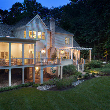
Our client desired a functional, tasteful, and improved environment to compliment their home. The overall goal was to create a landscape that was subtle and not overdone. The client was highly focused on their deck environment that would span across the rear of the house with an area for a Jacuzzi as well. A portion of the deck has a screened in porch due to the naturally buggy environment since the home is situated in the woods and a low area. A mosquito repellent injection system was incorporated into the irrigation system to help with the bug issue. We improved circulation of the driveway, increased the overall curb appeal of the entrance of the home, and created a scaled and proportional outdoor living environment for the clients to enjoy. The client has religious guidelines that needed to be adhered to with the overall function and design of the landscape, which included an arbor over the deck to support a Sukkah and a Green Egg smoker to cook Kosher foods. Two columns were added at the driveway entrance with lights to help define their driveway entrance since it's the end of a long pipe-stem. New light fixtures were also added to the rear of the house.
Our client desired multiple amenities with a limited budget, so everything had to be value engineered through the design and construction process. There is heavy deer pressure on the site, a mosquito issue, low site elevations, flat topography, poor soil, and overall poor drainage of the site. The original driveway was not sized appropriately and the front porch had structural issues, as well as leaked water onto the landing below. The septic tank was also situated close to the rear of the house and had to be contemplated during the design process.
Photography: Morgan Howarth. Landscape Architect: Howard Cohen, Surrounds Inc.
 Shuster Design Associates
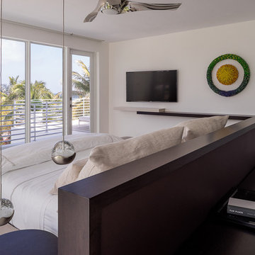
The Master Bedroom is Strategically Situated on the Third Floor. It Overlooks the Front Yard Complete with Swimming Pool and Patio as well as the Atlantic Ocean.
 Ambient
Graffio Collection by Antoniolupi
AL STUDIO
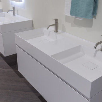
The Graffio sinks define a pure and contemporary style. The very thin edge widens in the back for the tap and to the side as an elegant and functional surface available smooth and grooved to increase the grip and facilitate the support of objects or accessories.
Rectangular, square, symmetrical or asymmetrical, single or double with rounded edges or perfectly regular, all with a flush drain cover of the same material. The perfect balance amongst the shapes amplifies the composition possibilities of this collection. Perfect alone or with furniture. Integrates well with the Bespoke collection. The sheer volume of the basin communicates well with the elegant finishes and surfaces of the cabinets.
Perfect geometrical shake that meet, clean lines and thin edges that define a perfect perimeter. Surfaces that overlap, compliment and pair up generating new shapes within its volume. Finally, a sign, a groove, a “scratch” that gives name to the collection.
Find the right local pro for your project
 G.B. Construction and Development, Inc.
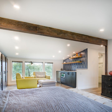
This studio apartment has a combo sleeping area, living area and kitchenette. Large windows on both sides of the room allow ample natural light giving the room a spacious airy feel. The ceiling beam adds visual interest as well as defines the spaces.
 menakaimai architects
Project Type : Residential
Location : Ethul Kotte
Land Area :3267 sqft ( 12 p )
Architects : Archt. Sameera Dharmasena (menakaimai design studio)
: Archt. Menaka Karunarathna (menakaimai design studio)
Structural Engineering : Eng Sajeewa Edirrisingha
Write-up : Archt. Navoda Rthnayaka
Photographs : Amila Rathnayaka (Amila Rathnayaka photography)
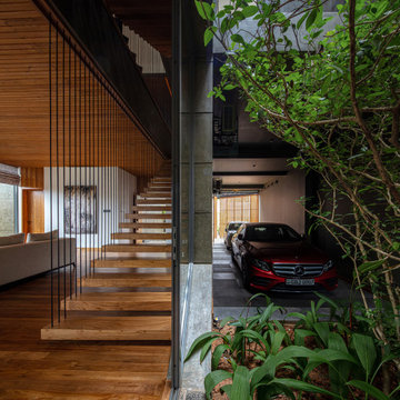
Just as the eyes are the windows to a person’s soul, a house is a window to its architect’s aspirations. The residence for Mr. Alex and family at Ethul Kotte is a perfect example for this, which is an open book with multiple layers. From the entrance to the rooftop, each space creates a specific impression and reveals a little more about the users, as it has been perfectly captured by the architect.
The house is located at the further end of a narrow drive-way, almost hidden from view with its dark façade and greenery, and sits in a compact lot that opens to a marsh at its rear end. With its cladded wall of cement blocks with a unique imprint and the line of bamboo covering the length of the front wall, the boundaries are defined effortlessly while drawing focus to the main entrance. Earthy feeling created at this point heavily dwells on the solidity of the materials and the muted color palette, which is juxtaposed by the lightness of the timber gate, perforated external façade and screen of vines flowing down from the rooftop. Upon entering, the ambiance of the house changes from its somber guarded exterior to a bright and spacious interior that completely opens to its surroundings.
The floating staircase that climbs along the dark titanium wall and the adjoining courtyard run through the full height of the building, merging the solids and the voids at all levels.
Spatial organization in the house is predominantly in three layers and each section of a floor has a clear demarcation between the public and private spaces. Spaciousness is achieved through the simplicity of the spaces, minimalistic furniture and muted tones that are complemented by the complete openness created by the glass facades covering the full height of the spaces. Another noticeable feature is the landscaping where thick low hedges are broken by thin trees to mimic a rampart that characterizes the intermediate space between the interior and boundary of the site, which is demarcated by the alternating solids and voids of the boundary fence.
The ground level creates a warm, welcoming ambiance that is ideal for entertaining guests. From the lines of textures and materials used, to heights and orientations of furniture, each element complements each other to add volume and composure to the space. A peculiar feature is a subtle inspiration from Japanese architecture that is visible in the sharp lines and several decorative features, which enhance the ambiance with splashes of vibrancy created by the simple, yet colorful elements. While the open living-dining space is a subtle fusion between a modern western living space and the Sri Lankan lifestyle that welcomes nature and social interactions, privacy of adjoining spaces such as the kitchen and bedroom is ensured by isolation made pleasant by their private courtyards.
Gradually gracing a visitor at the extended landing of the first floor is the calming sight of the full height cross formed by light filtering through crafted gaps on the wall which becomes a feature and an open shrine. This , seamless flows to the rest of the floor with its vibrant, spacious family living room and TV lobby a that connects all these well as the custom-designed bedrooms
The ambiance of each room voices the unique needs and tastes of its user, while the private balcony screened from the outside by a perforated aluminum façade and a screen of vines, creates an intimate niche. A significant feature is the glazed walls of the master bedroom, which are only screened by thick canvas shades that open to a mesmerizing sunset and a view of the marsh. This makes one question the concepts of privacy traditionally Sri Lankans, whereas the user appears to be embracing the vulnerability in openness and enjoying the soothing beauty in nature through the same.
The second floor is mostly the rooftop garden and bar, which is a multi-functional space ideal for a small gathering. The curtain of creepers covering the full height glass façade separating the bar and open terrace creates a significant change in ambiance by defining the cozy, timber interior of the bar, against the outdoor-, where the monotonous greenery is only broken by a splash of red from the punctured cover of a service staircase running to the upper rooftop level. The uniqueness is in how each space caters for contrast in transition between ambiances spanning from an intimate, mystic bar area ideal for isolation, to a lively social space creates a unique mood compared to the rest of the house. The rooftop thus completes the transition of spaces from open and interactive interior to a mind-palace and a garden that inspires the soul.
“I think that my job is to observe people and the world, and not to judge them; I always hope
To position myself away from so-called conclusions; I would like to leave everything wide open
To all the possibilities in the world.”
-Haruki Murakami-
Layering is a key feature in this design, which is evident in how the façade filters inwards from the curtain of greenery, permeable panel and the external wall, as well as the spatial structure of the interior. The linear form of the building, where the living spaces completely open-out through the glazed facades at the rear end of each floor merges these family-spaces with the neighborhood, which avoids complete isolation of the family. Thus, the design is inspired by the need for a sense of freedom in the residents, while allowing the house to become a place for escape when desired.
 Ambient
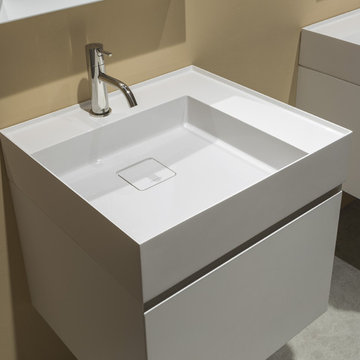
Graffio Collection by Antoniolupi
AL STUDIO
The Graffio sinks define a pure and contemporary style. The very thin edge widens in the back for the tap and to the side as an elegant and functional surface available smooth and grooved to increase the grip and facilitate the support of objects or accessories.
Rectangular, square, symmetrical or asymmetrical, single or double with rounded edges or perfectly regular, all with a flush drain cover of the same material. The perfect balance amongst the shapes amplifies the composition possibilities of this collection. Perfect alone or with furniture. Integrates well with the Bespoke collection. The sheer volume of the basin communicates well with the elegant finishes and surfaces of the cabinets.
Perfect geometrical shake that meet, clean lines and thin edges that define a perfect perimeter. Surfaces that overlap, compliment and pair up generating new shapes within its volume. Finally, a sign, a groove, a “scratch” that gives name to the collection.
 Richardson & Associates, Landscape Architects
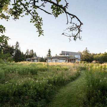
A cluster of new buildings including a residence, studio, garage, and gallery were sensitively sited and landscaped to have an intimate and powerful connection with their site. The structures were sited to mediate the transition between open fields and a woodland edge, as well as define a central open space around which the buildings organize. Through the careful selection and placement of materials, the landscape appears to be anything but “designed”. In addition, plants literally “lift” to the roof creating the sense of nature flowing over and around the buildings, establishing an intended tension between buildings and landscape.
Architect: Winkelman Architecture, Portland, Maine
Builder: NateHolyoke Builders, Holden, Maine
Landscape Contractor: Atlantic Landscape
Construction, Ellsworth, Maine
Photo Credit: Trent Bell

Sponsored
Columbus, OH

Hope Restoration & General Contracting
Columbus Design-Build, Kitchen & Bath Remodeling, Historic Renovations
 G.B. Construction and Development, Inc.
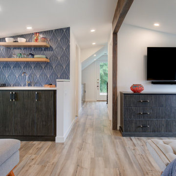
This studio apartment has a combo sleeping area, living area and kitchenette. Large windows on both sides of the room allow ample natural light giving the room a spacious airy feel. The ceiling beam adds visual interest as well as defines the spaces.
 Ambient
Graffio Collection by Antoniolupi
AL STUDIO
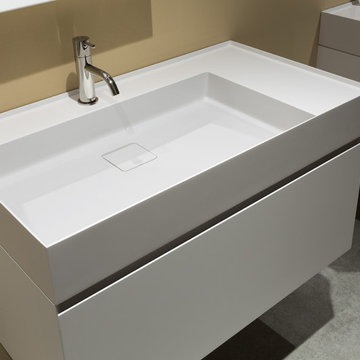
The Graffio sinks define a pure and contemporary style. The very thin edge widens in the back for the tap and to the side as an elegant and functional surface available smooth and grooved to increase the grip and facilitate the support of objects or accessories.
Rectangular, square, symmetrical or asymmetrical, single or double with rounded edges or perfectly regular, all with a flush drain cover of the same material. The perfect balance amongst the shapes amplifies the composition possibilities of this collection. Perfect alone or with furniture. Integrates well with the Bespoke collection. The sheer volume of the basin communicates well with the elegant finishes and surfaces of the cabinets.
Perfect geometrical shake that meet, clean lines and thin edges that define a perfect perimeter. Surfaces that overlap, compliment and pair up generating new shapes within its volume. Finally, a sign, a groove, a “scratch” that gives name to the collection.
 G.B. Construction and Development, Inc.
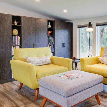
This studio apartment has a combo sleeping area, living area and kitchenette. Large windows on both sides of the room allow ample natural light giving the room a spacious airy feel. The ceiling beam adds visual interest as well as defines the spaces.
 Eubank Design Concepts
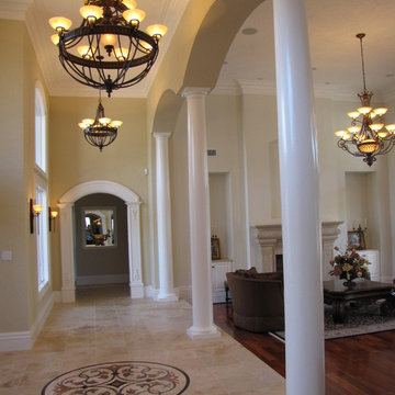
This spectacular entry foyer boasts a marble inlay in a travertine stone floor. The arches over the tapered classic columns separate the foyer from the formal living area and give a visual separation as well as defining a step down, ie two flooring materials. The shorter arch at the end of the foyer repeats the design element of the dramatic taller arches.
 Edifice Design - architects Sydney
AWARD WINNING DUPLEX DESIGN
Bob-a-day Park Little Bay duplex in historical precinct
This Little Bay duplex is the winner of the HIA Housing Awards 2019 for category:
– Townhouse/Villa Development 2-10 dwellings ‘HIA NSW Region’
and a finalist for category:
– Residential Interior Design ‘HIA NSW Region’
Judges said, “A functional design with a light and bright living area that has excellent cross flow ventilation and innovative design with sustainable features.”
Congratulating SSRB Developments with Edifice Design, Architects on such an outstanding achievement, HIA Executive Director – NSW, David Bare, said “The awards recognise excellence in residential construction and these awards provide a tremendous opportunity for HIA members to showcase their projects and highlight building and design excellence.” [HIA Media Release 19 October 2019]
Set in Little Bay’s old Prince Henry Hospital precinct, this dual occupancy is designed to complement its rare historic and coastal location. The two dwelling requirement and contextual fit make the building unique, shaped and functioning as follows:
Design
Subtly distinguished separate dwellings — while still appearing as a single residence.
Contemporary but synergistic with heritage setting — contemporary detailing with a scale (height, setbacks) in keeping with the historic “Flower’s Building” and materials/colour selections (face brick, boarded cladding, stone) that complements, not competes with, its heritage, seaside setting.
Streetscape and contextual fit:
The Ewing Avenue frontage and northern neighbour are addressed by a darker, quieter core element, clad in metal and light coloured, boarded features that extend from the ground to its flat parapeted roof.
The darker, northern side anchors the lighter and more open, glazed southern side that overlooks Bob A Day Park and sits beneath a flat planar roof. External walls are layered horizontally with boarded cladding to the first floor, flat rendered wall at the ground floor and a face brick basement.
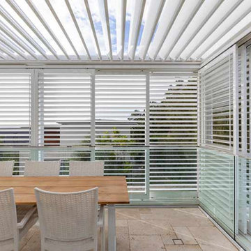
Balconies, views and privacy — generous floor to ceiling horizontal louvred windows fill rooms with sunlight and views to the park and ocean. The linear effect is further accentuated by both dwellings having projected outdoor balconies with the southern balcony having a continuum of louvres to either open or close for sunlight, stargazing or privacy.
Façade finishes and an entry of stone, copper and wood — texture and colour, accentuated by a copper panelled front door, timber louvres above and a feature stone blade wall, clearly defines the entry. Slender metal awnings and sliding panels also provide further articulation to the facades as well as privacy.
An entry of stone, copper and wood reflect façade finishes — texture and colour, accentuated by a copper panelled front door, timber louvres above and a feature stone blade wall, clearly define the entry. Slender metal awnings and
sliding panels also provide further articulation to the façades as well as privacy.
A welcoming sky lit void foyer — a large atrium with skylight window brightens the entryway and provides main circulation to the hall and stair.
Linear stair and lift amenity — a streamlined timber stairway with vertically lined balustrade is a focal point of the entry hall. A lift with ceramic tiles to floor and steel finishes services the main dwelling.
A handcrafted bespoke artisan sandstone wall with fireplace — is a centrepiece dividing the main living room from the eating and kitchen areas.
An unusual partially sunken roof terrace — which provides an entertainment area of spectacular district and ocean views while remaining relatively private, quiet and sheltered.
An exterior ‘living green wall’ — which is also viewable from the living room.
A sunny, north east plunge pool — which is overlooked by two semi enclosed entertainment balconies.
Large water tanks totalling 7000 litres — which services toilets, laundry and gardens.
An extensive solar panel system — totalling over 10 KWs.
Client brief
Dual occupancy required for accommodating two separate dwellings, the primary dwelling for parents long term and the secondary dwelling for extended family.
1. Quantitative requirements
Each dwelling with:
2 residential levels + roof terrace + basement carpark
main external balcony off the main living area
private garden setting
full ducted air conditioning
separation by a vertical, fire and acoustically rated, common wall.
Primary dwelling (southside) — for main family:
3 bedrooms, 2.5 bathrooms, laundry, open planned living, kitchen and dining areas, a separate TV room, roof terrace and serviced by a lift (basement to level 1)
5,000 litre rainwater tank servicing the toilets and laundry
5.4 KW solar panel system
2 car basement car park.
Secondary dwelling (northside) — for extended family:
3 bedrooms, 2 bathrooms, laundry, open planned living, kitchen, dining, a separate TV room
Plunge pool
2,000 litre rainwater tank servicing the toilets and laundry
4.8 kW solar panel system
1 car basement car park + 1 car hardstand.
2. Qualitative requirements:
Generally:
Maximise sun, light and outlook to all rooms. Extensive glazing and use of skylights.
Rooms to be designed as contemporary spaces with seamless, clean lines.
Colour selections to be light, non jarring, using colours from whites to neutrals.
Use of natural materials such as timber and stone.
Open planned living areas — kitchen, dining and living with a strong spatial connection to encourage family together time.
Main dwelling to have a separate TV room so that living areas remain unaffected by media intrusions.
Bedrooms grouped together on the ground floor to ensure district and ocean views are prioritised for the living areas.
Maximise louvred glazing to southern side of primary residence to overlook Bob A Day Park. Ocean views maximised where possible, most likely achieved across to the north east.
Multi-layered complex approval process
From the outset, there were numerous multi-layered approval stages through which to navigate. This ensured a vigorous, disciplined design approach. Stages included:
The Prince Henry Design Review Panel (PHDRP) — appointed by Landcom to monitor the historic Prince Henry development site
Randwick City Council — Development Application
NSW State Heritage Department — approval required given the project’s proximity to the historic “Flowers” building.
Randwick Council — the Construction Certificate was particularly involved with difficulties around strict adherence to; setbacks, height and floor space ratios and alignments with the southern setback of the “Flowers” Building, a flat roof geometry and guides around the use of external colour and materials.
Randwick Council jurisdiction
Photographer: Aimee Crouch
 G.B. Construction and Development, Inc.
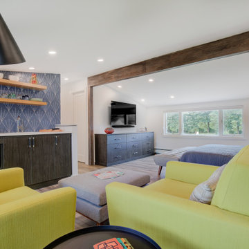
This studio apartment has a combo sleeping area, living area and kitchenette. Large windows on both sides of the room allow ample natural light giving the room a spacious airy feel. The ceiling beam adds visual interest as well as defines the spaces.

Sponsored
Sunbury, OH

J.Holderby - Renovations
Franklin County's Leading General Contractors - 2X Best of Houzz!
 Julie Schuster Design Studio
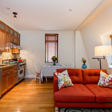
With the addition of an area rug, the space now has cohesiveness, as well as defined spaces
Example of a small 1960s home design design in New York
Example of a small 1960s home design design in New York
 Content Gift & Home Co.
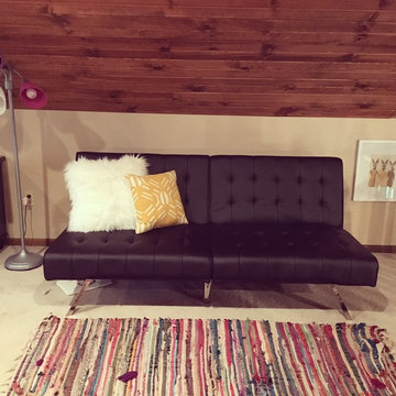
Client opted not to change the flooring of the loft at this time. I used a few rag rugs she had in another area of her home to add some color and texture to the loft floor, as well as define certain areas more clearly. This is the designated entertainment space - the futon sits across from the TV.
 Ambient
Graffio Collection by Antoniolupi
AL STUDIO
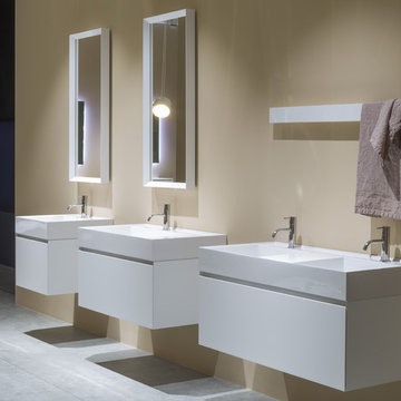
The Graffio sinks define a pure and contemporary style. The very thin edge widens in the back for the tap and to the side as an elegant and functional surface available smooth and grooved to increase the grip and facilitate the support of objects or accessories.
Rectangular, square, symmetrical or asymmetrical, single or double with rounded edges or perfectly regular, all with a flush drain cover of the same material. The perfect balance amongst the shapes amplifies the composition possibilities of this collection. Perfect alone or with furniture. Integrates well with the Bespoke collection. The sheer volume of the basin communicates well with the elegant finishes and surfaces of the cabinets.
Perfect geometrical shake that meet, clean lines and thin edges that define a perfect perimeter. Surfaces that overlap, compliment and pair up generating new shapes within its volume. Finally, a sign, a groove, a “scratch” that gives name to the collection.
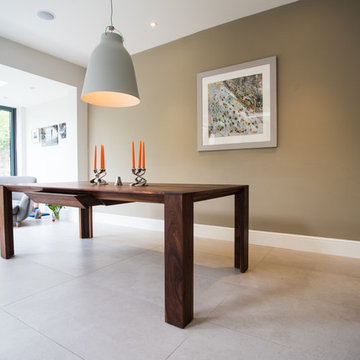
 George Robinson Kitchens
A feature wall behind the table has been painted with a different colour, complimenting the artwork and the rest of the space as well as defining the dining area as a focal point in its own right..


 Ambient
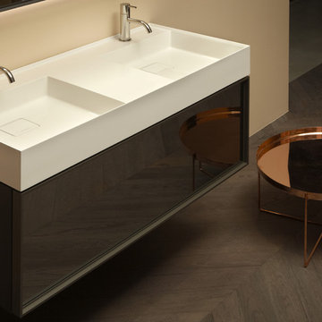
Graffio Collection by Antoniolupi
AL STUDIO
The Graffio sinks define a pure and contemporary style. The very thin edge widens in the back for the tap and to the side as an elegant and functional surface available smooth and grooved to increase the grip and facilitate the support of objects or accessories.
Rectangular, square, symmetrical or asymmetrical, single or double with rounded edges or perfectly regular, all with a flush drain cover of the same material. The perfect balance amongst the shapes amplifies the composition possibilities of this collection. Perfect alone or with furniture. Integrates well with the Bespoke collection. The sheer volume of the basin communicates well with the elegant finishes and surfaces of the cabinets.
Perfect geometrical shake that meet, clean lines and thin edges that define a perfect perimeter. Surfaces that overlap, compliment and pair up generating new shapes within its volume. Finally, a sign, a groove, a “scratch” that gives name to the collection.
 Ambient
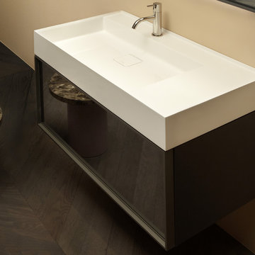
Graffio Collection by Antoniolupi
AL STUDIO
The Graffio sinks define a pure and contemporary style. The very thin edge widens in the back for the tap and to the side as an elegant and functional surface available smooth and grooved to increase the grip and facilitate the support of objects or accessories.
Rectangular, square, symmetrical or asymmetrical, single or double with rounded edges or perfectly regular, all with a flush drain cover of the same material. The perfect balance amongst the shapes amplifies the composition possibilities of this collection. Perfect alone or with furniture. Integrates well with the Bespoke collection. The sheer volume of the basin communicates well with the elegant finishes and surfaces of the cabinets.
Perfect geometrical shake that meet, clean lines and thin edges that define a perfect perimeter. Surfaces that overlap, compliment and pair up generating new shapes within its volume. Finally, a sign, a groove, a “scratch” that gives name to the collection.
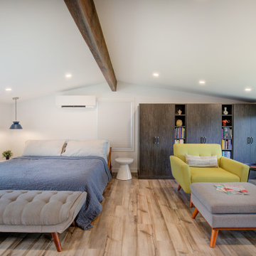 G.B. Construction and Development, Inc.
This studio apartment has a combo sleeping area, living area and kitchenette. Large windows on both sides of the room allow ample natural light giving the room a spacious airy feel. The ceiling beam adds visual interest as well as defines the spaces.
44