
Search results for "Well informed decisions" in Home Design Ideas

 Interiors By Agostino's
Interior Design Naples, FL
Small transitional enclosed medium tone wood floor and brown floor family room photo in Miami with beige walls, a wall-mounted tv and no fireplace
Small transitional enclosed medium tone wood floor and brown floor family room photo in Miami with beige walls, a wall-mounted tv and no fireplace

 Siberian Floors
Russian White Oak,
Fumed, Rustic Grade,
Hardwax Oil White Tint
Please visit the Siberian Floors website for more information and floor treatments!
Inspiration for a bedroom coastal kids' bedroom remodel in New York with white walls
Inspiration for a bedroom coastal kids' bedroom remodel in New York with white walls

 Eden LA Furniture and Interiors
Modern living with ocean breezes
__
This is another development project EdenLA assisted the client to finish quickly and for top dollar. The fun challenge of more contemporary spaces is how to make them warm and inviting while still maintaining the overall masculine appeal of their architecture. Water features, playful custom abstract art, unique furniture layouts, and warm stone and cabinetry decisions all helped to achieve that in this space. Beach Life Construction implemented the architect's indoor-outdoor flow on the top floor beautifully as well.
__
Kim Pritchard Photography
Find the right local pro for your project

 Acanthus Architecture, PA
Photography by Lissa Gotwals
Sunroom - large farmhouse screened-in, slate floor and gray floor sunroom idea with a roof extension, a standard fireplace, a brick fireplace and a skylight
Sunroom - large farmhouse screened-in, slate floor and gray floor sunroom idea with a roof extension, a standard fireplace, a brick fireplace and a skylight

 Miriam's River House Designs, LLC
Photo shows Japanese Tea House west side. The gravel path contains a Japanese dry river bed and an Inukshuk sculpture, metaphysically designed. The surrounding garden is the inner Roji garden and contains a Roji stepping stone path designed with a metaphysical pattern. pattern.
Photo credits:Dan Drobnick

 Deering Design Studio, Inc.
Deering Design Studio, Inc.
1950s open concept light wood floor living room photo in Seattle with a tile fireplace, a standard fireplace, no tv and beige walls
1950s open concept light wood floor living room photo in Seattle with a tile fireplace, a standard fireplace, no tv and beige walls

 Dovetail Renovation, Inc.
Example of a classic l-shaped medium tone wood floor eat-in kitchen design in Minneapolis with an undermount sink, shaker cabinets, white cabinets, blue backsplash, subway tile backsplash, stainless steel appliances and an island

Sponsored
Columbus, OH

Hope Restoration & General Contracting
Columbus Design-Build, Kitchen & Bath Remodeling, Historic Renovations

 Jennifer Robin Interiors
Paul Dyer Photography
Inspiration for a cottage formal living room remodel in San Francisco with white walls, a ribbon fireplace and no tv
Inspiration for a cottage formal living room remodel in San Francisco with white walls, a ribbon fireplace and no tv

 Advance Design Studio, Ltd.
After six years of living in their Huntley IL home, Chris and Meghan were tired of their dark, dingy, outdated kitchen and it was finally time for a long-anticipated change. “The kitchen is the place where we live, it’s where we do everything,” Meghan said. “It was important that it be a space where we wanted to be.” Meghan loves cooking and enjoys including their girls in healthy meal prepping, this led them to want a brighter, more enjoyable kitchen with increased functionality and improved storage.
For Chris especially, the laundry room was an entirely dysfunctional eyesore. “We had a washer and a dryer, but it was all kind-of cobbled together!” Chris said. “There were always laundry piles everywhere, we weren’t really sure what we wanted to do in there, but it was time for us to make a change.” The mess of the space was stressful every time they walked in the door from the garage each day. Kids’ backpacks and shoes piled up haphazardly in the makeshift boot-bench closet left the family feeling disorganized and stressed. They needed space for folding clothes and locker cubbies to help keep the family organized.
Having known Christine and Todd in the Huntley community for years, Chris and Meghan were familiar with their work. “We already trusted them personally and having seen their projects for years we knew they did top notch work. After we reviewed the initial round of designs, we knew that hiring them was definitely the right choice,” Meghan and Chris said. Although Chris had done a lot of work in their home himself, the kitchen and laundry room renovation was such a large undertaking that he didn’t want to steal time away from his family to spend what would surely be many long weekends doing the job himself. “That would not have been a wise choice for us,” Chris laughed.
“Our designer, Michelle was very, very, easy to work with; anything we wanted to see or weren’t sure about, she went above and beyond to make this easy for us. She was easy to get hold of and always quick to respond,” the couple said. Michelle pulled ideas that mirrored the couple’s taste and style and was adept at directing the couple to limited choices that didn’t overwhelm them and kept the process moving. “I have a hard time making decisions. Michelle made the decision-making process so easy. I loved how she listened to what I liked and then presented three great options for me to choose from,” Meghan said.
The main objectives for the kitchen were better storage solutions, they wanted the space to reflect their lifestyle and taste, and they wanted it to last for years with low maintenance. One of the first steps in creating a more functional kitchen was relocating the refrigerator, creating an improved workflow for the busy family.
“We didn’t know that we could even move the refrigerator to a new location where it is now, that was something that we never would have thought of,” Chris said. “The new refrigerator location makes the kitchen feel so much bigger. We didn’t add any space, but our whole kitchen with the new design just seems like it’s so much larger than before!” Meghan said.
The perimeter mist colored cabinets helped warm and brighten the entire room, while the graphite colored cabinets on the island added contrast. Using this fresh, clean color palette satisfied the couple’s desire for a bright space that was the exact opposite of what they had before. Organization accessories were also added to the cabinets such as a spice drawer tray and roll outs to create hidden convenience.
“I absolutely love the hidden spices – it makes cooking so much more enjoyable!” Chris said. “And all the pull outs, and the double trash bin, who would think you could get so excited about organization!” the couple said in unison.
One thing they hated in their original kitchen was how dark the space felt. Added lighting on the ceiling with the new light fixtures combined with the lighter cabinetry colors throughout solved this problem. “Our new kitchen has this warm, almost cozy feeling that our old kitchen never had, it’s just a space that I love spending my time in now,” Meghan said. The light airy feeling was accentuated with the use of floating white shelves on either side of the decorative range hood. “We have so much cabinetry space, the new design is amazing we actually have more storage space than we will ever need,” Meghan said.
The island was extended to create more work surface and added space for stool seating. “The new island changes how we live. Now the kids can be in the kitchen with us, doing homework, eating breakfast, and the three of us have special dinners there when Chris is working late,” Meghan said.
The Carrara Marmi Quartz countertops were chosen because they are, not only beautiful, but are made from hard-working material that doesn’t require maintenance. The white subway tile backsplash that wraps to the ceiling behind the focal point cooktop range/hood compliments the crisp white countertops perfectly, while brushed brass hardware and light fixtures keep the design fresh and new.
The couple had a few fears at the beginning of the project, as most homeowners do. Their biggest fear was being out of their kitchen and laundry room for an extended time. The crew made it very easy for the family to work in a limited space keeping the washer and dryer hooked up the majority of the time, and also getting appliances working with minimal downtime.
“They above and beyond accommodated us to get us through the process,” Meghan said. “They did a great job making sure we were as comfortable as possible throughout the process,” Chris added.
“Our project manager DJ did a great job. He was very good at updating us on schedule changes, getting guys in as quickly as possible. Everyone that stepped in the house was nice and did great work,” said Chris. They thought Advance’s carpenter was phenomenal and were impressed when he took a conceptual idea from a photograph and worked with designer Michelle to create a one of a kind range/hood that has become the topic of conversation with friends and family who visit the new kitchen. “He was in our house literally every day for several weeks. He was easy to work with and good at what he did,” Meghan and Chris said.
The focal point of the kitchen; a hand-crafted, custom-built ventilation hood was clad with handpicked reclaimed barnwood. Advance Design’s carpenter built the framework and the cladding to create a one-of-a-kind design element that the couple loves.
“I think it was especially fun for him to create something unique from scratch, showcasing his talent in this area,” Meghan said. “I love that my kitchen is not like everyone else’s. I got to pick out the wood on my hood and watch it being built and was able to choose what pieces of wood went where on it. It’s totally unique.”
Red Oak flooring was toothed-in throughout the kitchen and the rest of the first floor anywhere changes were made. Then the whole floor was refinished to tone down the orange undertones in the existing floor stain, ultimately changing the color complexion of the entire first floor. The result is a completely new feeling to the entire home.
Renovating the laundry room was extremely important to Meghan and Chris, but they had trouble visualizing what the possibilities were for the seemingly small space. Michelle produced beautiful 3D illustrations that helped them envision the space in a whole new way.
“I must have told Michelle 100 times that I am a visual person, seeing the designs in 3D made it so easy to make decisions and see what we could really do with our space,” Meghan said.
A dividing wall and doorway were removed between the existing laundry room and hallway formerly containing a coat closet, providing space to design specialized graphite colored cabinetry matching the kitchen island to house custom storage cubbies for each family member. Adding the tall utility cabinetry in the new laundry area helped solve the storage issue, tucking away cleaning supplies, household items, and even the cat got its own cubby.
“I love how everything is now hidden in its own space. I can’t tell you how much I hated coming home and seeing everything sitting around on counters,” Chris said.
Electrical outlets were planned for the inside of utility cabinets, so devices could charge in hidden locations. Stacking the washer and dryer allowed for wider countertop space to provide a folding area and a special space for clothes to hang. “The way I do laundry has been completely transformed! I can actually fold clothes and hang them now right out of the washer and dryer,” Meghan said.
“The end result in the kitchen and the laundry/mud room was an updated light and bright space, with a smarter work flow that better meets the needs of this family,” Michelle said.
“I would totally recommend Advance Design,” Meghan said. “Sometimes I sit and just look at my kitchen and laundry room and think ‘Wow, I can’t believe I get to live here!’ It’s an understatement to say we love our new space.”
 Designs by Priya
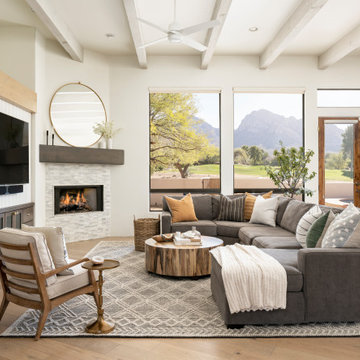
Inspiration for a transitional light wood floor living room remodel in Phoenix with a corner fireplace and a tile fireplace

 A! Emotional & estudioDOM
Inspiration for a bedroom and small scandinavian gender-neutral light wood floor kids' bedroom remodel in Barcelona with beige walls

 Rachel Loewen Photography
Photo: Rachel Loewen © 2018 Houzz
Beach style open concept living room photo in Chicago with white walls, a standard fireplace and a tile fireplace
Beach style open concept living room photo in Chicago with white walls, a standard fireplace and a tile fireplace

 TKS Design Group
Free ebook, Creating the Ideal Kitchen. DOWNLOAD NOW
This client came to us wanting some help with updating the master bath in their home. Their primary goals were to increase the size of the shower, add a rain head, add a freestanding tub and overall freshen the feel of the space.
The existing layout of the bath worked well, so we left the basic footprint the same, but increased the size of the shower and added a freestanding tub on a bit of an angle which allowed for some additional storage.
One of the most important things on the wish list was adding a rainhead in the shower, but this was not an easy task with the angled ceiling. We came up with the solution of using an extra long wall-mounted shower arm that was reinforced with a meal bracket attached the ceiling. This did the trick, and no extra framing or insulation was required to make it work.
The materials selected for the space are classic and fresh. Large format white oriental marble is used throughout the bath, on the floor in a herrinbone pattern and in a staggered brick pattern on the walls. Alder cabinets with a gray stain contrast nicely with the white marble, while shiplap detail helps unify the space and gives it a casual and cozy vibe. Storage solutions include an area for towels and other necessities at the foot of the tub, roll out shelves and out storage in the vanities and a custom niche and shaving ledge in the shower. We love how just a few simple changes can make such a great impact!
Designed by: Susan Klimala, CKBD
Photography by: LOMA Studios
For more information on kitchen and bath design ideas go to: www.kitchenstudio-ge.com



 O’Hara Interiors
Martha O'Hara Interiors, Interior Design | Troy Thies, Photography | Shannon Gale, Photo Styling
Large transitional living room photo in Minneapolis
Large transitional living room photo in Minneapolis

 Casabella Interiors
Bedroom - large traditional master carpeted and blue floor bedroom idea in Boston with beige walls and no fireplace

 Engstrom Wood Products
Inspiration for a coastal formal light wood floor living room remodel in Minneapolis with white walls, a standard fireplace, a stone fireplace and a concealed tv

 CDA Interior Design
Inspiration for a mediterranean dark wood floor dining room remodel in Dallas with multicolored walls and no fireplace



 Eco Choice Interiors
BAC Photography
Inspiration for a mid-sized timeless master subway tile and gray tile porcelain tile and white floor freestanding bathtub remodel in Atlanta with shaker cabinets, distressed cabinets, gray walls, an undermount sink and marble countertops
Inspiration for a mid-sized timeless master subway tile and gray tile porcelain tile and white floor freestanding bathtub remodel in Atlanta with shaker cabinets, distressed cabinets, gray walls, an undermount sink and marble countertops

 Colby Construction
Tricia Shay Photography
Beach style dark wood floor great room photo in Milwaukee with white walls
Beach style dark wood floor great room photo in Milwaukee with white walls

 Elise Landscapes & Nursery, LLC
Photo of a large traditional partial sun backyard stone retaining wall landscape in New York.
4