
Search results for "Well managed project" in Home Design Ideas
 U.S. Green Building Council (USGBC)
LEED Certification level: lEE FOR HOMES (V.3),SILVER.
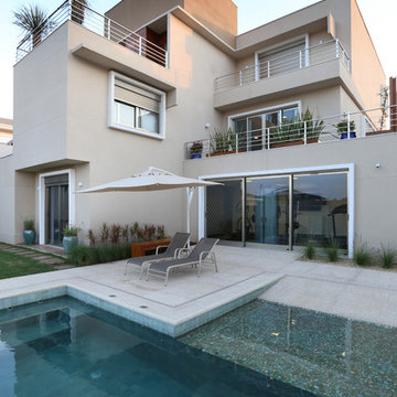
In Oct 8,2015, USGBC honored a Brazilian Project with the First LEED FOR HOMES certificate of Brazil, awarded with a high Silver score, ((81.5 final ptos - 12.5( HSA) resulting 69 ptos)) due to green strategies applied in different areas of construction. This outstanding result could only be achieved with the collaboration of a well-integrated team of professionals, focused on unifying solutions suitable to all areas of construction, with materials that provide high efficiency and counted on an experienced and dedicated team, the support given by homeowner during entire process was essential to success of this project.
The owner, who embraced LEED concepts, found his incentive on his granddaughter, who must have the opportunity to grow in an environment with availability of all natural resources, and endeavored to gather the team and to find solutions that best fit each opportunity.
The consequence of this work was an exceptional residence, being an impressive showcase of green building strategies that have come together in a home. Alphaville Dom Pedro Residence, as the project was named, sets an example of quality and sustainability, achieving new standards required by condominium rules of construction in Campinas city, 80 miles from São Paulo, state's capital capital.
The construction was managed by LCP Engineering & Construction, using the innovative Ecogrid® technology, based on SCIP (Structured Concrete Insulated Panel) construction, which provided this home a high thermal-acoustic performance, reduction on waste generation during construction and minimal energy consumption. Furthermore, this project was planned to take full advantage of the sun’s potential, through the usage of solar and photovoltaic panels, designed to produce the energy needed to heat all water from house and pool, as well as generate part of the electricity consumed.
Being one of the most treasured resources, a special care was given by the project team to the water management system. Saving water plays a big role in this fascinating project: action was taken to allow all water used in showers, sinks and from the rain to be reused after the treatment through a natural process, phytoremediation by wetland, for irrigation and toilets. Also efficient faucets and showers that have a low flow rate were used. The irrigation and landscape design, fully done with native vegetation, demands a low amount of water to fuel the drip irrigation system implemented on 100% of the landscape area.
Separate zones of irrigation were installed according to watering needs, equipped with an automatic activation system, moisture sensor and pressure regulation devices, all programmed to minimize evaporation losses. Polypropylene Random Copolymer (PPR) pipes were used replacing the PVC as non-toxic material, guarantying the joints between pipes and fittings for total security system . Furthermore, a high degree of internal living quality was achieved minimizing the bacterial proliferation; mold, mildew and termite free due to the Ecogrid Technology.
All finishing used on this residence, like tiles, faucets, toilets have a high percentage of recycle materials, provided by local manufacturers, promoting the maturity of the local industries complying with the rating of the certification process.
This marvel project is extremely important to the national market, representing a significant milestone in the Latin in Brazilian Residential Building Sector, bringing the LEED for Homes certification and establishing sustainable parameters to future home builders for example:
The house produces 46% of the energy used, NET Zero,
Inverter Split air conditioning system,
100% of the hot water coming from solar panel,
PVC free, use PPR pipes,
Use phytoremediation process achieving 62% efficient water reuse,
95% efficiency in non construction waste,
Confortable and Healthy Interior Environment.
In rapids highlights,
*Inovation in the technologic process of construction , ECOGRIDE, witch besides the environmental comfort, regards for the salubrity and owner,s welfare.
*Exceeded average rates of energy efficiency with the use of photovoltaic panels, HVAC and home appliances with the inverter technology.
*Consolidated the importance of social and education environmental practices of the workers and owner.
*Reference on sustainable urban condominiums with quality and connectivity in the state of Sao Paulo and Contribute for the Brazilian market improvement and proved that actual market is already prepare to supply the sustainable construction.
But the must important was….
“Once Upon a Time“… there was a devoted grandfather, who believed in a better world for his granddaughter, seeking for solutions to leave a legacy of learning and achievements ways for future generations.
This beautiful love story has a happy ending, with the reception of First Leed For Homes Silver in Brazil and First Leed For Homes Silver in Latin America, for this wonderful residence.
A home full of love, affection and “sweet home” for many happy moments between this grandfather and his granddaughter.
 Spazio LA
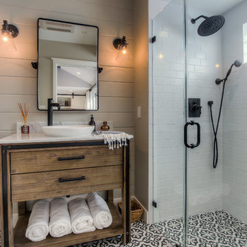
This beautiful bathroom features cement tiles (from Cement Tile Shop) on the floors with an infinity drain a custom frameless shower door and custom lighting. Vanity is Signature Hardware, and mirror is from Pottery Barn.
 DANE AUSTIN INTERIOR DESIGN Boston & Cambridge
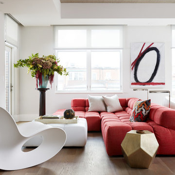
Governed by a white and red theme, we used sophisticated modern furnishings to divide the room into separate areas. For the TV area, we used a big square tufted cushion sectional in red with throw pillows and complemented it with a similar patterned coffee table and a futuristic rocking chair in white. The other area, which is more suitable for conversations, features four round sofa chairs in white and a circular center table in wood. We made the room more interesting through abstract wall art and a poodle dog sculpture in silver.
Stacy Zarin Goldberg Photography
Project designed by Boston interior design studio Dane Austin Design. They serve Boston, Cambridge, Hingham, Cohasset, Newton, Weston, Lexington, Concord, Dover, Andover, Gloucester, as well as surrounding areas.
For more about Dane Austin Design, click here: https://daneaustindesign.com/
To learn more about this project, click here: https://daneaustindesign.com/kalorama-penthouse
Find the right local pro for your project
 | SPIRAL ARCHITECTS |
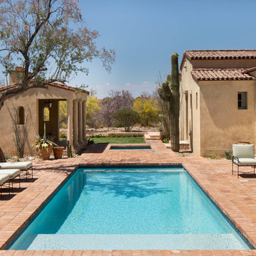
The backyard is designed around a traditional rectangular pool, with custom-sized fired adobe pavers crafted in Mexico specifically for the project. The large steel sash window and door assembly, 12 feet tall and 12 feet wide, offers a luxurious view of the pool courtyard, and the view continues to the lushly vegatated Reatta Wash and up to the mountains beyond. The house wraps around the pool area, creating an "estate" feel that is more commonly in nearby residences of far grander sizes. The tones of three-coat stucco wall finish blend perfectly with the pavers, water, and desert vegetation to create an authentic and satisfying environment, well suited to Scottsdale's climate. Design Principal: Gene Kniaz, Spiral Architects; General Contractor: Eric Linthicum, Linthicum Custom Builders; Photo: Josh Wells, Sun Valley Photo
 Luxapatio
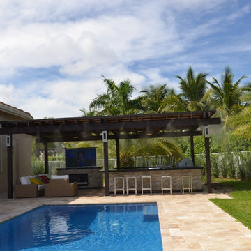
This Featured Project is a complete outdoor renovation in Weston Florida. This project included a Covered free standing wood pergola with a cooling mist irrigation system. The outdoor kitchen in this project was a one level bar design with a granite counter and stone wall finish. All of the appliances featured in this outdoor kitchen are part of the Twin Eagle line.
Some other items that where part of this project included a custom TV lift with Granite and stone wall finish as well as furniture from one of the lines featured at our showroom.
For more information regarding this or any other of our outdoor projects please visit our website at www.luxapatio.com where you may also shop online. You can also visit our showroom located in the Doral Design District ( 3305 NW 79 Ave Miami FL. 33122) or contact us at 305-477-5141.
 Drewett Works
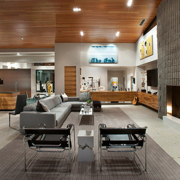
Believe it or not, this award-winning home began as a speculative project. Typically speculative projects involve a rather generic design that would appeal to many in a style that might be loved by the masses. But the project’s developer loved modern architecture and his personal residence was the first project designed by architect C.P. Drewett when Drewett Works launched in 2001. Together, the architect and developer envisioned a fictitious art collector who would one day purchase this stunning piece of desert modern architecture to showcase their magnificent collection.
The primary views from the site were southwest. Therefore, protecting the interior spaces from the southwest sun while making the primary views available was the greatest challenge. The views were very calculated and carefully managed. Every room needed to not only capture the vistas of the surrounding desert, but also provide viewing spaces for the potential collection to be housed within its walls.
The core of the material palette is utilitarian including exposed masonry and locally quarried cantera stone. An organic nature was added to the project through millwork selections including walnut and red gum veneers.
The eventual owners saw immediately that this could indeed become a home for them as well as their magnificent collection, of which pieces are loaned out to museums around the world. Their decision to purchase the home was based on the dimensions of one particular wall in the dining room which was EXACTLY large enough for one particular painting not yet displayed due to its size. The owners and this home were, as the saying goes, a perfect match!
Project Details | Desert Modern for the Magnificent Collection, Estancia, Scottsdale, AZ
Architecture: C.P. Drewett, Jr., AIA, NCARB | Drewett Works, Scottsdale, AZ
Builder: Shannon Construction | Phoenix, AZ
Interior Selections: Janet Bilotti, NCIDQ, ASID | Naples, FL
Custom Millwork: Linear Fine Woodworking | Scottsdale, AZ
Photography: Dino Tonn | Scottsdale, AZ
Awards: 2014 Gold Nugget Award of Merit
Feature Article: Luxe. Interiors and Design. Winter 2015, “Lofty Exposure”
 Bruns Architecture
Tricia Shay Photography
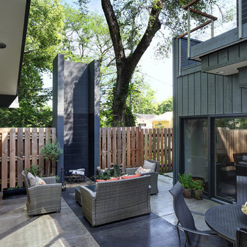
Example of a large trendy courtyard concrete patio design in Milwaukee with no cover
Example of a large trendy courtyard concrete patio design in Milwaukee with no cover

 TKS Design Group
Download our free ebook, Creating the Ideal Kitchen. DOWNLOAD NOW
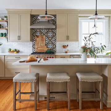
The homeowners came to us looking to update the kitchen in their historic 1897 home. The home had gone through an extensive renovation several years earlier that added a master bedroom suite and updates to the front façade. The kitchen however was not part of that update and a prior 1990’s update had left much to be desired. The client is an avid cook, and it was just not very functional for the family.
The original kitchen was very choppy and included a large eat in area that took up more than its fair share of the space. On the wish list was a place where the family could comfortably congregate, that was easy and to cook in, that feels lived in and in check with the rest of the home’s décor. They also wanted a space that was not cluttered and dark – a happy, light and airy room. A small powder room off the space also needed some attention so we set out to include that in the remodel as well.
See that arch in the neighboring dining room? The homeowner really wanted to make the opening to the dining room an arch to match, so we incorporated that into the design.
Another unfortunate eyesore was the state of the ceiling and soffits. Turns out it was just a series of shortcuts from the prior renovation, and we were surprised and delighted that we were easily able to flatten out almost the entire ceiling with a couple of little reworks.
Other changes we made were to add new windows that were appropriate to the new design, which included moving the sink window over slightly to give the work zone more breathing room. We also adjusted the height of the windows in what was previously the eat-in area that were too low for a countertop to work. We tried to keep an old island in the plan since it was a well-loved vintage find, but the tradeoff for the function of the new island was not worth it in the end. We hope the old found a new home, perhaps as a potting table.
Designed by: Susan Klimala, CKD, CBD
Photography by: Michael Kaskel
For more information on kitchen and bath design ideas go to: www.kitchenstudio-ge.com
 Advance Design Studio, Ltd.
After six years of living in their Huntley IL home, Chris and Meghan were tired of their dark, dingy, outdated kitchen and it was finally time for a long-anticipated change. “The kitchen is the place where we live, it’s where we do everything,” Meghan said. “It was important that it be a space where we wanted to be.” Meghan loves cooking and enjoys including their girls in healthy meal prepping, this led them to want a brighter, more enjoyable kitchen with increased functionality and improved storage.
For Chris especially, the laundry room was an entirely dysfunctional eyesore. “We had a washer and a dryer, but it was all kind-of cobbled together!” Chris said. “There were always laundry piles everywhere, we weren’t really sure what we wanted to do in there, but it was time for us to make a change.” The mess of the space was stressful every time they walked in the door from the garage each day. Kids’ backpacks and shoes piled up haphazardly in the makeshift boot-bench closet left the family feeling disorganized and stressed. They needed space for folding clothes and locker cubbies to help keep the family organized.
Having known Christine and Todd in the Huntley community for years, Chris and Meghan were familiar with their work. “We already trusted them personally and having seen their projects for years we knew they did top notch work. After we reviewed the initial round of designs, we knew that hiring them was definitely the right choice,” Meghan and Chris said. Although Chris had done a lot of work in their home himself, the kitchen and laundry room renovation was such a large undertaking that he didn’t want to steal time away from his family to spend what would surely be many long weekends doing the job himself. “That would not have been a wise choice for us,” Chris laughed.
“Our designer, Michelle was very, very, easy to work with; anything we wanted to see or weren’t sure about, she went above and beyond to make this easy for us. She was easy to get hold of and always quick to respond,” the couple said. Michelle pulled ideas that mirrored the couple’s taste and style and was adept at directing the couple to limited choices that didn’t overwhelm them and kept the process moving. “I have a hard time making decisions. Michelle made the decision-making process so easy. I loved how she listened to what I liked and then presented three great options for me to choose from,” Meghan said.
The main objectives for the kitchen were better storage solutions, they wanted the space to reflect their lifestyle and taste, and they wanted it to last for years with low maintenance. One of the first steps in creating a more functional kitchen was relocating the refrigerator, creating an improved workflow for the busy family.
“We didn’t know that we could even move the refrigerator to a new location where it is now, that was something that we never would have thought of,” Chris said. “The new refrigerator location makes the kitchen feel so much bigger. We didn’t add any space, but our whole kitchen with the new design just seems like it’s so much larger than before!” Meghan said.
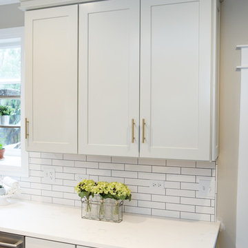
The perimeter mist colored cabinets helped warm and brighten the entire room, while the graphite colored cabinets on the island added contrast. Using this fresh, clean color palette satisfied the couple’s desire for a bright space that was the exact opposite of what they had before. Organization accessories were also added to the cabinets such as a spice drawer tray and roll outs to create hidden convenience.
“I absolutely love the hidden spices – it makes cooking so much more enjoyable!” Chris said. “And all the pull outs, and the double trash bin, who would think you could get so excited about organization!” the couple said in unison.
One thing they hated in their original kitchen was how dark the space felt. Added lighting on the ceiling with the new light fixtures combined with the lighter cabinetry colors throughout solved this problem. “Our new kitchen has this warm, almost cozy feeling that our old kitchen never had, it’s just a space that I love spending my time in now,” Meghan said. The light airy feeling was accentuated with the use of floating white shelves on either side of the decorative range hood. “We have so much cabinetry space, the new design is amazing we actually have more storage space than we will ever need,” Meghan said.
The island was extended to create more work surface and added space for stool seating. “The new island changes how we live. Now the kids can be in the kitchen with us, doing homework, eating breakfast, and the three of us have special dinners there when Chris is working late,” Meghan said.
The Carrara Marmi Quartz countertops were chosen because they are, not only beautiful, but are made from hard-working material that doesn’t require maintenance. The white subway tile backsplash that wraps to the ceiling behind the focal point cooktop range/hood compliments the crisp white countertops perfectly, while brushed brass hardware and light fixtures keep the design fresh and new.
The couple had a few fears at the beginning of the project, as most homeowners do. Their biggest fear was being out of their kitchen and laundry room for an extended time. The crew made it very easy for the family to work in a limited space keeping the washer and dryer hooked up the majority of the time, and also getting appliances working with minimal downtime.
“They above and beyond accommodated us to get us through the process,” Meghan said. “They did a great job making sure we were as comfortable as possible throughout the process,” Chris added.
“Our project manager DJ did a great job. He was very good at updating us on schedule changes, getting guys in as quickly as possible. Everyone that stepped in the house was nice and did great work,” said Chris. They thought Advance’s carpenter was phenomenal and were impressed when he took a conceptual idea from a photograph and worked with designer Michelle to create a one of a kind range/hood that has become the topic of conversation with friends and family who visit the new kitchen. “He was in our house literally every day for several weeks. He was easy to work with and good at what he did,” Meghan and Chris said.
The focal point of the kitchen; a hand-crafted, custom-built ventilation hood was clad with handpicked reclaimed barnwood. Advance Design’s carpenter built the framework and the cladding to create a one-of-a-kind design element that the couple loves.
“I think it was especially fun for him to create something unique from scratch, showcasing his talent in this area,” Meghan said. “I love that my kitchen is not like everyone else’s. I got to pick out the wood on my hood and watch it being built and was able to choose what pieces of wood went where on it. It’s totally unique.”
Red Oak flooring was toothed-in throughout the kitchen and the rest of the first floor anywhere changes were made. Then the whole floor was refinished to tone down the orange undertones in the existing floor stain, ultimately changing the color complexion of the entire first floor. The result is a completely new feeling to the entire home.
Renovating the laundry room was extremely important to Meghan and Chris, but they had trouble visualizing what the possibilities were for the seemingly small space. Michelle produced beautiful 3D illustrations that helped them envision the space in a whole new way.
“I must have told Michelle 100 times that I am a visual person, seeing the designs in 3D made it so easy to make decisions and see what we could really do with our space,” Meghan said.
A dividing wall and doorway were removed between the existing laundry room and hallway formerly containing a coat closet, providing space to design specialized graphite colored cabinetry matching the kitchen island to house custom storage cubbies for each family member. Adding the tall utility cabinetry in the new laundry area helped solve the storage issue, tucking away cleaning supplies, household items, and even the cat got its own cubby.
“I love how everything is now hidden in its own space. I can’t tell you how much I hated coming home and seeing everything sitting around on counters,” Chris said.
Electrical outlets were planned for the inside of utility cabinets, so devices could charge in hidden locations. Stacking the washer and dryer allowed for wider countertop space to provide a folding area and a special space for clothes to hang. “The way I do laundry has been completely transformed! I can actually fold clothes and hang them now right out of the washer and dryer,” Meghan said.
“The end result in the kitchen and the laundry/mud room was an updated light and bright space, with a smarter work flow that better meets the needs of this family,” Michelle said.
“I would totally recommend Advance Design,” Meghan said. “Sometimes I sit and just look at my kitchen and laundry room and think ‘Wow, I can’t believe I get to live here!’ It’s an understatement to say we love our new space.”
 RBL Architects
This project was nearly a complete gut renovation of an existing Victorian built in the 1890’s. We did save or rebuild major elements such as the exterior millwork, ornate entry stair and stained glass windows. An addition to the south side of the house integrated the rooflines and exterior details to create a seamless blend between the old and new. The goal of the project was to modernize the house and interior layout while still keeping the feel of a traditional home. Major elements in the scope included a completely new open kitchen, expanded living room, new master bedroom and bath suite, all new family baths and powder room. The renovation also included a library to house the owner’s extensive book collection as well as a basement workout and family room area. One primary request of the owners was to rid the house of a bat infestation problem due to poorly detailed roof vents. Once we rebuilt the roof soffits and provided new insulation for the house, the bat issue was resolved.

 Twelve Stones Designs, LLC
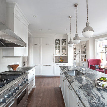
The owners of this kitchen had spent the money to upgrade the finishes in their kitchen upon building the home 12 years ago, but after living in the space for several years they realized how nonfunctional the layout really was. The (then) two preschool aged children had grown into busy, hungry teenagers with many friends who also liked to hang out at the house. So the family needed a more functional kitchen with better traffic flow, space for daily activities revolving around the kitchen at different times of day, and a kitchen that could accommodate cooking for and serving large groups. Furthermore, the dark, traditional finishes no longer reflected the homeowners’ style. They requested a brighter, more relaxed, coastal style that reflected their love of the seaside cities they like to visit.
Originally, the kitchen was U-shaped with a narrow island in the middle. The island created narrow aisles that bottle-necked at the dishwasher, refrigerator, and cooktop areas. There was a pass-through from the foyer into the kitchen, but the owners never liked that the pass-through was also located so close to the powder room. The awkward proximity was unappealing and made guests feel uncomfortable.
The kitchen’s storage was made up of lots of narrow cabinets, apothecary drawers, clipped corner units, and very few drawers. It lacked useful storage for the larger items the family used on a daily basis. And the kitchen’s only pantry was small closet that had only builder-grade, narrow shelving with no illumination to be able to see the contents inside.
Overall, the kitchen’s lighting plan was poorly executed. Only six recessed cans illuminated the entire kitchen and nook areas. The under cabinet lighting was not evenly distributed either. In fact, the builder had mis-placed the under cabinet lighting around the decorative pilasters which made for choppy, dark cubbies. Further, the builder didn’t include any lighting over the sink or the bar area, which meant whoever was doing the dishes was always in their own shadow. That, coupled with the steep overhang of the game room above made the bar area feel like a dim, cavernous space that wasn’t inviting or task oriented. The kitchen looked out into the main living space, but the raised bar and a narrow wall (which held the only large cabinet in the kitchen) created more of a barrier than a relationship to the living room or breakfast nook. In fact, one couldn’t even see the breakfast nook from the cooktop or sink areas due to its orientation. The raised bar top was too narrow to comfortably sit to either dine at or chat from due to the lack of knee space. The the homeowners confided that the kitchen felt more like a dark, dirty prison than place where the family, or their guests, wanted to gather and commune.
The clients' needs and desires were:
➢ to create a kitchen that would be a space the family loved to be in; to relate to the adjacent spaces all around, and to have better flow for entertaining large groups
➢ to remove the walls between the breakfast nook and living area and to be able to utilize the natural light from the windows in both those areas
➢ to incorporate a functional chopping block for prepping fresh food for home cooked meals, an island with a large sink and drain board, 2 pull out trash cans, and seating for at least the 2 teens to eat or do homework
➢ to design a kitchen and breakfast nook with an airy, coastal, relaxed vibe that blended with the rest of the house's coastal theme
➢ to integrate a layered lighting plan which would include ample general illumination, specific task lighting, decorative lighting, and lots of illuminated storage
➢ to design a kitchen with not only more storage for all the husband’s kitchen gadgets and collection of oils and spices, but smart storage, including a coffee/breakfast bar and a place to store and conceal the toaster oven and microwave
➢ to find a way to utilize the large open space between the kitchen, pantry area, and breakfast nook
Twelve Stones Designs achieved the owner's goals by:
➢ removing the walls between the kitchen and living room to allow the natural light to filter in from the adjacent rooms and to create a connection between the kitchen, nook, and living spaces for a sense of unity and communion
➢ removing the existing pantry and designing 3 large pantry style cabinets with LED tape lights and rollout drawers to house lots of kitchen appliances, gadgets, and tons of groceries. We also took the cabinets all the way up to the 9’ ceiling for additional storage for seasonal items and bulk storage.
➢ designing 2 islands - 1 with a gorgeous black walnut chopping block that houses a drawer for chopping and carving knives and a custom double pull out trash unit for point of use utilization - and 1 that houses the dishwasher, a large Blanco Gourmet sink with integrated drain board, woven baskets for fresh root vegetables and kitchen towels, plenty of drawer storage for kitchen items, and bar seating for up to 4 diners.
➢ closing off the space between the kitchen and the powder room to create a beautiful new private alcove for the powder room as well as adding some decorative storage. This also gave us space to include more tall storage near the new range for precision placement of the husband’s extensive oil and spice collection as well as a location for a combo-steam oven the wife wanted for baking and cooking healthy meals.
The project is enhanced functionally by:
➢ incorporated USB and standard receptacles for the kids’ laptops and phone charging in the large island
➢ designing the small island to include additional open shelving for items used on a daily basis such as a variety of bowls, plates, and colanders. This set up also works well for the husband who prefers to “plate” his dinners in restaurant-style fashion before presenting them to the table.
➢ the integration of specific storage units, such as double stacked cutlery drawers, a custom spice pull-out, a Kuerig coffee and tea pod drawer, and custom double stacked utensil drawers
➢ moving the refrigerator to the old oven location - this eliminated the bottle neck as well as created a better relationship to the eating table. It also utilizes the floor space between the pantry, nook, and kitchen
➢ creating a banquet style breakfast nook - this banquette seating not only doubles the amount of seating for large gatherings but it better utilizes the odd space between the kitchen and the previous nook area. It also helps to create a distinct pathway from the mudroom room through the pantry area, kitchen, nook, and living room.
➢ the coffee/breakfast bar area which includes the perfect location for the concealed microwave and toaster oven, convenient storage for the coffee pods and tea accoutrements. Roll-out drawers below also house the smoothie maker, hot water kettle, and a plethora of smoothie-making ingredients such as protein powders, smoothie additives, etc. Furthermore, the drawers below the Keurig house measuring utensil, cutlery, baking supplies and tupperware storage.
➢ incorporating lots of wide drawers and pullouts to accommodate large cookware.
➢ utilizing as much vertical space as possible by building storage to the ceiling which accommodates the family’s abundant amount of serving platters, baking sheets, bakeware, casserole dishes, and additional cutting boards.
The project is enhanced aesthetically by:
➢ new 5-piece Versailles pattern porcelain tile that now seamlessly joins the entire down stairs area together creating a bright, cohesiveness feeling instead of choppy separated spaces - it also adds a coastal feeling
➢ designing a cabinet to conceal the microwave and toaster oven
➢ the coastal influenced light fixtures over the nook table and island
➢ the sandy colors of the Langdon Cambria countertops. The swirling pattern and sparkling quartz pieces remind the homeowner of black-and-tan sandy beaches
➢ the striped banquet seating whose creamy white background and blue-green stripes were the inspiration for the cabinet and wall colors.
➢ All the interior doors were painted black to coordinate with the blacks and grays in the backsplash tile and countertop. This also adds a hint of tailored formality to an otherwise casual space.
➢ the use of WAC's Oculux small aperture LED units for the overhead lighting complimented with Diode LED strips for task lighting under the cabinets and inside the pantry and glass wall cabinets. All of the lighting applications are on separate dimmer switches.
Innovative uses of materials or construction methods by Realty Restoration LLC:
➢ Each 1-1/2” x 3” block of reclaimed end-grain black walnut that makes up the center island chopping block was hand milled and built in the shop. It was designed to look substantial and proportional to the surrounding elements, executed by creating the 4 inch tall top with a solid wood chamfered edge band.
➢ The metal doors on either side of the vent hood were also custom designed for this project and built in the Realty Restoration LLC shop. They are made 1x2, 11-gauge mild steel with ribbed glass. Weighing 60 lbs a piece, heavy duty cabinet hinges were added to support the weight of the door and keep them from sagging.
➢ Under-cabinet receptacles were added along the range wall in order to have a clean, uninterrupted backsplash.
Design obstacles to overcome:
➢ Because we were removing the demising walls between the kitchen and living room, we had to find a way to plumb and vent the new island. We did this by tunneling through the slab (the slab had post tension cables which prevented us from just trenching) to run a new wet vent through a nearby structural wall. We pulled the existing hot and cold lines between upper floor joists and ran them down the structural wall as well and up through a conduit in the tunnel.
➢ Since we were converting from wall overs to a gas range it allowed us to utilize the 220 feed for the wall ovens to provide a new sub panel for all the new kitchen circuits
➢ Due to framing deficiencies inherited from the original build there was a 1-1/2” differential in the floor-to-ceiling height over a 20 foot span; by utilizing the process of cutting and furring coupled with the crown moulding details on the cabinet elevations we were able to mask the problem and provide seamless transitions between the cabinet components.
Evidence of superior craftsmanship:
➢ uniquely designed, one-of-a-kind metal “X” end panels on the large island. The end panels were custom made in the Realty Restoration LLC shop and fitted to the exact dimensions of the island. The welding seams are completely indistinguishable - the posts look like they are cut from a single sheet of metal
➢ square metal posts on the small island were also custom made and designed to compliment and carry through the metal element s throughout the kitchen
➢ the beautiful, oversized end panels on the pantry cabinets which give the breakfast nook a tailored look
➢ integrating a large format 5 piece Versailles tile pattern to seamlessly flow from the existing spaces into the new kitchen space
➢ By constructing a custom cabinet that jogged around a corner we could not remodel (housing the entry way coat closet) we were able to camouflage the adjacent wall offset within the upper and lower cabinets. By designing around the existing jog in the structural walls we accomplished a few things: we were able to find the space to house, and hide, the microwave and toaster oven yet still have a clean cohesive appearance from the kitchen side. Additionally, the owners were able to keep their much needed coat closet and we didn’t have to increase the budget with unnecessary structural work.
 Equine Facility Design
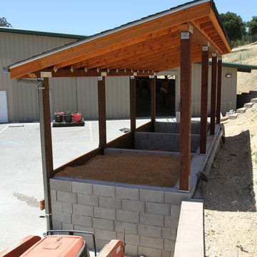
This project consisted of renovating an existing 17 stall stable and indoor riding arena, 3,800 square foot residence, and the surrounding grounds. The renovated stable boasts an added office and was reduced to 9 larger stalls, each with a new run. The residence was renovated and enlarged to 6,600 square feet and includes a new recording studio and a pool with adjacent covered entertaining space. The landscape was minimally altered, all the while, utilizing detailed space management which makes use of the small site, In addition, arena renovation required successful resolution of site water runoff issues, as well as the implementation of a manure composting system for stable waste. The project created a cohesive, efficient, private facility. - See more at: http://equinefacilitydesign.com/project-item/three-sons-ranch#sthash.wordIM9U.dpuf
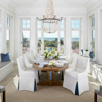
 ONYX DESIGN COLLABORATIVE
Photography: Dana Hoff
Architecture and Interiors: Anderson Studio of Architecture & Design; Scott Anderson, Principal Architect/ Mark Moehring, Project Architect/ Adam Wilson, Associate Architect and Project Manager/ Ryan Smith, Associate Architect/ Michelle Suddeth, Director of Interiors/Emily Cox, Director of Interior Architecture/Anna Bett Moore, Designer & Procurement Expeditor/Gina Iacovelli, Design Assistant
Dining Table: Century Furniture
Oyster Chandelier: Lowcountry Originals
Rug: Designer Carpets
Fabric/Leather: Perennials, Edelman
Built-in Cushions: Jean's Custom Workroom
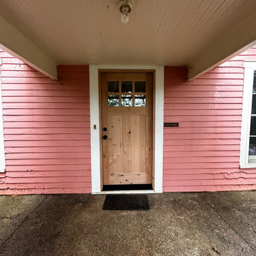
 Byggmeister Inc
Photo by Mike Casey
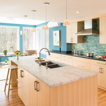
Cramped, uncomfortable, and out of date: when the owners of this home approached us about renovating their kitchen and adjoining sunroom, these were high on their list of complaints.
OPENING UP THE KITCHEN
Our plan kept the kitchen in the same location but took down the walls between both the dining room and the sunroom to create an expansive multi-purpose space with spectacular views to conservation land along the back of the property. We removed the powder room and in its place created a window-lined hallway to the living room—opening up direct access between these two previously disconnected spaces. We then built a new half bath between these two rooms, with a door along the back hallway. The result is a more private powder room that is easier to access than before.
Significantly improved cabinetry provides ample storage for both human and canine needs. An island countertop is functional and pleasant, enabling the owners to prep for and clean up from dinner all while enjoying the view of the woods behind their house.
CREATING COMFORT
We also completely rebuilt the sunroom, thickening the framing to allow for extra insulation and raising the roof to accommodate a higher ceiling and tall windows that let in as much natural light as the skylights they replaced, but much less of the solar gain that had made the room so intolerable in the summer.
We improved visual connections between spaces and admitted more natural light by converting the framing of the main stairway from full to half walls. We also insulated the attic and replaced an aging, inefficient central air conditioning system with ductless minisplit heat pumps, which can also be used as supplemental heat.
All in all, this was our kind of project: we made the home more attractive, more comfortable, and more energy-efficient—all over the course of a single, well-integrated project.
 Gardner Architects LLC
Photography by Jim Tetro
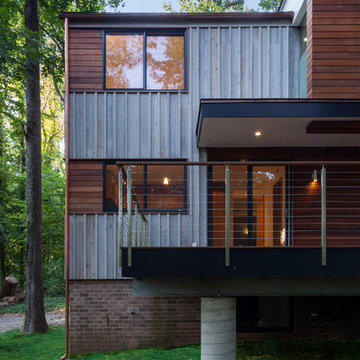
This house, built in the 1960s, sits southfacing on a terrific wooded lot in Bethesda, Maryland.
The owners desire a whole-house renovation which would improve the general building fabric and systems, and extend the sense of living out of doors in all seasons.
The original sixties-modern character is preserved and the renovation extends the design forward into a contemporary, modern approach. Connections to and through the site are enhanced through the creation of new larger window and door openings.
Screened porches and decks perch above the sloped and wooded site. The new kitchen and bathrooms allow for opportunities to feel out-of -doors while preparing, cooking, dining, and bathing.
Smart passive strategies guide the environmental choices for this project, including envelope improvements, updated mechanical systems, and on-site stormwater management.
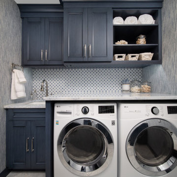
 Henrietta Heisler Interiors Inc
This little laundry room uses hidden tricks to modernize and maximize limited space. The main wall features bumped out upper cabinets above the washing machine for increased storage and easy access. Next to the cabinets are open shelves that allow space for the air vent on the back wall. This fan was faux painted to match the cabinets - blending in so well you wouldn’t even know it’s there!
Between the cabinetry and blue fantasy marble countertop sits a luxuriously tiled backsplash. This beautiful backsplash hides the door to necessary valves, its outline barely visible while allowing easy access.
Making the room brighter are light, textured walls, under cabinet, and updated lighting. Though you can’t see it in the photos, one more trick was used: the door was changed to smaller french doors, so when open, they are not in the middle of the room. Door backs are covered in the same wallpaper as the rest of the room - making the doors look like part of the room, and increasing available space.
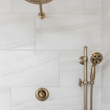
 StoneUnlimited Kitchen and Bath Remodeling
This aesthetically pleasing master bathroom is the perfect place for our clients to start and end each day. Fully customized shower fixtures and a deep soaking tub will provide the perfect solutions to destress and unwind. Our client's love for plants translates beautifully into this space with a sage green double vanity that brings life and serenity into their master bath retreat. Opting to utilize softer patterned tile throughout the space, makes it more visually expansive while gold accessories, natural wood elements, and strategically placed rugs throughout the room, make it warm and inviting.
Committing to a color scheme in a space can be overwhelming at times when considering the number of options that are available. This master bath is a perfect example of how to incorporate color into a room tastefully, while still having a cohesive design.
Items used in this space include:
Waypoint Living Spaces Cabinetry in Sage Green
Calacatta Italia Manufactured Quartz Vanity Tops
Elegant Stone Onice Bianco Tile
Natural Marble Herringbone Tile
Delta Cassidy Collection Fixtures
Want to see more samples of our work or before and after photographs of this project?
Visit the Stoneunlimited Kitchen and Bath website:
www.stoneunlimited.net
Stoneunlimited Kitchen and Bath is a full scope, full service, turnkey business. We do it all so that you don’t have to. You get to do the fun part of approving the design, picking your materials and making selections with our guidance and we take care of everything else. We provide you with 3D and 4D conceptual designs so that you can see your project come to life. Materials such as tile, fixtures, sinks, shower enclosures, flooring, cabinetry and countertops are ordered through us, inspected by us and installed by us. We are also a fabricator, so we fabricate all the countertops. We assign and manage the schedule and the workers that will be in your home taking care of the installation. We provide painting, electrical, plumbing as well as cabinetry services for your project from start to finish. So, when I say we do it, we truly do it all!
 Pennsylvania Landscape & Nursery Association
Terren Landscapes http://www.terrenlandscapes.com
Project Entry: Pembrooke Estate Rain Garden
2014 PLNA Awards for Landscape Excellence Winner
Category: Sustainable Landscape &60,000-$120,000
Award Level: Silver
Project Description:
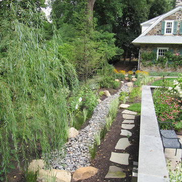
The client contracted our company to solve multiple existing drainage problems. In a heavy rain event the existing French drain system would overflow, causing water to pool in the driveway. After investigating the system we found that the capacity of the French drain was undersized for the amount of storm water from the large rain events received in recent years. As a result of our findings and at the request of the homeowner, we designed a storm water management system to capture all storm water from the structures on the property and regenerate the underground aquifers for the volume of a 5.8” rainstorm. In addition to the new drain system, the homeowners wanted a rain garden to provide a backdrop for an existing formal garden, provide a habitat for wildlife, and provide screening from an adjacent neighbor.
Throughout the design process many challenges were presented, including an existing gas line, which ran directly through the area that best suited the bioswale. The existence of the gas line caused us to alter the shape and depth of the bioswale in some areas. We also inspected the existing downspouts to make sure there were no obstructions that would impede the system’s efficiency, and then conducted a test pit dig to make sure we had sufficient percolation rates for disposal of storm water.
To effectively capture the storm water runoff, the existing downspouts were piped from the main house and the large detached garage to a large catch basin located at the low point in the driveway. The driveway catch basin contains two outlet pipes at different elevations within the basin allowing water from smaller rain events to enter the bioswale and rain garden area to percolate into the soil before excess water overflows into a sediment trap which filters out any debris and is then piped to an underground StormTech® pit to slowly percolate into the ground. The other outlet pipe in the driveway catch basin is used for larger storm water events, taking the water directly to the StormTech® pit.
Accepting and slowing the velocity of the storm water, mitigation of erosion, and filtering out pollutants contained in the “first flush” of rainfall are the primary functions of the bioswale and rain garden. Planting these areas with mostly native plant species helps carry out these functions while attracting and providing shelter for wildlife.
The ‘Niobe’ weeping willow is the centerpiece of the rain garden, connecting with the axis of the existing formal garden. To screen the neighboring property we chose Chamaecyparis nootkatensis ‘Pendula’ for its graceful evergreen habit and tolerance of wet sites. ‘Ivory Halo’ dogwood and Panicum ‘Cloud Nine’ were used for screening as well as winter interest. To provide deciduous structure to the garden Taxodium distichum and Magnolia virginiana were used in conjunction with witch hazel. Mostly native wetland perennials were used due to their tolerance of wet conditions and occasional drought.
The area above the StormTech® pit provides space for the client’s family to relax. The rain garden and bioswale provide screening, storm water management, a habitat for wildlife, and plants that enhance the adjacent formal garden.
Photo Credit: Terren Landscapes
 Rudloff Custom Builders
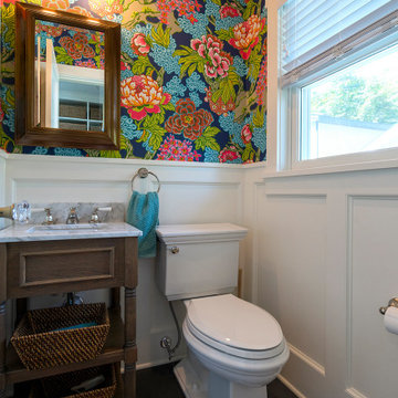
The vibrant powder room has floral wallpaper highlighted by crisp white wainscoting. The vanity is a custom-made, furniture grade piece topped with white Carrara marble. Black slate floors complete the room.
What started as an addition project turned into a full house remodel in this Modern Craftsman home in Narberth, PA. The addition included the creation of a sitting room, family room, mudroom and third floor. As we moved to the rest of the home, we designed and built a custom staircase to connect the family room to the existing kitchen. We laid red oak flooring with a mahogany inlay throughout house. Another central feature of this is home is all the built-in storage. We used or created every nook for seating and storage throughout the house, as you can see in the family room, dining area, staircase landing, bedroom and bathrooms. Custom wainscoting and trim are everywhere you look, and gives a clean, polished look to this warm house.
Rudloff Custom Builders has won Best of Houzz for Customer Service in 2014, 2015 2016, 2017 and 2019. We also were voted Best of Design in 2016, 2017, 2018, 2019 which only 2% of professionals receive. Rudloff Custom Builders has been featured on Houzz in their Kitchen of the Week, What to Know About Using Reclaimed Wood in the Kitchen as well as included in their Bathroom WorkBook article. We are a full service, certified remodeling company that covers all of the Philadelphia suburban area. This business, like most others, developed from a friendship of young entrepreneurs who wanted to make a difference in their clients’ lives, one household at a time. This relationship between partners is much more than a friendship. Edward and Stephen Rudloff are brothers who have renovated and built custom homes together paying close attention to detail. They are carpenters by trade and understand concept and execution. Rudloff Custom Builders will provide services for you with the highest level of professionalism, quality, detail, punctuality and craftsmanship, every step of the way along our journey together.
Specializing in residential construction allows us to connect with our clients early in the design phase to ensure that every detail is captured as you imagined. One stop shopping is essentially what you will receive with Rudloff Custom Builders from design of your project to the construction of your dreams, executed by on-site project managers and skilled craftsmen. Our concept: envision our client’s ideas and make them a reality. Our mission: CREATING LIFETIME RELATIONSHIPS BUILT ON TRUST AND INTEGRITY.
Photo Credit: Linda McManus Images
 Rudloff Custom Builders
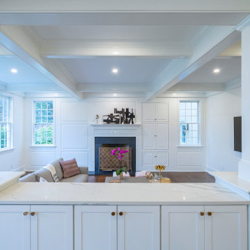
In the divide between the kitchen and family room, we built storage into the buffet. We applied moulding to the columns for an updated and clean look.
Sleek and contemporary, this beautiful home is located in Villanova, PA. Blue, white and gold are the palette of this transitional design. With custom touches and an emphasis on flow and an open floor plan, the renovation included the kitchen, family room, butler’s pantry, mudroom, two powder rooms and floors.
Rudloff Custom Builders has won Best of Houzz for Customer Service in 2014, 2015 2016, 2017 and 2019. We also were voted Best of Design in 2016, 2017, 2018, 2019 which only 2% of professionals receive. Rudloff Custom Builders has been featured on Houzz in their Kitchen of the Week, What to Know About Using Reclaimed Wood in the Kitchen as well as included in their Bathroom WorkBook article. We are a full service, certified remodeling company that covers all of the Philadelphia suburban area. This business, like most others, developed from a friendship of young entrepreneurs who wanted to make a difference in their clients’ lives, one household at a time. This relationship between partners is much more than a friendship. Edward and Stephen Rudloff are brothers who have renovated and built custom homes together paying close attention to detail. They are carpenters by trade and understand concept and execution. Rudloff Custom Builders will provide services for you with the highest level of professionalism, quality, detail, punctuality and craftsmanship, every step of the way along our journey together.
Specializing in residential construction allows us to connect with our clients early in the design phase to ensure that every detail is captured as you imagined. One stop shopping is essentially what you will receive with Rudloff Custom Builders from design of your project to the construction of your dreams, executed by on-site project managers and skilled craftsmen. Our concept: envision our client’s ideas and make them a reality. Our mission: CREATING LIFETIME RELATIONSHIPS BUILT ON TRUST AND INTEGRITY.
Photo Credit: Linda McManus Images
27