
Search results for "Well off environment" in Home Design Ideas
 | SPIRAL ARCHITECTS |
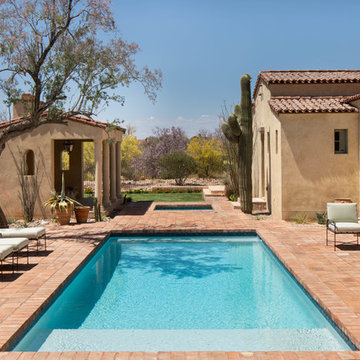
The backyard is designed around a traditional rectangular pool, with custom-sized fired adobe pavers crafted in Mexico specifically for the project. The large steel sash window and door assembly, 12 feet tall and 12 feet wide, offers a luxurious view of the pool courtyard, and the view continues to the lushly vegatated Reatta Wash and up to the mountains beyond. The house wraps around the pool area, creating an "estate" feel that is more commonly in nearby residences of far grander sizes. The tones of three-coat stucco wall finish blend perfectly with the pavers, water, and desert vegetation to create an authentic and satisfying environment, well suited to Scottsdale's climate. Design Principal: Gene Kniaz, Spiral Architects; General Contractor: Eric Linthicum, Linthicum Custom Builders; Photo: Josh Wells, Sun Valley Photo
 Windhill+Co.
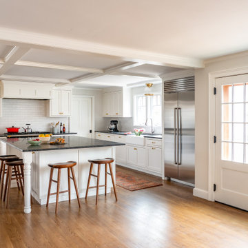
This family’s intention was clear – to create a well-functioning home for their busy family that will continue to be just as well-functioning in the future. With a wish list that included open kitchen and dining spaces, a guest bedroom, and a fresh, modernized master suite, this renovation left the owners delighted. The shifting of the kitchen created a mudroom area resulting in a happy landing space for the family returning from activities. The new mudroom casts a warm glow with an ample black walnut-topped bench. Handsfree entering the kitchen, the large island and coffered ceiling well defines this space. The cook’s Lacanche Saulieu black enamel range is a show-stopper, topped off with a uniquely custom maple hood. A pleasant hideaway, the Benjamin Moore wrought iron painted cabinetry and shelving in the butler’s pantry is both practical and pretty with a quick peek out to the backyard.
The upstairs bedrooms and bathrooms were reenergized with new tile, fixtures, and updated a/v. A Newburyport Blue vanity makes for a cheery children’s bath. A more sophisticated black satin vanity in the master bath compliments the basketweave tile rug created in cool and classy Walker Zanger stone tile. Lit from above, the frameless medicine cabinet mirrors’ simplicity let the gunmetal faucets ‘shine’. Down the hall, the family laundry room’s charming tile and easy function gives hope that every family member will chip in with the chores.
 FINNE Architects
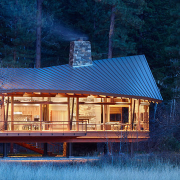
The Mazama house is located in the Methow Valley of Washington State, a secluded mountain valley on the eastern edge of the North Cascades, about 200 miles northeast of Seattle.
The house has been carefully placed in a copse of trees at the easterly end of a large meadow. Two major building volumes indicate the house organization. A grounded 2-story bedroom wing anchors a raised living pavilion that is lifted off the ground by a series of exposed steel columns. Seen from the access road, the large meadow in front of the house continues right under the main living space, making the living pavilion into a kind of bridge structure spanning over the meadow grass, with the house touching the ground lightly on six steel columns. The raised floor level provides enhanced views as well as keeping the main living level well above the 3-4 feet of winter snow accumulation that is typical for the upper Methow Valley.
To further emphasize the idea of lightness, the exposed wood structure of the living pavilion roof changes pitch along its length, so the roof warps upward at each end. The interior exposed wood beams appear like an unfolding fan as the roof pitch changes. The main interior bearing columns are steel with a tapered “V”-shape, recalling the lightness of a dancer.
The house reflects the continuing FINNE investigation into the idea of crafted modernism, with cast bronze inserts at the front door, variegated laser-cut steel railing panels, a curvilinear cast-glass kitchen counter, waterjet-cut aluminum light fixtures, and many custom furniture pieces. The house interior has been designed to be completely integral with the exterior. The living pavilion contains more than twelve pieces of custom furniture and lighting, creating a totality of the designed environment that recalls the idea of Gesamtkunstverk, as seen in the work of Josef Hoffman and the Viennese Secessionist movement in the early 20th century.
The house has been designed from the start as a sustainable structure, with 40% higher insulation values than required by code, radiant concrete slab heating, efficient natural ventilation, large amounts of natural lighting, water-conserving plumbing fixtures, and locally sourced materials. Windows have high-performance LowE insulated glazing and are equipped with concealed shades. A radiant hydronic heat system with exposed concrete floors allows lower operating temperatures and higher occupant comfort levels. The concrete slabs conserve heat and provide great warmth and comfort for the feet.
Deep roof overhangs, built-in shades and high operating clerestory windows are used to reduce heat gain in summer months. During the winter, the lower sun angle is able to penetrate into living spaces and passively warm the exposed concrete floor. Low VOC paints and stains have been used throughout the house. The high level of craft evident in the house reflects another key principle of sustainable design: build it well and make it last for many years!
Photo by Benjamin Benschneider
Find the right local pro for your project
 Thinkterior LLC
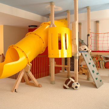
THEME This playroom takes advantage of
a high ceiling, wide floor space and multiple
windows to create an open, bright space
where a child can be a pirate boarding a
captured ship, a chef in a cafe, a superhero
flying down the slide, or just a kid swinging
on a tire.
FOCUS The tower and slide promise
fun for all — even from the doorway. The
multi-level structure doubles the play area;
leaving plenty of room for a workbench,
LEGO table, and other mobile toys. Below
the tower, there is a chalkboard wall and
desk for the young artist, as well as a toy
microwave and food items for the budding
chef. Brilliant primary colors on the walls
and a sky blue ceiling with clouds create an
entirely pleasant environment.
STORAGE To accommodate a multitude
of toys of varying sizes and shapes, the
room is equipped with easily accessible,
mobile and stationary storage units. Colorcoordinated
baskets, buckets, crates and
canvas bags make cleaning up a bit easier and
keep the room organized. Mindful that the
number and types of toys change as children
age, the shelving unit features floating boards
and adjustable pegs.
GROWTH Designed as a family
playroom with growth in mind, the room
suits the needs of children of various ages.
Different elements can be added or retired,
and older children can keep more mature
toys and games on higher shelves, safely out
of a younger sibling’s reach. Lower shelving
is reserved for the youngest child’s toys,
books, and other treasures.
SAFETY To minimize the bumps and
bruises common in playrooms, exposed
screws and bolts are covered by plastic
molds or rope twisted around metal joiners.
Elastic netting protects openings on the
tower’s upper levels, while playroom
activities can be monitored via any
television in the house. Smaller kids are kept
off the upper levels with the use of climbing
net and rock wall anchors.
 Heller & Associates
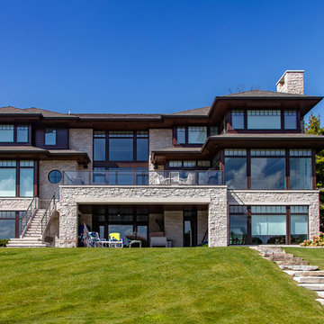
One of the hallmarks of Prairie style architecture is the integration of a home into the surrounding environment. So it is only fitting for a modern Prairie-inspired home to honor its environment through the use of sustainable materials and energy efficient systems to conserve and protect the earth on which it stands. This modern adaptation of a Prairie home in Bloomfield Hills completed in 2015 uses environmentally friendly materials and systems. Geothermal energy provides the home with a clean and sustainable source of power for the heating and cooling mechanisms, and maximizes efficiency, saving on gas and electric heating and cooling costs all year long. High R value foam insulation contributes to the energy saving and year round temperature control for superior comfort indoors. LED lighting illuminates the rooms, both in traditional light fixtures as well as in lighted shelving, display niches, and ceiling applications. Low VOC paint was used throughout the home in order to maintain the purest possible air quality for years to come. The homeowners will enjoy their beautiful home even more knowing it respects the land, because as Thoreau said, “What is the use of a house if you don’t have a decent planet to put it on?”
 Décor Aid
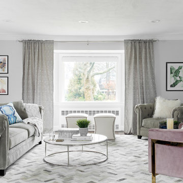
Having a small child, loving to entertain and looking to declutter and kid-proof the gathering spaces of their home in the quaint village of Rockville Centre, Long Island, a stone’s throw from Manhattan, our client’s main objective was to have their living room and den transformed with a family friendly home makeover with mid-century modern tones boasting a formal, yet relaxed spirit
Stepping into the home we found their living room and den both architecturally well appointed yet in need of modern transitional furniture pieces and the pops of color our clients admired, as there was a substantial amount of cool, cold grays in the rooms.
Decor Aid designer Vivian C. approached the design and placement of the pieces sourced to be kid-friendly while remaining sophisticated and practical for entertaining.
“We played off of the clients love for blush pinks, mid-century modern and turquoise. We played with the use of gold and silver metals to mix it up.”
In the living room, we used the prominent bay window and its illuminating natural light as the main architectural focal point, while the fireplace and mantels soft white tone helped inform the minimalist color palette for which we styled the room around.
To add warmth to the living room we played off of the clients love for blush pinks and turquoise while elevating the room with flashes of gold and silver metallic pieces. For a sense of play and to tie the space together we punctuated the kid-friendly living room with an eclectic juxtaposition of colors and materials, from a beautifully patchworked geometric cowhide rug from All Modern, to a whimsical mirror placed over an unexpected, bold geometric credenza, to the blush velvet barrel chair and abstract blue watercolor pillows.
“When sourcing furniture and objects, we chose items that had rounded edges and were shatter proof as it was vital to keep each room’s decor childproof.” Vivian ads.
Their vision for the den remained chic, with comfort and practical functionality key to create an area for the young family to come together.
For the den, our main challenge was working around the pre-existing dark gray sectional sofa. To combat its chunkiness, we played off of the hues in the cubist framed prints placed above and focused on blue and orange accents which complement and play off of each other well. We selected orange storage ottomans in easy to clean, kid-friendly leather to maximize space and functionality. To personalize the appeal of the den we included black and white framed family photos. In the end, the result created a fun, relaxed space where our clients can enjoy family moments or watch a game while taking in the scenic view of their backyard.
For harmony between the rooms, the overall tone for each room is mid-century modern meets bold, yet classic contemporary through the use of mixed materials and fabrications including marble, stone, metals and plush velvet, creating a cozy yet sophisticated enough atmosphere for entertaining family and friends and raising a young children.
“The result od this family friendly room was really fantastic! Adding some greenery, more pillows and throws really made the space pop.” Vivian C. Decor Aid’s Designer
 Regan Baker Design Inc.
Well-traveled. Relaxed. Timeless.
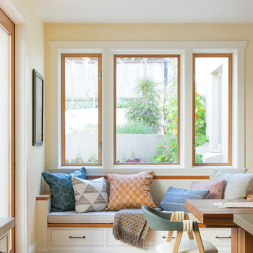
Our well-traveled clients were soon-to-be empty nesters when they approached us for help reimagining their Presidio Heights home. The expansive Spanish-Revival residence originally constructed in 1908 had been substantially renovated 8 year prior, but needed some adaptations to better suit the needs of a family with three college-bound teens. We evolved the space to be a bright, relaxed reflection of the family’s time together, revising the function and layout of the ground-floor rooms and filling them with casual, comfortable furnishings and artifacts collected abroad.
One of the key changes we made to the space plan was to eliminate the formal dining room and transform an area off the kitchen into a casual gathering spot for our clients and their children. The expandable table and coffee/wine bar means the room can handle large dinner parties and small study sessions with similar ease. The family room was relocated from a lower level to be more central part of the main floor, encouraging more quality family time, and freeing up space for a spacious home gym.
In the living room, lounge-worthy upholstery grounds the space, encouraging a relaxed and effortless West Coast vibe. Exposed wood beams recall the original Spanish-influence, but feel updated and fresh in a light wood stain. Throughout the entry and main floor, found artifacts punctate the softer textures — ceramics from New Mexico, religious sculpture from Asia and a quirky wall-mounted phone that belonged to our client’s grandmother.


 Amazing Spaces
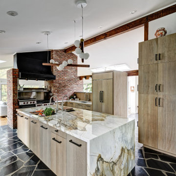
This is a great house. Perched high on a private, heavily wooded site, it has a rustic contemporary aesthetic. Vaulted ceilings, sky lights, large windows and natural materials punctuate the main spaces. The existing large format mosaic slate floor grabs your attention upon entering the home extending throughout the foyer, kitchen, and family room.
Specific requirements included a larger island with workspace for each of the homeowners featuring a homemade pasta station which requires small appliances on lift-up mechanisms as well as a custom-designed pasta drying rack. Both chefs wanted their own prep sink on the island complete with a garbage “shoot” which we concealed below sliding cutting boards. A second and overwhelming requirement was storage for a large collection of dishes, serving platters, specialty utensils, cooking equipment and such. To meet those needs we took the opportunity to get creative with storage: sliding doors were designed for a coffee station adjacent to the main sink; hid the steam oven, microwave and toaster oven within a stainless steel niche hidden behind pantry doors; added a narrow base cabinet adjacent to the range for their large spice collection; concealed a small broom closet behind the refrigerator; and filled the only available wall with full-height storage complete with a small niche for charging phones and organizing mail. We added 48” high base cabinets behind the main sink to function as a bar/buffet counter as well as overflow for kitchen items.
The client’s existing vintage commercial grade Wolf stove and hood commands attention with a tall backdrop of exposed brick from the fireplace in the adjacent living room. We loved the rustic appeal of the brick along with the existing wood beams, and complimented those elements with wired brushed white oak cabinets. The grayish stain ties in the floor color while the slab door style brings a modern element to the space. We lightened the color scheme with a mix of white marble and quartz countertops. The waterfall countertop adjacent to the dining table shows off the amazing veining of the marble while adding contrast to the floor. Special materials are used throughout, featured on the textured leather-wrapped pantry doors, patina zinc bar countertop, and hand-stitched leather cabinet hardware. We took advantage of the tall ceilings by adding two walnut linear pendants over the island that create a sculptural effect and coordinated them with the new dining pendant and three wall sconces on the beam over the main sink.
 Coco Maison Design
We planned a thoughtful redesign of this beautiful home while retaining many of the existing features. We wanted this house to feel the immediacy of its environment. So we carried the exterior front entry style into the interiors, too, as a way to bring the beautiful outdoors in. In addition, we added patios to all the bedrooms to make them feel much bigger. Luckily for us, our temperate California climate makes it possible for the patios to be used consistently throughout the year.
The original kitchen design did not have exposed beams, but we decided to replicate the motif of the 30" living room beams in the kitchen as well, making it one of our favorite details of the house. To make the kitchen more functional, we added a second island allowing us to separate kitchen tasks. The sink island works as a food prep area, and the bar island is for mail, crafts, and quick snacks.
We designed the primary bedroom as a relaxation sanctuary – something we highly recommend to all parents. It features some of our favorite things: a cognac leather reading chair next to a fireplace, Scottish plaid fabrics, a vegetable dye rug, art from our favorite cities, and goofy portraits of the kids.
---
Project designed by Courtney Thomas Design in La Cañada. Serving Pasadena, Glendale, Monrovia, San Marino, Sierra Madre, South Pasadena, and Altadena.
For more about Courtney Thomas Design, see here: https://www.courtneythomasdesign.com/
To learn more about this project, see here:
https://www.courtneythomasdesign.com/portfolio/functional-ranch-house-design/

 Irene Designs
This dream bathroom has everything one can wish for an ideal bathroom escape. It doesn’t just look fabulous – it works well and it is built to stand the test of time.
This bathroom was designed as a private oasis, a place to relax and unwind. Spa-like environment is created by expansive double-sink custom vanity, an elegant free standing tub, and a spacious two-person barrier-free shower with a floating bench. Toilet is concealed within a separate nook behind a pocket door.
Main bathroom area is outlined by a tray ceiling perimeter. The room looks open, airy and spacious. Nothing interferes with the ceiling design and overall space configuration. It hasn’t always been that way. Former layout had serious pitfalls that made the room look much smaller. The shower concealed behind solid walls protruded into the main area clashing with the tray ceiling geometry. Massive shower stall took up significant amount of the room leaving no continuous wall space for a double sink vanity. There were two separate vanities with a dead corner space between them. At the same time, the toilet room was quite spacious with just one fixture in the far end.
New layout not only looks better, it allows for a better functionality and fully reveals the space potential. The toilet was relocated to occupy the former linen closet space slightly expanded into adjacent walk-in closet. Shower was moved into the bigger alcove, away from the tray ceiling area. It opened up the room while giving space for a gorgeous wall-to-wall vanity. Having a full glass wall, the shower extends the space even further. Sparkling glass creates no barrier to the eyesight. The room feels clean, breezy and extra spacious. Gorgeous frameless shower enclosure with glass-to-glass clamps and hinges shows off premium tile designs of the accent shower wall.
Free standing tub remained in its original place in front of the window. With no solid shower walls nearby, it became a focal point adorned with the new crystal chandelier above it. This two-tier gorgeous chandelier makes the bathroom feel incredibly grand. A touch of luxury is showing up in timeless polished chrome faucet finish selections as well.
New expansive custom vanity has his and her full height linen towers, his and her sink cabinets with two individual banks of drawers on the sides and one shared drawer cabinet in the middle containing a charging station in the upper drawer.
Vanity counter tops and floating shower seat top are made of high-end quartz.
Vessel sinks resemble the shape and style of the free-standing tub.
To make the room feel even more spacious and to showcase the shower area in the reflection, a full size mirror is installed over the vanity. Crystal sconces are installed directly into the mirror.
Crisp classic white tile gives the room a timeless sense of polish and luxury. Walls around the perimeter of the entire bathroom are tiled half way. Three rows of 12”x 24” porcelain tile resembling white marble are crowned with a thin row of intricate glass tiles with marble accents, and a chair rail tile.
Tile design flows into a spacious barrier-free two-person walk-in shower. Two more tile patterns of the same tile collection are brought into play. Rear wall is adorned with a picture frame made out of 12”x12” tiles laid at 45 degree angle within the same chair rail and glass tile border. Shower floor is made of small hexagon tiles for proper drainage.
Shower area has two hidden from plain sight niches to contain shampoo bottles and toiletries. The rear side of the niches is made of glass mosaics for a waterfall effect.
To showcase the picture frame inside the shower, the accent shower wall is washed with cascading light from a discrete LED strip tucked in a cove behind “floating” shower ceiling platform.
Multiple shower heads (two ceiling-mount rain heads, one multi-functional wall mount shower head, and a handheld shower) are able to provide a fully customizable shower experience.
Despite of many hard surfaces and shiny finishes, which can sometimes lead to a cold impersonal feeling, this bathroom is cozy and truly welcoming. This sense of warms is maintained by exclusive multi-functional layered lighting. Carefully designed groups of lights (all having a dimmer control) can be used simultaneously, in various combinations, or separately to create numerous different effects and perfect atmosphere for every mood and occasion. Some lights have smart controls and can be operated remotely.
Amazing effect can be achieved by dimmable toe kick perimeter lighting. With the ceiling lights turned off, the vanity looks as if it is floating in the air. Multifaceted crystal fixtures produce cascades of sparkling rainbow reflections dancing around the room and creating an illusion of a starry sky.
Programmable radiant heating floor offers additional warmth and comfort to the room.
This bathroom is well suited for either a quick morning shower or a night in for ultimate relaxation with a champagne toast and a long soak in the freestanding tub.
 Nar Design Group
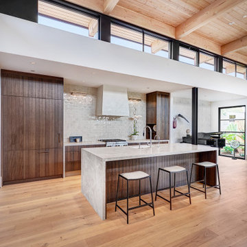
A combination of quarter sawn white oak material with kerf cuts creates harmony between the cabinets and the warm, modern architecture of the home. We mirrored the waterfall of the island to the base cabinets on the range wall. This project was unique because the client wanted the same kitchen layout as their previous home but updated with modern lines to fit the architecture. Floating shelves were swapped out for an open tile wall, and we added a double access countertwall cabinet to the right of the range for additional storage. This cabinet has hidden front access storage using an intentionally placed kerf cut and modern handleless design. The kerf cut material at the knee space of the island is extended to the sides, emphasizing a sense of depth. The palette is neutral with warm woods, dark stain, light surfaces, and the pearlescent tone of the backsplash; giving the client’s art collection a beautiful neutral backdrop to be celebrated.
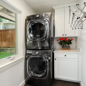
For the laundry we chose a micro shaker style cabinet door for a clean, transitional design. A folding surface over the washer and dryer as well as an intentional space for a dog bed create a space as functional as it is lovely. The color of the wall picks up on the tones of the beautiful marble tile floor and an art wall finishes out the space.
In the master bath warm taupe tones of the wall tile play off the warm tones of the textured laminate cabinets. A tiled base supports the vanity creating a floating feel while also providing accessibility as well as ease of cleaning.
An entry coat closet designed to feel like a furniture piece in the entry flows harmoniously with the warm taupe finishes of the brick on the exterior of the home. We also brought the kerf cut of the kitchen in and used a modern handleless design.
The mudroom provides storage for coats with clothing rods as well as open cubbies for a quick and easy space to drop shoes. Warm taupe was brought in from the entry and paired with the micro shaker of the laundry.
In the guest bath we combined the kerf cut of the kitchen and entry in a stained maple to play off the tones of the shower tile and dynamic Patagonia granite countertops.
 Alair Homes Plano
Our clients purchased this 1950 ranch style cottage knowing it needed to be updated. They fell in love with the location, being within walking distance to White Rock Lake. They wanted to redesign the layout of the house to improve the flow and function of the spaces while maintaining a cozy feel. They wanted to explore the idea of opening up the kitchen and possibly even relocating it. A laundry room and mudroom space needed to be added to that space, as well. Both bathrooms needed a complete update and they wanted to enlarge the master bath if possible, to have a double vanity and more efficient storage. With two small boys and one on the way, they ideally wanted to add a 3rd bedroom to the house within the existing footprint but were open to possibly designing an addition, if that wasn’t possible.
In the end, we gave them everything they wanted, without having to put an addition on to the home. They absolutely love the openness of their new kitchen and living spaces and we even added a small bar! They have their much-needed laundry room and mudroom off the back patio, so their “drop zone” is out of the way. We were able to add storage and double vanity to the master bathroom by enclosing what used to be a coat closet near the entryway and using that sq. ft. in the bathroom. The functionality of this house has completely changed and has definitely changed the lives of our clients for the better!
 Regan Baker Design Inc.
Well-traveled. Relaxed. Timeless.
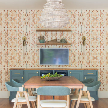
Our well-traveled clients were soon-to-be empty nesters when they approached us for help reimagining their Presidio Heights home. The expansive Spanish-Revival residence originally constructed in 1908 had been substantially renovated 8 year prior, but needed some adaptations to better suit the needs of a family with three college-bound teens. We evolved the space to be a bright, relaxed reflection of the family’s time together, revising the function and layout of the ground-floor rooms and filling them with casual, comfortable furnishings and artifacts collected abroad.
One of the key changes we made to the space plan was to eliminate the formal dining room and transform an area off the kitchen into a casual gathering spot for our clients and their children. The expandable table and coffee/wine bar means the room can handle large dinner parties and small study sessions with similar ease. The family room was relocated from a lower level to be more central part of the main floor, encouraging more quality family time, and freeing up space for a spacious home gym.
In the living room, lounge-worthy upholstery grounds the space, encouraging a relaxed and effortless West Coast vibe. Exposed wood beams recall the original Spanish-influence, but feel updated and fresh in a light wood stain. Throughout the entry and main floor, found artifacts punctate the softer textures — ceramics from New Mexico, religious sculpture from Asia and a quirky wall-mounted phone that belonged to our client’s grandmother.
Sponsored
Columbus, OH

Trish Takacs Design
Award Winning & Highly Skilled Kitchen & Bath Designer in Columbus
 Alair Homes Plano
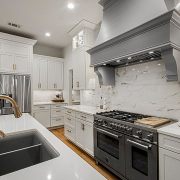
This new home was built on an old lot in Dallas, TX in the Preston Hollow neighborhood. The new home is a little over 5,600 sq.ft. and features an expansive great room and a professional chef’s kitchen. This 100% brick exterior home was built with full-foam encapsulation for maximum energy performance. There is an immaculate courtyard enclosed by a 9' brick wall keeping their spool (spa/pool) private. Electric infrared radiant patio heaters and patio fans and of course a fireplace keep the courtyard comfortable no matter what time of year. A custom king and a half bed was built with steps at the end of the bed, making it easy for their dog Roxy, to get up on the bed. There are electrical outlets in the back of the bathroom drawers and a TV mounted on the wall behind the tub for convenience. The bathroom also has a steam shower with a digital thermostatic valve. The kitchen has two of everything, as it should, being a commercial chef's kitchen! The stainless vent hood, flanked by floating wooden shelves, draws your eyes to the center of this immaculate kitchen full of Bluestar Commercial appliances. There is also a wall oven with a warming drawer, a brick pizza oven, and an indoor churrasco grill. There are two refrigerators, one on either end of the expansive kitchen wall, making everything convenient. There are two islands; one with casual dining bar stools, as well as a built-in dining table and another for prepping food. At the top of the stairs is a good size landing for storage and family photos. There are two bedrooms, each with its own bathroom, as well as a movie room. What makes this home so special is the Casita! It has its own entrance off the common breezeway to the main house and courtyard. There is a full kitchen, a living area, an ADA compliant full bath, and a comfortable king bedroom. It’s perfect for friends staying the weekend or in-laws staying for a month.
 Haven Design and Construction
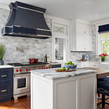
This 1902 San Antonio home was beautiful both inside and out, except for the kitchen, which was dark and dated. The original kitchen layout consisted of a breakfast room and a small kitchen separated by a wall. There was also a very small screened in porch off of the kitchen. The homeowners dreamed of a light and bright new kitchen and that would accommodate a 48" gas range, built in refrigerator, an island and a walk in pantry. At first, it seemed almost impossible, but with a little imagination, we were able to give them every item on their wish list. We took down the wall separating the breakfast and kitchen areas, recessed the new Subzero refrigerator under the stairs, and turned the tiny screened porch into a walk in pantry with a gorgeous blue and white tile floor. The french doors in the breakfast area were replaced with a single transom door to mirror the door to the pantry. The new transoms make quite a statement on either side of the 48" Wolf range set against a marble tile wall. A lovely banquette area was created where the old breakfast table once was and is now graced by a lovely beaded chandelier. Pillows in shades of blue and white and a custom walnut table complete the cozy nook. The soapstone island with a walnut butcher block seating area adds warmth and character to the space. The navy barstools with chrome nailhead trim echo the design of the transoms and repeat the navy and chrome detailing on the custom range hood. A 42" Shaws farmhouse sink completes the kitchen work triangle. Off of the kitchen, the small hallway to the dining room got a facelift, as well. We added a decorative china cabinet and mirrored doors to the homeowner's storage closet to provide light and character to the passageway. After the project was completed, the homeowners told us that "this kitchen was the one that our historic house was always meant to have." There is no greater reward for what we do than that.

 TKS Design Group
Download our free ebook, Creating the Ideal Kitchen. DOWNLOAD NOW
Lakefront property in the northwest suburbs of Chicago is hard to come by, so when we were hired by this young family with exactly that, we were immediately inspired by not just the unusually large footprint of this 1950’s colonial revival but also the lovely views of the manmade lake it was sited on. The large 5-bedroom home was solidly stuck in the 1980’s, but we saw tons of potential. We started out by updating the existing staircase with a fresh coat of paint and adding new herringbone slate to the entry hall.
The powder room off the entryway also got a refresh - new flooring, new cabinets and fixtures. We ran the new slate right through into this space for some consistency. A fun wallpaper and shiplap trim add a welcoming feel and set the tone for the home.
Next, we tackled the kitchen. Located away from the rest of the first floor, the kitchen felt a little isolated, so we immediately began planning for how to better connect it to the rest of the first floor. We landed on removing the wall between the kitchen and dining room and designed a modified galley style space with separate cooking and clean up zones. The cooking zone consists of the refrigerator, prep sink and cooktop, along with a nice long run of prep space at the island. The cleanup side of the kitchen consists of the main sink and dishwasher. Both areas are situated so that the user can view the lake during prep work and cleanup!
One of the home’s main puzzles was how to incorporate the mudroom and area in front of the patio doors at the back of the house. We already had a breakfast table area, so the space by the patio doors was a bit of a no man’s land. We decided to separate the kitchen proper from what became the new mudroom with a large set of barn doors. That way you can quickly hide any mudroom messes but have easy access to the light coming in through the patio doors as well as the outdoor grilling station. We also love the impact the barn doors add to the overall space.
The homeowners’ first words to us were “it’s time to ditch the brown,” so we did! We chose a lovely blue pallet that reflects the home’s location on the lake which is also vibrant yet easy on the eye. Countertops are white quartz, and the natural oak floor works well with the other honey accents. The breakfast table was given a refresh with new chairs, chandelier and window treatments that frame the gorgeous views of the lake out the back.
We coordinated the slate mudroom flooring with that used in the home’s main entrance for a consistent feel. The storage area consists of open and closed storage to allow for some clutter control as needed.
Next on our “to do” list was revamping the dated brown bar area in the neighboring dining room. We eliminated the clutter by adding some closed cabinets and did some easy updates to help the space feel more current. One snag we ran into here was the discovery of a beam above the existing open shelving that had to be modified with a smaller structural beam to allow for our new design to work. This was an unexpected surprise, but in the end we think it was well worth it!
We kept the colors here a bit more muted to blend with the homeowner’s existing furnishings. Open shelving and polished nickel hardware add some simple detail to the new entertainment zone which also looks out onto the lake!
Next we tackled the upstairs starting with the homeowner’s son’s bath. The bath originally had both a tub shower and a separate shower, so we decided to swap out the shower for a new laundry area. This freed up some space downstairs in what used to be the mudroom/laundry room and is much more convenient for daily laundry needs.
We continued the blue palette here with navy cabinetry and the navy tile in the shower. Porcelain floor tile and chrome fixtures keep maintenance to a minimum while matte black mirrors and lighting add some depth the design. A low maintenance runner adds some warmth underfoot and ties the whole space together.
We added a pocket door to the bathroom to minimize interference with the door swings. The left door of the laundry closet is on a 180 degree hinge to allow for easy full access to the machines. Next we tackled the master bath which is an en suite arrangement. The original was typical of the 1980’s with the vanity outside of the bathroom, situated near the master closet. And the brown theme continued here with multiple shades of brown.
Our first move was to segment off the bath and the closet from the master bedroom. We created a short hall from the bedroom to the bathroom with his and hers walk-in closets on the left and right as well as a separate toilet closet outside of the main bathroom for privacy and flexibility.
The original bathroom had a giant soaking tub with steps (dangerous!) as well as a small shower that did not work well for our homeowner who is 6’3”. With other bathtubs in the home, they decided to eliminate the tub and create an oversized shower which takes up the space where the old tub was located. The double vanity is on the opposite wall and a bench is located under the window for morning conversations and a place to set a couple of towels.
The pallet in here is light and airy with a mix of blond wood, creamy porcelain and marble tile, and brass accents. A simple roman shade adds some texture and it’s top-down mechanism allows for light and privacy.
This large whole house remodel gave our homeowners not only the ability to maximize the potential of their home but also created a lovely new frame from which to view their fabulous lake views.
Designed by: Susan Klimala, CKD, CBD
Photography by: Michael Kaskel
For more information on kitchen and bath design ideas go to: www.kitchenstudio-ge.com
 Alair Homes Plano
Our clients came to us wanting to maximize the space they had. They were not planning on moving anytime soon, as they loved their neighborhood. They wanted to renovate the front of their house, which included the front atrium, living room, kitchen, and powder bath. They hated their kitchen because it was completely closed off, had low ceilings, was dark and outdated, not to mention the floors were different in each of these rooms! The pantry was in the breakfast area and the kitchen table became a junk catcher, being the first thing you see when coming in from the garage/laundry room. In their living room, they wanted the spaces on either side of the fireplace to be symmetrical, whether that be bookshelves, a wet bar or closed off. Both parents are working professionals with no time and/or desire to design, create and figure this out on their own. They needed help figuring out how to reconfigure their current space in order to maximize what they already had, as they could not see an obvious solution. They could not envision how it would look so the fact that our designers were able to show them their new kitchen in 3D was pertinent.
We removed the pass-through windows that surrounded the atrium and front dining room, as well as the entire kitchen wall, completely opening up those two rooms. We removed a hall that used to lead between the kitchen and the living room since it was a complete waste of space! The ceilings were raised to 10’ in the kitchen and we were able to leave the skylight, letting in that natural light they wanted. We were able to give them a much larger pantry with tons of shelving and increase the size of their laundry room by utilizing the space of their old breakfast nook.
We relocated the door to the garage into their new elongated laundry room, built a wet bar across from their new larger pantry (with a pocket door) and the flow and functionality of these new spaces is just perfect! All new Waypoint cabinets were installed one two main kitchen surrounding walls painted Linen. Calacatta Bianco Polished Porcelain Tile 4x12 was used for the backsplash. A large eat-at island was installed, painted Stone, where the family can now gather for homework, meals, and mingling. The soft champagne bronze hardware and accent lighting really give this white and gray kitchen a soft classic look.
In the living room, we removed the built-in bookshelves to the left of the fireplace and closed off the wet-bar on the other side, giving them more space in their master suite. White Oak wood flooring, stained Putney, was installed throughout the entire new space, giving it the continuity they were looking for.
In the guest bathroom, Carrara white herringbone marble mosaic 12x12 tile was used on the shower floor and niche, while basic marble Bianco polished 12x24 porcelain tile was used on the walls. Luxart polished chrome traditional hardware gives this timeless bathroom the perfect shine.
Our clients are so happy with the new functionality and look of their space. It has definitely changed their lives in a way they could have never imagined!
Sponsored
Delaware, OH

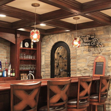
Buckeye Basements, Inc.
Central Ohio's Basement Finishing ExpertsBest Of Houzz '13-'21
 AV Architects + Builders
AV Architects + Builders
Location: Great Falls, VA, United States
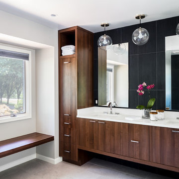
Our clients were looking to renovate their existing master bedroom into a more luxurious, modern space with an open floor plan and expansive modern bath design. The existing floor plan felt too cramped and didn’t offer much closet space or spa like features. Without having to make changes to the exterior structure, we designed a space customized around their lifestyle and allowed them to feel more relaxed at home.
Our modern design features an open-concept master bedroom suite that connects to the master bath for a total of 600 square feet. We included floating modern style vanity cabinets with white Zen quartz, large black format wall tile, and floating hanging mirrors. Located right next to the vanity area is a large, modern style pull-out linen cabinet that provides ample storage, as well as a wooden floating bench that provides storage below the large window. The centerpiece of our modern design is the combined free-standing tub and walk-in, curb less shower area, surrounded by views of the natural landscape. To highlight the modern design interior, we added light white porcelain large format floor tile to complement the floor-to-ceiling dark grey porcelain wall tile to give off a modern appeal. Last not but not least, a frosted glass partition separates the bath area from the toilet, allowing for a semi-private toilet area.
Jim Tetro Architectural Photography
 Saikley Architects
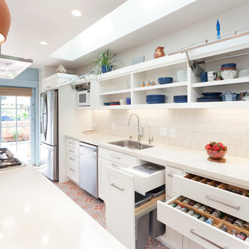
Down-to-studs remodel and second floor addition. The original house was a simple plain ranch house with a layout that didn’t function well for the family. We changed the house to a contemporary Mediterranean with an eclectic mix of details. Space was limited by City Planning requirements so an important aspect of the design was to optimize every bit of space, both inside and outside. The living space extends out to functional places in the back and front yards: a private shaded back yard and a sunny seating area in the front yard off the kitchen where neighbors can easily mingle with the family. A Japanese bath off the master bedroom upstairs overlooks a private roof deck which is screened from neighbors’ views by a trellis with plants growing from planter boxes and with lanterns hanging from a trellis above.
Photography by Kurt Manley.
https://saikleyarchitects.com/portfolio/modern-mediterranean/
 Corinthian Fine Homes
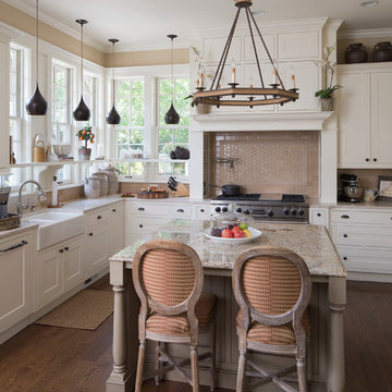
These homeowners relocated to Indianapolis and wanted a traditional home in the Meridian Hills area that offered family living space off the kitchen. “It’s what we were used to, but we had trouble finding exactly what we were looking for.” They spent a lot of time thinking about the possibilities of a remodel. They had space both within and outside the house that were under-utilized and decided to embark on a significant renovation project.
We endeavored to completely rework the current floor plan in hopes of addressing all their needs and wants. Plans included relocating the kitchen, moving the exterior walls by a couple of feet, raising the ceiling, and moving the office. The results of these changes were dramatic. Additionally the family now enjoys a larger and updated entrance with storage and closets that is perfect for their two active daughters and two often muddy labs, a beautiful kitchen with improved functionality that is filled with tons of natural light, as well as a cozy hearth room, ideal for relaxing together as a family. The once neglected screened porch is now a unique and inviting office with workspace for everyone.
Once these improvements were made the view to the back of the house was now apparent, the couple decided to enhance their outdoor living space as well. We added a new patio, a custom pergola, water feature and a fire pit. “Now it’s a private spot to relax and connect with the outdoors. It really highlights the style of the house and we love it,” says the homeowner.
1