
Search results for "Well off environment" in Home Design Ideas
 Alair Homes Plano
This house was built in 1994 and our clients have been there since day one. They wanted a complete refresh in their kitchen and living areas and a few other changes here and there; now that the kids were all off to college! They wanted to replace some things, redesign some things and just repaint others. They didn’t like the heavy textured walls, so those were sanded down, re-textured and painted throughout all of the remodeled areas.
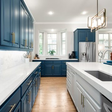
The kitchen change was the most dramatic by painting the original cabinets a beautiful bluish-gray color; which is Benjamin Moore Gentleman’s Gray. The ends and cook side of the island are painted SW Reflection but on the front is a gorgeous Merola “Arte’ white accent tile. Two Island Pendant Lights ‘Aideen 8-light Geometric Pendant’ in a bronze gold finish hung above the island. White Carrara Quartz countertops were installed below the Viviano Marmo Dolomite Arabesque Honed Marble Mosaic tile backsplash. Our clients wanted to be able to watch TV from the kitchen as well as from the family room but since the door to the powder bath was on the wall of breakfast area (no to mention opening up into the room), it took up good wall space. Our designers rearranged the powder bath, moving the door into the laundry room and closing off the laundry room with a pocket door, so they can now hang their TV/artwork on the wall facing the kitchen, as well as another one in the family room!
We squared off the arch in the doorway between the kitchen and bar/pantry area, giving them a more updated look. The bar was also painted the same blue as the kitchen but a cool Moondrop Water Jet Cut Glass Mosaic tile was installed on the backsplash, which added a beautiful accent! All kitchen cabinet hardware is ‘Amerock’ in a champagne finish.
In the family room, we redesigned the cabinets to the right of the fireplace to match the other side. The homeowners had invested in two new TV’s that would hang on the wall and display artwork when not in use, so the TV cabinet wasn’t needed. The cabinets were painted a crisp white which made all of their decor really stand out. The fireplace in the family room was originally red brick with a hearth for seating. The brick was removed and the hearth was lowered to the floor and replaced with E-Stone White 12x24” tile and the fireplace surround is tiled with Heirloom Pewter 6x6” tile.
The formal living room used to be closed off on one side of the fireplace, which was a desk area in the kitchen. The homeowners felt that it was an eye sore and it was unnecessary, so we removed that wall, opening up both sides of the fireplace into the formal living room. Pietra Tiles Aria Crystals Beach Sand tiles were installed on the kitchen side of the fireplace and the hearth was leveled with the floor and tiled with E-Stone White 12x24” tile.
The laundry room was redesigned, adding the powder bath door but also creating more storage space. Waypoint flat front maple cabinets in painted linen were installed above the appliances, with Top Knobs “Hopewell” polished chrome pulls. Elements Carrara Quartz countertops were installed above the appliances, creating that added space. 3x6” white ceramic subway tile was used as the backsplash, creating a clean and crisp laundry room! The same tile on the hearths of both fireplaces (E-Stone White 12x24”) was installed on the floor.
The powder bath was painted and 12x36” Ash Fiber Ceramic tile was installed vertically on the wall behind the sink. All hardware was updated with the Signature Hardware “Ultra”Collection and Shades of Light “Sleekly Modern” new vanity lights were installed.
All new wood flooring was installed throughout all of the remodeled rooms making all of the rooms seamlessly flow into each other. The homeowners love their updated home!
Design/Remodel by Hatfield Builders & Remodelers | Photography by Versatile Imaging
 Benvenuti and Stein
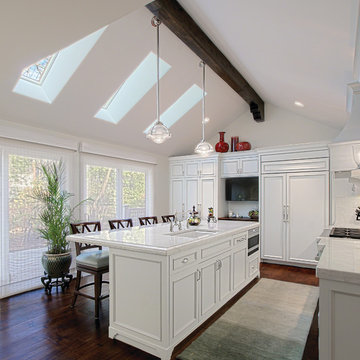
Northfield, IL kitchen remodel has an open floor plan which allows for better daylight dispursement. Defining the kitchen, dining, and sitting room space by varying ceiling design and open cabinetry makes the rooms more spacious, yet each space remains well defined. The added skylights in the hall gave natural light in the interior hallway as well as down the lower level stairway. The updated closets and baths use every inch wisely and the visual sight lines throughout are crisp and clean.
Norman Sizemore Photography
 Coco Maison Design
We planned a thoughtful redesign of this beautiful home while retaining many of the existing features. We wanted this house to feel the immediacy of its environment. So we carried the exterior front entry style into the interiors, too, as a way to bring the beautiful outdoors in. In addition, we added patios to all the bedrooms to make them feel much bigger. Luckily for us, our temperate California climate makes it possible for the patios to be used consistently throughout the year.
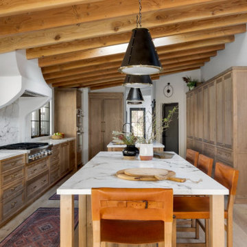
The original kitchen design did not have exposed beams, but we decided to replicate the motif of the 30" living room beams in the kitchen as well, making it one of our favorite details of the house. To make the kitchen more functional, we added a second island allowing us to separate kitchen tasks. The sink island works as a food prep area, and the bar island is for mail, crafts, and quick snacks.
We designed the primary bedroom as a relaxation sanctuary – something we highly recommend to all parents. It features some of our favorite things: a cognac leather reading chair next to a fireplace, Scottish plaid fabrics, a vegetable dye rug, art from our favorite cities, and goofy portraits of the kids.
---
Project designed by Courtney Thomas Design in La Cañada. Serving Pasadena, Glendale, Monrovia, San Marino, Sierra Madre, South Pasadena, and Altadena.
For more about Courtney Thomas Design, see here: https://www.courtneythomasdesign.com/
To learn more about this project, see here:
https://www.courtneythomasdesign.com/portfolio/functional-ranch-house-design/
Find the right local pro for your project

 Twelve Stones Designs, LLC
The owners of this kitchen had spent the money to upgrade the finishes in their kitchen upon building the home 12 years ago, but after living in the space for several years they realized how nonfunctional the layout really was. The (then) two preschool aged children had grown into busy, hungry teenagers with many friends who also liked to hang out at the house. So the family needed a more functional kitchen with better traffic flow, space for daily activities revolving around the kitchen at different times of day, and a kitchen that could accommodate cooking for and serving large groups. Furthermore, the dark, traditional finishes no longer reflected the homeowners’ style. They requested a brighter, more relaxed, coastal style that reflected their love of the seaside cities they like to visit.
Originally, the kitchen was U-shaped with a narrow island in the middle. The island created narrow aisles that bottle-necked at the dishwasher, refrigerator, and cooktop areas. There was a pass-through from the foyer into the kitchen, but the owners never liked that the pass-through was also located so close to the powder room. The awkward proximity was unappealing and made guests feel uncomfortable.
The kitchen’s storage was made up of lots of narrow cabinets, apothecary drawers, clipped corner units, and very few drawers. It lacked useful storage for the larger items the family used on a daily basis. And the kitchen’s only pantry was small closet that had only builder-grade, narrow shelving with no illumination to be able to see the contents inside.
Overall, the kitchen’s lighting plan was poorly executed. Only six recessed cans illuminated the entire kitchen and nook areas. The under cabinet lighting was not evenly distributed either. In fact, the builder had mis-placed the under cabinet lighting around the decorative pilasters which made for choppy, dark cubbies. Further, the builder didn’t include any lighting over the sink or the bar area, which meant whoever was doing the dishes was always in their own shadow. That, coupled with the steep overhang of the game room above made the bar area feel like a dim, cavernous space that wasn’t inviting or task oriented. The kitchen looked out into the main living space, but the raised bar and a narrow wall (which held the only large cabinet in the kitchen) created more of a barrier than a relationship to the living room or breakfast nook. In fact, one couldn’t even see the breakfast nook from the cooktop or sink areas due to its orientation. The raised bar top was too narrow to comfortably sit to either dine at or chat from due to the lack of knee space. The the homeowners confided that the kitchen felt more like a dark, dirty prison than place where the family, or their guests, wanted to gather and commune.
The clients' needs and desires were:
➢ to create a kitchen that would be a space the family loved to be in; to relate to the adjacent spaces all around, and to have better flow for entertaining large groups
➢ to remove the walls between the breakfast nook and living area and to be able to utilize the natural light from the windows in both those areas
➢ to incorporate a functional chopping block for prepping fresh food for home cooked meals, an island with a large sink and drain board, 2 pull out trash cans, and seating for at least the 2 teens to eat or do homework
➢ to design a kitchen and breakfast nook with an airy, coastal, relaxed vibe that blended with the rest of the house's coastal theme
➢ to integrate a layered lighting plan which would include ample general illumination, specific task lighting, decorative lighting, and lots of illuminated storage
➢ to design a kitchen with not only more storage for all the husband’s kitchen gadgets and collection of oils and spices, but smart storage, including a coffee/breakfast bar and a place to store and conceal the toaster oven and microwave
➢ to find a way to utilize the large open space between the kitchen, pantry area, and breakfast nook
Twelve Stones Designs achieved the owner's goals by:
➢ removing the walls between the kitchen and living room to allow the natural light to filter in from the adjacent rooms and to create a connection between the kitchen, nook, and living spaces for a sense of unity and communion
➢ removing the existing pantry and designing 3 large pantry style cabinets with LED tape lights and rollout drawers to house lots of kitchen appliances, gadgets, and tons of groceries. We also took the cabinets all the way up to the 9’ ceiling for additional storage for seasonal items and bulk storage.
➢ designing 2 islands - 1 with a gorgeous black walnut chopping block that houses a drawer for chopping and carving knives and a custom double pull out trash unit for point of use utilization - and 1 that houses the dishwasher, a large Blanco Gourmet sink with integrated drain board, woven baskets for fresh root vegetables and kitchen towels, plenty of drawer storage for kitchen items, and bar seating for up to 4 diners.
➢ closing off the space between the kitchen and the powder room to create a beautiful new private alcove for the powder room as well as adding some decorative storage. This also gave us space to include more tall storage near the new range for precision placement of the husband’s extensive oil and spice collection as well as a location for a combo-steam oven the wife wanted for baking and cooking healthy meals.
The project is enhanced functionally by:
➢ incorporated USB and standard receptacles for the kids’ laptops and phone charging in the large island
➢ designing the small island to include additional open shelving for items used on a daily basis such as a variety of bowls, plates, and colanders. This set up also works well for the husband who prefers to “plate” his dinners in restaurant-style fashion before presenting them to the table.
➢ the integration of specific storage units, such as double stacked cutlery drawers, a custom spice pull-out, a Kuerig coffee and tea pod drawer, and custom double stacked utensil drawers
➢ moving the refrigerator to the old oven location - this eliminated the bottle neck as well as created a better relationship to the eating table. It also utilizes the floor space between the pantry, nook, and kitchen
➢ creating a banquet style breakfast nook - this banquette seating not only doubles the amount of seating for large gatherings but it better utilizes the odd space between the kitchen and the previous nook area. It also helps to create a distinct pathway from the mudroom room through the pantry area, kitchen, nook, and living room.
➢ the coffee/breakfast bar area which includes the perfect location for the concealed microwave and toaster oven, convenient storage for the coffee pods and tea accoutrements. Roll-out drawers below also house the smoothie maker, hot water kettle, and a plethora of smoothie-making ingredients such as protein powders, smoothie additives, etc. Furthermore, the drawers below the Keurig house measuring utensil, cutlery, baking supplies and tupperware storage.
➢ incorporating lots of wide drawers and pullouts to accommodate large cookware.
➢ utilizing as much vertical space as possible by building storage to the ceiling which accommodates the family’s abundant amount of serving platters, baking sheets, bakeware, casserole dishes, and additional cutting boards.
The project is enhanced aesthetically by:
➢ new 5-piece Versailles pattern porcelain tile that now seamlessly joins the entire down stairs area together creating a bright, cohesiveness feeling instead of choppy separated spaces - it also adds a coastal feeling
➢ designing a cabinet to conceal the microwave and toaster oven
➢ the coastal influenced light fixtures over the nook table and island
➢ the sandy colors of the Langdon Cambria countertops. The swirling pattern and sparkling quartz pieces remind the homeowner of black-and-tan sandy beaches
➢ the striped banquet seating whose creamy white background and blue-green stripes were the inspiration for the cabinet and wall colors.
➢ All the interior doors were painted black to coordinate with the blacks and grays in the backsplash tile and countertop. This also adds a hint of tailored formality to an otherwise casual space.
➢ the use of WAC's Oculux small aperture LED units for the overhead lighting complimented with Diode LED strips for task lighting under the cabinets and inside the pantry and glass wall cabinets. All of the lighting applications are on separate dimmer switches.
Innovative uses of materials or construction methods by Realty Restoration LLC:
➢ Each 1-1/2” x 3” block of reclaimed end-grain black walnut that makes up the center island chopping block was hand milled and built in the shop. It was designed to look substantial and proportional to the surrounding elements, executed by creating the 4 inch tall top with a solid wood chamfered edge band.
➢ The metal doors on either side of the vent hood were also custom designed for this project and built in the Realty Restoration LLC shop. They are made 1x2, 11-gauge mild steel with ribbed glass. Weighing 60 lbs a piece, heavy duty cabinet hinges were added to support the weight of the door and keep them from sagging.
➢ Under-cabinet receptacles were added along the range wall in order to have a clean, uninterrupted backsplash.
Design obstacles to overcome:
➢ Because we were removing the demising walls between the kitchen and living room, we had to find a way to plumb and vent the new island. We did this by tunneling through the slab (the slab had post tension cables which prevented us from just trenching) to run a new wet vent through a nearby structural wall. We pulled the existing hot and cold lines between upper floor joists and ran them down the structural wall as well and up through a conduit in the tunnel.
➢ Since we were converting from wall overs to a gas range it allowed us to utilize the 220 feed for the wall ovens to provide a new sub panel for all the new kitchen circuits
➢ Due to framing deficiencies inherited from the original build there was a 1-1/2” differential in the floor-to-ceiling height over a 20 foot span; by utilizing the process of cutting and furring coupled with the crown moulding details on the cabinet elevations we were able to mask the problem and provide seamless transitions between the cabinet components.
Evidence of superior craftsmanship:
➢ uniquely designed, one-of-a-kind metal “X” end panels on the large island. The end panels were custom made in the Realty Restoration LLC shop and fitted to the exact dimensions of the island. The welding seams are completely indistinguishable - the posts look like they are cut from a single sheet of metal
➢ square metal posts on the small island were also custom made and designed to compliment and carry through the metal element s throughout the kitchen
➢ the beautiful, oversized end panels on the pantry cabinets which give the breakfast nook a tailored look
➢ integrating a large format 5 piece Versailles tile pattern to seamlessly flow from the existing spaces into the new kitchen space
➢ By constructing a custom cabinet that jogged around a corner we could not remodel (housing the entry way coat closet) we were able to camouflage the adjacent wall offset within the upper and lower cabinets. By designing around the existing jog in the structural walls we accomplished a few things: we were able to find the space to house, and hide, the microwave and toaster oven yet still have a clean cohesive appearance from the kitchen side. Additionally, the owners were able to keep their much needed coat closet and we didn’t have to increase the budget with unnecessary structural work.
 TVL Creative Ltd.
[Our Clients]
We were so excited to help these new homeowners re-envision their split-level diamond in the rough. There was so much potential in those walls, and we couldn’t wait to delve in and start transforming spaces. Our primary goal was to re-imagine the main level of the home and create an open flow between the space. So, we started by converting the existing single car garage into their living room (complete with a new fireplace) and opening up the kitchen to the rest of the level.
[Kitchen]
The original kitchen had been on the small side and cut-off from the rest of the home, but after we removed the coat closet, this kitchen opened up beautifully. Our plan was to create an open and light filled kitchen with a design that translated well to the other spaces in this home, and a layout that offered plenty of space for multiple cooks. We utilized clean white cabinets around the perimeter of the kitchen and popped the island with a spunky shade of blue. To add a real element of fun, we jazzed it up with the colorful escher tile at the backsplash and brought in accents of brass in the hardware and light fixtures to tie it all together. Through out this home we brought in warm wood accents and the kitchen was no exception, with its custom floating shelves and graceful waterfall butcher block counter at the island.
[Dining Room]
The dining room had once been the home’s living room, but we had other plans in mind. With its dramatic vaulted ceiling and new custom steel railing, this room was just screaming for a dramatic light fixture and a large table to welcome one-and-all.
[Living Room]
We converted the original garage into a lovely little living room with a cozy fireplace. There is plenty of new storage in this space (that ties in with the kitchen finishes), but the real gem is the reading nook with two of the most comfortable armchairs you’ve ever sat in.
[Master Suite]
This home didn’t originally have a master suite, so we decided to convert one of the bedrooms and create a charming suite that you’d never want to leave. The master bathroom aesthetic quickly became all about the textures. With a sultry black hex on the floor and a dimensional geometric tile on the walls we set the stage for a calm space. The warm walnut vanity and touches of brass cozy up the space and relate with the feel of the rest of the home. We continued the warm wood touches into the master bedroom, but went for a rich accent wall that elevated the sophistication level and sets this space apart.
[Hall Bathroom]
The floor tile in this bathroom still makes our hearts skip a beat. We designed the rest of the space to be a clean and bright white, and really let the lovely blue of the floor tile pop. The walnut vanity cabinet (complete with hairpin legs) adds a lovely level of warmth to this bathroom, and the black and brass accents add the sophisticated touch we were looking for.
[Office]
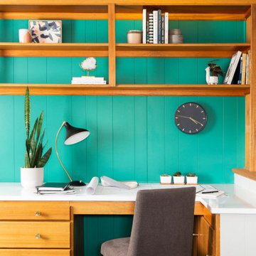
We loved the original built-ins in this space, and knew they needed to always be a part of this house, but these 60-year-old beauties definitely needed a little help. We cleaned up the cabinets and brass hardware, switched out the formica counter for a new quartz top, and painted wall a cheery accent color to liven it up a bit. And voila! We have an office that is the envy of the neighborhood.
 CONTENT Architecture
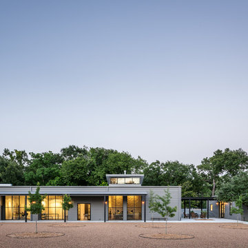
This project encompasses the renovation of two aging metal warehouses located on an acre just North of the 610 loop. The larger warehouse, previously an auto body shop, measures 6000 square feet and will contain a residence, art studio, and garage. A light well puncturing the middle of the main residence brightens the core of the deep building. The over-sized roof opening washes light down three masonry walls that define the light well and divide the public and private realms of the residence. The interior of the light well is conceived as a serene place of reflection while providing ample natural light into the Master Bedroom. Large windows infill the previous garage door openings and are shaded by a generous steel canopy as well as a new evergreen tree court to the west. Adjacent, a 1200 sf building is reconfigured for a guest or visiting artist residence and studio with a shared outdoor patio for entertaining. Photo by Peter Molick, Art by Karin Broker

 TEW Design Studio
This home is a true gem in the heart of MacGregor Downs community in Cary, NC. Built in the 1980's in true Modernist design and architecture, the new owners wanted to keep the integrity of the original design. We redesigned the Half Bath, created floor plan layouts for new furniture, spec'd out furniture, accessories, flooring material, lighting, and artwork, as well as worked on brightening the wall and ceiling paint colors. One challenge we faced during the design process were the very tall ceilings, the very wide walls, and unusual angles. We chose interesting , engaging, and minimalistic artwork for the walls, which proved a successful solution. Another challenge was having a large open angled living room space; we created the perfect layout with separate functional gathering areas and eliminated unused corners.
Photo credit: Bob Fortner

 Twelve Stones Designs, LLC
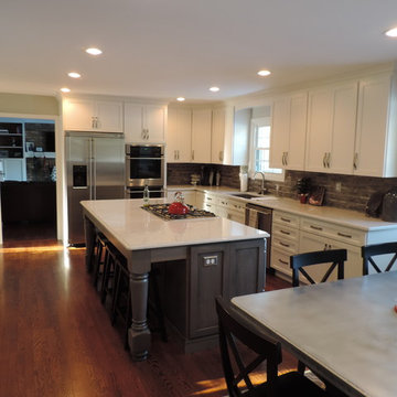
The owners of this kitchen had spent the money to upgrade the finishes in their kitchen upon building the home 12 years ago, but after living in the space for several years they realized how nonfunctional the layout really was. The (then) two preschool aged children had grown into busy, hungry teenagers with many friends who also liked to hang out at the house. So the family needed a more functional kitchen with better traffic flow, space for daily activities revolving around the kitchen at different times of day, and a kitchen that could accommodate cooking for and serving large groups. Furthermore, the dark, traditional finishes no longer reflected the homeowners’ style. They requested a brighter, more relaxed, coastal style that reflected their love of the seaside cities they like to visit.
Originally, the kitchen was U-shaped with a narrow island in the middle. The island created narrow aisles that bottle-necked at the dishwasher, refrigerator, and cooktop areas. There was a pass-through from the foyer into the kitchen, but the owners never liked that the pass-through was also located so close to the powder room. The awkward proximity was unappealing and made guests feel uncomfortable.
The kitchen’s storage was made up of lots of narrow cabinets, apothecary drawers, clipped corner units, and very few drawers. It lacked useful storage for the larger items the family used on a daily basis. And the kitchen’s only pantry was small closet that had only builder-grade, narrow shelving with no illumination to be able to see the contents inside.
Overall, the kitchen’s lighting plan was poorly executed. Only six recessed cans illuminated the entire kitchen and nook areas. The under cabinet lighting was not evenly distributed either. In fact, the builder had mis-placed the under cabinet lighting around the decorative pilasters which made for choppy, dark cubbies. Further, the builder didn’t include any lighting over the sink or the bar area, which meant whoever was doing the dishes was always in their own shadow. That, coupled with the steep overhang of the game room above made the bar area feel like a dim, cavernous space that wasn’t inviting or task oriented. The kitchen looked out into the main living space, but the raised bar and a narrow wall (which held the only large cabinet in the kitchen) created more of a barrier than a relationship to the living room or breakfast nook. In fact, one couldn’t even see the breakfast nook from the cooktop or sink areas due to its orientation. The raised bar top was too narrow to comfortably sit to either dine at or chat from due to the lack of knee space. The the homeowners confided that the kitchen felt more like a dark, dirty prison than place where the family, or their guests, wanted to gather and commune.
The clients' needs and desires were:
➢ to create a kitchen that would be a space the family loved to be in; to relate to the adjacent spaces all around, and to have better flow for entertaining large groups
➢ to remove the walls between the breakfast nook and living area and to be able to utilize the natural light from the windows in both those areas
➢ to incorporate a functional chopping block for prepping fresh food for home cooked meals, an island with a large sink and drain board, 2 pull out trash cans, and seating for at least the 2 teens to eat or do homework
➢ to design a kitchen and breakfast nook with an airy, coastal, relaxed vibe that blended with the rest of the house's coastal theme
➢ to integrate a layered lighting plan which would include ample general illumination, specific task lighting, decorative lighting, and lots of illuminated storage
➢ to design a kitchen with not only more storage for all the husband’s kitchen gadgets and collection of oils and spices, but smart storage, including a coffee/breakfast bar and a place to store and conceal the toaster oven and microwave
➢ to find a way to utilize the large open space between the kitchen, pantry area, and breakfast nook
Twelve Stones Designs achieved the owner's goals by:
➢ removing the walls between the kitchen and living room to allow the natural light to filter in from the adjacent rooms and to create a connection between the kitchen, nook, and living spaces for a sense of unity and communion
➢ removing the existing pantry and designing 3 large pantry style cabinets with LED tape lights and rollout drawers to house lots of kitchen appliances, gadgets, and tons of groceries. We also took the cabinets all the way up to the 9’ ceiling for additional storage for seasonal items and bulk storage.
➢ designing 2 islands - 1 with a gorgeous black walnut chopping block that houses a drawer for chopping and carving knives and a custom double pull out trash unit for point of use utilization - and 1 that houses the dishwasher, a large Blanco Gourmet sink with integrated drain board, woven baskets for fresh root vegetables and kitchen towels, plenty of drawer storage for kitchen items, and bar seating for up to 4 diners.
➢ closing off the space between the kitchen and the powder room to create a beautiful new private alcove for the powder room as well as adding some decorative storage. This also gave us space to include more tall storage near the new range for precision placement of the husband’s extensive oil and spice collection as well as a location for a combo-steam oven the wife wanted for baking and cooking healthy meals.
The project is enhanced functionally by:
➢ incorporated USB and standard receptacles for the kids’ laptops and phone charging in the large island
➢ designing the small island to include additional open shelving for items used on a daily basis such as a variety of bowls, plates, and colanders. This set up also works well for the husband who prefers to “plate” his dinners in restaurant-style fashion before presenting them to the table.
➢ the integration of specific storage units, such as double stacked cutlery drawers, a custom spice pull-out, a Kuerig coffee and tea pod drawer, and custom double stacked utensil drawers
➢ moving the refrigerator to the old oven location - this eliminated the bottle neck as well as created a better relationship to the eating table. It also utilizes the floor space between the pantry, nook, and kitchen
➢ creating a banquet style breakfast nook - this banquette seating not only doubles the amount of seating for large gatherings but it better utilizes the odd space between the kitchen and the previous nook area. It also helps to create a distinct pathway from the mudroom room through the pantry area, kitchen, nook, and living room.
➢ the coffee/breakfast bar area which includes the perfect location for the concealed microwave and toaster oven, convenient storage for the coffee pods and tea accoutrements. Roll-out drawers below also house the smoothie maker, hot water kettle, and a plethora of smoothie-making ingredients such as protein powders, smoothie additives, etc. Furthermore, the drawers below the Keurig house measuring utensil, cutlery, baking supplies and tupperware storage.
➢ incorporating lots of wide drawers and pullouts to accommodate large cookware.
➢ utilizing as much vertical space as possible by building storage to the ceiling which accommodates the family’s abundant amount of serving platters, baking sheets, bakeware, casserole dishes, and additional cutting boards.
The project is enhanced aesthetically by:
➢ new 5-piece Versailles pattern porcelain tile that now seamlessly joins the entire down stairs area together creating a bright, cohesiveness feeling instead of choppy separated spaces - it also adds a coastal feeling
➢ designing a cabinet to conceal the microwave and toaster oven
➢ the coastal influenced light fixtures over the nook table and island
➢ the sandy colors of the Langdon Cambria countertops. The swirling pattern and sparkling quartz pieces remind the homeowner of black-and-tan sandy beaches
➢ the striped banquet seating whose creamy white background and blue-green stripes were the inspiration for the cabinet and wall colors.
➢ All the interior doors were painted black to coordinate with the blacks and grays in the backsplash tile and countertop. This also adds a hint of tailored formality to an otherwise casual space.
➢ the use of WAC's Oculux small aperture LED units for the overhead lighting complimented with Diode LED strips for task lighting under the cabinets and inside the pantry and glass wall cabinets. All of the lighting applications are on separate dimmer switches.
Innovative uses of materials or construction methods by Realty Restoration LLC:
➢ Each 1-1/2” x 3” block of reclaimed end-grain black walnut that makes up the center island chopping block was hand milled and built in the shop. It was designed to look substantial and proportional to the surrounding elements, executed by creating the 4 inch tall top with a solid wood chamfered edge band.
➢ The metal doors on either side of the vent hood were also custom designed for this project and built in the Realty Restoration LLC shop. They are made 1x2, 11-gauge mild steel with ribbed glass. Weighing 60 lbs a piece, heavy duty cabinet hinges were added to support the weight of the door and keep them from sagging.
➢ Under-cabinet receptacles were added along the range wall in order to have a clean, uninterrupted backsplash.
Design obstacles to overcome:
➢ Because we were removing the demising walls between the kitchen and living room, we had to find a way to plumb and vent the new island. We did this by tunneling through the slab (the slab had post tension cables which prevented us from just trenching) to run a new wet vent through a nearby structural wall. We pulled the existing hot and cold lines between upper floor joists and ran them down the structural wall as well and up through a conduit in the tunnel.
➢ Since we were converting from wall overs to a gas range it allowed us to utilize the 220 feed for the wall ovens to provide a new sub panel for all the new kitchen circuits
➢ Due to framing deficiencies inherited from the original build there was a 1-1/2” differential in the floor-to-ceiling height over a 20 foot span; by utilizing the process of cutting and furring coupled with the crown moulding details on the cabinet elevations we were able to mask the problem and provide seamless transitions between the cabinet components.
Evidence of superior craftsmanship:
➢ uniquely designed, one-of-a-kind metal “X” end panels on the large island. The end panels were custom made in the Realty Restoration LLC shop and fitted to the exact dimensions of the island. The welding seams are completely indistinguishable - the posts look like they are cut from a single sheet of metal
➢ square metal posts on the small island were also custom made and designed to compliment and carry through the metal element s throughout the kitchen
➢ the beautiful, oversized end panels on the pantry cabinets which give the breakfast nook a tailored look
➢ integrating a large format 5 piece Versailles tile pattern to seamlessly flow from the existing spaces into the new kitchen space
➢ By constructing a custom cabinet that jogged around a corner we could not remodel (housing the entry way coat closet) we were able to camouflage the adjacent wall offset within the upper and lower cabinets. By designing around the existing jog in the structural walls we accomplished a few things: we were able to find the space to house, and hide, the microwave and toaster oven yet still have a clean cohesive appearance from the kitchen side. Additionally, the owners were able to keep their much needed coat closet and we didn’t have to increase the budget with unnecessary structural work.
 Axis Mundi | SF
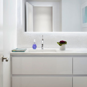
Packing a lot of function into a small space requires ingenuity and skill, exactly what was needed for this one-bedroom gut in the Meatpacking District. When Axis Mundi was done, all that remained was the expansive arched window. Now one enters onto a pristine white-walled loft warmed by new zebrano plank floors. A new powder room and kitchen are at right. On the left, the lean profile of a folded steel stair cantilevered off the wall allows access to the bedroom above without eating up valuable floor space. Beyond, a living room basks in ample natural light. To allow that light to penetrate to the darkest corners of the bedroom, while also affording the owner privacy, the façade of the master bath, as well as the railing at the edge of the mezzanine space, are sandblasted glass. Finally, colorful furnishings, accessories and photography animate the simply articulated architectural envelope.
Project Team: John Beckmann, Nick Messerlian and Richard Rosenbloom
Photographer: Mikiko Kikuyama
Contractor: Vered
© Axis Mundi Design LLC.
 Alair Homes Plano
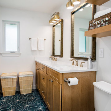
Our clients purchased this 1950 ranch style cottage knowing it needed to be updated. They fell in love with the location, being within walking distance to White Rock Lake. They wanted to redesign the layout of the house to improve the flow and function of the spaces while maintaining a cozy feel. They wanted to explore the idea of opening up the kitchen and possibly even relocating it. A laundry room and mudroom space needed to be added to that space, as well. Both bathrooms needed a complete update and they wanted to enlarge the master bath if possible, to have a double vanity and more efficient storage. With two small boys and one on the way, they ideally wanted to add a 3rd bedroom to the house within the existing footprint but were open to possibly designing an addition, if that wasn’t possible.
In the end, we gave them everything they wanted, without having to put an addition on to the home. They absolutely love the openness of their new kitchen and living spaces and we even added a small bar! They have their much-needed laundry room and mudroom off the back patio, so their “drop zone” is out of the way. We were able to add storage and double vanity to the master bathroom by enclosing what used to be a coat closet near the entryway and using that sq. ft. in the bathroom. The functionality of this house has completely changed and has definitely changed the lives of our clients for the better!
 Hearthstone Inc
Richard Herman is in the hospitality business and owns several upscale hotels in Florida and in other states as well as cattle ranches in both Florida and Missouri. Their farm in Ocala is by farm their most unique. The property serves as a 4-H demonstration project for the purpose of children’s education. They have been working with the Academy Prep of St. Pete which is dedicated to inner-city youths that are selected on the basis of need and achievement. Wife Diane spends her time on the farm raising Gypsy Vanners, a diminutive draft horse named after the job they did in Eastern Europe, pulling the wagons (vans) for gypsies that wandered across the continent. On the Ocala farm, there are several mules with a unique profession.
Richard had visited the Hearthstone display at a Log & Timber Home Shows at the Orlando Convention Center many years ago. He was impressed that Hearthstone had stayed in touch with him over the years by mailings, invitations to shows, and periodic phone calls. When the time came to start serious consideration of the design of barn, Hearthstone responded promptly and professionally to Richard and Diane’s requests for information and a review of their ideas for their barn, which would serve as the centerpiece for their new farm.
They wanted a multipurpose facility that could accommodate an educational environment and a large hall suitable for the fundraising events for his charities. Richard wanted a barn that reflected the look and feel of barns built at the dawn of the 20th century. Besides the rustic chicken houses and vegetable gardens, they have completely renovated a 1020’s era farmhouse to be as historically correct as possible and serves as the entry to the farm.
“They very careful to feel us out, get comfortable with our capabilities, and be convinced that we could perform as promised,” said Project Manager John Ricketson of Hearthstone.
Design Process
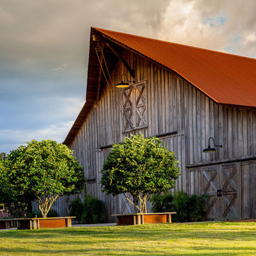
There were some initial drawings that gave us a start on the basic shape and size of the barn. From there, it was a process of narrowing down the uses of each area and the spans that could be achieved. The barn was going to have the traditional “board & batten” exterior siding and a metal roof. There is a cantilevered ‘hay hood” on the north gable end above the large sliding barn doors that open into the foyer and horse stalls. The wings house a combination of areas, beginning with the large restrooms to accommodate crowds for events. Other parts of the wings have garage areas for the farm vehicles, feed room, tack room, wash rack, storage, offices, and smaller restrooms.
Keeping with the look and feel of the turn of the century, Hearthstone developed a process for giving the timbers a surface texture that mimicked the circular cuts of timbers that had just come out of an old sawmill. This was easier said than done. Randy Giles guided his millwright (Wolfgang) in designing a machine that would do this effectively.
The barn was delivered in October of 2014 and was erected over the course of two weeks, thanks to a hardworking crew (Eric Foster) and near-perfect weather. After the Hearthstone crew completed the erection and roof dry-in, it was time for the local carpenters to step up and install some light conventional framing on the gable ends before applying the roof fascia and exterior board & batten siding. Next came the big sliding barn doors, plumbing, electrical, heating, and cooling. Large rustic fixtures were hung from the great hall roof timbers.
Exterior
The board & batten siding was cypress and allowed to turn color naturally as rain hit it and the sun started working on it with UV rays. This method causes a much grayer look closer to the ground and less so where the roof overhang provides protection. The North end has some large limestone boulders and planters arranged around the pad with tall pampas grass. The planters provide casual seating before events and during outside receptions. The entire area was sodded with lush St. Augustine grass and split rail fences were added to enclose the barn area. The corrugated metal roof was a special order material that immediately rusted after being exposed to moisture. The layer of rust protects the metal from the elements.
Interior
The board & batten theme was carried throughout most of the interior with the timbers left natural to show off the circular saw texture. All of the tongue & groove decking was shipped in advance to allow the local painter to pre-stain it with a dark brown transparent stain that is a beautiful background to the light color Eastern White Pine timbers.
“Everything was unique in this project” said Project Manager John Ricketson. “The setting on a small demonstration farm close to Ocala, the multipurpose design, the circular saw texture on the timbers.”
The Hermans are very proud of their farm’s outcome. Richard sent a note to Randy Giles, owner of Hearthstone: “The Barn is fantastic, not a single problem, period. Next month, we have Jo Dee Messina coming in to help with a fundraiser for a local center for abused kids. Folks love the farm, ...... but that barn gets all of the attention. I would encourage you to use me as a reference for your sales team, feel free to extend my cell phone to any prospective purchasers.”
 Edgewater Design Group
As written in Northern Home & Cottage by Elizabeth Edwards
In general, Bryan and Connie Rellinger loved the charm of the old cottage they purchased on a Crooked Lake peninsula, north of Petoskey. Specifically, however, the presence of a live-well in the kitchen (a huge cement basin with running water for keeping fish alive was right in the kitchen entryway, seriously), rickety staircase and green shag carpet, not so much. An extreme renovation was the only solution. The downside? The rebuild would have to fit into the smallish nonconforming footprint. The upside? That footprint was built when folks could place a building close enough to the water to feel like they could dive in from the house. Ahhh...
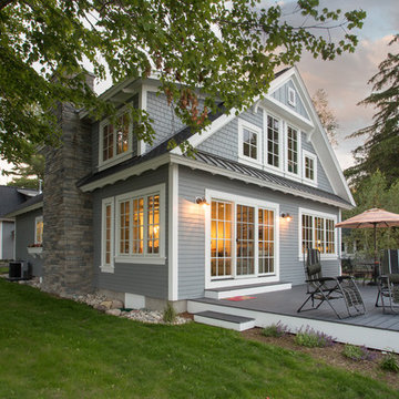
Stephanie Baldwin of Edgewater Design helped the Rellingers come up with a timeless cottage design that breathes efficiency into every nook and cranny. It also expresses the synergy of Bryan, Connie and Stephanie, who emailed each other links to products they liked throughout the building process. That teamwork resulted in an interior that sports a young take on classic cottage. Highlights include a brass sink and light fixtures, coffered ceilings with wide beadboard planks, leathered granite kitchen counters and a way-cool floor made of American chestnut planks from an old barn.
Thanks to an abundant use of windows that deliver a grand view of Crooked Lake, the home feels airy and much larger than it is. Bryan and Connie also love how well the layout functions for their family - especially when they are entertaining. The kids' bedrooms are off a large landing at the top of the stairs - roomy enough to double as an entertainment room. When the adults are enjoying cocktail hour or a dinner party downstairs, they can pull a sliding door across the kitchen/great room area to seal it off from the kids' ruckus upstairs (or vice versa!).
From its gray-shingled dormers to its sweet white window boxes, this charmer on Crooked Lake is packed with ideas!
- Jacqueline Southby Photography
 Edgewater Design Group
As written in Northern Home & Cottage by Elizabeth Edwards
In general, Bryan and Connie Rellinger loved the charm of the old cottage they purchased on a Crooked Lake peninsula, north of Petoskey. Specifically, however, the presence of a live-well in the kitchen (a huge cement basin with running water for keeping fish alive was right in the kitchen entryway, seriously), rickety staircase and green shag carpet, not so much. An extreme renovation was the only solution. The downside? The rebuild would have to fit into the smallish nonconforming footprint. The upside? That footprint was built when folks could place a building close enough to the water to feel like they could dive in from the house. Ahhh...
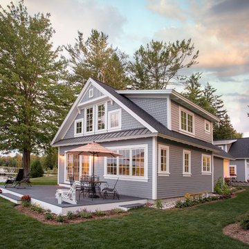
Stephanie Baldwin of Edgewater Design helped the Rellingers come up with a timeless cottage design that breathes efficiency into every nook and cranny. It also expresses the synergy of Bryan, Connie and Stephanie, who emailed each other links to products they liked throughout the building process. That teamwork resulted in an interior that sports a young take on classic cottage. Highlights include a brass sink and light fixtures, coffered ceilings with wide beadboard planks, leathered granite kitchen counters and a way-cool floor made of American chestnut planks from an old barn.
Thanks to an abundant use of windows that deliver a grand view of Crooked Lake, the home feels airy and much larger than it is. Bryan and Connie also love how well the layout functions for their family - especially when they are entertaining. The kids' bedrooms are off a large landing at the top of the stairs - roomy enough to double as an entertainment room. When the adults are enjoying cocktail hour or a dinner party downstairs, they can pull a sliding door across the kitchen/great room area to seal it off from the kids' ruckus upstairs (or vice versa!).
From its gray-shingled dormers to its sweet white window boxes, this charmer on Crooked Lake is packed with ideas!
- Jacqueline Southby Photography


 Sea Pointe Design & Remodel
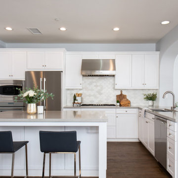
This San Juan Capistrano kitchen remodel shows off a new sleek design with different shades of white and gray. The kitchen island serves great function as well, giving this family a space to gather and eat while cooking.
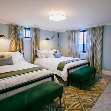 TVL Creative Ltd.
This project was such an incredible design opportunity, and instilled inspiration and excitement at every turn! Our amazing clients came to us with the challenge of converting their beloved family home into a welcoming haven for all members of the family. At the time that we met our clients, they were struggling with the difficult personal decision of the fate of the home. Their father/father-in-law had passed away and their mother/mother-in-law had recently been admitted into a nursing facility and was fighting Alzheimer’s. Resistant to loss of the home now that both parents were out of it, our clients purchased the home to keep in in the family. Despite their permanent home currently being in New Jersey, these clients dedicated themselves to keeping and revitalizing the house. We were moved by the story and became immediately passionate about bringing this dream to life.
The home was built by the parents of our clients and was only ever owned by them, making this a truly special space to the family. Our goal was to revitalize the home and to bring new energy into every room without losing the special characteristics that were original to the home when it was built. In this way, we were able to develop a house that maintains its own unique personality while offering a space of welcoming neutrality for all members of the family to enjoy over time.
The renovation touched every part of the home: the exterior, foyer, kitchen, living room, sun room, garage, six bedrooms, three bathrooms, the laundry room, and everything in between. The focus was to develop a style that carried consistently from space to space, but allowed for unique expression in the small details in every room.
Starting at the entry, we renovated the front door and entry point to offer more presence and to bring more of the mid-century vibe to the home’s exterior. We integrated a new modern front door, cedar shingle accents, new exterior paint, and gorgeous contemporary house numbers that really allow the home to stand out. Just inside the entry, we renovated the foyer to create a playful entry point worthy of attention. Cement look tile adorns the foyer floor, and we’ve added new lighting and upgraded the entry coat storage.
Upon entering the home, one will immediately be captivated by the stunning kitchen just off the entry. We transformed this space in just about every way. While the footprint of the home ultimately remained almost identical, the aesthetics were completely turned on their head. We re-worked the kitchen to maximize storage and to create an informal dining area that is great for casual hosting or morning coffee.
We removed the entry to the garage that was once in the informal dining, and created a peninsula in its place that offers a unique division between the kitchen/informal dining and the formal dining and living areas. The simple light warm light gray cabinetry offers a bit of traditional elegance, along with the marble backsplash and quartz countertops. We extended the original wood flooring into the kitchen and stained all floors to match for a warmth that truly resonates through all spaces. We upgraded appliances, added lighting everywhere, and finished the space with some gorgeous mid century furniture pieces.
In the formal dining and living room, we really focused on maintaining the original marble fireplace as a focal point. We cleaned the marble, repaired the mortar, and refinished the original fireplace screen to give a new sleek look in black. We then integrated a new gas insert for modern heating and painted the upper portion in a rich navy blue; an accent that is carried through the home consistently as a nod to our client’s love of the color.
The former entry into the old covered porch is now an elegant glass door leading to a stunning finished sunroom. This room was completely upgraded as well. We wrapped the entire space in cozy white shiplap to keep a casual feel with brightness. We tiled the floor with large format concrete look tile, and painted the old brick fireplace a bright white. We installed a new gas burning unit, and integrated transitional style lighting to bring warmth and elegance into the space. The new black-frame windows are adorned with decorative shades that feature hand-sketched bird prints, and we’ve created a dedicated garden-ware “nook” for our client who loves to work in the yard. The far end of this space is completed with two oversized chaise loungers and overhead lights…the most perfect little reading nook!
Just off the dining room, we created an entirely new space to the home: a mudroom. The clients lacked this space and desperately needed a landing spot upon entering the home from the garage. We uniquely planned existing space in the garage to utilize for this purpose, and were able to create a small but functional entry point without losing the ability to park cars in the garage. This new space features cement-look tile, gorgeous deep brown cabinetry, and plenty of storage for all the small items one might need to store while moving in and out of the home.
The remainder of the upstairs level includes massive renovations to the guest hall bathroom and guest bedroom, upstairs master bed/bath suite, and a third bedroom that we converted into a home office for the client.
Some of the largest transformations were made in the basement, where unfinished space and lack of light were converted into gloriously lit, cozy, finished spaces. Our first task was to convert the massive basement living room into the new master bedroom for our clients. We removed existing built-ins, created an entirely new walk-in closet, painted the old brick fireplace, installed a new gas unit, added carpet, introduced new lighting, replaced windows, and upgraded every part of the aesthetic appearance. One of the most incredible features of this space is the custom double sliding barn door made by a Denver artisan. This space is truly a retreat for our clients!
We also completely transformed the laundry room, back storage room, basement master bathroom, and two bedrooms.
This home’s massive scope and ever-evolving challenges were thrilling and exciting to work with, and the result is absolutely amazing. At the end of the day, this home offers a look and feel that the clients love. Above all, though, the clients feel the spirit of their family home and have a welcoming environment for all members of the family to enjoy for years to come.
 CONTENT Architecture
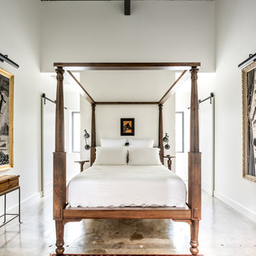
This project encompasses the renovation of two aging metal warehouses located on an acre just North of the 610 loop. The larger warehouse, previously an auto body shop, measures 6000 square feet and will contain a residence, art studio, and garage. A light well puncturing the middle of the main residence brightens the core of the deep building. The over-sized roof opening washes light down three masonry walls that define the light well and divide the public and private realms of the residence. The interior of the light well is conceived as a serene place of reflection while providing ample natural light into the Master Bedroom. Large windows infill the previous garage door openings and are shaded by a generous steel canopy as well as a new evergreen tree court to the west. Adjacent, a 1200 sf building is reconfigured for a guest or visiting artist residence and studio with a shared outdoor patio for entertaining. Photo by Peter Molick, Art by Karin Broker
 ZeroEnergy Design
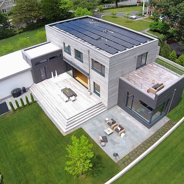
ZeroEnergy Design (ZED) created this modern home for a progressive family in the desirable community of Lexington.
Thoughtful Land Connection. The residence is carefully sited on the infill lot so as to create privacy from the road and neighbors, while cultivating a side yard that captures the southern sun. The terraced grade rises to meet the house, allowing for it to maintain a structured connection with the ground while also sitting above the high water table. The elevated outdoor living space maintains a strong connection with the indoor living space, while the stepped edge ties it back to the true ground plane. Siting and outdoor connections were completed by ZED in collaboration with landscape designer Soren Deniord Design Studio.
Exterior Finishes and Solar. The exterior finish materials include a palette of shiplapped wood siding, through-colored fiber cement panels and stucco. A rooftop parapet hides the solar panels above, while a gutter and site drainage system directs rainwater into an irrigation cistern and dry wells that recharge the groundwater.
Cooking, Dining, Living. Inside, the kitchen, fabricated by Henrybuilt, is located between the indoor and outdoor dining areas. The expansive south-facing sliding door opens to seamlessly connect the spaces, using a retractable awning to provide shade during the summer while still admitting the warming winter sun. The indoor living space continues from the dining areas across to the sunken living area, with a view that returns again to the outside through the corner wall of glass.
Accessible Guest Suite. The design of the first level guest suite provides for both aging in place and guests who regularly visit for extended stays. The patio off the north side of the house affords guests their own private outdoor space, and privacy from the neighbor. Similarly, the second level master suite opens to an outdoor private roof deck.
Light and Access. The wide open interior stair with a glass panel rail leads from the top level down to the well insulated basement. The design of the basement, used as an away/play space, addresses the need for both natural light and easy access. In addition to the open stairwell, light is admitted to the north side of the area with a high performance, Passive House (PHI) certified skylight, covering a six by sixteen foot area. On the south side, a unique roof hatch set flush with the deck opens to reveal a glass door at the base of the stairwell which provides additional light and access from the deck above down to the play space.
Energy. Energy consumption is reduced by the high performance building envelope, high efficiency mechanical systems, and then offset with renewable energy. All windows and doors are made of high performance triple paned glass with thermally broken aluminum frames. The exterior wall assembly employs dense pack cellulose in the stud cavity, a continuous air barrier, and four inches exterior rigid foam insulation. The 10kW rooftop solar electric system provides clean energy production. The final air leakage testing yielded 0.6 ACH 50 - an extremely air tight house, a testament to the well-designed details, progress testing and quality construction. When compared to a new house built to code requirements, this home consumes only 19% of the energy.
Architecture & Energy Consulting: ZeroEnergy Design
Landscape Design: Soren Deniord Design
Paintings: Bernd Haussmann Studio
Photos: Eric Roth Photography
Sponsored
Columbus, OH

Trish Takacs Design
Award Winning & Highly Skilled Kitchen & Bath Designer in Columbus
 SURROUNDS Landscape Architecture + Construction
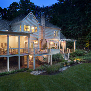
Our client desired a functional, tasteful, and improved environment to compliment their home. The overall goal was to create a landscape that was subtle and not overdone. The client was highly focused on their deck environment that would span across the rear of the house with an area for a Jacuzzi as well. A portion of the deck has a screened in porch due to the naturally buggy environment since the home is situated in the woods and a low area. A mosquito repellent injection system was incorporated into the irrigation system to help with the bug issue. We improved circulation of the driveway, increased the overall curb appeal of the entrance of the home, and created a scaled and proportional outdoor living environment for the clients to enjoy. The client has religious guidelines that needed to be adhered to with the overall function and design of the landscape, which included an arbor over the deck to support a Sukkah and a Green Egg smoker to cook Kosher foods. Two columns were added at the driveway entrance with lights to help define their driveway entrance since it's the end of a long pipe-stem. New light fixtures were also added to the rear of the house.
Our client desired multiple amenities with a limited budget, so everything had to be value engineered through the design and construction process. There is heavy deer pressure on the site, a mosquito issue, low site elevations, flat topography, poor soil, and overall poor drainage of the site. The original driveway was not sized appropriately and the front porch had structural issues, as well as leaked water onto the landing below. The septic tank was also situated close to the rear of the house and had to be contemplated during the design process.
Photography: Morgan Howarth. Landscape Architect: Howard Cohen, Surrounds Inc.
 NR Interiors
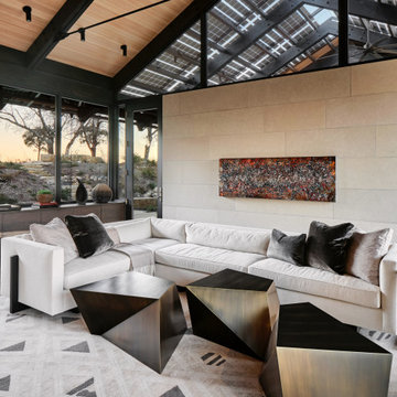
I was honored to work with these homeowners again, now to fully furnish this new magnificent architectural marvel made especially for them by Lake Flato Architects. Creating custom furnishings for this entire home is a project that spanned over a year in careful planning, designing and sourcing while the home was being built and then installing soon thereafter. I embarked on this design challenge with three clear goals in mind. First, create a complete furnished environment that complimented not competed with the architecture. Second, elevate the client’s quality of life by providing beautiful, finely-made, comfortable, easy-care furnishings. Third, provide a visually stunning aesthetic that is minimalist, well-edited, natural, luxurious and certainly one of kind. Ultimately, I feel we succeeded in creating a visual symphony accompaniment to the architecture of this room, enhancing the warmth and livability of the space while keeping high design as the principal focus.
The centerpiece of this modern sectional is the collection of aged bronze and wood faceted cocktail tables to create a sculptural dynamic focal point to this otherwise very linear space.
From this room there is a view of the solar panels installed on a glass ceiling at the breezeway. Also there is a 1 ton sliding wood door that shades this wall of windows when needed for privacy and shade.
 Bespoke By Acorn
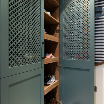
This luxury fitted mudroom, utility and cloakroom was installed for our clients who wanted to combine highly practical facilities with a cohesive design scheme that expressed their artistic aesthetic. What could have been a bland, utilitarian space has been transformed with dark walnut wood, decorative interest and exceptional craftmanship. The suite of bespoke built-in cabinets has created a beautifully organised, multipurpose free-flowing space. Flawlessly spray finished in Inchyra Blue by Farrow & Ball, the dark blue green grey is a dramatic colour which, along with the walnut wood and striking artworks, makes a bold and confident impression.
Bespoke walnut wood features
Walnut, renowned for its deep, lustrous tones has an enduring elegance. Used for fitted furniture and wall panelling, walnut elevates any space, adding natural warmth and richness. As a hardwood, walnut has exceptional durability and is naturally resistant to moisture and warping, which makes it an ideal choice for a cloakroom or bathroom setting. For this project, the walnut veneers have a natural oiled finish to bring out the beauty of the grain. The reeded walnut veneer wall panel behind the built-in bench adds stunning texture and visual interest to the joinery.
Shaker-style doors with fretwork panels
Made to measure fretwork doors and panels like these conceal unsightly features while also providing ventilation. A well-aired mudroom or boot room is vital to ensure outerwear dries quickly and doesn’t become musty. This is especially important for the floor to ceiling shoe cupboard we built here as it helps to keep the footwear fresh. The decorative fretwork pattern also adds visual interest and makes the room feel less enclosed. Integrated LED lighting installed throughout the joinery enhancing safety, brightness and enjoyment to the space.
Custom-made vanity unit
This large, sleek handle-free vanity unit provides a generous amount of storage space with a smart interior arrangement with customised waste management. The soft-closing drawers are operated by a smooth, silent, push to open mechanism. The floating design allows for LED lighting underneath the cabinet.
Dog shower and storage
The purpose-built indoor dog shower is great for hosing down and drying off the dogs. It doubles up as somewhere to wash muddy wellies and golf clubs too. Bespoke shelving and hooks for all the dog paraphernalia keeps the pet zone well-organised and tidy.
All in all, the result is a cloakroom which combines highly functional mudroom, utility and cloakroom facilities in an immensely stylish space. It’s immensely practical yet incredibly stylish with a strong focus on aesthetics and design.
21