
Search results for "Well trained dating" in Home Design Ideas
 Kristin Hoaglund Design
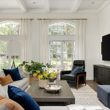
This beautiful French Provincial home is set on 10 acres, nestled perfectly in the oak trees. The original home was built in 1974 and had two large additions added; a great room in 1990 and a main floor master suite in 2001. This was my dream project: a full gut renovation of the entire 4,300 square foot home! I contracted the project myself, and we finished the interior remodel in just six months. The exterior received complete attention as well. The 1970s mottled brown brick went white to completely transform the look from dated to classic French. Inside, walls were removed and doorways widened to create an open floor plan that functions so well for everyday living as well as entertaining. The white walls and white trim make everything new, fresh and bright. It is so rewarding to see something old transformed into something new, more beautiful and more functional.
 Chi Renovation & Design
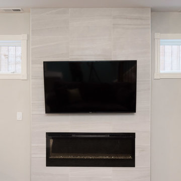
A fun updated to a once dated basement. We renovated this client’s basement to be the perfect play area for their children as well as a chic gathering place for their friends and family. In order to accomplish this, we needed to ensure plenty of storage and seating. Some of the first elements we installed were large cabinets throughout the basement as well as a large banquette, perfect for hiding children’s toys as well as offering ample seating for their guests. Next, to brighten up the space in colors both children and adults would find pleasing, we added a textured blue accent wall and painted the cabinetry a pale green.
Upstairs, we renovated the bathroom to be a kid-friendly space by replacing the stand-up shower with a full bath. The natural stone wall adds warmth to the space and creates a visually pleasing contrast of design.
Lastly, we designed an organized and practical mudroom, creating a perfect place for the whole family to store jackets, shoes, backpacks, and purses.
Designed by Chi Renovation & Design who serve Chicago and it's surrounding suburbs, with an emphasis on the North Side and North Shore. You'll find their work from the Loop through Lincoln Park, Skokie, Wilmette, and all of the way up to Lake Forest.
For more about Chi Renovation & Design, click here: https://www.chirenovation.com/
To learn more about this project, click here: https://www.chirenovation.com/portfolio/lincoln-square-basement-renovation/
 ZeroEnergy Design
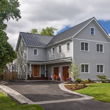
This LEED Platinum certified house reflects the homeowner's desire for an exceptionally healthy and comfortable living environment, within a traditional neighborhood.
INFILL SITE. The family, who moved from another area of Wellesley, sought out this property to be within walking distance of the high school and downtown area. An existing structure on the tight lot was removed to make way for the new home. 84% of the construction waste, from both the previous structure and the new home, was diverted from a landfill. ZED designed to preserve the existing mature trees on the perimeter of the property to minimize site impacts, and to maintain the character of the neighborhood as well as privacy on the site.
EXTERIOR EXPRESSION. The street facade of the home relates to the local New England vernacular. The rear uses contemporary language, a nod to the family’s Californian roots, to incorporate a roof deck, solar panels, outdoor living space, and the backyard swimming pool. ZED’s careful planning avoided to the need to face the garage doors towards the street, a common syndrome of a narrow lot.
THOUGHTFUL SPACE. Homes with dual entries can often result in duplicate and unused spaces. In this home, the everyday and formal entry areas are one and the same; the front and garage doors share the entry program of coat closets, mudroom storage with bench for removing your shoes, and a laundry room with generous closets for the children's sporting equipment. The entry area leads directly to the living space, encompassing the kitchen, dining and sitting area areas in an L-shaped open plan arrangement. The kitchen is placed at the south-west corner of the space to allow for a strong connection to the dining, sitting and outdoor living spaces. A fire pit on the deck satisfies the family’s desire for an open flame while a sealed gas fireplace is used indoors - ZED’s preference after omitting gas burning appliances completely from an airtight home. A small study, with a window seat, is conveniently located just off of the living space. A first floor guest bedroom includes an accessible bathroom for aging visitors and can be used as a master suite to accommodate aging in place.
HEALTHY LIVING. The client requested a home that was easy to clean and would provide a respite from seasonal allergies and common contaminants that are found in many indoor spaces. ZED selected easy to clean solid surface flooring throughout, provided ample space for cleaning supplies on each floor, and designed a mechanical system with ventilation that provides a constant supply of fresh outdoor air. ZED selected durable materials, finishes, cabinetry, and casework with low or no volatile organic compounds (VOCs) and no added urea formaldehyde.
YEAR-ROUND COMFORT. The home is super insulated and air-tight, paired with high performance triple-paned windows, to ensure it is draft-free throughout the winter (even when in front of the large windows and doors). ZED designed a right-sized heating and cooling system to pair with the thermally improved building enclosure to ensure year-round comfort. The glazing on the home maximizes passive solar gains, and facilitates cross ventilation and daylighting.
ENERGY EFFICIENT. As one of the most energy efficient houses built to date in Wellesley, the home highlights a practical solution for Massachusetts. First, the building enclosure reduces the largest energy requirement for typical houses (heating). Super-insulation, exceptional air sealing, a thermally broken wall assembly, triple pane windows, and passive solar gain combine for a sizable heating load reduction. Second, within the house only efficient systems consume energy. These include an air source heat pump for heating & cooling, a heat pump hot water heater, LED lighting, energy recovery ventilation, and high efficiency appliances. Lastly, photovoltaics provide renewable energy help offset energy consumption. The result is an 89% reduction in energy use compared to a similar brand new home built to code requirements.
RESILIENT. The home will fare well in extreme weather events. During a winter power outage, heat loss will be very slow due to the super-insulated and airtight envelope– taking multiple days to drop to 60 degrees even with no heat source. An engineered drainage system, paired with careful the detailing of the foundation, will help to keep the finished basement dry. A generator will provide full operation of the all-electric house during a power outage.
OVERALL. The home is a reflection of the family goals and an expression of their values, beautifully enabling health, comfort, safety, resilience, and utility, all while respecting the planet.
ZED - Architect & Mechanical Designer
Bevilacqua Builders Inc - Contractor
Creative Land & Water Engineering - Civil Engineering
Barbara Peterson Landscape - Landscape Design
Nest & Company - Interior Furnishings
Eric Roth Photography - Photography
Find the right local pro for your project
 Jackson & Perkins
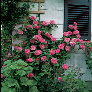
Introduced in 1868, 'Zephirine Drouhin' is a romantic, fantastically fragrant, old-fashioned Rose that is still one of the most popular Climbing Roses today, especially in Europe. No Modern Rose has been able to exceed it for sheer performance and season-long bloom.
Peaking in spring and fall, the loose, semi-double blossoms of vivid cerise-carmine provide outstanding mass effect. Each bloom is about 4 inches across, opening from a long, pointed bud and made up of 20 to 30 richly colored petals that are infused with a strong damask scent.
The plant grows vigorously to 15 to 20 feet high and 4 to 5 feet wide and, remarkable for any Rose, performs well in shade! It's an excellent choice for north-facing walls and areas with little sunlight.
The rich, dark green foliage (coppery-purple when young) is very mildew-resistant, and the canes are thornless, making it great for planting where traffic is heavy or children are nearby. This classic, time-tested climbing rose is the perfect choice to train over a trellis or porch, or trim into a formal hedge. Plant in moist, well-drained, loamy soil. Zones 5-9. Late spring-Early Fall
 Kristin Hoaglund Design
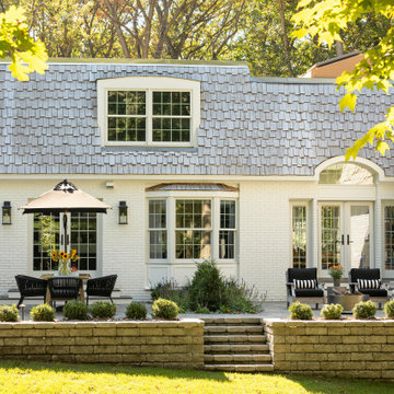
This beautiful French Provincial home is set on 10 acres, nestled perfectly in the oak trees. The original home was built in 1974 and had two large additions added; a great room in 1990 and a main floor master suite in 2001. This was my dream project: a full gut renovation of the entire 4,300 square foot home! I contracted the project myself, and we finished the interior remodel in just six months. The exterior received complete attention as well. The 1970s mottled brown brick went white to completely transform the look from dated to classic French. Inside, walls were removed and doorways widened to create an open floor plan that functions so well for everyday living as well as entertaining. The white walls and white trim make everything new, fresh and bright. It is so rewarding to see something old transformed into something new, more beautiful and more functional.
 Marvin
Architect: Blaine Bonadies, Bonadies Architect
Photography By: Jean Allsopp Photography
“Just as described, there is an edgy, irreverent vibe here, but the result has an appropriate stature and seriousness. Love the overscale windows. And the outdoor spaces are so great.”
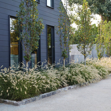
Situated atop an old Civil War battle site, this new residence was conceived for a couple with southern values and a rock-and-roll attitude. The project consists of a house, a pool with a pool house and a renovated music studio. A marriage of modern and traditional design, this project used a combination of California redwood siding, stone and a slate roof with flat-seam lead overhangs. Intimate and well planned, there is no space wasted in this home. The execution of the detail work, such as handmade railings, metal awnings and custom windows jambs, made this project mesmerizing.
Cues from the client and how they use their space helped inspire and develop the initial floor plan, making it live at a human scale but with dramatic elements. Their varying taste then inspired the theme of traditional with an edge. The lines and rhythm of the house were simplified, and then complemented with some key details that made the house a juxtaposition of styles.
The wood Ultimate Casement windows were all standard sizes. However, there was a desire to make the windows have a “deep pocket” look to create a break in the facade and add a dramatic shadow line. Marvin was able to customize the jambs by extruding them to the exterior. They added a very thin exterior profile, which negated the need for exterior casing. The same detail was in the stone veneers and walls, as well as the horizontal siding walls, with no need for any modification. This resulted in a very sleek look.
MARVIN PRODUCTS USED:
Marvin Ultimate Casement Window
 TKS Design Group
Download our free ebook, Creating the Ideal Kitchen. DOWNLOAD NOW
I am still sometimes shocked myself at how much of a difference a kitchen remodel can make in a space, you think I would know by now! This was one of those jobs. The small U-shaped room was a bit cramped, a bit dark and a bit dated. A neighboring sunroom/breakfast room addition was awkwardly used, and most of the time the couple hung out together at the small peninsula.
The client wish list included a larger, lighter kitchen with an island that would seat 7 people. They have a large family and wanted to be able to gather and entertain in the space. Right outside is a lovely backyard and patio with a fireplace, so having easy access and flow to that area was also important.
Our first move was to eliminate the wall between kitchen and breakfast room, which we anticipated would need a large beam and some structural maneuvering since it was the old exterior wall. However, what we didn’t anticipate was that the stucco exterior of the original home was layered over hollow clay tiles which was impossible to shore up in the typical manner. After much back and forth with our structural team, we were able to develop a plan to shore the wall and install a large steal & wood structural beam with minimal disruption to the original floor plan. That was important because we had already ordered everything customized to fit the plan.
We all breathed a collective sigh of relief once that part was completed. Now we could move on to building the kitchen we had all been waiting for. Oh, and let’s not forget that this was all being done amidst COVID 2020.
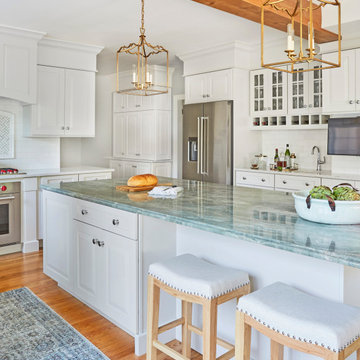
We covered the rough beam with cedar and stained it to coordinate with the floors. It’s actually one of my favorite elements in the space. The homeowners now have a big beautiful island that seats up to 7 people and has a wonderful flow to the outdoor space just like they wanted. The large island provides not only seating but also substantial prep area perfectly situated between the sink and cooktop. In addition to a built-in oven below the large gas cooktop, there is also a steam oven to the left of the sink. The steam oven is great for baking as well for heating daily meals without having to heat up the large oven.
The other side of the room houses a substantial pantry, the refrigerator, a small bar area as well as a TV.
The homeowner fell in love the with the Aqua quartzite that is on the island, so we married that with a custom mosaic in a similar tone behind the cooktop. Soft white cabinetry, Cambria quartz and Thassos marble subway tile complete the soft traditional look. Gold accents, wood wrapped beams and oak barstools add warmth the room. The little powder room was also included in the project. Some fun wallpaper, a vanity with a pop of color and pretty fixtures and accessories finish off this cute little space.
Designed by: Susan Klimala, CKD, CBD
Photography by: Michael Kaskel
For more information on kitchen and bath design ideas go to: www.kitchenstudio-ge.com
Sponsored
Columbus, OH

Snider & Metcalf Interior Design, LTD
Leading Interior Designers in Columbus, Ohio & Ponte Vedra, Florida
 Regan Baker Design Inc.
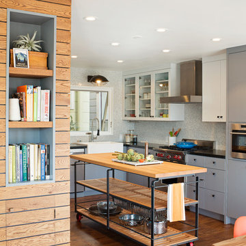
Stylish brewery owners with airline miles that match George Clooney’s decided to hire Regan Baker Design to transform their beloved Duboce Park second home into an organic modern oasis reflecting their modern aesthetic and sustainable, green conscience lifestyle. From hops to floors, we worked extensively with our design savvy clients to provide a new footprint for their kitchen, dining and living room area, redesigned three bathrooms, reconfigured and designed the master suite, and replaced an existing spiral staircase with a new modern, steel staircase. We collaborated with an architect to expedite the permit process, as well as hired a structural engineer to help with the new loads from removing the stairs and load bearing walls in the kitchen and Master bedroom. We also used LED light fixtures, FSC certified cabinetry and low VOC paint finishes.
Regan Baker Design was responsible for the overall schematics, design development, construction documentation, construction administration, as well as the selection and procurement of all fixtures, cabinets, equipment, furniture,and accessories.
Key Contributors: Green Home Construction; Photography: Sarah Hebenstreit / Modern Kids Co.
 Kitchen Design Concepts
With a little bit of love, you can transform your kitchen into a space you love to spend time in! Many people are so used to their surroundings that we don’t realize what a little bit of paint and new finishes can do to change a room. That’s exactly the case of this kitchen. Actually, the cabinetry was already refinished prior to us coming into the picture, our clients couldn’t wait! So, we had the opportunity to incorporate those finishing touches to really seal the deal of this space. Today, this kitchen is up-to-date and classic. It really will stand the test of time! To learn more about this space, continue reading below:
Cabinets
The cabinetry was already refinished prior to us doing our magic. But we love how the crisp and clean finishes of the cabinetry pairs so well with the new finishes and materials we incorporated. To elevate the cabinetry, we embellished the doors and drawers with 5 inch “Emerald” hardware from Top Knobs (TK288BSN).
Countertops
At first glance, you may have noticed we incorporated beautiful marble countertops to this space. So, what if we told you those countertops are not made of marble? Actually, not even close! These countertops are a beautiful 3cm Cambria quartz in the finish “Ironsbridge”. The specs of grey and veining in the countertops might have fooled you! We love the way it looks in this space.
Backsplash
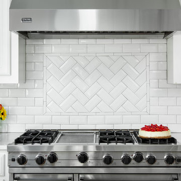
Subway tiles have been around a long time. Still, we love the classic look of subway tile and our clients are always requesting it! A simple way to add interested to subway tile is to utilize tile with beveling, create a contrasting pattern, and add contrasting grout color, as we have done here. Here we have utilized a 3×6 Daltile Rittenhouse Square with beveled edges as the main tile. Then, over the range, we have framed the tile and changed the pattern to herringbone to add some pop!
Fixtures
The fixtures of this space are classically styled as well. From Blanco, we have the main sink in a Precis Super Single Bowl in White paired with an Atura kitchen faucet with pull-down spray in stainless steel. Then on the island, we have a Precis Medium Bowl in White and an Atura Pulldown bar faucet in stainless steel, also from Blanco.
 Cape Associates, Inc.
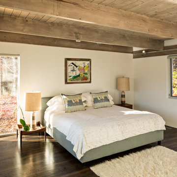
Overthinking a situation isn’t always a bad thing, particularly when the home in question is one in which the past is suddenly meeting the present. Originally designed by Finnish architect Olav Hammarstrom in 1952 for fellow architect Eero Saarinen, this unique home recently received its first transformation in decades. Still in its 1950s skin, it was completely gutted, inside and out. It was a serious undertaking, as the homeowner wanted modern upgrades, while keeping an eye toward retaining the home’s 1950s charm. She had a vision for her home, and she stuck to it from beginning to end.
Perched on a rise of land and overlooking the tranquil Wellfleet Herring Pond, the home initially appears split, with the guest house on the left, and the main house of the right, but both ends are connected with a breezeway. The original home’s bones were in good shape, but many upgrades and replacements were necessary to bring the house up to date.
New siding, roofing, gutters, insulation and mechanical systems were all replaced. Doors and windows with metal frames were custom made by a company in Long Island that fabricates doors for office buildings. Modern heating and cooling systems were added, and the three bathrooms were all updated. The footprint of the home remained unchanged. Inside, the only expansion was more closet space.
The attention to detail in retaining the 50s-style look took a lot of online searching, from handles and knobs to lighting fixtures, with bits and pieces arriving from all over the world, including a doorstop from New Zealand. The homeowner selected many of the fixtures herself, while a very detail-oriented foreman exhaustively researched as well, looking for just the right piece for each and every location.
High-end appliances were purchased to modernize the kitchen and all of the old cabinetry was removed, replaced and refaced with NUVACOR, a versatile surfacing material that not only provided a sleek, modern look, but added convenience and ease of use.
Bare, wood-beamed ceilings throughout give a nod to the home’s natural surroundings, while the main living area (formerly a fisherman’s cabin), with a brick fireplace, was completely trimmed in walnut, while multiple windows of varying sizes welcome sunlight to brighten the home. Here, the sheetrock ceiling with faux rafters provides an interesting and room-brightening feature.
Behind the house sits the serene pond, which can now be enjoyed from the stunning new deck. Here, decking material was not laid out side by side, as it typically is but, instead, meticulously laid out on edge, creating an unusual and eye-catching effect. A railing of tempered glass panels allows unobstructed views of the surrounding natural beauty, and keeps consistent with the open, airy feel of the place. A new outdoor shower is accessible via the deck and left open to the wilderness and the pond below, completing the bold yet sophisticated feeling of this retro-modern home.
 TKS Design Group
Free ebook, Creating the Ideal Kitchen. DOWNLOAD NOW
One of my favorite things to work on is older homes with a bit of history because I find it an interesting challenge to marry the historical architectural features of a home with modern design elements that work well for my client’s current lifestyle.
This home was particularly fun because it was the second kitchen we had done for this family and was quite a departure from the style of the first kitchen.
The before shot of the kitchen shows a view from the family room. See the dropped ceiling? We were curious, was this just part of the design or was the dropped ceiling there to hide mechanicals? Well we soon found out that it was mostly decorative (yay!), and with the exception of a little bit of work to some plumbing from an upstairs bathroom and rerouting of the ventilation system within the original floor joists, we were in the clear, phew! The shot of the completed kitchen from roughly the same vantage point shows how much taller the ceilings are. It makes a huge difference in the feel of the space. Dark and gloomy turned fresh and light!
Another serious consideration was what do we do with the skinny transom window above the refrigerator. After much back and forth, we decided to eliminate it and do some open shelving instead. This ended up being one of the nicest areas in the room. I am calling it the “fun zone” because it houses all the barware, wine cubbies and a bar fridge — the perfect little buffet spot for entertaining. It is flanked on either side by pull out pantries that I’m sure will get a ton of use. Since the neighboring room has literally three walls of almost full height windows, the kitchen gets plenty of light.
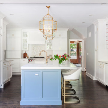
The gold shelving brackets, large pendant fixtures over the island and the tile mural behind the range all pay subtle homage to the home’s prairie style architecture and bring a bit of sparkle to the room.
Even though the room is quite large, the work triangle is very tight with the large Subzero fridge, sink and range all nearby for easy maneuvering during meal prep. There is seating for four at the island, and work aisles are generous.
Designed by: Susan Klimala, CKD, CBD
Photography by: LOMA Studios
For more information on kitchen and bath design ideas go to: www.kitchenstudio-ge.com
 Haven Design and Construction
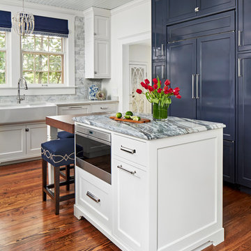
This 1902 San Antonio home was beautiful both inside and out, except for the kitchen, which was dark and dated. The original kitchen layout consisted of a breakfast room and a small kitchen separated by a wall. There was also a very small screened in porch off of the kitchen. The homeowners dreamed of a light and bright new kitchen and that would accommodate a 48" gas range, built in refrigerator, an island and a walk in pantry. At first, it seemed almost impossible, but with a little imagination, we were able to give them every item on their wish list. We took down the wall separating the breakfast and kitchen areas, recessed the new Subzero refrigerator under the stairs, and turned the tiny screened porch into a walk in pantry with a gorgeous blue and white tile floor. The french doors in the breakfast area were replaced with a single transom door to mirror the door to the pantry. The new transoms make quite a statement on either side of the 48" Wolf range set against a marble tile wall. A lovely banquette area was created where the old breakfast table once was and is now graced by a lovely beaded chandelier. Pillows in shades of blue and white and a custom walnut table complete the cozy nook. The soapstone island with a walnut butcher block seating area adds warmth and character to the space. The navy barstools with chrome nailhead trim echo the design of the transoms and repeat the navy and chrome detailing on the custom range hood. A 42" Shaws farmhouse sink completes the kitchen work triangle. Off of the kitchen, the small hallway to the dining room got a facelift, as well. We added a decorative china cabinet and mirrored doors to the homeowner's storage closet to provide light and character to the passageway. After the project was completed, the homeowners told us that "this kitchen was the one that our historic house was always meant to have." There is no greater reward for what we do than that.

 Orren Pickell Building Group
 http://www.pickellbuilders.com. Photography by Linda Oyama Bryan. Stone Window Well Sheds Light into Basement.

Sponsored
Sunbury, OH

J.Holderby - Renovations
Franklin County's Leading General Contractors - 2X Best of Houzz!
 Middlefork Luxury Home Builders
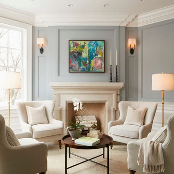
This six-bedroom home — all with en-suite bathrooms — is a brand new home on one of Lincoln Park's most desirable streets. The neo-Georgian, brick and limestone façade features well-crafted detailing both inside and out. The lower recreation level is expansive, with 9-foot ceilings throughout. The first floor houses elegant living and dining areas, as well as a large kitchen with attached great room, and the second floor holds an expansive master suite with a spa bath and vast walk-in closets. A grand, elliptical staircase ascends throughout the home, concluding in a sunlit penthouse providing access to an expansive roof deck and sweeping views of the city..
Nathan Kirkman

 Chi Renovation & Design
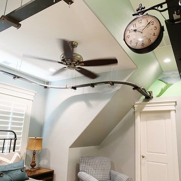
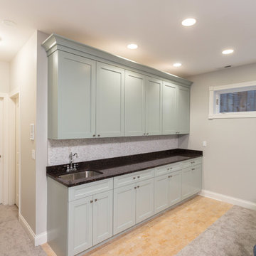
A fun updated to a once dated basement. We renovated this client’s basement to be the perfect play area for their children as well as a chic gathering place for their friends and family. In order to accomplish this, we needed to ensure plenty of storage and seating. Some of the first elements we installed were large cabinets throughout the basement as well as a large banquette, perfect for hiding children’s toys as well as offering ample seating for their guests. Next, to brighten up the space in colors both children and adults would find pleasing, we added a textured blue accent wall and painted the cabinetry a pale green.
Upstairs, we renovated the bathroom to be a kid-friendly space by replacing the stand-up shower with a full bath. The natural stone wall adds warmth to the space and creates a visually pleasing contrast of design.
Lastly, we designed an organized and practical mudroom, creating a perfect place for the whole family to store jackets, shoes, backpacks, and purses.
Designed by Chi Renovation & Design who serve Chicago and it's surrounding suburbs, with an emphasis on the North Side and North Shore. You'll find their work from the Loop through Lincoln Park, Skokie, Wilmette, and all of the way up to Lake Forest.
For more about Chi Renovation & Design, click here: https://www.chirenovation.com/
To learn more about this project, click here: https://www.chirenovation.com/portfolio/lincoln-square-basement-renovation/
 Craig O'Connell Architecture
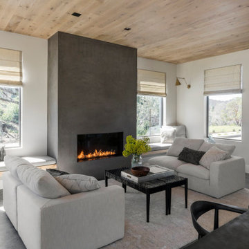
After the devastating Tubbs fire, Craig reimagined this Calistoga property into a wine country retreat for the owners' family as well as corporate/wellness guests. He approached the design by studying the natural elements of the site including trees, views and light, the vernacular design of the area and the clients’ personality. Craig designed a barn and the house – made up of a one-story and a two-story building – connected by a stunning 20-foot steel and glass breezeway. Expansive doors and windows create seamless indoor/outdoor flow and numerous patios and the pool area provide comfortable outdoor spaces. The modern and warm interior is bright, luxurious and comfortable.


 Cape Associates, Inc.
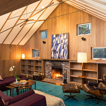
Overthinking a situation isn’t always a bad thing, particularly when the home in question is one in which the past is suddenly meeting the present. Originally designed by Finnish architect Olav Hammarstrom in 1952 for fellow architect Eero Saarinen, this unique home recently received its first transformation in decades. Still in its 1950s skin, it was completely gutted, inside and out. It was a serious undertaking, as the homeowner wanted modern upgrades, while keeping an eye toward retaining the home’s 1950s charm. She had a vision for her home, and she stuck to it from beginning to end.
Perched on a rise of land and overlooking the tranquil Wellfleet Herring Pond, the home initially appears split, with the guest house on the left, and the main house of the right, but both ends are connected with a breezeway. The original home’s bones were in good shape, but many upgrades and replacements were necessary to bring the house up to date.
New siding, roofing, gutters, insulation and mechanical systems were all replaced. Doors and windows with metal frames were custom made by a company in Long Island that fabricates doors for office buildings. Modern heating and cooling systems were added, and the three bathrooms were all updated. The footprint of the home remained unchanged. Inside, the only expansion was more closet space.
The attention to detail in retaining the 50s-style look took a lot of online searching, from handles and knobs to lighting fixtures, with bits and pieces arriving from all over the world, including a doorstop from New Zealand. The homeowner selected many of the fixtures herself, while a very detail-oriented foreman exhaustively researched as well, looking for just the right piece for each and every location.
High-end appliances were purchased to modernize the kitchen and all of the old cabinetry was removed, replaced and refaced with NUVACOR, a versatile surfacing material that not only provided a sleek, modern look, but added convenience and ease of use.
Bare, wood-beamed ceilings throughout give a nod to the home’s natural surroundings, while the main living area (formerly a fisherman’s cabin), with a brick fireplace, was completely trimmed in walnut, while multiple windows of varying sizes welcome sunlight to brighten the home. Here, the sheetrock ceiling with faux rafters provides an interesting and room-brightening feature.
Behind the house sits the serene pond, which can now be enjoyed from the stunning new deck. Here, decking material was not laid out side by side, as it typically is but, instead, meticulously laid out on edge, creating an unusual and eye-catching effect. A railing of tempered glass panels allows unobstructed views of the surrounding natural beauty, and keeps consistent with the open, airy feel of the place. A new outdoor shower is accessible via the deck and left open to the wilderness and the pond below, completing the bold yet sophisticated feeling of this retro-modern home.
 Gardner Architects LLC
Photography by Ken Wyner
2101 Connecticut Avenue (c.1928), an 8-story brick and limestone Beaux Arts style building with spacious apartments, is said to have been “the finest apartment house to appear in Washington between the two World Wars.” (James M. Goode, Best Addresses, 1988.) As advertised for rent in 1928, the apartments were designed “to incorporate many details that would aid the residents in establishing a home atmosphere, one possessing charm and dignity usually found only in a private house… the character and tenancy (being) assured through careful selection of guests.” Home to Senators, Ambassadors, a Vice President and a Supreme Court Justice as well as numerous Washington socialites, the building still stands as one of the undisputed “best addresses” in Washington, DC.)
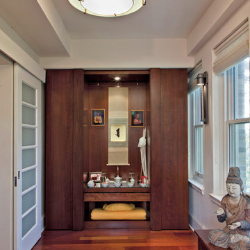
So well laid-out was this gracious 3,000 sf apartment that the basic floor plan remains unchanged from the original architect’s 1927 design. The organizing feature was, and continues to be, the grand “gallery” space in the center of the unit. Every room in the apartment can be accessed via the gallery, thus preserving it as the centerpiece of the “charm and dignity” which the original design intended. Programmatic modifications consisted of the addition of a small powder room off of the foyer, and the conversion of a corner “sun room” into a room for meditation and study. The apartment received a thorough updating of all systems, services and finishes, including a new kitchen and new bathrooms, several new built-in cabinetry units, and the consolidation of numerous small closets and passageways into more accessible and efficient storage spaces.
 Kristin Hoaglund Design
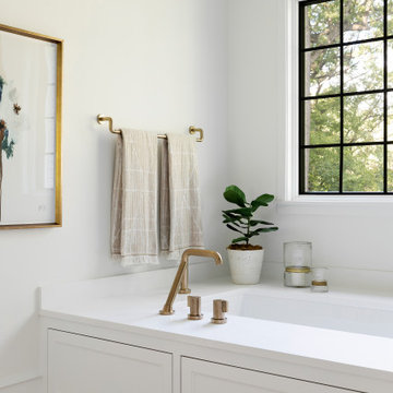
This beautiful French Provincial home is set on 10 acres, nestled perfectly in the oak trees. The original home was built in 1974 and had two large additions added; a great room in 1990 and a main floor master suite in 2001. This was my dream project: a full gut renovation of the entire 4,300 square foot home! I contracted the project myself, and we finished the interior remodel in just six months. The exterior received complete attention as well. The 1970s mottled brown brick went white to completely transform the look from dated to classic French. Inside, walls were removed and doorways widened to create an open floor plan that functions so well for everyday living as well as entertaining. The white walls and white trim make everything new, fresh and bright. It is so rewarding to see something old transformed into something new, more beautiful and more functional.
18