
Search results for "Which bosch" in Home Design Ideas
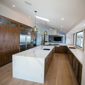
 Kitchens of Diablo
A mix of contemporary, modern, and mid century design. Natural wood finishes with simple countertop surfaces and stainless steel appliances. Light, open, and clean feel. Elmwood frameless cabinetry. All wood construction cabinets in Walnut with a natural finish. The countertop on the perimeter is Dekton in Zenith with a honed finish. The island is Neolith in Estatuario Silk. Both countertops have a mitered edge finish. The rangetop is a Wolf 48" gas range. The dishwasher is by bosch and this kitchen has two of them. The refrigerator and freezer are Subzero 36" built-in units placed next to each other to make one big component. The hood is by Best and is a 48" Island Hood called Gorgona. The microwave is a microwave drawer by Wolf and is 24". The double oven and the warming drawer are lined up vertically and all 30" by Wolf. The wine refrigerator is an under counter 24" by Subzero. The main sink is Oliveri 33" x 21" single bowl apron sink. There is an instant hot and an instant cold faucet, both by WaterINC. The island sink is by Franke and in the Peak Series. The island sink faucet is by KWC and is a single pull down faucet. The pendant lights over the island are by Niche and are the Modern Stamen Pendants in Smoke. The backsplash is 12" x 12" Koshi tile, with a blend between light grey and white. The wall and ceiling paint colors are by Benjamin Moore and are Chantilly Lace. The trim paint color is Swiss Coffee by Kelly Moore. All of the cabinet hardware is by Atlas Homewares. The flooring throughout the great room is by Boen and is a Oak Traditional in Chaletino.
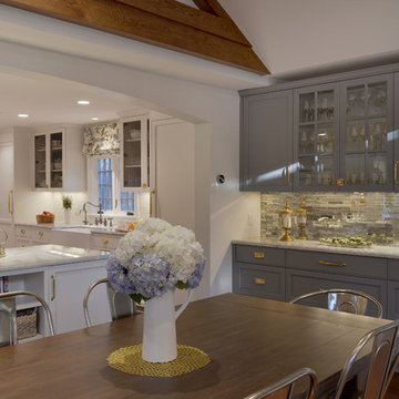
 Bilotta Kitchen & Home
For this project, the entire kitchen was designed around the “must-have” Lacanche range in the stunning French Blue with brass trim. That was the client’s dream and everything had to be built to complement it. Bilotta senior designer, Randy O’Kane, CKD worked with Paul Benowitz and Dipti Shah of Benowitz Shah Architects to contemporize the kitchen while staying true to the original house which was designed in 1928 by regionally noted architect Franklin P. Hammond. The clients purchased the home over two years ago from the original owner. While the house has a magnificent architectural presence from the street, the basic systems, appointments, and most importantly, the layout and flow were inappropriately suited to contemporary living.
The new plan removed an outdated screened porch at the rear which was replaced with the new family room and moved the kitchen from a dark corner in the front of the house to the center. The visual connection from the kitchen through the family room is dramatic and gives direct access to the rear yard and patio. It was important that the island separating the kitchen from the family room have ample space to the left and right to facilitate traffic patterns, and interaction among family members. Hence vertical kitchen elements were placed primarily on existing interior walls. The cabinetry used was Bilotta’s private label, the Bilotta Collection – they selected beautiful, dramatic, yet subdued finishes for the meticulously handcrafted cabinetry. The double islands allow for the busy family to have a space for everything – the island closer to the range has seating and makes a perfect space for doing homework or crafts, or having breakfast or snacks. The second island has ample space for storage and books and acts as a staging area from the kitchen to the dinner table. The kitchen perimeter and both islands are painted in Benjamin Moore’s Paper White. The wall cabinets flanking the sink have wire mesh fronts in a statuary bronze – the insides of these cabinets are painted blue to match the range. The breakfast room cabinetry is Benjamin Moore’s Lampblack with the interiors of the glass cabinets painted in Paper White to match the kitchen. All countertops are Vermont White Quartzite from Eastern Stone. The backsplash is Artistic Tile’s Kyoto White and Kyoto Steel. The fireclay apron-front main sink is from Rohl while the smaller prep sink is from Linkasink. All faucets are from Waterstone in their antique pewter finish. The brass hardware is from Armac Martin and the pendants above the center island are from Circa Lighting. The appliances, aside from the range, are a mix of Sub-Zero, Thermador and Bosch with panels on everything.
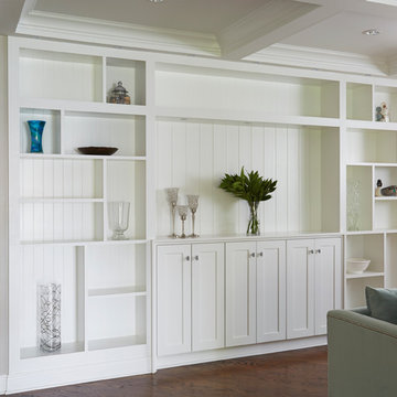
 Miro Kitchen Design
Transitional, transitional, transitional. This kitchen renovation started with the appliances; BlueStar 36" range, Best 900 cfm hood, 2 Bosch dishwashers, and Electrolux side-by-side refrigeration. The appliances were placed utilizing functionality and practicality. The kitchen also utilizes a main Kraus sink and commercial faucet as well as a Kraus island sink with a Grohe kitchen pull-out facet matching and flanking a smaller Grohe faucet which utilizes a fresh water filtration system. White shaker cabinetry is the bulk of the kitchen accompanied by a custom grey raised panel element with chrome wire mesh accenting the glass doors. Custom open shelving niches were used to tie the white kitchen into the grey element, and at the same time creating another visual cue. Vicostone (quartz) accents the island which features the use of waterfall effect (continuing the counter-top material down to the floor). ColorQuartz (quartz) was used at the perimeter and on the grey accent piece as well, also using the waterfall effect. The backsplash was done in Turkish White Marble, as every piece was custom cut and laid in a vertical chevron pattern. Cliffside Industry hardware was used combining ice-box and linear finger-pull hardware on the grey accent piece, and cup-pulls and knobs on the perimeter which all pop while the chrome finish reflects the light and appears to sparkle. A decorative ceiling displays an abundance of 4" recess lighting with Halo Reflector trims as well as two decorative pendants. Accent lighting is completed in Hafele's 12volt system with the use of chrome LED puck lighting. The family room boasts another piece that melds with the kitchen, which displays two different width of bead board for another visual effect.
Find the right local pro for your project
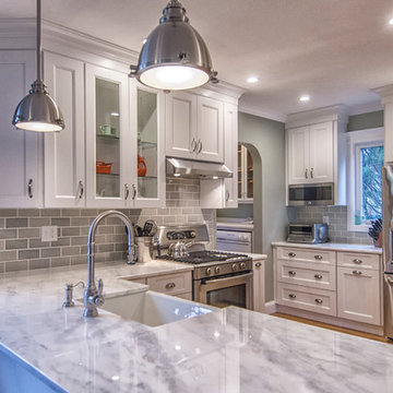
 BENDER
Bender was able to take an old, closed in 1927 kitchen and transform it into an open transitional kitchen that functions properly for a 2014 family. Durable and washable cabinets make for ease of use, while sealed marble countertops give this space a luxurious feel.
Photo Credit: Jim Fuhrmann
 Bilotta Kitchen & Home
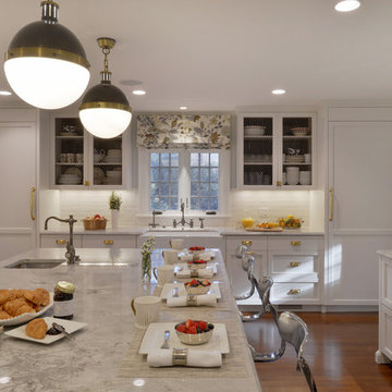
For this project, the entire kitchen was designed around the “must-have” Lacanche range in the stunning French Blue with brass trim. That was the client’s dream and everything had to be built to complement it. Bilotta senior designer, Randy O’Kane, CKD worked with Paul Benowitz and Dipti Shah of Benowitz Shah Architects to contemporize the kitchen while staying true to the original house which was designed in 1928 by regionally noted architect Franklin P. Hammond. The clients purchased the home over two years ago from the original owner. While the house has a magnificent architectural presence from the street, the basic systems, appointments, and most importantly, the layout and flow were inappropriately suited to contemporary living.
The new plan removed an outdated screened porch at the rear which was replaced with the new family room and moved the kitchen from a dark corner in the front of the house to the center. The visual connection from the kitchen through the family room is dramatic and gives direct access to the rear yard and patio. It was important that the island separating the kitchen from the family room have ample space to the left and right to facilitate traffic patterns, and interaction among family members. Hence vertical kitchen elements were placed primarily on existing interior walls. The cabinetry used was Bilotta’s private label, the Bilotta Collection – they selected beautiful, dramatic, yet subdued finishes for the meticulously handcrafted cabinetry. The double islands allow for the busy family to have a space for everything – the island closer to the range has seating and makes a perfect space for doing homework or crafts, or having breakfast or snacks. The second island has ample space for storage and books and acts as a staging area from the kitchen to the dinner table. The kitchen perimeter and both islands are painted in Benjamin Moore’s Paper White. The wall cabinets flanking the sink have wire mesh fronts in a statuary bronze – the insides of these cabinets are painted blue to match the range. The breakfast room cabinetry is Benjamin Moore’s Lampblack with the interiors of the glass cabinets painted in Paper White to match the kitchen. All countertops are Vermont White Quartzite from Eastern Stone. The backsplash is Artistic Tile’s Kyoto White and Kyoto Steel. The fireclay apron-front main sink is from Rohl while the smaller prep sink is from Linkasink. All faucets are from Waterstone in their antique pewter finish. The brass hardware is from Armac Martin and the pendants above the center island are from Circa Lighting. The appliances, aside from the range, are a mix of Sub-Zero, Thermador and Bosch with panels on everything.
 Dalia Tole
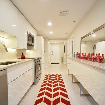
This condo is in an industrial redevelopment district in Jersey City, right across from Manhattan. Before, the dated wooden cabinets and black granite was not in synch with the modern loft look. Ceilings were low (7'2"), light was weak. The peninsula/breakfast bar under stairs was awkward, and the laundry jut out, making the entrance too narrow and claustrophobic. First, we raised the ceiling 7 inches, and straightened the sight lines, widening the entry to the condo. This allowed us to install new upper cabinets are on average 10 longer than the older ones. We put down white, scratch-resistant hardwood floors, white acrylic cabinets from IKEA, quartz counters, and Bosch appliances. The laundry was brought into the kitchen. We also added a second 1 foot wide 9 foot long counter space with cabinets underneath, making this a galley kitchen. We used stainless legs and upper cabinets to make the 2nd row of cabinets (an IKEA hack), which kept the kitchen from feeling narrow. We extended the kitchen into the living room, extending it 5 ft longer, and making it open concept and functional. The floating staircase was closed with risers to keep the kitchen cleaner. Finally, we used a large format tile as backsplash, making clean up a breeze and put in LED undercabinet lights. I love how the reflective surfaces bounce the light around. The most expensive part of the project was raising the ceiling and straightening the entrance, which cost about $10,000. We splurged on Bosch 800 appliances, top of the line flooring (Mohawk Architexture), countertop (Caesarstone), tile (Porcelanosa), and doors (Ringhult IKEA) but managed to stay under $20,000 otherwise. The kitchen was part of a full renovation designed by the owner, and undertaken by Nazco Interiors.
 Bilotta Kitchen & Home
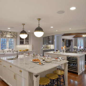
For this project, the entire kitchen was designed around the “must-have” Lacanche range in the stunning French Blue with brass trim. That was the client’s dream and everything had to be built to complement it. Bilotta senior designer, Randy O’Kane, CKD worked with Paul Benowitz and Dipti Shah of Benowitz Shah Architects to contemporize the kitchen while staying true to the original house which was designed in 1928 by regionally noted architect Franklin P. Hammond. The clients purchased the home over two years ago from the original owner. While the house has a magnificent architectural presence from the street, the basic systems, appointments, and most importantly, the layout and flow were inappropriately suited to contemporary living.
The new plan removed an outdated screened porch at the rear which was replaced with the new family room and moved the kitchen from a dark corner in the front of the house to the center. The visual connection from the kitchen through the family room is dramatic and gives direct access to the rear yard and patio. It was important that the island separating the kitchen from the family room have ample space to the left and right to facilitate traffic patterns, and interaction among family members. Hence vertical kitchen elements were placed primarily on existing interior walls. The cabinetry used was Bilotta’s private label, the Bilotta Collection – they selected beautiful, dramatic, yet subdued finishes for the meticulously handcrafted cabinetry. The double islands allow for the busy family to have a space for everything – the island closer to the range has seating and makes a perfect space for doing homework or crafts, or having breakfast or snacks. The second island has ample space for storage and books and acts as a staging area from the kitchen to the dinner table. The kitchen perimeter and both islands are painted in Benjamin Moore’s Paper White. The wall cabinets flanking the sink have wire mesh fronts in a statuary bronze – the insides of these cabinets are painted blue to match the range. The breakfast room cabinetry is Benjamin Moore’s Lampblack with the interiors of the glass cabinets painted in Paper White to match the kitchen. All countertops are Vermont White Quartzite from Eastern Stone. The backsplash is Artistic Tile’s Kyoto White and Kyoto Steel. The fireclay apron-front main sink is from Rohl while the smaller prep sink is from Linkasink. All faucets are from Waterstone in their antique pewter finish. The brass hardware is from Armac Martin and the pendants above the center island are from Circa Lighting. The appliances, aside from the range, are a mix of Sub-Zero, Thermador and Bosch with panels on everything.

Sponsored
Columbus, OH

Hope Restoration & General Contracting
Columbus Design-Build, Kitchen & Bath Remodeling, Historic Renovations
 Dalia Tole
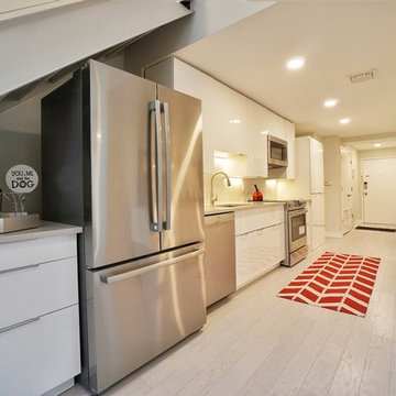
This condo is in an industrial redevelopment district in Jersey City, right across from Manhattan. Before, the dated wooden cabinets and black granite was not in synch with the modern loft look. Ceilings were low (7'2"), light was weak. The peninsula/breakfast bar under stairs was awkward, and the laundry jut out, making the entrance too narrow and claustrophobic. First, we raised the ceiling 7 inches, and straightened the sight lines, widening the entry to the condo. We then put down white hardwood floors, white acrylic cabinets from IKEA, Caesarstone quartz counters, and Bosch appliances. The laundry was brought into the kitchen. We also added a second 1 foot wide 9 foot long counter space with cabinets underneath, making this a galley kitchen. We used stainless legs and uppers to make the 2nd row of cabinets, which kept the kitchen from feeling narrow. We extended the kitchen into the living room, extending it 5 ft longer, and making it open concept and functional. The floating staircase was covered to keep it sanitary. Finally, we used a large format tile as backsplash, making clean up a breeze and put in LED undercabinet lights. The most expensive part of the project was raising the ceiling and straightening the entrance, which cost about $10,000. We splurged on Bosch 800 appliances, top of the line flooring (Mohawk Architexture), countertop (Caesarstone), tile (Porcelanosa), and doors (Ringhult IKEA) but managed to stay under $20,000 otherwise. The kitchen was part of a full renovation designed by the owner, and undertaken by Nazco Interiors.
 TKS Design Group
Download our free ebook, Creating the Ideal Kitchen. DOWNLOAD NOW
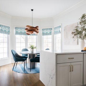
The homeowners built their traditional Colonial style home 17 years’ ago. It was in great shape but needed some updating. Over the years, their taste had drifted into a more contemporary realm, and they wanted our help to bridge the gap between traditional and modern.
We decided the layout of the kitchen worked well in the space and the cabinets were in good shape, so we opted to do a refresh with the kitchen. The original kitchen had blond maple cabinets and granite countertops. This was also a great opportunity to make some updates to the functionality that they were hoping to accomplish.
After re-finishing all the first floor wood floors with a gray stain, which helped to remove some of the red tones from the red oak, we painted the cabinetry Benjamin Moore “Repose Gray” a very soft light gray. The new countertops are hardworking quartz, and the waterfall countertop to the left of the sink gives a bit of the contemporary flavor.
We reworked the refrigerator wall to create more pantry storage and eliminated the double oven in favor of a single oven and a steam oven. The existing cooktop was replaced with a new range paired with a Venetian plaster hood above. The glossy finish from the hood is echoed in the pendant lights. A touch of gold in the lighting and hardware adds some contrast to the gray and white. A theme we repeated down to the smallest detail illustrated by the Jason Wu faucet by Brizo with its similar touches of white and gold (the arrival of which we eagerly awaited for months due to ripples in the supply chain – but worth it!).
The original breakfast room was pleasant enough with its windows looking into the backyard. Now with its colorful window treatments, new blue chairs and sculptural light fixture, this space flows seamlessly into the kitchen and gives more of a punch to the space.
The original butler’s pantry was functional but was also starting to show its age. The new space was inspired by a wallpaper selection that our client had set aside as a possibility for a future project. It worked perfectly with our pallet and gave a fun eclectic vibe to this functional space. We eliminated some upper cabinets in favor of open shelving and painted the cabinetry in a high gloss finish, added a beautiful quartzite countertop and some statement lighting. The new room is anything but cookie cutter.
Next the mudroom. You can see a peek of the mudroom across the way from the butler’s pantry which got a facelift with new paint, tile floor, lighting and hardware. Simple updates but a dramatic change! The first floor powder room got the glam treatment with its own update of wainscoting, wallpaper, console sink, fixtures and artwork. A great little introduction to what’s to come in the rest of the home.
The whole first floor now flows together in a cohesive pallet of green and blue, reflects the homeowner’s desire for a more modern aesthetic, and feels like a thoughtful and intentional evolution. Our clients were wonderful to work with! Their style meshed perfectly with our brand aesthetic which created the opportunity for wonderful things to happen. We know they will enjoy their remodel for many years to come!
Photography by Margaret Rajic Photography
 TKS Design Group
Free ebook, Creating the Ideal Kitchen. DOWNLOAD NOW
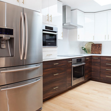
One of my very favorite parts of the design process is space planning and considering all the possible floor plan solutions at the beginning stages of the project. What works for one person as a solution may not be the best solution for the next. What you think you want going into the process, may change once all the space planning options are considered. This was exactly the case for this family. They thought they really wanted an island configuration.
Once we figured out the flow of the work triangle and saw how great a large peninsula would work for the family, we proceeded along those lines. The peninsula not only works great for food prep, it also allows more of a traditional table seating versus an island with everyone lined up in a row — not so great for daily dinner conversation.
To the right of that is a counter depth fridge and a speed oven which gives some flexibility with cooking and reheating smaller meals instead of having to heat the entire oven. An induction cooktop with its easy to clean surface keeps the space looking clean and tidy. Induction heats very quickly to high temperatures so is also wonderful to cook on. To the right of cooktop is a long stretch of countertop perfect for prep space.
Storage was very important to the homeowners. We took our time discussing where spice pull outs and tray dividers would be located, how the corner storage would be addressed and the location of the other items such as trash and recycling cans. We worked as many drawers as possible into the space, as I always recommend drawers over doors and/or roll outs as they offer the most flexibility and ease of use. Customizing these details is time well spent as having a place for everything and everything in its place, just like Mom said, really is the key to a functional and professionally designed kitchen.
The talls and wall cabinets are white acrylic which combined with the white marble look quartz countertops and full height backsplash keep the room feeling light, bright and airy. The wood toned base cabinets are made of a textured laminate that has the look of wood but is a very easy to maintain product. Brushed gold metal on the hardware, faucet and chandelier add a warm touch and ties into the blond maple flooring. The neighboring breakfast room was also remodeled as part of the project and houses a small coffee station.
Designed by: Susan Klimala, CKBD
Photography by: Kari Firak
For more information on kitchen and bath design ideas go to: www.kitchenstudio-ge.com
 McCabe By Design LLC
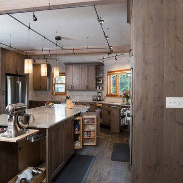
The original kitchen was designed and built by the original homeowner, needless to say neither design nor building was his profession. Further, the entire house has hydronic tubing in gypcrete for heat which means to utilities (water, ventilation or power) could be brought up through the floor or down from the ceiling except on the the exterior walls.
The current homeowners love to cook and have a seasonal garden that generates a lot of lovely fruits and vegetables for both immediate consumption and preserving, hence, kitchen counter space, two sinks, the induction cooktop and the steam oven were all 'must haves' for both the husband and the wife. The beautiful wood plank porcelain tile floors ensures a slip resistant floor that is sturdy enough to stand up to their three four-legged children.
Utilizing the three existing j-boxes in the ceiling, the cable and rail system combined with the under cabinet light illuminates every corner of this formerly dark kitchen.
The rustic knotty alder cabinetry, wood plank tile floor and the bronze finish hardware/lighting all help to achieve the rustic casual look the homeowners craved.
Photo by A Kitchen That Works LLC
 Studio Dearborn
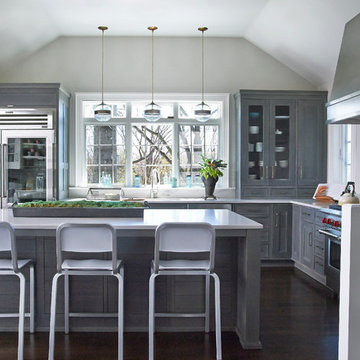
A lovely rustic modern kitchen in cerused rift sawn oak cabinetry by Studio Dearborn. White Macauba quartzite countertops and backsplash by Marble America. Wolf 48” range. Refrigerator by Subzero. Dishwasher by Bosch. Garrison pendant lights by Arteriors. Schaub & Co. Italian Contemporary pulls 6” in Brushed brass finish. Photography c 2015 by Jeff McNamara.
 Spaces Renewed
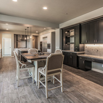
This San Diego remodel masterfully blends the aesthetic style of this home with the necessities of a functional lifestyle. This standard builder grade kitchen was in need of a modern update which was accomplished with thoughtful accents, color selections and more.
Replacing the outdated cabinets with a classic white and black pallet made the pairing feel modern or traditional, depending on the use of accessories and surrounding materials. Stacking cabinets took advantage of gorgeous, high ceilings and brought volume to the space, while delivering multiple storage options with a custom feel. For this particular client, we added touches of grey marble and dramatic blue glass to bring a contemporary edge to this kitchen.
In addition, the wood look porcelain tile throughout the space brings kitchen, dining, and family room together to create an open concept with connection and flow and virtually zero maintenance for a busy family.


 Bilotta Kitchen & Home
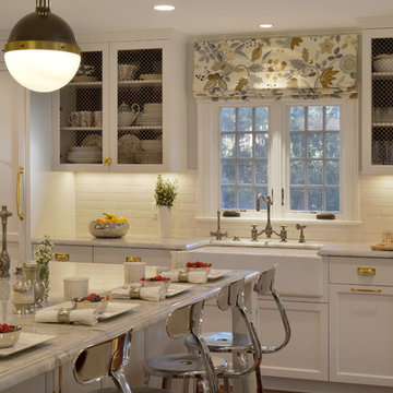
For this project, the entire kitchen was designed around the “must-have” Lacanche range in the stunning French Blue with brass trim. That was the client’s dream and everything had to be built to complement it. Bilotta senior designer, Randy O’Kane, CKD worked with Paul Benowitz and Dipti Shah of Benowitz Shah Architects to contemporize the kitchen while staying true to the original house which was designed in 1928 by regionally noted architect Franklin P. Hammond. The clients purchased the home over two years ago from the original owner. While the house has a magnificent architectural presence from the street, the basic systems, appointments, and most importantly, the layout and flow were inappropriately suited to contemporary living.
The new plan removed an outdated screened porch at the rear which was replaced with the new family room and moved the kitchen from a dark corner in the front of the house to the center. The visual connection from the kitchen through the family room is dramatic and gives direct access to the rear yard and patio. It was important that the island separating the kitchen from the family room have ample space to the left and right to facilitate traffic patterns, and interaction among family members. Hence vertical kitchen elements were placed primarily on existing interior walls. The cabinetry used was Bilotta’s private label, the Bilotta Collection – they selected beautiful, dramatic, yet subdued finishes for the meticulously handcrafted cabinetry. The double islands allow for the busy family to have a space for everything – the island closer to the range has seating and makes a perfect space for doing homework or crafts, or having breakfast or snacks. The second island has ample space for storage and books and acts as a staging area from the kitchen to the dinner table. The kitchen perimeter and both islands are painted in Benjamin Moore’s Paper White. The wall cabinets flanking the sink have wire mesh fronts in a statuary bronze – the insides of these cabinets are painted blue to match the range. The breakfast room cabinetry is Benjamin Moore’s Lampblack with the interiors of the glass cabinets painted in Paper White to match the kitchen. All countertops are Vermont White Quartzite from Eastern Stone. The backsplash is Artistic Tile’s Kyoto White and Kyoto Steel. The fireclay apron-front main sink is from Rohl while the smaller prep sink is from Linkasink. All faucets are from Waterstone in their antique pewter finish. The brass hardware is from Armac Martin and the pendants above the center island are from Circa Lighting. The appliances, aside from the range, are a mix of Sub-Zero, Thermador and Bosch with panels on everything.
 Bilotta Kitchen & Home
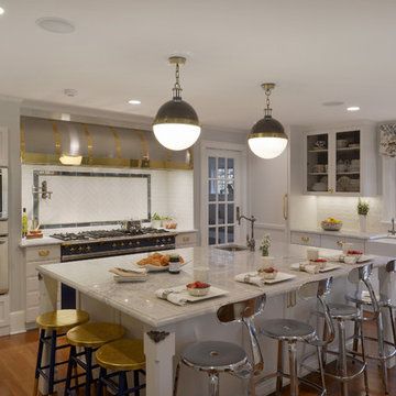
For this project, the entire kitchen was designed around the “must-have” Lacanche range in the stunning French Blue with brass trim. That was the client’s dream and everything had to be built to complement it. Bilotta senior designer, Randy O’Kane, CKD worked with Paul Benowitz and Dipti Shah of Benowitz Shah Architects to contemporize the kitchen while staying true to the original house which was designed in 1928 by regionally noted architect Franklin P. Hammond. The clients purchased the home over two years ago from the original owner. While the house has a magnificent architectural presence from the street, the basic systems, appointments, and most importantly, the layout and flow were inappropriately suited to contemporary living.
The new plan removed an outdated screened porch at the rear which was replaced with the new family room and moved the kitchen from a dark corner in the front of the house to the center. The visual connection from the kitchen through the family room is dramatic and gives direct access to the rear yard and patio. It was important that the island separating the kitchen from the family room have ample space to the left and right to facilitate traffic patterns, and interaction among family members. Hence vertical kitchen elements were placed primarily on existing interior walls. The cabinetry used was Bilotta’s private label, the Bilotta Collection – they selected beautiful, dramatic, yet subdued finishes for the meticulously handcrafted cabinetry. The double islands allow for the busy family to have a space for everything – the island closer to the range has seating and makes a perfect space for doing homework or crafts, or having breakfast or snacks. The second island has ample space for storage and books and acts as a staging area from the kitchen to the dinner table. The kitchen perimeter and both islands are painted in Benjamin Moore’s Paper White. The wall cabinets flanking the sink have wire mesh fronts in a statuary bronze – the insides of these cabinets are painted blue to match the range. The breakfast room cabinetry is Benjamin Moore’s Lampblack with the interiors of the glass cabinets painted in Paper White to match the kitchen. All countertops are Vermont White Quartzite from Eastern Stone. The backsplash is Artistic Tile’s Kyoto White and Kyoto Steel. The fireclay apron-front main sink is from Rohl while the smaller prep sink is from Linkasink. All faucets are from Waterstone in their antique pewter finish. The brass hardware is from Armac Martin and the pendants above the center island are from Circa Lighting. The appliances, aside from the range, are a mix of Sub-Zero, Thermador and Bosch with panels on everything.
 TKS Design Group
Free ebook, Creating the Ideal Kitchen. DOWNLOAD NOW
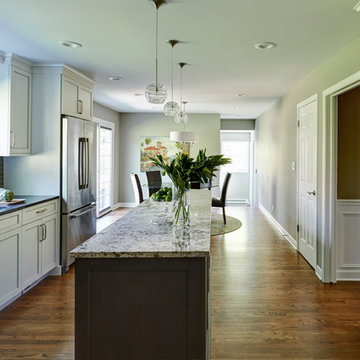
The homeowners of this mid-century Colonial and family of four were frustrated with the layout of their existing kitchen which was a small, narrow peninsula layout but that was adjoining a large space that they could not figure out how to use. Stealing part of the unused space seemed like an easy solution, except that there was an existing transition in floor height which made that a bit tricky. The solution of bringing the floor height up to meet the height of the existing kitchen allowed us to do just that.
This solution also offered some challenges. The exterior door had to be raised which resulted in some exterior rework, and the floor transition had to happen somewhere to get out to the garage, so we ended up “pushing” it towards what is now a new mudroom and powder room area. This solution allows for a small but functional and hidden mudroom area and more private powder room situation.
Another challenge of the design was the very narrow space. To minimize issues with this, we moved the location of the refrigerator into the newly found space which gave us an L-shaped layout allowing for an island and even some shallow pantry storage. The windows over the kitchen sink were expanded in size and relocated to allow more light into the room. A breakfast table fits perfectly in the area adjacent to the existing French doors and there was even room for a small bar area that helps transition from inside to outside for entertaining. The confusing unused space now makes sense and provides functionality on a daily basis.
To help bring some calm to this busy family, a pallet of soft neutrals was chosen -- gray glass tile with a simple metal accent strip, clear modern pendant lights and a neutral color scheme for cabinetry and countertops.
For more information on kitchen and bath design ideas go to: www.kitchenstudio-ge.com
 Design Manifest
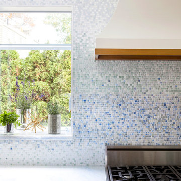
High end, highly custom complete kitchen remodel with amazing details.
THE KEY FEATURES IN THIS PHOTO:
- 1 of the 3 Work Zones: left of the range, right of the range and the island
-Mosaic tile
-Custom Hood
- Garden Window Relocated and Re-sized.
.Photo by Courtney Apple
Sponsored
Columbus, OH
Hope Restoration & General Contracting
Columbus Design-Build, Kitchen & Bath Remodeling, Historic Renovations
 TKS Design Group
Free ebook, Creating the Ideal Kitchen. DOWNLOAD NOW
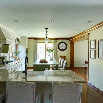
From dark and dated to bright and beautiful, who says you can't take your kitchen from the past into the future? Open almost any design magazine today and you will see tons of examples of contemporary and transitional design. Maybe those designs are appealing, but you’re are just not feeling it for your own space or traditional suburban home filled with traditional furniture. Do you still have the option to remodel your kitchen in a traditional style and not have it look instantly dated? The answer is yes! This kitchen is a perfect example of how to do that. Take traditional cabinetry and sprinkle in a few updated accents and voila!
In addition to the look of the space, this 1970’s neo-Tudor home also had a very traditional floorplan which was given new life for today’s living. We eliminated the wall between the kitchen and the (rarely used) dining room which opened up the whole first floor and created the open plan that the homeowners wanted. With the added space, a larger island was added with seating for casual dining. An existing room off the kitchen now works as the main dining area and even houses a fireplace! Hardworking quartz countertops were used to keep maintenance easy, and professional style appliances were added for this home cook to really get cooking in the kitchen. An apron sink, Ann Sacks bronze accent tile, green glass pendants lighting and new window treatments transition this kitchen into the current decade!
Designed by: Susan Klimala, CKD, CBD
Photography by: Mike Kaskel
For more information on kitchen and bath design ideas go to: www.kitchenstudio-ge.com
 Bilotta Kitchen & Home
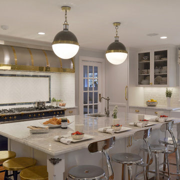
For this project, the entire kitchen was designed around the “must-have” Lacanche range in the stunning French Blue with brass trim. That was the client’s dream and everything had to be built to complement it. Bilotta senior designer, Randy O’Kane, CKD worked with Paul Benowitz and Dipti Shah of Benowitz Shah Architects to contemporize the kitchen while staying true to the original house which was designed in 1928 by regionally noted architect Franklin P. Hammond. The clients purchased the home over two years ago from the original owner. While the house has a magnificent architectural presence from the street, the basic systems, appointments, and most importantly, the layout and flow were inappropriately suited to contemporary living.
The new plan removed an outdated screened porch at the rear which was replaced with the new family room and moved the kitchen from a dark corner in the front of the house to the center. The visual connection from the kitchen through the family room is dramatic and gives direct access to the rear yard and patio. It was important that the island separating the kitchen from the family room have ample space to the left and right to facilitate traffic patterns, and interaction among family members. Hence vertical kitchen elements were placed primarily on existing interior walls. The cabinetry used was Bilotta’s private label, the Bilotta Collection – they selected beautiful, dramatic, yet subdued finishes for the meticulously handcrafted cabinetry. The double islands allow for the busy family to have a space for everything – the island closer to the range has seating and makes a perfect space for doing homework or crafts, or having breakfast or snacks. The second island has ample space for storage and books and acts as a staging area from the kitchen to the dinner table. The kitchen perimeter and both islands are painted in Benjamin Moore’s Paper White. The wall cabinets flanking the sink have wire mesh fronts in a statuary bronze – the insides of these cabinets are painted blue to match the range. The breakfast room cabinetry is Benjamin Moore’s Lampblack with the interiors of the glass cabinets painted in Paper White to match the kitchen. All countertops are Vermont White Quartzite from Eastern Stone. The backsplash is Artistic Tile’s Kyoto White and Kyoto Steel. The fireclay apron-front main sink is from Rohl while the smaller prep sink is from Linkasink. All faucets are from Waterstone in their antique pewter finish. The brass hardware is from Armac Martin and the pendants above the center island are from Circa Lighting. The appliances, aside from the range, are a mix of Sub-Zero, Thermador and Bosch with panels on everything.
 Kirkendall Design
Michael Hunter
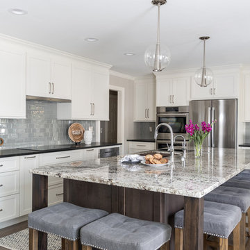
Example of a transitional kitchen design in Other with an undermount sink, shaker cabinets, white cabinets, gray backsplash, subway tile backsplash, stainless steel appliances and an island
Example of a transitional kitchen design in Other with an undermount sink, shaker cabinets, white cabinets, gray backsplash, subway tile backsplash, stainless steel appliances and an island
6