
Search results for "Your own classical" in Home Design Ideas
 Melissa Hill Home Design
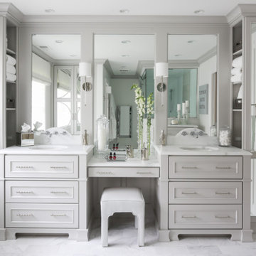
We were so delighted to be able to bring to life our fresh take and new renovation on a picturesque bathroom. A scene of symmetry, quite pleasing to the eye, the counter and sink area was cultivated to be a clean space, with hidden storage on the side of each elongated mirror, and a center section with seating for getting ready each day. It is highlighted by the shiny silver elements of the hardware and sink fixtures that enhance the sleek lines and look of this vanity area. Lit by a thin elegant sconce and decorated in a pathway of stunning tile mosaic this is the focal point of the master bathroom. Following the tile paths further into the bathroom brings one to the large glass shower, with its own intricate tile detailing within leading up the walls to the waterfall feature. Equipped with everything from shower seating and a towel heater, to a secluded toilet area able to be hidden by a pocket door, this master bathroom is impeccably furnished. Each element contributes to the remarkably classic simplicity of this master bathroom design, making it truly a breath of fresh air.
Custom designed by Hartley and Hill Design. All materials and furnishings in this space are available through Hartley and Hill Design. www.hartleyandhilldesign.com 888-639-0639
 FineLine Kitchens, Inc.
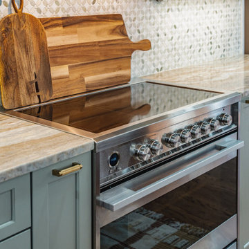
Hi everyone, I'm Sarah and Ogun we are here with fine line kitchens. So we are a couple working together. I do the interior design and remodeling of the space material selection meeting with the clients. And I handled operations outside, you know meaning all the construction work that is taking place the inside. The houses that we work in. I handle all the aspects of the construction, so today's project is very special. We're in Vienna and the client had a very big family. It's a family of seven that lives here. So we had a few aspects that we needed to keep in mind while designing this one. Having everybody be able to sit on the island. So we wanted plenty of seating all the way around. We didn't want anybody standing or anything like that. So what we did is we maximize the space. The center island is the biggest part of the kitchen. We use a natural stone to kind of give it a beautiful texture versus quartz. It's kind of standard white or kind of fabricated, so I wanted something very natural. We did this because I took my inspiration from the outside, so the inspiration if you look at the view right in front of me is there are so many greens there's a lot of brass accents and I wanted to bring this. Into this kitchen while designing it for my clients. She is very warm very. She wanted a very homey, comfy kind of look for the kitchen. So that's what we did today. As you can see, the cabinets are sage green, very light, so I still think it's a neutral, but it's a lighter color that again brings the outside in and we combine that with the oak right behind me so it's a slightly warm oak. It's not very dark. It's not very light. It's a medium brown and the same color went on the island. To kind of tie these two in and the backsplash, my favorite part is where you can see a little bit of design. It is, in my opinion still classic, but includes a pattern so the outside part is as we said in the beginning, is handled by my husband. I'd like him to speak a little bit about that. Thanks, Sarah, I want to talk to you guys a little bit about the construction part of this project. Originally this kitchen was located mostly in this area. They had their stove there sing. It was more of a peninsula layout in Sarah's and the customer vision they wanted. They wanted to get rid of the peninsula and they want to be able to have a huge island that can at least sit seven people because they're familiar with seven. So we wanted to make sure that we can achieve this design and bring it to life so that they can be happy with this layout. Some of the challenges we had, the house, the home being, you know, old home. There were a lot of you know the older electrical and plumbing that had to be replaced. We had to relocate the stove from here to this area. Over here we had put a nice foot fan that we had to relocate all the ductwork and the plumbing. Was being on the peninsula area. We had to relocate it to the center islands. So we achieved all this and kind of like bring it to bring in this kitchen up to date it looks beautiful. That's true, so yes, the old layout did not function for my clients because everything was kind of gathered on one side of the kitchen. So there was like a peninsula right there. So the end of this island kind of continued straight. And that was just the L shape. Kind of where everything was and there used to be another big table here, so they were using only kind of half of the space. So like I said at the beginning, our vision was to kind of feed everybody at the island, create some symmetry. 'cause I love that. So as you can see behind me, this is kind of the focal point symmetrical. Everything is kind of even we wanted to also panel the fridge here so it mimics the pantry and another size. So when you're looking at it, it is bringing again that symmetry back again. I hope you enjoyed this kitchen and this video and I'll see you soon. So how do you think this project turned out? It's nice. I like the color. I think it turned out nice. It's kind of like a little bit different color than what we always do. So I realize. Are you giving me a little bit of credit here that I did something different? Are you proud? I'm so proud of you. Other than that I like it. That they have kind of like a two sink. So if this was our kitchen, if we ever like you can have your own. I can have mine if we ever get into a fight then this can be like my own kitchen. Why are we gonna bring in a fight right now? So I'm cooking anyway. You're grilling most of the time, So what are you even talking about? My kitchen? That's my kitchen. You can just take the small sink. That's fine. It's always good to have your own space right there, so anyways. Thank you guys for watching. We hope to see you soon and if you have any questions please click the link below. It'll lead you to our website, house, YouTube and all of the social media is so nice to have you guys. We'll see you soon. Thanks bye bye-bye.
 The Kitchen Company
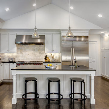
Transitional black and white kitchen remodel designed by Gail Bolling
Woodbridge, Connecticut To get more detailed information copy and paste this link into your browser. https://thekitchencompany.com/blog/featured-kitchen-everyday-chefs-delight,
Photographer, Dennis Carbo
Find the right local pro for your project
 FineLine Kitchens, Inc.
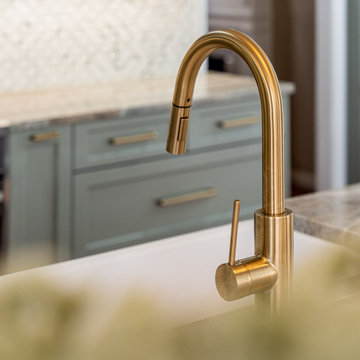
Hi everyone, I'm Sarah and Ogun we are here with fine line kitchens. So we are a couple working together. I do the interior design and remodeling of the space material selection meeting with the clients. And I handled operations outside, you know meaning all the construction work that is taking place the inside. The houses that we work in. I handle all the aspects of the construction, so today's project is very special. We're in Vienna and the client had a very big family. It's a family of seven that lives here. So we had a few aspects that we needed to keep in mind while designing this one. Having everybody be able to sit on the island. So we wanted plenty of seating all the way around. We didn't want anybody standing or anything like that. So what we did is we maximize the space. The center island is the biggest part of the kitchen. We use a natural stone to kind of give it a beautiful texture versus quartz. It's kind of standard white or kind of fabricated, so I wanted something very natural. We did this because I took my inspiration from the outside, so the inspiration if you look at the view right in front of me is there are so many greens there's a lot of brass accents and I wanted to bring this. Into this kitchen while designing it for my clients. She is very warm very. She wanted a very homey, comfy kind of look for the kitchen. So that's what we did today. As you can see, the cabinets are sage green, very light, so I still think it's a neutral, but it's a lighter color that again brings the outside in and we combine that with the oak right behind me so it's a slightly warm oak. It's not very dark. It's not very light. It's a medium brown and the same color went on the island. To kind of tie these two in and the backsplash, my favorite part is where you can see a little bit of design. It is, in my opinion still classic, but includes a pattern so the outside part is as we said in the beginning, is handled by my husband. I'd like him to speak a little bit about that. Thanks, Sarah, I want to talk to you guys a little bit about the construction part of this project. Originally this kitchen was located mostly in this area. They had their stove there sing. It was more of a peninsula layout in Sarah's and the customer vision they wanted. They wanted to get rid of the peninsula and they want to be able to have a huge island that can at least sit seven people because they're familiar with seven. So we wanted to make sure that we can achieve this design and bring it to life so that they can be happy with this layout. Some of the challenges we had, the house, the home being, you know, old home. There were a lot of you know the older electrical and plumbing that had to be replaced. We had to relocate the stove from here to this area. Over here we had put a nice foot fan that we had to relocate all the ductwork and the plumbing. Was being on the peninsula area. We had to relocate it to the center islands. So we achieved all this and kind of like bring it to bring in this kitchen up to date it looks beautiful. That's true, so yes, the old layout did not function for my clients because everything was kind of gathered on one side of the kitchen. So there was like a peninsula right there. So the end of this island kind of continued straight. And that was just the L shape. Kind of where everything was and there used to be another big table here, so they were using only kind of half of the space. So like I said at the beginning, our vision was to kind of feed everybody at the island, create some symmetry. 'cause I love that. So as you can see behind me, this is kind of the focal point symmetrical. Everything is kind of even we wanted to also panel the fridge here so it mimics the pantry and another size. So when you're looking at it, it is bringing again that symmetry back again. I hope you enjoyed this kitchen and this video and I'll see you soon. So how do you think this project turned out? It's nice. I like the color. I think it turned out nice. It's kind of like a little bit different color than what we always do. So I realize. Are you giving me a little bit of credit here that I did something different? Are you proud? I'm so proud of you. Other than that I like it. That they have kind of like a two sink. So if this was our kitchen, if we ever like you can have your own. I can have mine if we ever get into a fight then this can be like my own kitchen. Why are we gonna bring in a fight right now? So I'm cooking anyway. You're grilling most of the time, So what are you even talking about? My kitchen? That's my kitchen. You can just take the small sink. That's fine. It's always good to have your own space right there, so anyways. Thank you guys for watching. We hope to see you soon and if you have any questions please click the link below. It'll lead you to our website, house, YouTube and all of the social media is so nice to have you guys. We'll see you soon. Thanks bye bye-bye.
 DANIELLE Interior Design & Decor
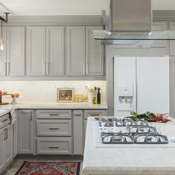
Embark on a culinary crave with this classic gray and white family kitchen. We chose a warm neutral color for the cabinetry and enhanced this warmth with champagne gold cabinet hardware. These warm gray cabinets can be found at your neighborhood Lowes while the champagne hardware are designed by Atlas. Add another accent of shine to your kitchen and check out the mother of pearl diamond mosaic tile backsplash by Jeffrey Court, as seen here. Adding this hint of sparkle to your small space will allow your kitchen to stay bright and chic. Don't be afraid to mix metals or color. This island houses the glass cook top with a stainless steel hood above the island, and we added a matte black as our finish for the Edison lighting as well as black bar stool seating to tie it all together. The Taj Mahal white Quartzite counter tops are a beauty. The contrast in color creates dimension to your small kitchen layout and will continually catch your eye.
Designed by Dani Perkins @ DANIELLE Interior Design & Decor
Taylor Abeel Photography
 FineLine Kitchens, Inc.
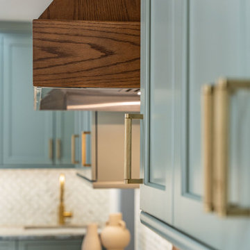
Hi everyone, I'm Sarah and Ogun we are here with fine line kitchens. So we are a couple working together. I do the interior design and remodeling of the space material selection meeting with the clients. And I handled operations outside, you know meaning all the construction work that is taking place the inside. The houses that we work in. I handle all the aspects of the construction, so today's project is very special. We're in Vienna and the client had a very big family. It's a family of seven that lives here. So we had a few aspects that we needed to keep in mind while designing this one. Having everybody be able to sit on the island. So we wanted plenty of seating all the way around. We didn't want anybody standing or anything like that. So what we did is we maximize the space. The center island is the biggest part of the kitchen. We use a natural stone to kind of give it a beautiful texture versus quartz. It's kind of standard white or kind of fabricated, so I wanted something very natural. We did this because I took my inspiration from the outside, so the inspiration if you look at the view right in front of me is there are so many greens there's a lot of brass accents and I wanted to bring this. Into this kitchen while designing it for my clients. She is very warm very. She wanted a very homey, comfy kind of look for the kitchen. So that's what we did today. As you can see, the cabinets are sage green, very light, so I still think it's a neutral, but it's a lighter color that again brings the outside in and we combine that with the oak right behind me so it's a slightly warm oak. It's not very dark. It's not very light. It's a medium brown and the same color went on the island. To kind of tie these two in and the backsplash, my favorite part is where you can see a little bit of design. It is, in my opinion still classic, but includes a pattern so the outside part is as we said in the beginning, is handled by my husband. I'd like him to speak a little bit about that. Thanks, Sarah, I want to talk to you guys a little bit about the construction part of this project. Originally this kitchen was located mostly in this area. They had their stove there sing. It was more of a peninsula layout in Sarah's and the customer vision they wanted. They wanted to get rid of the peninsula and they want to be able to have a huge island that can at least sit seven people because they're familiar with seven. So we wanted to make sure that we can achieve this design and bring it to life so that they can be happy with this layout. Some of the challenges we had, the house, the home being, you know, old home. There were a lot of you know the older electrical and plumbing that had to be replaced. We had to relocate the stove from here to this area. Over here we had put a nice foot fan that we had to relocate all the ductwork and the plumbing. Was being on the peninsula area. We had to relocate it to the center islands. So we achieved all this and kind of like bring it to bring in this kitchen up to date it looks beautiful. That's true, so yes, the old layout did not function for my clients because everything was kind of gathered on one side of the kitchen. So there was like a peninsula right there. So the end of this island kind of continued straight. And that was just the L shape. Kind of where everything was and there used to be another big table here, so they were using only kind of half of the space. So like I said at the beginning, our vision was to kind of feed everybody at the island, create some symmetry. 'cause I love that. So as you can see behind me, this is kind of the focal point symmetrical. Everything is kind of even we wanted to also panel the fridge here so it mimics the pantry and another size. So when you're looking at it, it is bringing again that symmetry back again. I hope you enjoyed this kitchen and this video and I'll see you soon. So how do you think this project turned out? It's nice. I like the color. I think it turned out nice. It's kind of like a little bit different color than what we always do. So I realize. Are you giving me a little bit of credit here that I did something different? Are you proud? I'm so proud of you. Other than that I like it. That they have kind of like a two sink. So if this was our kitchen, if we ever like you can have your own. I can have mine if we ever get into a fight then this can be like my own kitchen. Why are we gonna bring in a fight right now? So I'm cooking anyway. You're grilling most of the time, So what are you even talking about? My kitchen? That's my kitchen. You can just take the small sink. That's fine. It's always good to have your own space right there, so anyways. Thank you guys for watching. We hope to see you soon and if you have any questions please click the link below. It'll lead you to our website, house, YouTube and all of the social media is so nice to have you guys. We'll see you soon. Thanks bye bye-bye.
 Prime 1 Builders
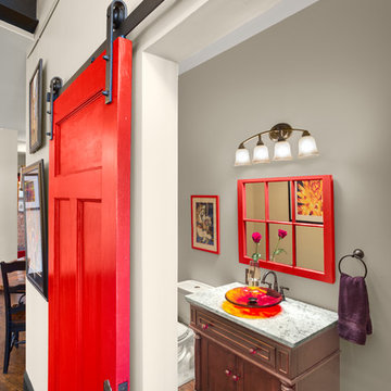
This project won in the 2013 Builders Association of Metropolitan Pittsburgh Housing Excellence Award for Best Urban Renewal Renovation Project. The glass bowl was made in the glass studio owned by the owner which is adjacent to the residence. The mirror is a repurposed window. The door is repurposed from a boarding house.
George Mendel


 FineLine Kitchens, Inc.
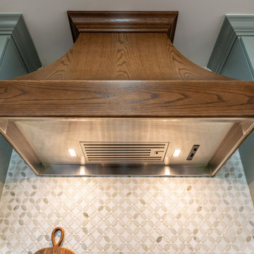
Hi everyone, I'm Sarah and Ogun we are here with fine line kitchens. So we are a couple working together. I do the interior design and remodeling of the space material selection meeting with the clients. And I handled operations outside, you know meaning all the construction work that is taking place the inside. The houses that we work in. I handle all the aspects of the construction, so today's project is very special. We're in Vienna and the client had a very big family. It's a family of seven that lives here. So we had a few aspects that we needed to keep in mind while designing this one. Having everybody be able to sit on the island. So we wanted plenty of seating all the way around. We didn't want anybody standing or anything like that. So what we did is we maximize the space. The center island is the biggest part of the kitchen. We use a natural stone to kind of give it a beautiful texture versus quartz. It's kind of standard white or kind of fabricated, so I wanted something very natural. We did this because I took my inspiration from the outside, so the inspiration if you look at the view right in front of me is there are so many greens there's a lot of brass accents and I wanted to bring this. Into this kitchen while designing it for my clients. She is very warm very. She wanted a very homey, comfy kind of look for the kitchen. So that's what we did today. As you can see, the cabinets are sage green, very light, so I still think it's a neutral, but it's a lighter color that again brings the outside in and we combine that with the oak right behind me so it's a slightly warm oak. It's not very dark. It's not very light. It's a medium brown and the same color went on the island. To kind of tie these two in and the backsplash, my favorite part is where you can see a little bit of design. It is, in my opinion still classic, but includes a pattern so the outside part is as we said in the beginning, is handled by my husband. I'd like him to speak a little bit about that. Thanks, Sarah, I want to talk to you guys a little bit about the construction part of this project. Originally this kitchen was located mostly in this area. They had their stove there sing. It was more of a peninsula layout in Sarah's and the customer vision they wanted. They wanted to get rid of the peninsula and they want to be able to have a huge island that can at least sit seven people because they're familiar with seven. So we wanted to make sure that we can achieve this design and bring it to life so that they can be happy with this layout. Some of the challenges we had, the house, the home being, you know, old home. There were a lot of you know the older electrical and plumbing that had to be replaced. We had to relocate the stove from here to this area. Over here we had put a nice foot fan that we had to relocate all the ductwork and the plumbing. Was being on the peninsula area. We had to relocate it to the center islands. So we achieved all this and kind of like bring it to bring in this kitchen up to date it looks beautiful. That's true, so yes, the old layout did not function for my clients because everything was kind of gathered on one side of the kitchen. So there was like a peninsula right there. So the end of this island kind of continued straight. And that was just the L shape. Kind of where everything was and there used to be another big table here, so they were using only kind of half of the space. So like I said at the beginning, our vision was to kind of feed everybody at the island, create some symmetry. 'cause I love that. So as you can see behind me, this is kind of the focal point symmetrical. Everything is kind of even we wanted to also panel the fridge here so it mimics the pantry and another size. So when you're looking at it, it is bringing again that symmetry back again. I hope you enjoyed this kitchen and this video and I'll see you soon. So how do you think this project turned out? It's nice. I like the color. I think it turned out nice. It's kind of like a little bit different color than what we always do. So I realize. Are you giving me a little bit of credit here that I did something different? Are you proud? I'm so proud of you. Other than that I like it. That they have kind of like a two sink. So if this was our kitchen, if we ever like you can have your own. I can have mine if we ever get into a fight then this can be like my own kitchen. Why are we gonna bring in a fight right now? So I'm cooking anyway. You're grilling most of the time, So what are you even talking about? My kitchen? That's my kitchen. You can just take the small sink. That's fine. It's always good to have your own space right there, so anyways. Thank you guys for watching. We hope to see you soon and if you have any questions please click the link below. It'll lead you to our website, house, YouTube and all of the social media is so nice to have you guys. We'll see you soon. Thanks bye bye-bye.
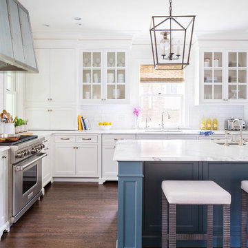
 O’Hara Interiors
Martha O'Hara Interiors, Interior Design & Photo Styling | John Kraemer & Sons, Remodel | Troy Thies, Photography
Please Note: All “related,” “similar,” and “sponsored” products tagged or listed by Houzz are not actual products pictured. They have not been approved by Martha O’Hara Interiors nor any of the professionals credited. For information about our work, please contact design@oharainteriors.com.
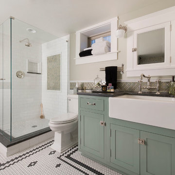
 Classic Homeworks
The basement batthroom is bright and open. There is plenty of room for the laundry facilities and additional cabinetry.
Corner shower - large traditional corner shower idea in Denver with beige walls, a vessel sink, shaker cabinets and green cabinets
Corner shower - large traditional corner shower idea in Denver with beige walls, a vessel sink, shaker cabinets and green cabinets
 FineLine Kitchens, Inc.
Hi everyone, I'm Sarah and Ogun we are here with fine line kitchens. So we are a couple working together. I do the interior design and remodeling of the space material selection meeting with the clients. And I handled operations outside, you know meaning all the construction work that is taking place the inside. The houses that we work in. I handle all the aspects of the construction, so today's project is very special. We're in Vienna and the client had a very big family. It's a family of seven that lives here. So we had a few aspects that we needed to keep in mind while designing this one. Having everybody be able to sit on the island. So we wanted plenty of seating all the way around. We didn't want anybody standing or anything like that. So what we did is we maximize the space. The center island is the biggest part of the kitchen. We use a natural stone to kind of give it a beautiful texture versus quartz. It's kind of standard white or kind of fabricated, so I wanted something very natural. We did this because I took my inspiration from the outside, so the inspiration if you look at the view right in front of me is there are so many greens there's a lot of brass accents and I wanted to bring this. Into this kitchen while designing it for my clients. She is very warm very. She wanted a very homey, comfy kind of look for the kitchen. So that's what we did today. As you can see, the cabinets are sage green, very light, so I still think it's a neutral, but it's a lighter color that again brings the outside in and we combine that with the oak right behind me so it's a slightly warm oak. It's not very dark. It's not very light. It's a medium brown and the same color went on the island. To kind of tie these two in and the backsplash, my favorite part is where you can see a little bit of design. It is, in my opinion still classic, but includes a pattern so the outside part is as we said in the beginning, is handled by my husband. I'd like him to speak a little bit about that. Thanks, Sarah, I want to talk to you guys a little bit about the construction part of this project. Originally this kitchen was located mostly in this area. They had their stove there sing. It was more of a peninsula layout in Sarah's and the customer vision they wanted. They wanted to get rid of the peninsula and they want to be able to have a huge island that can at least sit seven people because they're familiar with seven. So we wanted to make sure that we can achieve this design and bring it to life so that they can be happy with this layout. Some of the challenges we had, the house, the home being, you know, old home. There were a lot of you know the older electrical and plumbing that had to be replaced. We had to relocate the stove from here to this area. Over here we had put a nice foot fan that we had to relocate all the ductwork and the plumbing. Was being on the peninsula area. We had to relocate it to the center islands. So we achieved all this and kind of like bring it to bring in this kitchen up to date it looks beautiful. That's true, so yes, the old layout did not function for my clients because everything was kind of gathered on one side of the kitchen. So there was like a peninsula right there. So the end of this island kind of continued straight. And that was just the L shape. Kind of where everything was and there used to be another big table here, so they were using only kind of half of the space. So like I said at the beginning, our vision was to kind of feed everybody at the island, create some symmetry. 'cause I love that. So as you can see behind me, this is kind of the focal point symmetrical. Everything is kind of even we wanted to also panel the fridge here so it mimics the pantry and another size. So when you're looking at it, it is bringing again that symmetry back again. I hope you enjoyed this kitchen and this video and I'll see you soon. So how do you think this project turned out? It's nice. I like the color. I think it turned out nice. It's kind of like a little bit different color than what we always do. So I realize. Are you giving me a little bit of credit here that I did something different? Are you proud? I'm so proud of you. Other than that I like it. That they have kind of like a two sink. So if this was our kitchen, if we ever like you can have your own. I can have mine if we ever get into a fight then this can be like my own kitchen. Why are we gonna bring in a fight right now? So I'm cooking anyway. You're grilling most of the time, So what are you even talking about? My kitchen? That's my kitchen. You can just take the small sink. That's fine. It's always good to have your own space right there, so anyways. Thank you guys for watching. We hope to see you soon and if you have any questions please click the link below. It'll lead you to our website, house, YouTube and all of the social media is so nice to have you guys. We'll see you soon. Thanks bye bye-bye.
 J Design Group - Interior Designers Miami - Modern
A TOUCHDOWN BY DESIGN
Interior design by Jennifer Corredor, J Design Group, Coral Gables, Florida
Text by Christine Davis
Photography by Daniel Newcomb, Palm Beach Gardens, FL
What did Detroit Lions linebacker, Stephen Tulloch, do when he needed a decorator for his new Miami 10,000-square-foot home? He tackled the situation by hiring interior designer Jennifer Corredor. Never defensive, he let her have run of the field. “He’d say, ‘Jen, do your thing,’” she says. And she did it well.
The first order of the day was to get a lay of the land and a feel for what he wanted. For his primary residence, Tulloch chose a home in Pinecrest, Florida. — a great family neighborhood known for its schools and ample lot sizes. “His lot is huge,” Corredor says. “He could practice his game there if he wanted.”
A laidback feeling permeates the suburban village, where mostly Mediterranean homes intermix with a few modern styles. With views toward the pool and a landscaped yard, Tulloch’s 10,000-square-foot home touches on both, a Mediterranean exterior with chic contemporary interiors.
Step inside, where high ceilings and a sculptural stairway with oak treads and linear spindles immediately capture the eye. “Knowing he was more inclined toward an uncluttered look, and taking into consideration his age and lifestyle, I naturally took the path of choosing more modern furnishings,” the designer says.
In the dining room, Tulloch specifically asked for a round table and Corredor found “Xilos Simplice” by Maxalto, a table that seats six to eight and has a Lazy Susan.
And just past the stairway, two armless chairs from Calligaris and a semi-round sofa shape the living room. In keeping with Tulloch’s desire for a simple no-fuss lifestyle, leather is often used for upholstery. “He preferred wipe-able areas,” she says. “Nearly everything in the living room is clad in leather.”
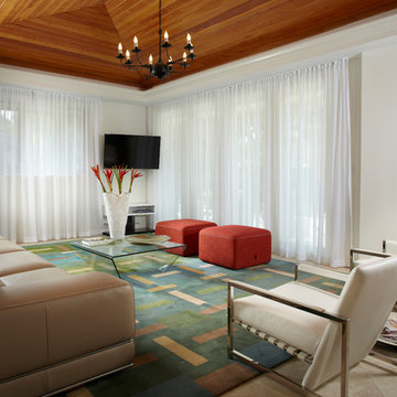
An architecturally striking, oak-coffered ceiling warms the family room, while Saturnia marble flooring grounds the space in cool comfort. “Since it’s just off the kitchen, this relaxed space provides the perfect place for family and friends to congregate — somewhere to hang out,” Corredor says. The deep-seated sofa wrapped in tan leather and Minotti armchairs in white join a pair of linen-clad ottomans for ample seating.
With eight bedrooms in the home, there was “plenty of space to repurpose,” Corredor says. “Five are used for sleeping quarters, but the others have been converted into a billiard room, a home office and the memorabilia room.” On the first floor, the billiard room is set for fun and entertainment with doors that open to the pool area.
The memorabilia room presented quite a challenge. Undaunted, Corredor delved into a seemingly never-ending collection of mementos to create a tribute to Tulloch’s career. “His team colors are blue and white, so we used those colors in this space,” she says.
In a nod to Tulloch’s career on and off the field, his home office displays awards, recognition plaques and photos from his foundation. A Copenhagen desk, Herman Miller chair and leather-topped credenza further an aura of masculinity.
All about relaxation, the master bedroom would not be complete without its own sitting area for viewing sports updates or late-night movies. Here, lounge chairs recline to create the perfect spot for Tulloch to put his feet up and watch TV. “He wanted it to be really comfortable,” Corredor says
A total redo was required in the master bath, where the now 12-foot-long shower is a far cry from those in a locker room. “This bath is more like a launching pad to get you going in the morning,” Corredor says.
“All in all, it’s a fun, warm and beautiful environment,” the designer says. “I wanted to create something unique, that would make my client proud and happy.” In Tulloch’s world, that’s a touchdown.
Your friendly Interior design firm in Miami at your service.
Contemporary - Modern Interior designs.
Top Interior Design Firm in Miami – Coral Gables.
Office,
Offices,
Kitchen,
Kitchens,
Bedroom,
Bedrooms,
Bed,
Queen bed,
King Bed,
Single bed,
House Interior Designer,
House Interior Designers,
Home Interior Designer,
Home Interior Designers,
Residential Interior Designer,
Residential Interior Designers,
Modern Interior Designers,
Miami Beach Designers,
Best Miami Interior Designers,
Miami Beach Interiors,
Luxurious Design in Miami,
Top designers,
Deco Miami,
Luxury interiors,
Miami modern,
Interior Designer Miami,
Contemporary Interior Designers,
Coco Plum Interior Designers,
Miami Interior Designer,
Sunny Isles Interior Designers,
Pinecrest Interior Designers,
Interior Designers Miami,
J Design Group interiors,
South Florida designers,
Best Miami Designers,
Miami interiors,
Miami décor,
Miami Beach Luxury Interiors,
Miami Interior Design,
Miami Interior Design Firms,
Beach front,
Top Interior Designers,
top décor,
Top Miami Decorators,
Miami luxury condos,
Top Miami Interior Decorators,
Top Miami Interior Designers,
Modern Designers in Miami,
modern interiors,
Modern,
Pent house design,
white interiors,
Miami, South Miami, Miami Beach, South Beach, Williams Island, Sunny Isles, Surfside, Fisher Island, Aventura, Brickell, Brickell Key, Key Biscayne, Coral Gables, CocoPlum, Coconut Grove, Pinecrest, Miami Design District, Golden Beach, Downtown Miami, Miami Interior Designers, Miami Interior Designer, Interior Designers Miami, Modern Interior Designers, Modern Interior Designer, Modern interior decorators, Contemporary Interior Designers, Interior decorators, Interior decorator, Interior designer, Interior designers, Luxury, modern, best, unique, real estate, decor
J Design Group – Miami Interior Design Firm – Modern – Contemporary
Contact us: (305) 444-4611 http://www.JDesignGroup.com
 FineLine Kitchens, Inc.
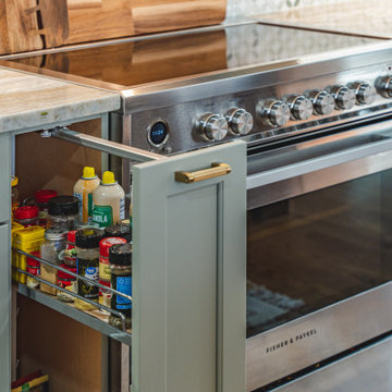
Hi everyone, I'm Sarah and Ogun we are here with fine line kitchens. So we are a couple working together. I do the interior design and remodeling of the space material selection meeting with the clients. And I handled operations outside, you know meaning all the construction work that is taking place the inside. The houses that we work in. I handle all the aspects of the construction, so today's project is very special. We're in Vienna and the client had a very big family. It's a family of seven that lives here. So we had a few aspects that we needed to keep in mind while designing this one. Having everybody be able to sit on the island. So we wanted plenty of seating all the way around. We didn't want anybody standing or anything like that. So what we did is we maximize the space. The center island is the biggest part of the kitchen. We use a natural stone to kind of give it a beautiful texture versus quartz. It's kind of standard white or kind of fabricated, so I wanted something very natural. We did this because I took my inspiration from the outside, so the inspiration if you look at the view right in front of me is there are so many greens there's a lot of brass accents and I wanted to bring this. Into this kitchen while designing it for my clients. She is very warm very. She wanted a very homey, comfy kind of look for the kitchen. So that's what we did today. As you can see, the cabinets are sage green, very light, so I still think it's a neutral, but it's a lighter color that again brings the outside in and we combine that with the oak right behind me so it's a slightly warm oak. It's not very dark. It's not very light. It's a medium brown and the same color went on the island. To kind of tie these two in and the backsplash, my favorite part is where you can see a little bit of design. It is, in my opinion still classic, but includes a pattern so the outside part is as we said in the beginning, is handled by my husband. I'd like him to speak a little bit about that. Thanks, Sarah, I want to talk to you guys a little bit about the construction part of this project. Originally this kitchen was located mostly in this area. They had their stove there sing. It was more of a peninsula layout in Sarah's and the customer vision they wanted. They wanted to get rid of the peninsula and they want to be able to have a huge island that can at least sit seven people because they're familiar with seven. So we wanted to make sure that we can achieve this design and bring it to life so that they can be happy with this layout. Some of the challenges we had, the house, the home being, you know, old home. There were a lot of you know the older electrical and plumbing that had to be replaced. We had to relocate the stove from here to this area. Over here we had put a nice foot fan that we had to relocate all the ductwork and the plumbing. Was being on the peninsula area. We had to relocate it to the center islands. So we achieved all this and kind of like bring it to bring in this kitchen up to date it looks beautiful. That's true, so yes, the old layout did not function for my clients because everything was kind of gathered on one side of the kitchen. So there was like a peninsula right there. So the end of this island kind of continued straight. And that was just the L shape. Kind of where everything was and there used to be another big table here, so they were using only kind of half of the space. So like I said at the beginning, our vision was to kind of feed everybody at the island, create some symmetry. 'cause I love that. So as you can see behind me, this is kind of the focal point symmetrical. Everything is kind of even we wanted to also panel the fridge here so it mimics the pantry and another size. So when you're looking at it, it is bringing again that symmetry back again. I hope you enjoyed this kitchen and this video and I'll see you soon. So how do you think this project turned out? It's nice. I like the color. I think it turned out nice. It's kind of like a little bit different color than what we always do. So I realize. Are you giving me a little bit of credit here that I did something different? Are you proud? I'm so proud of you. Other than that I like it. That they have kind of like a two sink. So if this was our kitchen, if we ever like you can have your own. I can have mine if we ever get into a fight then this can be like my own kitchen. Why are we gonna bring in a fight right now? So I'm cooking anyway. You're grilling most of the time, So what are you even talking about? My kitchen? That's my kitchen. You can just take the small sink. That's fine. It's always good to have your own space right there, so anyways. Thank you guys for watching. We hope to see you soon and if you have any questions please click the link below. It'll lead you to our website, house, YouTube and all of the social media is so nice to have you guys. We'll see you soon. Thanks bye bye-bye.

Sponsored
Columbus, OH

Hope Restoration & General Contracting
Columbus Design-Build, Kitchen & Bath Remodeling, Historic Renovations
 Peters Billiards
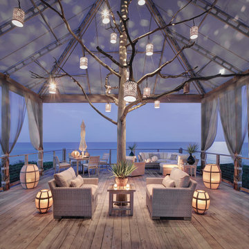
The Club Woven by Summer Classics is the resin version of the aluminum Club Collection. Executed in durable woven wrought aluminum it is ideal for any outdoor space. Club Woven is hand woven in exclusive N-dura resin polyethylene in Oyster. French Linen, or Mahogany. The comfort of Club with the classic look and durability of resin will be perfect for any outdoor space.
 FineLine Kitchens, Inc.
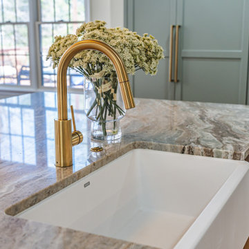
Hi everyone, I'm Sarah and Ogun we are here with fine line kitchens. So we are a couple working together. I do the interior design and remodeling of the space material selection meeting with the clients. And I handled operations outside, you know meaning all the construction work that is taking place the inside. The houses that we work in. I handle all the aspects of the construction, so today's project is very special. We're in Vienna and the client had a very big family. It's a family of seven that lives here. So we had a few aspects that we needed to keep in mind while designing this one. Having everybody be able to sit on the island. So we wanted plenty of seating all the way around. We didn't want anybody standing or anything like that. So what we did is we maximize the space. The center island is the biggest part of the kitchen. We use a natural stone to kind of give it a beautiful texture versus quartz. It's kind of standard white or kind of fabricated, so I wanted something very natural. We did this because I took my inspiration from the outside, so the inspiration if you look at the view right in front of me is there are so many greens there's a lot of brass accents and I wanted to bring this. Into this kitchen while designing it for my clients. She is very warm very. She wanted a very homey, comfy kind of look for the kitchen. So that's what we did today. As you can see, the cabinets are sage green, very light, so I still think it's a neutral, but it's a lighter color that again brings the outside in and we combine that with the oak right behind me so it's a slightly warm oak. It's not very dark. It's not very light. It's a medium brown and the same color went on the island. To kind of tie these two in and the backsplash, my favorite part is where you can see a little bit of design. It is, in my opinion still classic, but includes a pattern so the outside part is as we said in the beginning, is handled by my husband. I'd like him to speak a little bit about that. Thanks, Sarah, I want to talk to you guys a little bit about the construction part of this project. Originally this kitchen was located mostly in this area. They had their stove there sing. It was more of a peninsula layout in Sarah's and the customer vision they wanted. They wanted to get rid of the peninsula and they want to be able to have a huge island that can at least sit seven people because they're familiar with seven. So we wanted to make sure that we can achieve this design and bring it to life so that they can be happy with this layout. Some of the challenges we had, the house, the home being, you know, old home. There were a lot of you know the older electrical and plumbing that had to be replaced. We had to relocate the stove from here to this area. Over here we had put a nice foot fan that we had to relocate all the ductwork and the plumbing. Was being on the peninsula area. We had to relocate it to the center islands. So we achieved all this and kind of like bring it to bring in this kitchen up to date it looks beautiful. That's true, so yes, the old layout did not function for my clients because everything was kind of gathered on one side of the kitchen. So there was like a peninsula right there. So the end of this island kind of continued straight. And that was just the L shape. Kind of where everything was and there used to be another big table here, so they were using only kind of half of the space. So like I said at the beginning, our vision was to kind of feed everybody at the island, create some symmetry. 'cause I love that. So as you can see behind me, this is kind of the focal point symmetrical. Everything is kind of even we wanted to also panel the fridge here so it mimics the pantry and another size. So when you're looking at it, it is bringing again that symmetry back again. I hope you enjoyed this kitchen and this video and I'll see you soon. So how do you think this project turned out? It's nice. I like the color. I think it turned out nice. It's kind of like a little bit different color than what we always do. So I realize. Are you giving me a little bit of credit here that I did something different? Are you proud? I'm so proud of you. Other than that I like it. That they have kind of like a two sink. So if this was our kitchen, if we ever like you can have your own. I can have mine if we ever get into a fight then this can be like my own kitchen. Why are we gonna bring in a fight right now? So I'm cooking anyway. You're grilling most of the time, So what are you even talking about? My kitchen? That's my kitchen. You can just take the small sink. That's fine. It's always good to have your own space right there, so anyways. Thank you guys for watching. We hope to see you soon and if you have any questions please click the link below. It'll lead you to our website, house, YouTube and all of the social media is so nice to have you guys. We'll see you soon. Thanks bye bye-bye.
 Advance Design Studio, Ltd.
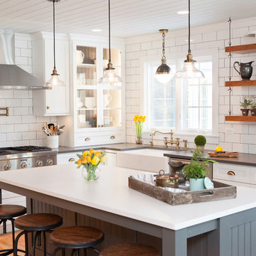
When this suburban family decided to renovate their kitchen, they knew that they wanted a little more space. Advance Design worked together with the homeowner to design a kitchen that would work for a large family who loved to gather regularly and always ended up in the kitchen! So the project began with extending out an exterior wall to accommodate a larger island and more moving-around space between the island and the perimeter cabinetry.
Style was important to the cook, who began collecting accessories and photos of the look she loved for months prior to the project design. She was drawn to the brightness of whites and grays, and the design accentuated this color palette brilliantly with the incorporation of a warm shade of brown woods that originated from a dining room table that was a family favorite. Classic gray and white cabinetry from Dura Supreme hits the mark creating a perfect balance between bright and subdued. Hints of gray appear in the bead board detail peeking just behind glass doors, and in the application of the handsome floating wood shelves between cabinets. White subway tile is made extra interesting with the application of dark gray grout lines causing it to be a subtle but noticeable detail worthy of attention.
Suede quartz Silestone graces the countertops with a soft matte hint of color that contrasts nicely with the presence of white painted cabinetry finished smartly with the brightness of a milky white farm sink. Old melds nicely with new, as antique bronze accents are sprinkled throughout hardware and fixtures, and work together unassumingly with the sleekness of stainless steel appliances.
The grace and timelessness of this sparkling new kitchen maintains the charm and character of a space that has seen generations past. And now this family will enjoy this new space for many more generations to come in the future with the help of the team at Advance Design Studio.
Photographer: Joe Nowak
Dura Supreme Cabinetry
 FineLine Kitchens, Inc.
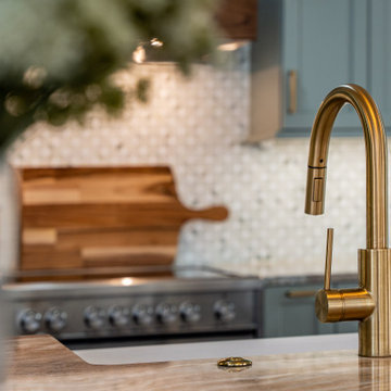
Hi everyone, I'm Sarah and Ogun we are here with fine line kitchens. So we are a couple working together. I do the interior design and remodeling of the space material selection meeting with the clients. And I handled operations outside, you know meaning all the construction work that is taking place the inside. The houses that we work in. I handle all the aspects of the construction, so today's project is very special. We're in Vienna and the client had a very big family. It's a family of seven that lives here. So we had a few aspects that we needed to keep in mind while designing this one. Having everybody be able to sit on the island. So we wanted plenty of seating all the way around. We didn't want anybody standing or anything like that. So what we did is we maximize the space. The center island is the biggest part of the kitchen. We use a natural stone to kind of give it a beautiful texture versus quartz. It's kind of standard white or kind of fabricated, so I wanted something very natural. We did this because I took my inspiration from the outside, so the inspiration if you look at the view right in front of me is there are so many greens there's a lot of brass accents and I wanted to bring this. Into this kitchen while designing it for my clients. She is very warm very. She wanted a very homey, comfy kind of look for the kitchen. So that's what we did today. As you can see, the cabinets are sage green, very light, so I still think it's a neutral, but it's a lighter color that again brings the outside in and we combine that with the oak right behind me so it's a slightly warm oak. It's not very dark. It's not very light. It's a medium brown and the same color went on the island. To kind of tie these two in and the backsplash, my favorite part is where you can see a little bit of design. It is, in my opinion still classic, but includes a pattern so the outside part is as we said in the beginning, is handled by my husband. I'd like him to speak a little bit about that. Thanks, Sarah, I want to talk to you guys a little bit about the construction part of this project. Originally this kitchen was located mostly in this area. They had their stove there sing. It was more of a peninsula layout in Sarah's and the customer vision they wanted. They wanted to get rid of the peninsula and they want to be able to have a huge island that can at least sit seven people because they're familiar with seven. So we wanted to make sure that we can achieve this design and bring it to life so that they can be happy with this layout. Some of the challenges we had, the house, the home being, you know, old home. There were a lot of you know the older electrical and plumbing that had to be replaced. We had to relocate the stove from here to this area. Over here we had put a nice foot fan that we had to relocate all the ductwork and the plumbing. Was being on the peninsula area. We had to relocate it to the center islands. So we achieved all this and kind of like bring it to bring in this kitchen up to date it looks beautiful. That's true, so yes, the old layout did not function for my clients because everything was kind of gathered on one side of the kitchen. So there was like a peninsula right there. So the end of this island kind of continued straight. And that was just the L shape. Kind of where everything was and there used to be another big table here, so they were using only kind of half of the space. So like I said at the beginning, our vision was to kind of feed everybody at the island, create some symmetry. 'cause I love that. So as you can see behind me, this is kind of the focal point symmetrical. Everything is kind of even we wanted to also panel the fridge here so it mimics the pantry and another size. So when you're looking at it, it is bringing again that symmetry back again. I hope you enjoyed this kitchen and this video and I'll see you soon. So how do you think this project turned out? It's nice. I like the color. I think it turned out nice. It's kind of like a little bit different color than what we always do. So I realize. Are you giving me a little bit of credit here that I did something different? Are you proud? I'm so proud of you. Other than that I like it. That they have kind of like a two sink. So if this was our kitchen, if we ever like you can have your own. I can have mine if we ever get into a fight then this can be like my own kitchen. Why are we gonna bring in a fight right now? So I'm cooking anyway. You're grilling most of the time, So what are you even talking about? My kitchen? That's my kitchen. You can just take the small sink. That's fine. It's always good to have your own space right there, so anyways. Thank you guys for watching. We hope to see you soon and if you have any questions please click the link below. It'll lead you to our website, house, YouTube and all of the social media is so nice to have you guys. We'll see you soon. Thanks bye bye-bye.
Sponsored
Columbus, OH
Hope Restoration & General Contracting
Columbus Design-Build, Kitchen & Bath Remodeling, Historic Renovations
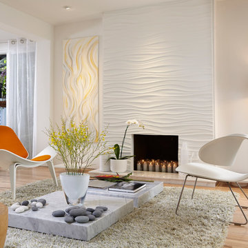 J Design Group - Interior Designers Miami - Modern
Panels – Wall Paneling - Modern – Contemporary.
Interior paneling is a great way to show off your personality while creating a warm and inviting feeling within your home. Your guests will be talking about your home for months to come.
At J. Design Group, we offer turn-key projects where we incorporate the most modern materials for all types of paneling - from wood to high gloss, and everything in between. We can even create custom interior paneling to make sure the right mood is captured within your home.
Whether you want to add the paneling to enhance your kitchen, bedroom, family room, or dining room, our team of experts will help you choose the right design and color. One of the best ways to bring an entire design together in your home is through the use of panels and with contrasting elements and textures, you can turn your home into the luxurious place you have always wanted it to be.
We welcome you to take a look at some of our past paneling jobs. As you can see, paneling is a great way to decorate the interior of your home or office space. We invite you to give our office a call today to schedule your appointment with one of our design experts. We will work one-on-one with you to ensure that we create the right look in every room throughout your home.
Give J. Design Group a call today to discuss all different options and to receive a free consultation.
Your friendly Interior design firm in Miami at your service.
Contemporary - Modern Interior designs.
Top Interior Design Firm in Miami – Coral Gables.
Panel,
Panels,
Paneling,
Wall Panels,
Wall Paneling,
Wood Panels,
Glass Panels,
Bedroom,
Bedrooms,
Bed,
Queen bed,
King Bed,
Single bed,
House Interior Designer,
House Interior Designers,
Home Interior Designer,
Home Interior Designers,
Residential Interior Designer,
Residential Interior Designers,
Modern Interior Designers,
Miami Beach Designers,
Best Miami Interior Designers,
Miami Beach Interiors,
Luxurious Design in Miami,
Top designers,
Deco Miami,
Luxury interiors,
Miami modern,
Interior Designer Miami,
Contemporary Interior Designers,
Coco Plum Interior Designers,
Miami Interior Designer,
Sunny Isles Interior Designers,
Pinecrest Interior Designers,
Interior Designers Miami,
J Design Group interiors,
South Florida designers,
Best Miami Designers,
Miami interiors,
Miami décor,
Miami Beach Luxury Interiors,
Miami Interior Design,
Miami Interior Design Firms,
Beach front,
Top Interior Designers,
top décor,
Top Miami Decorators,
Miami luxury condos,
Top Miami Interior Decorators,
Top Miami Interior Designers,
Modern Designers in Miami,
modern interiors,
Modern,
Pent house design,
white interiors,
Miami, South Miami, Miami Beach, South Beach, Williams Island, Sunny Isles, Surfside, Fisher Island, Aventura, Brickell, Brickell Key, Key Biscayne, Coral Gables, CocoPlum, Coconut Grove, Pinecrest, Miami Design District, Golden Beach, Downtown Miami, Miami Interior Designers, Miami Interior Designer, Interior Designers Miami, Modern Interior Designers, Modern Interior Designer, Modern interior decorators, Contemporary Interior Designers, Interior decorators, Interior decorator, Interior designer, Interior designers, Luxury, modern, best, unique, real estate, decor
J Design Group – Miami Interior Design Firm – Modern – Contemporary
Contact us: (305) 444-4611
www.JDesignGroup.com
 Haven Design and Construction
Matthew Niemann Photography
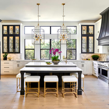
Example of a transitional u-shaped light wood floor and beige floor kitchen design in Austin with a farmhouse sink, raised-panel cabinets, gray backsplash, paneled appliances, an island, white countertops, quartz countertops, white cabinets and stone tile backsplash
Example of a transitional u-shaped light wood floor and beige floor kitchen design in Austin with a farmhouse sink, raised-panel cabinets, gray backsplash, paneled appliances, an island, white countertops, quartz countertops, white cabinets and stone tile backsplash
 Arizona Tile
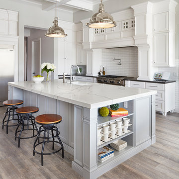
Della Terra is a natural quartz surface, it is a blend of nature and technology, combining beauty and functionality in a high performance surface. Della Terra is comprised of more than 93% natural quartz crystals, one of the hardest minerals in nature. Color controlled quartz is blended together with technologically advanced polymers. Because of its high quartz content, Arizona Tile's Della Terra Quartz surfaces are ultra-durable and resistant to scratches and chipping. Its dense composition also makes Della Terra Quartz highly resistant to staining.
Photo: Aperture Architectural Images
4