
Search results for "Renovated low ceiling kitchen" in Kitchen Photos
Refine by:
Budget
Sort by:Relevance
1 - 20 of 95,267 photos
Item 1 of 1
 Cape Associates, Inc.
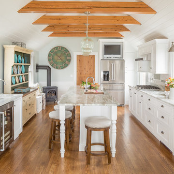
As innkeepers, Lois and Evan Evans know all about hospitality. So after buying a 1955 Cape Cod cottage whose interiors hadn’t been updated since the 1970s, they set out on a whole-house renovation, a major focus of which was the kitchen.
The goal of this renovation was to create a space that would be efficient and inviting for entertaining, as well as compatible with the home’s beach-cottage style.
Cape Associates removed the wall separating the kitchen from the dining room to create an open, airy layout. The ceilings were raised and clad in shiplap siding and highlighted with new pine beams, reflective of the cottage style of the home. New windows add a vintage look.
The designer used a whitewashed palette and traditional cabinetry to push a casual and beachy vibe, while granite countertops add a touch of elegance.
The layout was rearranged to include an island that’s roomy enough for casual meals and for guests to hang around when the owners are prepping party meals.
Placing the main sink and dishwasher in the island instead of the usual under-the-window spot was a decision made by Lois early in the planning stages. “If we have guests over, I can face everyone when I’m rinsing vegetables or washing dishes,” she says. “Otherwise, my back would be turned.”
The old avocado-hued linoleum flooring had an unexpected bonus: preserving the original oak floors, which were refinished.
The new layout includes room for the homeowners’ hutch from their previous residence, as well as an old pot-bellied stove, a family heirloom. A glass-front cabinet allows the homeowners to show off colorful dishes. Bringing the cabinet down to counter level adds more storage. Stacking the microwave, oven and warming drawer adds efficiency.
 Dillon Kyle Architects (DKA)
Casey Dunn Photography
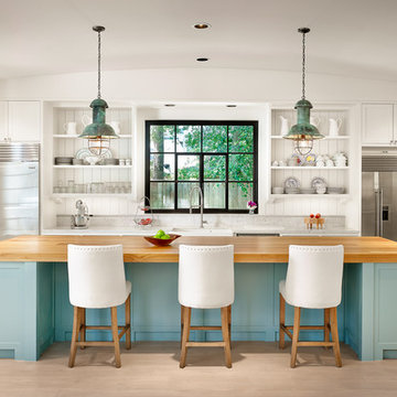
Inspiration for a large coastal u-shaped light wood floor kitchen remodel in Houston with an island, white cabinets, marble countertops, stainless steel appliances, open cabinets, a farmhouse sink, white backsplash and wood backsplash
Inspiration for a large coastal u-shaped light wood floor kitchen remodel in Houston with an island, white cabinets, marble countertops, stainless steel appliances, open cabinets, a farmhouse sink, white backsplash and wood backsplash
 Alair Homes Plano
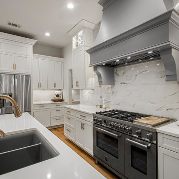
Our clients came to us wanting to maximize the space they had. They were not planning on moving anytime soon, as they loved their neighborhood. They wanted to renovate the front of their house, which included the front atrium, living room, kitchen, and powder bath. They hated their kitchen because it was completely closed off, had low ceilings, was dark and outdated, not to mention the floors were different in each of these rooms! The pantry was in the breakfast area and the kitchen table became a junk catcher, being the first thing you see when coming in from the garage/laundry room. In their living room, they wanted the spaces on either side of the fireplace to be symmetrical, whether that be bookshelves, a wet bar or closed off. Both parents are working professionals with no time and/or desire to design, create and figure this out on their own. They needed help figuring out how to reconfigure their current space in order to maximize what they already had, as they could not see an obvious solution. They could not envision how it would look so the fact that our designers were able to show them their new kitchen in 3D was pertinent.
We removed the pass-through windows that surrounded the atrium and front dining room, as well as the entire kitchen wall, completely opening up those two rooms. We removed a hall that used to lead between the kitchen and the living room since it was a complete waste of space! The ceilings were raised to 10’ in the kitchen and we were able to leave the skylight, letting in that natural light they wanted. We were able to give them a much larger pantry with tons of shelving and increase the size of their laundry room by utilizing the space of their old breakfast nook.
We relocated the door to the garage into their new elongated laundry room, built a wet bar across from their new larger pantry (with a pocket door) and the flow and functionality of these new spaces is just perfect! All new Waypoint cabinets were installed one two main kitchen surrounding walls painted Linen. Calacatta Bianco Polished Porcelain Tile 4x12 was used for the backsplash. A large eat-at island was installed, painted Stone, where the family can now gather for homework, meals, and mingling. The soft champagne bronze hardware and accent lighting really give this white and gray kitchen a soft classic look.
In the living room, we removed the built-in bookshelves to the left of the fireplace and closed off the wet-bar on the other side, giving them more space in their master suite. White Oak wood flooring, stained Putney, was installed throughout the entire new space, giving it the continuity they were looking for.
In the guest bathroom, Carrara white herringbone marble mosaic 12x12 tile was used on the shower floor and niche, while basic marble Bianco polished 12x24 porcelain tile was used on the walls. Luxart polished chrome traditional hardware gives this timeless bathroom the perfect shine.
Our clients are so happy with the new functionality and look of their space. It has definitely changed their lives in a way they could have never imagined!
Find the right local pro for your project
 Besch Architecture
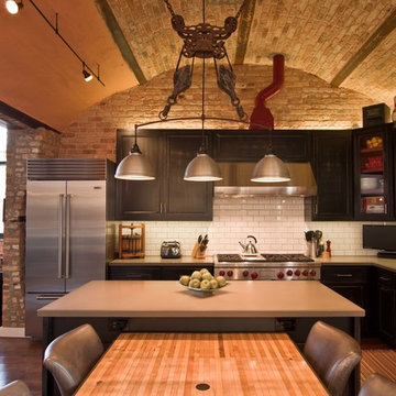
Arched brick ceiling with a custom made light fixture. The owners found the parts for this light fixture over the island and had a local artist create this one of a kind fixture. The table with the seating is made from an old bowling alley lane. The pin placement marks can still be seen on the table top. The table is free standing so it can be moved off the island if desired.
A reclaimed scupper box is the transition piece from the range hood to the duct work with red accent paint.
Peter Nilson Photography
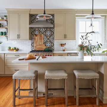
 TKS Design Group
Download our free ebook, Creating the Ideal Kitchen. DOWNLOAD NOW
The homeowners came to us looking to update the kitchen in their historic 1897 home. The home had gone through an extensive renovation several years earlier that added a master bedroom suite and updates to the front façade. The kitchen however was not part of that update and a prior 1990’s update had left much to be desired. The client is an avid cook, and it was just not very functional for the family.
The original kitchen was very choppy and included a large eat in area that took up more than its fair share of the space. On the wish list was a place where the family could comfortably congregate, that was easy and to cook in, that feels lived in and in check with the rest of the home’s décor. They also wanted a space that was not cluttered and dark – a happy, light and airy room. A small powder room off the space also needed some attention so we set out to include that in the remodel as well.
See that arch in the neighboring dining room? The homeowner really wanted to make the opening to the dining room an arch to match, so we incorporated that into the design.
Another unfortunate eyesore was the state of the ceiling and soffits. Turns out it was just a series of shortcuts from the prior renovation, and we were surprised and delighted that we were easily able to flatten out almost the entire ceiling with a couple of little reworks.
Other changes we made were to add new windows that were appropriate to the new design, which included moving the sink window over slightly to give the work zone more breathing room. We also adjusted the height of the windows in what was previously the eat-in area that were too low for a countertop to work. We tried to keep an old island in the plan since it was a well-loved vintage find, but the tradeoff for the function of the new island was not worth it in the end. We hope the old found a new home, perhaps as a potting table.
Designed by: Susan Klimala, CKD, CBD
Photography by: Michael Kaskel
For more information on kitchen and bath design ideas go to: www.kitchenstudio-ge.com
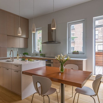
 ZeroEnergy Design
This renovated brick rowhome in Boston’s South End offers a modern aesthetic within a historic structure, creative use of space, exceptional thermal comfort, a reduced carbon footprint, and a passive stream of income.
DESIGN PRIORITIES. The goals for the project were clear - design the primary unit to accommodate the family’s modern lifestyle, rework the layout to create a desirable rental unit, improve thermal comfort and introduce a modern aesthetic. We designed the street-level entry as a shared entrance for both the primary and rental unit. The family uses it as their everyday entrance - we planned for bike storage and an open mudroom with bench and shoe storage to facilitate the change from shoes to slippers or bare feet as they enter their home. On the main level, we expanded the kitchen into the dining room to create an eat-in space with generous counter space and storage, as well as a comfortable connection to the living space. The second floor serves as master suite for the couple - a bedroom with a walk-in-closet and ensuite bathroom, and an adjacent study, with refinished original pumpkin pine floors. The upper floor, aside from a guest bedroom, is the child's domain with interconnected spaces for sleeping, work and play. In the play space, which can be separated from the work space with new translucent sliding doors, we incorporated recreational features inspired by adventurous and competitive television shows, at their son’s request.
MODERN MEETS TRADITIONAL. We left the historic front facade of the building largely unchanged - the security bars were removed from the windows and the single pane windows were replaced with higher performing historic replicas. We designed the interior and rear facade with a vision of warm modernism, weaving in the notable period features. Each element was either restored or reinterpreted to blend with the modern aesthetic. The detailed ceiling in the living space, for example, has a new matte monochromatic finish, and the wood stairs are covered in a dark grey floor paint, whereas the mahogany doors were simply refinished. New wide plank wood flooring with a neutral finish, floor-to-ceiling casework, and bold splashes of color in wall paint and tile, and oversized high-performance windows (on the rear facade) round out the modern aesthetic.
RENTAL INCOME. The existing rowhome was zoned for a 2-family dwelling but included an undesirable, single-floor studio apartment at the garden level with low ceiling heights and questionable emergency egress. In order to increase the quality and quantity of space in the rental unit, we reimagined it as a two-floor, 1 or 2 bedroom, 2 bathroom apartment with a modern aesthetic, increased ceiling height on the lowest level and provided an in-unit washer/dryer. The apartment was listed with Jackie O'Connor Real Estate and rented immediately, providing the owners with a source of passive income.
ENCLOSURE WITH BENEFITS. The homeowners sought a minimal carbon footprint, enabled by their urban location and lifestyle decisions, paired with the benefits of a high-performance home. The extent of the renovation allowed us to implement a deep energy retrofit (DER) to address air tightness, insulation, and high-performance windows. The historic front facade is insulated from the interior, while the rear facade is insulated on the exterior. Together with these building enclosure improvements, we designed an HVAC system comprised of continuous fresh air ventilation, and an efficient, all-electric heating and cooling system to decouple the house from natural gas. This strategy provides optimal thermal comfort and indoor air quality, improved acoustic isolation from street noise and neighbors, as well as a further reduced carbon footprint. We also took measures to prepare the roof for future solar panels, for when the South End neighborhood’s aging electrical infrastructure is upgraded to allow them.
URBAN LIVING. The desirable neighborhood location allows the both the homeowners and tenant to walk, bike, and use public transportation to access the city, while each charging their respective plug-in electric cars behind the building to travel greater distances.
OVERALL. The understated rowhouse is now ready for another century of urban living, offering the owners comfort and convenience as they live life as an expression of their values.
Photography: Eric Roth Photo
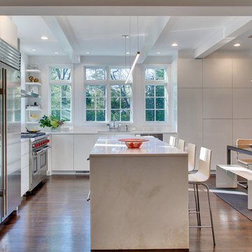
 Sellars Lathrop Architects, llc
kitchen/eating/ family room addition to a renovated 1940's colonial
Mid-sized trendy l-shaped dark wood floor eat-in kitchen photo in New York with a single-bowl sink, flat-panel cabinets, quartzite countertops, stainless steel appliances, an island and white cabinets
Mid-sized trendy l-shaped dark wood floor eat-in kitchen photo in New York with a single-bowl sink, flat-panel cabinets, quartzite countertops, stainless steel appliances, an island and white cabinets
Sponsored
Plain City, OH

Kuhns Contracting, Inc.
Central Ohio's Trusted Home Remodeler Specializing in Kitchens & Baths
 Baxter Construction
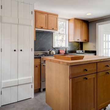
Farmhouse gray floor kitchen photo in Philadelphia with shaker cabinets, light wood cabinets, black backsplash, stainless steel appliances, two islands and black countertops
 Sheedy Watts Design
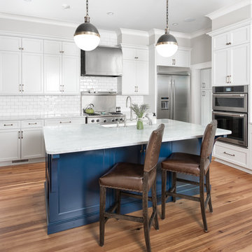
Ready to start a family, the owners began this project with the hope of correcting problems from previous renovations, while looking to gain an open kitchen, upstairs bedrooms and a carport with storage.
The recipe for fixing low ceilings and a dead-end kitchen, low ceilings was a two-story addition to the rear that features a double-height ceiling, great room, open staircase and a small mudroom at the back.
Interior finishes were selected to compliment the home’s original feel while exterior elements like cedar shingles, brackets and a tall window wall create an inviting facade for the family’s entrance and connects the interior with views to the backyard.
Photo credit: Joe Purvis
 Gast Architects
Mariko Reed Architectural Photography
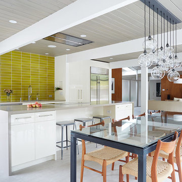
Open concept kitchen - 1950s galley open concept kitchen idea in San Francisco with white cabinets, yellow backsplash and an island
Open concept kitchen - 1950s galley open concept kitchen idea in San Francisco with white cabinets, yellow backsplash and an island
 Howell Custom Building Group
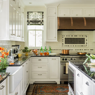
Built in 1860, this historic home is located next to Phillips Academy in Andover MA and has served as a home to the academy’s administrators. The kitchen was a utilitarian, dark and cramped space. The goal of the remodel was to create a brighter and more elegant kitchen. Two new windows on either side of the cooking area, bring in light and views of the backyard. A wood paneled raised ceiling with drop soffit was added, giving new depth and warmth to the room. A glass display cabinet with interior lighting lines one wall adding to the airy, bright ambiance. Elegant styling includes hand painted custom cabinetry from Jewett Farms with decorative furniture feet and a hand-hammered copper range hood.Cosmic black granite replaced the outdated Formica countertops. A custom designed backsplash tile consists of a traditional 3 x 6 subway tile with custom selected square mosaics which tie the dark counters in with the white cabinets. Coppery accents within the mosaics reflect the copper range hood and beautiful wood floors. The flooring throughout the first floor was replaced with antique reclaimed oak.
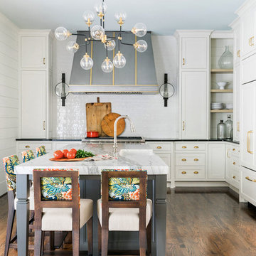
 EK Interiors
patterned counter stools, blue ceiling, circa lighting, classic design, custom cabinets, funky lighting, inset cabinetry, kitchen renovation, kohler, marble, metal hood, renovation, white kitchen
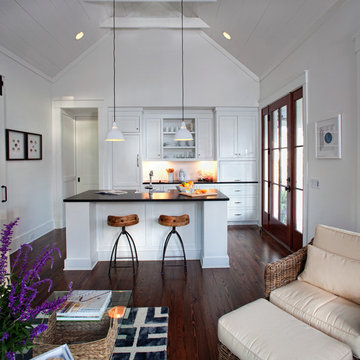
 lisa furey interiors
Our goal on this project was to create a live-able and open feeling space in a 690 square foot modern farmhouse. We planned for an open feeling space by installing tall windows and doors, utilizing pocket doors and building a vaulted ceiling. An efficient layout with hidden kitchen appliances and a concealed laundry space, built in tv and work desk, carefully selected furniture pieces and a bright and white colour palette combine to make this tiny house feel like a home. We achieved our goal of building a functionally beautiful space where we comfortably host a few friends and spend time together as a family.
John McManus

 Jordan Design Build Group
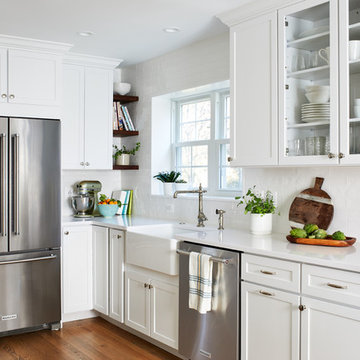
One small window, faux woodgrain cabinets and lots of doors made this closed-off Arlington kitchen feel dark and drab, the total opposite of the vibrant young family of four that lives here. To brighten and open up the small kitchen, we removed the wall separating the dining room, expanded the window above the sink and installed a French door to let even more light in from an adjoining sun room. Light now pours into the kitchen, making it feel welcoming, airy and bright. To accommodate the expanded kitchen, we removed a hulking set of built-ins from the dining room which provided two extra feet to work with. The larger footprint allowed us to relocate major appliances and provide a generous amount of storage and prep space including a food safe butcher block to the right of the range. Natural wood elements such as the chopping block, reclaimed shelves and beautiful new floors add character and warmth to the all-white kitchen.
One of the must-haves in this renovation was a farmhouse sink which is a great way to maximize function when a smaller sink base is used. We opted to take the tile backsplash all the way to the ceiling along the window wall, creating a more polished look with the added bonus of making the ceiling feel taller. The subway tiles’ subtle texture adds depth to the simple white-on-white motif and the change to a herringbone pattern behind the range adds visual interest without feeling too busy. A crisp white backdrop is perfect for adding pops of color with dishware, accessories and the family’s vintage stand mixer. The newly renovated kitchen-dining area is much better suited for this family’s active lifestyle and the updated design now complements the rest of their stylish home.
Photos by Stacy Zarin Goldberg
 H2D Architecture + Design
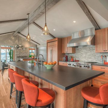
H2D transformed this Mercer Island home into a light filled place to enjoy family, friends and the outdoors. The waterfront home had sweeping views of the lake which were obstructed with the original chopped up floor plan. The goal for the renovation was to open up the main floor to create a great room feel between the sitting room, kitchen, dining and living spaces. A new kitchen was designed for the space with warm toned VG fir shaker style cabinets, reclaimed beamed ceiling, expansive island, and large accordion doors out to the deck. The kitchen and dining room are oriented to take advantage of the waterfront views. Other newly remodeled spaces on the main floor include: entry, mudroom, laundry, pantry, and powder. The remodel of the second floor consisted of combining the existing rooms to create a dedicated master suite with bedroom, large spa-like bathroom, and walk in closet.
Photo: Image Arts Photography
Design: H2D Architecture + Design
www.h2darchitects.com
Construction: Thomas Jacobson Construction
Interior Design: Gary Henderson Interiors
 Beyond the Box Design Collective
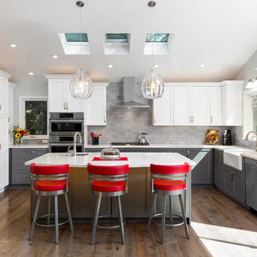
This beautiful kitchen remodel includes a complete renovation of the existing space. We vaulted the ceiling, added skylights, walls ovens, appliance garages, and stunning pendant lighting. A formerly small, closed-off kitchen was transformed into a beautiful, open space perfectly designed for food, friends, and entertainment.
Contractor: Jared Lewis Construction,
Photographer: Kate Falconer Photography,
Appliances: Built In Distributors
 TimeLine Renovations Inc.
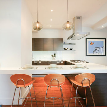
Going house hunting to find the dream home is difficult in every aspect, especially in NYC. The first apartment may have a feature that the other has but very rarely will one place have all. Most important is making sure the location and size works and everything else can be incorporated later. As the apartment our clients selected was "move in" condition its surely was not for what they work looking for in creating their dream home. We first started by creating a "wish list" of all of the essentials, which included; open kitchen, walk in closet, office space , larger master bathroom with stand up shower and soaking tub. With creating many different floor plan options, the only way we would achieve this was by sacrificing the 3rd bedroom. At this stage the 3rd bedroom was very easy for them to sacrifice as it gave them all of the wish list for now. In the future ,they could easily take the square footage from the new oversized living room and add that 3rd bedroom if it were necessary. Our first goal in the demolition stage was to remove all existing interior partition walls and start with a fresh new slate. By removing the existing kitchen walls the New Kitchen layout now combines it with the living room. The cabinetry is 2 tone color, flat slab doors for the modern look. State of the art appliances were installed; Integrated panels were installed on the fridge, wall oven, microwave, cook top. The sink is the ultimate chefs prep station sliding butcher block with bowls that slide over the sink. A garage cabinet was installed to conceal smaller appliances. The cantilever counter top adds the additional seating space for guests while keeping the bottom portion open for the view. The existing walk in closet was relocated to achieve the New Master Bathroom, Combining the spaces now gave us the option to add all the features. Floating vanity with double sinks, soaking tub, stand up shower. The glossy rectified tiles used are 12x36 and when installed make the grout line disappear and make it look like a solid wall. The chocolate floor tiles are randomly staggered then wrap up the tub platform and continue up one wall to create an accent. No tile edge was used but all tiles that meet on a 90 degree outside corner are mitered; tub platform, walls and shower niches. Heated floors were installed to keep the feet warm on the cold winter days. In the Master Bedroom we built a bed frame accent wall. Serves for multiple functions; eliminates night stands by using the niches for alarm clock / phone charger station, lights were added inside the niches for accent lights and raised wall paper was used to finish this beautiful feature. Each his and hers niche has an outlet, 4 way switch for the accent lights and 4 way switch for the recessed lights above when they are done reading in bed. Custom steps were built for easy up and down off the bed for the little puppies that could not possibly make the jump up. Other features throughout the apartment include; New bamboo floors throughout. Since the concrete ceiling slab cannot be chopped , soffits and drop ceilings were built throughout the apartment to accommodate recessed lights. Low voltage recessed lights were used with multiple zone dimmers for energy efficiency. Remote operated shades were installed The overall design was for the apartment was modern, simple lines and true elegance. The newly renovated apartment will be enjoyed by them, friends and family for many years to come...
edit

 Advance Design Studio, Ltd.
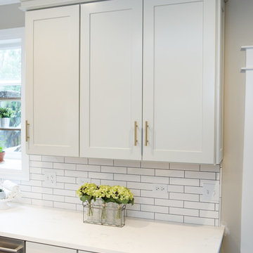
After six years of living in their Huntley IL home, Chris and Meghan were tired of their dark, dingy, outdated kitchen and it was finally time for a long-anticipated change. “The kitchen is the place where we live, it’s where we do everything,” Meghan said. “It was important that it be a space where we wanted to be.” Meghan loves cooking and enjoys including their girls in healthy meal prepping, this led them to want a brighter, more enjoyable kitchen with increased functionality and improved storage.
For Chris especially, the laundry room was an entirely dysfunctional eyesore. “We had a washer and a dryer, but it was all kind-of cobbled together!” Chris said. “There were always laundry piles everywhere, we weren’t really sure what we wanted to do in there, but it was time for us to make a change.” The mess of the space was stressful every time they walked in the door from the garage each day. Kids’ backpacks and shoes piled up haphazardly in the makeshift boot-bench closet left the family feeling disorganized and stressed. They needed space for folding clothes and locker cubbies to help keep the family organized.
Having known Christine and Todd in the Huntley community for years, Chris and Meghan were familiar with their work. “We already trusted them personally and having seen their projects for years we knew they did top notch work. After we reviewed the initial round of designs, we knew that hiring them was definitely the right choice,” Meghan and Chris said. Although Chris had done a lot of work in their home himself, the kitchen and laundry room renovation was such a large undertaking that he didn’t want to steal time away from his family to spend what would surely be many long weekends doing the job himself. “That would not have been a wise choice for us,” Chris laughed.
“Our designer, Michelle was very, very, easy to work with; anything we wanted to see or weren’t sure about, she went above and beyond to make this easy for us. She was easy to get hold of and always quick to respond,” the couple said. Michelle pulled ideas that mirrored the couple’s taste and style and was adept at directing the couple to limited choices that didn’t overwhelm them and kept the process moving. “I have a hard time making decisions. Michelle made the decision-making process so easy. I loved how she listened to what I liked and then presented three great options for me to choose from,” Meghan said.
The main objectives for the kitchen were better storage solutions, they wanted the space to reflect their lifestyle and taste, and they wanted it to last for years with low maintenance. One of the first steps in creating a more functional kitchen was relocating the refrigerator, creating an improved workflow for the busy family.
“We didn’t know that we could even move the refrigerator to a new location where it is now, that was something that we never would have thought of,” Chris said. “The new refrigerator location makes the kitchen feel so much bigger. We didn’t add any space, but our whole kitchen with the new design just seems like it’s so much larger than before!” Meghan said.
The perimeter mist colored cabinets helped warm and brighten the entire room, while the graphite colored cabinets on the island added contrast. Using this fresh, clean color palette satisfied the couple’s desire for a bright space that was the exact opposite of what they had before. Organization accessories were also added to the cabinets such as a spice drawer tray and roll outs to create hidden convenience.
“I absolutely love the hidden spices – it makes cooking so much more enjoyable!” Chris said. “And all the pull outs, and the double trash bin, who would think you could get so excited about organization!” the couple said in unison.
One thing they hated in their original kitchen was how dark the space felt. Added lighting on the ceiling with the new light fixtures combined with the lighter cabinetry colors throughout solved this problem. “Our new kitchen has this warm, almost cozy feeling that our old kitchen never had, it’s just a space that I love spending my time in now,” Meghan said. The light airy feeling was accentuated with the use of floating white shelves on either side of the decorative range hood. “We have so much cabinetry space, the new design is amazing we actually have more storage space than we will ever need,” Meghan said.
The island was extended to create more work surface and added space for stool seating. “The new island changes how we live. Now the kids can be in the kitchen with us, doing homework, eating breakfast, and the three of us have special dinners there when Chris is working late,” Meghan said.
The Carrara Marmi Quartz countertops were chosen because they are, not only beautiful, but are made from hard-working material that doesn’t require maintenance. The white subway tile backsplash that wraps to the ceiling behind the focal point cooktop range/hood compliments the crisp white countertops perfectly, while brushed brass hardware and light fixtures keep the design fresh and new.
The couple had a few fears at the beginning of the project, as most homeowners do. Their biggest fear was being out of their kitchen and laundry room for an extended time. The crew made it very easy for the family to work in a limited space keeping the washer and dryer hooked up the majority of the time, and also getting appliances working with minimal downtime.
“They above and beyond accommodated us to get us through the process,” Meghan said. “They did a great job making sure we were as comfortable as possible throughout the process,” Chris added.
“Our project manager DJ did a great job. He was very good at updating us on schedule changes, getting guys in as quickly as possible. Everyone that stepped in the house was nice and did great work,” said Chris. They thought Advance’s carpenter was phenomenal and were impressed when he took a conceptual idea from a photograph and worked with designer Michelle to create a one of a kind range/hood that has become the topic of conversation with friends and family who visit the new kitchen. “He was in our house literally every day for several weeks. He was easy to work with and good at what he did,” Meghan and Chris said.
The focal point of the kitchen; a hand-crafted, custom-built ventilation hood was clad with handpicked reclaimed barnwood. Advance Design’s carpenter built the framework and the cladding to create a one-of-a-kind design element that the couple loves.
“I think it was especially fun for him to create something unique from scratch, showcasing his talent in this area,” Meghan said. “I love that my kitchen is not like everyone else’s. I got to pick out the wood on my hood and watch it being built and was able to choose what pieces of wood went where on it. It’s totally unique.”
Red Oak flooring was toothed-in throughout the kitchen and the rest of the first floor anywhere changes were made. Then the whole floor was refinished to tone down the orange undertones in the existing floor stain, ultimately changing the color complexion of the entire first floor. The result is a completely new feeling to the entire home.
Renovating the laundry room was extremely important to Meghan and Chris, but they had trouble visualizing what the possibilities were for the seemingly small space. Michelle produced beautiful 3D illustrations that helped them envision the space in a whole new way.
“I must have told Michelle 100 times that I am a visual person, seeing the designs in 3D made it so easy to make decisions and see what we could really do with our space,” Meghan said.
A dividing wall and doorway were removed between the existing laundry room and hallway formerly containing a coat closet, providing space to design specialized graphite colored cabinetry matching the kitchen island to house custom storage cubbies for each family member. Adding the tall utility cabinetry in the new laundry area helped solve the storage issue, tucking away cleaning supplies, household items, and even the cat got its own cubby.
“I love how everything is now hidden in its own space. I can’t tell you how much I hated coming home and seeing everything sitting around on counters,” Chris said.
Electrical outlets were planned for the inside of utility cabinets, so devices could charge in hidden locations. Stacking the washer and dryer allowed for wider countertop space to provide a folding area and a special space for clothes to hang. “The way I do laundry has been completely transformed! I can actually fold clothes and hang them now right out of the washer and dryer,” Meghan said.
“The end result in the kitchen and the laundry/mud room was an updated light and bright space, with a smarter work flow that better meets the needs of this family,” Michelle said.
“I would totally recommend Advance Design,” Meghan said. “Sometimes I sit and just look at my kitchen and laundry room and think ‘Wow, I can’t believe I get to live here!’ It’s an understatement to say we love our new space.”
 My House Design|Build|Team
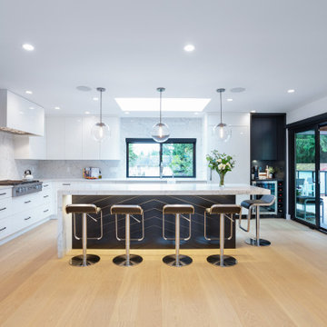
The family who owned this 1965 home chose a dramatic upgrade for their Coquitlam full home renovation. They wanted more room for gatherings, an open concept kitchen, and upgrades to bathrooms and the rec room. Their neighbour knew of our work, and we were glad to bring our skills to another project in the area.
Choosing Dramatic Lines
In the original house, the entryway was cramped, with a closet being the first thing everyone saw.
We opened the entryway and moved the closet, all while maintaining separation between the entry and the living space.
To draw the attention from the entry into the living room, we used a dramatic, flush, black herringbone ceiling detail across the ceiling. This detail goes all the way to the entertainment area on the main floor.
The eye arrives at a stunning waterfall edge walnut mantle, modern fireplace.
Open Concept Kitchen with Lots of Seating
The dividing wall between the kitchen and living areas was removed to create a larger, integrated entertaining space. The kitchen also has easy access to a new outdoor social space.
A new large skylight directly over the kitchen floods the space with natural light.
The kitchen now has gloss white cabinetry, with matte black accents and the same herringbone detail as the living room, and is tied together with a low maintenance Caesarstone’s white Attica quartz for the island countertop.
This over-sized island has barstool seating for five while leaving plenty of room for homework, snacking, socializing, and food prep in the same space.
To maximize space and minimize clutter, we integrated the kitchen appliances into the kitchen island, including a food warming drawer, a hidden fridge, and the dishwasher. This takes the eyes to focus off appliances, and onto the design elements which feed throughout the home.
We also installed a beverage center just beside the kitchen so family and guests can fix themselves a drink, without disrupting the flow of the kitchen.
Updated Downstairs Space, Updated Guest Room, Updated Bathrooms
It was a treat to update this entire house. Upstairs, we renovated the master bedroom with new blackout drapery, new decor, and a warm light grey paint colour. The tight bathroom was transformed with modern fixtures and gorgeous grey tile the homeowners loved.
The two teen girls’ rooms were updated with new lighting and furniture that tied in with the whole home decor, but which also reflected their personal taste.
In the basement, we updated the rec room with a bright modern look and updated fireplace. We added a needed door to the garage. We upgraded the bathrooms and created a legal second suite which the young adult daughter will use, for now.
Laundry Its Own Room, Finally
In a family with four women, you can imagine how much laundry gets done in this house. As part of the renovation, we built a proper laundry room with plenty of storage space, countertops, and a large sink.
 My House Design|Build|Team
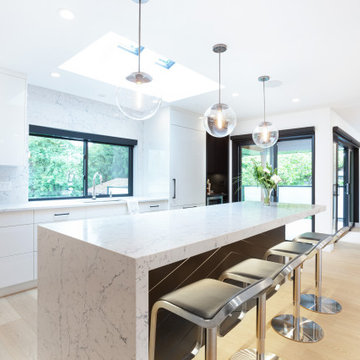
The family who owned this 1965 home chose a dramatic upgrade for their Coquitlam full home renovation. They wanted more room for gatherings, an open concept kitchen, and upgrades to bathrooms and the rec room. Their neighbour knew of our work, and we were glad to bring our skills to another project in the area.
Choosing Dramatic Lines
In the original house, the entryway was cramped, with a closet being the first thing everyone saw.
We opened the entryway and moved the closet, all while maintaining separation between the entry and the living space.
To draw the attention from the entry into the living room, we used a dramatic, flush, black herringbone ceiling detail across the ceiling. This detail goes all the way to the entertainment area on the main floor.
The eye arrives at a stunning waterfall edge walnut mantle, modern fireplace.
Open Concept Kitchen with Lots of Seating
The dividing wall between the kitchen and living areas was removed to create a larger, integrated entertaining space. The kitchen also has easy access to a new outdoor social space.
A new large skylight directly over the kitchen floods the space with natural light.
The kitchen now has gloss white cabinetry, with matte black accents and the same herringbone detail as the living room, and is tied together with a low maintenance Caesarstone’s white Attica quartz for the island countertop.
This over-sized island has barstool seating for five while leaving plenty of room for homework, snacking, socializing, and food prep in the same space.
To maximize space and minimize clutter, we integrated the kitchen appliances into the kitchen island, including a food warming drawer, a hidden fridge, and the dishwasher. This takes the eyes to focus off appliances, and onto the design elements which feed throughout the home.
We also installed a beverage center just beside the kitchen so family and guests can fix themselves a drink, without disrupting the flow of the kitchen.
Updated Downstairs Space, Updated Guest Room, Updated Bathrooms
It was a treat to update this entire house. Upstairs, we renovated the master bedroom with new blackout drapery, new decor, and a warm light grey paint colour. The tight bathroom was transformed with modern fixtures and gorgeous grey tile the homeowners loved.
The two teen girls’ rooms were updated with new lighting and furniture that tied in with the whole home decor, but which also reflected their personal taste.
In the basement, we updated the rec room with a bright modern look and updated fireplace. We added a needed door to the garage. We upgraded the bathrooms and created a legal second suite which the young adult daughter will use, for now.
Laundry Its Own Room, Finally
In a family with four women, you can imagine how much laundry gets done in this house. As part of the renovation, we built a proper laundry room with plenty of storage space, countertops, and a large sink.
1