
Search results for "Soffit removal" in Home Design Ideas
 Rosa Moreno Kitchens
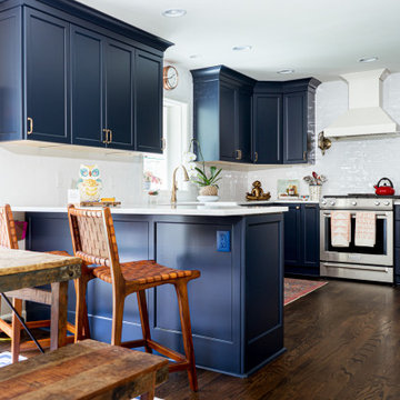
Eat-in kitchen - small eclectic l-shaped medium tone wood floor and brown floor eat-in kitchen idea in Atlanta with a farmhouse sink, shaker cabinets, blue cabinets, quartz countertops, blue backsplash, ceramic backsplash, stainless steel appliances, a peninsula and blue countertops
 ReVision Design + Build
© Ascendant Imaging
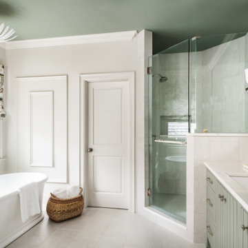
Example of a large transitional master white tile and porcelain tile porcelain tile, beige floor and double-sink bathroom design in Charlotte with furniture-like cabinets, green cabinets, a two-piece toilet, white walls, an undermount sink, quartz countertops, a hinged shower door, white countertops, a niche and a built-in vanity
Example of a large transitional master white tile and porcelain tile porcelain tile, beige floor and double-sink bathroom design in Charlotte with furniture-like cabinets, green cabinets, a two-piece toilet, white walls, an undermount sink, quartz countertops, a hinged shower door, white countertops, a niche and a built-in vanity
 Kitchen Associates
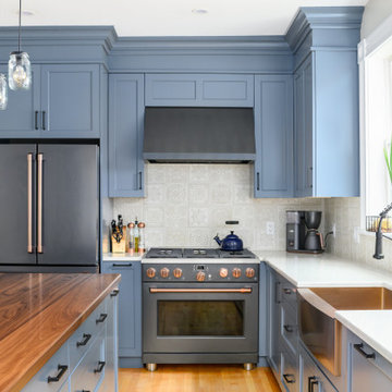
Blue painted Brookhaven cabinets with a mix of quartz and walnut plank countertops. The appliances are in a matte finish with copper accents that match the copper farmer sink.
Find the right local pro for your project
 Rosa Moreno Kitchens
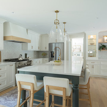
This inviting kitchen features a Shade Grown Sherwin Williams green island paired with Alabaster white perimeter cabinets and a few white oak touches, creating a beautiful earthy contrast.
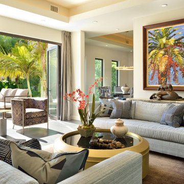
 David L. Smith Interiors
Large trendy formal and open concept brown floor living room photo in Miami with beige walls, no fireplace and no tv
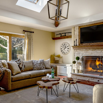
 Decorating Den Interiors - Bromberek Design Team
We replaced the brick with a Tuscan-colored stacked stone and added a wood mantel; the television was built-in to the stacked stone and framed out for a custom look. This created an updated design scheme for the room and a focal point. We also removed an entry wall on the east side of the home, and a wet bar near the back of the living area. This had an immediate impact on the brightness of the room and allowed for more natural light and a more open, airy feel, as well as increased square footage of the space. We followed up by updating the paint color to lighten the room, while also creating a natural flow into the remaining rooms of this first-floor, open floor plan.
After removing the brick underneath the shelving units, we added a bench storage unit and closed cabinetry for storage. The back walls were finalized with a white shiplap wall treatment to brighten the space and wood shelving for accessories. On the left side of the fireplace, we added a single floating wood shelf to highlight and display the sword.
The popcorn ceiling was scraped and replaced with a cleaner look, and the wood beams were stained to match the new mantle and floating shelves. The updated ceiling and beams created another dramatic focal point in the room, drawing the eye upward, and creating an open, spacious feel to the room. The room was finalized by removing the existing ceiling fan and replacing it with a rustic, two-toned, four-light chandelier in a distressed weathered oak finish on an iron metal frame.
Photo Credit: Nina Leone Photography
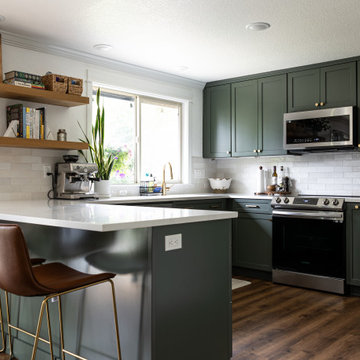
 JDI Construction
Immerse yourself in this green kitchen oasis, where luxurious gold hardware accents every corner. The striking green cabinets steal the spotlight, elegantly contrasting with the crisp white countertops and backsplash. This harmonious blend of colors and textures creates a vibrant yet sophisticated space, inviting you to enjoy both cooking and entertaining in style.



 TKS Design Group
Download our free ebook, Creating the Ideal Kitchen. DOWNLOAD NOW
For many, extra time at home during COVID left them wanting more from their homes. Whether you realized the shortcomings of your space or simply wanted to combat boredom, a well-designed and functional home was no longer a want, it became a need. Tina found herself wanting more from her Old Irving Park home and reached out to The Kitchen Studio about adding function to her kitchen to make the most of the available real estate.
At the end of the day, there is nothing better than returning home to a bright and happy space you love. And this kitchen wasn’t that for Tina. Dark and dated, with a palette from the past and features that didn’t make the most of the available square footage, this remodel required vision and a fresh approach to the space. Lead designer, Stephanie Cole’s main design goal was better flow, while adding greater functionality with organized storage, accessible open shelving, and an overall sense of cohesion with the adjoining family room.
The original kitchen featured a large pizza oven, which was rarely used, yet its footprint limited storage space. The nearby pantry had become a catch-all, lacking the organization needed in the home. The initial plan was to keep the pizza oven, but eventually Tina realized she preferred the design possibilities that came from removing this cumbersome feature, with the goal of adding function throughout the upgraded and elevated space. Eliminating the pantry added square footage and length to the kitchen for greater function and more storage. This redesigned space reflects how she lives and uses her home, as well as her love for entertaining.
The kitchen features a classic, clean, and timeless palette. White cabinetry, with brass and bronze finishes, contrasts with rich wood flooring, and lets the large, deep blue island in Woodland’s custom color Harbor – a neutral, yet statement color – draw your eye.
The kitchen was the main priority. In addition to updating and elevating this space, Tina wanted to maximize what her home had to offer. From moving the location of the patio door and eliminating a window to removing an existing closet in the mudroom and the cluttered pantry, the kitchen footprint grew. Once the floorplan was set, it was time to bring cohesion to her home, creating connection between the kitchen and surrounding spaces.
The color palette carries into the mudroom, where we added beautiful new cabinetry, practical bench seating, and accessible hooks, perfect for guests and everyday living. The nearby bar continues the aesthetic, with stunning Carrara marble subway tile, hints of brass and bronze, and a design that further captures the vibe of the kitchen.
Every home has its unique design challenges. But with a fresh perspective and a bit of creativity, there is always a way to give the client exactly what they want [and need]. In this particular kitchen, the existing soffits and high slanted ceilings added a layer of complexity to the lighting layout and upper perimeter cabinets.
While a space needs to look good, it also needs to function well. This meant making the most of the height of the room and accounting for the varied ceiling features, while also giving Tina everything she wanted and more. Pendants and task lighting paired with an abundance of natural light amplify the bright aesthetic. The cabinetry layout and design compliments the soffits with subtle profile details that bring everything together. The tile selections add visual interest, drawing the eye to the focal area above the range. Glass-doored cabinets further customize the space and give the illusion of even more height within the room.
While her family may be grown and out of the house, Tina was focused on adding function without sacrificing a stunning aesthetic and dreamy finishes that make the kitchen the gathering place of any home. It was time to love her kitchen again, and if you’re wondering what she loves most, it’s the niche with glass door cabinetry and open shelving for display paired with the marble mosaic backsplash over the range and complimenting hood. Each of these features is a stunning point of interest within the kitchen – both brag-worthy additions to a perimeter layout that previously felt limited and lacking.
Whether your remodel is the result of special needs in your home or simply the excitement of focusing your energy on creating a fun new aesthetic, we are here for it. We love a good challenge because there is always a way to make a space better – adding function and beauty simultaneously.
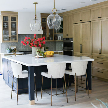
 Lori Ramsay Design
Our Modern Santa Barbara Style Kitchen underwent a huge transformation that opened the kitchen to the family room and formal dining room to create spaces that are more livable and functional as well as beautiful.

 Drury Design
The Setup:
After purchasing this home, the homeowners faced a unique opportunity to reimagine their kitchen and nearby spaces. Water damage from a burst pipe had left much of the home’s interior in need of repair, and while the existing kitchen was functional and in relatively good shape, it didn’t align with the family’s vision for their new home. The layout included a peninsula that wasn’t ideal, and there were some druthers with the nearby pantry.
Since the space needed to be rebuilt anyway, the homeowners saw this as a chance to create a kitchen that was both highly functional for their four young children and timeless in its design. The project also included a refresh of the adjacent message center and dining room — spaces that play key roles in the family’s daily life. The goal was to create a cohesive flow between these areas, balancing modern functionality with the craftsman-inspired character of the rest of the home.
Design Objectives:
- Replace the outdated peninsula with a large island to maximize counter space and create new seating options.
- Open up the space visually by removing soffits and rethinking the cabinetry layout.
Incorporate concealed refrigeration and freezer units to provide significant storage for the family while maintaining a streamlined aesthetic.
- Integrate black cabinetry into the design without making the space feel harsh or heavy.
- Ensure the lighting plan balances functional task lighting with ambient accent lighting.
- Avoid visual clutter in the cabinetry design while still giving a nod to the craftsman aesthetic.
- Incorporate a slab backsplash as a key design feature.
Design Challenges:
- The outdated peninsula left dead space in the kitchen and lacked sufficient seating for the family.
- The cooktop wall was cramped, with small cabinets flanking the hood, limited storage, and soffits that made the space feel closed-in.
- The family needed significant refrigeration space (two refrigerators and a freezer) but wanted to avoid a cluttered look with visible stainless steel appliances.
- Adding black cabinetry risked making the space feel too dark or heavy.
- The original lighting plan was insufficient, particularly over the dining table where a decorative fixture proved too dim.
- The family wanted shaker-style drawer fronts to match the home’s arts-and-crafts design but worried that too much shaker cabinetry might look overly busy.
- Prioritizing a slab backsplash in the wish list priority planning.
The Renewed Space
Design Solutions:
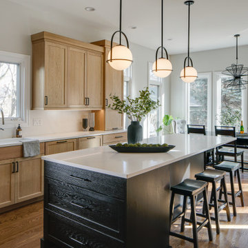
- A functional island: The peninsula was replaced with a large island that provides continuous countertop space for prepping and serving. The island also features seating for four people, creating a central hub for informal meals and activities.
- Streamlined cooktop wall: The soffits were removed, and the upper cabinets on the cooktop wall were eliminated to create a more open, streamlined design. A custom oversized hood became the focal point of the wall, with the blower unit offset inside it to align with the cooktop while maintaining exterior visual symmetry.
- Concealed refrigeration: Two column refrigerators and one freezer were integrated into the cabinetry, concealing them behind wood paneling that blends seamlessly with the overall design.
- Warm black cabinetry: The black cabinetry was crafted from hickory with a visible grain, softening its appearance and adding warmth. The grain detail gives the cabinetry a rich, textured look that avoids feeling stark or overpowering.
- Additional lighting: In the dining area, recessed can lights were added during an additional installation phase to supplement the gorgeous decorative fixture’s dim output. The new lighting plan creates a layered effect, combining functional task lighting with softer ambient lighting.
- Simplified cabinetry details: Slab drawer fronts were used on the upper drawers, while five-piece shaker fronts (with slightly less prominent rail and stile pieces) were reserved for the middle and lower drawers. This approach simplified the overall look while maintaining the craftsman-inspired aesthetic.
- Slab backsplash priority: The slab backsplash was prioritized by making thoughtful adjustments elsewhere, like opting not to extend cabinetry to the ceiling, which also helped visually prioritize the gorgeous slab backsplash. This decision also enhanced the kitchen’s furniture-like feel, aligning with the home’s craftsman character.
- This kitchen perfectly balances practicality with timeless style. By addressing the family’s functional needs — ample seating, smart storage, and effective lighting — while incorporating thoughtful design elements like warm black cabinetry and a striking slab backsplash, Alicia created a space that works beautifully for a busy household. The result is a cohesive, inviting kitchen that honors the home’s craftsman roots and will serve the family well for years to come.
 building Lab, inc.
The remodeling of the kitchen and bathroom forms the core of this interior renovation.
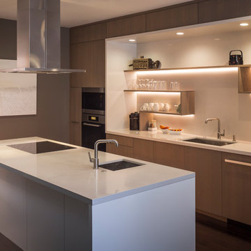
The existing peninsula design and cabinetry broke up the ‘great room’ and stood the kitchen as a distinct element within the room. Our design strategy operates more on a principle of integration. As such, we created a galley condition with a spine of cabinetry and appliances that anchors to the long wall of the room. The feature design element is the solid Caesarstone backsplash which appears to be carved from the wall itself.
The particular challenge in the windowless bathroom was how to create an inviting, expanded sense of depth without a resulting cave-like feel. Removal of a half wall, soffit and tub unified the space overall. We reinforced the unification with the deployment of a single large format tile spec. Smaller details such as touch latch cabinetry hardware and flush conditions between tile, wall and mirror further the principle that simpler is bigger, deeper and more inviting.
We were also charged with elevating what was a pedestrian 1990’s townhouse to something more sophisticated and engaging. Our approach was to first remove builder grade detailing around windows and railings. Then, we introduced simplified profiles and glass guardrails that would extend a consistency established in the new kitchen and bathroom designs.
photo by Scott Hargis
 Jordan Design Build Group
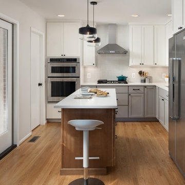
The kitchen was at the top of the list for a total overhaul – the worn oak cabinets, dated appliances, and clunky layout all had to go. Removing the decorative soffits allowed us to take the new cabinetry all the way to the ceiling, adding functional storage and visually extending the room’s height. We reconfigured the layout from a modified U to an L-shape which accomplished several things – it opened up the kitchen to the dining room, redirected circulation, and most importantly, created space for an island. A brand new pantry was created for overflow food storage, bulk items, occasional dishware and small appliances, ensuring that our client’s goal of uncluttered countertops was achievable.
The finish selections and clean lines give a nod to the home’s mid-century bones. The wood island provides warmth and the light quartz countertops, textured backsplash and white cabinets keep the kitchen feeling light and bright. We opted to install open shelving above the sink which provides display space and needed storage without the bulkiness of an overhead cabinet. The matte black faucet, hardware and decorative pendants add another level of visual interest to the modern kitchen. To unify the kitchen and dining room, we replaced the drab kitchen flooring with select red oak hardwoods that were expertly installed and refinished to match the gorgeous wood flooring throughout the home.

 Precision Cabinetry and Design
Stephanie Russo
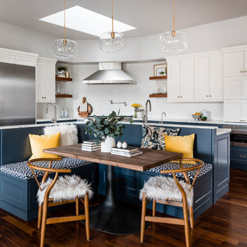
Inspiration for a transitional l-shaped medium tone wood floor and brown floor eat-in kitchen remodel in Sacramento with recessed-panel cabinets, white cabinets, white backsplash, stainless steel appliances, an island and white countertops
Inspiration for a transitional l-shaped medium tone wood floor and brown floor eat-in kitchen remodel in Sacramento with recessed-panel cabinets, white cabinets, white backsplash, stainless steel appliances, an island and white countertops
 Blythe Interiors
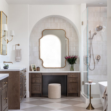
Gorgeous primary bathroom features warm tones, organic materials and a splash of glam.
Huge transitional master white tile and porcelain tile porcelain tile, beige floor and double-sink bathroom photo in San Diego with shaker cabinets, white walls, an undermount sink, a hinged shower door, white countertops, a niche, a built-in vanity and dark wood cabinets
Huge transitional master white tile and porcelain tile porcelain tile, beige floor and double-sink bathroom photo in San Diego with shaker cabinets, white walls, an undermount sink, a hinged shower door, white countertops, a niche, a built-in vanity and dark wood cabinets
 austin outdoor design
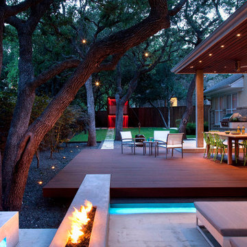
fire pit creates a visual and physical connection from the sunken sitting area to the modern play house at the end of the backyard. the tigerwood ceiling opens itself to a spacious ipe deck that leads down to conversation pit surrounding the fire or the outdoor kitchen patio. the space provides entertainment space for both the young and the old.
designed & built by austin outdoor design
photo by ryann ford
 Mantis Design + Build, LLC
Photography by Paul Linnebach
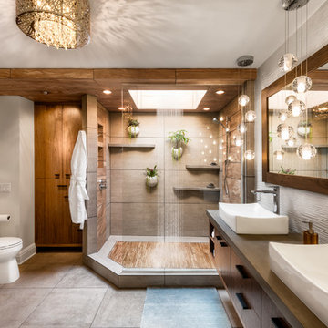
Inspiration for a large tropical master gray tile and ceramic tile gray floor and ceramic tile bathroom remodel in Minneapolis with flat-panel cabinets, dark wood cabinets, a one-piece toilet, white walls, a vessel sink and concrete countertops
Inspiration for a large tropical master gray tile and ceramic tile gray floor and ceramic tile bathroom remodel in Minneapolis with flat-panel cabinets, dark wood cabinets, a one-piece toilet, white walls, a vessel sink and concrete countertops
 TKS Design Group
Download our free ebook, Creating the Ideal Kitchen. DOWNLOAD NOW
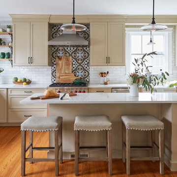
The homeowners came to us looking to update the kitchen in their historic 1897 home. The home had gone through an extensive renovation several years earlier that added a master bedroom suite and updates to the front façade. The kitchen however was not part of that update and a prior 1990’s update had left much to be desired. The client is an avid cook, and it was just not very functional for the family.
The original kitchen was very choppy and included a large eat in area that took up more than its fair share of the space. On the wish list was a place where the family could comfortably congregate, that was easy and to cook in, that feels lived in and in check with the rest of the home’s décor. They also wanted a space that was not cluttered and dark – a happy, light and airy room. A small powder room off the space also needed some attention so we set out to include that in the remodel as well.
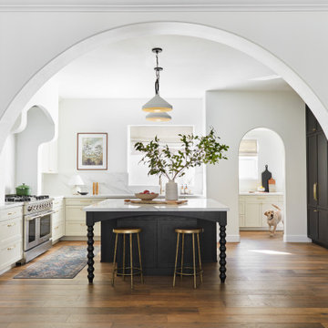
See that arch in the neighboring dining room? The homeowner really wanted to make the opening to the dining room an arch to match, so we incorporated that into the design.
Another unfortunate eyesore was the state of the ceiling and soffits. Turns out it was just a series of shortcuts from the prior renovation, and we were surprised and delighted that we were easily able to flatten out almost the entire ceiling with a couple of little reworks.
Other changes we made were to add new windows that were appropriate to the new design, which included moving the sink window over slightly to give the work zone more breathing room. We also adjusted the height of the windows in what was previously the eat-in area that were too low for a countertop to work. We tried to keep an old island in the plan since it was a well-loved vintage find, but the tradeoff for the function of the new island was not worth it in the end. We hope the old found a new home, perhaps as a potting table.
Designed by: Susan Klimala, CKD, CBD
Photography by: Michael Kaskel
For more information on kitchen and bath design ideas go to: www.kitchenstudio-ge.com
 Four Brothers Design + Build
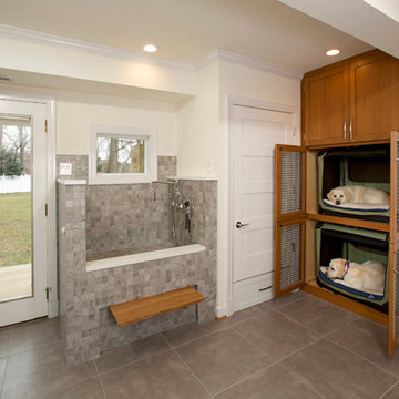
Example of a mid-sized transitional l-shaped porcelain tile utility room design in DC Metro with shaker cabinets, medium tone wood cabinets and white walls
 Soul Interiors Design, LLC
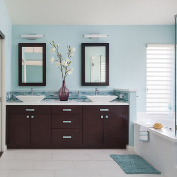
An original overhead soffit, tile countertops, fluorescent lights and oak cabinets were all removed to create a modern, spa-inspired master bathroom. Color inspiration came from the nearby ocean and was juxtaposed with a custom, expresso-stained vanity, white quartz countertops and new plumbing fixtures.
Sources:
Wall Paint - Sherwin-Williams, Tide Water @ 120%
Faucet - Hans Grohe
Tub Deck Set - Hans Grohe
Sink - Kohler
Ceramic Field Tile - Lanka Tile
Glass Accent Tile - G&G Tile
Shower Floor/Niche Tile - AKDO
Floor Tile - Emser
Countertops, shower & tub deck, niche and pony wall cap - Caesarstone
Bathroom Scone - George Kovacs
Cabinet Hardware - Atlas
Medicine Cabinet - Restoration Hardware
Photographer - Robert Morning Photography
1