
Search results for "Windowless space ideas" in Home Design Ideas
 WERK | Building Modern
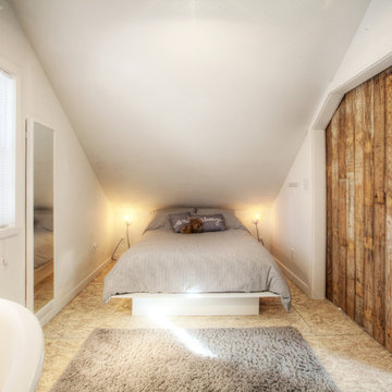
Carriage House loft bedroom shares space directly with open bathroom with barn door separation from loft kitchen/living space - Interior Architecture: HAUS | Architecture + BRUSFO - Construction Management: WERK | Build - Photo: HAUS | Architecture
 Howell Custom Building Group
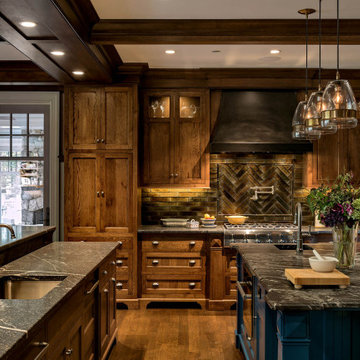
The homeowners of this wanted to create an informal year-round residence for their active family that reflected their love of the outdoors and time spent in ski and camping lodges. The result is a luxurious, yet understated, comfortable kitchen/dining area that exudes a feeling of warmth and relaxation. The open floor plan offers views throughout the first floor, while large picture windows integrate the outdoors and fill the space with light. A door to the three-season room offers easy access to an outdoor kitchen and living area. The dark wood floors, cabinets with natural wood grain, leathered stone counters, and coffered ceilings offer the ambiance of a 19th century mountain lodge, yet this is combined with painted wainscoting and woodwork to brighten and modernize the space. A blue center island in the kitchen adds a fun splash of color, while a gas fireplace and lit upper cabinets adds a cozy feeling. A separate butler’s pantry contains additional refrigeration, storage, and a wine cooler. Challenges included integrating the perimeter cabinetry into the crown moldings and coffered ceilings, so the lines of millwork are aligned through multiple living spaces. In particular, there is a structural steel column on the corner of the raised island around which oak millwork was wrapped to match the living room columns. Another challenge was concealing second floor plumbing in the beams of the coffered ceiling.
 STUDIO / PUBLIC
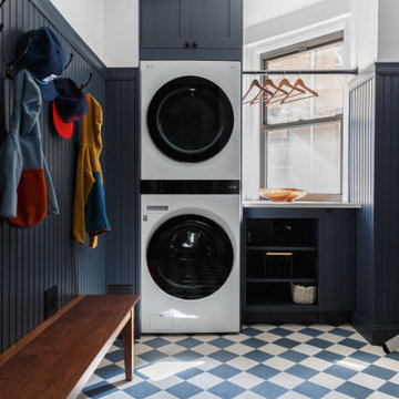
We were approached to build out a new laundry - mud room for a family of five. This space was an old kitchen which had been demolished and left as a blank canvas. The clients wanted a feeling of a custom, yet refined space that reminded them of a trendy suburban home. The clients had some wonderful ideas on how they envisioned the finished space, with a color palate of whites, blues and blacks. The stacked vented washer and dryer along with an abundance of storage was the main focus of the space and all other items had to make those two focus points work well. Gathering their ideas, with an eye on a custom color we were able to create the space that not only captured exactly what the family envisioned design wise but also functioned just as well.
Find the right local pro for your project
 SkB Architects
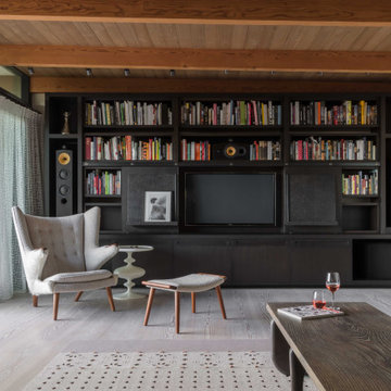
Originally built in 1955, this modest penthouse apartment typified the small, separated living spaces of its era. The design challenge was how to create a home that reflected contemporary taste and the client’s desire for an environment rich in materials and textures. The keys to updating the space were threefold: break down the existing divisions between rooms; emphasize the connection to the adjoining 850-square-foot terrace; and establish an overarching visual harmony for the home through the use of simple, elegant materials.
The renovation preserves and enhances the home’s mid-century roots while bringing the design into the 21st century—appropriate given the apartment’s location just a few blocks from the fairgrounds of the 1962 World’s Fair.
 Marvin
The 2023 Southern Living Idea House is an oasis on the Tennessee hillside. Bill Holloway and Luke Sippel of Lake + Land Studio had the task of building and designing the perfect home for clients who loved dogs, music, and indoor-outdoor living.
The 5,600-square-foot contemporary Southern farmhouse in Leiper’s Fork was intentionally placed to fit the surrounding natural landscape. Holloway and Sippel wanted the home to feel as though it had always been there.
An important element of Southern living was present in the home’s design and build: porches. The home has a large, covered porch that runs the nearly the entire length of the back of the home on the main floor and one on the lower level. Using Marvin Ultimate multi-slide doors on the porch unified the indoor and outdoor spaces. The multi-slide door has the ability for the door to open fully, seamlessly blending the two spaces.
MARVIN PRODUCTS USED:
Elevate Direct Glaze Window
Elevate Casement Window
Elevate Sliding French Door
Elevate French Door
Ultimate Glider Window
Ultimate Multi-Slide Door
Ultimate Outswing Door
Architecture Firm: Lake + Land Studio
Builder: Hatcliff Construction
Interior Design: Laura Hodges Studio
Landscape: Southern Creations Landscaping
Dealer: AVI Windows and Doors
 Kaplan Thompson Architects
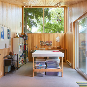
Designed to maximize function with minimal impact, the studio serves up adaptable square footage in a wrapping almost healthy enough to eat.
The open interior space organically transitions from personal to communal with the guidance of an angled roof plane. Beneath the tallest elevation, a sunny workspace awaits creative endeavors. The high ceiling provides room for big ideas in a small space, while a cluster of windows offers a glimpse of the structure’s soaring eave. Solid walls hugging the workspace add both privacy and anchors for wall-mounted storage. Towards the studio’s southern end, the ceiling plane slopes downward into a more intimate gathering space with playfully angled lines.
The building is as sustainable as it is versatile. Its all-wood construction includes interior paneling sourced locally from the Wood Mill of Maine. Lengths of eastern white pine span up to 16 feet to reach from floor to ceiling, creating visual warmth from a material that doubles as a natural insulator. Non-toxic wood fiber insulation, made from sawdust and wax, partners with triple-glazed windows to further insulate against extreme weather. During the winter, the interior temperature is able to reach 70 degrees without any heat on.
As it neared completion, the studio became a family project with Jesse, Betsy, and their kids working together to add the finishing touches. “Our whole life is a bit of an architectural experiment”, says Jesse, “but this has become an incredibly useful space.”
 Marvin
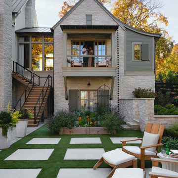
The 2023 Southern Living Idea House is an oasis on the Tennessee hillside. Bill Holloway and Luke Sippel of Lake + Land Studio had the task of building and designing the perfect home for clients who loved dogs, music, and indoor-outdoor living.
The 5,600-square-foot contemporary Southern farmhouse in Leiper’s Fork was intentionally placed to fit the surrounding natural landscape. Holloway and Sippel wanted the home to feel as though it had always been there.
An important element of Southern living was present in the home’s design and build: porches. The home has a large, covered porch that runs the nearly the entire length of the back of the home on the main floor and one on the lower level. Using Marvin Ultimate multi-slide doors on the porch unified the indoor and outdoor spaces. The multi-slide door has the ability for the door to open fully, seamlessly blending the two spaces.
MARVIN PRODUCTS USED:
Elevate Direct Glaze Window
Elevate Casement Window
Elevate Sliding French Door
Elevate French Door
Ultimate Glider Window
Ultimate Multi-Slide Door
Ultimate Outswing Door
Architecture Firm: Lake + Land Studio
Builder: Hatcliff Construction
Interior Design: Laura Hodges Studio
Landscape: Southern Creations Landscaping
Dealer: AVI Windows and Doors

 River Valley Landscapes
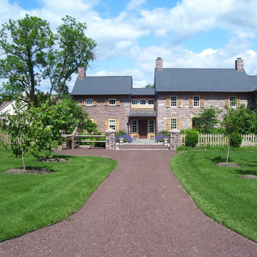
This project presented unique opportunities that are not often found in residential landscaping. The homeowners were not only restoring their 1840's era farmhouse, a piece of their family’s history, but also enlarging and updating the home for modern living. The landscape designers continued this idea by creating a space that is a modern day interpretation of an 1840s era farm rather then a strict recreation. The resulting design combines elements of farm living from that time, as well as acknowledging the property’s history as a horse farm, with staples of 21st century landscapes such as space for outdoor living, lighting, and newer plant varieties.
Guests approach from the main driveway which winds through the property and ends at the main barn. There is secondary gated driveway just for the homeowners. Connected to this main driveway is a narrower gravel lane which leads directly to the residence. The lane passes near fruit trees planted in broken rows to give the illusion that they are the remains of an orchard that once existed on the site. The lane widens at the entrance to the gardens where there is a hitching post built into the fence that surrounds the gardens and a watering trough. The widened section is intended as a place to park a golf cart or, in a nod to the home’s past, tie up horses before entering. The gravel lane passes between two stone pillars and then ends at a square gravel court edged in cobblestones. The gravel court transitions into a wide flagstone walk bordered with yew hedges and lavender leading to the front door.
Directly to the right, upon entering the gravel court, is located a gravel and cobblestone edged walk leading to a secondary entrance into the residence. The walk is gated where it connects with the gravel court to close it off so as not to confuse visitors and guests to the main residence and to emphasize the primary entrance. An area for a bench is provided along this walk to encourage stopping to view and enjoy the gardens.
On either side of the front door, gravel and cobblestone walks branch off into the garden spaces. The one on the right leads to a flagstone with cobblestone border patio space. Since the home has no designated backyard like most modern suburban homes the outdoor living space had to be placed in what would traditionally be thought of as the front of the house. The patio is separated from the entrance walk by the yew hedge and further enclosed by three Amelanchiers and a variety of plantings including modern cultivars of old fashioned plants such as Itea and Hydrangea. A third entrance, the original front door to the 1840’s era section, connects to the patio from the home’s kitchen, making the space ideal for outdoor dining.
The gravel and cobblestone walk branching off to the left of the front door leads to the vegetable and perennial gardens. The idea for the vegetable garden was to recreate the tradition of a kitchen garden which would have been planted close to the residence for easy access. The vegetable garden is surrounded by mixed perennial beds along the inside of the wood picket fence which surrounds the entire garden space. Another area designated for a bench is provided here to encourage stopping and viewing. The home’s original smokehouse, completely restored and used as a garden shed, provides a strong architectural focal point to the vegetable garden. Behind the smokehouse is planted lilacs and other plants to give mass and balance to the corner and help screen the garden from the neighboring subdivision. At the rear corner of the garden a wood arbor was constructed to provide a structure on which to grow grapes or other vines should the homeowners choose to.
The landscape and gardens for this restored farmhouse and property are a thoughtfully designed and planned recreation of a historic landscape reinterpreted for modern living. The idea was to give a sense of timelessness when walking through the gardens as if they had been there for years but had possibly been updated and rejuvenated as lifestyles changed. The attention to materials and craftsmanship blend seamlessly with the residence and insure the gardens and landscape remain an integral part of the property. The farm has been in the homeowner’s family for many years and they are thrilled at the results and happy to see respect given to the home’s history and to its meticulous restoration.
 BK Interior Design
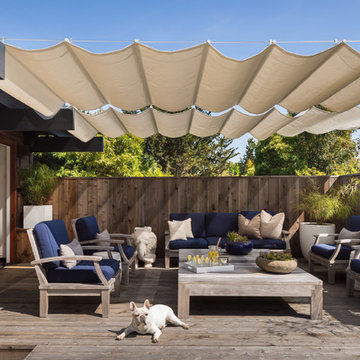
This space is perfect for entertaining! When the owners originally moved in, this deck was not here. There were several steps down from the kitchen door, and the stone slabs were a toe-stubbing minefield.
We added the deck and designed it perfectly for entertaining. Since we had several large pine trees removed from the property, we increased sun exposure creating a need for more shade. We had this awning custom made by PJ Canvas in Santa Rosa, CA. The awning tucks neatly under the roof of the house during the rainy months.
 Corine Maggio Design
This adorable beach cottage is in the heart of the village of La Jolla in San Diego. The goals were to brighten up the space and be the perfect beach get-away for the client whose permanent residence is in Arizona. Some of the ways we achieved the goals was to place an extra high custom board and batten in the great room and by refinishing the kitchen cabinets (which were in excellent shape) white. We created interest through extreme proportions and contrast. Though there are a lot of white elements, they are all offset by a smaller portion of very dark elements. We also played with texture and pattern through wallpaper, natural reclaimed wood elements and rugs. This was all kept in balance by using a simplified color palate minimal layering.
I am so grateful for this client as they were extremely trusting and open to ideas. To see what the space looked like before the remodel you can go to the gallery page of the website www.cmnaturaldesigns.com
Photography by: Chipper Hatter
 Housetrends Magazine
Old fixer-uppers often require two competing levels of priorities from their new homeowners. First and foremost is the need to immediately attend to those repairs that ensure the continued functioning and general well being of the house’s structure. By nature, these usually demand “house on fire!” status, especially when compared to other types of remodeling work that simply enhances aesthetics and general comfort.
In the case of a Delaware couple, a structural issue with the front of their 125 year old Victorian (it was sinking!), along with some other more pressing challenges, put a 13 year long hold on getting the bathroom for which they had long dreamed.
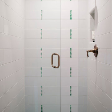
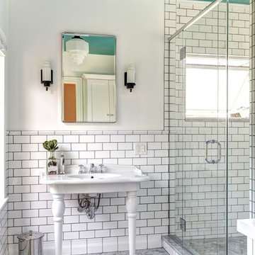
The shower enclosure features a base of hexagon patterned tile, bordered by marble subway tiles.
The shower enclosure features a base of hexagon patterned tile, bordered by marble subway tiles.
By the time Dave Fox Design Build Remodelers was hired to handle the construction, the couple certainly had put plenty of thought into converting a spare second-floor bedroom into the master bath. Courtney Burnett, Fox’s Interior Design Manager on the project, credits the owners for “having great creative minds, with lots of ideas to contribute.” By the time it came to put a formal design plan into place, the client “drove the look while we devised how the space would function.”
It’s worth noting that there are drawbacks in being given too much time for advance planning. Owners’ tastes in design may change, while a steady stream of new fixtures and building products always demand consideration up to the last minute. “We had been collecting ideas for a while…pictures of what we liked, but as it turned out, when it came time to select fixtures, tile, etc., we used little from those pictures,” the owners admit.
A framed herringbone pattern of subway tiles provides a perfect focal point for the shower.
A framed herringbone pattern of subway tiles provides a perfect focal point for the shower.
The finished bath exudes an art deco spirit that isn’t true to the home’s Victorian origins, which Burnett attributes to being more of a reflection of the homeowners’ preferences than the actual era of the structure. Despite that incongruity, everyone feels that they have remained true to the house by selecting vintage style elements, including subway tiles for the walls, hexagonal tile for the floors, and a pedestal sink that served as the focal point for the entire room.
But as with all dreams, once one is achieved, a new one soon beckons. With the bathroom’s strikingly beautiful turquoise paint barely dry, the completion of that long-awaited project has served to kick-start plans for finishing off the remainder of the Victorian’s second floor.
 Corinthian Fine Homes
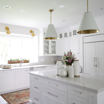
Our busy young homeowners were looking to move back to Indianapolis and considered building new, but they fell in love with the great bones of this Coppergate home. The home reflected different times and different lifestyles and had become poorly suited to contemporary living. We worked with Stacy Thompson of Compass Design for the design and finishing touches on this renovation. The makeover included improving the awkwardness of the front entrance into the dining room, lightening up the staircase with new spindles, treads and a brighter color scheme in the hall. New carpet and hardwoods throughout brought an enhanced consistency through the first floor. We were able to take two separate rooms and create one large sunroom with walls of windows and beautiful natural light to abound, with a custom designed fireplace. The downstairs powder received a much-needed makeover incorporating elegant transitional plumbing and lighting fixtures. In addition, we did a complete top-to-bottom makeover of the kitchen, including custom cabinetry, new appliances and plumbing and lighting fixtures. Soft gray tile and modern quartz countertops bring a clean, bright space for this family to enjoy. This delightful home, with its clean spaces and durable surfaces is a textbook example of how to take a solid but dull abode and turn it into a dream home for a young family.
 Milgard Windows & Doors
The Kiguchi family moved into their Austin, Texas home in 1994. Built in the 1980’s as part of a neighborhood development, they happily raised their family here but longed for something more contemporary. Once they became empty nesters, they decided it was time for a major remodel. After spending many years visiting Austin AIA Home Tours that highlight contemporary residential architecture, they had a lot of ideas and in 2013 were ready to interview architects and get their renovation underway.
The project turned into a major remodel due to an unstable foundation. Architects Ben Arbib and Ed Hughey, of Arbib Hughey Design were hired to solve the structural issue and look for inspiration in the bones of the house, which sat on top of a hillside and was surrounded by great views.
Unfortunately, with the old floor plan, the beautiful views were hidden by small windows that were poorly placed. In order to bring more natural light into the house the window sizes and configurations had to be addressed, all while keeping in mind the homeowners desire for a modern look and feel.
To achieve a more contemporary and sophisticated front of house, a new entry was designed that included removing a two-story bay window and porch. The entrance of the home also became more integrated with the landscape creating a template for new foliage to be planted. Older exterior materials were updated to incorporate a more muted palette of colors with a metal roof, dark grey siding in the back and white stucco in the front. Deep eaves were added over many of the new large windows for clean lines and sun protection.
“Inside it was about opening up the floor plan, expanding the views throughout the house, and updating the material palette to get a modern look that was also warm and inviting,” said Ben from Arbib Hughey Design. “Prior to the remodel, the house had the typical separation of rooms. We removed the walls between them and changed all of the windows to Milgard Thermally Improved Aluminum to connect the inside with the outside. No matter where you are you get nice views and natural light.”
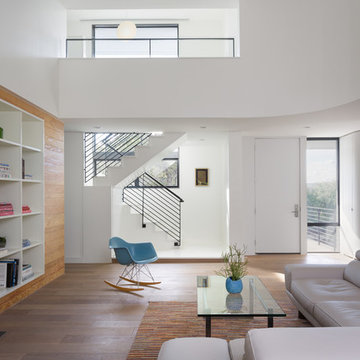
The architects wanted to create some drama, which they accomplished with the window placement and opening up the interior floor plan to an open concept approach. Cabinetry was used to help delineate intimate spaces. To add warmth to an all-white living room, white-washed oak wood floors were installed and pine planks were used around the fireplace. The large windows served as artwork bringing the color of nature into the space.
An octagon shaped, elevated dining room, (named “the turret”), had a big impact on the design of the house. They architects rounded the corners and added larger window openings overlooking a new sunken garden. The great room was also softened by rounding out the corners and that circular theme continued throughout the house, being picked up in skylight wells and kitchen cabinetry. A staircase leading to a catwalk was added and the result was a two-story window wall that flooded the home with natural light.
When asked why Milgard® Thermally Improved Aluminum windows were selected, the architectural team listed many reasons:
1) Aesthetics: “We liked the slim profiles and narrow sightlines. The window frames never get in the way of the view and that was important to us. They also have a very contemporary look that went well with our design.”
2) Options: “We liked that we could get large sliding doors that matched the windows, giving us a very cohesive look and feel throughout the project.”
3) Cost Effective: “Milgard windows are affordable. You get a good product at a good price.”
4) Custom Sizes: “Milgard windows are customizable, which allowed us to get the right window for each location.”
Ready to take on your own traditional to modern home remodeling project? Arbib Hughey Design advises, “Work with a good architect. That means picking a team that is creative, communicative, listens well and is responsive. We think it’s important for an architect to listen to their clients and give them something they want, not something the architect thinks they should have. At the same time you want an architect who is willing and able to think outside the box and offer up design options that you may not have considered. Design is about a lot of back and forth, trying out ideas, getting feedback and trying again.”
The home was completely transformed into a unique, contemporary house perfectly integrated with its site. Internally the home has a natural flow for the occupants and externally it is integrated with the surroundings taking advantage of great natural light. As a side note, it was highly praised as part of the Austin AIA homes tour.

 Advance Design Studio, Ltd.
Jennifer and Dan have lived in their Deer Park Illinois home for 15 years, slowly making minor fixes like painting and decorating; but they had a new plan for their kitchen the entire time. An awkwardly placed garage door, and an island cooktop with a terrible downdraft made a full-scale kitchen remodel an absolute must. Jennifer had many ideas in mind and wanted to work with a company that could provide high-end work, while partnering with a designer that would tailor the kitchen to her ideas.
She was intrigued by the phrase “Common Sense Remodeling” in Advance Design’s feature she discovered while perusing an issue of the community’s Quintessential Barrington Magazine. Doing further research on the company’s website, as she looked through project profiles and read about Advance Design’s “Common Sense Remodeling” philosophy, she promptly scheduled an appointment to see if the people and ideas she read about were truly who they said they were. The more she read, the more she knew that the “Common Sense” approach to remodeling they described was exactly the type of company she was looking for.
The partnership was sealed after an initial consultation with Owner Todd Jurs and Project Designer Michelle Lecinski. They displayed a combination of friendliness, professionalism and respect that was unmatched by any of the other companies Jennifer talked to. She knew that with Advance Design, she would be able to retain the vision that she had in mind with high-quality craftsmanship.
“I reached out to Advance Design because of the ‘Common Sense Remodeling’ tagline,” Jennifer said. “That’s what lingered for me”. “Advance Design was the most respectful- of the house and of my design ideas, and the most professional of the handful of companies that looked at my project”.
Soon after the meeting Jennifer began working with Michelle on the project design. They quickly developed chemistry. Jennifer loved how Michelle researched and located every detail that Jennifer wanted for the kitchen. Between the two of them, every concept and idea was worked through and perfected. “Jennifer had definite ideas about what she wanted the new kitchen to look like, she just didn’t know how to bring it all together. We worked together really well to make her ideas into the practical reality necessary for a well-functioning kitchen, with the look and feel that she had envisioned”, says Michelle.
“Michelle was wonderful in using the CAD system she would show me new drawings every time we changed the layout while working through the design,” Jennifer said. “She was a really wonderful partner in execution, she made sure everything happened quickly and easily.”
The finished design drew out elements of Jennifer’s style and personality. The pair call the look “sophisticated farmhouse” to describe the kitchen renovation to family and friends. The result was a beautifully crafted, authentic-feeling space that satisfied Jennifer’s dreams 15 years in the making. The whole project consisted of a kitchen remodel, mudroom upgrade with powder room, and garage entry relocation. “The projects I personally like the best, are the ones that put the client’s dreams on display,” Project Designer Michelle said. “And this is one of those projects.”
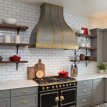
The main focal point of the kitchen is custom zinc and brass ventilation hood with a vintage sheen, which was hand made to order by a small company in Indiana named Vogler Metalworking. “It’s like sculpture, a true work of art”, says Jennifer. Your eye is immediately drawn towards this elegant yet practical hood that eliminated the home’s downdraft problem and added a striking conversation piece at the same time. The carpenters had to use special gloves when transporting and installing it, so they didn’t smudge it with fingerprints. The beautiful hood centers proudly over the stunning black enamel and brass LaCornue Range. “I had a friend who had a LaCornue range and after learning how easy it was to cook perfect meals, I was convinced I wanted to have one”, says Jennifer. This unique, breathtaking combination anchors the entire kitchen and is apparent immediately as you walk into the great room the surrounds the space.
DuraSupreme Crestwood cabinets with a Kendall Panel add function and sophistication. A custom gray paint color paired with a storm blue was developed so that the new kitchen looked like it belonged to the existing space. Unlacquered brass faucets and hardware were important to Jennifer because she wanted the living finishes to age over time. Remarkable brass diamond mesh cabinet door inserts imported from the UK continue to add this one-of-a-kind kitchen renovation; giving it a “you won’t see this everywhere” quality. The use of old railcar flooring for the coffee bar countertop and reclaimed oak for the open shelving gives an authenticity to the space uncommon in kitchens today.
Jennifer and Michelle fell in love with the Limestone Grey Stone while they were investigating unique island countertop ideas. They liked the fact that the limestone as a living finish will age and change over time. Calcutta Miel Quartz countertops made for an excellent pairing around the perimeter, as it’s durable and perfect for cooking preparations. A textured white subway tile backsplash that runs to the ceiling keeps your eye moving towards the open shelving, and to the main focal point of the stunning range hood combination.
“The kitchen functions beautifully, and it’s gorgeous,” beams Jennifer as she gestures with both hands while smiling ear to ear. “The most important thing was I wanted a kitchen that had a wonderful flow, cooked beautiful meals and was a great gathering place for family and friends, and this space does that perfectly! Beauty wise, it turned out exactly how I had envisioned. I felt the function part was the hardest part, and that was nailed”!
Relocating the garage entry to the new mudroom was a huge priority and has finally separated the family’s arriving home functions from their kitchen. Now coats and shoes and bags have their own area for dropping once members arrive home. Matching gray DuraSupreme cabinetry helped create gorgeous, purposeful lockers for the family. A reclaimed vintage sink and custom wall paper were added to the tiny powder room to beautify the once previously only functional space. Advance Design was even able to create a custom space for their dog to sleep while the family is away.
“It was unbelievable that a project of this size was completed in such a short time, and I think that’s because of the large amount of planning and preparation that went into it,” Jennifer marveled, “When we started, we were ready, and everything was prepared”.
When it came to execution, Project Manager Justin Davis and his crew were quick, accessible, and organized. Projects like this kitchen are typically completed in as little as 8-10 weeks. Jennifer’s kitchen however despite the relocation of some challenging HVAC in a soffit and moving of an exterior door was completed remarkably fast in part because the team was working with an existing tile floor that ran throughout the first floor that the client really loved.
“You get to know these people really well because they’re living in your house while you’re living in your house. They were so fast and really good, it didn’t take as long as even planned” reported Jennifer. “I would text Justin and he always responded almost immediately. I got to know all the guys who were working in our house and they were all wonderful people”.
Details in a customized kitchen like this one require skill and care from the people who install it. “All the guys on the job were skilled at what the did. I wanted small details like little feet to look like furniture, that is where their carpentry skill came in to make these all perfect”, said Jennifer. “The tile guys were wonderful. They even let me determine how I wanted the texture with the grout to appear for a salt and pepper look; now that is a very skilled trade person making it custom”.
In Jennifer’s interview, she continued to reference Advance Design’s “Common Sense Remodeling”, so I took a minute to ask her exactly what that phrase meant to her and how it played out in her experience with her project and the Advance Design team. Here is what she said: “I was intrigued about Common Sense Remodeling and in my head that there would be clear costs and prices, great communication between the design team, the execution team and me”, said Jennifer. They did deliver on that, it was so clear about the cost breakdown, what I could expect from everyone who came to my house, and everything that we had ordered. That to me is the Common Sense”!
It’s great to see a client take literally our assertion that a well-planned remodeling project is simply “Common Sense”! She anticipated each step of the way would be clear, concise, and predictable, all the while protecting the outcome due to the careful upfront planning. “Advance Design delivered on their ‘Common Sense Remodeling’ promise,” Jennifer said. “From the design team, to the execution team - everything was straight forward like I imagined. The project turned out exactly how I envisioned, I enjoyed this process and absolutely would recommend Advance Design Studio to anyone.”
 TKS Design Group
Free ebook, Creating the Ideal Kitchen. DOWNLOAD NOW
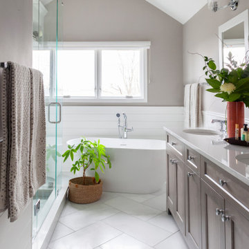
This client came to us wanting some help with updating the master bath in their home. Their primary goals were to increase the size of the shower, add a rain head, add a freestanding tub and overall freshen the feel of the space.
The existing layout of the bath worked well, so we left the basic footprint the same, but increased the size of the shower and added a freestanding tub on a bit of an angle which allowed for some additional storage.
One of the most important things on the wish list was adding a rainhead in the shower, but this was not an easy task with the angled ceiling. We came up with the solution of using an extra long wall-mounted shower arm that was reinforced with a meal bracket attached the ceiling. This did the trick, and no extra framing or insulation was required to make it work.
The materials selected for the space are classic and fresh. Large format white oriental marble is used throughout the bath, on the floor in a herrinbone pattern and in a staggered brick pattern on the walls. Alder cabinets with a gray stain contrast nicely with the white marble, while shiplap detail helps unify the space and gives it a casual and cozy vibe. Storage solutions include an area for towels and other necessities at the foot of the tub, roll out shelves and out storage in the vanities and a custom niche and shaving ledge in the shower. We love how just a few simple changes can make such a great impact!
Designed by: Susan Klimala, CKBD
Photography by: LOMA Studios
For more information on kitchen and bath design ideas go to: www.kitchenstudio-ge.com
 Starr Homes
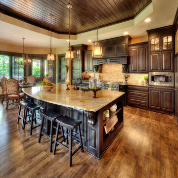
Large tuscan l-shaped kitchen photo in Kansas City with an undermount sink, raised-panel cabinets, dark wood cabinets, granite countertops, beige backsplash, stainless steel appliances and an island
 NJ Kitchens and Baths
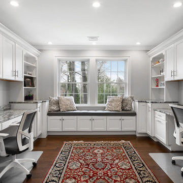
Our client was so happy with her kitchen she came back to NJ Kitchens And Baths to help her design her new home office. She needed 2 work areas. Considering the space in the room, I thought it would be a great idea to add a window seat that separated the work areas and create a calming space to relax or read.
Sponsored
Delaware, OH

Buckeye Basements, Inc.
Central Ohio's Basement Finishing ExpertsBest Of Houzz '13-'21
 Tapestry Landscape Architecture
Tim Kuder
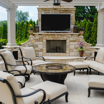
Inspiration for a mediterranean patio remodel in New York with a pergola and a fireplace
Inspiration for a mediterranean patio remodel in New York with a pergola and a fireplace
 Dream Coast Builders
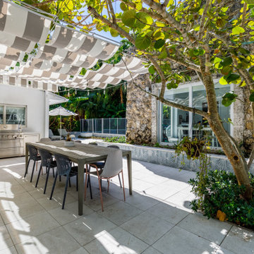
Welcome to DreamCoast Builders, where we turn your home dreams into unique realities. From Clearwater Fl. to Tampa and the 33756 area, we specialize in remodeling, custom homes, and home additions that stand out. Picture your modern house with a captivating swimming pool, complemented by lush artificial grass in the backyard. Our attention to detail ensures every aspect, from interior ideas to outdoor amenities like pool umbrellas and wave shades, reflects your individual style. Let us create a home that's as unique as you are. Contact us today and make your dream home a reality
 Haven Design and Construction
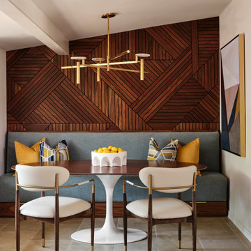
One functional challenge was that the home did not have a pantry. MCM closets were historically smaller than the walk-in closets and pantries of today. So, we printed out the home’s floorplan and began sketching ideas. The breakfast area was quite large, and it backed up to the primary bath on one side and it also adjoined the main hallway. We decided to reconfigure the large breakfast area by making part of it into a new walk-in pantry. This gave us the extra space we needed to create a new main hallway, enough space for a spacious walk-in pantry, and finally, we had enough space remaining in the breakfast area to add a cozy built-in walnut dining bench. Above the new dining bench, we designed and incorporated a geometric walnut accent wall to add warmth and texture.
1