Software
Houzz Logo Print
mallyyyyd

Color Suggestions Needed!

14 years ago
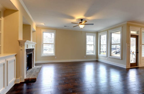
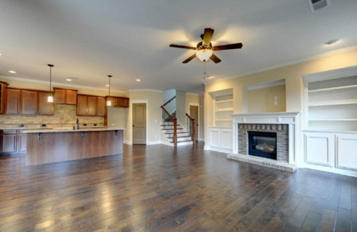
I need help deciding on a color for our open living room/kitchen/eat in nook in our new home. I am going to keep everything that's white currently white but I want to warm up the area. I have been thinking blue but I am afraid to go too dark but don't want too much of a "baby boy blue." I was thinking a nice blue/gray but can't commit. The house is a craftsman, my sofas are a light cream color, my coffee table is a dark mahogany and I plan to add some mercury glass lamps in the living area. I plan to add pops of color to the room so I don't want the color to be too much.

Any advice would be appreciated!

Thank you!

Comments (48)

  • PRO
    14 years ago
    last modified: 14 years ago
    Hi mallyyyyd, your new home has beautiful neutral colors and finishes. I think you should hold off on painting the walls until you place all the furniture and live in there for a while to see sun patterns / shades in the room. You can always add color through accessories and if that doesn't work for you, then go ahead and pick a color for the walls. Have fun decorating.
  • PRO
    14 years ago
    You have a beautiful house there and yes I do see the craftsman details. When you do decide to paint try these two favorites of mine for craftsman homes. Clarksville Gray HC-102 and Gray Mirage 2142-40, both by Benjamin Moore. Hope that helps. Good luck with your project. Charmean Neithart
  • PRO
    14 years ago
    It looks to me like your granite and backsplash are warmer colors. I would suggest more of a green tha the blue. It can be a green-gray. But the blue gray family is not always a great color for a kitchen. Whatever you select should work with the granite and tile.
  • 14 years ago
    Thank you all so much for your suggestions! As a first time homebuyer, I'm nervous to mess this up and my husband is starting to get tired of my hour long trips to the paint store!

    I'm not much of a green fan so I was trying to stay away from it. I'm starting to think a gray would be a good option but are there other colors (other than green) that I should consider? The backsplash does have some brown warm colors in it and the doors look green but are actually a gray/brown.
  • PRO
    14 years ago
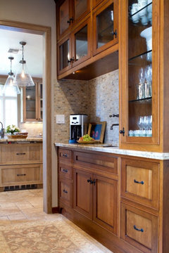
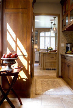
    Here is a butler's pantry that I did that has similar colors to your kitchen. The cabinets have a similar shaker detail and they also have a cherry shading to them. I used beiges and grays on flooring and walls. The color I used here on the walls is Pismo Dunes AC-32 by Benjamin Moore. Gray looks fabulous with cherry, so do some shades of green (olives). Gray and cherry have a very sleek and modern look when paired together with the right details. Pismo Dunes is a gray with lots of beige undertones so it works well with the noche travertine on the floor. These colors will all look great in your kitchen. Hope it helps to see it all together. I also agree that blue is not the right color for a craftsman kitchen. Good luck. Charmean
  • 14 years ago
    I agree with the others. Keep it neutral with gray, which will further accent the stainless.
  • PRO
    14 years ago
    How about a soft slate blue? You can go to a Benjamin Moore Store and purchase small sample containers for about $ 2.00, I would paint several areas to see how the color looks in different lights, I wouldnt go too dark, nor too lite and tie all together when you do drapes and accessories.
  • 14 years ago
    last modified: 14 years ago
    Your kitchen and family room is large - so I think it can afford a little bit of a drama color -- have a look at " Amsterdam " by Benjamin Moore -- it's a greyed down blue and it's beautiful . Get the color card to try in the room before you commit if you like it . I think it will go with what you said you have. Be brave - it's only paint . First I have to say - wall color is the LAST thing to pick out . The curtains and upholstered furniture and rug should be the first picks - starting with the rug first. And work on your furniture layout plan.It will be a big help. I love the room !
  • 14 years ago
    I don't think you're going to warm up the room by painting it blue or gray. There are some warm gray colors, but they won't be warmer than what's currently on the walls.
  • 14 years ago
    your space is beautiful, and offers many colour choices based on your personal taste
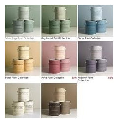
    attached is a blue grey pallet, as well as a selection of various combinations that you can use . Try painting walls various tones of the same colour family based on the lighting and depth of the room to create interest
  • 14 years ago
    The lovely colors you already have brought to mind this inspiration.
    http://design-seeds.com/index.php/home/entry/feathered-tones1
  • PRO
    14 years ago
    If you're looking for more information, here's a great article … just Google ... Yahoo! The Color Perfect: Finding The Perfect Colors For Your Furniture, Flooring, Walls, And Accessories … It's an easy read with lots of tips you can use on the subject.
  • 14 years ago
    Benjamin Moore - Wythe Blue - HC-143 - blue/green/gray - give that a try
  • 14 years ago
    Benjamin Moore HC35, Powell Buff accented with HC25, Quincy Tan. Very light shades of gold that will go with your granite and tile.
  • 14 years ago
    If you have a Sherwin Williams store nearby, you can purchase a $10 fan deck of all the colors, look at them in your room, and you can even order online 8.5x11 sheets of the individual colors you're intested in (to carefully tape onto the wall and look at during different times of day for the changes of lighting on your walls.) I'm a strong proponent of Sherwin Williams paints because they have proven truer colorfastness -- all depends on whether you even have access to a Sherwin Williams store. But even if you don't, you could use the online tools and order (free and free shipping) the color sheets (btw, I would order 10 of each color you like- you're not limited.) If you like one of their colors, you can have it matched by BM if you don't have access to SW. I went through this process with my living room which connects to my kitchen, and SW has tons of beautiful blue/grey combinations that are sophisticated and thrilling! Good luck and have fun with the process!
  • 14 years ago
    I am going thru the very same thing; for over a year. Splotches of paint on the walls and still can't make up my mind. Haven't been to Sherwin Williams but will get on it.
  • 14 years ago
    I think warm colors are more liveable in the main areas of the home. I love the grey-blue color, however, I would reserve that for the bedroom, bathroom or office, due to it's serene calming feel. It would make your kitchen and main room feel sterile and unwelcoming. I think muted warm colors would be beautiful in your home. Bold, highly saturated color is fun, but when painted all-over, it causes anxiety. Buy samples of muted yellows, greens and taupes. Paint samples on all the walls and observe how they change throughout the day. Pick one you feel comfortable with. If you crave a bold color, paint one accent wall and then carry it through with your decor.
  • 14 years ago
    You can get a color fan deck from any paint store but you don't need one .. Look at the new Affinity colors from Benjamin Moore. Best paint colors I've seen in a long time . I'am sure you will find your color there.Don't over think it -- it's only paint and everyone repaints in 3 to 5 years anyway. Have fun with it !
  • 14 years ago
    last modified: 14 years ago
    First of all, your huge room is beautiful!!! We just remodeled our kitchen and our colors are very similar to yours. I found a Benjamin Moore color that is perfect for our house and I think you should give it a try.......it's called Berkshire Beige (the name is dull - the paint is not!) . It's a taupe with a sage green undertone......not too dark, not too light. Sooooo pretty!!
  • 14 years ago
    I love blue, but am not feeling it for that space with all of the warm browns. Consider pulling a color from the brick around the fireplace or from the backsplash. If you want it to feel cozy, take it directly. If you want it lighter, just go up a shade or two.
  • PRO
    14 years ago
    Thank you all for your color picks, I have written them down for my own home. I will check out the Benjamin Moore. I love this site!
  • 14 years ago
    last modified: 14 years ago
    You have a lovely home. I think the feel that these rooms need warming comes from the grey tones in your white ceiling paint. 70% of the light in a room gets bounced off of the ceiling. I would just paint the ceilings a warmer shade of white.
  • 14 years ago
    I love the colors you have in this large, open, gorgeous space, but like you, I love color on the walls. I found "neutral" greens and blues for my home and smile every time I walk in.

    I used Behr "Gray Morning" in my spare room which has white and dark brown furniture and dark brown leather couch. It's beautiful and if I had your space I'd use a lighter version of it. I wish I could upload a picture of it but this site doesn't seem to like my iPad.

    Because you like the blue gray, you might want to start by using it for your accent colors. A large Area rug, creme curtains with the the blue gray incorporated via stripes or abstract, pillows on your couch, ceramics in your kitchen and on the built-in shelves.

    Paint is relatively cheap. Here's what I would do: Buy a gallon of the color and put it on the small wall around the door next to the staircase to see how it feels. It's easy to repaint if you decide you want something else.

    I hope you update us on your progress.
  • PRO
    14 years ago
    Unless you are strongly drawn to a certain color family and have "always wanted to use it," I wouldn't paint the kitchen AT ALL until you have furnishings in the space. The wall color should be one of the last things chosen. Wood tables and glass lamps won't influence a color choice - but decor items like rugs, accent pillows, curtains or art will.

    If you have those things already, pull a color from one of them to use in the kitchen, assuming it blends ok with the tile and countertop.

    If not, and you are determined to paint, I'd repeat a color from your tile backsplash.

    Your space looks lovely, btw, and I feel certain it will all come together nicely. Just take your time, and good luck with it.
  • PRO
    14 years ago
    Ben Moore's affinity collection or Porter Paint's Atmospheric collection really narrow the choices to livable yummy colors that all work well together. You can consult professionals. Most paint stores, BM, Porter and Sherwin Williams have designers you can have come to your home. In our area of St. Louis, you can pay $50 and it goes towards your paint purchase. Or consult a designer for a consultation.
  • PRO
    14 years ago
    Juli is right -- that's what my article teaches people. You really need a multi-color inspiration point to find the perfect wall color. Good advice Juli -- although some of the color suggestion above are well worth considering.
  • PRO
    14 years ago
    last modified: 14 years ago
    Hi Mallyyyd!
    OK, you have 26 opinions/thoughts of colors that you should paint your walls. Some based on the architecture, some on the color of your backsplash and most based on what is seen as safe and all over the Decor Magazines! Only one person (Juli) brought up the point that you should have all your furnishings in before choosing your paint colors! I'm guessing that you would like to paint before you get your items in, but if you take the advice of others, your home will look as if you just went with the builder's paint regardless of what color you choose! Even if you are planning to buy new furniture... go find what you LOVE first and then work on colors that will enhance the overall home.
    The trained eye will see a furnished and accessorized room as a collection of colors, the perfect paint color can bring all the pieces and colors together for a beautiful result if done correctly. It is imperative that you have all the players in place before you choose the paint colors and I promise you will love your room!
  • PRO
    14 years ago
    Perfectly said, Everyday Elegance!
  • 14 years ago
    to everyday elegance - it is obvious that you did not read all the other comments - you are not the first one to give that advice. That was said in the first few comments and I don't think you made note of the things she was keeping in the way of furniture etc.
  • PRO
    14 years ago
    last modified: 14 years ago
    I say paint is always the last thing you choose. Why? because it is the easiest thing to choose...the selection is endless and you can even create a custom color. And because you have a better idea of what furniture and fabric pieces do to complete the space. Wall paint is just a backdrop to those pieces. You can do a neutral color, but you may miss an opportunity for something other than neutral, if you choose your paint first. Further, neutrals are not all alike. I learned this many years ago when I did my bedroom. I painted a taupe on the wall, but darn if I could find the right bit of taupe in a bedspread. Not all taupes are alike, some a little greenish, some a little brownish. I ended up finding the right bedspread, but had to pay a lot more for it. Other less expensive ones could have worked if it had not painted my walls first. Let the more expensive items drive decisions. Most of my clients call me to pick paint first...I always have to reorder their priorities.
  • PRO
    14 years ago
    last modified: 14 years ago
    To Lefty 47 Lynda,

    Please accept my apologies, it was not my intention to offend you or any others. I would normally let this go, but in "two" of your comments on this discussion you started off with color recommendations before mentioning, "Color is the LAST thing to pick out." In your last comment you also stated, "Don't over think it -- it's only paint and everyone repaints in 3 to 5 years anyway."

    Dear Mallyyyyd,
    Please "over think it"! Save yourself from the frustrations and/or expense of repainting. There are many different undertones in creams and whites and any color (neutrals) for that matter. As I stated earlier, "The trained eye will see a furnished and accessorized room as a collection of colors, the perfect paint color can bring all the pieces and colors together for a beautiful result if done correctly."
    Best of Luck!
  • 14 years ago
    Hello everyone,

    Emily here, Community Manager at Houzz. I am thrilled to see you pitching in all over the discussions with ideas and help. Let's remember that as individuals we are bound to have differing opinions. It's always important to respect those differences and be kind to each other. If you disagree with a suggestion, the best way to handle it is to make one you *do* agree with.

    Remember we are all here because we have a passion for design and want to help our fellow Houzzers. We don't have to agree, but we do need to be polite. Now...let's have some fun guys! This kitchen is going to be fabulous. :)
  • PRO
    14 years ago
    Emily, thank you for the guidance. You are absolutely correct! Forgive my careless way in which I framed my comment. I only meant to support their opinions, but in no way meant to dis the absolutely great commentary offered by everyone. I love the spirit of Houzz and hope to add to the conversation in a constructive way.
  • 14 years ago
    Thank you all for your wonderful advice and opinions!! They have all been so helpful and I love how passionate you are about design. It has truly inspired me. I promise to post an update in the next few weeks sharing our progress. Happy decorating to all!
  • PRO
    14 years ago
    last modified: 14 years ago
    This is so entertaining, who knew? I have to put my two cents in for Everyday Elegance. They are right on the money with their direction! If anyone was out of line it was Lefty Lynda, very defensive and based on her comments, she should be. Don't stop Everyday Elegance, you are the Simon Cowell of Design and I can't wait to read more of your comments. I am new to this site, but I believe you call this a discussion, Community Manager.
  • 14 years ago
    I have an open Kitchen/ living/ dining room that has west, north and south light exposure and painted the entire area Horizon Silver Spree. It is a beautiful warm, light grey that looks good in any light, blends well with other neutral colors as well as color pops. I have been living with the color for 3 years now and haven't gotten tired of it yet. I have attached the link to the color swatch online here- http://www.myperfectcolor.com/Cloverdale-Color-Matches/88.htm/page/4
  • 14 years ago
    I guess because I'm not a designer, I consider walls a back drop. As a senior citizen, (and long time renter) and new owner of her first home, I wanted the beige gone before I moved in. I have green walls in most rooms and none of my furniture, pillows, or accessories include the same color. I think my earth tone neutral soft surfaces, eccentric art, and deep brown (and teak and various other wood tones) hard surfaces look great. My rooms might feel chaotic to some, but I feel peaceful in them. The point being? "decorate for how you live, not for company". I chose colors based on what I love and what worked with the flooring, and it worked for me. Beginners luck? My recommendation; read all the comments, consider what will work for you, make a decision, and enjoy. Decorating is a creative process, and like life it is a journey.

    I agree about getting some guidance from an interior designer. I worked with one in choosing window coverings and will seek her advice to create a bit more harmony in each room while incorporating my eccentricities. My understanding is that most designers are happy to provide this service. It was fun and educational talking to a professional as she guided me through the process of color and shape.
  • PRO
    14 years ago
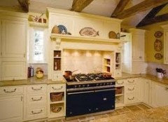
    I agree with Marie,,,and Julie. Color is the last thing you choose. Select pieces you like, clip rooms you like from magazines and note that you said you want a little color to "warm" the space. Reds and yellows are warm colors, blues and greens are cool colors. You can also use more than one color and wallpapers are great in kitchens and dens...something cheerful with a light background. or go cream with a yellow pale buttery base, not beige and consider lightening the island to set it apart and lighten the room, see photo... a good designer will help, even if you only get consultation.
  • 14 years ago
    One more point that I should've made first---- THE most important reason to choose a specific color is because it will influence the way you FEEL in the room. This is the most wonderful quality of colors-- to effect your affect! You're drawn to the gray/blues, this tells me you want to feel restful, cool, basically express your feeling of freedom and restfullness in this room rather than encouraging strong emotions (the influence of warm colors like yellow, orange, reds).

    So your color choice (how you want to feel in that room) needs to drive your choices thereafter. In my opinion, the very first choice to make in a room before purchasing accessories that will include color.
  • 14 years ago
    Stay in the green family of color.
  • 14 years ago
    Bring in your belongings. Find a great painting or pillow that you love and that is your beginning. Everything is so neutral that you can go anywhere. Also it is just paint, it can be changed. Don't be afraid, trust yourself.
  • 14 years ago
    Your house is beautiful. I painted my open floor plan gray and installed hardwood floors recently. My floors are a dark red walnut stain, so reddish brown and I bought a soft gold rug and my couch is a stone white or very neutral. I have pops of color and silver with gold wash accent pieces, like Mercury glass candle sticks. Soft gold cane in one of my dark walnut furniture pieces and I even have a table or two in a light wash wood.

    It's eclectic, modern and transitional.

    I don't think you want blue in that room, too limiting. You don't like green so stay away from greenish gray. I think a taupe gray like the Pismo Dunes suggested would be pretty, but if you are like me you want something not expected, to get away from the beige and taupe country estate feel.

    I would strongly suggest you paint some sample boards and try them on various walls, light changes paint color and don't go by a swatch.

    I tried so many grays, very difficult to get a neutral beige. To go with your reddish floor, the gold in your kitchen, your mahogany furniture, try Baltic Gray by Benjamin Moore and keep it a flat sheen, gray does not look great in eggshelll.

    I used the Aria Paint by Benjamin Moore in Matte which is a step up from flat in sheen. Aria is washable, covers well and is rated the highest against fading. Get a painter who has used it before. Unlike traditional paint, you cut the walls and let that dry
    before painting the walls, a good painter using a low nap roller can get it done in one coat with touching it up after dry

    Baltic Gray has a slight warm tone you're looking for, but feels modern. I love it!!
  • 14 years ago
    Auto correct put the word beige in place of gray. Sorry. You'll find many grays are either too lavender, too blue, way too brown or green. Baltic Gray goes with brights, soft golds, metallics and is just warm enough to go with whites and red or dark
  • 14 years ago
    Oh, forgot to mention I have vaulted ceilings, yours looks high. I used flat ceiling paint mixed 25% Baltic Gray to keep the same tones.
  • 14 years ago
    I have another suggestion. If you want to have fun and make a dramatic statement, choose a color for accent and paint only the back of those shelves surrounding your fireplace, and you could carry that theme to the paneling in your dining room. You could choose a darker charcoal gray (which is what I did) or a beautiful bright like Turquoise, or a mushroom shade would be cool. Let us know what you decide!
  • 11 years ago
    last modified: 11 years ago

    This is an old post but after reading the thread I thought I'd chime in from the perspective of a client with zero skills in design or choosing colors.

    When we first purchased our home most of the walls were a pinky white/beigish pukey color, and some others were obnoxious kids room blue, etc. -just awful colors that I didn't want to look at even temporarily.

    We hadn't chosen any furniture for our place yet and that was going to take time.... So....

    My interior designer had me paint everything BM Linen White (his go-to white) - my choice to paint before we picked out furniture.

    It was just a quick fix and then after we chose all of our furniture, only then did he give us our actual paint colors.

    Warm or cool and undertones matter in relation to your home and your furnishings AND the lighting in your home.

  • 11 years ago

    wow! lots of advice...I haven't read most of them, I confess....but, you mentioned wanting a blue. blue can be tricky and can easily look like baby boy nursery blue. so go for a gray with blue in it, which is much more subdued and sophisticated. in my kitchen I used california paint's "tudor ice" which is very similar to benjamin moore's "woodlawn blue". also look at han "wedgewood gray" from the same BM color strip, it is also a great shade. these colors are actually room brightening shades that will play nicely against the wood tones and browns. then be sure to add some black into the space...maybe with some barstools, curtain rods, etc. you have a great space!!