Software
Houzz Logo Print
hzdeleted_4791535

Inglewood Kitchen

11 years ago
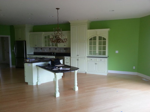
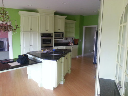
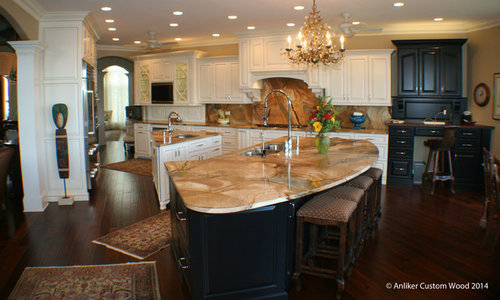
The homeowners bought a house and the kitchen had bright green walls and the cabinets didn't fill the room. Now the cabinets are a beautiful white with a brown, pencil style glaze highlighting the profiles. The counter tops are an intense granite with lots of movement and emotion. The larger island is black and the desk area is black with a walnut top that matches the hardwood floors. Under cabinet lighting and above cabinet lighting create illumination and the display cabinet's curved mullions and glass panel doors showcase various items.

Comments (44)

  • PRO
    11 years ago
    Interesting shape for islands! Nice updates!
    User thanked SoCal Contractor
  • PRO
    11 years ago
    Love the island! And that you kept the chandelier- great job!
    User thanked Custom Design & Construction
  • 11 years ago
    Nice new look, but I worry about tripping on the rugs while carrying a hot pot full of pasta.
    User thanked pcmom1
  • PRO
    11 years ago
    Beautiful job!
    User thanked Madden, Slick & Bontempo, Inc
  • PRO
    11 years ago
    @SoCal: the room is wedge shaped. The wall you can't see (starts by the clock and comes to right behind the photographer) is curved. The curve on the large island keeps that curve and the ends of the islands are parallel to each side wall, thus keeping aisle ways the same width. Lot's of interesting geometry on this one.
  • 11 years ago
    wow! like the 2 Islands forming such a interesting shape! very pleasing to the eye. i dont love the rugs though, it takes away the Quality look of it and as pcmom1 commented, i dont think it's that functional.
  • 11 years ago
    Personally don't like the 2 islands, or the rugs. Back splash the same as counter is too busy. 3 stools not 4
  • 11 years ago
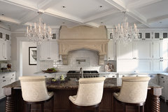
    Since the kitchen is elegant and the island has a curve, I think three of these stools instead:
    Historic St. Paul Kitchen and Mudroom Addition/Renovation · More Info
    User thanked pcmom1
  • PRO
    11 years ago
    That looks about a million times better.
    User thanked 123 Remodeling Inc.
  • PRO
    11 years ago
    So beautifully done, barely looks like the same space.
    User thanked Interior Affairs -- Vickie Daeley
  • PRO
    11 years ago
    Very nice use of an odd space! Job well done!
  • 11 years ago
    Awesome
  • 11 years ago
    Big improvement, hard to really get the true feeling of the various islands, it chops up the space to much, but could just be the photos. Personally, I love when the same counter material is used in the back splash, especially in smaller areas. The look is clean and with task lighting is gorgeous. I also have to agree, cut out the rugs. I know why you have them, but these are to big and really distract from the beauty of the kitchen.
  • 11 years ago
    Not for me but an improvement over what was there.
  • 11 years ago
    LOVE the white/off white kitchens! Bright, happy, breezy! Nice change!
  • 11 years ago
    last modified: 11 years ago
    I absolutely love everything about it but it's waaaay too big for me - you'd need running shoes to prepare a meal
  • PRO
    11 years ago
    Was there a special on light cans, buy a dozen, get a dozen free? Plus a chandelier and two ceiling fans? Seriously? On a more positive note, I like the "movement" in the pattern of the granite. I also like how it appears that the same flooring is continued throughout the main spaces! (using different flooring in rooms that are open to each other, looks way too much like a flooring showroom to me.)
  • 11 years ago
    ^^^the can lights are in the first picture^^^
  • 11 years ago
    Very nice... What are the counters?
  • 11 years ago
    Wow! Gorgeous.
  • PRO
    11 years ago
    Wow! Great improvement! Good for you!
  • 11 years ago
    I love the contrast of the dark Island & what looks like a desk - breaks up all the white. Really glad the "green" walls are gone! :)
  • 11 years ago
    Fabulous kitchen. what is the name of the granite?
  • 11 years ago
    last modified: 11 years ago
    I don't see one thing wrong with having canned lights, ceiling fans and a beautiful chandelier. It's about efficiency and comfort. I'm about to have a fan put in my kitchen too. It gets hot when lots of cooking is going on and usually the kitchen is the gathering spot when big dinners are going on. Ceiling fans move that heat out of the kitchen so it is at least bearable to enjoy visiting and cooking at the same time. The lights.....well, isn't it nice to have a well-lit kitchen? Want more of an intimate atmosphere? Turn off the canned lights and have only the chandelier turned on. Just remember, it is a must to have a dimmer switch on that chandelier too! ;-)
  • 11 years ago
    It looks like you removed the charming fireplace in the uber-pink room just beyond. Pity. The kitchen is gorgeous and not your cookie-cutter boring white kitchen thanks to the fabulous countertop/backsplash. Great idea with the oddly shaped island. I love a chandelier in the kitchen! Stunning job.
  • 11 years ago
    Oh and sheesh with those "before" walls, I'll bet you had to paint over a lot of walls in that house.
  • 11 years ago
    Very nice transformation and use of the space.
  • 11 years ago
    Gorgeous!! Before was harsh. After soft and elegant!
  • PRO
    11 years ago
    Nice job, Bob!
  • 11 years ago
    Love the granite!
  • 11 years ago
    Some fresh paint, artwork and a pantry with elegant barstools would have made a huge difference! Guess some people have money to burn!
  • 11 years ago
    Oh my gosh this project had to be a bit overwhelming! The size and the shape must have been a real challenge. I agree with the ceiling fan comment. I only have one in my loft. When I moved in I said it has to go. As soon as summer hit I was saying ya know lets just paint it black. I now love it!!! It looks great and it's left on constantly for 4 months. It keeps the place very comfortable.
  • 11 years ago
    One Long Island would look better, get rid of the busy back splash, it's trendy and will be "out" by next year. The color is great....love the chandelier...
  • 11 years ago
    It seems very odd to me that some folks feel the need to criticize the finished work that folks have just completed. Whats the point?
  • 11 years ago
    Some of these comments are just mean. If you notice, the poster of these pictures is the cabinet designer, so lighting design, rugs and bar stools are not in their purview. This kitchen is not my personal taste but I can appreciate the wonderful work that was done and how much it has improved. This is a challenging space because of the shape and I think the cabinetry solutions are great. Good job.
    User thanked mrssan
  • PRO
    11 years ago
    Thanks for the comments. We have thick skin! :-) And, yes, we had no control over the rugs, lights, etc. Actually, we did not even have full control over the cabinets! But she is very happy, which is the key matter. And some things are judgment calls. I would not have gone with that granite, but she loves it and if you know her, you would know why she likes it. The cabinet/island design layout works off of the windows you do not see, Starting from the black desk area to a point behind the photographer's back on the last photo is a bank of windows on an arc. The whole room is pie-shaped. We widened the door leading into the dining room and made the island perimeter lines offset from the room outline. Hence the shape of the islands. Thanks, all, and have a wonder time on Houzz!
  • 11 years ago
    Liked the green
  • 11 years ago
    I was going to ask what was wrong with the before, as I thought it was charming. However, the after is pretty spectacular!
  • 11 years ago
    Very nice, brightens up the space considerably....just one question....the column to the left of the refridge.....does it serve a purpose, or is it for decorative effect??? I don't recall seeing a column that holds or supports nothing.
  • PRO
    11 years ago
    last modified: 11 years ago
    What material is the countertop/backsplash? - Janis, GKB
  • 11 years ago
    I think you did an amazing job! I love that you have plenty of lighting in the kitchen. Lovely to look at and I bet wonderful to use! My only change would be to get rid of those rugs.
  • 11 years ago
    I also like the granite going up the wall as backsplash. Much easier to keep clean than tile/grout, and especially in a small space, is far more cohesive and less busy than backsplash. Don't love the two islands, i would have preferred one big one but, that is about my only criticism. Overall, great job.
  • PRO
    11 years ago
    Really love what you did with the space and the mixed finish cabinets really adds nice layering. The fact that it has a good flow in a pie shape and that you widened the opening really works well. I do agree one large island might have been a better option but it still seems to work the way it is - a little prep island.
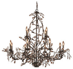
    Perhaps you can confirm from the homeowner if that is a Circeo Chandelier?
    Circeo 12-Light Chandelier · More Info