Software
Houzz Logo Print
scottsh1

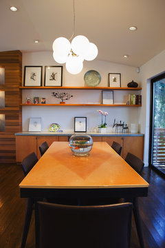
My Dining Room is bare....

14 years ago
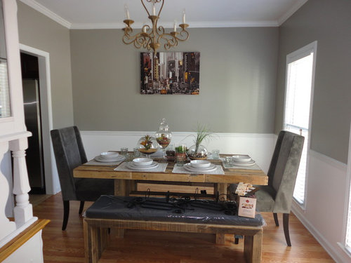
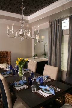
I need your help....Almost finished with my dining room but I am not sure what to do with the walls...they are soo bare and boring! I want to accent in yellow because & I love my picture of NY up! But I'm willing to work without it if I need to.

Comments (58)

  • 14 years ago
    I also was thinking that the space between the windows might be the right scale for your NYC painting. I love how you have decorated and love the paint colors you've chosen. I did wonder if the chandelier should be a little bit closer to the table, just lowered a little bit. I'm sure that the designers on here, could tell you how high it should be. Question what is sitting on the bench? Are they sconces that haven't been put up yet? Maybe they could go on either side of the NYC picture?
  • PRO
    14 years ago
    Consider stacking your art. You can keep the NY piece that you love, just lower it and put another smaller piece on top. Have a look...
    Charmean Neithart Interiors, LLC. · More Info

    I love to stack art, it's interesting. I love what you have done. If you want to take it to the next level, put wallpaper on the ceiling. :0...yes, the ceiling.
    Hermogeno Designs · More Info

    Have fun, you're doing great.
    Charmean Neithart
  • PRO
    14 years ago
    last modified: 14 years ago
    If you add drapery to the windows, then you likely won't have the room for the NYC piece between the windows. I would keep it where it is, but lower it at least 6-8" (from the angle of the shot, I would hang it so the bottom of the piece is about in line with the tallest glass jar on your table.....from this angle, that looks like it would be about the right height.
    Eye level as a general rule is 60" from the floor to the exact center of the piece, but in living rooms and dining rooms, I generally err on the side of lower, since people are seated in these rooms, so eye level is technically lower....for over a sofa, for instance, I hang art at about 6" above the back of the sofa.....off topic, sorry....

    As for beefing up the art, if you have the budget, have it professionally framed, with the intent on beefing up the size as much as possible (though I do like Michelle's idea of color blocking, as that is a really affordable way to add impact to a too-small piece)
    I also love Charmean's idea of stacking the art, or perhaps adding several more pieces...perhaps two pairs of black and white pics flanking the main art, or Amy's idea of fun, unexpected "NYC" art that could be movie stubs or playbills or something that can be mounted in a shadow box. Anything that generates conversation and reflects your personality!
    If you have the space on that side of the room, you could also add a shallow console table with a pair of tall, skinny lamps, and that would also give the effect of augmenting the size of the art, as the entire arrangement would be widened by adding lamps....

    Drapes, to me, are a must. Decorative side panels will suffice, as the windows are not too wide. You could go with a funky geometric or a solid, really anything that catches your eye, as you seem to have good instincts! Hang the rods just below your crown moulding to add height to the room, or at least 6-8" above the window casing.
    I find fabric finishes a room, so worth considering....
    Keep us posted on your progress!
  • 14 years ago
    I was typing many of ths ame recommendations as above regarding the art height, the console table, lamps or vase with curly willow or other branches. Consider iron wall sconces. I think part of the reason the room looks a little empty is the benches. Chair backs would take up visual space. Maybe you can pull the yellow to the table area with pillows on the upholstered chairs. A drum shade chandelier would certainly take up space in the room as well. If you want to keep the one in the photo, it should be lowered. I believe the rule of thumb is for the bottom of the chandelier to measure 30" above the table's surface, but perhaps a designer can confirm that for you. Also, a mirror always works well in a dining room for one of your walls. A round starburst design would look good and they are made in a wide variety of finishes.
  • PRO
    14 years ago
    Ha! We all missed the chandelier, as we were focusing on the art!
    Good catch, jannielee!
    I think your points are all bang on, as benches do tend to leave a dining room feeling more empty due to the lack of chair backs....Often when clients want a bench, we do it on the traffic side of the dining room, so at least you see it is a bench, and not just missing chairs....
    Adding a drum shade would be a great choice, or else lower the existing chandelier, I usually go about 32-33" from the tabletop to the very bottom of the fixture. I'm guessing the current chandelier is likely a good 40"-42" over the table, which is much too high.
  • 14 years ago
    I might lower the chandelier allowing 2 ½” – 3” for each foot of a rooms height. Using this calculation, a room that has an 8’ ceiling can use a chandelier that is approximately 20” to 24” in height. If the ceiling is 10 feet high, then a light fixture that is 25” to 30” would look more appropriate.

    Frame painting at a custom frame shop. Add wall sconces on either side of painting with same finish as light fixture. Or, move painting to side wall and hang a large antique gold framed mirror to reflect the light from the chandelier.

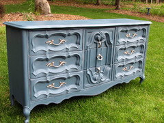
    Add a side board along the large wall ... search antique auctions using your zip code as Internet key words. (I found a small side board for my kitchen for $60.) Paint the side board with Annie Sloan chalk paint, which does not require stripping or priming. Make sure you measure your space before you buy ... tape off they area so that you know what would be the best fit.

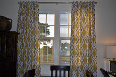
    Add curtains like these that can be found at Etsy.com. Hang curtains on an antique gold window hardware. Add a pop of color by using blue (or any color) goblets with your table setting. Repeat the color on the mantle with small glass candle holders.
  • 14 years ago
    In addition, I would paint the sideboard using a blue color like this one that is sold by Annie Sloan.
  • 14 years ago
    I like your picture also. You need to lower it to eye level though and to make it seem bigger, flank it with some modern sconses or 2 smaller pictures on either side with the same color scheme.
  • PRO
    14 years ago
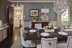
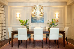
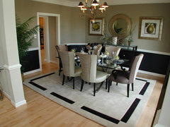
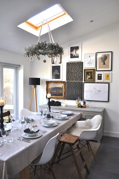
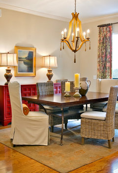
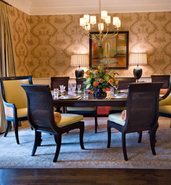
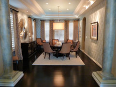
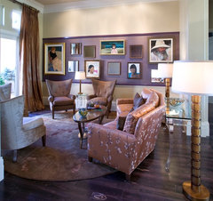
    Here are a few inspiration pics for the art possibilities.....Only looked at these rooms for art, not necessarily for other design ideas!

    Dining Room · More Info

    Dining Room · More Info

    Forest Manor Model Home · More Info

    Christmas Decor · More Info
  • PRO
    14 years ago
    Lorraine Vale · More Info

    Urban Townhome Dining Room · More Info


    Can you see I have nothing better to do on a Friday night? LOL
  • PRO
    14 years ago
    last modified: 14 years ago
    What great design tips from all the previous design experts! I love my Houzz community!

    Denise Jones is right on point regarding the chandelier and the yellow screen printed window treatments are it. They are more than likely cost effective and look lovely. Add a great rod, wooden rings and dramatic finials. Make sure you take the rod to just below the crown.

    As for your artwork, Wow Great Place DR #2 and Christmas Decor are the one I would lean towards. Definitely frame the picture to give it a greater impact -- add the 3" linen matte with a double frame -- one in the tone to emulate the chandelier patina and the outer frame distressed/washed look. All this and VOILA -- your dining room is on fire! Good Luck girl -- btw love the color block attire in your pic -- work it girl! I'm following you now!
  • PRO
    14 years ago
    Agree with so many suggestions here. Also, I'm wondering if there is any reason you can't turn your table to run the length of the room, so the one bench can be seen and the chairs on either end will anchor the room. Yes to lowering the chandelier. Yes to placing your NYC piece of art, unframed on the wall between the windows. Yes to those fabulous draperies. Yes to a much larger framed piece of art or a great mirror on the back wall. Yes to sconces on either side of the mirror or new piece of art. Love the idea of the drum chandelier to replace the existing because that round shape in a room full of geometry will be splendid. Love your choice of wall color and your table-top display. Great start!
  • PRO
    14 years ago
    Great job so far!

    I would not add another color, though, and most definitely not yellow; you're already right on the edge of too much with the different colored chairs, and you don't want to dilute the great impact you already have going. If you want more color, bring it in with accessories and flowers. The walls are absolutely perfect the way they are - don't touch them! ;->

    I agree with others that the painting, while beautiful, is really too small for that wall as is. Between the windows would definitely be better for it, where it will stand out better on its own - or you could, as others have suggested, frame it with a larger frame and mat and leave it there, but don't go too far, and stick to colors from the painting itself in the mat - maybe the red, or the light grey stone. If you do leave it there, it does need to be lowered - center it at your eye level, but no higher than roughly 58" at the center of it (lined up with the top of the window trim would probably be perfect) - and also center it on the wall left to right.

    Then flank it with some beautiful and simple sconces that coordinate with the new chandelier you are going to also get .

    You could also get one really large painting or photograph, or put a gridded series of four to six photos or images that coordinate with one another.

    Simple ripplefold sheers hung from next to the ceiling in a light color to coordinate with the trim would be terrific - https://www.houzz.com/photos/ripplefold-drapery-phbr0lbl-bl~l_40695

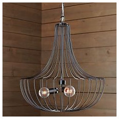
    And do ditch the chandelier; it's too small, and not of the right style. Go for something bigger and much more contemporary and clean-lined, like one of the following from Restoration Hardware - http://www.restorationhardware.com/catalog/product/product.jsp?productId=prod60226&categoryId=cat1701013 (my preference here) or

    http://www.restorationhardware.com/catalog/product/product.jsp?productId=prod1159180&categoryId=cat1701013 or

    http://www.restorationhardware.com/catalog/product/product.jsp?productId=prod1519006&categoryId=cat1701013
  • 14 years ago
    I think a nice, inexpensive idea would be to have some quotes by some famous people from New York printed in a nice font-maybe even a Broadway looking one-and placed in some nice black frames. These could be used around the big one in some way, or on that wall between the windows. They would make some pretty nice conversation pieces. ;)
  • PRO
    14 years ago
    Good You liked the ideas , I Am with Michelles idea , that will Bring out your NY Picture
    Alternately , you can Draw a circle bigger than the pic say 1 Ft plus; after putting the pictrte at proper height use a pencil or a marker then Put Yellow Paint blobs and let it dry dont add any diluting agent to the paint as that will make the paint Runny ; once dry Hang the picture in the centre n Voilà !
  • 14 years ago
    Vikrant S do you have a picture of something like this? Im having a hard time imagining it..thanks!
  • PRO
    14 years ago
    Actually we do not share pics of our clients but you can call me n I will explain you in a Jiffy how it can be done .
  • 14 years ago
    Ok, you can email me mznevadeva@live.com your contact info and I will do so, thanks!
  • 14 years ago
    I love your dining room and don't think it is bare, maybe try lowering the picture a bit or getting bigger picture on that wall. Good luck
  • 14 years ago
    Traditional Dining Room · More Info

    You just need to layer texture into the room- wallpaper would be amazing,drapes,mirror to glam it up and a photo wall. It's great!
  • 14 years ago
    last modified: 14 years ago
    I love Michelle's idea of painting on a yellow frame and potentially putting trim around it. I would take it a step further and rather than just a frame for this picture, continue the yellow centre to cover the full wall and cover that space with pictures. Something like this:
    '
    Hollywood Regency Living Room · More Info
    '>Contemporary Living Room design by Los Angeles Interior Designer Peg Berens Interior Design LLC
  • 14 years ago
    Per haps two complementary pictures on either side by the same artist to fill in the blank space.
  • 14 years ago
    Love your room and that fab painting...agree with others on lowering it just a bit...can appreciate suggestions for grouping other items or moving it to adjacent wall...but it makes a cleam bold statement in its current placement. Love your use of texture, inherent warmth and clean lines. If I were you I would run to the nearest fabric supply and grab a yard of linen in a few of the accent colors in your painting(yellow/golds/red) and see which looks best behind the painting and play with borders. Stretch your choice over plywood/canvas allowing 2-4 inch border(not necessarily even-you could offset the painting a bit) mount linen backing to wall with a couple molly screws and hang your painting. If you want a more formal look frame the board. Could also apply linen fabric panal directly to wall with starch. If you want a more modern appearance you could even color block with 2 different linen boards and float painting on top.
  • 14 years ago
    I think it looks great. I think a larger picture hanging lower would be perfect. Could the smaller picture go on another (smaller) wall? I believe there is a rule of thumb that the bottom of a chandelier should be so many inches from the top of the table, and I would suggest that the chandelier hang lower.
  • PRO
    14 years ago
    last modified: 14 years ago
    Start with some window treatments. Even something simple can make the room look more finished and "lived in". If you don't want to commit to as much yellow as Denise Jones suggested (although I love the drapes she found!), you couuld use white drapes with a stripe of yellow either painted along the edge or a stripe of ribbon or fabric. You could also do something similar with your placemats, or just go for it and use bright yellow placemats. Small, inexpensive accessories are a great way to add color into a room without committing to a color for a long time.
  • 14 years ago
    Your room really has a great start. The picture is way too small, and hung too high, and the chandelier looks like it is hung a bit high also. Your table-scape is really nice and balanced. I would add some drapes, either in a yellow and white pattern, or maybe just white with a yellow striped border. I think that you have some sconces sitting on the bench, and they look black . I would rather see white ones. I think that another possibility is to switch the picture to the wall between the two windows, and maybe add a white shelf on the wall where the picture is now, and place a collection, not to many, of different shaped yellow vessels. I think that the room needs a little drama, and a bit of black could be an answer, but I would rather see some black and white art photography.
  • 14 years ago
    It seems this room has a combination of styles going. There is the gray and white color scheme, and the formal-looking chandelier. Then, there is the modern, sophisticated painting of New York. Last, but not least, we have the table that is rustic looking because of the type of wood it's made of, and the bench, along with the nice terrariums. The gray chairs go back to the formal, sophisticated style area. As most everyone has noted, this really works on most levels. I do think that using the wrought iron sconces would help pull it together more, and I also think that a more rustic light fixture would help balance it out. Some very pretty yellow and white striped curtains-the formal kind of stripes, not cabana one-made in a formal fabric-perhaps silk, or a silk like fabric would also look nice and help balance out the styles.
    I also think that the picture would look nice if it was on some kind of yellow background like some of the others have suggested to make it seem larger, as well as lowering it like others have also suggested.
    It really is a great room. :)
  • 14 years ago
    Trying lowering the painting, place a smaller piece above or two smaller pieces above that will be almost the same with as existing. Then definitely use the sconces beside the artwork. Try spray painting the chandelier and then lowering it. The chandelier and the sconces appear to both the same curves.
    Very pretty room!
  • 14 years ago
    Just because you love something don't guarantee its prominence. I agree your painting is great but I, too, would move to other wall. Large wall is screaming for a mirror, totally changing and expanding your space. I think the bench deserves a neutral, perhaps black&white, contemporary fabric. Love your chairs...
  • 14 years ago
    I agree, the painting is too small, move it to another wall. Your look is great and so are your table and seating. Take your plates off the table. I am a Realtor and I can not stand seeing tables set for dinner as a decoration, especially when things start getting dusty. Let the table speak for itself. I think you have some plants in glass on the table, leave them. What about an arrangement of white platters on the wall or those white animal heads from West Elm or a combo.
  • 14 years ago
    Plus, I think your light fixture is too high
  • PRO
    14 years ago
    Have you considered pattern on the walls, either painted or wall covering? Texture adds to the interest in a room. Could be inexpensive textured wallcover that you then paint over with FLAT paint. Another idea for filling blank walls is to add wood trim. For a more architectural solution, try adding 4 or 5 vertical boxes or frames to the wall made out of wood molding you can buy very inexpensively at a lumber yard. You could paint the wall inside the frames the same color and accent the mitred frames in another color or just paint the frames the same color but a very glossy paint in the same color (Flat paint on the walls) for a subtler approach. Wallcover inside the frames is another option. Also, the chandelier may not be too small but it is hung too high. The bottom should be 30" above the table top so it doesn't interfere with people seeing each other across the table.
  • 14 years ago
    Will you share the paint color? It is beautiful! Love the table and chairs too.
  • 14 years ago
    Justifi, you couldn't be more correct ! When I see a table set that is not in use , I cringe. Sometimes people just put out place mats, and I can't wait to take them away ! Even though the table-scape is nice, I think it is too light weight for this room. I like the idea of a drum chandelier, and a shallow console on the wall, with a pair of lamps, or sconces. The benches could use another covering on them, but I would rather see more backed chairs, maybe even full slipcovered ones that you can easily find at Crate and Barrel. I know that you are set on using yellow as your accent color. I think that would be great with the wall color, but I think that it could look muddy with your table. It would have to be a very bright yellow, to look right , and I think that would not be great with the wood color. I am not huge on rugs in dining rooms, just for the cleanliness factor, but in this room, a linen color sisal, from Crate and Barrel, would add texture and interest. It would have to be large enough to pull out the chairs.
  • 14 years ago
    Maybe you could put the NY picture on one of the side walls and a great BIG mirror where it is now. That way it would still be predominant --which it wouldn't be if surrounded by other artwork-- and the dining room would look bigger (it would visually double the space) and even lighter than it is, since the mirror would reflect the light coming through the window.
  • PRO
    14 years ago
    Suggest lowering the chandelier - 30" off the table - and be sure the table is centered under it. The NYC painting needs to be lowered, as previously suggested. Rather than framing it, I would suggest hanging it on top of a large mirror (over the mirrored surface), which would "frame" it, and provide some additional architecture for that long wall. Hang some sconces on either side. Draperies would be wonderful - only I suggest using just two panels - one hung to the left of the left window, one to the right of the window on the right. Be sure they're hung as high as possible, just touch the floor, and clear the expanse of the glass and moldings when pulled aside. LOVE the fabric suggestion from Denise Jones for this space!
  • PRO
    14 years ago
    I love the room and painting. I would ALSO suggest you make the painting more of a statement. you could have it framed (take to a good frame shop and defer to the framers judgement) then set it on a simple white shelf that will be twice as long as painting. You can find at West Elm.
    OR have framed (tell framer you want oversize frame) and hang on wall flanked by some simple but bold candle sconces. Whichever way you go. Have a picture light put on painting . You can have it hard wired into wall, or drop the cord and cover it with cord cover and paint to match your wall. Will enhance your painting trememdiously!!Spray paint your chandlier a laquered white or YELLOW !! Add some beautiful curtains Yellow,white with maybe a bit of grey!!
  • 14 years ago
    I think I would put the piece of art you have between the windows on the right and definitely hang it lower. Then put a side board with a mirror and lamps or wall sconces above it. Panels with a pattern would finish the look. I also agree with turning the table. You have a good start. Keep it going!
  • 14 years ago
    What about a rug?
  • PRO
    14 years ago
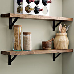
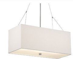
    I would get a more contemporary, linear chandelier with a shade(the one pasted is a bit too high, and not long enough)-and also think about some shallow floating shelves at the back wall with the painting. love the picture on picture idea, and would add a frame to ny city picture-the room is too traditional to not have a simple frame on the painting
    NW HOMES · More Info

    Salvaged Wood Shelf · More Info

    Alexis Rectangular Pendant by Forecast Lighting at Lumens · More Info
  • 14 years ago
    you need some color maybe yellow or orange and the pitcher is to small. you need a fouce point.from joy interior design.
  • PRO
    14 years ago
    I would subsitute your small picture (I know you love) with a larger picture that includes the same colors...bringing in just the right amount of yellow, with a dark grey frame (to include your seating color) and I agree with the yellow draperies for additional accent color (but light airy and opened) The room is beautiful so far...NICE JOB.
  • PRO
    14 years ago
    I bet at this point you are sorry you asked!! But upon reading all the suggestions I was just thinking that if you do deceide to hang curtains ,,,the picture/painting will be lost because the curtains will extend beyond the windows and make the space between windows too small for NY print/painting ...
  • 14 years ago
    if you decide to go with different art, check out rodney white. i think his style would go great with the room.
  • PRO
    14 years ago
    I would frame the NYC art with a large scale yellow frame (6" width) and flank either side with pieces slightly smaller in scale that also emulate things associated with NYC but not another skyline, such as photographic portraits of people you would expect to see in NYC done in black and white and then I would frame them with black or white frames and allow the NYC to take center stage. Then I would use yellow plates or possibly a yellow table runner to tie it together.
  • 14 years ago
    I thank everyone for helping me out with my little dilemma...Now I have so many great ideas I dont even know where to start! thanks
  • 14 years ago
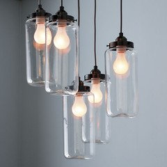
    Chandelier Options from West Elm...what do you think?
  • 14 years ago
    Another pic..
  • PRO
    14 years ago
    This mind-numbing surfeit of often conflicting ideas is part of the problem with design-by-committee ;->
  • PRO
    14 years ago
    If you're interested in accompanying the NYC print with another or are in the market for a new art piece by all means please take a look at the link below. We showcase a lot of award winning photographers. Everything on the site is made to measure with brand name gallery grade material and all images are assessed prior to being uploaded to the site so you know you're buying a flawless print.

    www.committedphotography.ca