Software
Houzz Logo Print

Comments (50)

  • PRO
    14 years ago
    Santa Fe Residence project is just too much fun.
  • 14 years ago
    I like that one a lot too.
  • PRO
    14 years ago
    Ditto on the Santa Fe room - love it!
  • 14 years ago
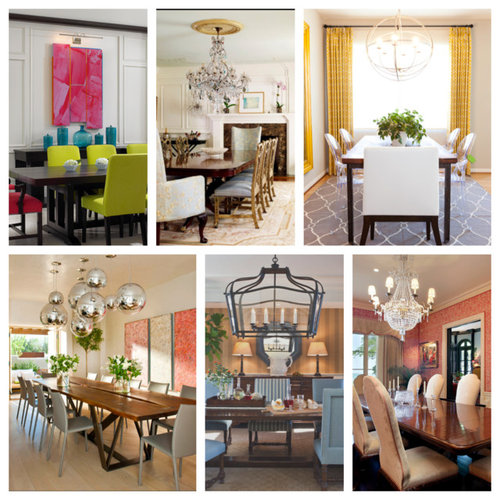
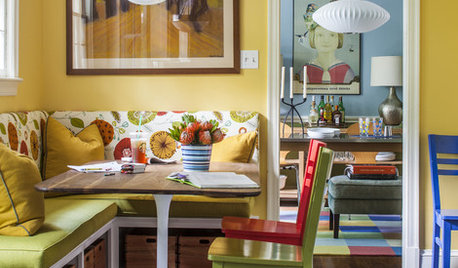
    I love the Vacation Retreat (photo 1). The colours equal happiness and having a very good time. :)
  • 14 years ago
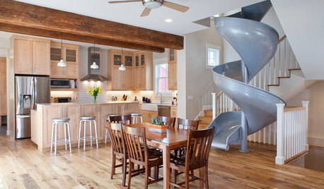
    You never know what Houzz fans will love. I like that. Personally I don't like the Sante Fe one. The grey chairs look too prison or military like, they don't match the table, which doesn't go with the cool light fixtures. I admit I don't see the appeal. I do like the light fixture, table and wall art, if maybe not together... or maybe together, just not with those chairs? Can you tell I really don't like the chairs? LOL
  • 14 years ago
    I'm a Santa Fe !!! table, chairs, lights, wall art!!!
  • 14 years ago
    ariadne, It's about the whole concept..
  • 14 years ago
    I love the far hills family home. It's comfortable and eclectic. The color palette is soothing and I really liked all the rooms.
  • PRO
    14 years ago
    Laurie's Vacation Retreat looks like a lot of energy!
  • PRO
    14 years ago
    Santa Fe took something as fundamental as light and made it into art.
    That's good design!
  • 14 years ago
    A table that seats 12! What a dining room, great for family feasts. I love the globe light fixtures and the rustic table, not so hot on the chairs.
  • 14 years ago
    Oh, oh what if you hate them all?
  • 14 years ago
    well you could create your own poll of ones you love and we could ask the same silly question... :)
  • 14 years ago
    Don't vote. I think the idea is to figure out the design you can appreciate most even if it's not what you would want in your own home. I'm old fashioned; I like the elegant, formal dining rooms with amazing chandeliers.
  • 14 years ago
    last modified: 14 years ago
    I love the exciting mix of colors in Laurie's Vacation Retreat. The Santa Fe Residence would be my second choice with its fun mix of shapes.
  • 14 years ago
    I am attracted to the bright colors...looks like a fun area to wine and dine in!
  • 14 years ago
    While these are aesthetically correct; most of these "Dining Rooms" look more like Board Rooms. I think the best test to determine a spectacular dining room is if you can imagine yourself eating a Holiday feast (comfortably) in one of them.
  • 14 years ago
    Sante Fe table is what really makes me want to host dinner party or just for our family. We use dining table almost every night. So the table can be casual yet interesting to share with friends. Love the silver balls and orange art but the gray on chairs feels monotonous.
  • 14 years ago
    Sante Fe table is what really makes me want to host dinner party or just for our family. We use dining table almost every night. So the table can be casual yet interesting to share with friends. Love the silver balls and orange art but the gray on chairs feels monotonous.
  • 14 years ago
    Far Hills Family Home -- I like the mix of elegance and natural elements. It feels fresh and clean. A perfect backdrop for any themed dinner party, and yet beautiful as it is.
  • 14 years ago
    Santa Fe! I love the table, the colors, the lighting, the art. They are great pieces and work together fantastically too.
  • PRO
    14 years ago
    Santa Fe - I like the mixed us of materials and introduction of plants that make it feel more organic. I understand the comment about the chairs and I think there could have been a better choice but I don't absolutely hate them. While I like the balls, I feel there are too many of them and it's a bit overwhelming and distracting... half the number would do.
  • PRO
    14 years ago
    The vacation retreat is wonderful when you look at additional pictures of that space. The colors really work with the view. Chairs look comfortable and the room all over looks cheerful!
    Marie Meko
  • 14 years ago
    Although Sante Fe captures my interest, Project G says comfort, linger, eat to me. I like it's balance of informal and formal elements. Made me want to sit down with family and friends and enjoy a leisurely dinner.
  • 14 years ago
    Santa Fe as a whole I see, but I didnt like any. I voted for which chair was most appealing to sit in so voted for Winnetka.
  • 14 years ago
    I like the clean, simple lines of Laurie's room but with the splash of color to make it fun.
  • PRO
    14 years ago
    Felt it was difficult to choose a 'best' as well - nothing caught my eye except for Santa Fe table - it was great - outside of that - struggled to choose my fav -
  • 14 years ago
    Ha! Boardroom! That's what I thought too when I picked "Project G" yet it was the only one I could live with all year round and host a variety of gatherings.
  • 14 years ago
    I like Laurie's Vacation Retreat for the colors. Winetka looks comfortable but I don't care for the chandelier.
  • 14 years ago
    Laurie's Vacation Retreat is more my style. I would have custom slip covers made for the chairs because I couldn't live with that shade of green year round. Also, I would clear the dining room table. It looks cluttered against the back drop of the collection on the sideboard. Finally, I would love the lighting from the Sante Fe room in Laurie's room.
  • PRO
    14 years ago
    I love the color and shape composition of Laurie's Vacation Retreat dining room. When you look at the other photos and get a sense of the entire space, it is harmonious and pleasing both architecturally and design wise. Although the green of the dining chairs may seem a bit much in the one photo, they are well balanced within the entire space.
  • 14 years ago
    OMG, I choose the one with the least number of votes. Guess my age is showing, but I love very formal dining rooms and this one reminds me of mine. Although it's only used for very special occasions, it is the perfect choice when I want to use the family heirlooms. Sante Fe reminds me more of my porch dining room, which is my go to for casual dinner parties.
  • 14 years ago
    While there are more bright colours put together than I am personally comfortable with, the Vacation Retreat looks welcoming and comfortable. I chose it.
  • PRO
    14 years ago
    Lazy Susan in a dining room - really? I agree we should have had a round dining table in the mix, and, maybe a bit more variety in the style genres - but each and every one of these is gorgeous - good mix of extreme formal to casual, but where is the in-between? My favorite is the Laurie's Vacation Retreat - although I don't care for the detailing on the wall, love the art, and bold hits of colour - very gutsy choices and they work together beautifully - I would love to see the table set in this photo though, see how it all mixes together. Well done everyone!
  • 14 years ago
    Funkiness is great..bonnie
  • 14 years ago
    I'm with you Rebecca- love the 1st one - fun and funky - and the Santa Fe decor is pretty good too, but colour is wonderful - too many people are scared of it!
  • 14 years ago
    Colours and style - classic and modern together.
  • PRO
    14 years ago
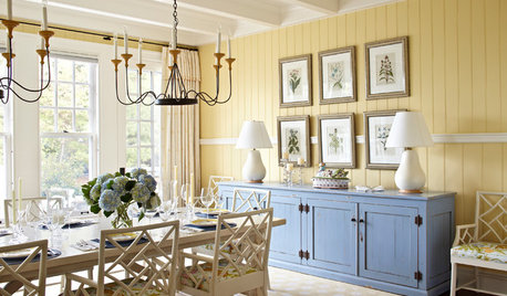
    Fantastic wood panelling in dining room number one provides a great backdrop for vibrant furniture
  • 14 years ago
    I like them all.
  • 14 years ago
    None of these are really my style but I went with Lauries' Vacation Retreat. I like the brightness and less formality. I would have used more toned down colors.
  • PRO
    14 years ago
    Laurie's and Santa Fe are both very appealing and look comfortable.
  • 14 years ago
    Project G reminds me of the community area of a motel, like where you would go for breakfast. I'm not crazy about any of them. They're all way too formal for my taste.
  • 14 years ago
    I like project g the best though not my style, but at least i doesn't scream 1. circus 2. an old gaudy hotel 3. strip club (plastic chairs???) 4. warehouse & 6. 80s?
  • PRO
    14 years ago
    Santa Fe just looks like a fun room to be in with friends and family!
  • 14 years ago
    I like the Santa Fe because of the table and the light fixture. The table looks as if a beautiful slab of wood was polished up with all the imperfections which makes it perfect!
  • 14 years ago
    None of them really jump out at me...
  • 14 years ago
    I chose Laurie's Vacation Retreat because the bright colors seem modern,happy and alive. This is a vibrant break from neutrals. Love it.
  • 14 years ago
    I chose Laurie's Vacation Retreat because the bright colors seem modern,happy and alive. This is a vibrant break from neutrals. Love it.
  • 14 years ago
    I chose Laurie's Vacation Retreat because the bright colors seem modern,happy and alive. This is a vibrant break from neutrals. Love it.