Software
Houzz Logo Print
hollywould

Help with paint color for formal dining room

14 years ago
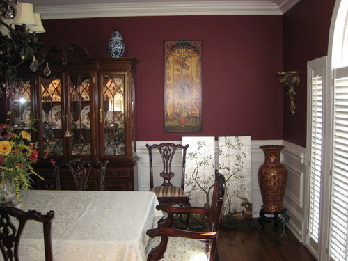
Please help! I made the mistake of painting my dining room a red color that I had used in another house several years ago. It looked great in the other house but it looks like burgundy in this house...it HAS to go!! It looks awful with my dark furniture. You can see a little of the entry hall in one of the pictures, it is showing much more gold than it actually is, it's alot lighter in person. I plan to paint the back of those doors in the entry hall also. I want a lighter color for the dining room but not a neutral, I definitely want it to be a color. The rest of the house is neutral except the master bedroom, it's Restoration Hardware Silver Sage. The area that is painted is Benjamin Moore Stratton Blue, a very greeny blue...just one of many colors I'm considering. The chinoiserie panels that are sitting against the wall have a silvery gold background and blues, greens and corals in them. There are 4 panels, I plan to put 2 on each side of the china cabinet. Thanks so much for any ideas!!

Comments (4)

  • 14 years ago
    I'm liking the Stratton Blue. It's refined and fresh. It should look nice with your furniture and not be a problem when both the entry color and it are in view at the same time.
  • 14 years ago
    Another color I like with dark furniture is BM's Storm Gray. I went from red to that color in my dining room and am very happy with the result. I painted the ceiling blue.

    I like the Stratton blue, too. I think it is a good choice. Either color would play well with the color in the hallway.

    Your room and furniture are really beautiful.
  • PRO
    14 years ago
    When I look at the picture, what is distracting to me is the white woodwork and door casings. I like the dark color with your furniture, which is very pretty. With your other colors, a red might be too warm, traditional and dramatic. I like the idea of a pearly grey, like Sherwin Williams' Dorian Grey, or one lighter, and would strongly suggest painting all of the wood work-- all of it. The white is very distracting, and takes away from the furniture by chopping it up. When I do it, I use a flat paint on the walls, and an eggshell or satin finish on the woodwork. It is a very elegant look. If you go blue, make sure it has a grey base to avoid primary colors and the Carolina blue look. I wouldn't discount a neutral-- Ben Moore's Edgecomb Grey is gorgeous, and moves from a creamy light camel to a grey depending on the light and time of day.
  • 14 years ago
    NBaxter Design - are you saying you would paint all of the woodwork the same color I decide to paint the walls or just something other than white? Thanks
  • 14 years ago
    paint is the easiest thing to change, so don't feel rushed to find the exact right one -- the light of day will change it a great deal as well as what you have on the wall/table. Best approach is decide on focal point of the room -- artwork, window treatment, centerpiece, seat cushion, curio piece -- and pick paint color that either matches or complements that look and feel. For instance, your chair cushions look like they have some nice medium gray/greens -- perhaps start there.

    Regarding paint samples -- please use primer over that burgundy -- don't use those little sample cans to make your final color choice (narrowing down between blue versus green okay) -- but the computer formula does not carry over to a gallon of paint, so resign yourself that you may have to try several gallons of paint samples to find what works best.

    Also sample on all 4 walls -- will reflect other rooms & sunlight different -- you may love three walls, and not be able to endure the 4th ;)
  • PRO
    14 years ago
    I agree with all the above comments. If painting all the trim seems too daunting, then perhaps a soft neutral as suggested to minimize the contrast.
    Also, consider putting a silverleaf type wallpaper on the ceiling. Works beautifully in a formal dining room and would be great with your chinoiserie panels!
  • 14 years ago
    LOVE the blue with the white wood work in the room. Please keep the white! Definitely prime the red first before painting. The blue will look nice with the gold from the hallway.
  • 14 years ago
    I actually love it. My dining room and kitchen is also RED.
  • 14 years ago
    Niveous, Benjamin Moore with cloud white wainscotting.. looks great with silver as mentioned above. The warm classic colour will set off the wood, pick up the neutral stripe in your chairs and set off the dark blue porcelain piece. Good luck.
  • 14 years ago
    Hello,

    Like others have commented, I also love the Stratton Blue you have "sampled". It truly freshens up the space, and brings it to the present. It looks wonderful with the white woodwork, modernizes your dark furniture, ( I do recommend re-covering your chair cushions, if possible, and take away the tablecloth ) and will look gorgeous with the panels, as well as working with the entry color. You seem to be drawn to blues and greens in the other rooms, so I suggest go with your gut- it works!
  • 14 years ago
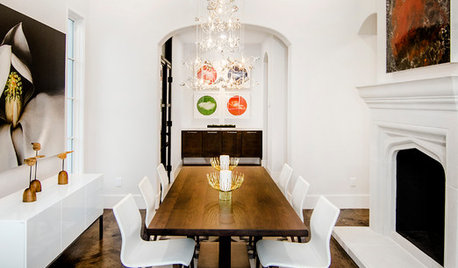
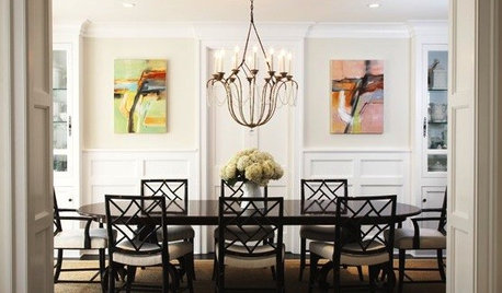
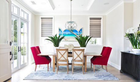
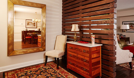
    For me, it's easier to imagine if I see some samples of what it could look like. I found some photos that put together different wall colors with white wainscoting and dark wood.
    MJ Lanphier · More Info

    Dining Room · More Info

    Brookhaven Dining · More Info

    Entry · More Info

    Oakley Home Builders · More Info

    Residential Interiors - Kansas City · More Info
  • 14 years ago
    Thank you all so much for all your input! This is so helpful!
  • 14 years ago
    I love the Stratton Blue and the white; the colors make the room look fresh and welcoming. I think white is too stark with the deep burgundy. The blue also looks nice with the color in the hall. The bottom line is: paint it a color you really love! Maybe even a color you like to wear that expresses your "look".
  • PRO
    14 years ago
    last modified: 14 years ago
    Weathered Coral Wall Paint - Gallon · More Info
    Silver Sage by Restoration Hardware · More Info
    For your dining room, I would recommend the Weathered Coral on the left. I've also shown your Silver Sage you have in the foyer. You were simply in the wrong family of "red". Of course, this will work with your Chinese panels, but it also appears your dining room chairs are more in the burgundy family, which would mean having to recover them. The color below is your Stratton Blue which you are testing. The intensity is about the same as the Weathered Coral.
    Stratton Blue HC-142 by Benjamin Moore · More Info
  • 14 years ago
    Go with a Prussian Blue.
  • PRO
    14 years ago
    What I often do, that's simpler than priming and painting samples on the wall, is I purchase a large paint chip which I can tape up in various positions in the room and look at in different lighting. My favourite paint is C2 (www.c2paint.com) and they offer the Ultimate Paint Chip which is 18"x24" and is actual paint rather than printing ink.
  • PRO
    14 years ago
    if you're going for colour( blue) .. look at Van Courtland blue or Nimbus Gray >BM , both tried and true cant miss colours. ; )
  • PRO
    14 years ago
    Here you go!.. All BM Mt Rainier Gray is also a good one. Shown here Nimbus gray and Van Courtland ( the darker Bl) also a more neutral palate to calm after the red.
  • PRO
    14 years ago
    last modified: 14 years ago
    For one of my customers wanting a more contemporary look we went from a rust faux to a metalic green striped faux. Both looks were great, one medeteranian and the new look more contemporary
  • PRO
    14 years ago
    last modified: 14 years ago
    Here is the origional look from !0 ys ago. I think I might contrast the red mahogony furniture with some green !
  • PRO
    14 years ago
    You're on the right track with Stratton Blue. Another great blue is Beach Glass by Benjamin Moore. A blue dining room is very traditional and will work well with your furniture and architectural style. Hope that helps. Charmean Neithart
    Charmean Neithart Interiors, LLC · More Info
  • PRO
    14 years ago
    Oh Charmean , you steal the Show ! ;)
  • PRO
    14 years ago
    Yes, blue or grey as advised is good. Leave the wood work white too. Good luck !
  • 14 years ago
    Keep the white woodwork. What would happen if you used the same color as the hall?
  • PRO
    14 years ago
    Late to reply, but yes, Hollywould, I would paint the trim the exact same color as the walls. It's a fairly recent trend, last 3-4 years here, and it is a great way to update a room. The difference is that when it is white, it becomes white blocks and lines that geometrically outline the room. When it is painted to match, it becomes very subtle and elegant, because the shadows, ridges, and details add wonderful texture. These things get lost when it's white, because it can over-power the details when there is a stron contrast with the room's other elements.
  • PRO
    14 years ago
    You might consider Sherwin Williams Analytical Gray. It is a green-toned gray that will create a beautiful background for your mahogany furniture and chinoiserie panels. I would not put the panels on the same wall as the china cabinet. The cabinet should be the focal point on that wall. Perhaps the opposite wall with all four panels would work, or a panel on each side of the window, and two on the opposite wall. Regarding the wainscoting, this lighter neutral will be better with the white existing color if you decide to keep it, but I do like N Baxter's idea of painting the trim a satin finish of the wall color. Remove the shades on the chandelier and reupholster the chairs to update your look.
    N. Callaghan, Callaghan Design, Ltd.
  • 14 years ago
    Karen paul hit the nail on the head! Take her advice and also recover those chairs def. it should be beautiful
  • 14 years ago
    Can you share with me the burgundy color you used (the one you hate)?
  • 14 years ago
    @ alex511 - Sure, it is Balmoral Red by Ralph Lauren. I don't hate it, it's a beautiful deep rich color but it just looks much darker in my current house. In my old house it looked much better, I guess that room had a lot more natural light.
  • 12 years ago
    Try a swatch of sherwin williams compatible cream. I used it in my master bedroom and its gorgeous. Shows as a soft mellow light bathed gold, nothing bright and sunny about it. My furniture is the same tone as yours and it really shows it off nicely.
  • 12 years ago
    I don't think the red color looks bad but if you don't like it, I think the color swatches look fabulous in the corner!
  • 12 years ago
    I don't think your decor will match with the teal colors though. If you want to keep your decor, I would suggest a color similar to your entryway.
  • 12 years ago
    I would glam it up with a BM pearlescent paint in white or shyness or a combo.