Software
Houzz Logo Print
trixietrujillo

My backsplash may be going too modern?

14 years ago
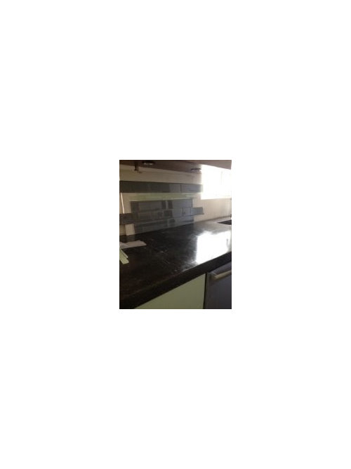
I'm having a freak out!
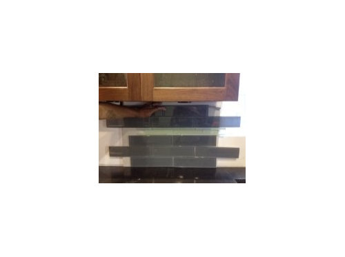
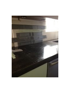
Should I keep this backsplash tile like I ordered? I'm just scared I'm taking my project too modern now. I have concrete countertops and a beautiful walnut burl wood slab as a coutnertop, mint frost green cabinets and walnut cabinets with stainless pulls arch pulls that are all going horizontal.
I'm scared this backsplash is going too modern and color coding to my green and grey pattern. Is this ok?!

Comments (43)

  • PRO
    14 years ago
    Does the green accent in the backsplash match the green frost of the cabinet doors?
  • 14 years ago
    Pretty much! It's funny. In some lights it right now and in some lights it may seem just a bit darker, but if you hold it up to the actual cabinets, it's right now point. Is it tacky to color code your kitchen like this? Thank you for commenting! I need the help! Ive been living in my garage since January and I want this finished!
  • PRO
    14 years ago
    I'd love to comment but your pictures are not of good quality, and I'd like to see more of the kitchen.
  • 14 years ago
    Yeah! My pictures are horrible! Let me see what I can do...I'll take more pictures. And put them up for ya!
  • 14 years ago
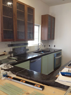
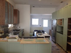
    So, this is what's going on. I really want to looove this tile. I don't have the energy or brain power to continue hunting, but I also want it to be right. So, the walnut slab is to be front and center (it's getting worked on right now). I will have a glass range hood over the cooktop and 3 glass bulb pendent lighting over the slab. All my pulls are arch pulls going horizontal on all cabinets...tell me what you think!
  • PRO
    14 years ago
    It looks like you have beautiful elements in your kitchen that are strong enough to shine in their starring roles. I think the dark glossy tile is upstaging everything else. It's too "in your face". My thought is a white or off white subway tile, or a glass mosaic with brown and white and stainless steel.
  • 14 years ago
    I wish I had just done white cabinets. This problem would not be a problem. I'm thinking the the white back splash may be out of place. I don;t know. This is such a headache. OK...I am going to look into white backspash subway tiles
  • PRO
    14 years ago
    You'll get a lot more answers in the next few hours. Wait for more views from other designers.
  • 14 years ago
    a lighter colored glass tile is my first instinct. the kitchen looks like it's going to be super cool, BTW!! Hang in there. Don't freak! You've come this far!
  • 14 years ago
    Thank you! I'm losing my mind! I am thinking lighter too, but it's so hard to go back out and find. First thing I need to do is get off my computer!!
  • 14 years ago
    nah. go to glasstileoasis.com. or don't. too many choices there. You might want to reverse the green and gray - more green and gray as an accent. The kitchen sounds pretty modern anyway with concrete and wood counters, glass and horizontal pulls.
  • PRO
    14 years ago
    what about running the tile vertically instead of horizontally-----and you could pop the green in randomly...or not at all.
  • 14 years ago
    White subway tile is classic. that's why so many people use it. But it is really safe and your kitchen is definitely NOT safe. But if your concern is that you are too modern, I think you are already there! So go with it.
  • 14 years ago
    Its refreshing to see a kitchen that isnt white and ugly granite
  • 14 years ago
    I like the warm natural look to the brown cabinets. They balance the green and other modern features. The green glass will work well, but I would not use the larger grey/silver (?) as I fear it will be too many different elements and a distraction., and white has no place in this design. Subway tile also comes in clear glass like your green and would work too. It's going well; stay calm and try it with other small samples.
  • PRO
    14 years ago
    What is the actual color and finish of the tiles? I looks like they are almost a green slate. I think the color needs to be neutral with a leaning to the green. I would try it in a midrange of darness between the dark counter and the lighter cabinet finish. Subway pattern is traditional, so I don't think that takes it to modern at all. Just remember, for every designer there is an opinion. Find a common thread among all of the comments and then use that as you see fit. It's your kitchen. If you like it then do it. Your concept looks very strong.
  • 14 years ago
    You want to avoid having too many elements as Roni states. The large dark tile works well with the concrete countertops. The green glass ties in with the cabinets. The wood adds a warm and interesting element without being overbearing. I think it works well. You can play with placing the tiles vertically, expanding the amount of the green glass tile to be a wider section, or other ideas but I think your first instinct is working well. With so many options these decisions can seem overwhelming but I think what you have is exceptional, out of the ordinary, and anyone who sees it will be impressed. Now get it done, get out of the garage, and start enjoying your work!
  • 14 years ago
    last modified: 14 years ago
    Your photos show a run of smaller rectangular tiles in two wonderful shades of light green in the fourth row from the bottom. I would just use those if that is an option. The lighter shades will help keep the space open / airy. It should also help create an effect that will make the space between the cabinets and countertop seem bigger and the kitchen overall seem longer. Yes, the long, thin glassy rectangles may be "modern" but I really enjoy mixing modern with classic and you and your kitchen can pull it off. I have no doubt.
    "Don't Panic" - Douglas Adams
  • PRO
    14 years ago
    You are using a lot of modern materials...even your faucet is modern. What style would you like to see? To pull away from the modern, you might want to reconsider stainless hardware. Pulls that have some detail...not so simple in a bronze finish. And then it is all about how you accessorize. Think about window treatment, artwork on the walls and any other accessories you will add to your kitchen.
  • 14 years ago
    I like the green tiles too but think they might be too matchy matchy.

    Since you are the one that has to wake up to this everyday, can I suggest that bring some of your accessories in and see how feel about the backsplash when it isnt so stark. Those things may pop and you wont even notice whats behind them.
  • PRO
    14 years ago
    last modified: 14 years ago
    Not sure if you custom ordered the tile...why not stripe the tile: a row of subway-then a row of light green-a row of subway-another row of light green, etc. This will break up the darker color and show contrast, as well as, echoing the other horizontal elements of your kitchen. Keep the design simple and try not to over think it-you don't have very much backsplash. You've probably put a great deal of time into choosing all of your elements and I absolutely love the green cabinets!!

    This is typically the stage when clients get scared of their project because it's not always easy to visualize the completed project. And again I feel strongly about maintaining the horizontal line in your project-it's a timeless design.
  • 14 years ago
    I just finished doing the kitchen backsplash about 3 mos.ago. I was so overwhelmed that I was starting to get bouts of vertigo. The finished project overall came out to my liking. I am not a designer but I think with your countertop being dark and your cabinets leaning on the darker side, maybe smaller tiles like mosaic with lighter tiles mixed in would look nicer. I brought home at least 50 samples with numerous returns of samples and even when I have decided on the rustic subway tiles from Turkey I still doubted my decision. Only after it was grouted did I really say "wow- I love it" and my husband agreed. Good luck!
  • 14 years ago
    I think you do have a lot of colors and elements going on, to some this may be clashing but for the eclectic eye it might be appealing. In the pictures the tiles look almost charcoal and not green at all. A lighter shade of subway tiles would also work, however, if you are keeping your walls white you may not want white tiles. Will you be painting walls because that would affect the tile color. I do not see a problem with the tiles you chose especially if you have task lighting under cabinets or lots of natural light or artificial light flooding the space. I do like the idea of going vertical with the subway tiles too, very modern and different. Ultimately you are the one living in it. If you like it go with it. If you are doubting it, then there must be reason why.
  • 14 years ago
    last modified: 14 years ago
    oh yes, sorry, I do see the accent green now. Yes, it is a little matchy matchy, I do not think that was your intention since you are already going with the unmatched two-toned cabinets, which I love! I would go without the green accent tiles. And just do subway tiles all the way. That is my opinion.
  • 14 years ago
    last modified: 14 years ago
    I like what J & D Interiors says. Any maybe not a stripe of two tiles/colors, but one or two more. White subway would work with this well. You've got to have green in the mix, and maybe black as the accent. Black as the main backsplash color is wrong. Try white or taupe subway with Green glass accent. Your kitchen looks great ~ Keep the Faith!
  • PRO
    14 years ago
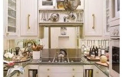
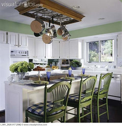
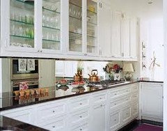
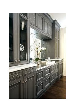
    You have a lot going on in your kitchen and the combination is terrific. I would definitely not go with the backsplash as it competes with what you have achieved so far. I recommend a mirror backsplash. It will reflect the beauty of you choices as well as light. It will not compete because you are not adding another element; you are reflecting what you already have. It is light, inexpensive and easy to maintain. I am attaching some photos as examples. Hope this helps! :)
  • PRO
    14 years ago
    last modified: 14 years ago
    The thing about tile - especially when you are near the end of a project, is that it is tedious, and relatively permanent. You won't likely be repeating the task as often, as, say, repainting your cabinets, should your tastes change. So in my view, in cool eclectic kitchens like yours, the tile needs to be one of the most timeless and neutral elements. I'd suggest a flat pale creamy honed or matte (not glossy finish) subway tile, in an off-white with a grey-taupe tinge to it, shaped just a titch longer and narrower than standard brick size, and run in a classic horizontal pattern. The pale matte colour will keep your kitchen crisp while letting your other elements shine, the narrower proportion will bridge the classic look of subway tile with the modern eclectic nature of your kitchen, and the horizontal run will keep things timeless (the tiles can be harder to cut and align vertically too). A grey tinge to the creamy off white colour will keep the tone cool, and connected to your wonderful concrete counters, and trendy painted cabinets, and a grout in the same colour as the tile will end up showing subtle textured shadow lines that will echo the lovely low-contrast grain characteristic of walnut that you are using (one of my favorite woods); your slab sounds seriously cool! Have a look at these pics that include some of your colours, materials and style, http://www.houzz.com/ideabooks/4080247 and see if you agree that the creamy tile can really support the other elements in modern eclectic kitchens and yet keep things crisp and timeless. Best of luck - your place is going to look great, and the mismatched cabinets are fab. Cheers!
  • PRO
    14 years ago
    That backsplash looks way too busy , look for something light .
  • 14 years ago
    just a qick note, u got great taste, good colour combination (not a "standard taste" ) I love the wood cabinett.. but my first impression was : the dark subway tiles, they are 2 dark...it makes the room looks smaller.... go with lighter shades there... god luck!
  • 14 years ago
    I agree with Daye & Co as the tiles need to be smaller and lighter. Since I just finished installing backsplash I have seen some frosted glass tiles of different shades. Your countertop looks too glossy to get backsplash tiles that are glossy.
  • 14 years ago
    I think it looks great! I love that the green mosaic is lining up with the window cill, I think you should increase the thickness of the green mosaic and that will lighten the effect. It looks as if its only going on one and a bit walls so I dont think it will take from the kitchen, if anything I think it grounds the colossal walnut units! Hope you find something you're happy with and don't rush the decision!
  • 14 years ago
    I really like the tile. I think it really ties everything together.
  • 14 years ago
    BB kitchen · More Info

    I agree with the comments that you should ge light for the backsplash. If you don't want the basic subway, check out Heath ceramics subtle but beautiful. Go white.
    I love all the elements in your new space.
  • PRO
    14 years ago
    You could forge ahead and it will look lovely. I think you could improve it with a minor adjustment of just using all glass tile as you chose and eliminate the larger dark tiles. If you can return what you ordered, then I would switch to a mosaic of 3/4" x 3/4" glass tiles that pick up the green and dark colors of the kitchen. To my eye, the backsplash tiles are a little large in scale and so they are acting as more of a statement than an accent. Here's a photo of what I am talking about although you need mildly different colors for your application.

    Innis Arden Kitchen · More Info
  • 14 years ago
    I have dark granite countertops, cherry cabinets and just installed ceramic white tiles and am putting white grout. looks good so far :)
  • PRO
    14 years ago
    What is your floor color? This can affect the overall darkness/contrast of your kitchen. I agree mixing in some Glass Tile could be lovely and brighten it a bit. Just a strip of 3" or so. I think you are off to a good start and would NOT change to white tile unless it is a unique shape.
  • 14 years ago
    Thank you! I just told my guy to put 3" more of the green to make it accent and lighten up just a bit more. Thank you!
  • 14 years ago
    Agree with RHG Architecture, floor colour is very important... I see 2 often 2 dark floors, too dark shrinks the room... maybe a lighter gray perhaps!? Be AWARE If using lighter colours stay away from white grout, it looks great at the beginning while still fresh but after a couple of cleanings grrrr.. ( my own experince)..pls send us your finished photos we cant wait to c them ;=) again good luck! www.arlebjerDOMUS.com & http://www.finearts-antiques.com/
  • 14 years ago
    Thank you! The floors are natural finish wide planked walnut throughout the whole living room and kitchen.
  • 14 years ago
    I am putting in light ivory 18" tiles.
  • 14 years ago
    thinking outside the box, have you considered either: 1) a stainless backsplash (industrial modern yet classic) or 2) a porcelain tile that looks like terrazzo or natural stone or glass that picks up all the colors (crossvilleinc.com has all those wonderful tile at good prices). remember, the more grout the harder to clean, so set the tiles close. also, the paler the grout, the harder to clean, so go darker. seal your grout before you start using the kitchen. gray and green go well together, as do brown and green. use accessories in a complimentary color to add the magic touch (such as eggplant color). i wish i had your kitchen!
  • 6 years ago

    The back splash is wonderful! Why ? It"s awesome!