Software
Houzz Logo Print
anniedeighnaugh

Pretty color combo

13 years ago
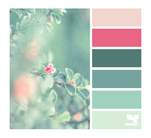
I like to browse design seeds and saw this one that really struck my fancy. So unusual, so pretty.

Comments (58)

  • 13 years ago

    Me neither, they are too close to the 80's colors that the Golden Girls' portrait conjures up, but the blossom photo is beautiful and I like the colors there - just not in my house or clothes.

  • 13 years ago

    I think it's all about execution....golden girls notwithstanding.

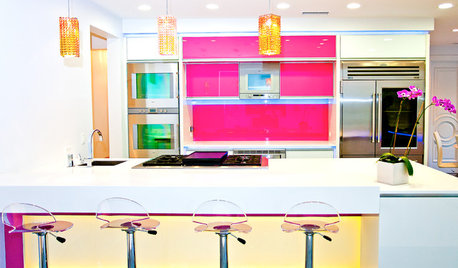
    [Contemporary Kitchen[(https://www.houzz.com/photos/contemporary-kitchen-ideas-phbr1-bp~t_709~s_2103) by Boston Interior Designers & Decorators PLATEMARK DESIGN

  • 13 years ago

    I'm not a fan of this color combination either.

  • 13 years ago

    I really like the one you just posted Annie, but it's missing all the jades and teals and the hot pink...doesn't read the same to me at all.

  • 13 years ago

    Speaking as someone who doesn't waste time on what old moronic tv shows did or didn't do, I like it.

  • 13 years ago

    Rats...I thought this was just going to be a nice friendly thread. I figured how wrong could I go with a pretty picture and some colors.

    Please don't make me have this one pulled too....

    I'm thinking maybe I need to just stop posting all together.

  • 13 years ago

    Sorry, but really, who cares what some ancient tv show did?

    If you find the colors displeasing on their own, that's one thing, but just because of something like that?

  • 13 years ago

    yes, "ymmv" = your mileage may vary. Sorry, I thought that was well understood Internet usage.

    just because other people don't like the colors, doesn't mean responses are not "friendly." Not everyone likes the same thing, so don't expect responses to be uniform. If the OP likes it, that's what counts.

    This post was edited by Violet.West on Wed, Aug 7, 13 at 18:45

  • 13 years ago

    Sorry, but I don't think I could ever use that color combo. Reminds me to much of the extremely over used colors in the 80's. What were we thinking anyway? Not meant to offend anyone, JMHO.

  • 13 years ago

    I think the picture is lovely. We rented a house one time, in the mid 90s, with pink carpet and green walls, the pink at the top end of your scale and the green at the other end. I didn't love those colors together because there wasn't anything to tie them together. With the color range you posted, I love it. I'd love to make a quilt with those colors.

  • 13 years ago

    I would have to call this color combo romantic.

  • 13 years ago

    Thanks for the reminder about Design Seeds, Annie! There are so many interesting sites and I had temporarily forgotten about that one. Good thing I have nothing planned for the rest of the evening! I might get 'lost' there! LOL I love looking at well planned color schemes even if not all are what I'd use in my home.

  • 13 years ago

    The drawing room on Downton Abby has that color combo. It is very pretty.

    I love all colors :)

  • 13 years ago

    I love that combo! I have a blouse that's the shade the third from the bottom that I wear with a vintage necklace that has funky glass beads in the pink shades. I always get compliments when I wear it.

    Our bedroom is in shades of teal, and it needs...something. Maybe I could talk DH into hot pink accents?

  • 13 years ago

    Downton Abbey drawing room

  • 13 years ago

    People seem to prefer either to the cooler or warmer colors. I really like that color scheme as teal and rose are two of my favorite colors. Very pretty and thanks for the site. It is a great resource for color ideas.

  • 13 years ago

    It's inspiration, not literal translation....

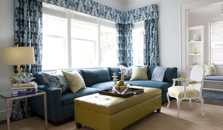
    Phoebe Howard does pink/green

  • 13 years ago

    Love it, Annie.

    My l/r and d/r in our beach condo (soon to become our primary residence) is presently dark beige (maybe you'd say mocha or latte) walls with seafoam green and white striped sofa and some teal, aqua and white accents- the colors of the sea and the sand and the vegetation that I see out of my windows. I see coral/orange a lot with that color combo and that's not for me, but maybe a bit of soft pink would be nice. Thanks!

  • 13 years ago

    Annie I think what happens is you have the vision to see beyond the 'color card' as it's shown and envision rooms with some or all, lighter tints and darker shades. Not everyone can do that or at least at that moment may get stuck with a static visual of the color card and so find that unappealing. But I love the examples you come up with that show the color card in action - it brings life to an otherwise flat visual.

  • 13 years ago

    The Phoebe Howard room is gorgeous, and has me very happy over a recent CL buy. This solid brass and beveled glass coffee table was $15. I put it in my mother's LR and she is thrilled with it. It looks very similar to the side tables in the room above. (minus the handles) So I'm very happy that you started this post!

  • 13 years ago

    Oh my and I just looked at Design-Seeds site. Down the page from your pinks and greens I found another option for me and that shows a soft yellow with my colors (which granted are different from your first inspiration photo). But thanks, Annie!

  • 13 years ago

    I like it quite a bit. I just think it takes skill to pull it off in a room, but when it is done right, it exudes comfort and class.

  • 13 years ago

    Annie, it's okay if people disagree with your taste, it's no reflection on you as a human being. It's so strange what different people can see/imagine with color inspiration. I love all the rooms posted further down, even though they are not my favorite color combos, but see none of the original colors from the samples in any of them. Yes, I see pink and green, but not THOSE pinks and greens... and I don't think the reference to the golden girls was meant literally either, just a metaphor for "dated". (However, I think they are somewhat hot again right now). This really is what those color cards conjure up for me and maybe others:

  • 13 years ago

    franksmom, I don't see it as a hot pink, but in the inspiration piece, it's more of a deep reddish coral. If you tell him it's coral, he may not object so much.

    I typically don't like that band-aid color, but somehow, in this arrangement, it looks ok.

  • 13 years ago

    Funny you posted this yesterday and today this is what is on the House of Turquoise site. It's a calming color palette.

    Here is a link that might be useful: More Kerry Hanson design.

  • 13 years ago

    geokid, The coral pillows above look so sharp. I've not seen Kerry Hanson before...some of those rooms are so pretty...some are yikes with the colors.

  • 13 years ago

    Annie,

    I received my latest PB catalog last night and thought of you when I saw this art. It is on the inside page of the back cover. I think adding more coral/orange and less pink changes the look.

    Here is a link that might be useful: PB Wall Art

  • 13 years ago

    Nice...thanks, Tuesday.

  • PRO
    13 years ago

    Yo. Relax. It's just color. ;)

  • 13 years ago

    Such lovely eye candy. Thanks for the info about design seeds, too!

  • 13 years ago

    You're welcome! Enjoy!

  • 13 years ago

    I love that color combo! We actually had it in the living room of our very first house. We inherited a vintage seafoam velvet french provincial sofa (it was fabulous) - and went with other pale greens and hits of hot pink in the room. We used a jute rug to tone down the sweetness. The room had huge windows and french doors... such great natural light. Sigh. Can you tell I miss this house? Thanks for sharing, brings back great memories.

    PS please don't stop posting, I love hearing your thoughts and learning from you :)

  • 13 years ago

    I love all the possibilities you show for using these colors, Annie. A favorite combo of mine is blue and orange, which plays out everywhere from kindergarten colors to so subtle and sophisticated that you can't use either word in a search if you want to find them (just tried).

  • 13 years ago

    I'm not instantly drawn to that color combination. But I can see it translating beautifully for a little girl's room especially. And the follow up examples are interesting. Thanks!

  • 13 years ago

    I happened to be in my PR the other day when it dawned on me....this pic was painted by my grandmother...more orange than coral, but the teal for sure.

  • 13 years ago

    Interesting to see how the theme evolved here. I like the later iterations, and of course Downton Abbey

  • 13 years ago

    Annie, I love it. The pic reminds me of looking out the window on a warm misty summer day. So calming and beautiful. How could nature ever be wrong?

  • 13 years ago

    I like the inspiration card Annie and and many of the pictures shown. I think the Golden Girls room was just bad taste, whatever the color combination.
    Here are a few pink and green ideas from my saved inspiration photos.

  • 13 years ago

    Porch

  • 13 years ago

    Front steps

  • 13 years ago

    Vases

  • 13 years ago

    Dining

  • 13 years ago

    Outside dining.

  • 13 years ago

    Baby

  • 13 years ago

    Rose garden

  • 13 years ago

    Wow deejaus, thanks for posting all those lovely pictures....hard to pick a favorite, but those front steps are so inviting!

  • 13 years ago

    This must be the new "in" color combo. A few days ago I saw a tv host wearing a sleeveless dress in a floral design with the above colors - beautiful.