Software
Houzz Logo Print
holbrook1

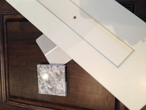
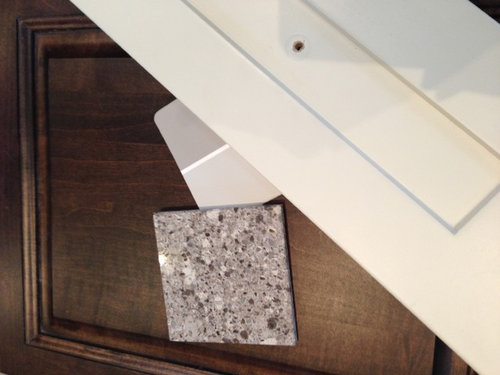
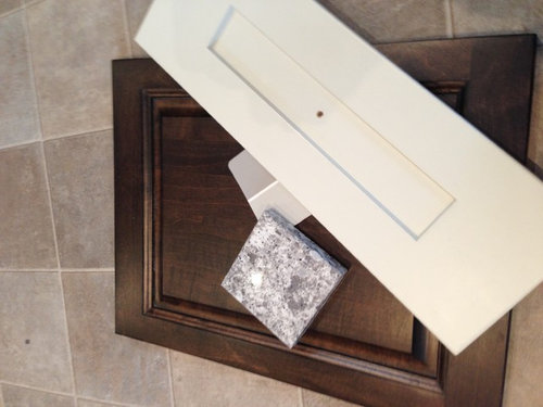
Which Quartz countertop do you like best?

11 years ago

Comments (169)

  • 11 years ago
    3rd, certainly
  • 11 years ago
    last modified: 11 years ago

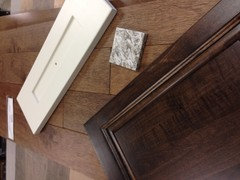
    They're all very close. Just make sure you take your paint chip and cabinet door to the fabricators and look at them with the large slab. It's very hard to decide on such a big purchase by looking at a 3" square. You want to make sure the movement isn't too much and that the colors are right.
    Also take a tile from your floor.

    holbrook1 thanked leelee
  • 11 years ago
    #3
  • 11 years ago
    2
  • 11 years ago
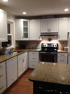
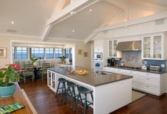
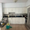
    Looks to me like your third choice is Alpine White. I'm just finishing up my kitchen remodel and I absolutely love the Alpine White counters we chose. Well here's what it looks like with white cabinets. Hope you find it helpful.
  • 11 years ago

    It is Alpine White, your kitchen looks beautiful!!

  • 11 years ago
    #3, “the magic number" ;)
  • 11 years ago
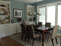
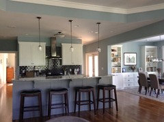
    My cabinets and island are the same colour as yours. We decided on Benjamin Moore Delaware Putty paint and our granite on the island is Magma and on the counters it is Cambrian. Looks classic and timeless.
  • 11 years ago
    I have Cambria counter similar to #2 with similar island choice.
  • 11 years ago

    #3 would look best because it matches your dark island color better. And it would be less busy looking than 2. :)


  • 11 years ago
    #1
  • 11 years ago

    Be really careful about those bold and beautiful Cambria quartz samples. In real life, unless you have a huge kitchen - they are really "busy" and overwhelm the space. Just too much.

    I went with Cosmos "ThunderRoad", and I like it. I think the Viaterra Aria, and Rococo are also good choices.


  • 11 years ago
    last modified: 11 years ago

    If you consider Cambria Quartz, it is very important to view the entire slab before selecting. The samples do not give you the true since of the quartz's design. We made a trip to their showrooms in Palm Desert, CA to view the slabs before making a selection. We also went to a supplier who handled Pental Quartz before making a final selection. The small samples of manmade quartz look very different in a large format. If you can't view the slab in person, the next best is an internet search of the installed product so you can view the slab installed via a picture.

    Good luck and enjoy your new kitchen!!

  • 11 years ago

    What do see as the focal point of your planned kitchen? #3, the whole point is to have the counter highly contrast the cabinets. Matching is last century boring.

  • 11 years ago

    #2

  • 11 years ago
    One has a "whiter" feel, two is the more neutral between the three choices and the third one has more interest, but is the busiest pattern. They would all work in the greater scheme. Just keep studying them and go with the one you are leaning toward. It might help to go to a showroom where you can see larger samples. Post final pics!
    holbrook1 thanked Janie Burton
  • 11 years ago

    #3 is the best for 2 reasons, color and pattern. It's not overpowering

  • 11 years ago

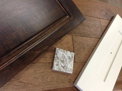
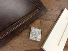
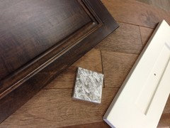
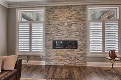
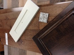
    Here's 3 pictures of the floor we liked best today. The picture at the bottom was my inspiration pic. I should have got a better picture of the floor but I was trying to see it next to the cabinet colours and quartz. Thoughts?


  • 11 years ago

    Oops it looks like it loaded the same picture 3 times... here's a different look at it.


  • 11 years ago

    I like that combo with the floor choice. Looks nice!

    holbrook1 thanked Ann
  • 11 years ago

    I agree with whoever said they all look too busy. I would choose something darker that matched the color of the island and with less of a pattern.

  • 11 years ago

    Of your samples I also like #2. Cambria WAS the only American made quartz option -- till just recently -- Now there is also Wilsonart (yes, the old laminate competitor of Formica)!

  • 11 years ago

    I just checked wilsonart.com and they show 24 quartz patterns.

  • PRO
    11 years ago

    2 Looks great

  • 11 years ago
    I say pick a less busy pattern and something a bit more original.
  • 11 years ago
    Have you seen Ceaserstone Frosty Carrina? Might work very well. You could use it just on the island and use one of the two you have chosen for the rest of the countertops.
  • 11 years ago
    #2 is the one I would choose. Looks good without looking "busy."
  • 11 years ago

    #2

  • 11 years ago
    I like 3. The spatter pops and makes more of a statement imho.
  • 11 years ago

    Out of the three you show I would pick # 2. But have another suggestion. I am doing my kitchen right now and originally had selected a quartz like yours in green/grey tones. It was suggested to me why I would pick a quartz that looked like a granite. If you want that look just get granite. But if you want quartz get something closer to a solid look. I picked Lagos Blue Ceasarstone (no blue at all but actually a gorgeous chocolate) and I LOVE it. (My cabinets are white too). Note: this is not my kitchen - I wish!

    Santa Barbara Hope Ranch · More Info


    holbrook1 thanked Vicki Kennedy
  • 11 years ago

    The 2nd choice looks elegant!
    See if you can get a larger piece before you make your decision.


  • 11 years ago
    All nice. I chose #2 as my first option & #1 as my second
  • PRO
    11 years ago

    I think the second one looks the nicest, with your ensemble!

  • 11 years ago
    I immediately picked 2! Beautiful! Number three is too "spotty" for me, but for you or someone else it might be their favorite. You've probably done this, but look at pictures of the full slab and have your supplier get you a larger sample of the one you like to see the pattern on a larger surface. I love your selections!
  • 11 years ago
    2
  • 11 years ago
    # 2 for me as well!
  • PRO
    11 years ago
    Being that those appear to be engineered quartz, I strongly suggest that you see a larger piece before committing to either. On a larger scale, the choice becomes much easier. One or perhaps both may seem too busy for you or maybe just right. Good luck.
  • PRO
    11 years ago

    Really like the movement in #2!!

  • 11 years ago

    Hi everyone! I have a new question for our build. My husband and I are having a very difficult time deciding on what colour the light fixtures should be. Since our house is very open concept I think they all need to be one colour. How do we know what will go better with the style of our home? Our taps and kitchen accents are chrome but our door handles are almost black. Any advice is appreciated! Thanks!

  • 11 years ago
    last modified: 11 years ago

    In our new build/open concept I mixed brushed nickel with dark grey (Hubbardton Forge) and black light fixtures, and my kitchen cabinet hardware is an antique pewter look. I didn't mix in chrome because my old house had builders grade chrome fixtures, and oiled bronze seemed out of place for the look I wanted.

    holbrook1 thanked juudean
  • PRO
    11 years ago

    If the rest of the color palette of your home is similar to what you have shared about your kitchen, dark bronze would look very rich.

    holbrook1 thanked Design Intervention
  • 11 years ago
    Number 1
  • 10 years ago

    2

  • 10 years ago

    thread is a year old -- they probably made a selection by now! :)

  • 10 years ago
    I like #2. Have you checked out Cambria's other new colors? Gallway is one of them.
  • 10 years ago
    Pick all the materials. Backsplash will affect you decision, so will floors. I do like two. I would suggest going to see the entire sheet of material before any work is done to counter top material. I have had a few surprises with swirls and veins that may disappoint you in the end. Those little samples do not reflect the real product. I try to stick to neutral counters. You have to live with them a long time.
  • 10 years ago
    Old post.
  • 8 years ago
    I love the 2nd one, not so busy and looks more elegant than the other two. Flows very nice with your cabinets too!
  • 8 years ago

    Just read this old post and finding many of your comments helpful thanks!

  • 5 years ago

    I'm sorry; I don't like either.I would look at quartzite. Much more beautiful.

Sponsored
Buckeye Basements, Inc.
Average rating: 5 out of 5 stars40 Reviews
Central Ohio's Basement Finishing ExpertsBest Of Houzz '13-'21