Software
Houzz Logo Print
cpucci

Need help desperately with paint in master bath...pls

11 years ago
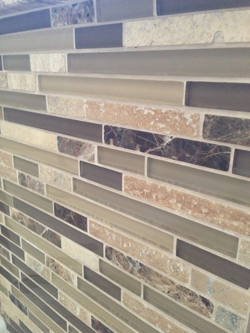
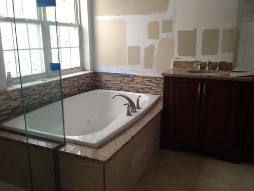
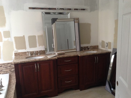
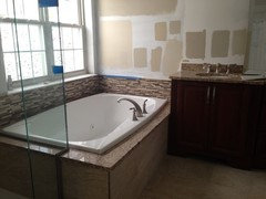
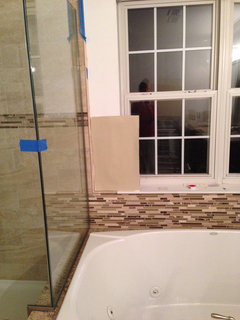
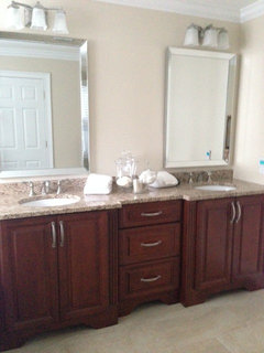
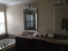
Ok this paint color has been driving me nuts and I mean nuts. This is a south/west facing bathroom..so lots of natural light. I really wanted a spa type bath. Here are some pics. Please help with the color paint. Because of the brightness during the day and of course the change at night the paint color change dramatically. HELP.


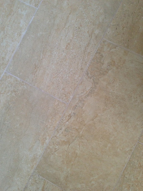
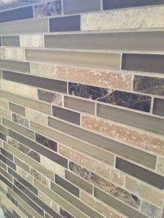
Floor and base of tubTile and on the shower wall

Comments (59)

  • 11 years ago
    I remember Sarah Richardson once said pick your favorite color for your bathroom and then go several shade lighter. How about a step lighter than your grout? Is that weird? I'd also consider Martha Stewart's ironstone white.
    Christina Pucci thanked miacometlady
  • 11 years ago

    diyer59 ...definitely ready to tear my hair out. I am trying to make sure I get the right tone b/c there are many colors in the room. The cabinet is a honey stained cherry wood. It was a custom cabinet that was made for us to fit the area 89 inches. But the granite was not the original granite I picked the one that I wanted was a more yellow Giallo Ornamental but ended up being a more brown Giallo Ornamental. It actually looks great with the cabinet. Anyway, my husband is going to kill me if I come home with one more sample paint color. I can honestly open up a BM store. It is a very room so when I put up light colors near the window they are washed out but I know that I want to go lighter - just seems like the right thing to do in a master bath.

  • PRO
    11 years ago

    Having used that granite and tile combo in the past. I have found that Sherwin Williams SW 6091 Reliable White works well.

    Christina Pucci thanked DirectBuy of Fort Worth
  • 11 years ago

    Would you have a comparable suggestion using Ben Moore paint...

  • 11 years ago
    last modified: 11 years ago

    Christina-we have all been there before. I have so many samples of paint in my garage from a recent kitchen renovation. Hang in there. Understandably, you want to get it just right. Do you have a sample of your travertine and mosaics that you could bring to the paint store? I agree with the above suggestions to go lighter. Pick the very lightest color in the tile. As long as you have a bit of a contrast with the white trim, it will look nice. Try to pick a neutral that doesn't have any yellow in it. Here is a picture of our bathroom-I'm not certain about the wall color bc it was already painted when we moved in, but as you can see, we have the same cabinet colors, same travertine, and same countertops. Keep us posted and hang in there.


    Christina Pucci thanked User
  • 11 years ago

    Try Benjamin Moore HC-172 Revere Pewter

    Christina Pucci thanked Jamie
  • 11 years ago

    Karen Dumont.. that's the look I am aiming for. believe me I have brought all that stuff to the paint store but when I bring it home its another story. But I am going to go light as all suggested just trying to find the right undertone. Yellow undertones definitely don't work - I tried the Manchester Tan - which is the lightest in the pics above. Just does not look right. . Jaime I tried Revere Pewter which I love but definatley too gray. The colors on the wall in the pics above are Grant Beige, Bleeker Beige, Manchester Tan all Ben Moore colors.

  • 11 years ago
    revere pewter
  • 11 years ago
    last modified: 11 years ago

    What is the next lightest color on the card from Manchester tan? You could be on the right track and close. Although I love revere pewter, I think it would be too gray in your bathroom. Accessible beige by sherwin williams is a very neutral greige-it looks great with almost anything. Here is a picture of the color on the walls. Think it would look great with your wood cabinets, travertine tile, and mosaics....and it is light enough. Also, it looks great with white trim work as you can see in the 3rd picture I posted.

    Christina Pucci thanked User
  • 11 years ago

    Karen the Manchester Tan is more yellow undertone that's why I don't think it works. I know what Accessible Beige is like that is a nice color...what are your thoughts on something with a green undertone? My master is painted in BM Camouflage with is adjoining to the master. should I be using something that complements that?

  • 11 years ago
    I like the color on the bottom right of the tub, but dont be afraid of bolder paint color with all of the neutrals you have. I have travertine in my powder room and it was killing me because it appeared pinkish under fluorescent lighting. I bit the bullet and did a warm midtone gold in a very small room. The pink disappeared. I think the same will happen to you.
    Christina Pucci thanked Linda Fleming
  • 11 years ago

    tio2 the color on the bottom right of the tub is also the same color as the bottom left of the tub(Manchester Tan) . Perfect indication of how the color changes as it gets away from the window.

  • 11 years ago
    I would also recommend trying Benjamin Moore revere pewter. It works well with so many colours.
  • PRO
    11 years ago

    Why stick with beige or tan? Consider a color like Benjamin Moore Palladian Blue and allow your beautiful tile work to really shine!


    Christina Pucci thanked MARK IV Builders, Inc
  • 11 years ago
    last modified: 11 years ago

    Yes, Christina-I would definitely try to find a color that compliments the color in your master bedroom. I'm not familiar with BM Camouflage. Do you have a picture of your room that you could post? And yes, I think a color with green under tones would work well. I love blue as others have suggested but not sure how it would work with your granite.

    Christina Pucci thanked User
  • 11 years ago

    I know that Palladian Blue is a very popular color which I have considered but I'm not sure how that would with the decorative tiles and counter?

  • 11 years ago
    last modified: 11 years ago

    I don't think blue would work with your granite and tiles, but it's worth a try since others are making the suggestions. I still think a very neutral beige would work best with the mosaics, travertine, counters, and cabinets. But trying a sample of the Palladian Blue is worth the try. Have you tried painting a sample of the revere pewter on the wall??

    Christina Pucci thanked User
  • 11 years ago
    I was just reading through your comments, and looking at your photos while I am sitting in my bedroom which is painted a light gray/blue/green, Sea Salt by Sherwin Williams. A comparable Benjamin Moore color is Crystalline, AF-485. The color is a very spa like color, and goes beautifully with my dark espresso wood furniture, and also with my newly painted white trim.

    As I looked at all of your color swatches on the wall, and read your description of wanting a spa like feel to your bathroom, I wondered if perhaps a soothing blue gray would work better instead of trying to match the tan colors.

    Sorry, not to introduce a different color, but I couldn't help myself! :)
    Christina Pucci thanked sarah_bezanson
  • 11 years ago

    christina..do you mind me asking what is the brand/color of your travertine tiles? very pretty!

    Christina Pucci thanked etravel3965
  • 11 years ago

    Indigo152 has a good point. Since you are looking to create a spa feel to your bathroom and your mosaics do have some green in them, why not try sea salt. It is a beautiful color. Accessible beige also has green under tones. Maybe that's what you should be aiming for-a color with green undertones because of your mosaic tiles. Keep us posted.

    Christina Pucci thanked User
  • 11 years ago

    Remember with the changing light from the window, each wall will appear a different shade even with identical paint, and it will change as the day goes by. Just keep it light.

    Christina Pucci thanked pdk920
  • 11 years ago
    last modified: 11 years ago

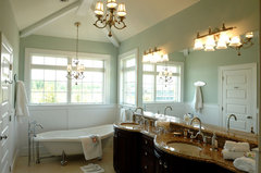
    You read my mind and got me thinking indigo152! Also, found this picture of sea salt in a bathroom with dark cabinets and what appears to be a similar counter top as yours, Christina. Still not sure how the blue-green will work with your mosaics, but it's worth a try. After all, what's one more paint sample? Haha. And while you are out, I would grab a sample of accessible beige. Can't wait to see what you decide on!

    Owner's Bath · More Info

    Christina Pucci thanked User
  • 11 years ago

    You guys are great. Thank you so much for all of your help. I was in the bathroom last night looking at the paint chips of sea salt and accessible beige and also White Sand. I actually like the White Sand (BM) that you suggested Karen. I think that Sea Salt may be a bit too minty looking for the room. The cabinet is a Honey stained cherry cabinet...not a walnut / espresso color. Im going to have my hubby paint primer over all the paint colors that I have and Im going to try to figure this all out. I almost think a gray/green will work it's just finding the right shade. Because when I tell you the light how it changes it is unbelievable.

  • 11 years ago

    here is a pic from last night. Disregard the poster board of paint.. I don't remember which color this is . But this will give you an idea of how the tiles look at night .


  • 11 years ago

    I really like this color with the mosaics, Christina! It looks pretty perfect to me. How do you like it with the cabinets, counters, and travertine?

    Christina Pucci thanked User
  • 11 years ago

    The color above is Bleeker Beige it has a bit of a green undertone. But this is also one of the many colors that I have on the wall. I am afraid it's too dark

  • 11 years ago
    Have you tried BM edgecomb gray? I have it in my hallways and find it blends well
    Christina Pucci thanked cvlee12
  • 11 years ago

    Try the color that is one to two shades lighter than Bleeker Beige.

    Christina Pucci thanked User
  • 11 years ago

    I will check that out.

  • 11 years ago

    Bleeker beige is a Historical Color so it's like not on one of those chips that show the lighter colors

  • 11 years ago
    last modified: 11 years ago

    If you really love Bleeker beige, you can always reduce the paint color 50% to lighten. See link below.

    http://theletteredcottage.net/how-to-lighten-or-darken-paint/

    Christina Pucci thanked User
  • 11 years ago

    Karen, that is what I was thinking but was not sure . I actually loved Grant Beige and was going to reduce that by 50% but was not really sure b/c from experience reducing something 50% honestly doesn't make a huge change.


  • 11 years ago
    Coastal Fog by BM???
    Christina Pucci thanked shortped
  • 11 years ago

    I will check out Coastal Fog. Is that more of a gray / green?

  • 11 years ago

    I am struggling with colors too for foyer right now and have been testing a lot of shades....take a look at BM Jute, its light and airy and might compliment your granite and backsplash. if going darker you can also take a look at BM thunder or revere pewter, revere pewter compliments dark wood very well and has a little green undertone, it will work with your camouflage in master bed as well.... I wouldn't try to match the tone of granite in paint color instead would work to make it the focal point or pop, revere pewter will keep you in the greige area, your beige bathroom tiles and your gray green bedroom might find a middle way with a greige....you will get tons of revere pewter photos on houzz! good luck!


    Christina Pucci thanked paromasri
  • 11 years ago

    paromasri...thank you. this is what I am having trouble with . To be honest it is the granite counter top that throws me off on the color...par for reason why I am having such a difficult time. It is a south/west exposure so lots of light, therefore the colors change so much from day to night. Revere Pewter is a great color but I think too gray for the room. I love grant beige but just too dark. this is driving me nuts.

  • 11 years ago
    last modified: 11 years ago

    Benjamin Moore "Glass Slipper" or "Quiet Moments" would make all of the dark colors in your bathroom pop. Plus, it is so very zen. If you want the bathroom to look relaxed, don't use a paint color that fights with the other dark colors in the room. Use a much lighter color to offset, and compliment the others. See how these match up to the flooring, cabinetry, granite countertop (and tiles). It will look "put together" in a very nice way.

    Look at the "Goes Great With" sections in these two BM web pages:

    Christina Pucci thanked M. Hope America
  • 11 years ago

    Here is revere pewter combined with more 'tans' in the marble, i think it can lean that way when paired...i too thought too gray when we first put it up but I love how it blends now. Edgecomb Gray is one shade lighter on the BM card


  • 11 years ago

    Another possibility is BM

    carlisle cream 1031


    Christina Pucci thanked cvlee12
  • 11 years ago
    Sometimes there IS no right color! Would you consider a statement wallpaper??? Not that it makes the choices any easier. And just a side note, if you are not married to that massive mirror I would consider two beautifully framed individual mirrors over the sinks.
    Christina Pucci thanked djstegman
  • 11 years ago
    I'm curious if you found the "perfect" color? If so, share photos, please :)
    Christina Pucci thanked sarah_bezanson
  • 11 years ago

    Hi indigo152. If you only knew how crazy I have been with this. I have been teaching myself to be like s color expert...as a matter of fact in the last week I think I narrowed it down to 2. BM white sand and clay beige. They both look great but I think I am leaning towards white sand. I will keep you posted. Ps thank tou so much for your help and touching back

  • 11 years ago

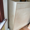
    I'm not sure why the pics are sideways

  • 11 years ago
    last modified: 11 years ago

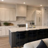
    Christina, your bathroom looks beautiful! Love your mirrors!

  • 11 years ago

    Thank you so much for all of your help Karen. I will definitely use Houzz for future projects. Love how real people are and the ideas that are given.

  • 11 years ago

    It is gorgeous.

  • 11 years ago

  • 8 years ago

    So Christina. Which color did you end up going with? It looks great!